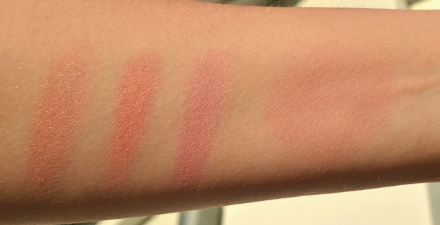
Who said a beauty blogger can't write a post about other things? Like random things... Let the world speak about Angelina Jolie's breasts, today I would like to talk about...
Birds!
Yes Birds. Over the decade we had seen many cat (and occasionally goat) images on beauty blogs, so why not birds? Birds are colorful, thus speak for the name of this blog and passion for the make-up enthusiasts, right?
After reading that someone spent several hours trying to create real Angry Birds digitally (which were anyway digital but, hey, those look at least more real) I decided to focus on real "analog" birds for today's post. Take a look at these three...
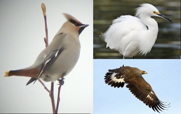 |
| Left: Bohemian Waxwing (source:cornell), right up: Snowy Egret (source: grahamowengallery), right down: Eclipse Eagle (source: raptorresearchfoundation) |
On the left we see Bohemian Waxwing. She is called Waxwing because of the shape of her secondary wings looking like drop of sealing wax. Her unpredictable migration patterns gave her the name "Bohemian" meant in a Gypsy way (source: Wikipedia). Once I look at her through my beauty blogger glasses *puts them on* I see the gorgeous taupe color of her body, makes me want to take out a few of her hair and decorate my lashes with them *finds herself drooling, terrified takes her glasses off*. Before we speak about how to make my scary visions come true, let me introduce you to Snowy Egret on right upper corner. Gorgeous white bird, with such a chic natural head decoration. Many women must have been inspired by it to the point that Snowy Egret was once being searched by market hunters for hat decoration (source Wikipedia). Thankfully those days with many feathers on hats must have been long over. Oh and what about the mighty eagle on the photo right down? I think this one introduces itself by just swinging her wings and doesn't need my help
These beautiful birds don't come together very often in real life, so much like the effort of digital artist putting Angry Birds together, I tried my best to put these three gorgeous colors together, in form of... Eye Shadows...
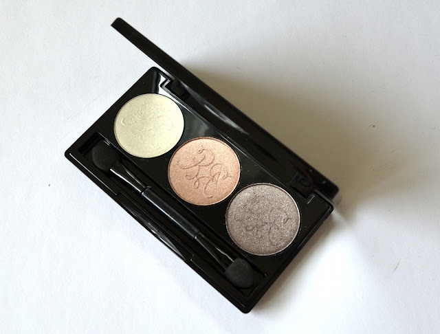 |
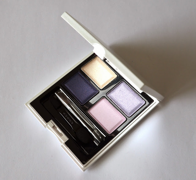
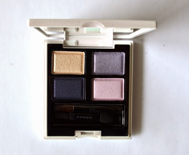
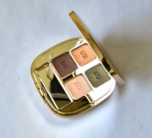
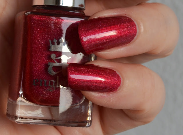
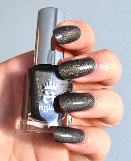
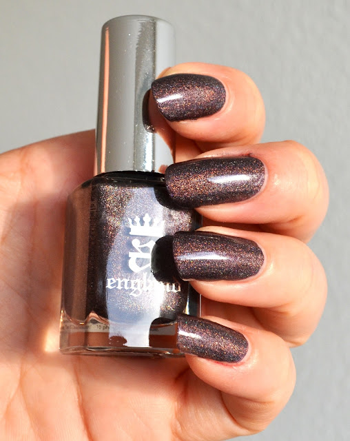
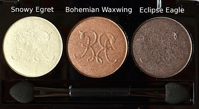
| Rouge Bunny Rouge Trio with Snowy Egret, Bohemian Waxwing, Eclipse Eagle |
Long lasting eye shadow range of Rouge Bunny Rouge (not an affilate link), a London/Moscow based beauty brand which has been praised for their quality and design on beauty blogging space for years, are inspired by these beautiful birds. Check out for Cardinals, Nightingales, Blue Bird and many more. I took advantage of one of their offers and ordered their empty eye shadow keeper. This is a sleek case and has nice details such as very tiny holes at the back making it easier to take the eye shadows out. I already had Snowy Egret and Eclipse Eagle, so I thought of a medium color to warm the combination up and ordered Bohemian Waxwing.
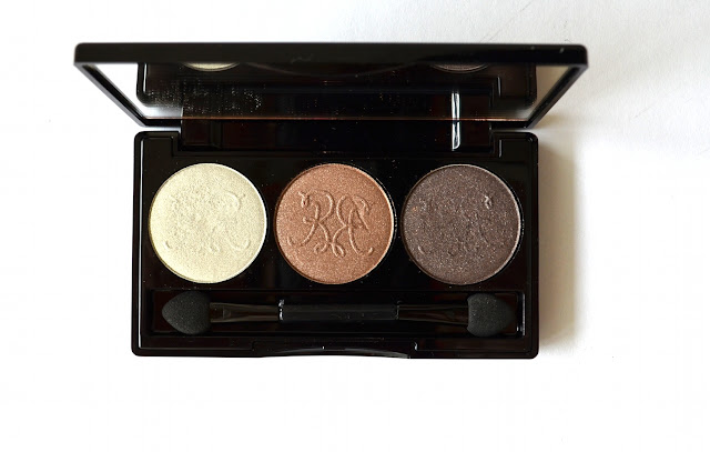 |
| Rouge Bunny Rouge Trio with Snowy Egret, Bohemian Waxwing, Eclipse Eagle |
I would like to shortly write that the quality is to die for, the powder is very soft to touch and almost like butter meting on the skin. Moreover the colors have a certain complexity once applied, having multi colored subtle shimmer making them appear gorgeous on the eyelids.
 |
| Close-up Rouge Bunny Rouge Trio with Snowy Egret, Bohemian Waxwing, Eclipse Eagle |
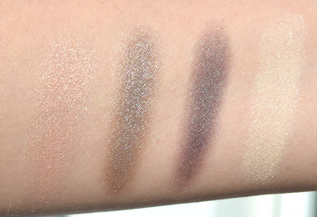
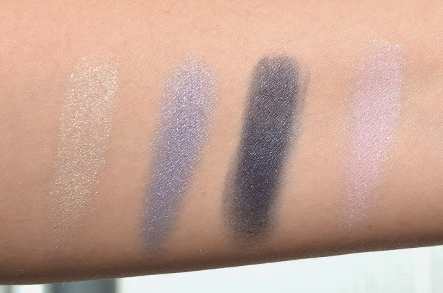
Snowy Egret is a warm white with golden shimmer, once swatched it appears more warm than in the pan. I like using it for highlighting purposes, on the corner of the eyes or sparingly under the brows. Bohemian Waxwing is defined as a bronzed champagne but it is more than that. It is a warm mid toned bronze with golden and taupe shimmer and is a gorgeous complex natural color. Eclipse Eagle is said to be the darker brother of "Delicate Hummingbird", a very popular eye shadow of Rouge Bunny Rouge. Eclipse Eagle is a dark taupe leaning plum with platinum shimmer. I prefer this one to Delicate Hummingbird in my trio because I use it as defining color and I like it to be a bit darker.
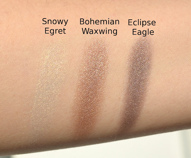 |
| Swatch of Snowy Egret, Bohemian Waxwing and Eclipse Eagle under direct sun light |
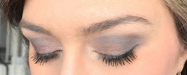
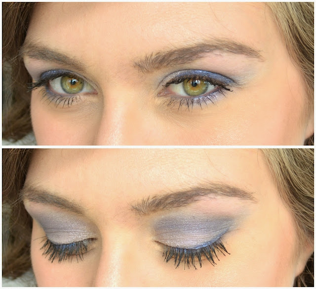
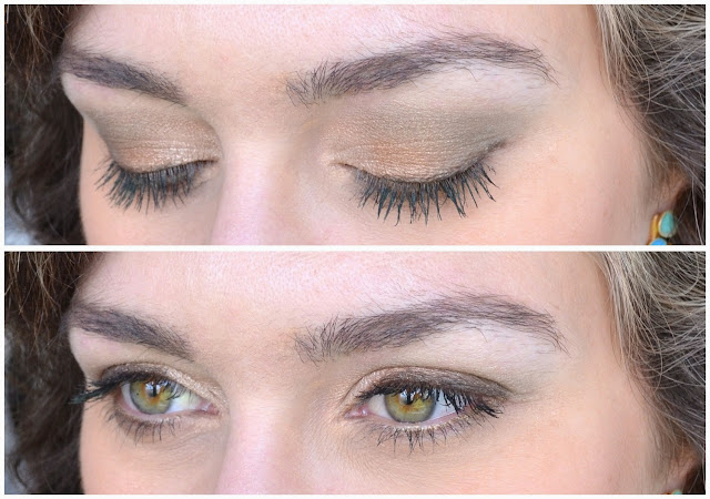
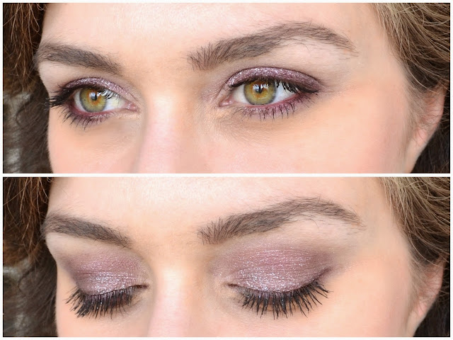
For the eye make-up below, I used Bohemian Waxwing all over the lid, then highlighted the inner corner of the lid with Snowy Egret. I then defined the crease with Eclipse Eagle and blended out the edges with Snowy Egret mixed with Bohemian Waxwing.
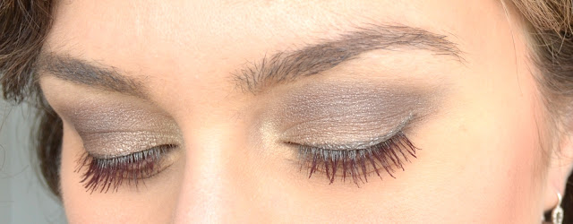 |
| Eye make-up with Snowy Egret, Bohemian Waxwing, Eclipse Eagle, eyes closed |
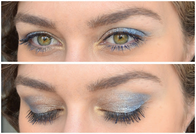
To complete this look, I used Urban Decay Eye Pencil in Mushroom along the upper lid and Chanel Stylo liner in Or Rose along the lover lashline to brighten up the eyes. If you carefully look, you will see that I am wearing a red mascara. This one is also from Rouge Bunny Rouge, called Megaplums in Oxblood. Although I don't find this mascara to be very dramatic, I love its color, especially once worn with black eye liner.
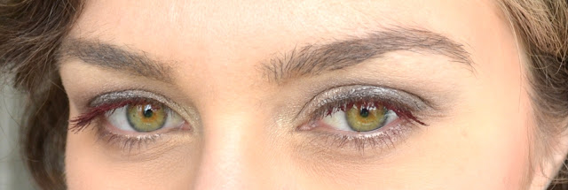 |
| Eye make-up with Snowy Egret, Bohemian Waxwing, Eclipse Eagle, eyes open |
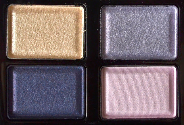
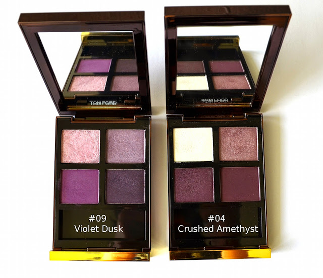
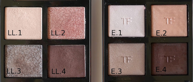
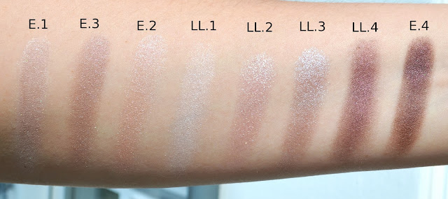
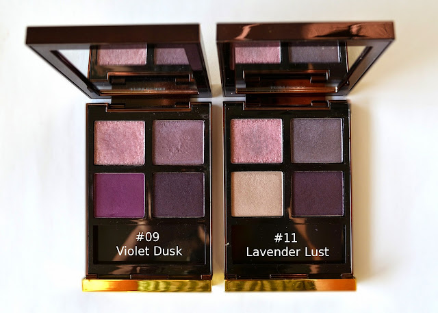
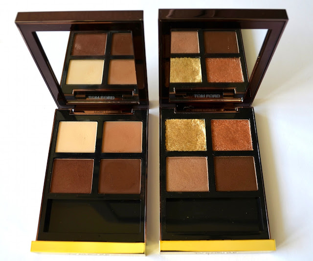
I went through my stash to find a similar colored palette to this one that I put together. The closest I got was the recently released spring palette of Chanel called Raffinement. As seen in the swatches below, although the shades are not very close, all in all the satin shades give a similar feeling to Snowy Egret and Bohemian Waxwing. As for Eclipse Eagle, I find that the closes shade is from Tom Ford's Silvered Topaz Palette, which is not swatched here. I am going to come back to that once I start my preview series for Tom Ford palettes.
 |
| Comparison of Snowy Egret, Bohemian Waxwing, Eclipse Eagle to Chanel Raffinement Quad |
Final thoughts: Although I own many palettes, I rarely put one myself together. This must have been one of my rare attempts and I have to say that I love it! Given the quality, color pay off and texture of Rouge Bunny Rouge eye shadows, this won't be my last trio. Big thumbs up. If you want everything swatched at once, check out RBR Swatch Set and Belly's blog.
Do you own any RBR products? How is your experience until now?