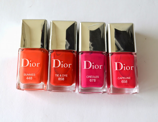
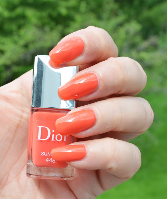
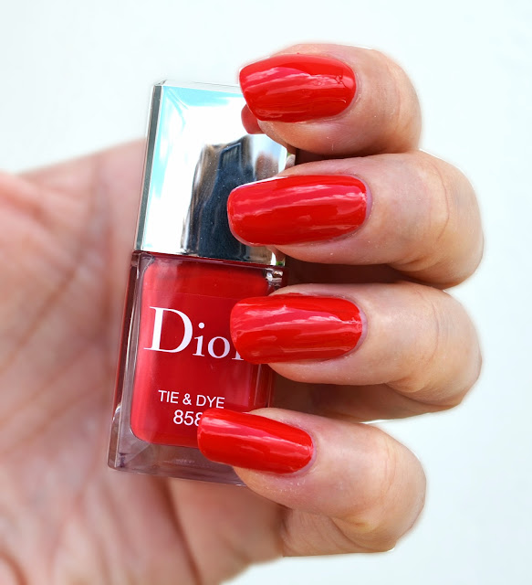
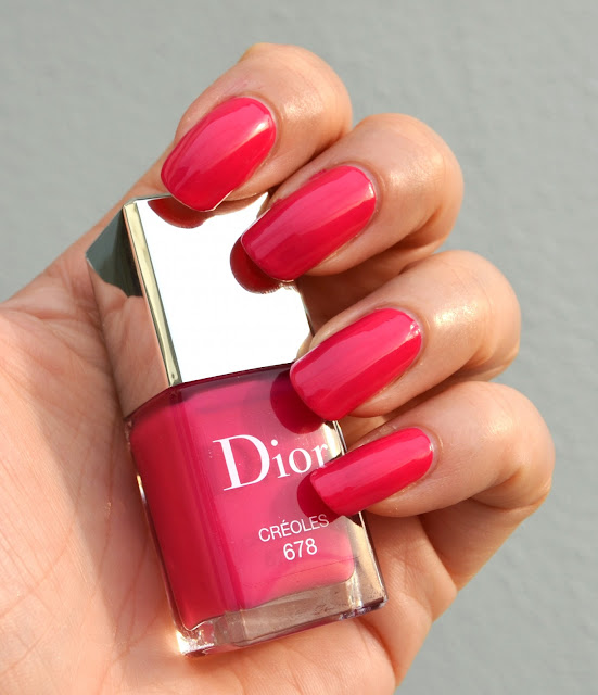
Dior's Summer Mix 2013 started to appear on the counters in some of the countries such as US, UK and Canada. They are still not here in Germany but with a bit of determination, it was possible to get my hands on them. Three of the four shades are on their way from Italy to me, the fourth shade entered Color Me Loud Headquarters yesterday night, Dior Vernis #678 in Créoles...
 |
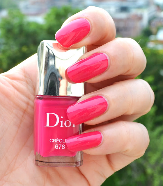
| Dior Vernis #678 Creoles from 2013 Summer Mix Collection |
This one was definitely the right one to come first and make me get excited for the other three even more. I guess it is going to be my favorite of the bunch by just considering the promo photos, since this is the one with the most blue in it! I am a sucker for blue based hot pink shades, one of my all time favorite nail colors being African Violet from Tom Ford must say it all. Dior #678 Créoles is not violet but borderline to fuchsia. It just stops at the point a pink stops being pink anymore, if this makes sense. On the photos it look less blue based. In reality it is also a tad brighter and slightly darker.
 |
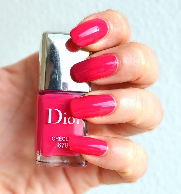
| Outdoor swatch with direct sun light: Dior Vernis #678 Creoles from 2013 Summer Mix Collection |
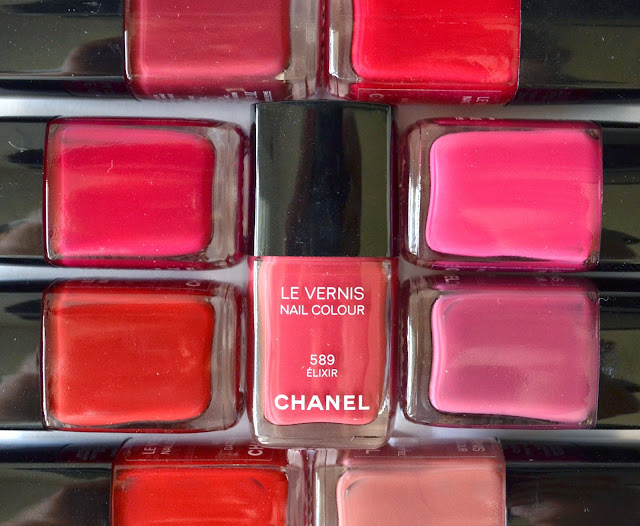
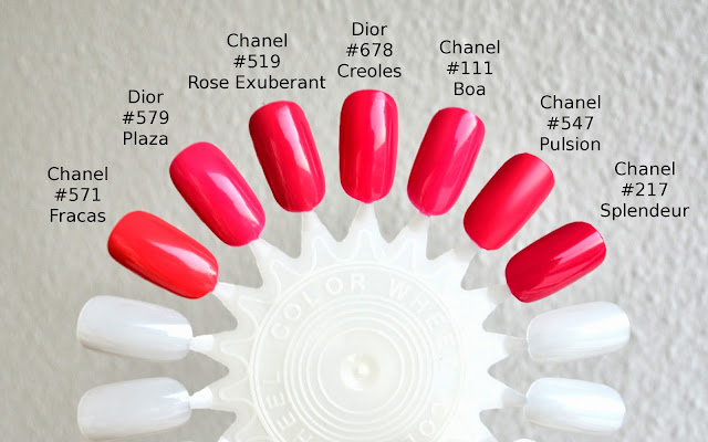
Formula wise Créoles is nail polish junkie's dream. Opaque with almost one coat, Créoles is self leveling and has a good consistency, not too thick or thin. Shade wise some of you may be thinking it is very dupable. I brought it together with similar Dior and Chanel shades. I went through my stash and found the most similar colors. Some other colors which are not included in this review are not very similar, such as Chanel #339 Cassis (more blue based and darker), Chanel #441 Cherry (redder), Chanel Riviera #537 (less blue based pink, lighter), Guerlain #165 Champs-Elysée (less blue based, redder) and Chanel #561 Suspicious (more red and darker).
 |
| Dior Vernis #678 Creoles and similar shades |
The most similar Dior shade to Créoles is Dior #579 Plaza, which is more pink, less blue based and lighter once applied. Chanel #547 Pulsion is pretty close in shade but matte in finish, not glossy like Créole. Chanel #217 Splendour is significantly darker and recently released Chanel #571 Fracas is almost a coral once compared to Créole (more yellow based).
 |
| Dior Vernis #678 Creoles and comparison to similar shades |
The closest of the two Chanel shades color and texture wise are #519 Rose Exuberant, which is a tic more red and darker and an older discontinued shade #111 Boa, which is a tic lighter and appears more pink. I haven't found a direct dupe to Créoles in my stash but I believe if one searches in drugstore, there should be a few shades which are close enough. Nevertheless I enjoy the superb quality and "just right" color of this true hot pink while writing these lines with Créoles on my nails.
 |
| Dior Vernis #678 Creoles and comparison to similar shades |
One more picture to enjoy... Getting inpatient for the rest of the colors...
 |
| Another outdoor swatch with direct sun light: Dior Vernis #678 Creoles |
Final thoughts: Vernis #678 Créoles is one of the four new nail polishes from Dior, released together with their four new creme blushes for this summer. Perfect in quality and finish, it is also in one of the colors I can't resist. I think this shade can be used throughout the year since it is not very vibrant nor very dark or light and also exactly between pink and fuchsia or pink and violet, Créoles is just right. Love!
Have you checked Summer Mix of Dior? What about the creme blushes?