Quantcast
Channel: Color Me Loud
Viewing all 679 articles
Browse latest View live

Chanel 579 Paparazzi from Avant-Première de Chanel

$
0
0
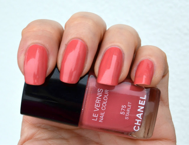
The release day of Chanel's new collection Avant Premiere de Chanel is now official. It is due to 15. April. Since only just a few days left, I would like to introduce you to the last piece I have for now, a china-rose shade with secret copper shimmer, Paparazzi, and here is her story...

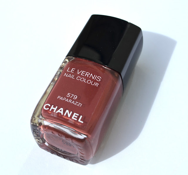
Chanel Le Vernis 579 Paparazzi mug shot

Paparazzi woke up that morning with excitement. It was an important day and she couldn't effort running late. She started searching her wardrobe for the best brownish rose dress she could find. After all it was the dress code for this very important event and she had to look flawless. After putting her dress on, she looked at herself on the mirror. It was daylight shining through the window and she could see the tiny sparkles of her dress playing with the sun light.

Chanel Le Vernis 579 Paparazzi under day light
She was not quiet convinced. How would she look like under all the flashes of the photographers. To test this, she took her camera and turned the flash on. She took her own photo and checked it out. Now she could also see the hidden shimmer of her dress. She liked it, it was looking gorgeous. Smiling she put the camera aside, went on fixing her make-up.

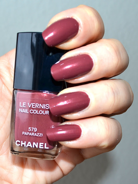
Chanel Le Vernis 579 Paparazzi with flash

After she was done with getting ready, took a cab to the location. Oh how excited she was. After getting ready for days now, would she be the prettiest one? Could she get her pictures on the newspapers? Or would she just be ignored? Were the others prettier? Deep in thought, she finally arrived the location, and what she had seen was a large queue trying to get in.

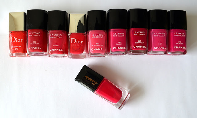
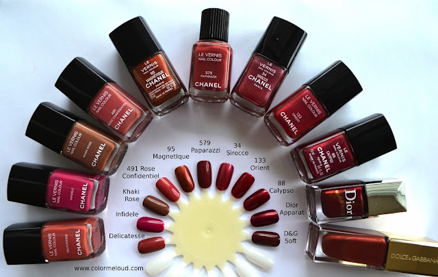
Chanel Le Vernis 579 Paparazzi with other similar Chanel, Dior and D&G shades I found in my stash
Once she was inside, she had seen how packed it was. Many nudy rose shades, some more brown some more pink, some were cremes some were metallic but everyone of them were posing to get their photos taken. It was not easy to get anybody's attention. She took off her hat and looked around trying to figure out what to do next.


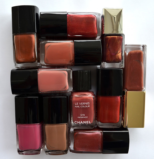
Chanel Le Vernis 579 Paparazzi and similar shades from my stash
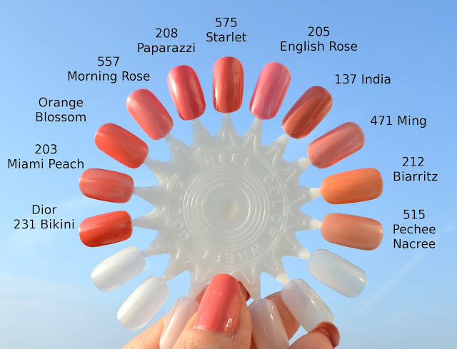
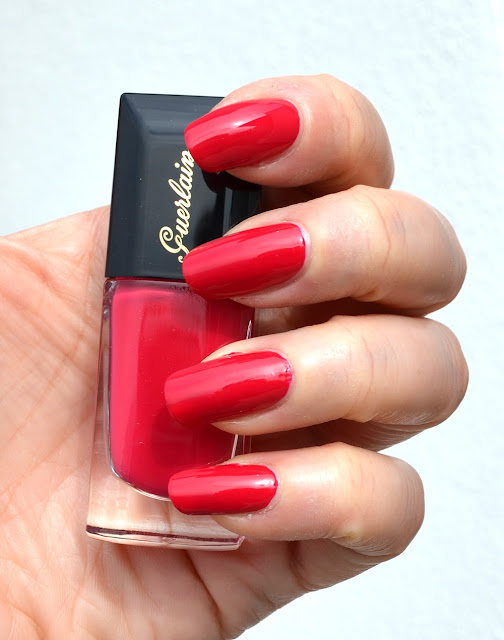
Then the music started, was loud but it was fun. All the colors were dancing and having fun. Paparazzi looked at Delicatesse and Infidele who were dancing together. They were the colors from last Fashion Night Out (FNO) event held in September 2012. Those were very limited editions and were looking so sure of themselves. Paparazzi thought, they were lacking the secret shimmer one needs to be pretty. And Khaki Rose just dancing next to those three, who was from FNO 2011? She thought she was ugly because was way too brown. Looking at herself again, she was once more convinced to have the best dress up to now. She then started dancing next to Magnetique and Rose Confidentiel. Magnetique was old but had gorgeous metal shine to her, Rose Confidentiel was way too pinky. Good old Sirocco joined them. She was also more metallic and much lighter. Maybe it was the years which wore her off?


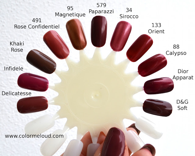
Chanel Le Vernis 579 Paparazzi comparisons to other similar colors on nail wheel

Paparazzi noticed two others waving their brushes, dancing as if nothing matters. Those were Orient and Calypso. She found both of her dresses to be too red and therefore lacking the modernity she herself has. Just next to them there was a shorter and an extremely tall one. Shorter one, Dior Apparat, had gorgeous gold shine to her dress. Paparazzi couldn't take her eyes off her but then convinced herself that this golden hue was not appropriate for this time of the year thus it was looking too Christmassy. And the tall one, wasn't her dress shining so beautiful. Hers was not a secret shimmer, she had a real one. Paparazzi sighed, was almost about to give up. D&G Soft had everything, slim, tall, shimmery... But wait a minute, she was way too dark once applied *nodded in agreement* yes she was, and it was not pretty!


Paparazzi had a fun night. She left the club thinking that she had the prettiest dress of them all, not too brown, not too pink, not an old-rose or too red and out of fashion. She had just the right amount of shimmer to show up only on special light and this made her mysterious and pretty. She was happy, she was so convinced of herself that she was not just another nude brown-pink out there. As she left for home the record was playing "Every Rose Has Its Thorn".

~The End~

Final Thoughts: For me Paparazzi is kind of an improved version to lately released FNO nail polishes Infidele and Delicatesse (which were true cremes). It has a bit more shimmer, which makes it more interesting. As it is not very brown or pink it should flatter many skin tones. I can see myself wearing this polish more during upcoming fall rather than spring or summer. If you own D&G Soft then be sure to check that out before buying because they are very similar. From Chanel nail polishes the closest match is Delicatesse in terms of shade but the finish is different. As for the formula, it applies beautifully, used two coats for the swatches above.

What are your thoughts about this new permanent color of Chanel. Do you like it? Are you thinking to get it? Would you wear this in spring or summer?


Chanel Ombres Fleuries Quadra Eye Shadow in Délicatesse

$
0
0
Le Blanc Delices du Chanel 2013 collection is released in February exclusively in Asia. I am hearing that some of the pieces of this collection will be available early in May in US too. When I first saw the promo pictures, I knew that the center pieces of the collection, an eye shadow quad embossed with beautiful camellia motives was a must have for me. Not just the design but also the colors blew my mind. I contacted my friend in Hong Kong and she was so nice to send me one, I really can't thank enough to her but I am going to keep her name anonymous so that she doesn't have to send hundreds of this one around the world *winks*

Chanel Ombres Fleuries Quadra Eye Shadow in Délicatesse
The quad is named as Chanel Ombres Fleuries Quadra Eye Shadow after beautiful flowers embossed on each color. It has round shape typical to Asian/European baked releases of Chanel but it is not a baked formula. Instead similar to the Christmas release Harmonie du Soir, it has a soft buttery texture. Here is a close up of the beautiful design.

Chanel Ombres Fleuries Quadra Eye Shadow in Délicatesse, close-up
Upon receiving the palette, I couldn't touch it for a long time. I was worried to ruin the pattern. I chose to enjoy it before starting to use it. The design is indeed beautiful but after two usages it almost disappears. Below I swatched the shades clockwise, starting with the silver shade on top left corner. The colors are very soft but the eye shadows are very pigmented. I used my fingers to pick the product for the following swatch.

Chanel Ombres Fleuries Quadra Eye Shadow in Délicatesse, arm swatch under indirect sun light
The silver shade is a glitter with a clear base and can be layered on other shades for a special effect. Next to it is a warm white, almost ivory once swatched. The burgundy shade has a beautiful pinkish sheen to it, can better be seen under sun light (see the swatch below). The peachy pink shade is very close to my skin color but is easily visible as it shines beautifully both under direct and indirect light.

Chanel Ombres Fleuries Quadra Eye Shadow in Délicatesse,arm swatch under direct sun light
Before I go onto the application and results, I would like to also refer to review in Kai's Obsessions for layered swatches. She mentioned that ivory and peachy pink shades could also be layered with burgundy shade for duo chrome effect.

I started padding the peachy pink shade on the inner half of the lid. I was a bit disappointed with the color pay-off at this point and quickly moved on to the burgundy to bring some drama. As they were not properly blended and burgundy was very pigmented, at this stage I was almost lost. Then I started bringing the burgundy shade to the middle where it met the peachy pink shade and the magic happened. The colors could be layered and as they started to be mixed, became even more beautiful. After applying the burgundy shade on the crease and applying the ivory shade to the inner corner, for a short moment I was clueless about the silver glitter. I thought about my Tom Ford quads and decided to layer it on top of the other shades to add some dimension. After picking up some glitter with the brush (I usually use my fingers for that matter but yes this one could be picked up by brush) I padded a gentle amount directly on the eye lid and the effect was wow! I loved how it brightened up those already awesome colors. Unfortunately it is not easy to catch this effect by photography but hope below gives some idea how the quad looks like once applied.

Chanel Ombres Fleuries Quadra Eye Shadow in Délicatesse in action, eyes closed

I finished the look with eye pencils from Chanel, Silver Light on lower lash line and Cassis along the upper lashes to give some thickness to the lashes. As mascara I applied Volume de Chanel on upper as well as lower lashes. As a finishing touch, I highlighted the brow bone with peachy pink shade from the palette. Here is the result.

Chanel Ombres Fleuries Quadra Eye Shadow in Délicatesse in action, eyes open
After getting so impressed by the application and many layering possibilities, I took out the Variation quad of Chanel for a comparison. It was the closest I thought of as I knew this one was also a combination of silver and plum colors. I have to admit Variations is one of those quads which I rarely reach for. I tried to make it work many times but somehow I failed. It looks very washed out on me and I am not impressed by its color pay-off. 


Chanel Palettes Variation (left), Délicatesse (right)
These two palettes are similar in terms of color theme. On the other hand in terms of application and color pay-off they are totally different. The clear base glitter, the ivory and peachy pink shades of Délicatesse can be layered but I can't layer Variations. Even blending doesn't work so evenly (if you can do that better than I do, then happy you! Please share your tips and tricks with me.) As opposed to Variation, Délicatesse is a breeze to work with. Instead of chunky glitters like the light pink shade of Variations has, Délicatesse colors have fine satiny finish and each color is so finely milled that it melts like butter on the lid. Full sun swatches of both of the quads can be seen below.


Chanel Palettes Variation (up) and Délicatesse (down) swatched under direct sun light
Final thoughts: Délicatesse is a very versatile quad which almost applies itself. Layered, it turns out to give many other possibilities. The color combo may not be very original but the uniqueness of the palette comes from the formula and the application. For me it is a must-have and it moved quickly up on my list of favorite palettes even after the first try. Unfortunately it won't be released world wide. It will hit some US counters and probably Chanel US website in May so you may want to reach for a friend if you are not living in the States.

Do you have your heart set on this quad? Do you like glitters on your daily make-up? Please let me know your comments and thoughts about this post. I am going "yay!" with each and every comment ;-)

Sneak Peek: L’été Papillon Chanel Summer 2013 Collection

$
0
0
Ready for summer yet? In Germany spring has just began two days ago and finally the nature awakens, trees blossom, birds sing... Can there be a better time to write about the flowers and butterflies?

Promo photo of L’été Papillon Chanel Summer 2013 Collection (source)
The summer collection of Chanel is inspired by butterfly wings, the other promo pictures show eye make-up close ups with very colorful mascara and vibrant eye shadow sticks applied heavily. The collection is not very typical of what we usually get from Chanel, who would think that they would release a yellow mascara right? Although some are already disappointed with the uber vibrant color theme of Chanel summer collection, I must say that I am beyond excited.  Especially after trying some of the products myself, but we will come to that...

The international released date is announced to be 12th of May. I still think that in Europe this may be a bit later. Here are the list of pieces in this collection (source):

Chanel Summer 2013 L’ete Papillon de Chanel Collection

Inimitable Waterproof Mascara – Limited Edition
  • Black
  • Zest
  • Limelight
  • Aqua Blue
  • Blue Note
Le Vernis – Limited Edition
  • #647 Lilis
  • #657 Azure
  • #667 Bel-Argus
Levres Scintillantes – Limited Edition
  • Zephyr
  • Envolee
  • Eden
Rouge Coco Shine – Limited Edition
  • Idylle
  • Pygmalion
Stylo Eyeshadow – Limited Edition
  • Moon River
  • Cool Gold
  • Pink Lagoon
  • Jade Shore
  • Blue Bay
  • Black Stream
Stylo Yeux Waterproof – Limited Edition
  • True Blue

I could track down few of the pieces to show you before the craziness all starts so that we can all start getting excited. Here is a quick sneak peek to what I will be reviewing soon. Hope you enjoy it...
Some pieces from upcoming Chanel's summer collection L’été Papillon
Mug shots of three gorgeous nail polishes from L’été Papillon Chanel Summer 2013 Collection

Eye shadow stick and vibrant blue mascara from L’été Papillon Chanel Summer 2013 Collection

Are you also so excited about this truly unique Chanel collection? Which pieces are you planning to get?

Edit: If you want to see the swatches, check the following posts:

647 Lilis, 657 Azure and 667 Bel-Argus, Swatches of L'été Papillon De Chanel Summer 2013 Collection Nail Polishes

$
0
0
I would probably take my time, start searching for similar colors in my stash and post comparisons while telling a story (as I did for Cinema and Paparazzi from Avant Premiere collection) but I was asked to show some quick swatches before I start with all those things. I know some of you are as excited as I am for gorgeous colors dressed in metallic duo-chrome finishes which carry double C on them, so I decided not to make you wait longer. Here are the three limited edition colors of Chanel summer 2013 collection L'été Papillon De Chanel.

L'été Papillon De Chanel Summer 2013 Collection Nail Polishes, 647 Lilis (left), 657 Azure (middle), 667 Bel-Argus (right)

I would like to start with the less spectacular nail polish color of the three, 647 Lilis, which is a true creme bright coral (no hidden shimmer). It is appropriate for summer and this particular color doesn't surprise me given that Chanel released close shades before with their summer collections. Those finding Le Vernis 617 Holiday from last year's summer collection too orange, will be pleased to have Lilis in their lives.

Chanel Le Vernis 647 Lilis in shadow

I took photos both under direct sun light and in shadow, hoping that this gives a better idea of different faces of the colors. Lilis appears much orange under sun light and more red in shadow. I am planning a comparison post of this gorgeous coral with other corals from Chanel and Dior to show you the exact undertones. For now I can only say it is not too orange, not too red and definitely very bright (more bright once compared to Chanel Distraction or Dior Bikini). I used two coats for the swatches, the formula was very good, not too thick or too watery and very much self layering.

Chanel Le Vernis 647 Lilis under direct sunlight

Next comes a beautiful metallic vibrant duo-chromish indigo blue called Bel-Argus. Although it would be appropriate to call it metalic, this is also an understatement because it has a truly unique finish. Under shadow it appears to have slightly duo-chrome properties by switching from darker blue to lighter blue. 


Chanel Le Vernis 667 Bel-Argus in shadow
Under the direct sun light it suddenly becomes like a sea with many silvery reflections playing upon its surface, if this makes any sense. As you see I am running out of words describing how beautiful it is. I tried to capture the color and the sparkles on a direct sun shot. You can see that my middle finger has another angle, therefore reflects light in a different way. Bel-Argus is really gorgeous. Also the formula was a breeze to work with. No streaking, nice consistency, good coverage. I used two coats for the swatches.


Chanel Le Vernis 667 Bel-Argus under direct sunlight


Finally comes the last nail polish of the collection. Although one would expect a blue nail polish by its name, Azure is a gorgeous aqua green/blue duo-chrome. This has a similar finish to Bel-Argus, so all of the light reflecting on the water description also applies to Azure. The only difference between the two is that Azure's duo-chrome property is much stronger. It can be seen more blue or green depending on the angle. In shadow you can watch your nails and appreciate the dual color play whereas under sun it starts sparkling which adds a whole new dimension.

Chanel Le Vernis 657 Azure in shadow


Azure is truly a stunner. It stands at the point where beauty blogger forgets all the words she knows,  stops and stares. I hope the photos can capture at least half of its beauty. Again the formula was excellent, right consistency, no streaking. Also forget about all your sheer duo-chromes and check Azure out. In the following swatch, there are a few imperfections of application. I am the one to blame for all of that. I think I was too excited...

Chanel Le Vernis 657 Azure under direct sunlight

Final thoughts: Out of three polishes which are going to be released with Chanel's summer 2013 collection L'été Papillon, Lilis will please the coral lovers. For those of you who are even more daring, Chanel offers two vibrant duo-chrome shades. Aside from their perfect formula, they also have a very unique metalic/sparkly finish, so be sure to check them out. Remember that all the three shades are limited editions. Release day is due to May.

Do you like tips and toes which get all the attention? Are you planning to get any of those?

Chanel Stylo Eyeshadow 47 Blue Bay, Inimitable Waterproof Mascara 57 Blue Note For Vibrant Blue Eyes This Summer

$
0
0
Today I would like to present you the second part of my L'été Papillon de Chanel haul. Although international release date is announced to be May, I am hearing that the collection had already arrived at some of the counters in US.

Chanel Stylo Eyeshadow 47 Blue Bay (right), Inimitable Waterproof Mascara 57 Blue Note (left)

Chanel Stylo Fresh Effect Eyeshadow 47 Blue Bay is one of the six eye shadow sticks to be released, the other colors are listed in my previous post. Blue Bay is a true mid blue with silver sparkle. It can be applied very densely if needed and sets very quickly. It then stays put for a long time without creasing. I don't have oily lids to test out how it really performs, but I usually put on make up in the morning and expect that once I am back home, which is at least 10 hours later, that it doesn't fade. Most of the time creme eye shadows fade much quicker if not set by powder but I was impressed by Blue Bay. Below are the comparison swatches against two Illusion D'ombre, which were released with Blue Illusion collection, a light blue Destination and a darker blue Apparition. Fourth swatch shows Destination layered on Apparition. The last one is eye gloss from Dior's 2012 summer collection No 240 Azur.

Swatched in indirect daylight. From left to right: Stylo Eyeshadow 47 Blue Bay, Illusion D'Ombre Destination, Illusion D'Ombre Apparition, Destination and Apparition layered, Dior Eye Gloss 240 Azur
Compared to Illusion D'Ombres, Stylo Eyeshadow sets quicker and stays longer put. On the other hand because of this property, it is not easy to blend the edges, so one needs to be quick. I recommend doing one eye at a time, rather than applying it on both eyes then start blending. Below are the swatches under direct sun light to show the gorgeous shimmer which brings the wet effect to the eyes to make you summer chic.

Swatched under direct sunlight. From left to right: Stylo Eyeshadow 47 Blue Bay, Illusion D'Ombre Destination, Illusion D'Ombre Apparition, Destination and Apparition layered, Dior Eye Gloss 240 Azur
Aside from black, four new limited edition Inimitable Waterproof Mascara shades are also to be released with L'été Papillon de Chanel collection. It is really surprising to see that Chanel releases a yellow and turquoise mascara. Those are meant to be used either on the lower lash line or on top of black mascara to add a touch of color to the tip of your lashes, to give you butterfly wing effect once you wink. Below I swatched Inimitable Waterproof Mascara 57 Blue Note next to Style Eyeshadow in Blue Bay and took the photo under sun light.

Inimitable Waterproof Mascara 57 Blue Note (left), Stylo Eyshadow Blue Bay (right)
Now it is time to show the vibrant blues in action. I applied the following eye make-up on last weekend. The weather was rather hot and humid, which was appropriate to test the summer products. Once I applied the Style Eyeshadow, I could feel a cooling effect, which will be something very pleasant during hot summer days. I applied the eye shadow stick all over my lid, starting near the lash line and blending upwards. For the first two shots, I applied black mascara on upper lashes and Blue Note on lower lashes. For the last photo, I applied Blue Note on black mascara. On all photos I used a blue liner close to the upper lash line for further definition.

Stylo Eye Shadow 47 Blue Bay on lids, Le Volume de Chanel Black on upper lashes, Inimitable Waterproof Mascara on lower lashes

As you can see below, vibrant mascara on the lower lashes adds a nice color to the look. I can see this one looking good under a natural eye look too. The ones who like adding funky colors only to the lower lash line can enjoy this summer using the new vibrant waterproof mascaras for a change.


Stylo Eye Shadow 47 Blue Bay on lids, Le Volume de Chanel Black on upper lashes, Inimitable Waterproof Mascara on lower lashes


For the photo below, I added some Blue Note Mascara also to the upper lashes on top of black mascara. This way some more color is added to the look. I wanted to show how blue you can go with these but as an everyday look, I would rather go for Moon River (Platine) or Cool Gold (gold) Style Eye shadows and add a turquoise or blue accent with one of the new mascaras.


Stylo Eye Shadow 47 Blue Bay on lids, Le Volume de Chanel Black on upper lashes, Inimitable Waterproof Mascara on lower lashes and upper lashes

Edit: To see the swatches of all the Chanel Stylo eye shadow sticks and other colors of Inimitable Waterproof mascaras, check out this post too.

Final thoughts: New Stylo Eyeshadows are long lasting and very pigmented. I could also feel a nice cooling effect on the lids. I am impressed by the formula but one should work fast with blending before it sets. New Inimitable Waterproof Mascara is also ideal to add a pop of color to your make up. I see it best working over black mascara on upper or lower lashline as well as applied directly on the lower lashes.

Have you already tried Stylo Eyeshadow? Considering to try or purchase any of the colors? What do you think of vibrant colorful mascaras? 

Chanel Le Vernis 647 Lilis & the Family of Corals

$
0
0
After the quick swatches of three new bold nail polishes from Chanel L'été Papillon Summer 2013 makeup collection, now it is time for a proper deep-dive into the ocean where gorgeous corals live. Here I go again with a story. For those who find the story part rather boring, please check out the photos, the captions and feel free to skip to final thoughts.

Lilis & the Coral Family

What a wonderful day in the ocean. Lilis opened her eyes and take a look around to see what was going on. The first lights of the day was just starting to touch the ground after traveling miles from the surface. The algea was now greener than ever. She looked at an angel fish which was just passing by her, its shining bluer than anything she had seen before. Lilis came to world just last night and this was the first morning of her life.

Mugshot: Chanel Le Vernis 647 Lilis from L'été Papillon de Chanel
Her parents looked at her with pride. Such sweet bright coral and it was theirs. As the sun now touched her surface, she was even prettier.

On nails, under the sun: Chanel Le Vernis 647 Lilis from L'été Papillon de Chanel

Her father smiled and looked at her mother. "She looks much like me!" he said, so bright and bold! Her mother shook her head and giggled. "Look at her under the sunlight will you? You are way too orange, she looks just like me!". Father shook her leaves in denial "Oh Fracas, you always see things yourself, you are so pink, she is much more like me!". The discussion would heat up but they all stopped and stared at a Mandarin Fish and its beautiful rings of orange and blue in awe.

Comparison of Le Vernis 647 Lilis to recent Chanel polishes, 571 Fracas (Spring 2013) and 617 Holiday (Summer 2012)
Being part of a large family of corals, now it was time for little Lilis to meet her sisters and brothers. They all surrounded their sister looking at her with their curious eyes.

Chanel Le Vernis 647 Lilis with other recent corals from Dior, Chanel and Lancome
Dior 537 Riviera was much like her sister Lilis, just a tad more brighter. Dior 545 Psychedelic Orange was also quiet close, just a tad pinker. Dior 231 Bikini, Chanel 549 Distraction and Chanel 307 Orange Fizz were all subtler and shy when compared to Lilis. They watched their sister waving her leaves with confidence and they giggled an her braveness. Dior 433 Delice was the one with gorgeous shimmer and the base color was almost like her sister Lilis but the overall effect was totally different once the sun hit her leaves.

Color wheel comparison with mug shot of Chanel Le Vernis 647 Lilis with other recent corals
Then Lancome Peach Melody arrived. She was the one which looked like no other in the family considering her shape. She had rather small leaves in which not many big fishes could hide but there she was and was almost the perfect match for the new born Lilis, maybe so slightly more orange but no one ever noticed.

Color wheel comparison of Chanel Le Vernis 647 Lilis with other recent corals from Dior, Chanel and Lancome
On such a sunny beautiful day, Lilis was born. She was a gorgeous coral, very pigmented and with a beautiful consistency. She was also blessed with a beautiful large family. Lilis felt herself very lucky and sighed in happiness as her leaves danced with the ocean waves.

On nails, in shadow: Chanel Le Vernis 647 Lilis from L'été Papillon de Chanel

Final thoughts: Chanel Le Vernis 647 Lilis from L'été Papillon collection for Summer 2013 is a gorgeous coral. This color perfectly stands between two recently released Chanel nail polishes Fracas (Spring 2013) and Holiday (Summer 2012). Being very bright, Lilis is much bolder than Distraction, Dior Bikini or Chanel Orange Fizz. Dior Riviera is close but a bit brighter, redder. Dior Psychedelic Orange has slightly more pink in it. The closest match is Lancome's Peach Melody from their Spring 2013 collection, so if you look for a more affordable option, you may want to check this out. 

What is your favorite coral nail polish? Would you consider Lilis for this summer?

Guerlain Terracotta 4 Seasons 03 Naturel-Brunettes Review and Comparison

$
0
0
Last month Guerlain released a new Terracotta collection, featuring lovely matte bronzers as the collection's focal point. As it hit the stores, many bloggers reviewed their picks, here are just a few to start with:

The lightest two shades were sold out in Germany in no time although the price point for these are very steep around $75/62€. The price made every beauty nerd a bit curious about how the performance would be. The idea behind the product is that it consists of 4 different shades to meet the lighter or darker bronzer needs for every season.

I took advantage of cosmetics sales event in April at a local department store to purchase one of these to try it out myself. After almost half an hour of applying different shades on different parts of my face (which in the end turned out to be pretty funny), me and my PA decided on Shade 03, called "Naturel-Brunettes" which I would like to present you today.

Guerlain Terracotta 4 Seasons 03 Naturel-Brunettes

I am NC 20-25 with natural undertones. I have seen/read that most of the people were going for lighter shades but during the trying process, I have noticed that the shade which had "blondes" in their names had some pink inside. Those were rather leaning cool in an undesirable way on my skin where the shades which ended with "brunettes" were blending and looking more natural. It may have to do with my undertones but I decided for the lightest brunettes shade as opposed to a medium blondes shade. Here are once more all the shades listed for reference:
  • 00: Nude
  • 02: Naturel-Blondes
  • 03: Naturel-Brunettes
  • 04: Moyen-Blondes
  • 05: Moyen-Brunettes
  • 08: Ebony
After coming home, I compared 03 Naturel-Brunettes with my other favorite bronzers from last summer, Soleil Tan de Chanel 907 Sable Beige and 917 Sable Rose and Diorskin Nude Tan 002 Sunlight. I have been using Soleil Tan de Chanel in Sable Rose a lot as a blusher, as it is way too pink as a bronzer for me. Sable Beige is a very natural light bronzer which I like using just to give a healthy glowing skin.


Soleil Tan de Chanel 907 Sable Beige (up left), 917 Sable Rose (up right), Diorskin Nude Tan 002 Sunlight (down left), Guerlain Terracotta 4 Seasons 03 Naturel-Brunettes (down right)

One bronzer I fell in love with but never reached for after my purchase is Diorskin Nude Tan 002. This one matches my skin tone beautifully and being not so shimmery as the Chanel bronzers, provides a natural day time look. I should definitely use this one on a more regular basis. Once all of them swatched together, it can be seen that the lightest of the two shades of Guerlain Terracotta 03 bronzer (top two shades) perform almost as dark as Diorskin 002 Sunlight, but they lean more brown then pink. Although Sable Rose is more pink than all the others, it is also visible that Terracotta 03 is more brown, less pink than any other shade, which justifies my buy, as it is something new in my collection.


Indirect light swatches of lightest shades and all shades of Guerlain Terracotta 4 Seasons 03 Naturel-Brunettes in comparison to Chanel and Dior bronzers from Summer 2012 collection

As I checked my swatches under the sun, I have seen that Chanel Soleil Tan de Chanel bronzers are significantly more shimmery than Dior Nude Tan and Guerlain Terracotta. It can also be seen that Guerlain bronzer is not flat and has a slight dimension to it although it is matte, which makes this very finely milled bronzer even more gorgeous for me.

Direct sunlight swatches of lightest shades and all shades of Guerlain Terracotta 4 Seasons 03 Naturel-Brunettes in comparison to Chanel and Dior bronzers from Summer 2012 collection

Final Thoughts: Although price point is steep, Guerlain offers four shades in one, which may justify the price for some. Shades which have blondes in their names are more pink than the shades which are called "brunettes". You have to try and find out which one is more flattering for your skin tone. I chose 03 Naturel-Brunettes and very happy with my choice as my other bronzers were already leaning more pink and they were much lighter. With my new purchase, I filled a gap in my stash with luxury.

Have you tried Guerlain new Terracotta line? Any picks so far?

Complete Swatches of Stylo Fresh Effect Eyeshadows and Inimitable Waterproof Mascaras from L’été Papillon de Chanel

$
0
0
Today I was determined to publish a post about Le Vernis Starlet from Avant Premiere de Chanel collection, one of the few pieces I haven't reviewed yet and it was requested by some fellow bloggers. But when I opened my post box, there was something waiting for me inside which changed my plans. Oh those lovely candies...

 Stylo Fresh Effect Eyeshadows and Inimitable Waterproof Mascaras from L’été Papillon de Chanel
On the weekend I finally tracked them all down, so today I would like to proudly present all of them to you, Stylo Fresh Effect Eye Shadows, all the six shades and Inimitable Waterproof Mascaras, all the four colorful shades (fifth one is a black mascara, which we all know how it looks like). Previously I reviewed the blue shades of this collection, with a demonstration on how it looked on the eyes, which you can find here. So let's start with the six gorgeous shadow sticks, shall we?

 Stylo Fresh Effect Eyeshadows from L’été Papillon de Chanel
Once I arrived home, carrying the envelope in my hand with those candies packed in, I was so happy to see that it was wonderfully sunny outside. I rushed out to be able to take sunlight photos which show the gorgeous shimmer.

 Sunlight swatches of Stylo Fresh Effect Eyeshadows from L’été Papillon de Chanel

To see the undertones, I also made an indirect light photo (see below). 07 Moon River is a warm taupe, which is my favorite of the bunch. 17 Cool Gold is a gold with strong yellow hues. Some bloggers were confused with the name as it is a very warm gold color. I think the indication of cold comes from the cooling effect of those eye shadows which I mentioned before, not from the tone. The third shade is 27 Pink Lagoon which is a peachy pink. 37 Jade shore is an aqua green leaning turquoise. I reviewed 47 Blue Bay before, it is a cool mid-toned blue with silver shimmer. 57 Black Stream is an intense black, which has subtle silver shimmer in it. Below are swatches photographed with indirect day light.


 Shadow swatches of Stylo Fresh Effect Eyeshadows from L’été Papillon de Chanel
I would like to compare them to Illusion D'ombres, which are sheerer in general. They also have more shimmer. I used them usually to add a wash of color to the lid or as a base color for powder eye shadows. Stylo Fresh Effect Eye Shadows are meant to be rather stand alone as they are much more pigmented. Of course they can also be used as base (black one would make a good base for color technique). Below are the comparison swatches with Illusion D'ombres. 88 Abstraction is close in color but it is much more sheer compared to 27 Pink Lagoon. 85 Mirifique is also sheerer and very shimmery once swatched side by side to Black Stream.

Comparison sunlight swatches of Stylo Fresh Effect Eyeshadows from L’été Papillon de Chanel with Illusion D'Ombres

The gap on top of Jade Shore could be filled with last year's asia exclusive shade Illusion D'ombre 87 Riviere but it was not released in Germany and I found it too sheer to justify the hunt so I don't own it. Later on I thought maybe 84 Epatant, which is a taupe green shade could be close to Jade Shore so did some more swatches which you can see below. In the end it turned out Epatant is closer to Moon River than Illusoire. Moon River is still a uniquely gorgeous taupe on its own.


Comparison sunlight swatches of Stylo Fresh Effect Eyeshadows from L’été Papillon de Chanel with Illusion D'Ombres

I also wanted to compare the golds from Illusion D'ombre and Cool Gold. As it turned out, they are also all very different, closest one being Apparence from Holiday 2012 look.

Comparison sunlight swatches of Cool Gold Stylo Fresh Effect Eyeshadow with gold Illusion D'Ombres

Now it is time to move on to the Mascaras. Yellow mascara? Who would think about it right? If someone would, this wouldn't be Chanel. But Chanel keeps on surprising us, so here are the four vibrant Inimitable Waterproof Mascaras.

 Vibrant Colored Inimitable Waterproof Mascaras from L’été Papillon de Chanel
I am planning to show those in action once I have some more time to play with them but for the time being, here are some more photos to enjoy.


Inimitable Waterproof Mascaras from L’été Papillon de Chanel
Zest is an egg yellow, Lime light is a turquoise. Aqua Blue is just what the name suggests, this one is also a bit shimmery compared to the others. I have already shown you Blue Note in action, if you want to check that out, it is here. I use those vibrant colors on black mascara for top lashes and directly for the bottom lashes to add some pop of color. I think there may really be very fun combinations with Stylo Eye Shadows.


 Sunlight swatches of Inimitable Waterproof Mascaras from L’été Papillon de Chanel
Final Thoughts: Very unexpected and pleasure to play around with those. I may need some time to figure out what kind of combinations will work for me but I am eager to try. As I already previously mentioned, I love the formula of Stylo Eye Shadows. Wish a few shades (like Moon River) would be permanent. By the way today "let's make-up" video of Lisa Eldridge is released and here is if you would like to check out how she used these:


Have you checked those out yet? Are you planning to get any of the vibrant mascaras? Which eye shadow colors are you eager to try out?

Chanel Le Vernis 575 Starlet & the Search for the Perfect Peach

$
0
0
The photos were taken and comparison swatches were done but it took sometime until I made it to this post, partly because I was interrupted with Chanel summer candies. The last piece from Avant Premiere de Chanel collection could still not be skipped. After Le Vernis 581 Cinema and 579 Paparazzi, today I would like to present you 575 Starlet, Chanel describes it as a peachy pink but I like calling it a low-key coral. I got used to making up a story about the polish to be compared, but you may skip this part and just check the photos, the captions and final thoughts if you wish. Once upon a time...

Starlet, Searching for the Perfect Peach

...there was a worm. An ugly white worm. They told her she would grow to be a beautiful butterfly with iridescent wings and a crown of a princess, but for this to happen, she had to find the perfect peach to eat. She packed her things and started crawling up the peach tree, slowly but determined.

Chanel Le Vernis 575 Starlet from Avant Premiere Collection
As she reached the top, she looked down to enjoy the beautiful view. All those years of living in the meadow was over. A light breeze was blowing towards her tiny body. She grabbed the tree trunk not to fall. Slowly moving to a branch she had chosen, she had seen all the beautiful peaches, all full of meat and their small hair shining under the sun. Oh how delicious they looked...


Chanel Le Vernis 575 Starlet together with similar peach colors
She first got her eyes on Ming, which was way too pink for her taste, sun must have not touched this one. She had seen Biarritz and Orange Blosson but they were almost looking like sour oranges. She grimaced as she turned her head and her eyes met Peche Nacree, such a beautiful name. She wished that it wouldn't be so pale. Then it was English Rose and Paparazzi, but find them to be a tad more pink than she would like. 

Chanel Le Vernis 575 Starlet comparison wheel and mugshot with other similar colors
India was gorgeous, but was it going bad with this brownish hue? Bikini and Miami Peach were almost unreal, they were bright, Miami Peach has gorgeous golden sparkle to it. Could they be the perfect peach? 


Chanel Le Vernis 575 Starlet comparison wheel with other similar colors
She was about the decide between these two but suddenly Starlet caught her attention. Its lovely tone, subtle pink shimmering skin, she drooled and she knew this was her peach. Slowly crawled over Starlet and took a bite. It was the most delicious food she had ever eaten in her whole worm life. Soon enough no one could see her anymore. She was lost in the deep peachy flesh, enjoying her new home.

Chanel Le Vernis 575 Starlet from Avant Premiere Collection
Final Thoughts: Chanel Le Vernis 575 Starlet is an understated coral with secret pink shimmer, you could call it a nude coral if this makes sense. It couldn't find a matching shade in my stash, but the base colors of 208 Paparazzi and 205 English Rose are close. Starlet is undoubtedly my favorite from three new Chanel releases in Avant Premiere de Chanel collection, too bad that it is also the only on which is limited edition.

Did you purchase Starlet? Do you like this color for spring and summer or do you find it to be a rather Fall shade? What is your favorite nail polish from Avant Premiere de Chanel?

YSL Pure Chromatics No.13 from Summer 2013 Saharienne Heat Collection

$
0
0
"Pure Chromatics" Wet & Dry eye shadow palettes have one of my favorite eye shadow formulas. I have collected quiet a few of them since their release and I make sure to follow the new releases. This addiction sometimes lead to fun transactions over the countries, I have YSL palettes bought in different countries in Europe and this one, no.13 which I would like to present you today, was ordered from France.

YSL Pure Chromatics No.13 from Summer 2013 Saharienne Heat Collection


This month YSL released their make-up collection for Summer 2013, called Saharienne Heat which currently, as far as I know, only available in US. The collection took my attention first with its hilarious promo picturewhich shows Lindsey Wixson hugging a stone bull and getting naughty. Then I have noticed the dark nail polish called Taupe Mauresque just to find out that I already have this shade as I picked it up a few months ago when only 30 pieces were sold as Breuninger exclusive in Stuttgart, Germany. I have to admit the color of the nail polish is really very dark and not particularly special for me but i am planning to get Vert Dorient, a gorgeous green, once the collection arrives to Europe. I knew I would pass on Ombres 5 Lumieres Eyeshadow Palette release, called Marrakesh Sunset. Although it does look gorgeous in the pan, according to past experience and what I have seen in blogs I know that I won't be reaching for the sheer and frosty formula of YSL quints. I have seen that they repromoted Pure Chromatics No. 20 from their 2011 Summer collection and released a new quad, No.13. In France Sephora, Pure Chromatics No 13 was already released a few months ago, although summer collection haven't arrived here yet. 


YSL Pure Chromatics No.13 from Summer 2013 Saharienne Heat Collection

The palette consists of four beautiful shades, a peachy pink shade on top left, next to it is a champagne highlighter color, bottom left you have a vibrant warm purple and bottom left is a dark plum which can also be used as a liner. All of the colors have good pay-off once applied dry. You can also slightly damp your eye shadow applicator and use them wet to build up more intensity and shimmer.


Colors close-up of YSL Pure Chromatics No.13 from Summer 2013 Saharienne Heat Collection

Below I swatched them with my fingers starting from top left color, then moving to top right and bottom left color, finishing with the darkest bottom right shade. All of the swatches are dry but i used the main shades wet for following eye look.

Direct sun swatch of YSL Pure Chromatics No.13, from left to right: top right, top left, bottom right, bottom left
The colors get a nice but not over-the-top shimmer under sun light and appear rather muted under indirect light, to show you the effect here are the swatches in shadow.

Indirect light swatch of YSL Pure Chromatics No.13, from left to right: top right, top left, bottom right, bottom left

I wore them last week to work, on a sunny day when i was feeling summery. Unfortunately on the weekend it started raining and my mood dropped a bit. For the below eye makeup, I used the peachy pink shade wet all over the lid, then started defining the eyes by adding the darker plum on the crease rather lightly. I then added some more purple to this look by padding some of vibrant purple shade on the outer half of the lid. I also used an Urban Decay eye liner along the top lashes and Chanel Le Volume mascara to finish the look.

YSL Pure Chromatics No.13 in action, eyes closed

On the bottom I mixed the pinky peach and vibrant purple shades to add some definition here too. Here is the look once more eyes open (please excuse my messy eye brows). 


YSL Pure Chromatics No.13 in action, eyes open

I was very happy with my purchase, which gave me a gorgeous purple eye makeup and lasted all day without fading with a base. The results were not too vibrant (as you know I was a bit overhelmed with Guerlain's Attrape-coeur being too flashy for my taste) but still colorful enough for a summer look. Then I decided to check my collection of YSL Pure Chromatics quads which led to a slight disappointment, here is the reason why...


I have seen that YSL Pure Chromatics No.13 was almost a reshuffle mostly of No.4 mixed with one shade from No.6 for a change. Check out the photo below for color matches which are denoted with same color boxes.


The peachy pink color of No. 13 on top left is almost a one to one match with the bottom left color from No.6, the darkest plum (bottom left) could also found in both of the palettes No. 4 and 6, No.4 being the closest. The other colors, the champagne is very close to the highlight color from No.4 but slightly more peachy. The vibrant plum has no perfect match but bottom left color of No.4 is a close match (a bit more pink). Check comparison swatches below.


Final thoughts: I am always a big fan of YSL Pure Chromatics. Lasting power, color selection and the possibility to adjust the intensity of application by using them dry or wet are among few reasons why I love them. No. 13 released for this summer is no exception in terms of quality so if you were planning to try this formula and like wearing purples, go ahead and check this one out. On the other hand if you already own some YSL Pure Chromatics palettes, like I do, check out to see if you have No.4 and No.6 because the colors in No.13 are reasonably close to some shades from these two permanent palettes. 

Do you also like the formula of Pure Chromatics as much as I do? Are you planning to check out No.13? Picked up anything else from YSL Summer 2013 Saharienne Heat Collection?

[TAG] What’s in my Bag?

$
0
0
Last weekend I was tagged by one of my favorite bloggers from Germany, Shelynx from Der blasse Shimmer. I thought it is a good idea for me to go for a different type of post than I have written until now, since in this one I could be a bit more personal, which some of you may find lacking in my blog. I also don't want to miss this opportunity to tag a few friends and see inside their bags *evil smile*. Alright so here is my take on this... 

The Bag

My crazy orange bag


Yes this is bright and orange! This was the reason I wanted it. Although this year there are many similar orange bags, last year, despite Pantone color of the year being tangerine, it was rather a challenge to find one. This one was not being sold in Stuttgart, Germany but that couldn't hold me back. I made them order it from Michael Kors counter in Breuninger and waited for it for a month to come.

I am generally happy with the pockets and sections it offers. It has two zipped and one open part. I use the open one to put things I have to reach quickly but which are also large enough not to fall and get lost, something like umbrella or gloves.

A look at inside of my bag
Inside the bag

I decided to follow the schema of Shelynx and go through the things by numbering them. 

Things which are in the middle pocket

#1 - Case for my glasses: Yes I use glasses, especially when I am driving. After managing to live without them over 25 years, I had to get one for driving. I then noticed that it was much easier also at meetings to read small text reflected by beamer. I don't have lenses, if I don't want glasses, I just don't use them :-)

#2: Umbrella: The smallest and lightest umbrella I could find. I believe this one is from Marks & Spencer. I always carry it with me including summer seasons, as I found it to be life saving on some unexpected occasions. Also I hate doing my hair and having rain ruining it, so this one is a must have for me.

#3 Gloves for Smartphone: What is this doing here, aren't we in spring yet? Well we were and I put it away but yesterday it was so cold that I decided to put it back in. These ones were a present from my hubby last year for Christmas. They have some metal part on the tip of the thumb and index finger so that I can use my iphone also when it is cold outside. For those of you who are curious, I got mine from Roeckl.

Other things from middle pocket

#4 - Garage opener: True vintage item inside my bag. This device is an early sample of electrical garage opener from probably around 20th century ;-) White button opens the gate and red one is for my garage and these are the only two tasks this big device can do! Think about how the things changed from 1995 to today... Now smart phones are even smaller and lighter than that one. Anyway after these serve their purpose, I should donate it to vintage electronics museum.

#5 - Keychain and keys: I still keep my keys in the key holder I purchased from Shanghai during World Expo in 2010. 

#6 - Blotting papers from Chanel: Having dry to normal skin, I really don't need those but I use its mirror from time to time.

#7 - Passport: Yes I always carry it with me around, especially after once forgetting it right before a flight and missing that flight.

Things from front pocket
#8 - Random discount coupons: You can make sure that you always find a few of those in my bag. I go over those from time to time an throw away the ones which expires.

#9 - Silver case for business cards: A necessity for modern day business woman ;-p Mine was a present from my mother. I find it really useful but I try to remember leaving it at home before flying because a few times scans have shown a big metal thing in my bag and I had to convince them that it was just this case.

#10 - Paper tissues: Without those, I couldn't survive. Especially because my nose reacts to each temperature change especially between indoor and outdoor and anything spicy may make me reach for those.

#11: Mirror: A gift from Laura Mercier counter in Breuninger, very light and handy as it can be folded to be placed on a desk.

Random things from small side pocket of my bag

#12 - Keys for office: These are for opening my drawers and cupboard at the office. Keychain came as a present with one of my favorite shoes from Art.

#13 - Car keys: Despite the distance between home and work being just 4 km, I am usually driving to work for not to carry my laptop all the way. 

#14 - Biometric photos: These days you never know when you need one of those, so i slipped the last ones taken for my passport in my bag.

#15 - Chewing gum: Perfect for after eating if I can't brush my teeth because of being on the way.

#16 - Discount coupons from WC: These might be unique to German. The idea is that you pay 70 cents for WC on motor-way service areas and they give you a 50 cent coupon which you can spend later while buying something from the shop. I usually get these then never find them in my bag again. Do you know these in any other country?


Now it is time for some cosmetics...

Cosmetics lingering in my bag

#17 - Retractable lip brush: I am loving this recent addition to my bag, retractable lip blush from Dior for touch-ups during the day, comes in a cute velvet pouch. 

#18 - Retractable kabuki brush: Another recent addition to my collection. I am using this to apply Chanel Les Beiges healthy glow sheer powder. It is very soft and fluffy and it certainly needs cleaning soon...

#19 - Chanel Les Beiges No.20: I am still testing this product and planning to write a proper review on it soon. Since only no. 10, 30, 40 and 50 available in Germany, I ordered this one from France. 

#20 - Chanel Eclat Lumiere highlighter pen: For touch-ups during the days I need concealing on my spots.

Rest include my favorite lipsticks at the moment, so I will be just stating their name and numbers. I try not to carry more than five lipsticks in my bag:

#21 - Tom Ford lip Color Shine in 06 Abandon

#22 - Dior Addict Extreme Lipstick in 343 Spring Ball

#23 - YSL Volupte Shine Lipstick in 03 Violet Incognito

#24 - Chanel Rouge Coco Lipstick in 51 Ce Soir

Inside and outside of my purse and my nail file

#25 - Purse: I got this purse for my winter bag, which is purple. I am so happy with it, I decided to keep it for now until I get something fitting to orange. I have some money, credit cards as well as store cards inside, which I won't reveal here for safety issues ;-)

#26 - Pocket file: Another must have for me since my long nails may break and need a first aid. 

Congratulations for reading up to here. I knew it would be a challenge to write about my bag and look how long this post became. Anyway now comes the fun part, I would like to tag my fellow blogger friends and hope to take a glance inside their bags: Bellyhead from Wondegondigo, Chicscience from Chic Science Blog,  Lipstickblvds from Lip Stick Boulevards, Kai from Kais Obsessions. Also any of you who would like to take the challenge or have already written a similar post, just put a link to your post below at comments section. 

April Wrap-up & Mini Poll

$
0
0
Here goes a wrap-up of April
  • Over 15000 page views, needless to say that I am thrilled!
  • 20 posts which were so much fun to write
  • 79 published comments although half of them are mine ;-) 
So here comes a big...

Quick thanks art

 ...to friends who encouraged me to start the blog, to the ones who read the posts and supported me with comments and to those of you following me via twitter and bloglovin'. The numbers grow each day which gives a big motivation to keep on writing.
 
The fact is that I still can't believe that I am blogging! 

So why do I do that? The simple answer is that I don't have many people around me who are so enthusiastic (crazy? obsessed?) about a new released lipstick, a new eye shadow formula or a special edition bronzer. For me my blog is a kind of platform to exchange with other make-up enthusiasts around the world, to share my love for certain products and hear your comments on those. By following which pages are referring to the blog, I also signed up of some forums and met new people which I find to be so exciting.

Mini poll: What should be next?

I will be going on with featuring new released products but I was also thinking about covering some permanent ones. I list some ideas below.
  • New series of posts to review complete Tom Ford quads
  • Some vintage Chanel nail polishes
  • New post series for Guerlain Ombre Eclat 6 Couleur palette reviews
  • My YSL Pure Chromatics collection and reviews of permanent range
  • Classic red lipsticks (Armani, Chanel, Dior etc.) comparisons.
  • Chanel Blush Collection
  • Tom Ford nail polish posts 
  • Eye shadow formulas, favorites post
Please leave a comment below to tell me what you would like to see most. If you have any other ideas, also let me know.


Dior Bird of Paradise 001 Samba Nail Lacquer Duo for Tips & Toes, Swatches and Comparison

$
0
0
The day before yesterday I went to Breuninger Stuttgart to return my Clinique Chubby sticks for eyes which I got last Saturday. I was so excited that they eventually arrived to Germany and got three of them at once. Unfortunately my excitement faded away once got home and started applying the first one. A big chunk broke down and fell on my trousers by the first application. Wish I would have taken a photo of that, it would make a good post and discussion here but I was so disappointed to ever think of that. First thing to do was to clean the trousers and second was to run to the counter to return them all. To make myself feel better about it, I was thinking about getting the Armani Face & Eyes Palette from summer collection instead, which I was successfully skipping since days, telling myself that I have Armani palette No. 10, which is supposed to be very close in terms of colors and textures.

On the way to Armani counter, passing by Dior, I have seen something new...
Bird of Paradise Summer 2013 collection was there!

I was waiting for it to arrive since February after seeing two nail polish duos in green and blues as well as a gorgeous blush/bronzer duo in Dior catalogue. Which brings us to today's post, presenting the first item I got, Bird of Paradise Nail Lacquer Duo for Tips & Toes 001 Samba


Dior Bird of Paradise Nail Lacquer Duo for Tips & Toes 001 Samba 

Usually I don't like the idea of duos, since I find it hard to love both of the colors they offer. This is why I missed many duos from YSL, but this one offers two colors right up my alley, a gorgeous mint green creme and a lovely mid-toned metallic teal. As the spring eventually arrived, can you think of prettier colors for nature to reach your hands and feet?


Dior Bird of Paradise Nail Lacquer Duo for Tips & Toes 001 Samba, mint green (left) metallic teal (right)

These come in 7ml as opposed to regular 10ml Dior bottles but the price is fair too. For 14 ml in total it costs 29 Euros in Germany, which makes them slightly cheaper in terms of price per ml. First I reached for creme mint green in number 402.

Dior Bird of Paradise Nail Lacquer Duo for Tips & Toes 001 Samba, creme mint No. 402 in indirect light

Such a pretty color, not very dark, not very light, not very yellow... Despite the smaller brush than usual, the application was easy, no troubles with pooling or sheerness, the swatches are all done with two coats. This one had to be photographed on a spring background too.

Dior Bird of Paradise Nail Lacquer Duo for Tips & Toes 001 Samba, creme mint No. 402, under sun

Going through my stash, I found nothing close to Dior 402. I picked up four nearest shades, Illamasqua Nomad, Dior Waterlily from last year's spring collection and legendary Chanel Jade.


Dior Bird of Paradise Nail Lacquer Duo for Tips & Toes 001 Samba, creme mint No. 402, comparison swatches

A closer comparison shot should be helpful to reveal that Waterlily and Jade are both more yellow and Nomad is brighter and lighter.

Dior Bird of Paradise Nail Lacquer Duo for Tips & Toes 001 Samba, creme mint No. 402, comparison swatches

Next comes the gorgeous metallic teal, again great formula, no streaks, opaque in two coats.

Dior Bird of Paradise Nail Lacquer Duo for Tips & Toes 001 Samba, metallic teal No. 794 in indirect light

Nature was also calling this shade thus another photo had to be taken. Under the sunlight, it has a  gorgeous reflective property. I was always complaining that the teals I had were much too dark to wear in summer and spring (e.g. Viridian from Illamasqua) but this one is just perfect.

Dior Bird of Paradise Nail Lacquer Duo for Tips & Toes 001 Samba, metallic teal No. 794 under sun light
Once I have seen the first swatches, I thought this one would be close to Azure from Chanel summer collection. Once they are side by side, Azure pulls more blue. Butter London Bluey is also more blue and it is darker.

The nail polish on the left is a surprise addition to my stash from a few days ago, when I was on duty to find a dupe for Chanel Azure. I went to drug store with a nail wheel and tried around fifteen colors. This one, although not being very close and being a bit more green than Chanel Azure, was the closest one I found. It costs around one Euro, so it came home with me. I was a bit disappointed by the greener undertone so never posted about this but now it matched almost perfectly to Dior's metallic teal No. 794!

Dior Bird of Paradise Nail Lacquer Duo for Tips & Toes 001 Samba, metallic teal No. 794 comparison swatch
For those of you who have access to P2 polishes, if you are looking for a budget alternative to No 794 of Dior, I strongly recommend you check this one out. Although it is a bit more streaky once applied, and a tad lighter in color than Dior, on the nails, they look almost identical.

Dior Bird of Paradise Nail Lacquer Duo for Tips & Toes 001 Samba, metallic teal No. 794 comparison swatch
P2 is a German drug store brand, everyone else may get it from eBay. I have heard that they are not doing animal testing.

Dior Bird of Paradise Nail Lacquer Duo 001 Samba, metallic teal No. 794 dupe P2 color victim 890 Lost in Paradise
Before I conclude I would like to shortly write about an issue I had with the metallic teal from Bird of Paraside duo of Dior. It was very hard to remove properly. I wouldn't say it stained but to remove the grayish color it left behind, I needed to go over it a few times with polish remover. I haven't had this problem with Azure or any other teal color (including P2!). I strongly recommend applying nail polish base under this one.

Final thoughts: Very pretty duo, gorgeous colors and nice quality, as is expected from Dior. These are slightly cheaper than regular ones in terms of ml prices. Metallic teal can be duped with P2 nail polish called "Lost in Paradise", I don't know of any dupes for the mint one yet. Nail polish base is recommended under metallic teal to make it easier to remove.

Have you checked Dior's Bird of Paradise? Are you getting anything from this collection?

Guerlain La Laque Couleur 165 Champs-Elysées Swatch & Comparisons

$
0
0
Right after work, I was running through the department store, to reach the garage. It was almost 20:00, as for the ones who don't know in Stuttgart the stores close at 20:00. Passing by Guerlain counter, might I have seen something new? Was it too late? Just grabbed the first shade SA showed before driving back. Upon arriving home, I opened the package and checked it inside. The color is called Champs-Elysées and it is number 165 of the newly released ten nail polishes from Guerlain permanent range.

Guerlain La Laque Couleur 165 Champs-Elysées
I was dying to try it out and see how it applied but I was too tired for any of that. Next day was labour day, so why the rush. I placed it inside one of the shoe boxes, where I keep my nail polishes. As I went to bed, I haven't heard anything nor seen something. Who would know what was happening in there?

Guerlain La Laque Couleur 165 Champs-Elysées & Welcome Commitee of Shoe-Box-Land

As she arrived in Shoe-Box-Land, she was too tired to check around, so decided to take a nap. Pulsion must have seen their guest and called the others. There were all those curious nail polishes surrounding her trying to understand who she is. They had never seen someone like her before...

Guerlain La Laque Couleur 165 Champs-Elysées and similar colors from Chanel and Dior
Pulsion whispered to Rose Insolent trying not to wake her up "Do you know who she is?" Dior Lucky joined the conversation by shaking her head "she is supposed to be from Guerlain but the other gal I knew was looking different, round and... not so slick". Suspicious joined them "I am relieved that she doesn't look like me! I am dense and more pink" then turned to Boa "I think you are saved too, too pink!" she giggled. Lucky was looking around, seeing she would probably be quiet close to the new shade and not feeling lucky about it. Diablotine grinned "I anyway have gorgous shimmer, none of you may imitate that".

As they were talking so loud, Champs-Elysée woke up to see the curious welcome commitee. Looked around with eyes trying to understand what was going on, it was when Cherry came closer and asked "Hi! I am Cherry, what is your name?". "Champs-Elysée" she said in a sleepy tone, Image Rose couldn't help but laugh but then stopped seeing the others giving her an evil look. Lucky was on her way bringing the nail wheel. "Here how we say hi to everyone who comes, wanna join?" Champs-Elysée nodded quietly, and smiled.

Guerlain La Laque Couleur 165 Champs-Elysées nail wheel comparison

I woke up in the morning and grabbed Champs-Elysée to paint my nails. Then I went through my stash to find some similar shades for the comparison post. I found it a bit strange that those were all lying together and all swatched on a nail wheel! When have I swatched those? Yesterday night? I might have forgotten... I was happy to see none of the shades were matching, Chanel Suspicious and Dior Lucky were the strongest candidates but Lucky was brighter and more orange/red, Suspicious was darker and had more pink. Image Rose was pulling more red too.

Guerlain La Laque Couleur 165 Champs-Elysées nail wheel comparison
But the real joy was after the application. It had a rather jelly consistency but was very opaque, could almost be applied as one coater. It dried very quickly and had a gorgeous glossy finish. It was so shiny that I had reflection problems during the photography. If you check out the index finger, you can almost see the view from the balcony!

Guerlain La Laque Couleur 165 Champs-Elysées under sun light

Final thoughts: The packaging is sleek and elegant. I am also very much impressed by this nail polish formula, rather jelly consistency but very opaque. I am testing it right now to see how long it lasts, up till now (2 days) no chipping nor tip-wear, only the glossiness is slightly diminished but still looking good. Guerlain also released a gel top coat to use on those, which might even prolong its wear (I am testing with a regular top coat). I wished there would be more shades in the range but I guess they will extend it sooner or later. These are now available in Germany, I believe during May they should also be available worldwide, retails around 23 EUR/$23 for 10ml/0.33 ounce.

Have you checked out new Guerlain nail polishes? Are you planning to get any of those?

Dior 5 Couleurs 374 Blue Lagoon from Bird of Paradise Summer 2013 Collection, Swatches & Comparison

$
0
0
After presenting you nail polish duo Samba 001 from Dior's summer 2013 collection, Bird of Paradise, I decided to give back my back-up of Samba and get something else instead. The main reason for that was that the metallic color was slightly staining. I went to the counter to return Samba and talked to SA, she said she also noticed that it stained. It is good to know that it is not just me. I would like to get something else instead from this collection but I was undecided between Blush/Bronzer duo Pink Glow and Blue Lagoon palette. After being convinced that Coral Glow and Pink Glow give you almost the same effect, I decided on the palette. Dior 5 Couleurs 374 Blue Lagoon, which looks like it would give me the trendy peacocky eyes for this summer.

Dior 5 Couleurs 374 Blue Lagoon from Bird of Paradise Summer 2013 Collection
I usually like the formula and the iridescent quality of Dior eye shadows but some of their recent releases lacked some pigmentation (such as Swimming Pool from last year summer or Rose Ballerine from Cherie Bow). Usually Dior releases two palettes with their collections, one for very very fair ladies and the other for everyone else. Besides Blue Lagoon, the collection has another palette, called Peacock, which is again way too light for me (although I am only NC20-25). Those lighter palettes usually doesn't have great color pay-off and all shades look like highlight shades on my lids (then why bother with five colors?). 

Dior 5 Couleurs 374 Blue Lagoon from Bird of Paradise Summer 2013 Collection

Blue Lagoon consist of a baby blue (#1), a light sea green (#2), a duo-chromish turquoise (#3), a light lime-green (#4) and a darker teal/blue (#5). All shades are numbered below for the ease of reference.


Colors close-up: Dior 5 Couleurs 374 Blue Lagoon 

Three shades in this quint have good to perfect pigmentation. There are #1,#3 and #5. The third shade is gorgeous with slight duo-chrome effect and gorgeous yellow shimmer. #4 is also good for inner corner highlighter or to brighten up the look and to layer on top of #3 to give yellowish greenish effect of peacocky eye. One shade which truly disappointed me was #2. This one is not true to pan, look up to see how it looks like and look down for the swatch. It is a very pale blue, which has to be scratched out of the pan to show itself. A highlight color was what I was lacking in this quint, so I was not particularly upset about the color but about the inconsistency between how it looked and what I got.

Colors under sun light: Dior 5 Couleurs 374 Blue Lagoon
Almost all the colors are satin, with little iridescent quality, which is good as they don't look chalky once applied. #1 is almost matte. 

Colors with indirect light: Dior 5 Couleurs 374 Blue Lagoon
For the eye look below, I used the gorgeous duo chromish shade, #3, all over the lid and highlighted the inner corner of the lids with #4, which I applied also over #3 half way to add some dimension. I defined the crease with the darkest shade, #5. I wishes this shade would be a tad darker, but I think they did it in purpose to keep the soft summer look. I used (or tried to use) shade #2 to highlight brow bone. 

Dior Blue Lagoon in action, eyes closed

As it is very difficult for me to pull off a baby blue, I decide to use this one along the lower lash line, which you can see in the photo with open eyes. To complete this look, I used Urban Decay pencil in Mainline from their Smoked Set and set it with shade #5. I applied Armani Eyes to Kill Excess Volume Mascara in dark green for a softer look (shade 05, currently not available in US). 


Dior Blue Lagoon in action, eyes open

For a comparison, I took out some similar palettes from my stash, Guerlain's Ecrin 4 Couleurs in 12 Les Aqua and 10 Les Ombres de Nuit, Armani Ecailles Black Pearl from last years Bronze Mania collection and Tom Ford's Emerald Lust. Blue Lagoon is unique once compared to those palettes because of the yellow-green hues and brighter lighter shades. 


Similar palettes from my stash

Below I numbered the shades for a reference in the upcoming comparison swatches.

Color close-up of similar palettes for comparison purposes
My favorite shade, #3 of Blue Lagoon, is comparable to other mid-toned shades of above palettes, the closest is the 3rd shade of Armani quad (A3) which is also a summer palette. Tom Ford and Armani shades have more shimmer whereas Dior has more fine iridescent quality. 

Similar colors to #3 from Blue Lagoon, under sun light
The darker shade of Dior quint, #5, is lighter than most of the others, the darkest shade of Guerlain's Les Aqua being the closest match.

Similar colors to #5 from Blue Lagoon, under sun light
Below I swatched #2 and #4 together, as they are both highlighter shades for me. None of the palettes have similar shades but I am sure I could find something closer if I would go on searching my quad. I believe the combination of this yellow shade with the greens make Blue Lagoon special. I believe the online exclusive quad of Chanel from summer 2013 collection called Metamorphose has a similar combination. 

Similar colors to #2 and #4 from Blue Lagoon, under sun light
Below the baby blue shade #1 and yellowish green #4 are swatched against the lighter yellowish green shade of Guerlain's Les Aqua, which almost looks like the combination of these two.

Comparison of #1 and #4 f Blue Lagoon with light green shade of Guerlain Les Aqua

Final thoughts: Dior 5 Couleurs 374 Blue Lagoon from Bird of Paradise Summer 2013 Collection indeed gave me the peacocky eyes. My only problem was with light green shade which was not true to pan but still could be used as highlighter under brow bone. The originality of this quad comes from the yellow and green color combination, which can be layered for different effects. Although these are very pastel colors, they are not chalky and has good color pay-off (only one shade on up right doesn't). The palette is now available worldwide, retails for around 55 EUR/$60.


Have you tried Dior's Blue Lagoon or Chanel's Metamorphose? Do you like peacocky eyes?


Dior Bird of Paradise Diorshow Liner 348 in Aqua Green

$
0
0
Here s a quick review of new Diorshow Liner released as a part of Dior's Bird of Paradise collection for those who wonder how it compares to the last year's liner from Croisette collection. Review is rather quick as of today I am officially on sick leave after a terrible stay-in-bed Sunday. I will try to get the best of this time by not posting that much and relax, but I can't help so I will try to make it short...

Diorshow Liner 348 in Aqua Green from Bird of Paradise Collection

The summer limited editions are usually a good way to get your hands on interesting colors which don't usually belong to the permanent range. This year's liner is a gorgeous sea green, thus appropriately named as Aqua Green.

Close up: Diorshow Liner 348 in Aqua Green from Bird of Paradise Collection

Once I have seen Aqua Green on the counter, I was not sure how it would compare to last year's liner. Last year Dior released another limited edition Diorshow liner in Turquoise. So I swatched them side by side for you. As expected, Turquoise is more blue. Their formula is very similar. Once applied on the eyes they also have a similar effect. Both of those are waterproof, thus good for summer and even beach but they are also rather hard, so you need to sweep them a few times before the colors show up.

Diorshow liners in Aqua Green vs. Turquoise
I also would like to compare it against recently released Lancome In Love Khol in Jade Crush.

Diorshow liners in Aqua Green and Turquoise, Lancole Khol in Jade Crush

Lancome Khol became one of the "don't miss" items in the community which I think was for a good reason. It is super soft, easy to apply and at the same time very pigmented and stays long. Here is a comparison swatch of three shades.

Diorshow liners in Aqua Green and Turquoise, Lancole Khol in Jade Crush

Jade Crush has almost the same color as Turquoise, but more dense and pigmented. If you are going for a more subtle look then Dior might be your choice. I think Aqua Green is unique in my collection, though I haven't try to find a similar shade in my Urban Decay collection. If I find one, I will edit this post tomorrow.

Edit (7th May): I tried the color against Freak, Deep End and Electric from Urban Decay, none of them being ever close. Any other ideas?

Final Thoughts: This year's Dior liner has the same formula as last year's. Aqua Green might be a nice addition to your stash if you like using eye liners which have harder consistency.

Armani Face&Eye Summer 2013 Palette Review and Comparison

$
0
0
While Armani fans were waiting eagerly for the long expected nail polish launch, the company released a gorgeous Face&Eye Palette for this summer. It had been a sudden hit and already reviewed by many lovely blogs (e.g. Cafe Make-up, Beauty Look Book, Temptalia) but I would still like to share this it with you today, as it is one of my top picks within summer collections. I also would like to point out to a feature of the top layer highlighter/bronzer, which seems to me that is not covered by many.


Armani Face&Eye Summer 2013 Palette

Similar to last year's Face&Eye Palette releases, this one also consists of two layers. On the top layer there is a shimmery bronzer/highlighter. Highlighter has an irregular sun ray pattern with Giorgio Armani's signature embossed on it. To me it looks like molten gold in a pan embracing summer sun. 


Armani Face&Eye Summer 2013 Palette top layer (left), bottom layer (right)

The second layer keeps three eye shadows and two sponged tip applicators. One of the sponge applicators has only one sponge, making it three application sides in total, one for each eye shadow. These are useful for on the go touch up.

Armani Face&Eye Summer 2013 Palette, bottom layer close-up

Eye colors in the second layer of this palette are:
#1: Shimmery warm champagne
#2: Natural peach with golden shimmer
#3: Shimmery bronze-brown  


Armani Face&Eye Summer 2013 Palette, bottom layer numbered

All are very smooth to touch and pigmented. #1 is a great highlighter shade for my eye make-up as it is lighter than my NC20-25 skin tone. #2 gives just enough color for a soft look all over the eye lid. #3 can be used to define crease as well as on its own for a stronger eye look. All of the shades have enough shimmer to appear complex yet not over the top.


Armani Face&Eye Summer 2013 Palette, swatches of bottom layer

Below is the eye look I wore several times last week (yes I can't get enough of this one). It is a soft polished look, that is great for day time, work but it would work great for beach parties and summer banquets. There are only three eye shadows but the look comes with them is universally flattering and modernly chic.


Eye make-up by using bottom layer of Armani Face&Eye Summer 2013 Palette

For this eye make-up I used #2 all over the lid, extending it a bit to my crease as a base color. I then defined my crease and outer corner of the eye with MAC 217 using #3, blending it outwards with #2. I then highlighted the inner corner of the eye using #1 and used this shade also sparingly under the brow bone.


Eye make-up by using bottom layer of Armani Face&Eye Summer 2013 Palette

I applied a mixture of #2 and #3 along the lower lash line. I finished this look by sliding a brown pencil along upper lash line and setting it with #3. I also used Chanel's Stylo Eyeliner Or Rose along my lower water line and the dark green Armani Mascara for upper and lower lashes. 

Next I would like to show you some recently released palettes with similar colors for comparison. The following palettes have similar concept of peachy neutrals: Armani Eyes to Kill Palette No.10 and from Chanel's Hong-Kong collection, Pearl River.


Comparison of Armani Face&Eye Summer 2013 Palette with similar palettes

The similarity between Armani Eyes to Kill No.10 and summer palette was the reason why I hesitated before I purchased my Face&Eye palette. On the other hand considering that this quad is one of my favorites of ETK releases, I could still justify buying the other after trying the top layer highlighter at the counter.


Comparison of Armani Face&Eye Summer 2013 Palette with similar palettes

For the following photo, I swatched only the closest shades, denoted by the numbers. It can be seen that the peach color of Chanel's quad is more orange, denser and more matte compared to the similar shades from Armani ETK No.10 or the second layer of F&E Palette. Second highlighter shade of Chanel quad is a bit more pigmented but very similar in color with the others, and the defining brown shade of this palette is much cooler and darker. Armani ETK #10 is very close to F&E eye shadows but they are not the same to me. I find F&E eye shadows to be more pigmented and even smoother, therefore the defining bronze shade (#3) is denser and the peach shade (#2) also shows more color on the lids. The effect on the eyes of these two are almost the same. If you don't have any of these and want to buy one, I would go for the F&E Summer Palette because I don't think the first shade (A10-1) adds much to the the palette for the end result an I found the eye shadows of F&E to have better quality.


Comparison swatches of Armani Face&Eye Palette bottom layer with similar palettes

Now let me talk about the top layer, which made me fall in love with this product. Let alone the design, which I can't emphasize enough how pretty it is, I can't believe how versatile this powder is. For me it works as a bronzer all over the cheek and as a highlighter to the high points of the face at the same time.


Armani Face&Eye Summer 2013 Palette top layer
Let's take a closer look. I missed to see that it is ever mentioned in the blogs that this powders has an ombre property. It is much lighter on the left hand side, which gives only a slight wash of color and a gorgeous shimmer, and more pigmented on the right hand side, which works great as a shimmery bronzer for me. Please check out the swatches below to see what I mean. I find this to be a genius idea. It also means that, if you are fairer/darker, you can sweep your brush more to the right or more to the left. Isn't that great for summer and changing skin tone throughout this season? The highlighter/bronzer on the top layer makes sure you get the right color to make your cheeks play with the sun light regardless of your tan. I am loving this.


Swatches of Armani Face&Eye Summer 2013 Palette top layer swatches

Final thoughts: If there would be a rating in Color Me Loud, this summer palette from Armani would surely get an A+ from me. Eye shadows are great to give a polished effortless summer look, which I can see working for a wide range of skin tones. The top layer has an ombre color concept, going from lighter to darker, making it a suitable highlighter (even a bronzer) for your changing skin color throughout the summer. This one is limited edition and selling out very quickly so be sure to reserve yours soon if you decide to get it (as I am writing this post, it is still available online at Armani's web page and I have spotted a few left at the local counters in Germany).

Have you checked out this palette? What do you think about combined releases of face and eye products like this one?

Le Metier de Beaute Femme Fatale Kaleidoscope Review & Comparison

$
0
0
Mid-April was the time when Le Metier released their online exclusive new Kaleidoscope, called Femme Fatale. I couldn't find any reviews online back then and it was almost certain that there would be just a few days before it would eventually sell out. At the promotional e-mail next to the photo of Kaleidoscope, it was written "Take a risk" with capital letters. I checked out the international shipping option and found out it was as expensive as the Kaleidoscope itself to send it to Germany so it was out of question. I contacted my friend Mari, or maybe even she contacted me before knowing that I would love to get my hands on that piece. I replied her e-mail, saying "I don't know how this one performs, but I am willing to take the risk!". Only after I got the following response, I have understood that I sent the e-mail to LMdB customer service instead of to Mari and they replied back "I think you will be pleased, it is really gorgeous."

Le Metier de Beaute Femme Fatale Kaleidoscope
My Kaleidoscope travelled some distances until here. Firstly it visited another state where my brother in law lives. He was kind enough to take it with him and travelled to some other cities in Germany with it before it eventually came here. In some of the photos below, you will see some small pieces cracked and second shade from top got loose of its housing and fell down, but as you see there is only some minor damage on its surface. I feel so lucky that it is still intact after all the miles! The package is the same as all other Kaleidoscopes, on top there is the gorgeous mirror. It is such a practical yet an elegant design and very travel friendly.


Le Metier de Beaute Femme Fatale Kaleidoscope

Here are the list of the shades and how Le Metier de Beaute defines them (from top to bottom):

Oystersatin shimmery dust (#1 in the photo below)
Sapphiremidnight blue with jewel tones (#2 in the photo below)
Autumn Rustdeep and rustic topaz (#3 in the photo below)
Matte Plumbodacious, bright purple (#4 in the photo below)


Le Metier de Beaute Femme Fatale Kaleidoscope, all layers shown together

Once swatched, the first tier (#1) is very close to my skin color, a bit cooler, therefore does not show up intensively. It is a satin color with very subtle shimmer, I found #1 to be very useful to tone down other colors as needed. #2 is a midnight blue with ruby sparkles which is what is meant as jewel tone by LMdB I suppose. It is a gorgeous complex color but is rather on the dry side, so for the color intensity a wet application can be needed. #3 is a bronze brown leaning olive green on me. #4 is a warm purple which is rather satin than matte and also rather a bit dry, similar to #2 in consistency. As LMdB recommends the colors to be layered, I also swatched them all together to show the resulting color once all are applied from top to bottom. The mix of colors is a gorgeous complex taupe leaning purple.

Le Metier de Beaute Femme Fatale Kaleidoscope swatches
I really like LMdB's layering technique and partly used it for the eye look below. I applied #1 completely on my eye lid. Then padded #3 starting one third away from inner corner all the way to the outer corner. From two third of the lid from inner to the outer lid I applied #2 on top of the other two, and defined this look further by using #4 on the crease. 


Le Metier de Beaute Femme Fatale Kaleidoscope in action, eyes open

I really like Oyster getting more and more complexby each added shade on top and reaching the layered taupe on the crease. The resulting look reminds me of Suqqu Ex-13 from their summer spring collection. Which makes me ask myself why I haven't published the review of Suqqu palettes although the post is ready since ages *deep sigh*. Temptalia also has a gorgeous eye makeup with Femme Fatale using the shades rather seperately, which you can find here


Le Metier de Beaute Femme Fatale Kaleidoscope in action, eyes closed

Femme Fatale is released right after Melange de Colour Fashion Eye Palette which houses 18 true color eye shadows from Le Metier de Beaute. Below I tried to find similar shades from this release to put together Femme Fatale Kaleidoscope.


Le Metier de Beaute Femme Fatale Kaleidoscope comparison to Melange de Colour Eye Palette

As you can also see from the swatches, there are no shades which come close to #1 and #4 of Femme Fatale. #2 is close to L5 but they are not dupes as L5 is lighter and doesn't have the complex shimmer of #2. #3 is also darker and leaning more olive than L1. 


Le Metier de Beaute Femme Fatale Kaleidoscope comparison to Melange de Colour Eye Palette
Final thoughts: I love the "warm bronze shades reaching purple leaning taupe" look I created with Femme Fatale. I need to play with the palette a little bit more to explore some of many other possibilities. It is a pity that this product is sold out but may be released again so make sure to sign up to LMdB's mailing list. If the consistency of #2 and #4 would be a bit creamier, I would be head over heals with this one. It will still be one of my favorites for spring and also for upcoming fall since I find that the colors are suitable for all year around. All in all, another gorgeous Kaleidoscope which makes fun to play with.

Have you ordered Femme Fatale? Do you like the color combination?

Guerlain La Laque Couleur 143 Nahema Swatch & Comparisons

$
0
0
Some days ago I introduced you a rather different looking bottle and reported about the reaction of the Shoebox Land citizens. That very positive experience made me want to explore some more colors from new Guerlain nail polishes. I would like to review another one today, Guerlain La Laque Couleur 143 Nahema.

Guerlain La Laque Couleur 143 Nahema
Nahema is a bright coral leaning a tad more orange than pink. Depending on the light it would appear more orange or more pink, so I took some pictures with different settings trying to show you different faces.

Guerlain La Laque Couleur 143 Nahema, indirect light, outdoors
The consistency is very similar to previously reviewed 165 Champs-Elysée. It has a gel like property too but unlike Champs-Elysee which was opaque in two coats, this one needed three coats which still showed a bit of nail line on some nails.

Guerlain La Laque Couleur 143 Nahema, indirect light, indoors
The staying power is very impressive. After four days, I don't even have tip wear. I am guessing that the gel consistency is much more flexible so the bending of nails doesn't form small cracks on the surface, which makes this formula overall more durable. 

Guerlain La Laque Couleur 143 Nahema, direct light, outdoors

All in all I like the color and the staying power, I just wished that it would be a tad more opaque since I usually only like applying two coats of my nail polish. The reason is that I like changing the color frequently which makes the third coat only a waste of time and product for me.


Guerlain La Laque Couleur 143 Nahema, indirect light, indoors
Once I checked for the closest shades in my stash, I found the summer polishes of Chanel, Lilis from this year and Holiday from last year as well as two close Dior polishes, Riviera from last year and Psychedelic Orange from the permanent range. 


Guerlain La Laque Couleur 143 Nahema comparison to close shades

Once swatched side by side Holiday is more orange. This shows that Nahema is more a mid-toned bright coral, not an orange nail polish as it may appear in some of the previous photos. Lilis and Psychedelic Orange have more pink inside. Dior Riviera is very close in terms of color. However the consistency of Riviera is rather creme and different than Guerlain 143 Nahema.

Guerlain La Laque Couleur 143 Nahema nail wheel comparison under direct sun light

Final thoughts: Guerlain La Laque Couleur 143 Nahema is a gorgeous vibrant summer coral with gel like consistency. It is a bit sheerer than 165 Champs-Elysées, which was opaque with just two coats. Nahema needs three coats. Lasting power is very good, still no tip wear on me after 4 days. If you have Dior Riviera though, you may want to splurge on something else, since two shades are very close. 

Clarins Splendours Summer Bronzing Compact Review & Comparison

$
0
0
I just had to stumble upon just one image to cave for it. Clarins Splendours Summer Bronzing Compact is the star product of their Summer 2013 collection, certainly deserving this status by its gorgeous design and finely milled quality offering versatile application. But before starting with all that it offers, let's take a moment to appreciate the design.


Clarins Splendours Summer Bronzing Compact
Its chic plastic case, no way looking cheap with 3-D design on the lid, houses 20g/0.7 Oz. of product, which is double the size of what you usually get ( e.g. Guerlain Terracotta 4 Season or Diorskin Nude Tan being both 10g/0.35 Oz.) and costs around two third of standard bronzers. Is it a steal? Let's look a bit closer...

Clarins Splendours Summer Bronzing Compact

Inspired by the ruins of South America, Clarins Splendours Summer Bronzing Compact must be the most gorgeously designed bronzer I own. It is composed of a matte bronzer with two distinct shades around a shimmery center embossed with letter C of Clarins. Two matte shades give a sun kissed look on the high points of the face or applied all over. The shimmery shade can be mixed with those for a subtle glow, or can be left out. It is then possible to add this only as a highlighter and/or directly on the eyelids. 


Clarins Splendours Summer Bronzing Compact, close-up

I would like to compare the shade with recently released bronzers to give you an idea of how dark or light it is. For this purpose I took out Guerlain Terracotta 03 Naturel-Brunettes, Tom Ford 01 Gold Dust and Diorskin Nude Tan 002 Sunlight from my stash.


Clarins Splendours Summer Bronzing Compact, comparison to Tom Ford, Dior and Guerlain Bronzers

The outer part of the compact is slightly darker once compared to Guerlain 03 Naturel-Brunettes and more brown compared to Diorskin 002 Sunlight (which leans more pink). The inner part of the compact is lighter in shade with fine subtle golden shimmer to it, which is more obvious in photo taken under sunlight. The shimmer particles are small and gives rather a healthy glow for a day time look. These particles resemble the ones in Tom Ford's Gold Dust. If the inner and the outer part of Clarins Splendours are swiped together, than the resulting shade and shimmer effect is very close to that one of Tom Ford's Gold Dust.


Clarins Splendours Summer Bronzing Compact, comparison to Tom Ford, Dior and Guerlain Bronzers, indirect light
One more set of swatches to show the subtle glow of the center part as well as inner and outer parts mixed. I find Tom Ford Gold Dust to be just a bit more long lasting, but given the fact that Clarins costs half the price for the same amount of product, you may want to carry this chic compact with you and apply just one more time during the day. The only problem you may have is having second thoughts not to ruin its beautiful design.

Clarins Splendours Summer Bronzing Compact, comparison to Tom Ford, Dior and Guerlain Bronzers, sunlight

Final thoughts: Gorgeous design, lots of product and butter soft quality powder that comes with a reasonable price. It is very versatile as it can be applied with and without shimmer or the center part can be used additionally as a highlighter. The shade is very close to Tom Ford's Gold Dust once swiped together with the center part. Summer of 2013 must be the summer of gorgeous bronzers (Dior blush bronzers yet to be reviewed) and this one certainly takes its place in top three. Highly recommended.


Viewing all 679 articles
Browse latest View live