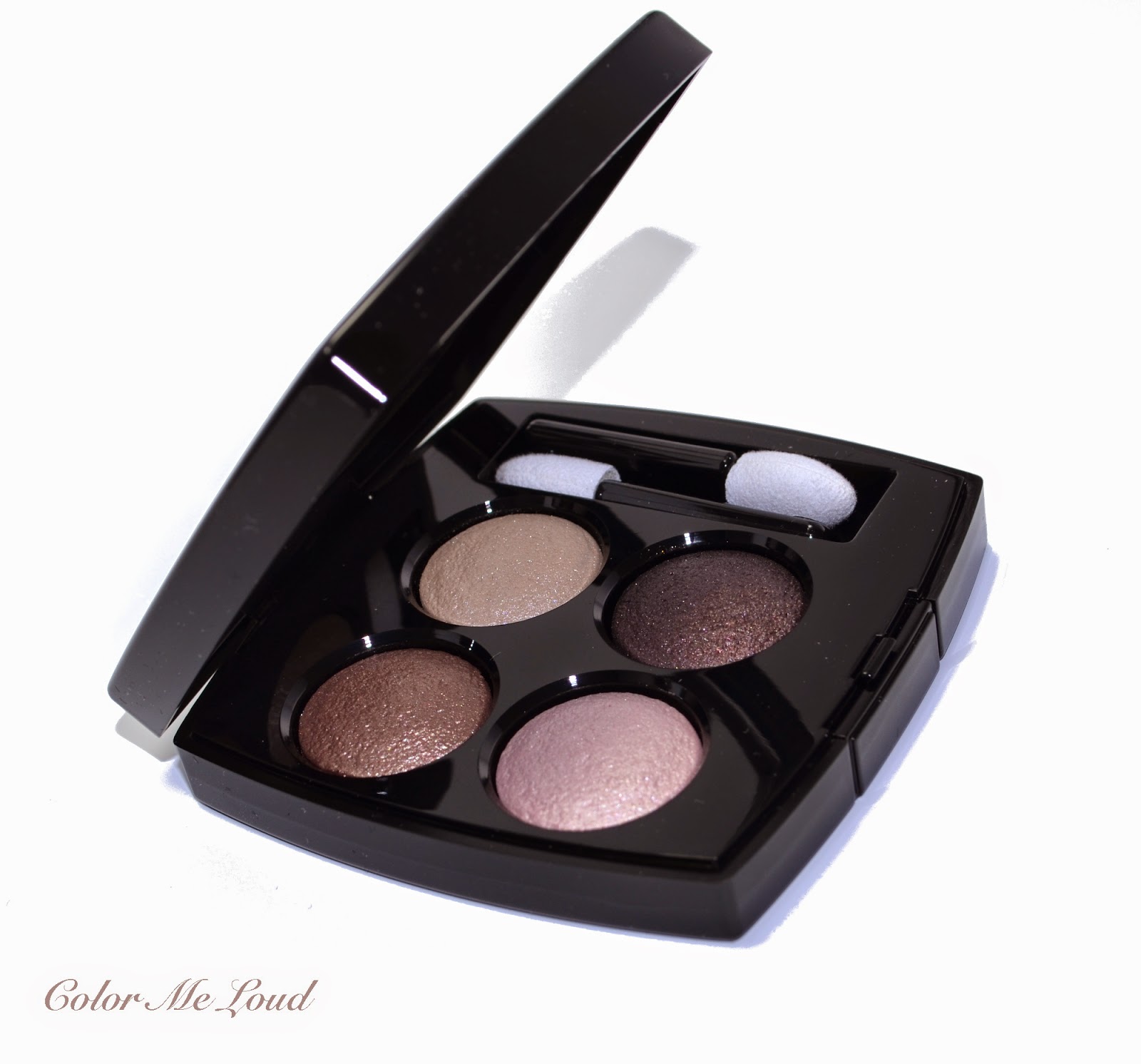
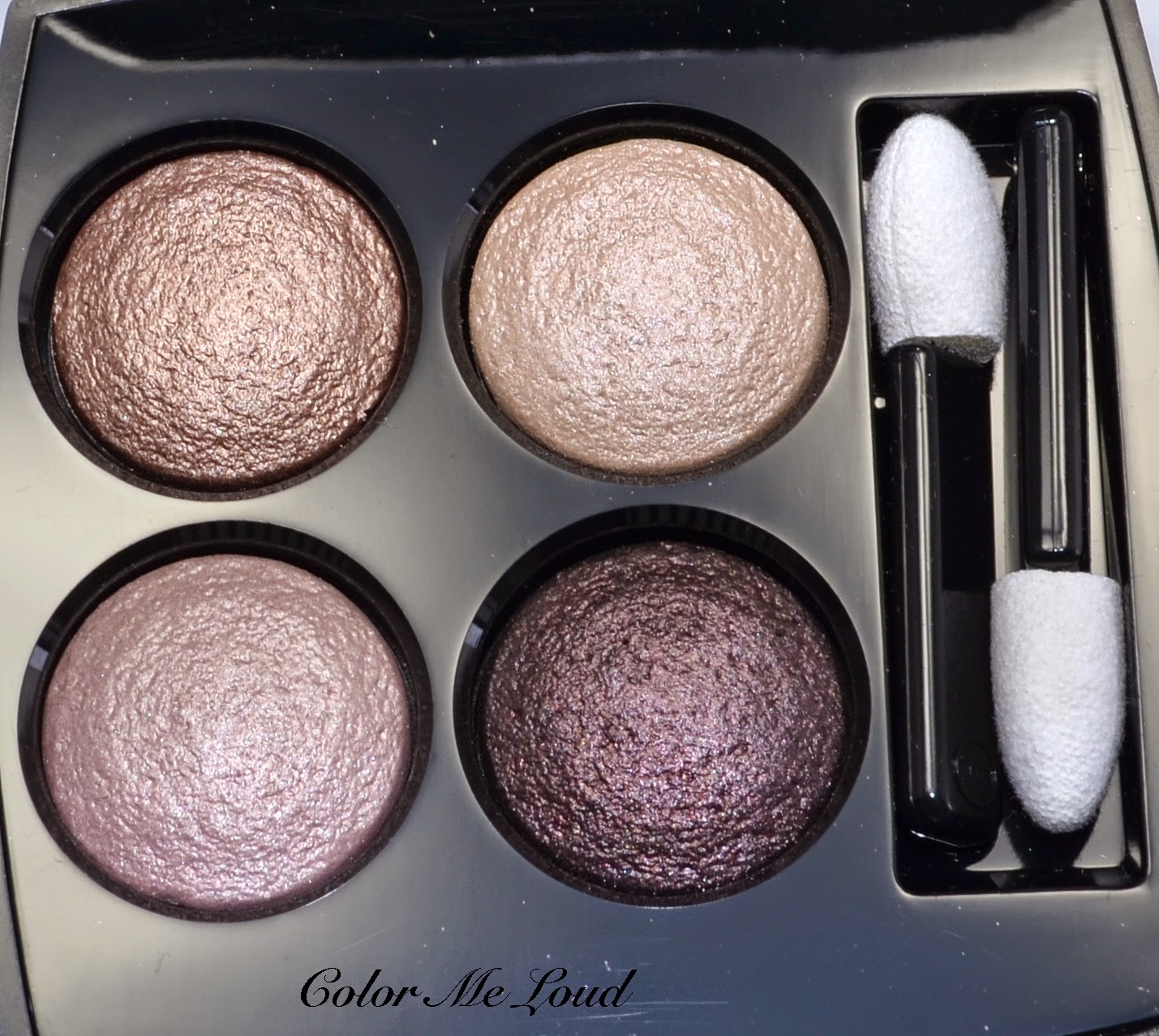
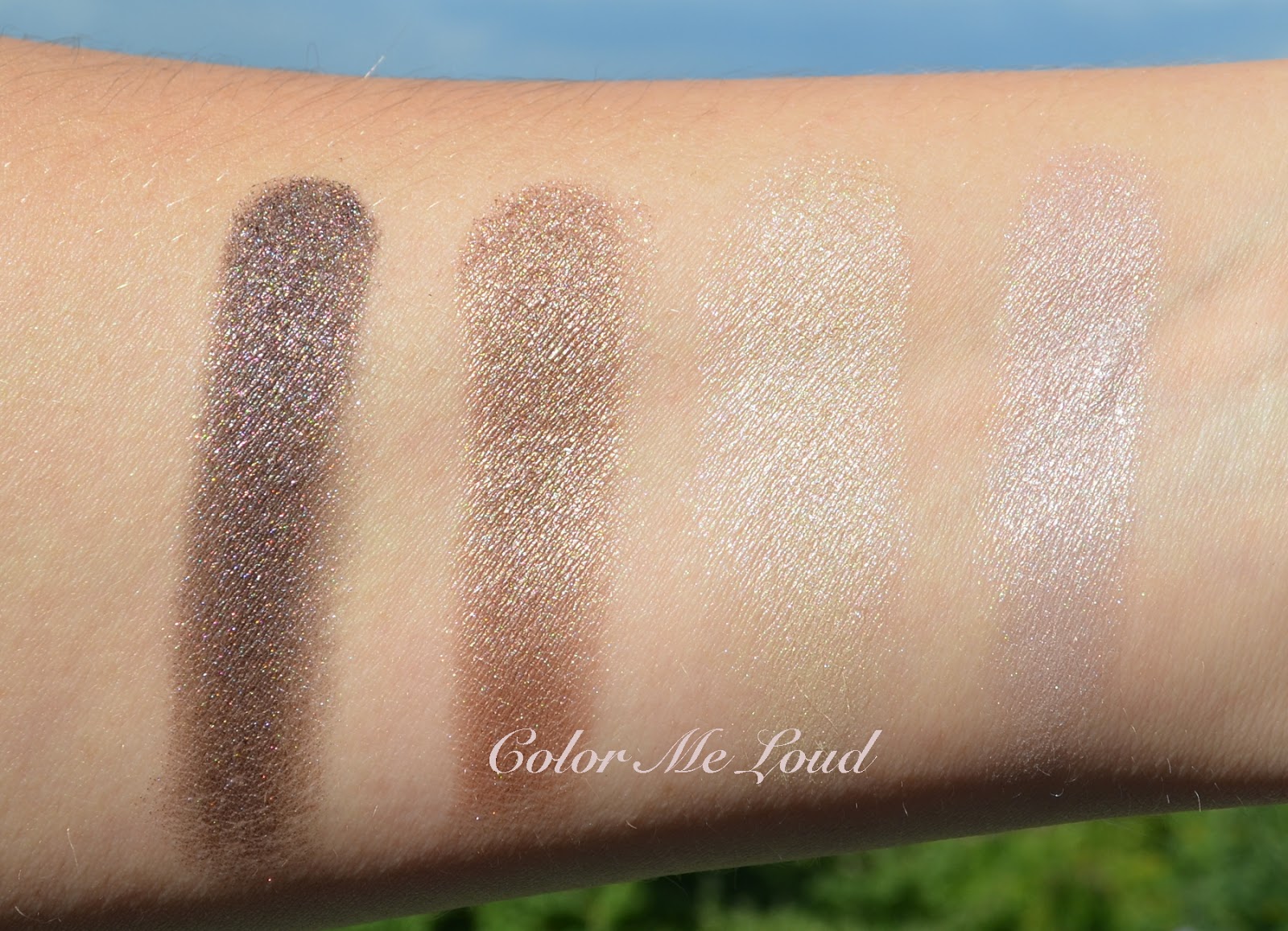
Quantcast
Channel: Color Me Loud
Viewing all 679 articles
Browse latest View live

Nars Dual Intensity Eye Shadows in Callisto and Desdemona, Review, Swatch & FOTD

$
0
0
Nars and once more I am late to the party. Having no counter in Germany doesn't help it but doesn't prevent me getting hold of the Nars pretties either. Nars states "Double or Nothing" and I say, yes please. So I decided to get to know them first, ordered two shades from Nars.eu, sight unseen.
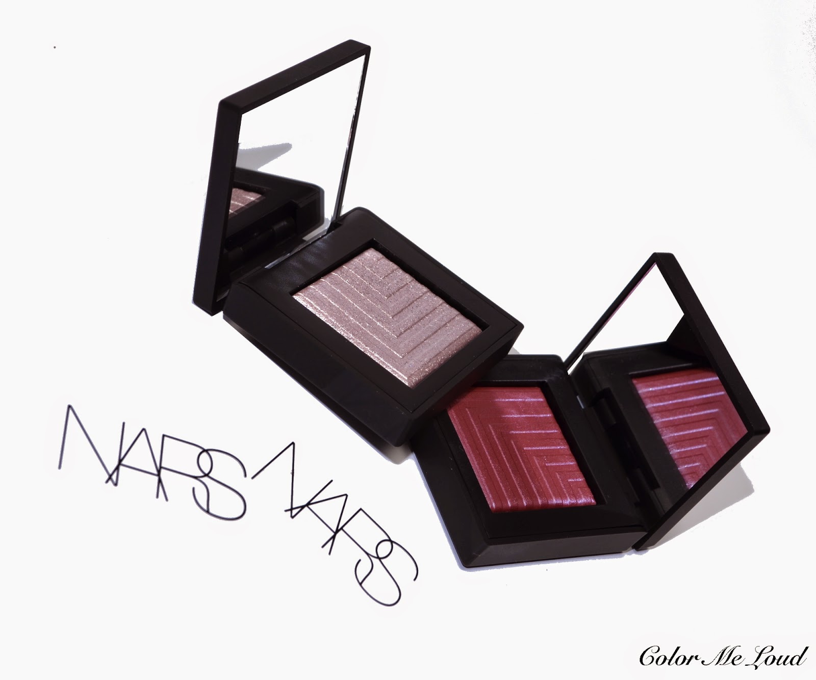

Nars Dual Intensity Eye Shadows in Callisto and Desdemona

My first choice was Phoebe but that one was busy crossing some oceans (thanks to Linda) so I selected two more shades, which looked intriguing from the swatches online, Desdemona and Callisto.

Callisto is a light pink with metallic/frosty finish. Nars defines it as "Icy Pink Silver", which I find to be spot on. I failed to remember icy is pretty much the same thing as frosty though so ended up getting a bit shocked by how shimmery it is. Callisto is by far the most metallic eye shadow I own and I didn't even try it wet yet. Would it work on its own? I will come to this issue soon...


Nars Dual Intensity Eye Shadows in Callisto

My second choice was Desdemona, why, I don't know. I guess I must have thought that this would be a great addition to my now growing "Fall Rabbit Eye Shadow Section" of my stash. Oh and I thought this would have a great duo chrome quality. Desdemona is really a unique color, which I didn't own. At the same time I found it to be a little too red based and less plum based and therefore more difficult for me to pull off. 


Nars Dual Intensity Eye Shadows in Desdemona

Here are my dry swatches, I wished I had seen similar swatches online before ordering Callisto because you see the frost? *nods* This particular shade is impossible to wear alone for me. I tried today and ended up removing it because I simply couldn't go to work like that. Callisto is very clashy (no I didn't mean classy!) and very frosty. I am sure though it will receive some love from others and as far as I read it does, just not me...

Desdemona is fuchsia shimmer, which is fine but then that red base... I was a little nervous but it turns out that it works nicely on me. I love the more subdued shimmer of that one (Callisto hear that?) I just wished it would be a touch more brown and wearable but instead it is interesting and edgy. Not your everyday neutral though...


Nars Dual Intensity Eye Shadows in Callisto (left) and Desdemona (right)


Here is me wearing Desdemona (inner and outer lid) and Callisto (midlid, blended over Desdemona). 
Although one by one these colors wouldn't be my first choice, together they work much better for me, Callisto's shimmer is nice to layer over other eye shadows and Desdemona gets more purple once combined with Callisto.


In-action: Nars Dual Intensity Eye Shadows in Callisto and Desdemona


Here is the whole look. I was on a bold make-up mode so I combined the eye makeup with MAC's Pure Heroine, I wanted Pure Heroine very much but it was sold out in less than an hour in Germany, so thanks to Dawn for getting it for me from US. Red shirt clashes a little with almost monochromatic face make-up and I like the variation there.


FOTD with Nars Dual Intensity Eye Shadows in Callisto and Desdemona and MAC Pure Heroine

Final thoughts: Quality of those are phenomenal and I really liked how pigmented and smooth they are. The shade selection, being sight-unseen, was not optimal for me though. If you are no fan of frosts, Callisto might not be for you. There are other interesting shades in the line though, I hope these are available in France soon so I can check out in person. 


How do you feel about frosts? Could you wear Callisto on its own? Any tips to make it work?
Burberry Sheer Eye Shadows in #27 Storm Grey and #28 Graphite, Review, swatch & FOTD

$
0
0
Burberry is in the hearts of many beauty enthusiasts. It is not hard to understand why, the design, the packaging as well as the longevity and texture of their eye shadows and blushes are phenomenal. The amount of high-quality product you get with a Burberry purchase is usually more than that of other high-end brands (for eye shadows 2.5 g of product, instead of the usual 2g or 2.2g) and you get it in a sturdy heavy luxurious compact.

This is why when the brand silently launched two more eye shadows to join their permanent line back in June, they were sold out within days. Luckily these two are back in stores and online in case you still couldn't make-up your mind. I have been getting reader requests to review more Burberry, so I thought I am giving these two a go...


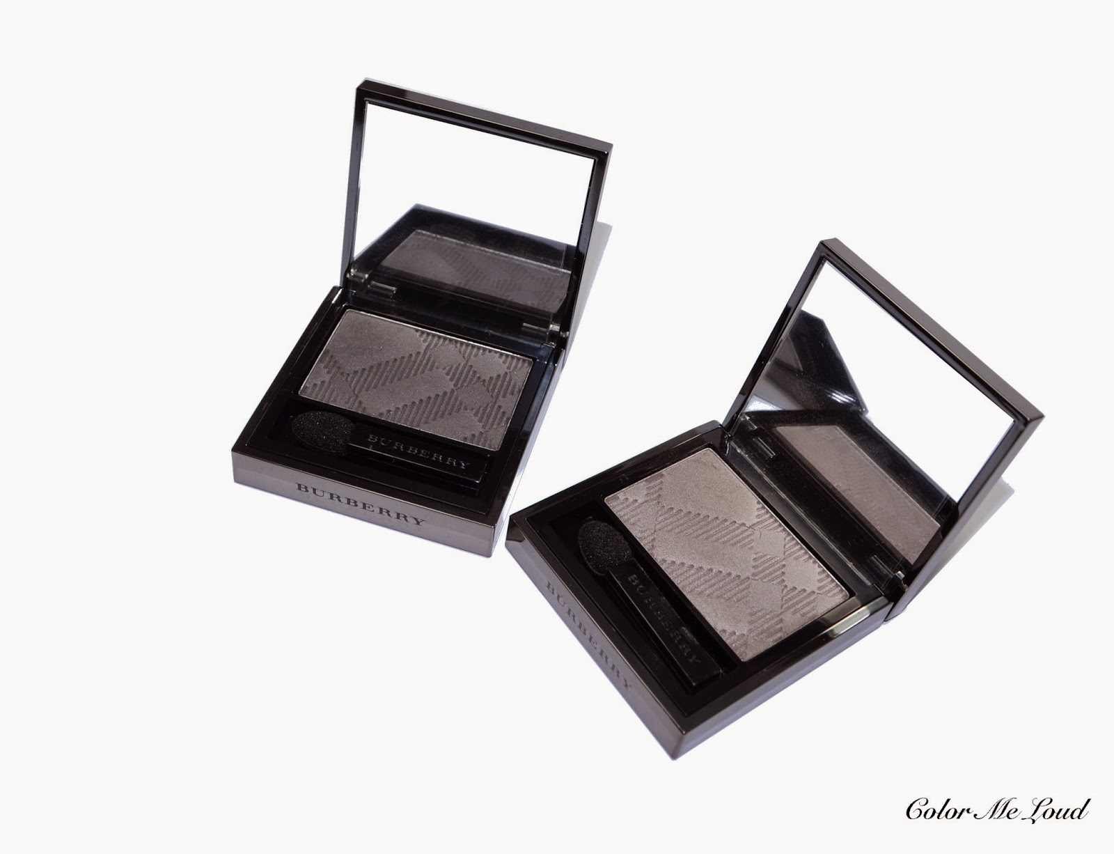
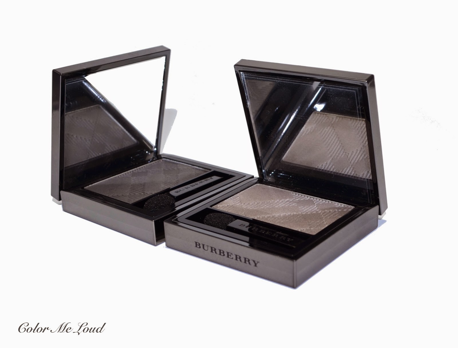
Burberry Sheer Eye Shadows in #27 Storm Grey and #28 Graphite


Burberry calls their eye shadow line "sheer" but don't worry, these lack in no means any pigment. I believe they only try to indicate that they can be sheered out if needed. Two of the new eye shadows are called #27 Storm Grey and #28 Graphite, which are two of the signature colors of the brand. They also have nail polishes named after these shades, which I reviewed a while ago. Now all I am hoping that they bring steel grey as an eye shadow. Dark grey base with golden flecks, would be lovely for holiday, don't you think?


Burberry Sheer Eye Shadows in #27 Storm Grey and #28 Graphite

#27 Storm Grey is a mid-toned grey taupe with right amount of warmness to it. It is a chameleon shade and looks different under different light conditions, sometimes even casts a tad of green in there, go figure. The texture is buttery and satin texture has the most wonderful subtle shimmer to look flattering instead of flat. It has been said that Storm Grey is a cooler version of the famous Pale Barley. I would like to add something more to that, although I like Pale Barley, I found it always way too subtle, I am happy to say that Storm Grey is more "there". It is not shouting in any way but it is more apparent on my lids, which makes me happy.


#28 Graphite is a mid-toned to deep anthracite with matte to satin finish. It also has slight brown undertones, which gives some warmth to it and makes it neutral rather than warm or cool.I have read that the texture of this one is not au pair with Storm Grey so I was expecting that it would be patchy or a little dry but I am happy to report that mine is none of these. It is buttery and smooth with great color pay-off. I would like that it is a little deeper so that I can use Storm Grey and Graphite together but we have to remember that these are singles and they are not designed to be worn together. If Graphite would be deeper, it would be too dark on the lids by itself. Two of the shades are rather close though, especially once applied. So I think getting one of them is enough for a reasonable mind (wish I had one of that)


Swatch with studio light: Burberry Sheer Eye Shadows in #27 Storm Grey and #28 Graphite

There are many good comparisons done for these eye shadows, so I am skipping this part and I will be linking some of them at the end of this post. If you wonder how they look like on the lids, here it is. I love it, I love them both, together, one by one... They are phenomenal. I am especially delighted with the neutral take on smokey eye without getting too dark, too warm or too cool. 

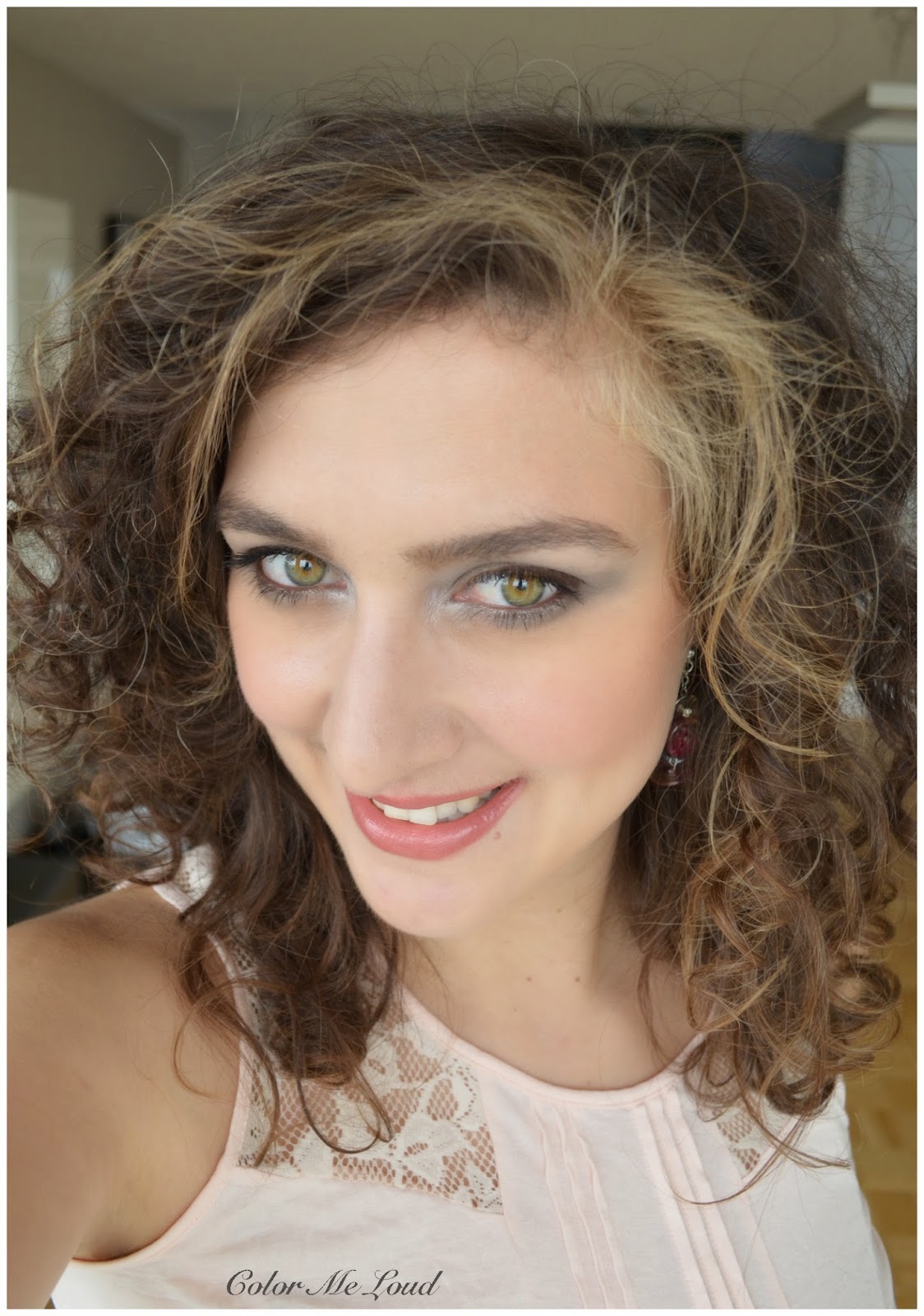
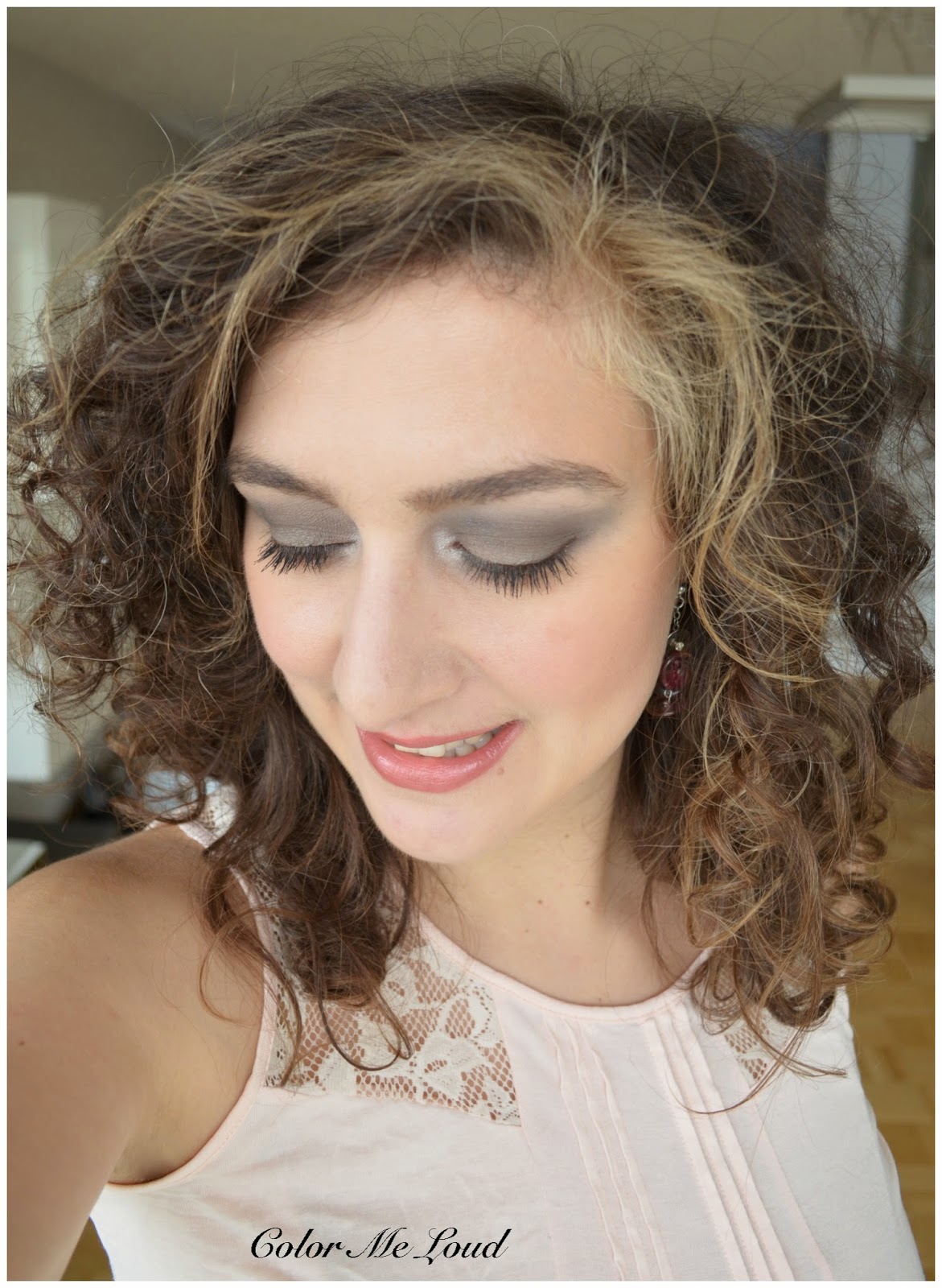
Below I am wearing Storm Grey all over the lid and Graphite at the outer corner and crease. I added a tiny amount of MAC Crystal Avalanche on the inner corner, which I prefer to "Nylon". CA became my go-to inner corner highlighter at the moment. As for the liner, Urban Decay 24/7 Glide on in Uzi matches very good with Storm Grey and Graphite.


In action: Burberry Sheer Eye Shadows in #27 Storm Grey and #28 Graphite

Here is me, wearing Burberry Sheer Eye Shadows in #27 Storm Grey and #28 Graphite, crazy hair, some blush and a Guerlain Rouge G of which I can't recall the name but it is probably #06 Garance :-) (read: lousy b-blogger, note to myself: take the pictures of the products after application). The make up lasted on me over 14 hours, but we know this is one of the (many) strengths of Burberry eye shadows. Beyond 14 hours? I don't know, I had to go to sleep. I am planning for a full 24 hour test sometime but I don't know how I feel about sleeping with make-up.


FOTD with Burberry Sheer Eye Shadows in #27 Storm Grey and #28 Graphite
Burberry Sheer Eye Shadows in #27 Storm Grey and #28 Graphite

Check out these wonderful reviews for more swatches and helpful comparisons: Chic Science, Belletristic Beauty, Gummy Vision and The Beauty Look Book. #27 Storm Grey and #28 Graphite are available in the States but I haven't seen these in Europe yet. Burberry Europe website doesn't list them either. I believe they should be available sooner than later though. Just as a small sneaky peak side note, there will be more Burberry in a few days, like, Fall goodies and stuff, so stay tuned if you like this brand ;-)

Final thoughts: I think both Graphite and Storm Grey are great additions to the line because I found the single eye shadows of Burberry were either too cool (Pearl Grey) or too warm (Taupe Brown, Pale Barley etc.). so to me they fill in the gap. I like both of the shades for a subtle natural smokey eye for all year around.

Have you checked them out? Which one do you like most?

Guerlain Ecrin 4 Couleurs #15 Les Sables, #16 Les Aciers, #17 Les Violines for Fall 2014, Review & Swatches

$
0
0
Guerlain's reformulated Kiss Kiss Lipsticks are recently released in US, UK and some parts of Asia. The collection is about to roll out to the rest of the world soon. I am happy and excited to read that these are receiving good resonance in beauty blogosphere. I have yet to try one and waiting for the collection to hit the stores in Germany. Principally I try not to buy lipstick without trying because some of the shades are very hard for me to pull off. When I have seen three of the new palettes popping up at Escentuals, which are released together with the lippies, I couldn't resist and this happened...


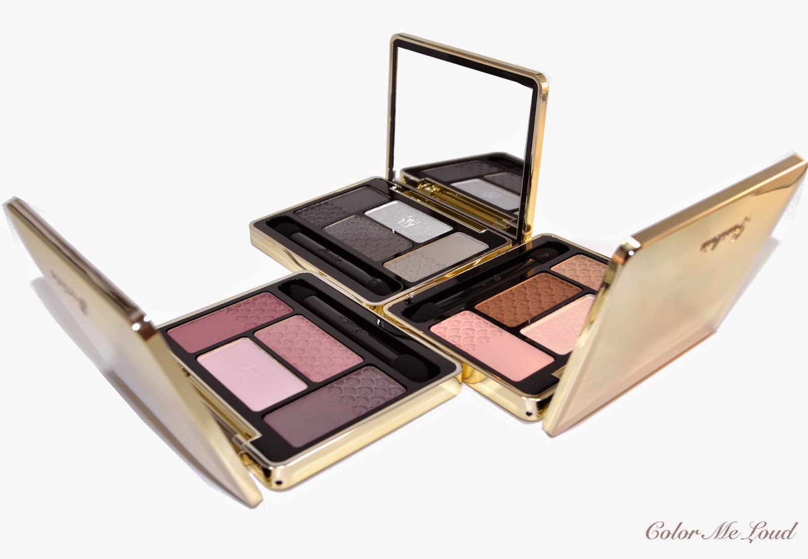
Guerlain Ecrin 4 Couleurs #15 Les Sables, #16 Les Aciers, #17 Les Violines

I would like to first use them and post FOTDs as well as comparisons but I decided to post this sneak peek sooner than later, knowing that some of you are trying to decide and order, and it might be helpful. I haven't used any of these eye shadows yet, so my thoughts are based solely on swatching. I will write a more detailed review about how the shades apply and how long they last during next days.

#15 Les Sables is a warm neutral quad with one shimmery/frosty and three satin to matte shades. The shimmery shade on top and peachy pink on the right sight of the palette balance the warmness nicely. 


Guerlain Ecrin 4 Couleurs #15 Les Sables

Below swatches start with left more shade and go clockwise (left, top, right, bottom).

Left: Mid-toned neutral brown with satin to matte finish.

Top: Very light peachy pink which appears almost white. This shade has frosty finish

Right: Light peachy pink with matte finish

Bottom: Deep reddish brown with matte finish


The quality of the shadows are phenomenal, they are very creamy to touch, even the matte ones which are usually hard to get right. The consistency of shadows are close to Guerlain's other Ecrin 4 Couleurs. The closest texture I can think of is Burberry singles. I can see Les Sables working on variety of skiing tones and undertones since all in all it is more neutral than warm.


Close-up: Guerlain Ecrin 4 Couleurs #15 Les Sables
Swatch (studio light): Guerlain Ecrin 4 Couleurs #15 Les Sables

#16 Les Aciers is the classical smokey eye quad which is like the grey counter part of Les Sables. #15 and #16 are very similar in concept, they both have one shimmery/frosty shade (top) one satin shade (left) and two matte to satin eye shadows. Their texture is similar too.


Guerlain Ecrin 4 Couleurs #16 Les Aciers

The shades, again close wise, are as follows:

Left: Very deep charcoal with satin finish which has slight taupe/brown undertones and therefore it is not very cool.

Top: Very pale grey/silver with frosty finish. This shade may clash with warm skin tones. I am excited to find out if it works on me since some silvers don't.

Right: Light grey with matte finish, it pulls rather cool than warm

Bottom:  Very deep grey with matte finish. It didn't swatch as intense as the left shade but left and bottom shades are very close, other slight difference in their finishes (matte vs. satin to matte). Again great texture and finishes, my only problem with Les Aciers would be two of the shades being particularly close.


Close-up: Guerlain Ecrin 4 Couleurs #16 Les Aciers
Swatch (studio light) : Guerlain Ecrin 4 Couleurs #16 Les Aciers

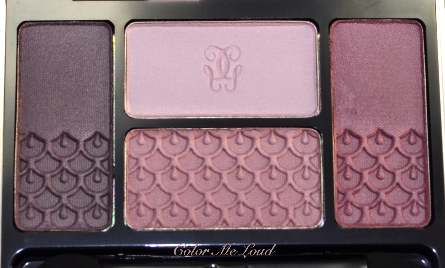
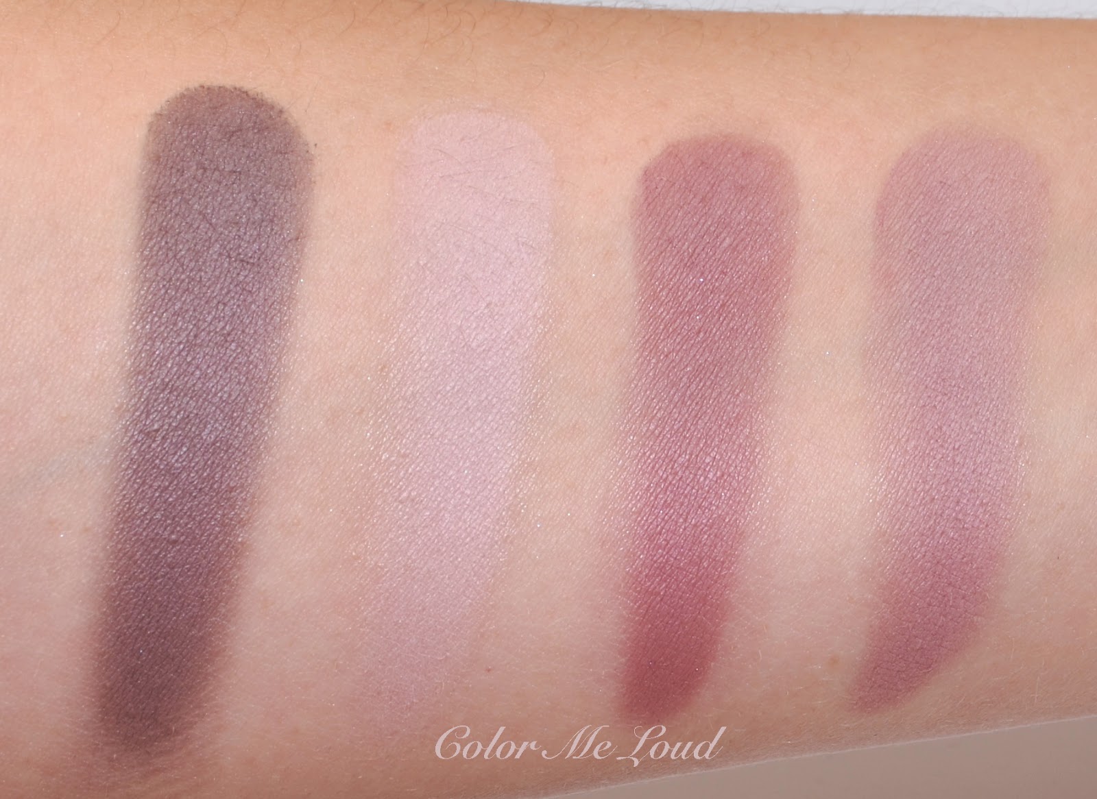
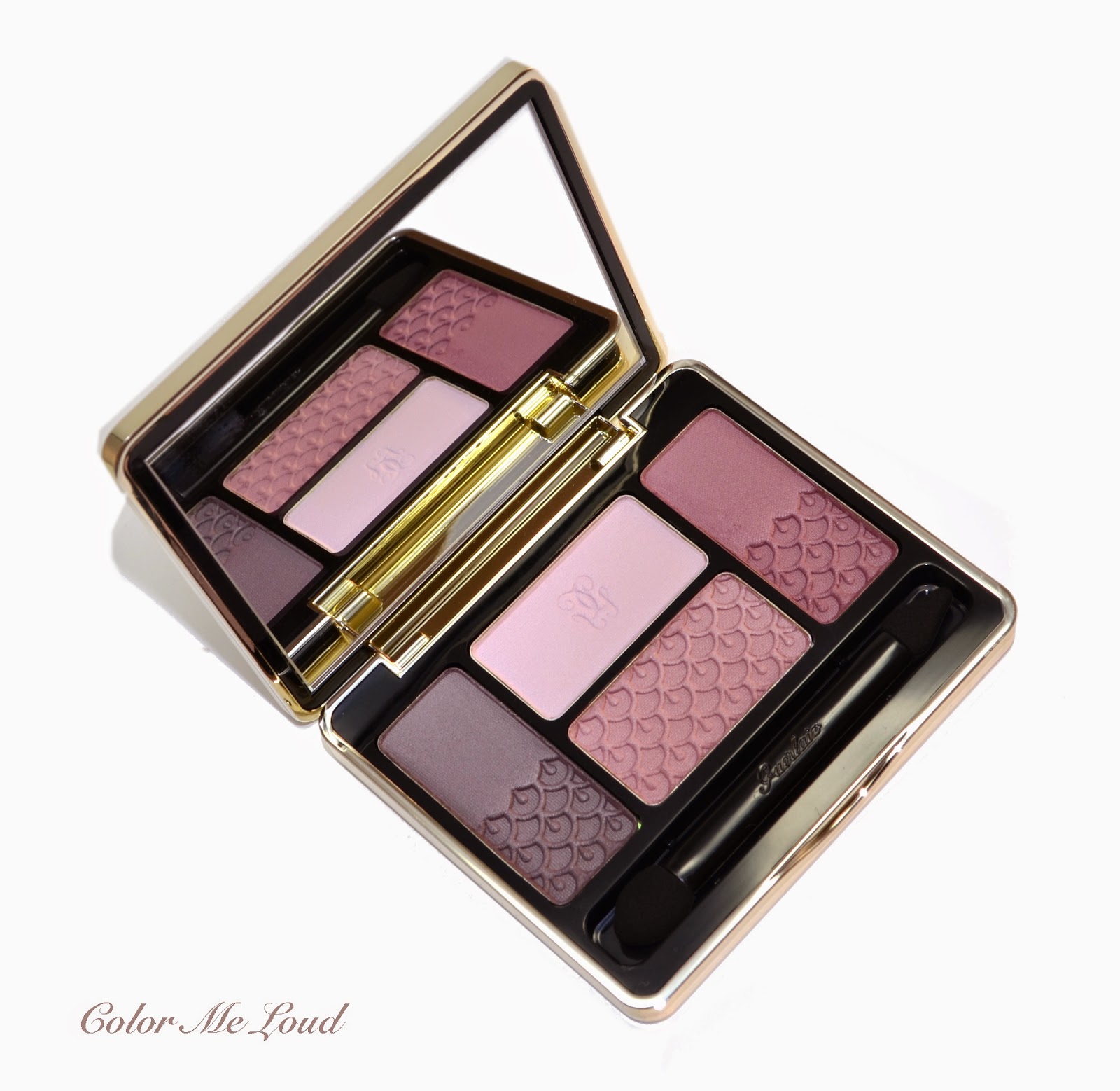
#17 Les Violines is a little different than other two quads, it doesn't have any shimmery/frosty eye shadow. Instead all four of them have either satin or satin to matte finish. The shades are greatly in harmony with upcoming en vogue shades of this Fall, soft mauve, orchid, pink and plum. I am also delighted to see that the shades are rather different from each other. Although these are ton in ton (as the names suggest) it is a more versatile quad. If #17 Les Violines would have a frosty/shimmery eye shadow like the other two quads, it would be very close to Tom Ford Orchid Haze but I am happy to tell you that these two are very different and owning both is justified ;-)


Guerlain Ecrin 4 Couleurs #17 Les Violines


I can't get over the fact that how pretty Les Violines is, it is a matte lowers dream come true in a mauve world ;-)

Left: Deep satin plum with satin finish. A lovely shade which is not too bright nor too neutrally brown, right way in between.

Top: Light neutral pink with matte finish. A matte base shade, yay!

Right: A lovely mid-toned plum pink with satin finish, I believe this one is close to Chanel Hesitation which is also released for Fall (reviewed here). I have to check though,  comparisons are coming soon. 

Bottom: Mid-toned mauve with matte to satin finish. Another lovely shade, I can't wait to get it on my lids.


Close-up: Guerlain Ecrin 4 Couleurs #17 Les Violines
Swatch (studio light): Guerlain Ecrin 4 Couleurs #17 Les Violines


Once more group photo, I love the imprints on the powder, which wears of rather quick since the textures are so smooth, but it still looks so chic.


Guerlain Ecrin 4 Couleurs #15 Les Sables, #16 Les Aciers, #17 Les Violines

Final thoughts: My first impression is: Impressive! I have to try and see how they apply and if the shades can be distinguished after the application but for now, I am enjoying how pretty they look and how smooth they swatch. Needless to say, my favorite of the bunch at the moment is Les Violines since it doesn't have a frosty shade and I just love mauve.

Which one is your favorite?

Guerlain Ecrin 4 Couleurs #17 Les Violines, Review, Swatch, Comparison & FOTD

$
0
0
I hope you are all having a great weekend. We are having visitors over the weekend, so I thought I would write a post quickly before they arrive and share my thoughts about one of the three newly released Guerlain Quads, which will join the permanent line. I was very impressed when I played with them yesterday (check the swatches of all the three palettes here). Reading the comments on Instagram and the blog,  I have noticed there was more excitement for #17 Les Violines there, so let me start with this one.


Guerlain Ecrin 4 Couleurs #17 Les Violines

What makes Guerlain #17 Violines special is its finish. The palette is composed only of satin to matte shades which are very soft and finely milled. Although these are so soft, I haven't experienced fall-out during the application. The intensity of the application can be tuned depending on the fullness of the brush or the layers you apply. With one pass, you can achieve a sheer coverage, with multiple passes or a fluffy brush, you can get full on effect, which is still soft due to the shade selection. I have introduced the shades in my previous post, which you can check here.


Close-up: Guerlain Ecrin 4 Couleurs #17 Les Violines
Swatch (studio lighting): Guerlain Ecrin 4 Couleurs #17 Les Violines

Below I am wearing pale pink (top) all over the lid as a base, soft mauve (right) in the middle and mid-toned plummy pink (bottom) on the outer corner. I defined the outer corner and crease with the deep plum (left). I lined my eyes with Guerlain Eye Pencil #02 in Jackie Brown, which is my go to eye pencil for soft looks and applied Rouge Bunny Rouge Modelling Mascara in Witchery which I am loving at the moment (review coming up soon) on my lashes. 


In-action: Guerlain Ecrin 4 Couleurs #17 Les Violines

It is getting hard for a palette to be very unique in my stash but Les Violines accomplishes it not only with its finish but also because of the tones. Just when I was thinking that I have all the plummy purply colors out there, I was surprised to find out I don't have anything like it. The closest which I can think of is Burberry Complete Eye Palette #06 in Plum Pink because the finish is close, but it turns out that Plum Pink is warmer and has more brown/beige tones once compared. Also Plum Pink has mostly satin shades while the shades in Les Violines are more matte. Burberry is releasing another plummy pink palette for this fall which I will introduce you during next week, I suspect that one can be closer to Les Violines, so stay tuned.


Guerlain Ecrin 4 Couleurs #17 Les Violines vs. Burberry Complete Eye Palette #06 Plum Pink
Swatch: Guerlain Ecrin 4 Couleurs #17 Les Violines vs. Burberry Complete Eye Palette #06 Plum Pink

Another palette which crossed my mind when I see Les Violines is Guerlain's Turandot, which must be one of my all time favorite Guerlain Ecrin 4 Couleurs. It was unfortunately a limited edition item but if you happen to have it, below you see that they are not even close. Turandot is warmer and the plums in this palette are redder. I also thought about Chanel Hesitation from 2014 Fall Collection (reviewed here), but Hesitation is also redder. Nice thing about these comparisons is that I end up noticing unexpected things, this time I found out Hesitation minus the gorgeous sparse shimmer is very close to bottom shade of Turandot, which means those of you who own Turandot can give a second thought in investing for Hesitation :-)


Guerlain Ecrin 4 Couleurs #17 Les Violines vs. Guerlain #500 Turandot and Chanel #106 Hesitation
Plummy shades from Guerlain Les Violettes, Turandot and Chanel Hesitation

I wore Les Violines yesterday and I was impressed by the longevity. I applied my make-up at 9am (over Nars Pro-prime) and at 11pm almost everything was gone other than my eye-makeup, which was looking fresh with no signs of fading. Usually I don't have problem with longevity but I often experience fading after 6-7 hours mark, which means the shades doesn't look as vibrant or fresh as it was applied, which is not the case with just a few brands, like Suqqu, some of Tom Ford and latest palettes of Chanel. I am happy to report that Guerlain is now included in this extreme wear accomplishment list. If you have oily lids and happened to try Guerlain Ecrin 4 Couleurs please leave a comment below and let us know your thoughts about the longevity.

Below I am wearing:

Eyes:

  • Guerlain Ecrin 4 Couleurs #17 Les Violines
  • Nars Pro-prime
  • Guerlain Eye Pencil in #02 Jackie Brown
  • Rouge Bunny Rouge Modelling Mascara in Witchery
Brows:
  • MAC Single Eyeshadow in Omega
  • Anastasia Brow Gel
Complexion:
  • Guerlain Lingerie De Peau BB Creme in Light
  • Guerlain Les Meteorites (huge balls from Spring 2013, which are my favorite)
  • Chanel Joues Contraste #160 Innocence (reviewed here)
Lips
  • Armani Rouge d'Armani Sheers in #114 Incense (from Fall 2014 Fade to Grey Collection, swatched with other shades here)


FOTD with Guerlain Ecrin 4 Couleurs #17 Les Violines
Guerlain Ecrin 4 Couleurs #17 Les Violines

Final thoughts: Loving it, #17 Les Violines might become my daily affair for a polished daily look. I can't recommend it enough if you like these tones as much as I do.

Guerlain Kiss Kiss Collection is now available in the States, UK and it will be released in a few weeks time in Germany and rest of Europe. Palette will cost around 53 EUR in Germany and $60 in the States, Escentuals (not affiliated) from UK has a Guerlain sale going on, and offers 10% on all Guerlain products, this is where I got mine. The palettes are permanent, but I know it is still hard to wait ;-)


How do you feel about palettes with just matte shades?

Giorgio Armani Nail Lacquer #214 Incence Velvet, #624 Crimson Velvet, #714 Iron Velvet and #724 Acid Velvet from Fade to Grey Fall 2014 Collection, Review & Swatches

$
0
0
If you remember my previous post about Armani Fall, the story went on like this: A day before my birthday I came across the pretties at the counter and made myself a big present. I was considering to pass on the nail polishes but as soon as I have seen that they have a very unique finish, I couldn't resist.

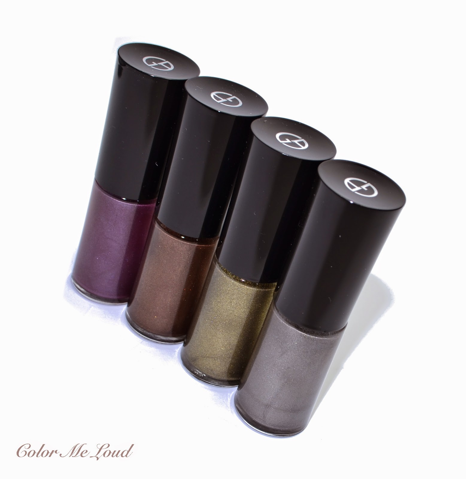
A note about all the four polishes, they have a metallic look in the bottle with very pretty multi colored shimmer. Once applied on the nails, they go on metallic as well but they dry to a matte finish. In shadow they look pretty much matte and under the sun multicolored shimmer shows up, making the polish look like a frost over a metal, if that makes sense. I don't own anything like these so no comparisons this time around. Also I didn't apply a top coat to make them glossy because I loved wearing them like this as they are more unique. Without a top coat, the longevity was impressive, I have worn them 5+ days and still there was only minor tip wear. 


Giorgio Armani Nail Lacquer #214 Incence Velvet, #624 Crimson Velvet, #714 Iron Velvet and #724 Acid Velvet

#214 Incence Velvet is a chocolate color with multi-colored shimmer and matte finish on the nails. This one was one of the most opaque and thicker one of the bunch. The application was easy, I didn't end up getting any brush strokes or imperfections. For the pictures below I applied 2 coats but one coat would be fine as well.


Giorgio Armani Nail Lacquer #214 Incence Velvet

#624 Crimson Velvet is a reddish purple with slight silver, light pink and other colors of shimmer in the bottle. On the nails it looks more frosty and matte than the others and even under sun light the shimmer is not very pronounced. I chose this shade for my birthday mani and loved wearing it. 


Giorgio Armani Nail Lacquer #624 Crimson Velvet

#714 Iron Velvet has the strangest name ever, wouldn't iron and velvet make an oxymoron? Iron Velvet is a mid-toned silver with white and silver shimmer and matte frosty finish. The matte finish of Iron Velvet is more on the subdued side, like Crimson Velvet it doesn't have lots of shimmer under the light. It is a great grey for the Fall season, it also has a tad of warmth which makes it not clash with my skin tone.


Giorgio Armani Nail Lacquer #714 Iron Velvet

#724 Acid Velvet is the stunner and most unique shade of this collection. It is a metallic olive green with multi-colored shimmer and matte finish. Under the light, all the shimmer goes crazy here, as you see below and it looks not that matte but in shadow it is very natural and not over the top. Acid Velvet was a tad thinner than the others from this collection and the first coat applied sheer, but with the second coat, it was opaque. Below swatches are with two coats. Although this are not exactly my type of color, I love this one to bits. In fact I am typing this post with Acid Velvet on my nails. <3


Giorgio Armani Nail Lacquer #724 Acid Velvet

All in all I love all four of them and ended up wearing them since the day I purchased. I notice that Armani nail polish didn't really make it to many blogs and stashes. I think it is a pity since they are of best quality in terms of consistency and longevity. I am guessing the round bottle is putting off  some of the people as well as the price. I would recommend you get one of those to try, they are worth it.


Giorgio Armani Nail Lacquer #214 Incence Velvet, #624 Crimson Velvet, #714 Iron Velvet and #724 Acid Velvet

Final thoughts: These must be the most interesting polishes of Fall 2014 Collections so far. They are unique interesting and wearable. Consistency and longevity are also at their best. I highly recommend checking them out.

Are you eyeing any of these? Which one is your favorite?


Burberry Complete Eye Palette in #12 Nude Blush and #20 Slate Blue from Bloomsbury Girls Collection for Fall 2014, Review & Swatches

$
0
0
I just received my order from Burberry and I thought I would make a few pictures and take some swatches for those of you who are wondering how the eye shadow quads swatch. As always I will be doing looks with these soon. Since I haven't used them yet, my thoughts below are just first impressions.

There are two color focus of Burberry's Bloomsbury Girls Collection for Fall 2014. Each look has one eye shadow palette and three nail polishes which I will also introduce during the upcoming days. The blush for both of the looks is a repromote from their permanent line called Earthy. The first color focus has natural and plummy tones combined in a satin and matte palette called Blush Nude. This is combined with golden, dark red and dark plum nail polishes. The second look is for the blue lovers, with eye shadow palette called Slate Blue and three dark blue and green nail polishes.


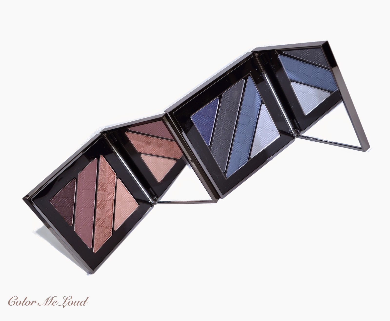
Burberry Complete Eye Palette in #12 Nude Blush (left) and #20 Slate Blue (right)

When I first opened Burberry Complete Eye Palette in #12 Nude Blush compact, I thought, oh, they combined two palettes. It is like two beige/gold shades from another palette combined with plum and a dark eggplant from another. I always complain about the palettes being too monochromatic, so I was more than happy to see that this one was not. Once I swatched it, I sighed happily, the balance of warm and cool shades, mattes and satin or shimmers is as good as it can get. The textures are creamy, soft and the eye shadows are pigmented. I was a little careful since the green palette from Spring lacked a bit of pigment in my book but this time around they nailed it. 


Burberry Complete Eye Palette in #12 Nude Blush

Oh Nude Blush, such a pretty name, such a pretty combination

Top right: A light to mid toned beige with natural undertones and satin to matte finish.

Middle right: A mid-toned shimmery bronze copper. I love this shade, it is shimmery but not frosty, it is also not very light so I will definitely use it as an all over color. I can see this one working on its own too. 

Middle left: Mid-toned mauve with matte finish. This one has a slight duo-chromatic feel with a hidden shimmer, so lovely.

Bottom left: Deep eggplant with satin finish and gorgeous pinkish shimmer which is not over the top. Another lovely shade, I think I love all the shades in here.


Close-up: Burberry Complete Eye Palette in #12 Nude Blush
Swatch (studio lighting): Burberry Complete Eye Palette in #12 Nude Blush

I was contemplating about only getting Blush Nude because I couldn't come along with the blue palettes I purchased lately, including Dior Carre Bleu and YSL Lumieres Majorelle. Then I remembered trying to get hold of Burberry Pink Palette after skipping it in Spring and I didn't want to run after any palettes at the moment, so decided to order this one too. I am not sure I have done right though... 


Burberry Complete Eye Palette in #20 Slate Blue

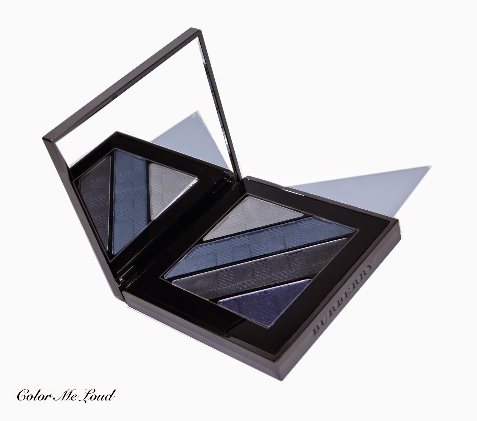
As opposed to Nude Blush, Slate Blue is more of a ton-sur-ton palette with tones of blue. The blues are different but, well, they are all blues. When I see this, I always wonder, why not throwing in an interesting shade, a yellow or a brown, beige, or maybe a pink? That would make Slate Blue much more interesting and would avoid two shades being almost the same...

Top right: Very light grey blue with matte to satin finish

Middle right: Mid-toned blue with satin finish

Middle left: A very deep black with blue shimmers, which makes it look like the deepest blue ever.

Bottom left: A deep indigo blue with shimmery finish.

As you see blue and indigo blue are rather close and I believe they wouldn't look so different on the lids but I have to try and see. For the time being, I am a little skeptical about Slate Blue.


Close-up: Burberry Complete Eye Palette in #20 Slate Blue
Swatch (studio lighting): Burberry Complete Eye Palette in #20 Slate Blue


Here is one more shot of two new Burberry palettes. I don't have information about if they will be permanent or limited but I haven't seen anything selling out and not restocking from Burberry. Spring Quads which sold out at first are both available now and when I asked SA said they are permanent. I also believe these two may similarly become permanent. I hope they keep Nude Blush in their line because it looks so amazing. 


Burberry Complete Eye Palette in #12 Nude Blush (left) and #20 Slate Blue (right)

Final thoughts: My first impressions, Burberry Complete Eye Palette in #12 Nude Blush is love at first sight, #20 Slate Blue is rather disappointment but I have yet to try them on the eyes and let you know.


Are you eyeing any of them?

Burberry Complete Eye Palette in #12 Nude Blush from Bloomsbury Girls Collection for Fall 2014, Swatch, Comparison & FOTD

$
0
0
Recently Burberry silently released their Fall Collection in Europe, which is composed of two new eye shadow quads, five new nail polishes and reprobate products that compliment the pieces. I have shared the swatches of both of the eye shadow quads. Today I would like to review Burberry Complete Eye Palette in #12 Nude Blush in more depth and show you some comparisons.


Burberry Complete Eye Palette in #12 Nude Blush 

I would like to include the swatches and close-up of the palette once more for the sake of completeness. For shade descriptions please refer to the previous post. I am especially impressed by the balance of finishes and shades in Burberry Complete Eye Palette in #12 Nude Blush, which makes it very versatile. Nude Blush has two plummy and two beige/natural eye shadows which range from matte to satin and shimmery. The most plummy tone in the palette is matte so if you have doubts in wearing similar shades, it will be easier for you to pull of because of the texture.


Close-up: Burberry Complete Eye Palette in #12 Nude Blush 
Swatch (studio lighting): Burberry Complete Eye Palette in #12 Nude Blush 

Before I show you Nude Blush in action, I would like to introduce some comparisons with similar Palettes. As I have already mentioned in Instagram, the first palette which came to my mind after seeing Nude Blush in person was Tom Ford Orchid Haze (reviewed here). It is no secret that I have mixed feelings about Orchid Haze. One day I would wear it and end up loving it, one day I would hate it for looking muddy. The mystery of Orchid Haze is yet to be solved but for now let's go back to the comparison. Are they similar? No they are not. They are just in the same color family but they are very different. Here is a comparison:


  • Orchid Haze is cooler compared to Nude Blush
  • Nude Blush has more matte/satin shades as opposed to Orchid Haze which is more shimmery and frosty.
  • Shades in Nude Blush are more mid-toned to dark whereas Orchid Haze offers lighter and darker shades.
Check out the below swatches too. My opinion if I were to get just one of them would be to go with Nude Blush because it flatters me more than Orchid Haze does but it might be just me and my satin/matte loving heart.


Burberry #12 Nude Blush vs. Tom Ford #13 Orchid Haze

The second comparison is with #06 Pink Plum from Burberry quads. When I have seen the promo photos with Nude Blush, I though that it was Plum Pink but it turned out it was a new quad, lucky us! ;-) Plum Pink and Nude Blush are close, closer than Orchid Haze and Nude Blush, yet again to me they are different enough to justify owning both. Again I am not a big fan of Plum Pink to start with, it must be one of the Plummy Quads which never worked on me, it looks rather flat and blends way too much for my liking. It might be the mid-toned shade which lacks some dimension. Instead of that shade Nude Blush has a gorgeous coppery rose/gold (second from left on swatches, middle right on the palette) which I love. I wished it would be available as a single. Here are a few things I noted down:


  • Plum Pink has overall plum feeling while Nude Blush offers beige/neutral shades.
  • Nude Blush is a tad warmer than Plum Pink
  • Light and mid-tones which are usually applied as base are more subdued and do lack some dimension in Plum Pink whereas Nude Blush has a lovely shimmery base shade, which is not over the top but it is enough for the eye look to be flattering.


Burberry #12 Nude Blush vs. Burberry #06 Plum Pink

The best thing about Nude Blush is that, it gives you the look from the promo photos (check out Blush Nude promo photo here). It must have been a long time since I told myself "hey this looks like the promo image once worn" about a make-up. I even started believing that in the promos, models never wear the makeup from the campaign ;-)

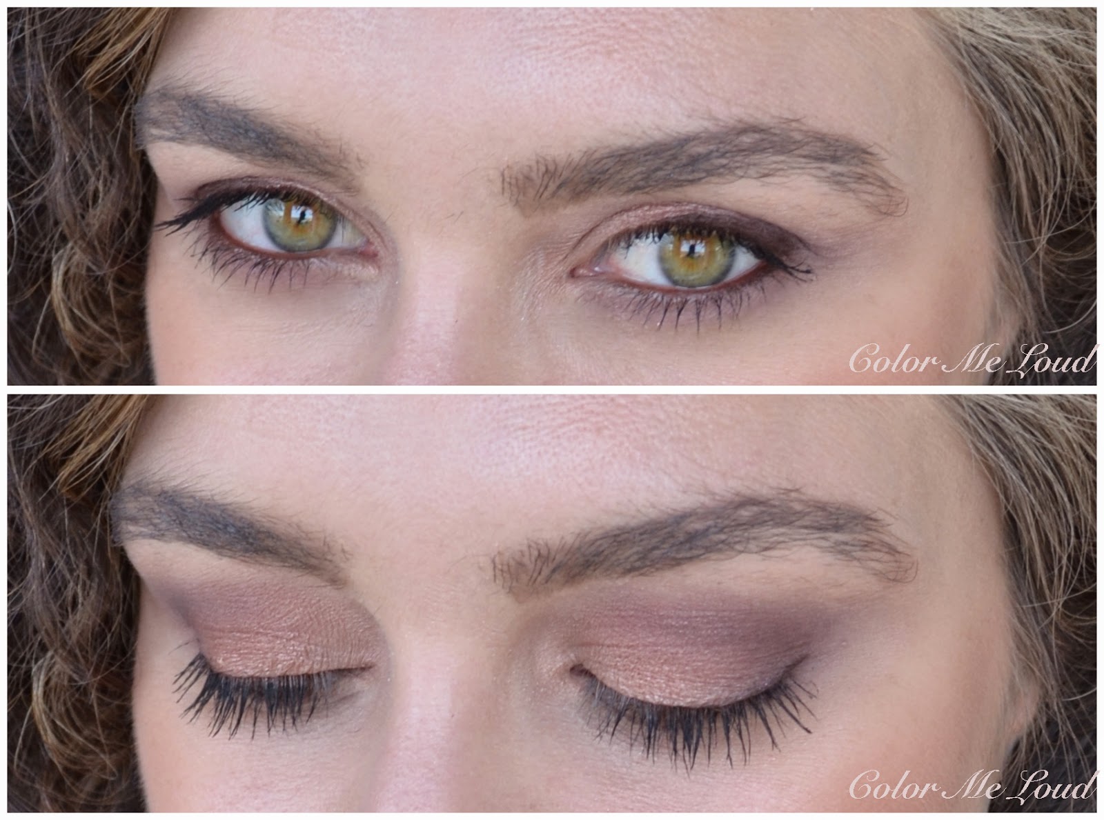
Below I applied the lightest shade to the corner, coppery rose/gold as a base all over the lid, matte plum to the crease to blend and darkest shade on it to define. Darkest shade could be build up even more but I didn't want to destroy the delicate prettiness of Nude Blush. 


In-action: Burberry Complete Eye Palette in #12 Nude Blush

Here is the complete look, I am wearing Burberry Blush in Earthy which is a repromoted product for Bloomsbury Girls Collection for Fall 2014. I really like how it complements Nude Blush Palette. On lips I have Armani Sheers d'Armani #524 in Rosewood (reviewed here). 

I don't own any Burberry lip products until now. The reason for it is a little strange but here it goes, I try not to buy lip products before trying out but the testers at my local Burberry counter is so dirty and broken that I can't ever picture anyone even swiping it on their hands. Would you recommend me any lip products? Which line of Burberry lippies do you like most?


FOTD Burberry Complete Eye Palette in #12 Nude Blush, Earthy Blush

Here is one more closeup, I love how delicate yet flattering this look turned on me. This fall I can see myself wearing it often.


Close-up: FOTD Burberry Complete Eye Palette in #12 Nude Blush, Earthy Blush

Final thoughts: Nude Blush is nothing but love. That shimmery base shade, we need it as a single in our lives too!

Burberry Bloomsbury Girls Collection for Fall 2014 has just arrive to Europe. I ordered mine through Burberry website since it may take some(!) time for it to be available at the counters. To the best of my knowledge it is not released in US yet but it should be very soon.

What do you think, will you be checking Nude Blush out?

Suqqu Autumn/Winter 2014 Collection, Information & Photos

$
0
0
I would like to share some press material for the upcoming Suqqu Autumn/Winter Collection so that we can all start making our lists. The collection is inspired from jewelry and will be released on the 21st of August in Selfridges and 28th of August in Fenwick Bondstreet, London. Fenwick is the new Suqqu Counter in London where I can't wait to visit during my next visit to London. If you are outside of London, you can order the items from Selfridges Online Store.

The theme of the new Suqqu collection is "subtle luminosity and sophisticated radiance", all of these words remind me of Suqqu so I can't wait to try their limited edition split pan eye shadow palette  Ex-21 Murasakisuishou which offers so many possible combinations. The brand also releases a new product, Eye Color Palettes with three colors combined for a wet look. They offer the most shimmery finish at the Suqqu's history so I am very excited to check these out in person. There are also semi-matte lipsticks, which sound so interesting. For more details, keep on reading.

I would also love to know about your wishlist...


Inspired by the elegance and beauty of your most treasured items of jewellery, SUQQU’s newest collection exudes subtle luminosity and sophisticated radiance.

This striking collection, presents both natural and vibrant hues that will add brilliance to any occasion. The color variations available throughout the range evoke depth of color and playfulness.


Suqqu Blend Color Eye Shadow Ex-21 Murasakisuishou (£45)


A stunning eight-in-one treasury box creating a radiant and luminous look with each added layer. The subtle nuances, achievable through all eight colours, creates a profound yet delicate impression around the eyes.

How to use
Combine- translucent, delicate and beautiful shades are achieved by combining the two colours in each tray.
Use separately - the four colours placed on the outer rims of the palette create a refined and elegant, purple-based finish.

The four inner colours offer a classic brown-based finish.


A: Light Colour (pearly)
A translucent colour, this “wet-type” formula glides on to the skin and spreads smoothly on to the eyelid, giving a radiant shimmer. The outer purple contains silver and red lamé, while the inner gold contains silver, gold and red lamé.


B: Arrange Colour (pearly)
A glamorous and playful colour option, full of light. The pearly colour shifts at different angles, creating definition and dimension around the eyes. The eye impression will differ according to how and where you apply this colour. The “wet-type” formula, like colour A, gives a bright, radiant finisharound the eyes.


C: Deep Colour (pearly)
A unique and defining colour that has both depth and translucency. The exquisite intensity gives a stronger impression around the eyes. The brown contains gold pearls, and the navy contains silver pearls, which adds an overall luminous accent.

D: Pale Colour (pearly)

The pale colour is key to creating a base that blends with the eye area and prevents dullness when eight colours are layered. The Soft Focus Powder diffuses light and covers up dullness, darkness and fine lines.


Suqqu Eye Color Palette (£35)


This glamorous yet playful eye shadow palette is made up of three complimentary colours. The easy to apply moist eye shadow glides evenly and comfortably on to the eye lids with a translucent, satin-like finish. A unique colour combination creates a luminous “wet look” whilst still radiating sophistication. The three new shades contain the highest amount of lamé in SUQQU history – a challenge that was set by the brand in order to give women of all ages the confidence to play with “wet look” shades, whilst still feeling elegant and sophisticated, and without being overpowered with glitter. After a long process of trial and error the SUQQU Eye Colour Palette was born – an exquisite balance of lamé, pearl and radiance.


01: TOUTOUSEKI — Pink & Beige [Natural Elegance]
A subtle look for natural elegance
02: KINSHISEKI — Yellow & Purple [Intelligent Femininity]
A feminine eye that’s polished and sophisticated
03: AORURI — Glow White & Deep Turquoise [Stylish Chic]
A stylish eye with refined taste and subtleness


A: Highlight (pearly)
A soft shade full of light, containing lamé that blends with the eye lid and creates a glamorous brilliance. The combination of minute pearls and pearlescent creates radiant depth, a translucent and sophisticated luminosity, and an exquisite intensity.

B: Middle (pearly)
The colour spreads evenly and softly on the eye lid, with a lightweight texture that’s easy to work. The formula combines minute pearl and lamé with a radiance that catches in the light. It is not only light, but also bright with a satin finish, creating an elegant feel and definition. Play with the colours to layer and build intensity.

C: Shade (pearly)
The creamy shade defines the contour around the eye lids, while the colour sharpens. This colour combines both depth and translucency, giving the eyes a vibrant and playful accent. Use it to line the eye, or to blend in - it can be used to create a variety of eye impressions.

Suqqu Creamy Glow Lipstick Moist (£27)


The Lipstick Moist collection, famed for its lip balm-like texture and moisturizing properties, now comes in a selection of new elegant colours evocative of coral and moonstone. The series’ unique moisturising quality still exists, but with a new soft colouring and a semi-matte finish/texture. The colours in the new collection give a refined and elegant look with a modern twist.


Shades 

Veil Glow (Semi-matte) 

07: Sangoseki — Coral [New shade / Fresh Elegance]
A dense, red coral shade that creates a bright, fresh complexion.

08: Tougyoku — Pink [New shade / Glamorous Femininity]
A pink shade with an exquisite intensity to brighten up the complexion.

EX-15: Benikiseki — Red [Seasonal limited edition new shade / Refined Sophistication]
A red lipstick that achieves a refined and polished look.

Regular Glow

09: Zakuroseki — Rose Pink [New shade / Conservative Sensuality]
An opaque, radiant rose pink shade.

Introducing the new veil-glow version - a new type of radiance
The formula retains the internal moist feel that is characteristic of the Moist Series, and gives a semi-matte finish. The Moisture Matte Complex formula enables a skin-fitting sensation without compromising on colour. The Moist Series’ unique feel repairs dryness and signs of ageing with a single application.


Other Items


Suqqu Creamy Eye Liner Ex-03 in Ruby Navy (£28)


This pearly, cream-like eyeliner in an exquisite navy hue, adds definition around the eyes whilst exuding depth, softness and intensity. The waterproof formula ensures a consistent, beautiful, thin line from one end of the eye to the other, and will last all day long.

Suqqu Nail Colors (£18)


These two colours will brighten up your hands during the autumn and winter season, which often tends to have a melancholy feel. Achieve a certain translucency and radiance that creates luminous fingertips that seem to attract light with a single coat.

EX-07: Nanairoseki (Lame) [Refined Glamour] — An aurora-like lamé nail colour that resembles scattered gems. This sophisticated lamé has a refined glamour that will surely stand out amongst the crowd.


EX-08: Kouseki - Ruby Pink [Cool Femininity] A beautiful hue that has the depth and translucency of rubies. A glamorous colour that is both impressive and sophisticated.


Burberry Nail Polish #407 Elderberry, #423 Dark Bottle Green, #425 Ink Blue, #427 Teal Blue and #445 Antique Gold from Bloomsbury Girls Collection for Fall 2014, Review & Swatches

$
0
0
Are you ready for some eye candy? I am sitting here, typing the post and I can't help but look at the gorgeous little square nail polish bottles and sigh. I love their design, and those moody shades for Fall  just make me super happy.

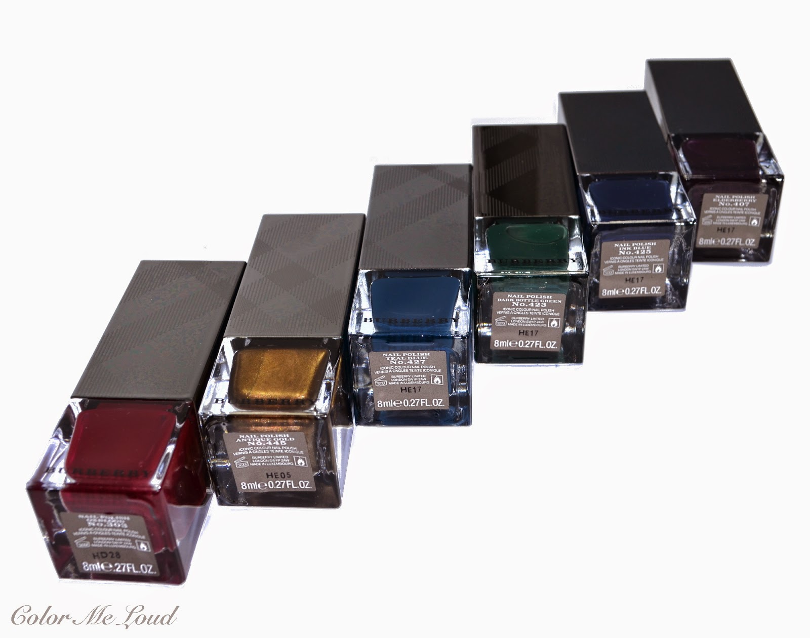
Burberry released six shades for Bloomsbury Girls Collection for Fall 2014, five of them are new shades and one of them is a repromote. It is the most sought after nail polish of Burberry, #303 Oxblood, which I reviewed and swatched previously (check here). Today I would like to show you the five new shades. 


Burberry Nail Polish #407 Elderberry, #423 Dark Bottle Green, #425 Ink Blue, #427 Teal Blue and #445 Antique Gold


The moodiest, darkest but one of the prettiest of the shades must be #407 Elderberry. It is a very dark blackened plum cream which appears black or very dark purple according to the light. It is a nice alternative to classical black. This one has great consistency and it is very self leveling. I applied two coats for the photos below but you can get along with one.


Burberry Nail Polish #407 Elderberry

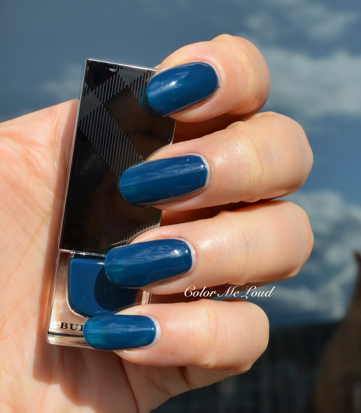
One of the most unique shades of the collection is #423 Dark Bottle Green. It is a deep forest green cream which is not blackened so the green really shows up. If you like green polish, you have to get this one. I believe I don't own anything like that other than a very limited edition Dior Nail Polish #801 called Malice. Dark Bottle Green was one of the tinniest of the bunch so it needs two coats, below I have applied two coats. 


Burberry Nail Polish #423 Dark Bottle Green

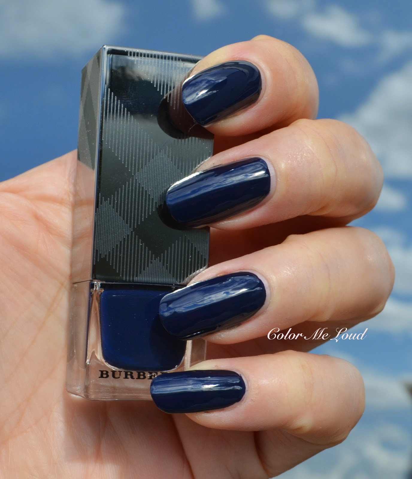
The blue part of the collection with a blue quad called #20 Slate Blue (swatched here) is combined with a dark blue nail polish #425 Ink Blue. Ink Blue is a very deep navy blue with cream finish. It has a very good consistency and it is almost opaque in one coat but below I applied two.  Deep blues are a thing of this upcoming season, so you may have to choose between Burberry Ink Blue, Chanel Orage (deeper, blackened, has subtle shimmer), Dior Carre Bleu (is a tad warmer and has also little shimmer which doesn't transfer to the nails). If there is some interest, I might consider to do a post on dar navy/blues for Fall 2014, please leave a comment below.


Burberry Nail Polish #425 Ink Blue

Now the next one... #427 Teal Blue is a big disappointment for me. I love these type of mid-toned saturated blues on my nails but my problem with Teal Blue started as I opened the bottle and have seen that the brush was defect (it was spread and some of the hair were messed up). Then I have noticed it was thicker and more gloppier than the others. But maybe because of the brush? Anyhow, I was able to swatch then I have seen it didn't even got dry after all those times I was swatching at the balcony... Strange. But then I tried to remove it. Gosh, was it staining! For this one, brush can really not be the reason and I can't tolerate staining polish at this price point, so yes, nice color but better watch out!


Burberry Nail Polish #427 Teal Blue


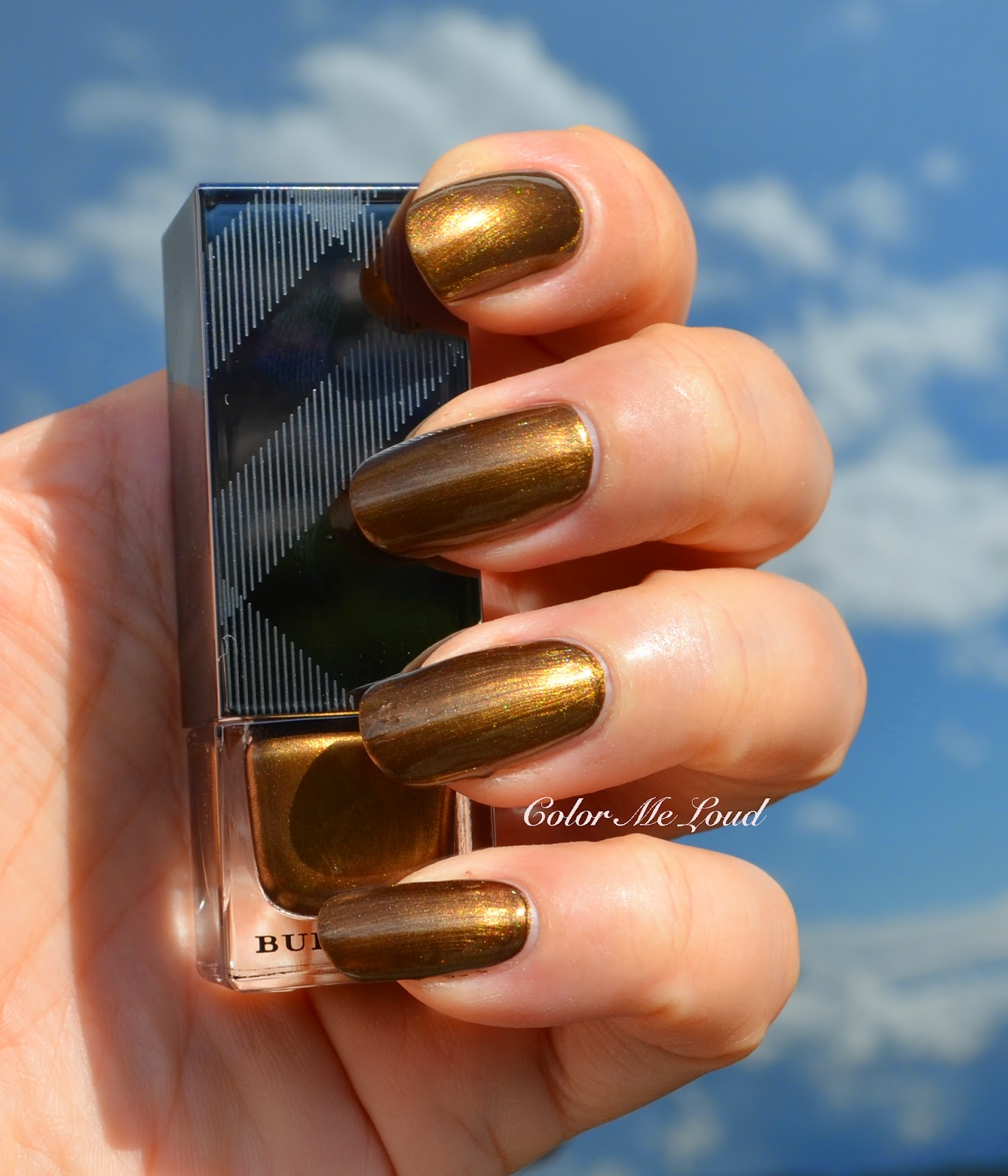
The last and the best, the only metallic shade of the collection and this must be the most gorgeous golden shade I have ever worn. #445 Antique Gold is a mid-toned metallic bronze gold, with gorgeous almost duo chrome shift under light from dark to light, love it! Although it is metallic, I didn't experience any brush strokes (but they say I have a steady hand) and in two coats it applied like a dream. Antique Gold is close to Burberry's Metallic Khaki (previously swatched here) but is lighter and less green, I think it is a true stunner.


Burberry Nail Polish #445 Antique Gold


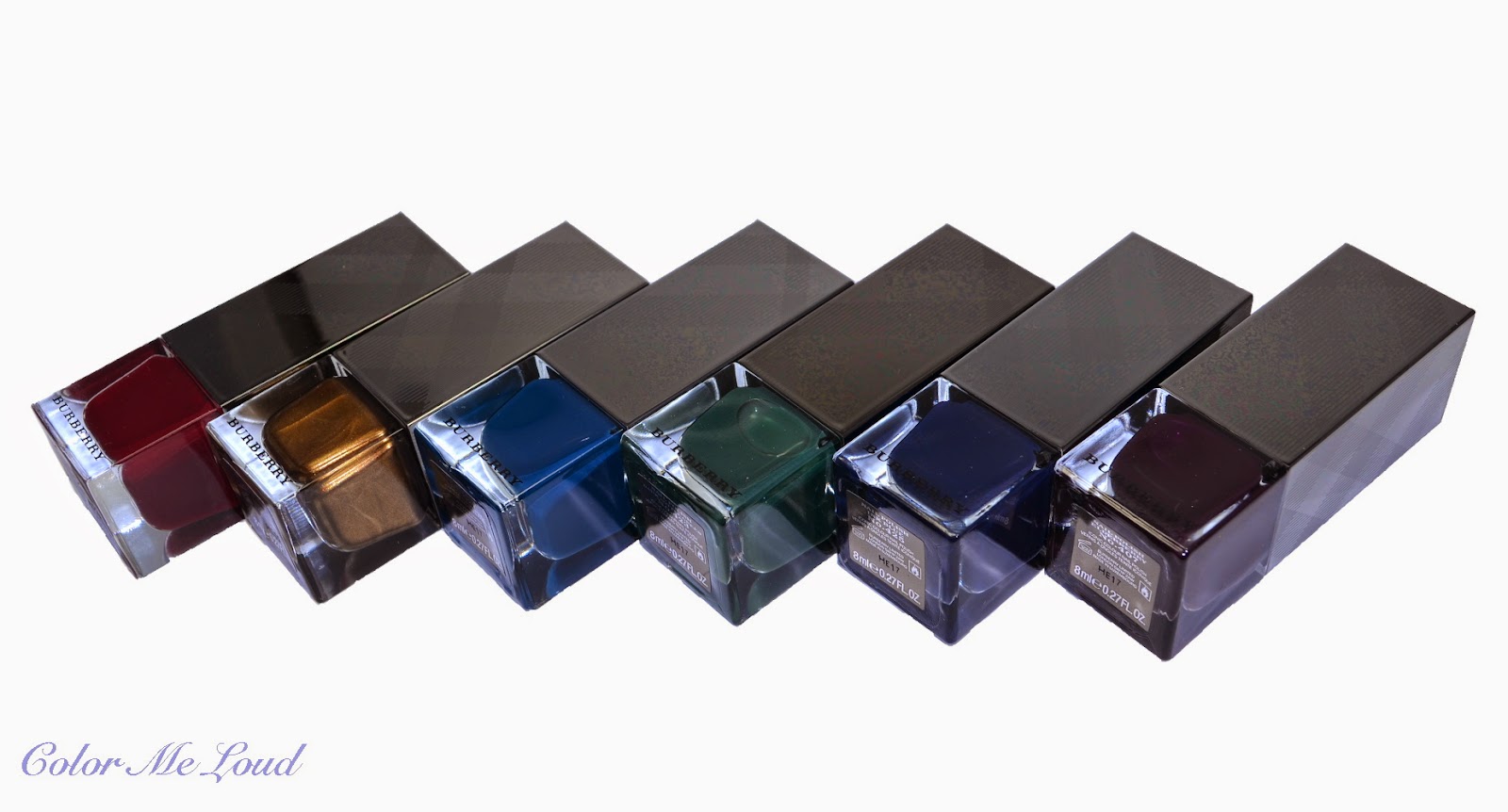
Here is the group photo together with the repromoted shade #303 Oxblood. They look so nice together, I don't want to put them back into their boxes. Love the theme of "dark candy".


Burberry Nail Polish #407 Elderberry, #423 Dark Bottle Green, #425 Ink Blue, #427 Teal Blue and #445 Antique Gold

Final thoughts: I love moody fall shades on the tips and these are definitely worth checking out. I have written about it before, Burberry's brush is not the easiest to work with but it stays very long on the nails. Other than #427 Teal Blue which was staining and had poor consistency, I can recommend all of them, my favorites are #407 Elderberry and #445 Antique Gold, also #423 Dark Bottle Green is calling all the green lovers among you. 

Burberry Bloomsbury Girls Collection is available at Burberry's website. In US though, the nail polishes can't be ordered separately and the eye shadow quads are not being shown. I believe they should be available shortly.

Which one of these shades is your favorite?

Guerlain Kiss Kiss Lipsticks, Swatches of all the Shades

$
0
0
This week was the launch of Guerlain's Kiss Kiss lipsticks in Germany and I made sure to quit work a little earlier than usual to drop by the counter to swatch them. As I did by some other collections recently, I found it helpful of me and everyone else, especially for those of you who can't make it to the counter to swatch and document all the shades. I also found myself checking out my own swatches to buy more shades recently with Dior's Fluid Sticks ;-)


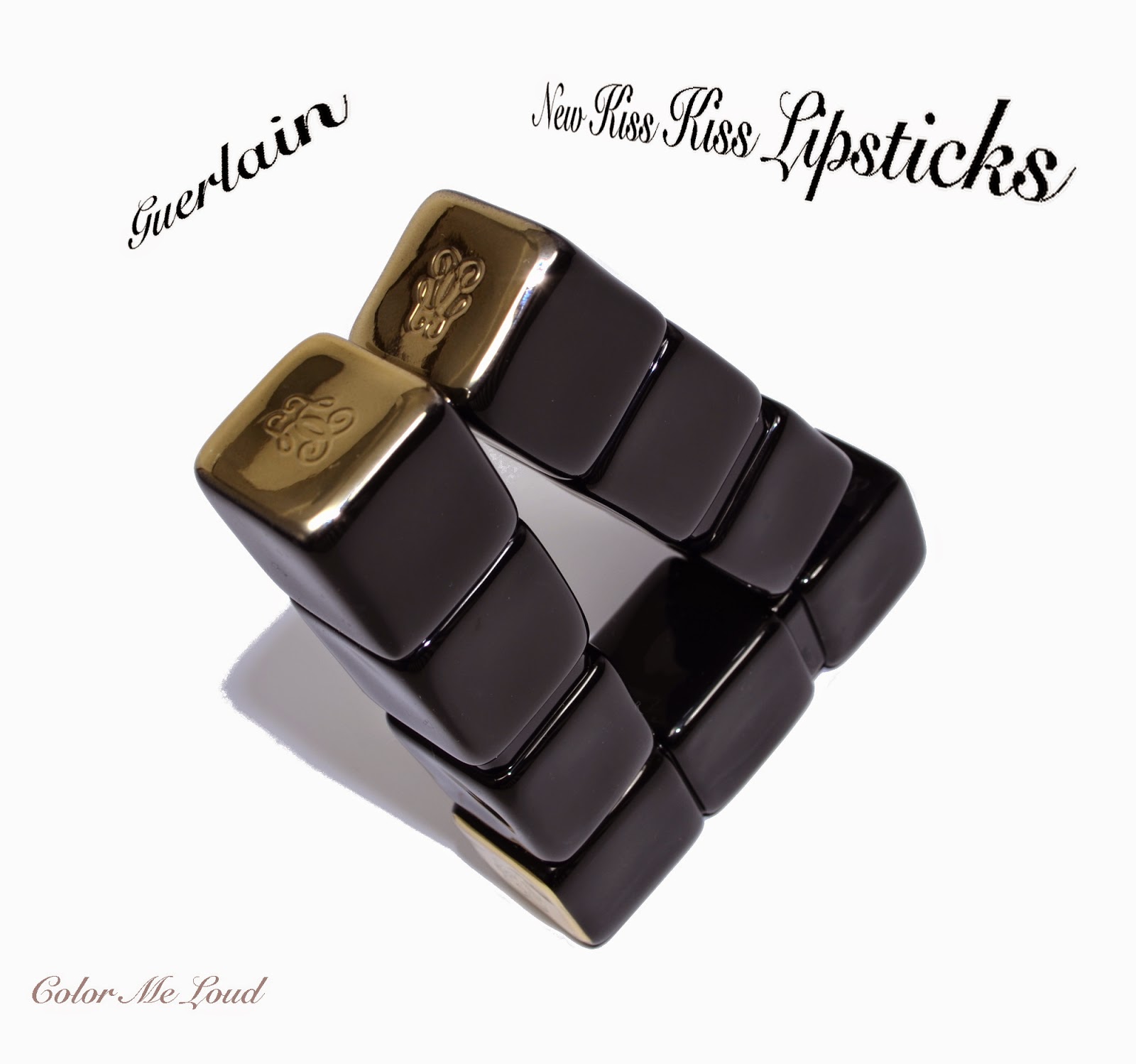
Packaging, Guerlain Kiss Kiss Lipsticks

The package of these are breath taking. I love love love black and gold. Does anyone else remember of this song when they see the packaging? The packaging of Guerlain is anyone of the best in the market. Think about the famous design of Rouge Ga without any edges and the creative mechanism of Rouge Automatics. Kiss Kiss Lipsticks offer a more classical touch and a very luxurious feel. I will rave about these in the next post though when I got to show you the ones I have.... 

A little disclaimer: The below descriptions are first impressions and mostly are based on swatching rather than wearing (I would need a day and more lips to try all of them on my lips) so please take them with a grain of salt and let me know if you have any corrections.


Guerlain Kiss Kiss Lipsticks Board as seen by Stuttgart Breuninger

A lovely SA helped me to remove the part with the lipsticks and gave me a nice table to sit, swatch and take my photos freely, I am very grateful for that. Let me start introducing the shades before I write longer ;-) There are 25 Shades being released. The lipstick feels light weight and moisturizing, the finishes range from frosty to glossy and satin, some are even shimmery with glitter particles.

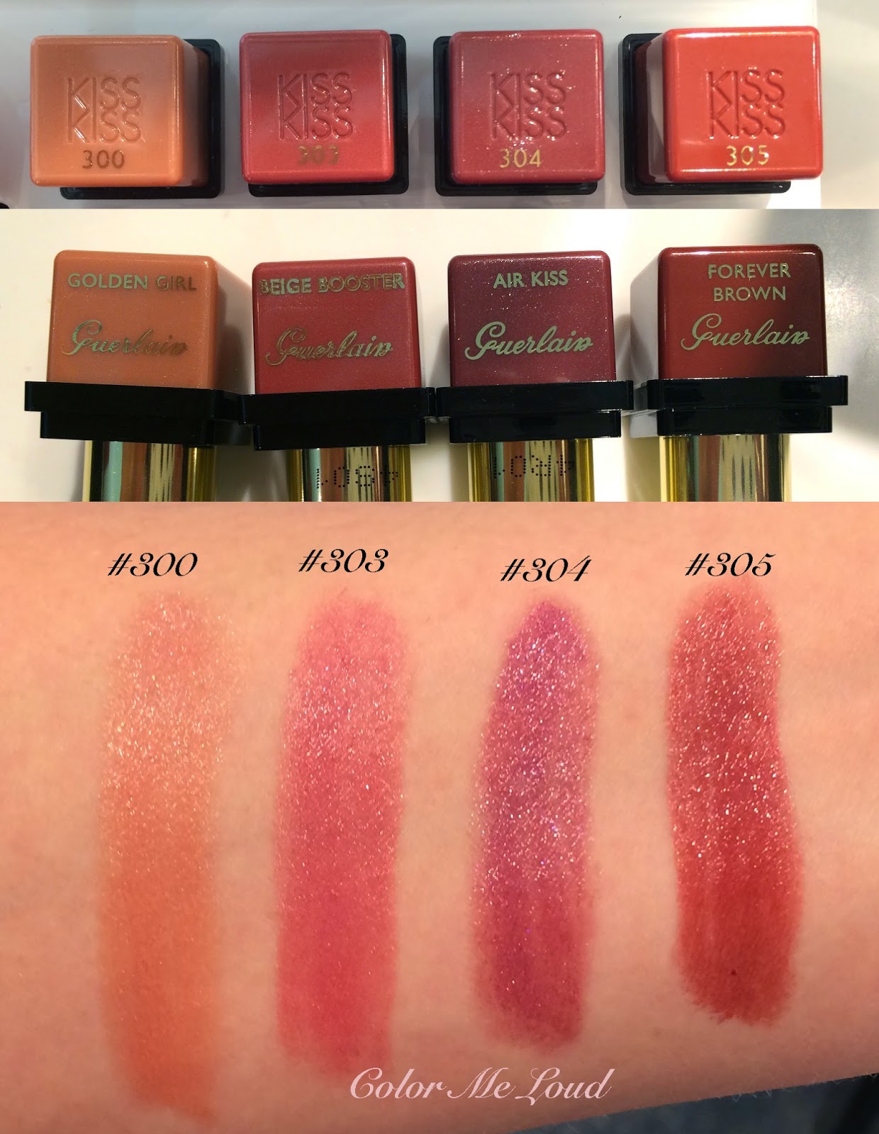
#300 Golden Girl: light golden beige with satin finish

#303 Beige Booster: mid-toned natural satin pink

#304 Air Kiss: Frosty plummy shade, which I lost no time in trying out on my lips. Unfortunately the finish was too frosty for my liking, or maybe it was the lights\, I will check that one again once more.

#305 Forever Brown: Deep reddish brown with frosty finish.


Guerlain Kiss Kiss Lipsticks #300, #303, #304, #305

#320 Red Insolence: A lovely warm mid-toned rosa with satin finish.

#321 Red Passions: The most opaque of all the shades, applies like a dream, I am sure you will love it if you are into bright lippies.

#322 Red On Fire: Such a lovely name, it is a wearable shimmery red.

#323 Spicy Girl: If you are into warmer red, this might be for you, the finish is satin to frosty.


Guerlain Kiss Kiss Lipsticks #320, #321, #322, #323

Now ready for more red.... I can see red lovers all over this collection!

#324 Red Love: A blue based mid-toned red with a tad of transparency for an easy every-day wear. It has satin finish. If I would pick one red from the collection, this would be the one I get.

#325 Rouge Kiss: This is the shade which was used on the model on promo photos. It is a natural, universally flattering red, a little warmer than Red Love but not too warm, it also has similar finish to Red Love, satin and slightly transparent. 

#326 Love Kiss: A darker and warmer sister of Rouge Kiss, finish is satin to frost.

#327 Red Strass: Similar to Love Kiss in finish and opacity, but cooler, more blue based.


Guerlain Kiss Kiss Lipsticks #324, #325, #326, #327

#328 Red Hot: A dark berry red with some fine shimmer

#340 Miss Kiss: Fun name again... It is a cooler coral with glossy and somehow frosty finish

#341 Peach Fizz: A warm coral with a similar finish to Miss Kiss

#343 Sugar Kiss: A warm pink or a cool coral, name it... Finish is similar to Miss Kiss and Peach Fizz, it is the coolest of these three.


Guerlain Kiss Kiss Lipsticks, #328, #340, #341, #343


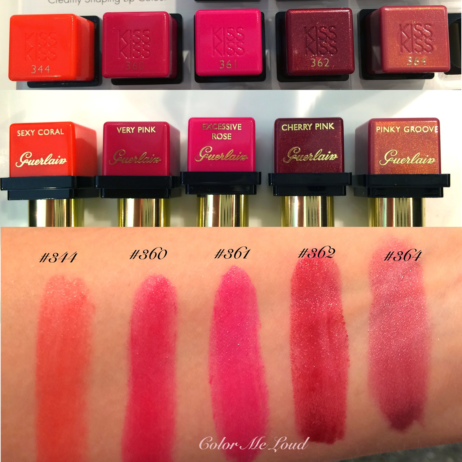
#344 Sexy Coral: This is an ultimate shade for coral lovers out there, it applies smoothly and not too frosty (which is great!) it should be very flat erring on warm skin tones

#360 Very Pink: An opaque mid-toned fuchsia with satin finish (again not frosty)

#361 Excessive Rose: Gorgeous shade for bright lip lovers. Mid-toned blue based pink with satin finish. 

#362 Cherry Pink: Deep blue based red with satin finish, which is slightly more shimmery than other three of the bunch.

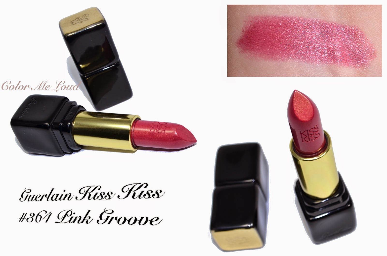
#364 Pink Groove: A mid-toned plummy pink with similar finish to Cherry Pink. This one is just gorgeous, I tried it on, and liked it but #369 stole my heart a tad more but I might revisit it ;-)


Guerlain Kiss Kiss Lipsticks #344, #360. #361, #362, #364

The last set is a little more transparent and slightly transparent shades, they are not frosty but they have a shimmery/glossy base. 

#363 Fabulous Rose: A deep plummy rosy shade with finish as explained above.

#366 Fall In Rose: A gorgeous corally nude, oh so pretty... I am definitely going back tomorrow to check this one out and try it on!

#368 Baby Rose: A cool mid-toned rose with some glitter particles, which may be desirable or not depending on your taste.

#369 Rosy Boop: Hilarious name and my pick from the collection, it is slightly darker than Baby Rose and doesn't have the glitters, so applies more smoothly. I will review it together with Pinky Groove and Golden Girl soon. Maybe I fall for Fall in Rose too (!).


Also check out this post for more swatches and especially for other shades, obviously depending on the region, there are differences. I was wondering why we have #300 and #303 but not #301 and #302.


Guerlain Kiss Kiss Lipsticks #363, #366, #368, #369

Congratulations if you have made it so far. Now tell me, which one are you eyeing?

Dior 5 Couleurs Eye Shadow Palette #156 Femme-Fleur, Swatch, Review & FOTD

$
0
0
I hope you are all having a great Sunday. On this part of the world it is almost over, which reminds me that the next week is my last week before holidays, which is a good thing, but then I remember all the things I have to finish before going to holidays, ugh... Let's not go into that ;-)

Today I have one of the thirteen palettes which hit our shores. Shores, which shores? Holiday state of mind? ;-) Anyway, here is #156 Femme-Fleur, a shimmery taupe/purple palette, the cooler purple palette of Dior's new 5 Couleurs range.


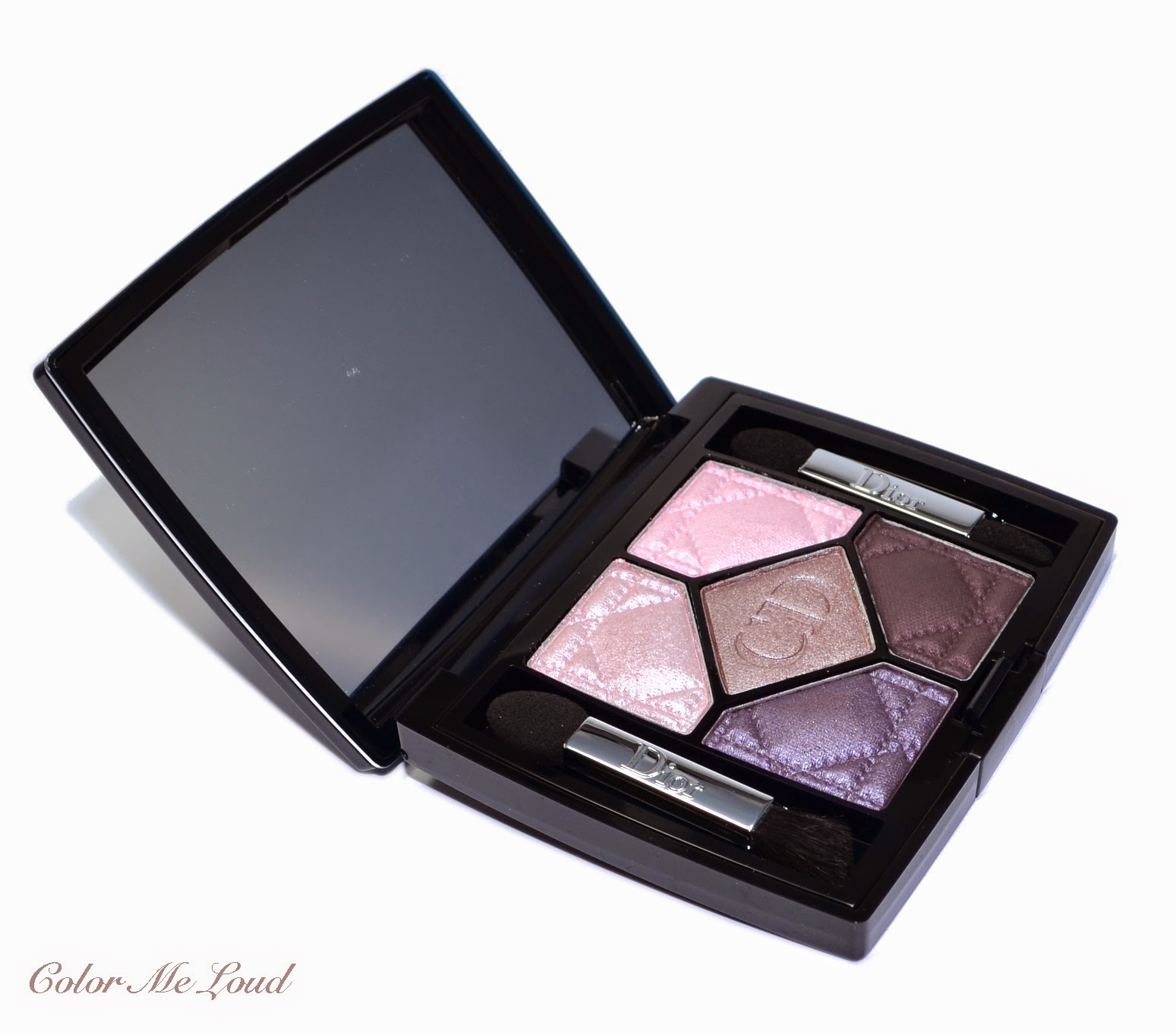
Dior 5 Couleurs Eye Shadow Palette #156 Femme-Fleur

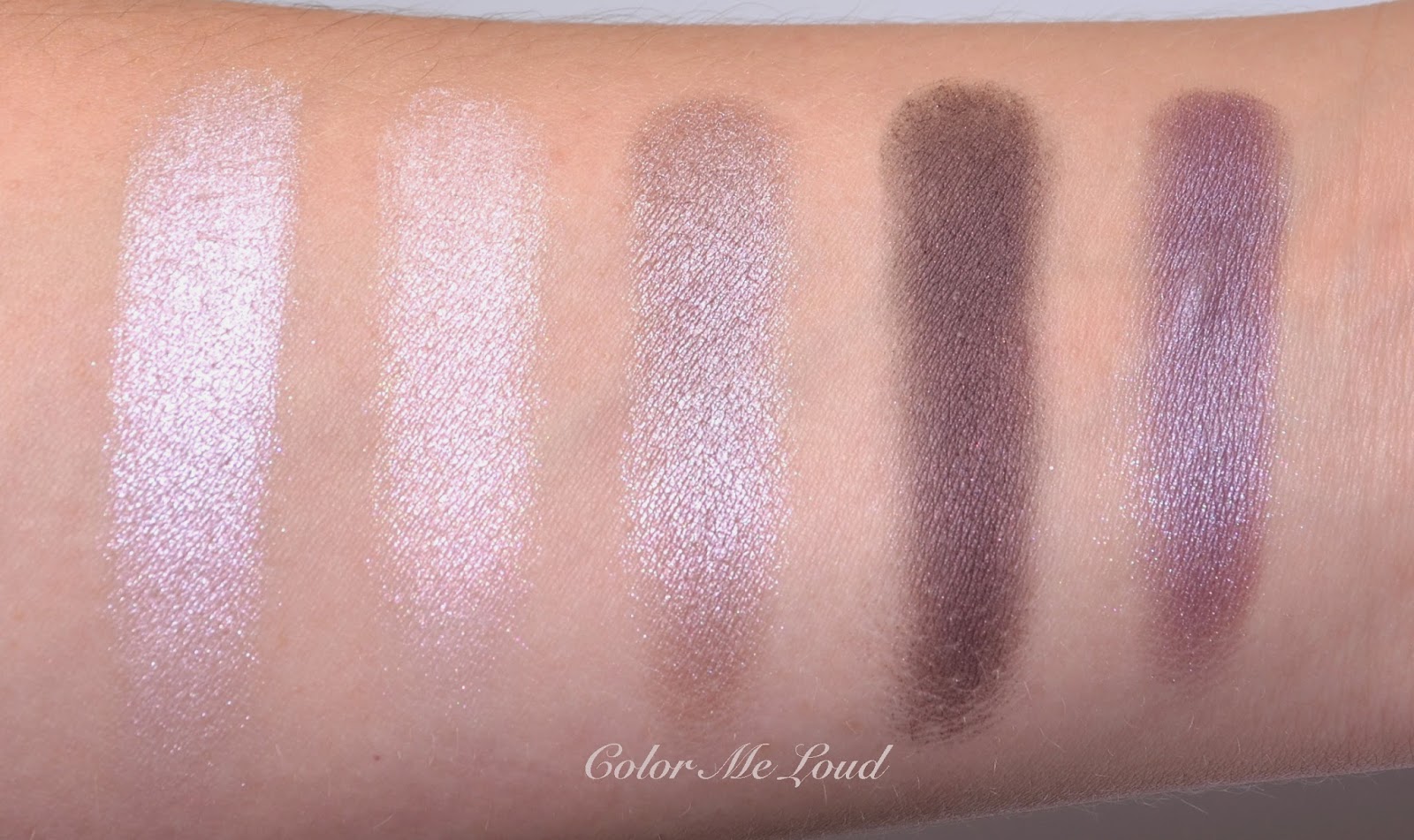
Dior 5 Couleurs #156 Femme-Fleur is a very feminine color combination with delicate shimmery rose, a gorgeous taupe, a lovely plum and a natural brown plum. You can use the middle taupe shade and the darkest shade for a natural day look and spice it up with purple and rose shimmers for a special occasion. 


Dior 5 Couleurs Eye Shadow Palette #156 Femme-Fleur

Top left: A very light cool pink with frosty finish. 

Top right: Light neutral pink with shimmery finish. The shimmer in this one is less pronounced than the top left shade and it is less light.

Middle: A lovely shimmery taupe with very complex color, it is my favorite of this palette. I believe no taupe is the same and this one is so gorgeous!

Bottom right: A very deep brownish plum with satin finish. I like the fact that this is deep enough so the palette can be taken up to different stages of drama by using it on its own or mixing it with the plum shade next to it. 

Bottom left: A deep cool purple with satin to shimmery finish. This doesn't appear too frosty and has a nice sheen to it, love this shade too.


Close-up: Dior 5 Couleurs Eye Shadow Palette #156 Femme-Fleur
Swatch: Dior 5 Couleurs Eye Shadow Palette #156 Femme-Fleur

Below I am wearing #156 Femme-Fleur with a black liner which seems to go all wrong in the morning with hurry :-) but please ignore it... I used the lightest shade on the inner corner, which unfortunately emphasized the fine lines there so one application tip would be not to go overboard with the lightest shade as I did. I have the taupe (center) shade in the middle of the lid, purple ay the outer corner and brown to lightly define the crease. 


In-action: Dior 5 Couleurs Eye Shadow Palette #156 Femme-Fleur

Below I combine Dior #156 Femme Fleur with MAC's Riot House, to get something like Kelly Osbourne Promo Photos. She of course had a lot of smokey kohl thing going on around her eyes but if I would do that, you wouldn't be able to see how the quint performs, so it is a softer take on purple with very light matte peach lip combination. I don't know if this lipstick works on me, I guess I have to get used to it more.

After trying out the palette, here are my thoughts:

Pros: Gorgeous taupe shade, versatility of colorful or cool neutral makeup, less shimmery crease/definition shade to get the depth or drama as needed.

Cons: Frosty shade might not be for everyone depending on age and preference, ton sur ton so might be close to one of the other purple quads you have in your stash.


FOTD: Dior 5 Couleurs Eye Shadow Palette #156 Femme-Fleur and MAC Riot House

Final thoughts: If you like purple and like shimmer then make sure to check out Dior 5 Couleurs Eye Shadow Palette in #156 Femme-Fleur. It is permanent and now available around the globe.

How would you use the frosty shades of Femme-Fleur? Would you layer them or use on their own?

Chanel Joues Contraste #80 Jersey & #170 Rose Glacier, Review, Swatch & Comparison

$
0
0
Here starts another week. This is the last week before my holidays so I am trying to get as much work done as possible. I also have a long list of blog posts I should take photos of, once my stash is reachable so that I can post during the holidays as well. I don't want to evoke any envy but it will be a rather long holiday so preparation on the blog front is necessary, blogger duties anyone? ;-)

Since I am short on time, my shopping sessions became shorter and more impulsive. On Saturday I was trying to buy some necessities before holiday and I bumped by the Chanel counter to see two new blushes and their new Vitalumiere powder foundation. I tried the foundation at the back of my hand and it felt very moisturising. I am dry to normal (in the summer I am a little more normal than dry if that makes sense) so I don't usually go for powder foundation but this one was really smoothing and nice so I decided to try it out. With the foundation, Chanel released two new limited edition blushes, so I had to have them too. Here comes the comparison and review of the two new Joues Contraste, #80 Jersey and #170 Rose Glacier.

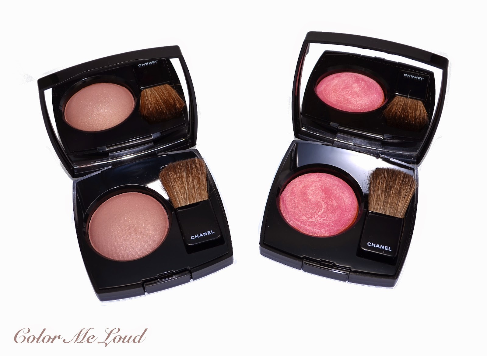
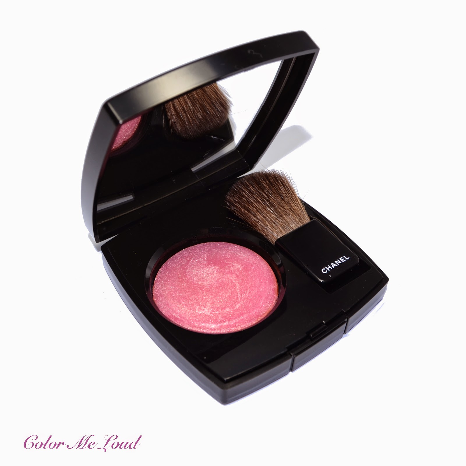
Chanel Joues Contraste #80 Jersey & #170 Rose Glacier

Chanel Joues Contraste #80 Jersey is a... I am lacking words to describe this shade. On me it is a warm rosewood with a touch of brown but it is no way orange or too brown. It has a enough rose to be flattering and enough brown so it is warm but not orange. I adore this shade, since I can#t get enough of shades which I can't explain. I own nothing like this. Jersey has just the right amount of shimmer to be flattering and not flat. Jersey is now getting prepared to be one of the stand-out blushes of this year, you have to try it out!


Chanel Joues Contraste #80 Jersey

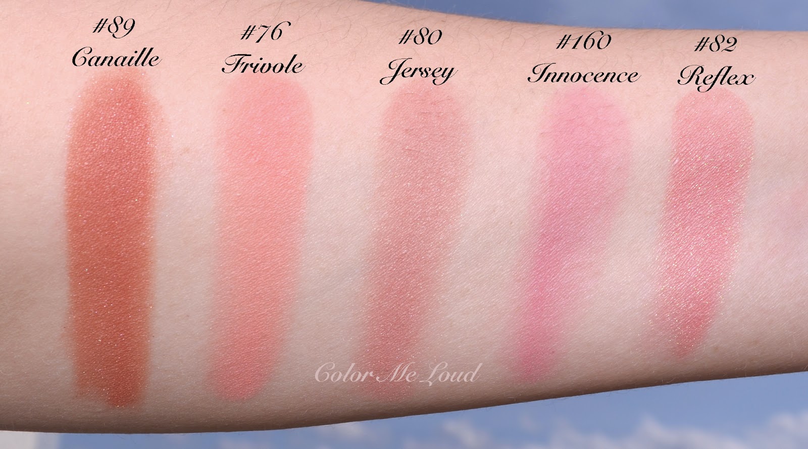
Below you can see some attempts to compare Jersey to other Joues Contraste from my stash. you see nothing ever comes close. #89 Canaille, which never worked on me, is darker and, well, orange! (ok, girls told me it is terracotta, which is a shade of orange right?). The ultimate coral blush of the range, #76 Frivole (love!) is brighter, Fall blush #160 Innocence is cooler and more rosy. #82 Reflex has more shimmer and it is brighter. I then attempted to compare it to Burberry Earthy but they were way too different to ever mention, Burberry is lighter and much more brownish. 


Chanel Joues Contraste #80 Jersey & similar Joues Contraste
Chanel Joues Contraste #80 Jersey & comparison swatches (in shadow)
Chanel Joues Contraste #80 Jersey & comparison swatches (with direct sunlight)


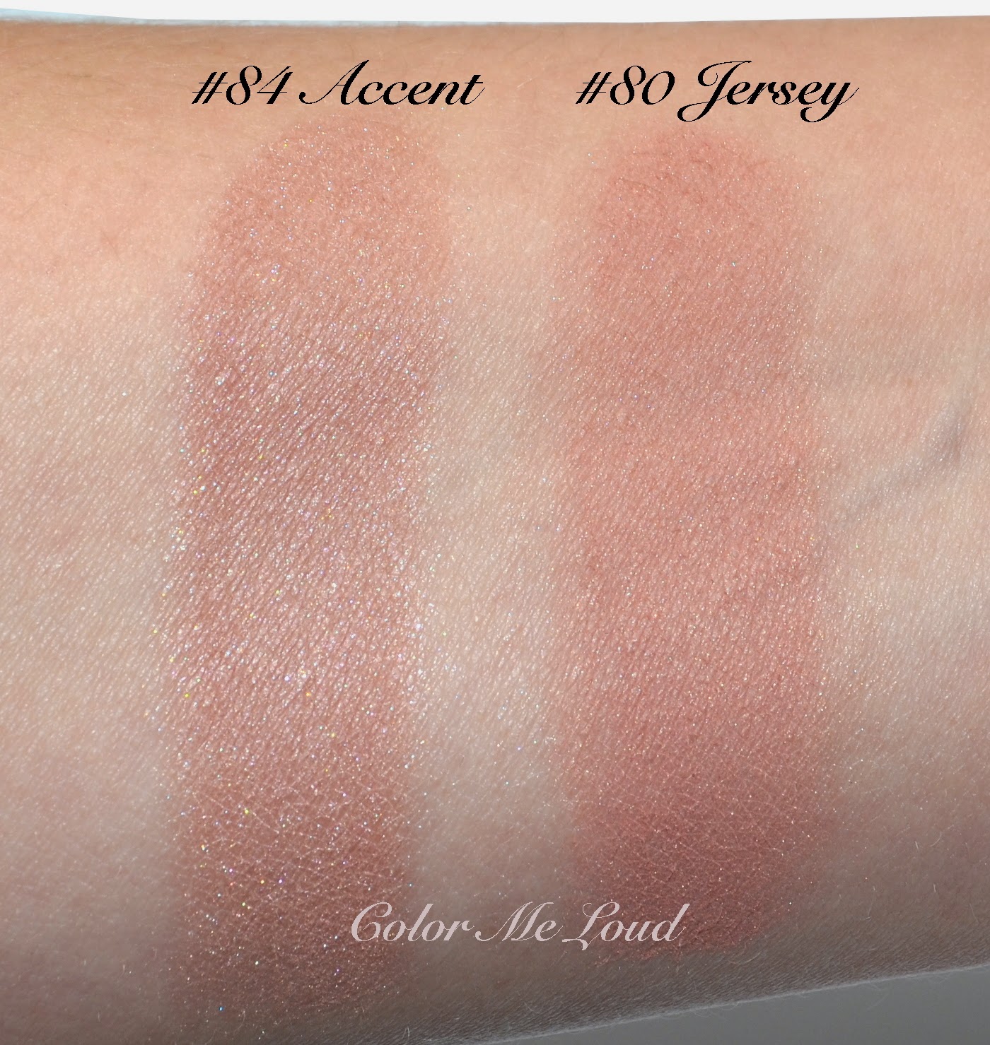
Below is a comparison between Jersey and #80 Accent, which turned out to be the closest shade in my stash. Jersey is a less shimmery and warmer than Accent. I remember Accent didn't work for very fair ladies and looked very brown, Jersey may look orange on those complexions, since it is warmer. It is still worth a try since it is a unique and beautiful shade from gorgeous Chanel blush formula.


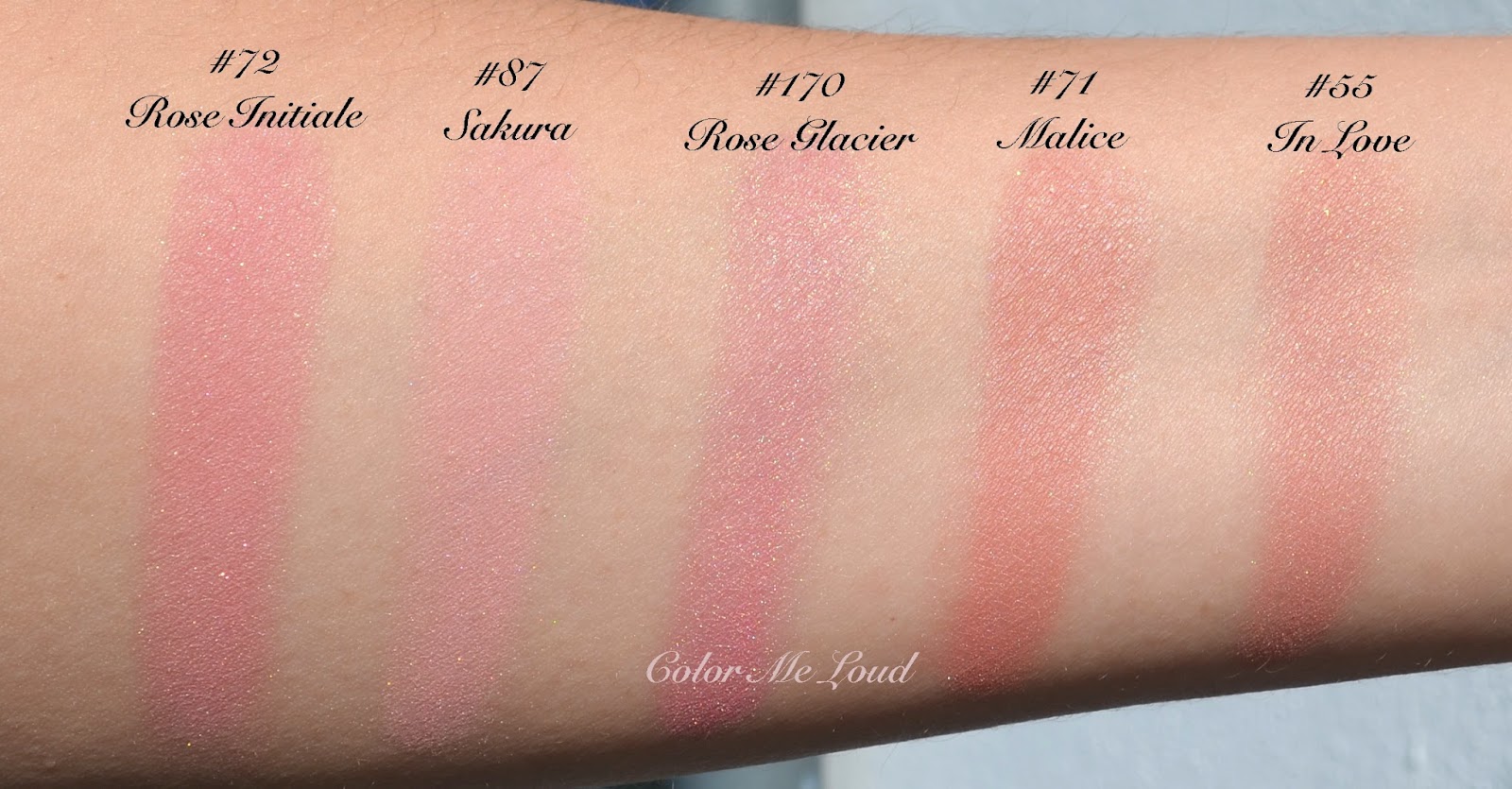
The second shade is #170 Rose Glacier, which is a lovely neutral rose with golden shimmer. It is a flattering shade for many skin tones. The golden shimmer is very pretty and it doesn't turn you into a disco ball but it is definitely there, especially under strong lighting you can see the shine. I am sure Rose Glacier is a shade many of us would jump right into buying. Be cautious though, your stash may already be full of similar shades, check out the comparisons below to make sure.


Chanel Joues Contraste #170 Rose Glacier

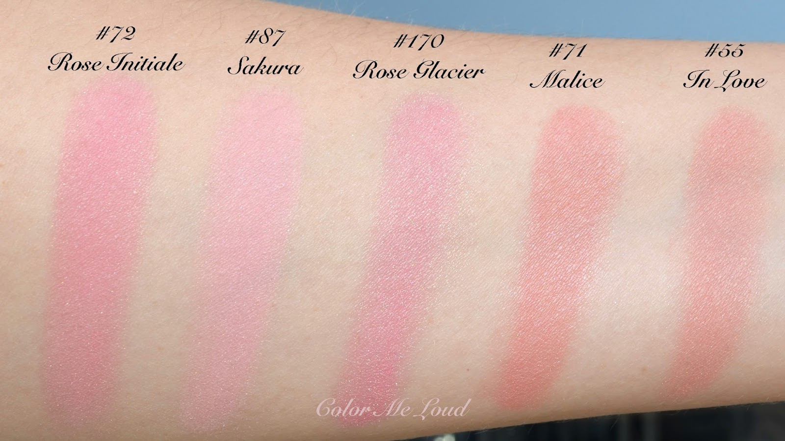
Here are a few of the similar Joues Contraste, #72 Rose Initiale is very similar, has less shimmer and is a tad darker. #87 Sakura is lighter, #71 Malice is warmer. #55 In Love is close from the finish as it also has golden shimmer but of course it is more warmer. To me #170 Rose Glacier is a cooler sister of In Love.


Chanel Joues Contraste  #170 Rose Glacier and similar Joues Contraste
Chanel Joues Contraste  #170 Rose Glacier and comparison swatches (shadow)
Chanel Joues Contraste  #170 Rose Glacier and comparison swatches (with direct sunlight)

I was about to put all the blushes back into their boxes (you know what I am talking about if you checked this post in Instagram) but then I was like, wait a minute, what about #61 Pink Explosion? I then took it out and swatched for you, here are the results, they are very close, Pink Explosion has less shimmer and is a little more saturated. If you own one of them, it is safe to say that you don't need the other.


Chanel Joues Contraste #170 Rose Glacier vs. #64 Pink Explosion

Here is me wearing Joues Contraste #80 Jersey together with Guerlain Kiss Kiss Lipstick in Golden Girl (check out all the swatches here). I love them both and I think they combine so nicely.


FOTD wearing Chanel Joues Contraste #80 Jersey

EDIT: an important note to add, Jersey is pressed powder (US) version with 6 g while Rose Glacier is baked version and has 4 g. This is the first time I got to buy pressed version in Germany, I don't know why they now release both of the formulas at once, go figure.


Final thoughts: Two lovely blushes from my favorite formula by Chanel. I love them both. #80 Jersey is very unique to my stash but if you own #64 Pink Explosion and #72 Rose Initiale, #170 Rose Glacier might be too similar to justify the purchase.

Which one is your favorite? Are you eyeing any of them?

Chanel Les 4 Ombres #234 Poésie from États Poétiques Collection for Fall 2014, Review, Swatches & FOTD

$
0
0
First it was chanel.com exclusive, then a store exclusive in the States. Dear Chanel lovers will be delighted to hear that now it is a part of Fall 2014 Collection États Poétiques around the world. I was chasing it when it is first released, was about to click order at chanel.com and it got disappeared at that moment! Then reappeared, I was excited and ordered it, just to get an e-mail that my order was canceled later that day. I have seen prices going rocket high at eBay and had to smile because it was apparent from an early auction back in May that this palette would make it eventually to Europe. Yay! Here it is.


Chanel Les 4 Ombres #234 Poésie

If you read my glowing reviews about the permanent Chanel quads then you know how much I love the new formula of Chanel. Poésie is no exception, it is buttery, creamy, pigmented and blends like a dream. It also has very complex shimmer for the metallic shades. Once the shades are matte, they are never too dry and perform wonderfully.


Chanel Les 4 Ombres #234 Poésie

Back to Poésie...Did someone said matte? satin? no no no, this is a shimmery quad. From light to dark, it has the beautiful complex shimmer I was talking about. The lightest shade is the only satin one which balances things out a bit and can be used under brow bone without going old fashioned. I also used this shade to blend the crease for a soft transition.


Close-up: Chanel Les 4 Ombres #234 Poésie

Bottom right: A very deep shimmery eggplant with lovely complex shimmer. This one is also dark enough applied alone or on other shades so without a doubt it will give you as much drama as needed.

Top left: A mid-toned warm shimmering taupe, which is the star of the show. It makes this palette neutral and warms it a little so that it is flattering across different undertones. This shade also has very complex shimmer.

Top right: A very light ivory with very subtle shimmer. This is the balance shade of the palette to make things more day appropriate if needed.

Bottom left: A very light neutral frosty pink. This shade is not that frosty and looks nice as a highlight on the inner corner. I used it for this purpose and found out that it didn't emphasize the fine lines.


Swatch (sun): Chanel Les 4 Ombres #234 Poésie
Swatch (shadow): Chanel Les 4 Ombres #234 Poésie

Below you can see my eye make-up from today, the products used are:


  • Chanel Les 4 Ombres #234 Poésie: light pink inner corner, taupe on the lid, eggplant on the crease, ivory to blend out the crease.
  • Nars Proprime to prime the lids
  • Chanel Stylo Yeux Waterproof #906 Marron Glace along upper lash line
  • Chanel Stylo Yeux Waterproof #89 Or Rose along the lower waterline.
  • Rouge Bunny Rouge Witchery Mascara


In-action: Chanel Les 4 Ombres #234 Poésie

FOTD, look in context: Chanel Les 4 Ombres #234 Poésie on the eyes and Guerlain Kiss Kiss Rosy Boop lipstick on the lips.

All in all, I like Poésie but I am having a hard time to understand all the hype around this product. It does give a nice polished look and it is hard to overdo, which is probably a good thing. But for my satin matte loving heart this one is way too shimmery across the board and therefore lacks a bit of versatility. It is pretty, very pretty indeed but it is not my favorite of this line. Actually I would easily prefer Rivoli, Vendome and Venitien to Poésie. Lucky me that former are permanent.


FOTD with Chanel Les 4 Ombres #234 Poésie and Guerlain Kiss Kiss Rosy Boop
Also check out the following posts for lovely swatches, FOTDs and comparisons: Belletristic Beauty, The Beauty Look Book, Cafe Makeup, Bella Chique and Mostly Sunny


Final thoughts: Poésie is a lovely seasonal palette for those of you who like shimmering neutrals. It is limited edition and now released outside of US. In US, I am hearing that it is rather hard to find at the moment.

Tell me what the hype is about? Is Poésie just a pretty name?


Suqqu Blend Color Eyeshadow Ex-21 Murasakisuishou, Creamy Glow Lipstick Moist #09 Zakuroseki for Autumn/Winter 2014 Collection, Review, Swatch & Comparison

$
0
0
Do you remember the information post on Autumn Winter Collection of Suqqu which would be released in Selfridges today and Fenwick Bond Street on the 28th of August? Yesterday I was driving around like a mad woman, trying to catch my package. I am so happy that I could so that I can share my first impressions review with you today, right on time for the UK release.


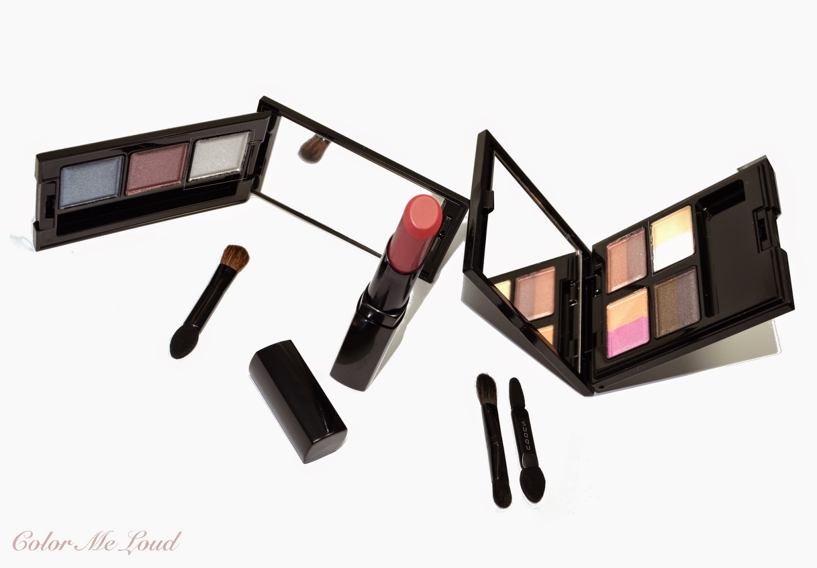
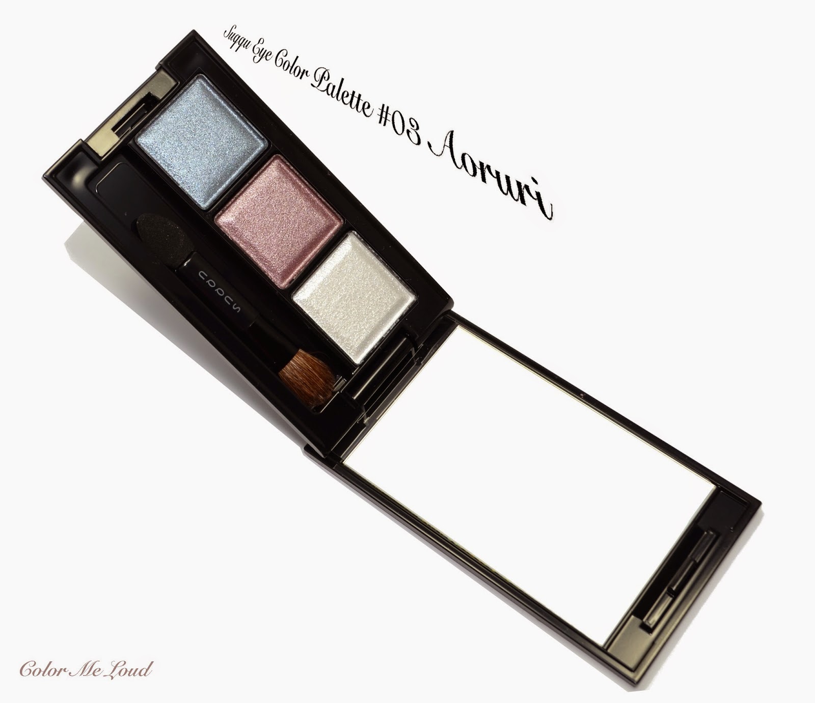
Suqqu Blend Color Eyeshadow Ex-21 Murasakisuishou, Creamy Glow Lipstick Moist #09 Zakuroseki and Eye Color Palette #03 Aururi for Autumn/Winter 2014 Collection

The collection is composed of three Eye Color Palettes, one Blend Eye Shadow with four split pan (limited), one creamy eye liner, two nail polishes and four lipsticks, only one of them being limited. At the moment I have three of the items to share with you, Eye Color Palette in Aoruri, Blend Eye Shadow Palette Ex-21 in Murasakisuishou and Creamy Glow Lipstick Moist #09 in Zakuroseki. Thanks to a friend in London, I made it on the Selfridges list for two of the other Eye Color Palette (#01 and #02) as well as the new formula (veil glow) lipstick in #08. I will review them once I get hold of them which will be sometime around the second week of September.


Suqqu Blend Color Eyeshadow Ex-21 Murasakisuishou, Creamy Glow Lipstick Moist #09 Zakuroseki and Eye Color Palette #03 Aururi for Autumn/Winter 2014 Collection

I would like to start the reviews with the gorgeously unique Blend Color Eye Shadow Ex-21 Murasakishuishou which I am wearing today on my eyes and Creamy Glow Lipstick Moist #09 Zakuroseki which I currently enjoy on my lips. If you are not familiar with Suqqu naming convension, here is a tip, the products starting with Ex are limited edition, so if you want to get hold of Ex-21, you should be checking out stalking Selfridges website (not affiliated) today or alternatively give them a call in store. You can call general customer service (+44 113 369 8040) and get directed or call (e.g. London +44 20 7318 3956) directly. (I am not affiliated, telephone numbers are just for your convenience). Just a remark from me though, if you are inside EU, by buying the items from online store, you are better off since calling means shipping would be almost twice as much for you. For US residents, shipping should be almost the same in store or online.

After going over some organizational points, let me introduce you to...


Suqqu Blend Color Eyeshadow Ex-21 Murasakisuishou, Creamy Glow Lipstick Moist #09 Zakuroseki

...the most gorgeous Suqqu Blend Color Eyeshadow which is ever released, Ex-21 Murasakisuishou. Is it the pretties ever? Some of the previous ones have really a special place in my heart (to name a few, Ex-20, Ex-15, Ex-17, Ex-11 and the list goes on) but this one is certainly unique in a way that it is so versatile. You will see what I mean once I start showing you the swatches...


Suqqu Blend Color Eyeshadow Ex-21 Murasakisuishou

The theme of Autumn/Winter 2014 Collection is jewellery, the products are named after gemstones.  Murasakisuishou is the old name for Amethyst, which is composed of two words, "Murasaki" meaning violet and "Shuishou" meaning crystal. After my research I found out that today one would use amejisuto for amethyst. When I could de-cypher the name of the quad, I started getting ever more excited because Ametyst is my favorite stone and I think why... the color? ;-)


Close-up: Suqqu Blend Color Eyeshadow Ex-21 Murasakisuishou

Murasakisuishou is composed of four split pan eye shadows. I have written about the idea before but here is once more shortly, you can opt for a brown neutral look by selecting the inner shades, or mix and match as you like.


Eye Shadow pans of Suqqu Blend Color Eyeshadow Ex-21 Murasakisuishou


Top left: A combination of light cool pink and pale gold. Once mixed together, these reveal a lovely peachy/rose gold shade. The finish is pearly but in no ways frosty, the shimmer in Suqqu is very delicate, it never emphasizes any lines nor becomes too shimmery. I find Suqqu line great for all ages.

Top right: Taupe fest! A mid toned cool taupe together with a warmer taupe, they are both lovely, once mixed, they reveal a gorgeous neutral taupe, which is so complex, you can just swipe this one on your lids and you are done.

Bottom left: Deep brown with khaki undertones sharing the pan with a cooler anthracite with brown undertones. These two have less shimmer than top left and right shades. The shimmer is rather sparse to bring complexity. Once mixed together, they form a lovely natural definition/liner shade.

Bottom right: Very light pink and beige to form a cooler or warmer base color so that the other shades can be blended to perfection. I use these to define the brow bone and blend the crease and they work great.


Swatches: Suqqu Blend Color Eyeshadow Ex-21 Murasakisuishou

If you are a little confused and don't want to deal with the split pan, here is how the shades would look if you mix them together. You see that this way Ex-21 Murasakisuishou is a neutral quad with lovely taupe and peach.


Swatches of Suqqu Blend Color Eyeshadow Ex-21 Murasakisuishou when all the shades are mixed

But I like mixing and matching so today I used the pink shade on the inner third of the lid, gold next to it on the inner corner, cooler taupe around the center and mix of dark shades on the crease. Now you see why the quad is called Amethyst? Because it can put purple crystals on your eyes. I found it easy to pick up the single eye shadows from split pan, loved the resulting look. I can already think of many other looks using this palette, I will try to post more depending on my travel schedule on the next days.


In-action: Suqqu Blend Color Eyeshadow Ex-21 Murasakisuishou

I compared the single and combined shades some other shades from previous palettes, I hope this helps to give you some idea. 

Top left: Good news here, the very limited Ex-20 Natsubotan's pink is close to the pink in Murasakisuishou, so if you missed that one, here is a second chance. Once two of the shades are swirled together, they are close to Ex-19 Toryokuzora's delicate peach. Check out Kate's wonderful eye looks using what she calls "copper peach".


Suqqu Blend Color Eyeshadow Ex-21 Murasakisuishou, top left pan, comparisons

Top right: There is one rule that every make-up product enthusiast knows, no taupe is like another! I remembered it once more while I was going over my Suqqu palettes trying to find a close taupe, no chance. #11 Himesango is the closest, but shimmer is different and it is cooler. Ex-16 top right is close to the bottom shade, but not the same.


Suqqu Blend Color Eyeshadow Ex-21 Murasakisuishou, top right pan, comparisons

Bottom left: Again I don't own anything close to these two deeper taupes. I included Ex-19 to show you the sparse shimmer, which is close to Ex-19 but much sparser and finer.


Suqqu Blend Color Eyeshadow Ex-21 Murasakisuishou, bottom left pan, comparisons

Botton right: The base shades of Ex-21 Murasakisuishou are lighter and more brightening than the regular quads, such as ones from #17 Yomogiiro or #16 Hanashuobo.


Suqqu Blend Color Eyeshadow Ex-21 Murasakisuishou, bottom right pan, comparisons

For the FOTD, let me introduce you to Suqqu Creamy Glow Lipstick Moist #09 Zakuroseki, this is my first Suqqu lipstick and I really like it since I like sheer lipsticks and this one is even not that sheer, it has a glossy finish and a tad of stickiness which goes away after the first minutes. I find it comfortable to wear with moderate wear time. Zakuro means pomegranate in japanese, which describes the color wonderfully.


Suqqu  Creamy Glow Lipstick Moist #09 Zakuroseki

Below I am wearing Blend Color Eyeshadow Ex-21 Murasakisuishou on the eyes as explained above, Creamy Glow Lipstick Moist #09 Zakuroseki on the lips and Balancing Cheeks #01 Momoshuiro Blush Duo (reviewed here) on the cheeks. I really like the feminine but natural look of the quad and the combination with the lip color. I will definitely try many other possible looks with it.


FOTD with Suqqu Blend Color Eyeshadow Ex-21 Murasakisuishou, Creamy Glow Lipstick Moist #09 Zakuroseki

Final thoughts: Love at first sight for Murasakisuishou. It is unique, versatile, feminine, natural and the shimmer is so delicate and complex. Creamy Glow Lipstick Moist #09 Zakuroseki is also lovely for a swipe and go day.

As I am typing this post, products haven't appeared yet on Suqqu website. I will let you know over social media once they are there. Please leave a comment if you spot them, thanks.

Are you eyeing anything from this collection?


The products in this post are provided for my consideration. 
I am not paid for this review, all opinions are honest and my own.


Dior 5 Couleurs Eye Shadow Palette #796 Cuir Cannage, Review, Swatch & FOTD

$
0
0
Dior released thirteen new palettes, twelve of which made it to Germany. I am trying to get hold of Cuir Cannage since a few weeks. I was out of luck and my order got canceled, which is another story I shared in Instagram but today it is all about the palette. Now it is not only a parfum from La Collection Privée line but also a palette with coppery warm neutrals, it is Cuir Cannage. 


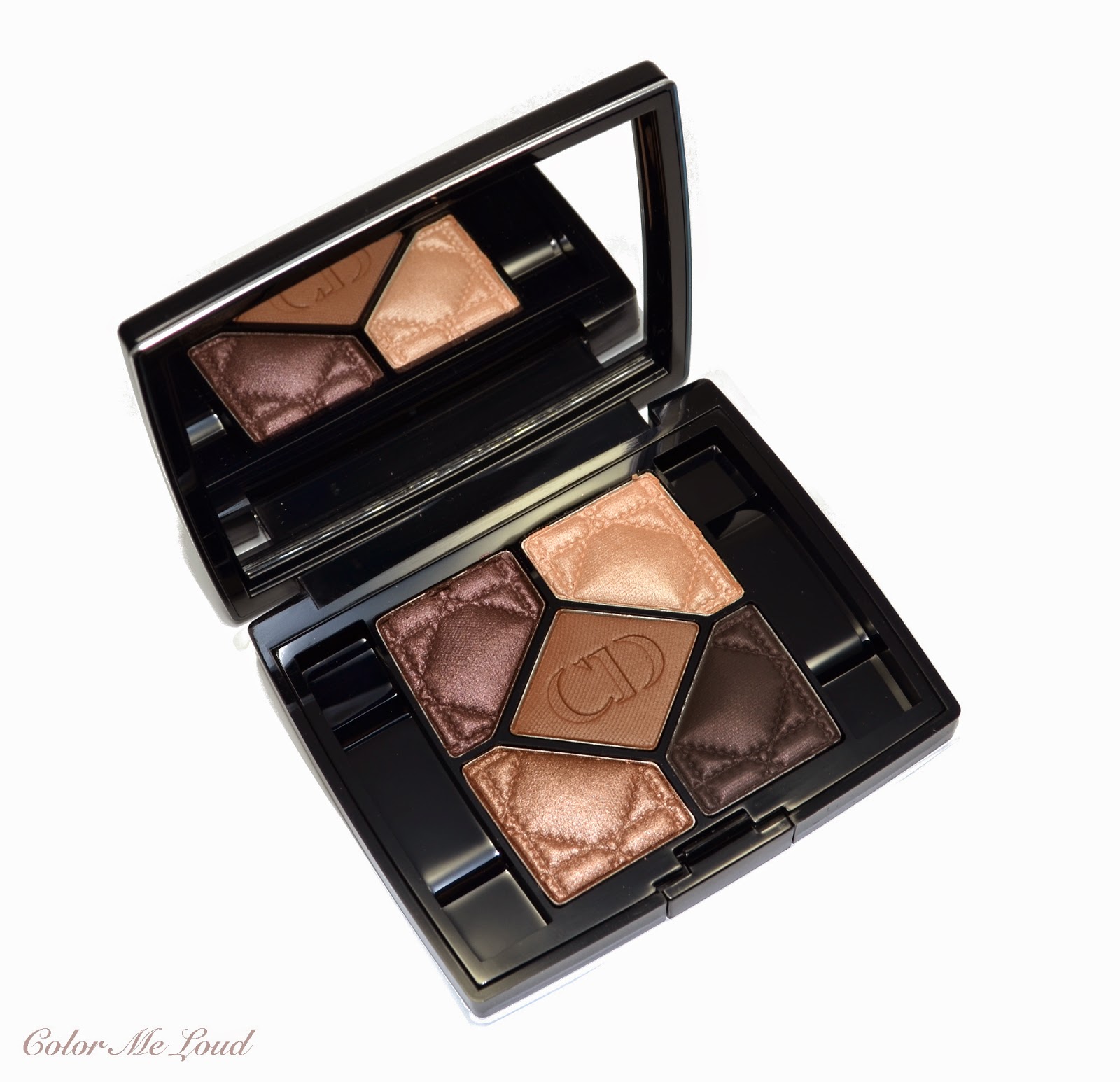
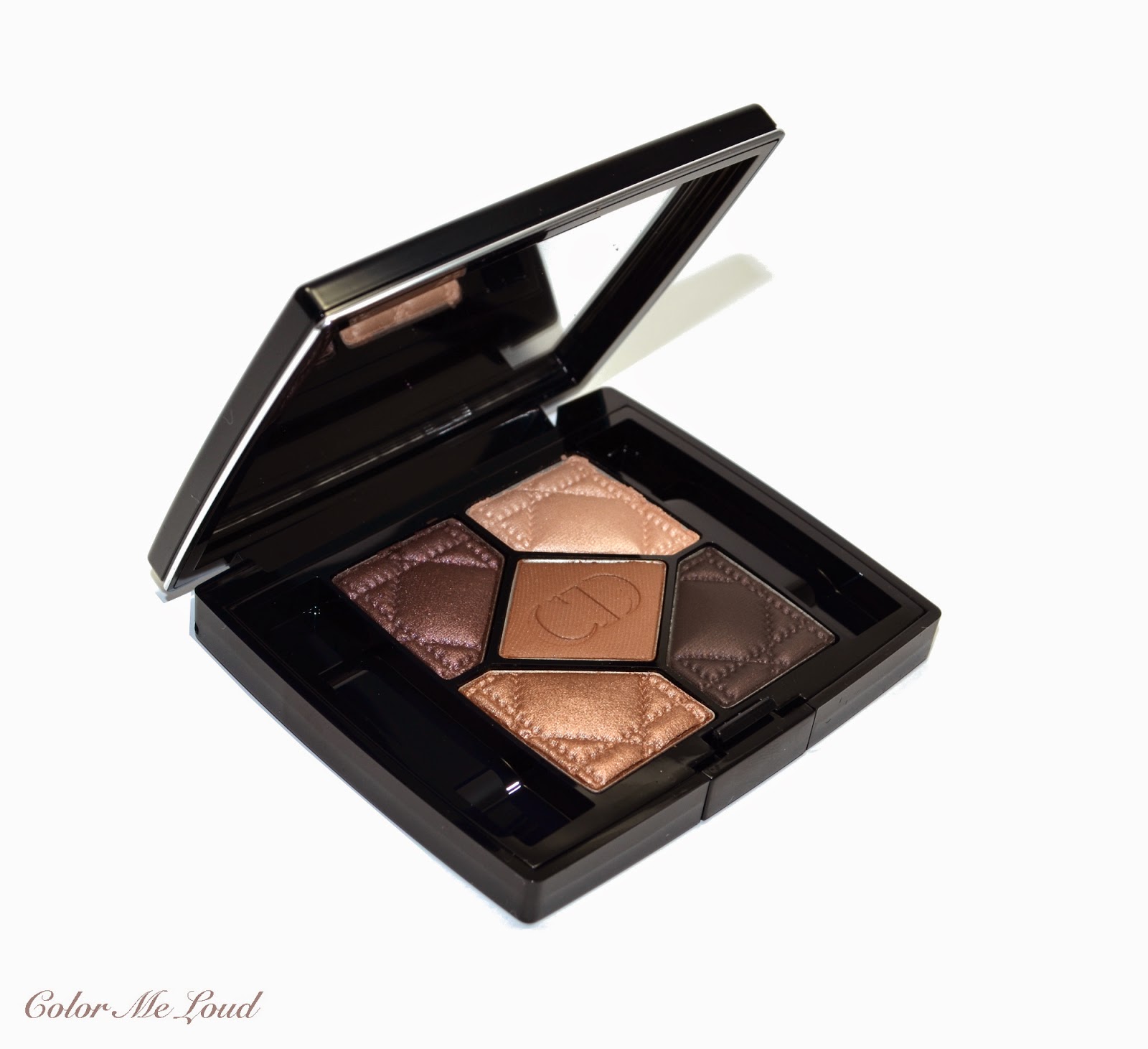
Dior 5 Couleurs Eye Shadow Palette #796 Cuir Cannage

Compared to the other palettes I have reviewed so far, which are Trafalgar, Carre Bleu, Femme Fleur, and Bar, Cuir Cannage is one of my favorites of the bunch because of true to pan color pay-off and subdued shimmer. With new quints of Dior, it gets a little frosty across the board for my satin/matte loving heart. The shimmer in Cuir Cannage gives mostly satin finish without being too metallic/frosty and looks natural once applied.


Dior 5 Couleurs Eye Shadow Palette #796 Cuir Cannage


Top left: Deep plumy brown with satin finish. It is a gorgeous shade which can be worn on its own or in combination with other shades from the palette.

Top right: A very light ivory with satin to shimmery finish. The lightest shade of the palette, which is very useful under the brow bone or as a corner highlighter as well as to lighten up any other deeper shades.

Bottom right: A very deep cool blackened brown with satin finish. There are enough dark shades for definition but if you want to increase the drama even further, this is your shade.

Bottom left: A mid-toned copper, this is the most metallic shade in the palette, the shimmer is there but not over the top.

Center: A mid-toned matte to satin warm olive brown. It is a great shade to run around the crease before deepening it. Because of its matte/satin quality balances the palette perfectly.


The palette in general pulls very warm so if you are not into warm neutrals, you might check other palettes from the line, such as Montaigne.


Close-up: Dior 5 Couleurs Eye Shadow Palette #796 Cuir Cannage
Swatch: Dior 5 Couleurs Eye Shadow Palette #796 Cuir Cannage

Below I am wearing copper all over, enhanced with ivory on the corner until one third of the lid. I have the center matte shade on the crease which is deepened further by the darkest shade and plummy brown is padded on the outer third. I am wearing Chanel Stylo Yeux Santal (above) and Or Rose (below) as well as Rouge Bunny Rouge's Witchery Mascara on my lashes. The wear time of Cuir Cannage was quiet impressive, didn't fade nor creased over 10-12 hours. 


In-action: Dior 5 Couleurs Eye Shadow Palette #796 Cuir Cannage

Below you can see the resulting look, I am wearing My Lady Dior Blush Palette in Coral (reviewed here) on the cheeks and Chanel Rouge Allure #144 Conquise on the lips. I thought there warm colors would go well with a coral cheek and lip to brighten up the face. 


FOTD: Dior 5 Couleurs Eye Shadow Palette #796 Cuir Cannage

Final thoughts: Dior 5 Couleurs Cuir Cannage is the warm neutral palette of Dior's new line with subtle shimmer to give a lovely polished look. I can see this one flattering warmer complexions more but anyone can wear it. The shades are very pigmented and deep enough for deeper complexions as well. Cuir Cannage is permanent.

Did you find time to check Dior Quints? Which one is your favorite?


Suqqu Eye Color Palette #03 Aoruri for Autumn/Winter 2014 Collection, Review, Swatch and FOTD

$
0
0
Hi from holidays! *waves* I am trying to fit blogging to my daily schedule which consists of sleeping (long!), having a (long) breakfast, sweating (it is hot down here), swimming, hanging out at the beach and trying to find the fish bones during a prolonged dinner. You see there is little time left between these duties. As excited as it is,  a new addition to Suqqu line, Eye Color Palettes deserve to be featured sooner than later.


Suqqu Eye Color Palette #03 Aoruri


First things first, I would like to talk about Suqqu A/W 2014 Collection release situation. As of today the items didn't appear at Selfridges online but as expected, they hit the counters in the 21st of August. I don't think everything sold out there and I have heard that they have some in store stock so I am expecting to see the products any day now appearing online. Suqqu Eye Color Palettes are permanent so keep calm and keep stalking ;-)


Suqqu Eye Color Palette #03 Aoruri


Suqqu Eye Color Palettes include three eye shadow shades. The sizes of each pan is close to the each eye shadow shade in Blend Color Eye Shadow Palettes. A small brush is included, one side has sponge tip and the other side has the cutest tiny Suqqu real hair brush to blend. Since there is only room for one small brush (not two), the compact is smaller in size. Eye Color Palettes (trios) are slightly longer than quads and a little wider than the half of the width of Blend Color compacts, you can see a size comparison below.


Comparison of the compact sizes: Suqqu Blend Color Eye Shado Palette (Quad) vs. Eye Color Palette (Trio)


Suqqu Eye Color Palette #03 Aoruri is the blue trio of the line, Aoruri meaning Lapis Lazuli in Japanese fitting to the jewelry theme of the collection. The top most shade is for highlighting. I found the highlighter shade more shimmery than Blend Color Eye Shadow (quad) base shades but we are talking about Suqqu, so there is nothing over the top. Aoruri has two color shades with similar depth, a mid toned pearly blue and a warm plum which is a tad deeper. 


Close-up: Suqqu Eye Color Palette #03 Aoruri

Top (#1): A shimmery light white highlighter shade, which is the most shimmery shade in the palette. It can be used on its own on the corner or under brow bone but my favorite usage must be to layer this on other shades to bring a little bit of something or to go from a day makeup to a night one. You can see this shade layered with other two on the second photo below.

Center (#2): A mid-toned warm plum with lovely multi dimensional shimmer which is not over the top. On the lids it appears less shimmery and more complex. This is my favorite shade in the palette (guess why!)

Bottom (#3): A mid-toned turquoise blue with complex shimmer. As lovely as it is alone, it can also be layered with #2 to give a complex cool toned taupe.


Swatch: Suqqu Eye Color Palette #03 Aoruri
Layered Swatches: Suqqu Eye Color Palette #03 Aoruri

Below I have used top (#1) white shade on the inner corner and blended it over the blue which I applied on the middle of the lid. I then added the plum at the outer corner and blended it with blue. The resulting look on the eyes was not shimmery, rather iridescent but if I would like more shimmer, I could run a layer of the white shade.


In-action: Suqqu Eye Color Palette #03 Aoruri

Here is the look in context (so called FOTD). Suqqu Eye Color Palette #03 Aoruri on eyes, Creamy Glow Lipstick Moist#09 Zakuroseki on the lips and Balancing Cheeks#01 MomoshuiroBlush Duo on cheeks. After applying this makeup, it reminded me of mermaids and the iridescent tail of her, may it be because I was already at a sea holiday mood? 


FOTD: Suqqu Eye Color Palette #03 Aoruri

Final thoughts: The magic of Suqqu is in layering, so three shades give six possible combinations and it is full of surprises. I love the plum and blue and how they turn out once they are layered. The white can be used as a highlighter but can also be layered on other shades for more shimmery look. All in all I am very pleased with the usual Suqqu quality, creamy and pigmented, complex and not over-the-top shimmer as well as fun shades in Aoruri. I definitely recommend it. 


Do you experiment with layering and mixing your eye shadows or do you like using them straight from the pan?


The products in this post are provided for my consideration. 
I am not paid for this review, all opinions are honest and my own.


Rouge Bunny Rouge Raw Garden Eye Shadow Palette in Chronos, Review, Swatch & FOTD

$
0
0

"And treats all men, worthy or no, alike;
And Time dissolves not only visible things,
But eloquence, and what the mind hath wrought."
...
from Triumph of Time, Petrarch


I thought it would be best to introduce Chronos, the personification of time, with this wonderful piece by Petrarch. Time ticks dear friends and this time for the release of the first palette of Rouge Bunny Rouge. It will be available online here (not affiliated) and later on will be available at US retailers in September. Chronos will be limited edition, so is our time on earth, isn't it limited too? I know I know... It must be time to stop philosophizing and sharing my thoughts with you....about... make-up...


Rouge Bunny Rouge Raw Garden Eye Shadow Palette in Chronos


For their first palette, Rouge Bunny Rouge opted for one to create an the ultimate smokey eye, with a metallic touch while still preserving the delicate natural beauty. Chronos is all about the light and how it reflects on your eyes. The palette comes in a box which has a similar design to the one on the compact. Compact is made of a sturdy plastic, similar to the eye shadow keepers, so is the opening mechanism. 


Packaging: Rouge Bunny Rouge Raw Garden Eye Shadow Palette in Chronos


Inside there are five regular size Rouge Bunny Rouge eye shadows, each being 2 g like their singles.  In total you get 10 g of product. Palette is definitely an affordable way to get your hands on five shades from Rouge Bunny Rouge's buttery smooth and pigmented eye shadow formula since singles cost 17 to 24 € each (refill/regular) but palette will cost only 55€ which is a little more than 2 single eye shadows. But we know that these calculations are not that easy because companies sometimes have some shades which don't show the same quality as their singles. I am happy to report though, none of the shades in Chronos disappoint in that manner.


Rouge Bunny Rouge Raw Garden Eye Shadow Palette in Chronos


Rouge Bunny Rouge Raw Garden Eye Shadow Palette in Chronos has five metallic shade, but they have less shimmer as they get darker, which is very pleasant if you like some depth to define your eye looks on the crease. Each shade has a graphical take on humming bird on them, and they can be taken out of the compact by a needle and replaced later on with another refill, which I find to be great since the compact can be recycled. This is why the shade do rotate a little as you dip your brush in them, just try not to get obsessed to put the hummingbirds straight again ;-)


Close-up: Rouge Bunny Rouge Raw Garden Eye Shadow Palette in Chronos

Formula: All the shades in the palette are very smooth to touch, creamy and very pigmented. 
From left to right:

Left most: Light warm pewter shade which is more metallic once compared to the rest of the shades in the palette. It is thought to be a highlighter but can also be layered on other shades to make them more shimmery if this is what you would like to go for.

2nd from left: This is hands down my favorite shade of the palette, a mid-toned taupe with rosy undertones, the shimmer in this one almost dances with the light, love!

Center: A deep khaki with antique gold shimmer. Lovely for green and antique gold lovers out there. I can see this shade applied all over the lid with a touch of one of the darkest shades to its right on the crease. 

2nd from right: A very deep anthracite shade with a tad of aubergine. How I wished this would pull more purple on me, but if you are not fond of a purple kick then you will be happy with this one, it is more neutral and universally flattering than a dark purple, that is for sure. It is just my purple loving heart who wants more ;-)

Right most: A very deep anthracite with a tad of blue. This shade is very close to the one next to it, which is the only thing I can find to complaint about this palette. They certainly have different reflection properties under light but on the eyes they appear rather close.


Swatch (studio lighting): Rouge Bunny Rouge Raw Garden Eye Shadow Palette in Chronos
Swatch (outdoor): Rouge Bunny Rouge Raw Garden Eye Shadow Palette in Chronos

Since I am traveling at the moment, I am experiencing with light and trying to find the best spot to take pictures. Below you can see an attempt of me putting makeup on (over 35º C anyone?) and taking a selfie. Hope it helps.

I used only 3 of the shades for the look below:
Inner corner: Left most pewter shade
Mid-lid: Taupe, second from left, love love love the reflection on that one, look at this...
Outer corner/crease: Gunmetal with a touch of aubergine (2nd from right)

I also used Rouge Bunny Rouge Eye Khol in Salome for this look, which goes great with the smokey shades and finished the look with their Witchery Mascara.


In-action: Rouge Bunny Rouge Raw Garden Eye Shadow Palette in Chronos

Here is the FOTD featuring this eye look, you can see that as smokey and shimmery as it is, it doesn't appear over the top, which is why I like Rouge Bunny Rouge line, it always manages to stay neutral and flattering.

Complexion:
Rouge Bunny Rouge Milk Aquarelle in Almond
Rouge Bunny Rouge Milk Glide Concealer in Eunice (over the spots)
Dior Skin Concealer #02 (under the eyes)


Cheeks:
Rouge Bunny Rouge Original Skin Blush in Habanera (contour)
Rouge Bunny Rouge Original Skin Blush in Gracilis (apples of the cheeks)

Eyes:
Rouge Bunny Rouge Raw Garden Eye Shadow Palette in Chronos
Rouge Bunny Rouge Eye Khol in Salome
Rouge Bunny Rouge Modelling Mascara in Witchery

Brows:
MAC Omega

Lips:
Rouge Bunny Rouge Sheer Lipstick in Fluttering Sighs


FOTD: Rouge Bunny Rouge Raw Garden Eye Shadow Palette in Chronos


Before I conclude my review, here is the ingredients list on the compact, eye shadows are fragrance-free and they don't have parabens.


Check out more swatches at Best Things in Beauty, The Non-Blonde and useful comparisons at Mostly Sunny.

Final thoughts: For those of you who like metallics without being frosty, neutrals with a twist and who are in for a smokey eye with right amount of shimmer, you will love Chronos as much as I do. If you are a matte/satin lover or a colorful smokey eye rocker, than maybe you want to keep searching. If you haven't tried the famous Rouge Bunny Rouge eye shadow formula but always wanted to, I think this is a affordable way and a good introduction to the brand. All in all thumbs up for Rouge Bunny Rouge's first palette.

According to their website, it will be released tomorrow. It is listed as limited edition.

Are you intrigued? What kind of a palette would you like to see from Rouge Bunny Rouge next?


The products in this post are provided for my consideration. 
I am not paid for this review, all opinions are honest and my own.

Burberry Complete Eye Palette in #20 Slate Blue from Bloomsbury Girls Collection for Fall 2014, Swatch, Review & FOTD

$
0
0
There was some confusion whether or not Burberry Quads #12 Nude Blush and #20 Slate Blue would be available in US and when if at all. I am happy to inform you that as of today it is available on Burberry online store. These are also still available since some week  in Europe too.  I have previously wrote three posts, and today I would like to conclude my Burberry Bloomsbury Girls Fall 2014 make-up collection reviews. If you haven't made up your mind yet, previous posts you would like to check out are:


I will also write a wrap up of the collection at the end of this post together with my favorite items.


Burberry Complete Eye Palette in #20 Slate Blue


Burberry Complete Eye Palette line didn't have a blue quad, so it must have been time for one. 

#20 Slate Blue is composed of different blue tones and it looks like there are not lots of variations, not in finish nor in tones. I was a little disappointed with one of the blue quads I have purchased recently (I believe readers know which one I am talking about) so first I was reluctant to get another blue quad. I have to admit, blues don't look so good on me either. 


Burberry Complete Eye Palette in #20 Slate Blue


I have already written a shade description of #20 Slate Blue, so here is a reminder:

Top right: Very light grey blue with matte to satin finish

Middle right: Mid-toned blue with matte to satin finish


Middle left: A very deep black with blue shimmers, I would call it a satin finish. It is very deep thus looks blackened.


Bottom left: A deep indigo blue with satin finish.


Close-up: Burberry Complete Eye Palette in #20 Slate Blue

As you see two of the four shades are almost matte. They are all very pigmented and their formula is au par with brand's famous singles, so they are very creamy and smooth to touch. I haven't felt that way for any of Burberry's quads until now (other than Dark Spices and now Nude Blush). With Slate Blue and Nude Blush, I can definitely say that you are getting four eye shadows singles and it is a good deal for the price. 


Swatch: Burberry Complete Eye Palette in #20 Slate Blue

Below I applied the lightest shade all over, then padded the matte blue (middle right) on the lid starting from half way, blending with the lightest. I then defined the crease very softly with the darkest shade. I really loved how this one looked. It stayed put all day exactly in the same way after application. Since I applied the lightest shade underneath, the overall look was looking lighter and more of a teal than a slate blue.  


In-action: Burberry Complete Eye Palette in #20 Slate Blue


Below I combined Burberry Complete Eye Palette in #20 Slate Blue on eyes with Burberry Earthy Blush. Isn't it amazing how it brings out the cheek bones? On my lips I am wearing Armani Sheer Lipstick in #114 Incense (swatched here).


FOTD with Burberry Complete Eye Palette in #20 Slate Blue

Wrap-up for Bloomsbury Girls Collection: My favorite eye shadow quad here is still Nude Blush, which I think is a must. If you can get Slate Blue too, I would recommend it. My favorites from nail polishes are #407 Elderberry and #445 Antique Gold. 

Final thoughts: I was not expecting to love a palette with only tones of blue but ended up really liking Slate Blue because of the finish and how it looks on the eye. I am all for color if the textures are right, this is why I like Armani Solos so much too. I can recommend Slate Blue to blue fans and all smokey eye fans alike. Thumbs up for texture and strongly pigmented creamy formula.

Do you also think a bright color should have a less shimmery finish not to look cheap or do you believe it is complexity of shimmer which is important. Blue eye shadows yay or nay? 

Guerlain Kiss Kiss Lipsticks #300 Golden Girl, #364 Pinky Groove, #369 Rosy Boop, Review, Swatch & FOTD

$
0
0
It has been some weeks since I posted about my first impressions and counter swatches of Guerlain's reformulated and repackaged Kiss Kiss lipsticks. I have been testing three of the shades since then and today I would like to write about my thoughts.

First the packaging, I have read mixed thoughts about it. I fall under the category of people who love it. The old package with all gold was not really my cup of tea but this black and gold combination, the closing mechanism as well as the weight and the grip, they all feel luxurious to me. 

Guerlain Kiss Kiss Lipsticks


Formula wise, I see Kiss Kiss lipstick line somewhere between Rouge Automatique and Rouge G, Rouge G being more opaque and its coverage being high, Rouge Automatique being on the more casual, sheer and "swipe and go" end. That being said all lines have more sheer and more opaque shades so it is hard to generalize. 

One thing which I loved about Kiss Kiss though was how hydrating it is and that one is consistent throughout the range. Guerlain's Rouge G formula is one of my all time favorites, mainly because of its longevity and moisturizing effect. Kiss Kiss Lipsticks have almost the same effect in terms of moisturizing, with a little sheerer and in result a little shorter life time on the lips. I see them as a more casual version of Rouge Gs. 


Guerlain Kiss Kiss Lipsticks (left to right): #369 Rosy Boop, #300 Golden Girl and #364 Pinky Groove

How about application? As Linda@Silverkis here pointed out, because of the creamy texture of the lipstick, it might be hard to get a crisp lip line without a liner if that is what you want. Since I love sheerer lipsticks, I don't try to build up the color and enjoy the casualty and how nicely it combines with a more defined eye look. I prefer to use them without a liner. 

Color range? 25 shades... If you try on one of the lipsticks and find it to be "too dark", "too light", "too warm" or "too cool" there is always another shade which would suit you better. 

Guerlain Kiss Kiss Lipsticks #300 Golden Girl is a glossy sheer peachy nude on me. It has enough color so that it doesn't give me concealer lips. I usually don't go for such warm shades, but some of them, especially the sheer ones, tend to work really good. Golden Girl is the second one I love, after Tom Ford's Sweet Spot (see a FOTD with that one here), which is brighter but has a similar tone. 


Guerlain Kiss Kiss Lipsticks #300 Golden Girl


Golden Girl is great with a smokey eye or a natural no make-up make-up day. I love combining it with Chanel's Jersey blush (reviewed here), as seen below. On eyes I am wearing Laura Mercier's new sticks (review is coming up soon)


FOTD: Guerlain Kiss Kiss Lipsticks #300 Golden Girl

Do you also love berry tones? Then you are in luck because Kiss Kiss line has many of them with different undertones. #364 Pinky Groove is a mid-toned berry pink with glossy finish. I didn't first pay intention to that one but I am so happy when I tried it on. Pinky Groove is not too plum nor too pink, a perfect balance between the two and the sheerness is just right to make it casual yet apparent.  


Guerlain Kiss Kiss Lipsticks #364 Pinky Groove


I like combining Pinky Groove with Guerlain's new palette Les Aciers (swatched here, review coming up soon) and Chanel's Fall blush Innocence (reviewed here). Below you can see all three in action.


FOTD: Guerlain Kiss Kiss Lipsticks #364 Pinky Groove

#369 Rosy Boop is the shade I picked up after playing with Kiss Kiss Lippies for over an hour. I thought it was looking most flattering on me. It is an easy natural mid-toned pink, not too cool nor too warm, it has a hint of mauve in there which my complexion usually likes. I can see myself using it up and getting a new one, I am so happy that it is permanent. I was thinking #368 Rose Baby would be a shade for me, but I found it a tad too cool and its golden particles were not that comfortable to wear. I am still thinking I should go back and try Rose Baby once more, but till then Rosy Boop, despite its beyond funny name, will be my favorite Kiss Kiss lipstick. 


Guerlain Kiss Kiss Lipsticks #369 Rosy Boop

Here is me wearing Rosy Boop with Chanel Les 4 Ombres in Poesie (reviewed here). I love combining Rosy Boop with a pink natural blush like Chanel Joues Contraste #72 in Rose Initial.


FOTD: Guerlain Kiss Kiss Lipsticks #369 Rosy Boop

Here is three shades swatched side by side as a comparison and wrap up, for all the shades, check out this post


Guerlain Kiss Kiss Lipsticks #300 Golden Girl, #364 Pinky Groove, #369 Rosy Boop
See more swatches at Silverkis (Rouge Kiss, Sexy Coral), Mel-et-fel (Golden Girl, Rouge Kiss) and Nikki Tutorials (Excessive Rose, Sexy Coral, Rouge Kiss and Baby Rose)


Final thoughts: As a lover of sheer and casual lipsticks with moisturizing quality, I am in love with Guerlain's reformulation of Kiss Kiss lipsticks. I will certainly be back at the counter and pick up more. At the moment, I am eyeing Peach Fizz, which I tried and loved.

Have you checked out the line? Which ones are you eyeing or have you picked up?


Golden Girl and Pinky Groove are provided for my consideration. I purchased 
Rosy Boop myself. I am not paid for this review, all opinions are honest and my own.

YSL La Laque Couture #52 Bleu Galuchat, #53 Taupe Graine from Fall 2014 Leather Fetish Collection, Review & Swatch

$
0
0
Hi there everyone, I hope you are all doing great. As I know I am enjoying my holiday while trying to blog in between. I started struggling with a few technical problems such as: forgetting the charger of the camera, not having all my stash available, melting lipsticks, sweating after putting on foundation for an FOTD etc. etc. The list is long but forgetting the camera batteries charger must have been the hardest on me. If you come across some iPhone photos, such as the one below, now you know what I am going through...


YSL La Laque Couture #52 Bleu Galuchat and #53 Taupe Graine

Today it is about the two textured nail polishes YSL released this fall with their Leather Fetish Collection. The texture is supposed to look like leather on the nails. Although I am not so fond of textured nails, I got these because I was curious about the first textured nail polish I would get my hands on from YSL. Since they repackaged and reformulated their nail polishes a few years ago, I started collecting them. YSL makes one of my favorite nail polishes, color and formula wise, so I was eager to try the "new thing" out.

YSL La Laque Couture #52 Bleu Galuchat is a deep blue with a hint of teal and light blue glitter particles. The polish is thinner than the particles and this way the texture is formed. I would call the resulting texture close to OPI's Liquid Sand formula, one with glitter. 


YSL La Laque Couture #52 Bleu Galuchat

I applied two coats of #52 Bleu Galuchat for the swatches, which was perfectly opaque. Infact I might get away with just one, but with two coats, texture shows itself much better. The glitters look so pretty under the sun and this one didn't stain my nails, which is always a good thing for a blue nail polish. I think it is a lovely shade for fall.


YSL La Laque Couture #52 Bleu Galuchat

The second shade is #53 Taupe Graine which is a deep neutral brown with silvery shimmers. The shimmers in that one are more fine but the nail polish is thinner, so it gives a similar effect to Bleu Galuchat. Taupe Graine needs at least two coats, you can see that even with two coats, with the middle finger (no pun here) shows some transparency once sun hits on it. 


YSL La Laque Couture #53 Taupe Graine

I found Taupe Graine looking more like leather on the nails but it can be because of the color. I liked how the shimmer particles shine under strong light and these the nail polish is converted to something unique. No issues again with removal nor application.


YSL La Laque Couture #53 Taupe Graine

Although both of the shades can as well be worn with a top coat, I wouldn't do that simply because it kills the uniqueness of it. You can see more swatches at Ommorphia, also with a top coat. Silverkis also tried these with topcoat and reported that gel top coat doesn't work with these all that well, so you would like to go for something classical like Seche Vite.


YSL La Laque Couture #53 Taupe Graine

Final thoughts: All in all unique and interesting, something I will wear this fall when I feel like I need a change. My Favorite is #52 Bleu Galuchat because I like blues more than browns on the nails and the formula of that one is slightly thicker, hence covers the nail better.

What are your feelings about textured nail polish? Love it or leave it?

Viewing all 679 articles
Browse latest View live