Quantcast
Channel: Color Me Loud
Viewing all 679 articles
Browse latest View live

Guerlain Ecrin 4 Couleurs #15 Les Sables for Fall 2014, Review, Swatch & FOTD

$
0
0
Everyone must have been informed by now that Guerlain released three new beautiful quads, in their buttery smooth, nicely pigmented Ecrin 4 Couleurs formula. The formula is said to be left unchanged, which reminds me of that Bruno Mars song, ('Cause you're amazing) "Just the way you are".

I swatched three of the quads almost a month ago.  Right after that I admitted having a serious crash to Les Violines, which might have become my favorite permanent Guerlain Ecrin 4 Couleurs. I was also very excited about Les Sables, which was the quad, which I thought I would love the most after seeing the promo photos.
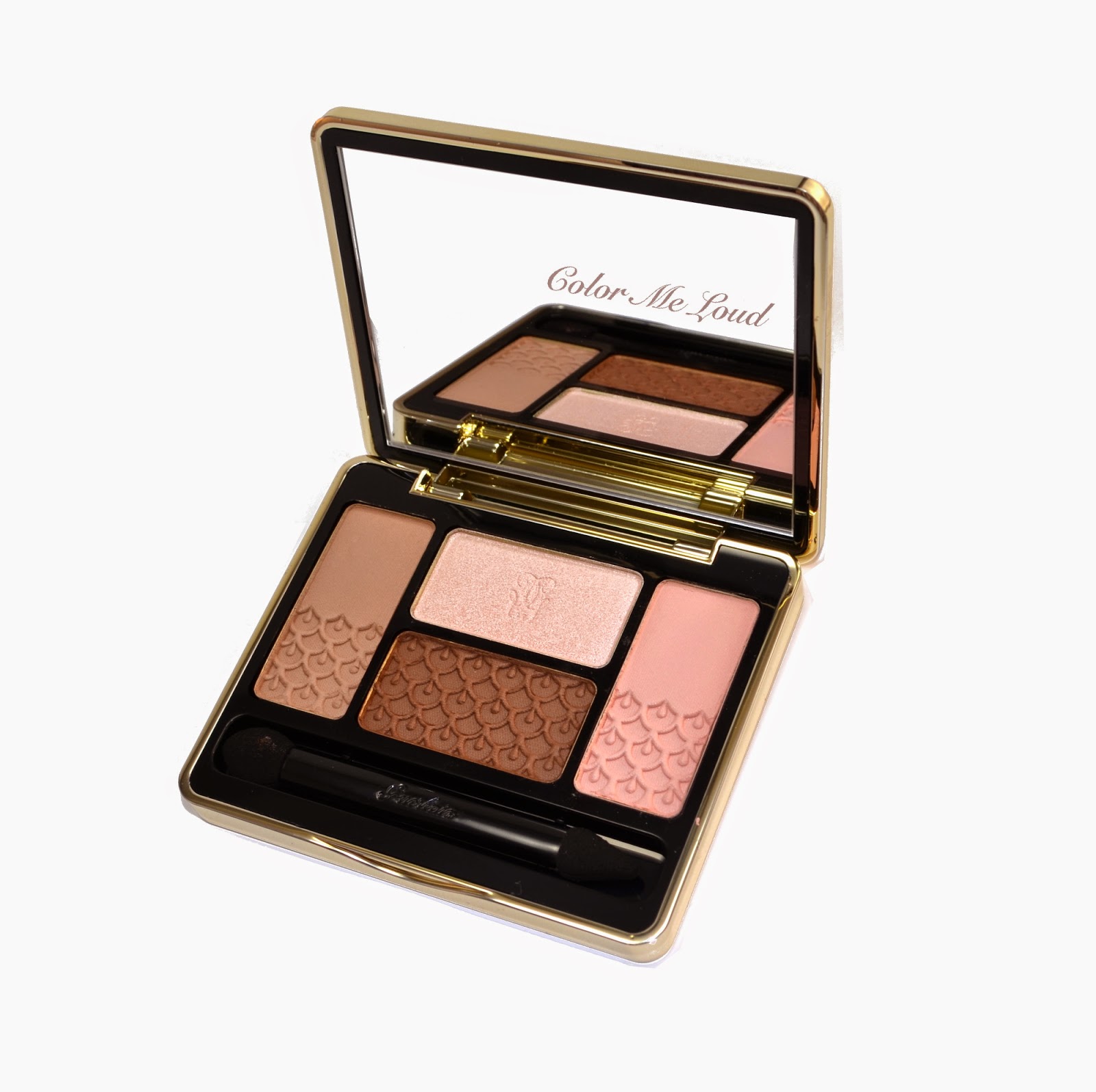

Guerlain Ecrin 4 Couleurs #15 Les Sables


Les Sables is the natural quad of the three. It has lovely peach and brown tones for an everyday, office-friendly eye look. Because of its natural tones, it can as well be coupled nicely with most of the gorgeous Kiss Kiss Lipsticks which are now reformulated and repackaged. 


Guerlain Ecrin 4 Couleurs #15 Les Sables

Guerlain Ecrin 4 Couleurs #15 Les Sables has three matte to satin shades and one shade with frosty/metallic finish. As I have previously mentioned, matte to satin shades of Guerlain is a dream to apply, they are pigmented, buttery soft yet not powdery. I love them. The frosty shade in this palette makes it all very versatile. This can be worn only at the inner corner or can be extended over the lid for more glamour. 


Close-up: Guerlain Ecrin 4 Couleurs #15 Les Sables

I have given shade descriptions before, but I will write that here once more for the sake of completeness:


Below swatches start with left more shade and go clockwise (left, top, right, bottom).

Left: Mid-toned neutral brown with satin to matte finish.

Top: Very light peachy pink which appears almost white. This shade has frosty finish.

Right: Light peachy pink with matte finish, a lovely overall color for a nude look.

Bottom: Deep reddish brown with matte finish. This shade is very warm thus if you are neutral to cool, it might clash with your skin tone depending on the usage, but we will come to that...


Swatch (with studio light): Guerlain Ecrin 4 Couleurs #15 Les Sables

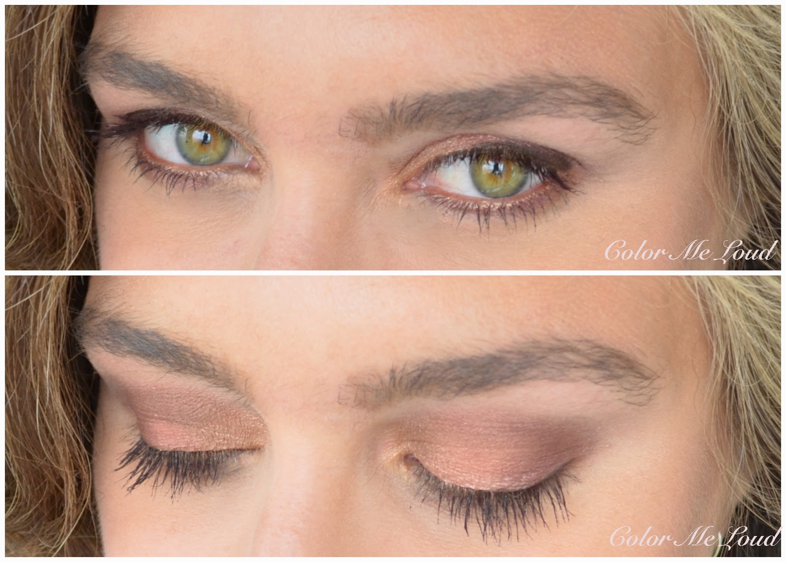
Below I have applied the light frosty shade on the inner corner, blending it towards the mid of the eye lid. I then added the mid-toned neutral brown from there all the way to the outer corner. I defined the crease with the darkest warm brown and blended with the peachy pink shade. I found the resulting look difficult to pull off with my natural to cool undertones. The warm brown gave a little bit of a muddy feeling. 

That said I have seen Wade Ashore wearing it much better although she is cooler than me. She is quiet pale so uses the darkest shade as a liner, which works great since the peachy pink shade cools down the palette a little and mid brown may work on the crease.


In-action: Guerlain Ecrin 4 Couleurs #15 Les Sables

I tried to make the very warm eye workable for me, below, by coupling it with cool toned berry lips. Below I am wearing Giorgio Armani Rouge d'Armani Sheers #624 (swatched here) on the lips.


FOTD with Guerlain Ecrin 4 Couleurs #15 Les Sables on eyes and Rouge  d'Armani Sheers #624 on lips


I was not sure if berry lips worked, so below I went for a similar tone lipstick to support the warmness of the palette. I think it clashed less, hence worked much better, especially for an office look. Below I am wearing Giorgio Armani Rouge d'Armani Sheers #114 (swatched here)


FOTD: Guerlain Ecrin 4 Couleurs #15 Les Sables on eyes and Rouge  d'Armani Sheers #114

It certainly gives that nice neutral eye polished look. I just wished the darkest shade would be a tad on the neutral/cooler side.


FOTD: Guerlain Ecrin 4 Couleurs #15 Les Sables on eyes and Rouge  d'Armani Sheers #114

Final thoughts: Guerlain's Ecrin 4 Couleurs eye shadow formula is a dream to work with, it always was so I am happy that these quads are not reformulated. I am in love with #17 Les Violines which suits my complexion better but I have mixed feelings about the warmness of the darkest shade in #15 Les Sables. I can see this palette working on fair ladies though if the neutral brown is deep enough to define the eye look. All in all it is surely worth checking out.

Guerlain Ecrin 4 Couleurs #15 Les Sables, #16 Les Aciers and  #17 Les Violines are now available around the globe, they are released with the Fall Collection but they are permanent.


Do you think Les Sables work on me? What about on you, could you pull this off? Which of the above looks do you like most, purple lippie or going rather brownish nude with it?
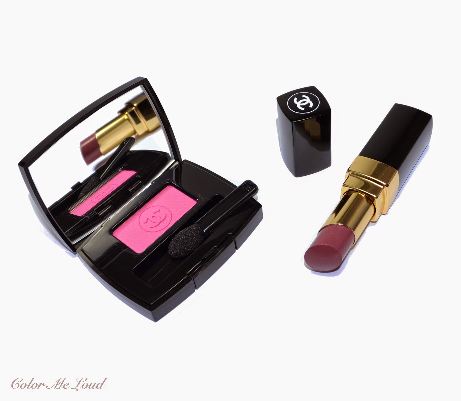

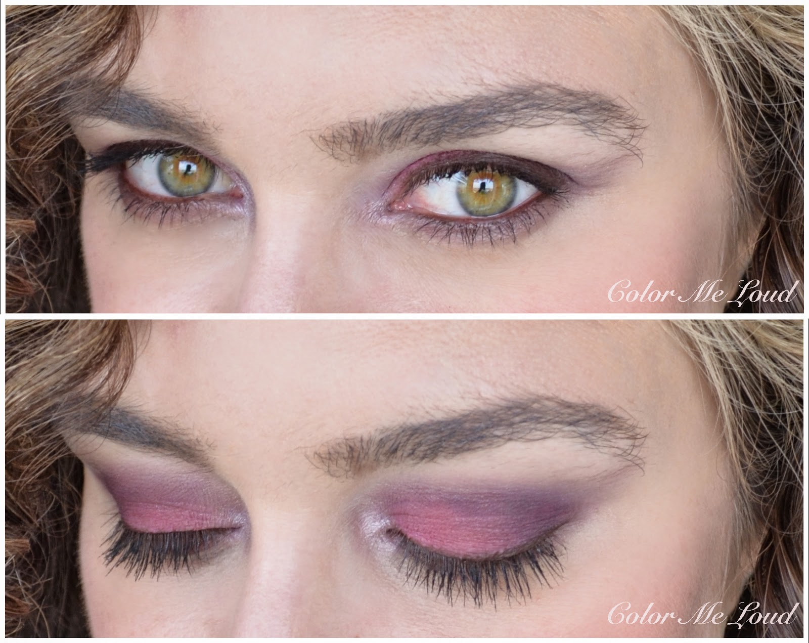
Chanel Ombre Essentielle #108 Exaltation and Rouge Coco Shine #94 Confident from États Poétiques Collection for Fall 2014, Review, Swatch & FOTD

$
0
0
This post was meant to be published a few hours ago (yesterday!) but I was trying to place the new banner and it took sometime. I would love to hear what you think of this one. A little background information: I was trying to decide what to do with my banner. Although during my blogging year(s) I have come to terms with basic photo editing,  I am an absolute noob when it comes to produce something, well, out of nothing, if that makes sense.

I asked to a fellow blogger and my pal Shelynx from Der Blasse Shimmer about hers and how she did it. I am an avid reader of hers and I absolutely love the design of her blog. She was also one of those people who encouraged me to start my own blog. Needless to say I was thrilled when she proposed me to do a banner for Color Me Loud! I would like to thank so much from the bottom of my heart. We both would love to hear what you think of this design. Also if you have improvement ideas, please let us know in the comments below.

So back to make-up shall we?
Today is another day to chase the rabbit...


Chanel Ombre Essentielle #108 Exaltation and Rouge Coco Shine #94 Confident

It is no secret that rabbit eyes are in for this fall. If you remember, I had some attempts before, but believe me I saved the best for the last:

  • YSL #09 Love (reviewed here): A true rabbit eye for all year around, what about Easter? 
  • Chanel Hesitation (reviewed here): A subtler version of the rabbit.
  • Dior #876 Trafalgar (reviewed here): Use the red shade all over to catch the rabbit.


This fall you will feel the need to find some pigmented blush and apply it all over your lids. Or alternatively you can try Chanel Ombre Essentielle #108 Exaltation, which is a warm mid-toned pink with matte finish.


Chanel Ombre Essentielle #108 Exaltation

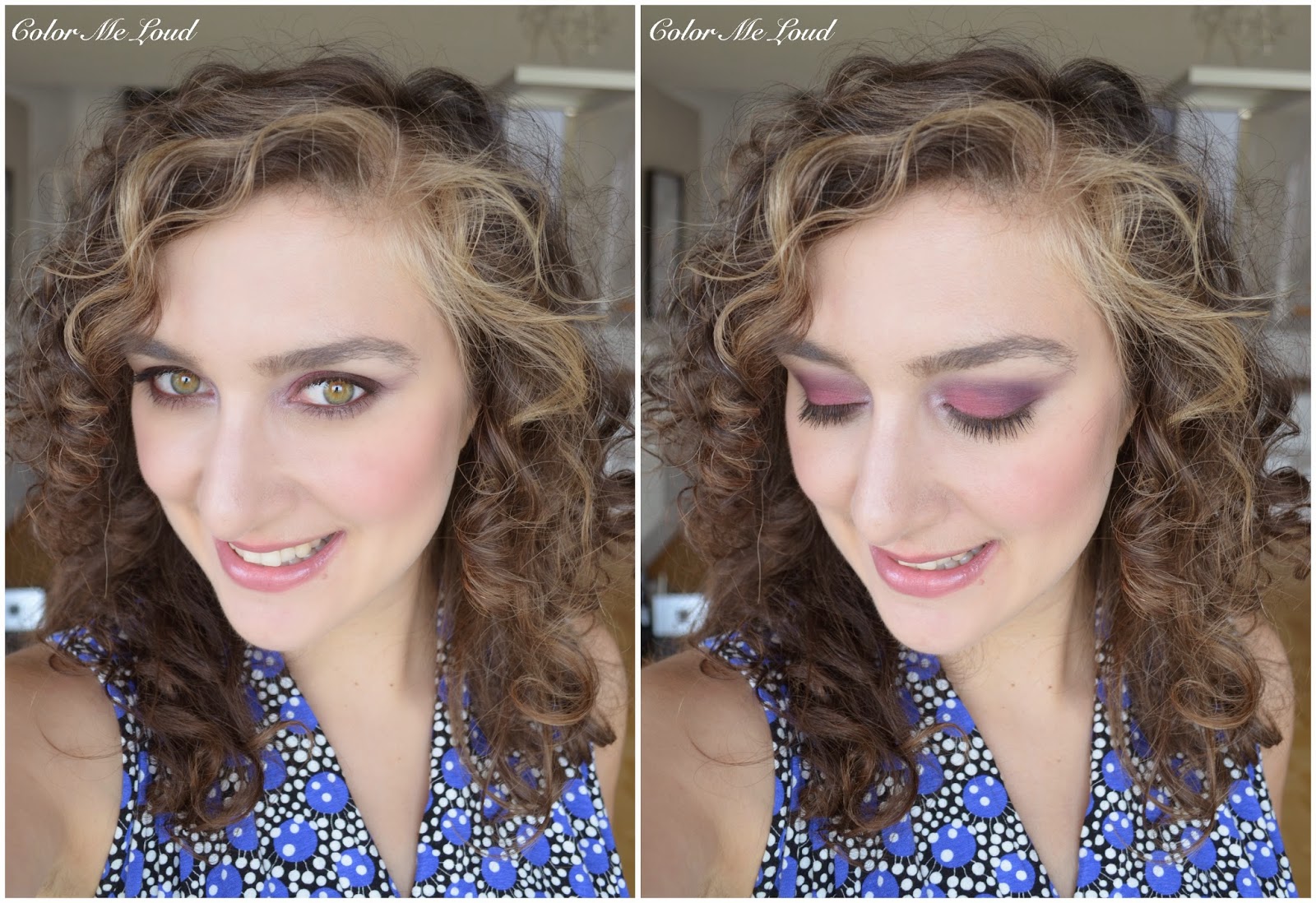
You can use Exaltation to give a tad of pinkish accent to your natural colors, which would be the way to go but I would like to demonstrate how many degrees of rabbit this one promises, so here is me wearing #108 Exaltation all over the lid (talk about courage!), #112 Pulsion (reviewed here) at the outer corner to define the look in a very subtle way (not to miss the rabbit) and I applied tiniest amount of MAC Crystal Avalanche as an inner corner highlighter.


In-action: Chanel Ombre Essentielle #108 Exaltation and #112 Pulsion, inner corner MAC Crystal Avalanche

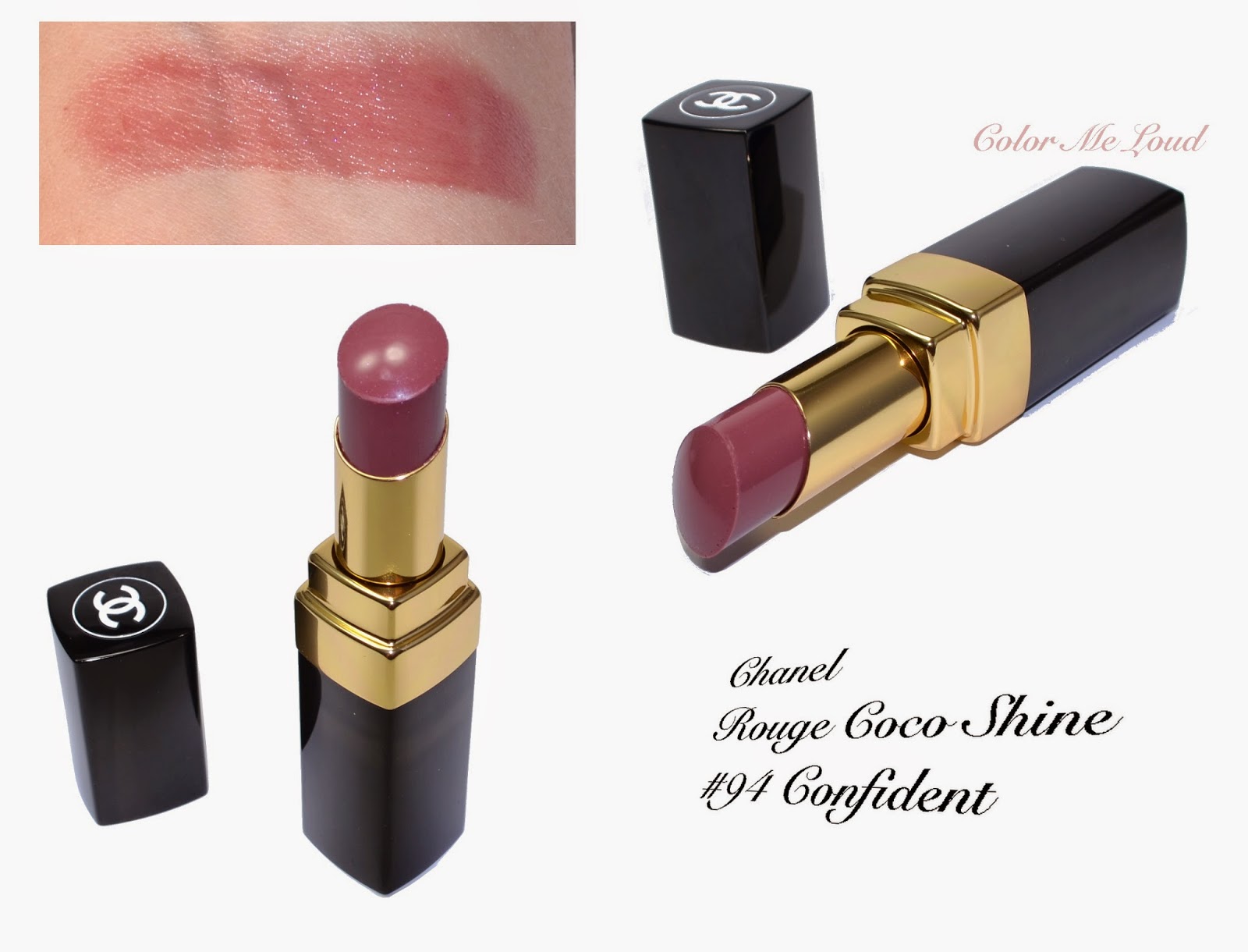
I would like to pair this blushy eyes with more subtle lips. Rouge Coco Shine #94 Confident from the same collection looked promising, so here is a swatch for you. Confident is a slightly deeper version of the famous Boy, here you can see a lovely comparison swatch posted in Instagram by @meletfel . 


Chanel Rouge Coco Shine #94 Confident

As usual here is a full face shot for you to see how (not-that) wearable Exaltation is when it is heavily applied on its own. It might be just me but to my surprise I really enjoyed wearing it like this.

Below I am wearing Ombre Essentielle #108 Exaltation and #112 Pulsion on the eyes, Rouge Coco Shine #94 Confident on the lips and Chanel Joues Contraste #160 Innocence (reviewed here) on the cheeks.


FOTD with Chanel Ombre Essentielle #108 Exaltation, #112 Pulsion and Rouge Coco Shine #94 Confident 

Final thoughts: Those were the shades I would never imagine wearing just last year but thanks to this year's trends I tried it and I absolutely love it. To me it is a great alternative to purple. Just some tips: make sure to conceal any redness in your face before attempting to catch the rabbit.

Chanel Fall Collection is already in retailers all around the world. Ombre Essentielle #108 Exaltation and Rouge Coco Shine #94 Confident are both permanent so you can take your time.

I am dying to hear what you think about the banner and the rabbit ;-)

Givenchy Palette Extravagancia Lip & Eye Palette for Fall 2014 Collection, Review, Swatch & FOTD

$
0
0
Highlight of the week was definitely seeing a seal close up yesterday on the shore. I didn't even know that Mediterranean has seals. It was shocking to watch something quiet big (bigger than a human) and black swimming at a high speed towards me, I thought I would never be able to see my stash again (talk about make-up addict's fears!). Then he (or she?) raised his head just a meter away from me and he was so adorable! Wish mustache and everything, and the cutest round face. Then he let out water in a funny way, lol. Have you ever seen a seal so close?

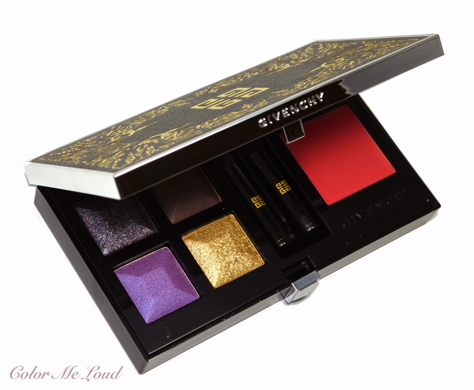
Today I would like to show you a product I tried to resist but gave up, it is the star product of Givenchy's Fall Collection, Extravagancia Lip & Eye Palette.


Givenchy Palette Extravagancia Lip & Eye Palette

Extravagancia Lip & Eye Palette is hosted in a sturdy plastic compact, which is covered with artificial leather, embossed with lovely golden Givenchy logo and a design suggesting leaves. It reminds me of an old luxurious book cover.


Packaging: Givenchy Palette Extravagancia Lip & Eye Palette

Inside the compact there is a 4 g/0.14 OZ eye shadow quad and a 1.9 g/0.06 OZ lipstick. As far as the size goes, lipstick is the half size of a regular Givenchy lipstick and eye shadow quad is exactly the same size to their Le Prism Eye Shadow Quartets. All in all you save a little (7€ or $9) which I think is not enough to justify getting the palette if this is the only reason. You should definitely love the colors before you decide.


Givenchy Palette Extravagancia Lip & Eye Palette

Extravagancia's eye shadows are promising glamour, that is for sure. Two of them are glitter shades, one being a multi colored glitter which is pretty unique. Other two shades are satin to balance it all out and both of these are more on the less shimmery side. 


Close-up: Givenchy Palette Extravagancia Lip & Eye Palette


Top left: Grey base with silver, pink, purple multi colored glitter. It is a unique and lovely shade which promises that you will be noticed. The best way to apply this shade is with fingers. I get a little on one of my fingers and lightly pad that on the application area. If you want precision, you may want to use your pinky ;-)

Top right: A deep warm brown with satin finish. It is a lovely shade to be used as a liner or to define the outer corners and crease.

Bottom left: Who said the radiant orchid is gone, here you see it recreated in the fall mood. A mid-toned cool orchid shade with satin finish. By seeing the pan, I was expecting something more complex, like duo chrome, it isn't that, but it is pretty nevertheless.

Bottom right: Golden glitter on a more or less colorless base recalls one of the most wanted purple combination, gold & purple. I use this shade again with my fingers and tab it onto the lid. I also like using it on inner corner since there is no other highlighter shade in the palette.


Eye shadows close-up: Givenchy Palette Extravagancia Lip & Eye Palette
Swatch (sun light): Givenchy Palette Extravagancia Lip & Eye Palette

Below I applied the purple all over the lid, defined the crease with brown and padded the glitters as explained above all over the purple shade, mainly in the middle. I finished this look with a black kohl and black mascara. 


In-action: Givenchy Palette Extravagancia Lip & Eye Palette

Lipstick and eye shadow parts of the palette is separated through two applicators, one with hair and other one sponge tipped. I like that the applicators are in between since there is nothing I hate more than my eye shadow sticking onto the surface of the lipstick, making it look dirty. Fortunately this didn't happen to me with Extravagancia. The lipstick shade is a sheer mid-toned warm pink, it is great to wear with smokey eyes or colorful make-up since it is subtle.


Close-up (lipstick and applicators): Givenchy Palette Extravagancia Lip & Eye Palette

Below I am wearing Extravagancia on lips and eyes. The combination is lovely although I wouldn't classify this lipstick as Fall lipstick, nor would I think that these eye shadows are for autumn. It looks more like a holiday compact but I believe you can wear it all year around, whenever you need something glamorous. 


FOTD with Givenchy Palette Extravagancia Lip & Eye Palette

I love the purple and the brown in the palette but I am a little undecided with two glitter shades. I find quad with two glitters lacking some versatility since there is only one base shade and a definition shade, the others are sheer and has to be applied on another eye shadow, which in this case is purple. Although I am a purple lover, I might even like the palette more if there would be one highlighter shade or a lighter base shade which doubles as a highlighter and blending shade over the crease.

Below I attempted another look with Extravagancia, I applied the brown to the inner and outer corner, the blended with purple in the middle to give that 3D eye lids effect. I then applied the glitters on the inner corner only. If it wouldn't be so hot in here, I would have done more looks but sweating and make-up don't get along so well.


FOTD with Givenchy Palette Extravagancia Lip & Eye Palette
Check out more swatches and looks by Beautyscene, Fabzilla and mel-et-fel.

Final thoughts: Extravagancia is glamorous, I would classify it as rather for a special occasion or a night out. The consistency and pigmentation is nice. I would love it even more if instead of one of the glitters, there would be a satin highlighter/base shade.

What do you think about this palette, yay or nay? Would you rather pay 7 bucks more and get the lipstick your heart desires or do you find it nice that they include a matching lippie in the palette?


Dior Vernis #575 Wonderland, #551 Aventure, #338 Mirage, #853 Massai and #918 Hypnotic Couture Colour Gel Shine and Long Wear Nail Polish, Swatch & Comparison Part 3

$
0
0
I am using the opportunity of things which looked like a real bad luck in the beginning. I don't have the charge of my camera, I had to leave most of my stash behind and it is too hot to put any kind of makeup on the face. Those are why decided to glance upon the photos I have already taken and make use of these. 

This is when I found out that the part 3 of Dior's new permanent Gel Effect nail polish swatches and comparisons were never posted.

You can check out the previous posts here:


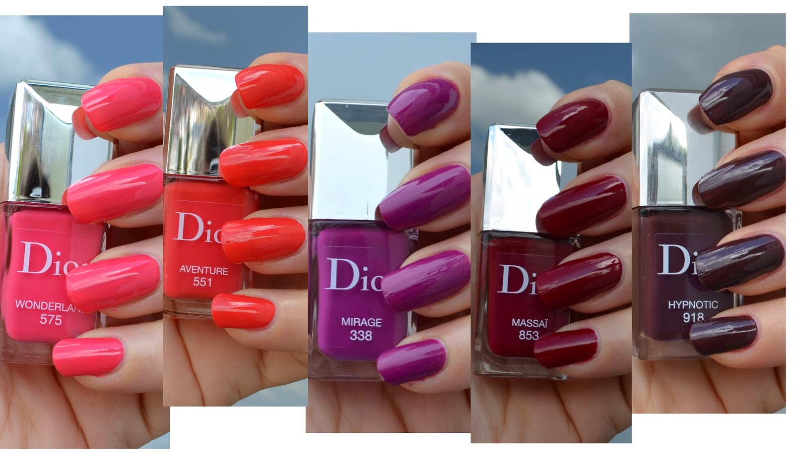
Today I have Dior Vernis#575 Wonderland, #551 Aventure, #338 Mirage, #853 Massai and #918 Hypnotic for you. These are permanent so you could grab them anytime you want. And since I can't make a photo of the mugs to start with, a prepared a fancy collage of my swatches ;-)


Dior Vernis #575 Wonderland, #551 Aventure, #338 Mirage, #853 Massai, #918 Hypnotic

I would like to start with my favorite of the shades, #338 Mirage is a lighthearted warm purple with cream finish. The application of this one is very smooth. It is opaque in two coats, which I am wearing for the swatch below.


Dior Vernis #338 Mirage


Mirage reminded me of my favorite Tom Ford nail polish of all times, #08 African Violet. Oh how I like it. These two are indeed very close but African Violet is slightly warmer. YSL #14 Violine Surrealiste is also close but slightly cooler. Chanel #609 Coup de Coeur has more red, Chanel #339 Cassis is more pink. All in all, if you have Tom Ford African Violet or YSL Violine Surrealiste, probably you don't need Mirage. 


Comparison: Dior Vernis #338 Mirage


There are some serious bright shades at Dior's new permanent range. Dior #551 Aventure is one of them. It is an almost neon orange red with cream finish. Application is smooth, two coats for the photo below. I do like Aventure but I am not in love. It is probably because that brightness is slightly out of my comfort zone. Not that I don't like bright nail polishes but a neon like polish looks like it is not Dior, if you know what I mean.


Dior Vernis #551 Aventure

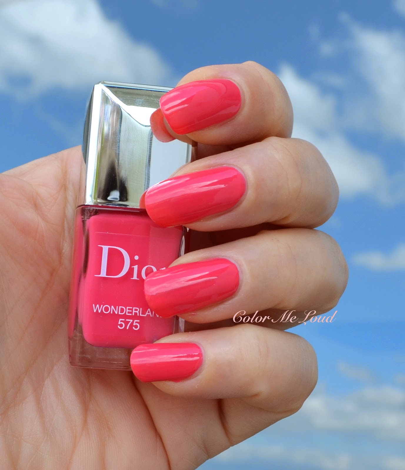
What about a bright natural pink then? Dior #575 Wonderland offers you this and a smooth self-leveling application. Below photo is with two coats. Again I have similar feelings todays Wonderland in terms of brightness, but I think Wonderland is less neon so more wearable for me.


Dior Vernis #575 Wonderland


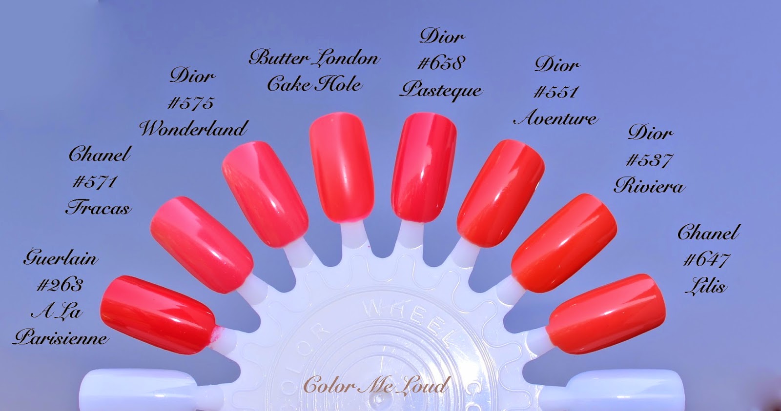
Below you can see my camera going crazy with all these bright colors. Important is that Dior #551 Aventure and Dior #537 Riviera are very close. Chanel #647 Lilis is also a little cooler but similar. Dior#575 Wonderland and Chanel #571 Fracas are also rather close, Wonderland being brighter. Butter London Cake Hole and Guerlain #263 A La Parisienne are also from the same color family.


Comparison: Dior Vernis #575 Wonderland, #551 Aventure

Next two are both great shades for this fall. #853 Massai was repromoted with Dior's Fall 2014 Collection. It is a deep warm red with cream finish. Some would call it "oxblood". Application is again flawless, photo is taken after applying two layers.


Dior Vernis #853 Massai

One of my favorites from Dior's new line is #918 Hypnotic. It is a very deep blackened red shade, but it is still obvious that it is red and on me it doesn't look black. Lovely shed for fall and winter. Those of you who like their vampies, you need Hypnotic.


Dior Vernis #918 Hypnotic

Below you can see some comparison swatches. Guerlain #125 Vega (another love of mine) is more purple and deeper than Dior #918 Hypnotic. Tom Ford #04 Bitter Bitch (<333) is warmer, more brown and deeper. Dior #981 Orchid is lighter, Dior #970 Nuit 1947 is close, Chanel #599 Provacation is more blue based, hence looks purple. Chanel #469 Imperial is warmer/more brown.  


The closest shade to Dior #853 Massai is Guerlain #168 L'Heure Bleue which is slightly darker. Tom Ford #15 Smoke Red is more red and lighter. YSL #45 Piment D'ailleurs is also close but was a very restricted shade so it is harder to find. I now notice not to have included Burberry #303 Oxblood, but I believe it is deeper. 


Conparison: Dior Vernis #853 Massai, #918 Hypnotic

Final thoughts: I love Dior's new formula. There were previously some concerns and questions, so here I write that these nail polishes are not gel, they are gel effect. This means they only have the long lasting and glossy effect of a gel formula. The brush is also a little slimmer, which I compared previously. Overall love, shades like Aventure and Wonderland are a little too "neon" for my liking but I am sure there are enthusiast of those too. My favorite from the bunch is Mirage and Hypnotic


I wonder... What do you think about really bright nail polishes from high-end brands. Love/don't care/hate? Do you think that they reflect the luxury on fingertips or toes or do they look more like from drugstore? I want to know, is it just me? ;-)


Maria Candida Gentile Finisterre Eau de Parfum Review

$
0
0
"The engine stopped. She heart the click of the other door. They must have arrived to the place he was taking her to. As he opened her door, a fresh breeze filled in the car. Although her eyes were blind folded, she could feel the smile and excitement on his face. Carefully she got out off the car while holding his hand and took a few steps forward as he led her. 

Warm breeze was messing her hair. She didn't care about a few strands blocking her vision as she didn't have any at that moment. She smiled at the thought of the freedom of her sightlessness and took a long, deep breath. The scent of the sea carried by the breeze filled her lungs. Another deeper breath would reveal the secret aroma of the pine tree leaves struggling to overcome the wind. She could hear the gulls scream while blooms of immortelle were hushing them. Were they screaming with each fallen leave and each sea wave? 

She was so carried away with the sensuality of the blindfolded scene, she wouldn't open her eyes even after he let her do it. She knew it, it was Finisterre, where they first met. Now she met this beautiful cape in another dimension, with her other senses. " 


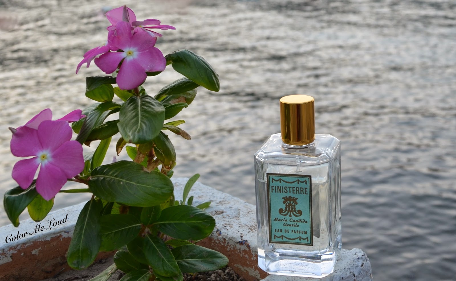
Maria Candida Gentile Finisterre Eau de Parfum

Although I am the writer and narrator of the story, I don't know how it ends. All I wanted was to describe how I feel when I apply a spray of my favorite summer fragrance on my wrist and let it linger in the air. I have purchased a bottle of Maria Candida Gentile's Eau de Parfum in Finisterre after circling around the flacons for months in Stuttgart Breuninger. It was not easy to make a decision between her other equally lovely creations and this one. I added Sideris to my wish list for Fall/Winter and decided for the light hearted marine fragrance Finisterre for summer. 


Maria Candida Gentile Finisterre Eau de Parfum

Finisterre was released just last year and I have noticed the reviews about this one is very limited on the internet. This is how I decided to go to the sea side and make a few photos which would underline the beauty of the vintage flacon. Finisterre is classified as a marine fragrance. Its top note is marine accord and heart notes are immortelle and pine. The base notes are grey amber (ambergris) and sandalwood. 

On me a few minutes in, the fragrance opens up with a humid sea air carrying a refreshing accord reminding me of an anis spirit, such as raki or ouzo. Although Finisterre can not be describes as sweet, this anis spirit scent has a slightly sweet character to it. I believe this is the pine tree pronouncing itself. Slowly the yellow floral immortelle comes out to play with now more developed pine accord as ambergris always grounds these notes to a marine feel. Immortelle never becomes very pronounced on my skin. Thirty minutes to an hour, the scent becomes close to the skin although it can still be noticed by my friends. After three hours mark I notice the sandalwood taking over, leading the way to a lovely fresh but woody dry down. On a not particularly hot day, I can still smell sandalwood, ambergris and pine on my wrist even after 8 hours. I describe this fragrance as long lasting considering how light and refreshing it is.


Maria Candida Gentile Finisterre Eau de Parfum

From Maria Candida Gentile's website (not affiliated), described with her own words:

"I chose to dedicate this perfume to the Way of St. James, a long path where wanderers often find their way back to a lost dimension between the realms of the sacred and that of the physical. In particular, it is dedicated to the Finisterre, the place where you can decide to keep walking for about a hundred kilometers after arriving in Santiago. The local tradition calls for travellers to bathe in the ocean, to then burn a garment they had been wearing during their march, and finally to collect a shell as evidence of their experience. The encounter with the ocean, the power of the sea, the wind and nature, along with the special energy of this place inspired this creation."


Maria Candida Gentile Finisterre Eau de Parfum

Maria Candida Gentile Finisterre Eau de Parfum is offered in 100 ml flacons and costs 150€ in Breuninger and Allesliebezumduft in Germany. She also has an online store at her website and ships worldwide at rates around 15-20€. At her online store the perfumes cost less than in stores (120€ for classical 100 ml Eau de Parfum line).  She also offers 15ml flacons if you are in the mood for trying out her different creations. 

Final thoughts: It is no secret that I miss the sea climate in Stuttgart. If you are like me and like woody fragrances and a refreshing one for summer without being citrusy, you will like Finisterre. I would classify it as a summer fragrance but it can be worn into and out of summer alike. On me it pronounces itself rather linear, changing a little from the beginning to the end but this doesn't bother me slightest since I love the opening and the dry down as well as its slow progression. All in all thumbs up for a lovely fragrance which is unique and interesting yet easy to wear, office appropriate and most important of all survives a long day without reapplying.


Have you yet tried Maria Candida Gentile's fragrances? Which one is your favorite?

Did you enjoy this review? Would you like to see more fragrance reviews?


Estée Lauder Pure Color Envy Sculpting 5-Color Palette in Fiery Saffron for Fall 2014, Review, Swatch & FOTD

$
0
0
This year was without a doubt "the year of the new eye shadow palettes".

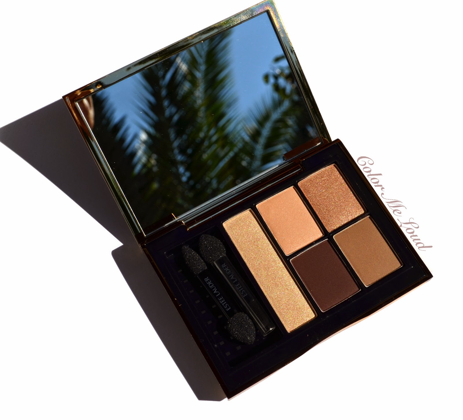
Being an eye shadow palette addict junky lover, there were so many exciting products to try out for me. Chanel, Dior, YSL renewed their formulas while Guerlain released three new palettes which joined the permanent line. Although I loved the formula of former Estee Lauder Eye Shadow Palettes (Batik Sun reviewed here) I thought it was time for the brand to redesign the packaging and fit the formula to new needs. Today I would like to show you Estée Lauder Pure Color Envy Sculpting 5-Color Palette in Fiery Saffron that I got to try. Oh and... yes the reflection from the mirror is really there, it is leaves of a palm tree ;-)


Estée Lauder Pure Color Envy Sculpting 5-Color Palette in Fiery Saffron

Packaging: The compact is made of plastic but it has a luxury feel to it. The lid and backside is black with golden frame. On the cover the brand name is placed. Opening/closure of the palette is magnetic, which is really practical. I think by now all brands should follow this example. I don't know how many times I damaged my nails or nail polishes trying to open a non-magnetic compact, thumbs up for the packaging which is chic and practical.


Packaging: Estée Lauder Pure Color Envy Sculpting 5-Color Palette in Fiery Saffron

Inside the compact there are five eye shadow shades which come with two both-ended applicators. Three of the ends are sponge tipped, one is a tiny blending brush for touch-ups. Although one of the shades look like it has more product, I believe all the five are equally divided. The compact has 7 g of eye shadow. The new formula has what they call "Advanced True Vision Technology" and it promises to be especially long lasting even on oily lids. I can't really test that because I don't have oily lids but it definitely performed very good at hot and humid weather.


Estée Lauder Pure Color Envy Sculpting 5-Color Palette in Fiery Saffron

The following instruction card shows how natural, intensified and dramatic looks can be achieved using Estée Lauder Pure Color Envy Sculpting 5-Color Palettes. The intensity of the look increases as you go clockwise from the long base shade and integrate deeper colors. 


Instruction card showing how to use Estée Lauder Pure Color Envy Sculpting 5-Color Palettes


Fiery Saffron is a gorgeous natural quint for rose gold lovers. Although it looks warm at the first glance, it has cooler shades to bring it what I would call natural to warm on scale. It is composed of three matte and two metallic shades. On me the metallic shades don't look frosty nor overly shimmery, they has a nice multi dimensional quality to them. Some may ask how these compare to Urban Decay Naked 3. I can certainly say that I prefer the quality of Fiery Saffron much more in terms of complexity of the shimmers.


Close-up: Estée Lauder Pure Color Envy Sculpting 5-Color Palette in Fiery Saffron

The shades are as follows:

Left most: Very light metallic champagne. I love to use this shade all over the lid for brightening up the look or on the inner corner for highlight.

Top middle: Very light peachy pink with matte finish. This is a great base color for all over the lid if you would like to go for a naked understated eye look. Run this one on the crease to make the blending a breeze.

Top right: Gorgeous light rose gold with complex shimmer. It is my favorite shade from the palette. I like it wearing as the main shade on my lids and combine with one of the darker shades for definition.

Bottom right: A very deep plummy brown with matte finish. I really like this shade since it is not too yellow nor too warm and it is also nicely pigmented for a dramatic take. It gives a lovely contrast against the golden shades of the quad and complete the concept by bringing them closer to the rosy shades.

Bottom left: Mid-toned natural brown with matte finish. This is a great shade if you don't want to go all dramatic but would like a soft crease. I also run this shade over the crease to blend the darker shade.


Swatch (direct sunlight): Estée Lauder Pure Color Envy Sculpting 5-Color Palette in Fiery Saffron
Swatch (indirect sunlight): Estée Lauder Pure Color Envy Sculpting 5-Color Palette in Fiery Saffron

Excuse me for the poor lighting of the below photo but I think you can get the idea ;-) I am still trying to get a good spot with right amount of light here.

Below I use the rose gold shade all over the lid, champagne on the inner corner, natural brown on the crease to blend and deep plummy brown on the crease and as a liner for more definition. 


In-action: Estée Lauder Pure Color Envy Sculpting 5-Color Palette in Fiery Saffron

For the below look I combined Estée Lauder Pure Color Envy Sculpting 5-Color Palette in Fiery Saffron with MAC Blush in Fun Ending from A Novel Romance Collection, which I will probably never review since it is mostly sold out, but I really love the blush. On my lips I have a combination of MAC Lipstick Myself with Good Kisser for a softer everyday rosy nude from the same collection.


FOTD with Estée Lauder Pure Color Envy Sculpting 5-Color Palette in Fiery Saffron

Fiery Saffron is not the most dramatic quint out there but it is a very pretty one for a polished everyday look, which can be intensified by using the darker mattes for a night out. All in all I find the combination of matte and shimmery/metallic shades very versatile. I also love the fact that the metallic shades are very complex and not looking frosty (Yes, I am looking at that Dior quint). My one and only complaint would be the matte formula blending too easily. The quality of these are close to Tom Ford's latest quad Orchid Haze. I find the mattes in those also a bit too smooth, I prefer mattes when they are a little on the drier side so that I can place them accurately.


FOTD with Estée Lauder Pure Color Envy Sculpting 5-Color Palette in Fiery Saffron

Final thoughts: Chic, sleek, versatile, nicely pigmented and easy to blend. If you are searching for a natural palette with a pretty rose gold shade, Fiery Saffron is for you. 

Estée Lauder Pure Color Envy Sculpting 5-Color Palettes are permanent and they started to arrive at the counters worldwide. From 10 total shades, in Germany there are six shades being released; Envious Orchid, Currant Desire, Fierce Safari, Fiery Saffron, Infamous Sky and Ivory Powder. They have 7 g of product and they cost around 53 €.

Are you eyeing any of the palettes? Have you checked them at the counter yet?


The product in this post is provided free of charge for my consideration. 
I am not paid for this review, all opinions are honest and my own.


Guerlain Ecrin 4 Couleurs #16 Les Aciers for Fall 2014, Review, Swatch & FOTD

$
0
0
This fall Guerlain brought us three new palettes in their buttery smooth and pigmented formula. I can never resist a new Ecrin 4 Couleurs so ended up getting all three. I have already swatched them together (check out this post) and reviewed two of them with FOTDs, #15 Les Sables (reviewed here) and #17 Les Violines (check here). 

Guerlain Ecrin 4 Couleurs #16 Les Aciers is going to be my last review post for Guerlain's Fall Collection. Check out this and that post for Kiss Kiss Lipstick reviews and swatches too.

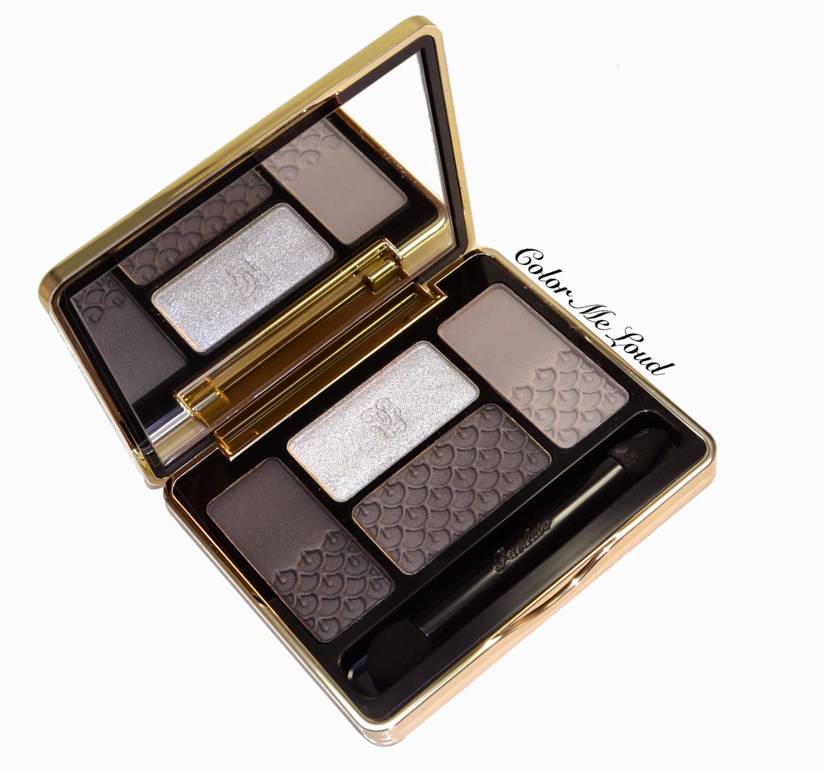
Guerlain Ecrin 4 Couleurs #16 Les Aciers

The steels quad, Les Aciers has a similar concept to Les Sables, in which there are three matte to satin shades combined with one metallic/shimmery shade. New quads are characterized by their embossed design pattern on the lower half of the compact. The compact and the formula are the same as the existing Guerlain Ecrin 4 Couleurs.


Guerlain Ecrin 4 Couleurs #16 Les Aciers

Les Aciers is the classical smokey eye palette with grays and silvers. What I like about them is that the shades are not very cool. Sometimes silver and grey tones crashes against my skin tone but with Les Aciers this doesn't happen to a degree that is looking unnatural. Especially the darkest shades have some warmth to them.


Close-up: Guerlain Ecrin 4 Couleurs #16 Les Aciers


The shades are as follows in a close-wise manner (published partly before here, included for the sake of completeness of this post):


Left: Very deep charcoal with satin finish which has slight taupe/brown undertones and therefore it is not very cool.


Top: Very pale grey/silver with frosty finish. It is a great shade for inner one third of the lid or inner corner highlight. I like the fact that this can be layered on other shades to obtain a shimmery finish.


Right: Light grey with matte finish. It is the coolest shade of the palette, great for blending out the darker shades or to use all over the lid.


Bottom: Very deep grey with matte finish. It didn't swatch as intense as the left shade but left and bottom shades are very close, other slight difference in their finishes (matte vs. satin to matte). Again great texture.


Swatch: Guerlain Ecrin 4 Couleurs #16 Les Aciers

Below I am wearing the lightest shade on the inner corner, blended on the 1/3 of the upper lid. On the lid I have the matte medium grey shade and the deepest shade on the crease. I then applied a dark grey eye pencil and mascara. You can see that one my right eye (from your perspective) it looks like as if the medium grey color doesn't apply smoothly to cover the lid. The formula isn't to blame here. It is the color against my skin giving this effect, which shows itself more on the photos than in real life.


In-action: Guerlain Ecrin 4 Couleurs #16 Les Aciers

Below you can see this eye look in context. I am wearing Chanel Joues Contraste Rose Glacier (reviewed here) on the cheeks, Guerlain Kiss Kiss Rosy Boop (reviewed here) on the lips. I love the combo and I think Les Aciers do combine beautifully with them.


FOTD: Guerlain Ecrin 4 Couleurs #16 Les Aciers

Final thoughts: I am not all that big on grey/silver/black combos but all in all I like Les Aciers more than I like the palettes with similar color theme. The formula is great, I love the shimmery shade which can be layered on the mattes in the quad. Guerlain's matte formula is one of the best out there, it is buttery smooth and very pigmented without being powdery so thumbs up for that. As a black palette though, my heart still belongs to Les Noirs from their line. 

Wrap-up of new Guerlain Ecrin 4 Couleurs:
From Kiss Kiss Collection, my preference of quads are in this order (from high to low): Les Violines, Les Aciers and Less Sables. -> That typo with two "s" tells it all, I couldn't make the shades  in Les Sables work on me but I am sure on different complexions, they are just fine.


What is your favorite Guerlain Ecrin 4 Couleurs?


Rescue Beauty Lounge Fan Collection 3.0 Voting is Now Open

$
0
0
Hi everyone *waves*

You must have sensed that I am unexceptionally quiet. That was because I had a very restricted access to internet. As I am recovering from a lovely wedding weekend, bus traveling and a smashed feet from walking and dancing, I would like to give you a quick information about what I happened to learn the day before yesterday. 

I am a fan of Rescue Beauty Lounge nail polish, especially after my dear friend Jenny led me into this world. She owns every polish made until now, I am more of a humble collector, mainly because I am trying to restrict the purchase of things I can't review. RBL has very a restrictive reviewing policy and once there are swatches online from many lovely blogs who got the polishes much before, it makes no sense to put another swatch up there. I am also trying to be selective about my nail polish purchases recently since I have a bit too many nail polishes. If you have checked my stash page, then you know what I mean. Still I can't say no to what Ji designs and make sure to get 2 to 3 and sometimes 4 from each collection.

Last year I have heard about the buzz going on about Fan Collection 2.0. I loved each and every polish from that one and ended up with some of them. During free shipping world wide event, I purchase the others and completed the collection.

This year she I have heard about the selection phase, I started thinking what would be a nice idea that is not yet implemented. One day I was driving to work and I came up with this one...


The idea is to create a nail polish which fits the theme "White & Gold". It has an off-white/ champagne rather warm base with slight cool colored iridescence. On it there are golden flecks, similar to "Naked without polish" shade from Fan Collection 2.0. Check out this photo to know what I mean. RBL doesn't have many off-white nail polishes and I think it will be a unique addition to the line. White is timeless, it is chic and once combined with gold, it is pure elegance. 

I have shared my idea and enthusiasm after I am back from traveling today on Instagram and thanks to the votes of friends, it seems I might make it to first 6

If you haven't voted yet and if you liked the idea, please drop by the following link and cast a vote to #6 Sara BeauTime.


The voting is open until tomorrow (Wednesday), noon EST (only something like 20 hours left). You can vote once for each IP, so to vote multiple times from home/cell-phone/work is possible. I am hoping to be able to introduce my very own RBL nail polish after this, so excited about the other colors too. Even if I can't make ip, all the story boards look divine so I will definitely get the collection.

You can see the rest of the White & Gold pins from the following link:


Oh and yes, I am working on Tom Ford Fall 2014 Collection picks post and Dior Star Concealer post as well as Laura Mercier Caviar Sticks I picked up recently. I also have YSL's purple palette review coming up. Which one would you like me to publish first?


Tom Ford Contouring Cheek Color Duo in Softcore and Stroked for Fall 2014 Collection, Review, Swatch & FOTD

$
0
0
I know I am late to the party, although a dear friend sent me Tom Ford Fall 2014 pieces in the speed of light, holiday and traveling kept me from writing an early review. Today I would like to talk about two new and limited edition products from Tom Ford Contouring Cheek Color Duos in colors Softcore and Stroked

On a side note, only a few more days left for my holiday. At the moment I am enjoying taking photos under the sun, loving the shadows and accuracy of colors. This might explain the abundance of photos *winks*.


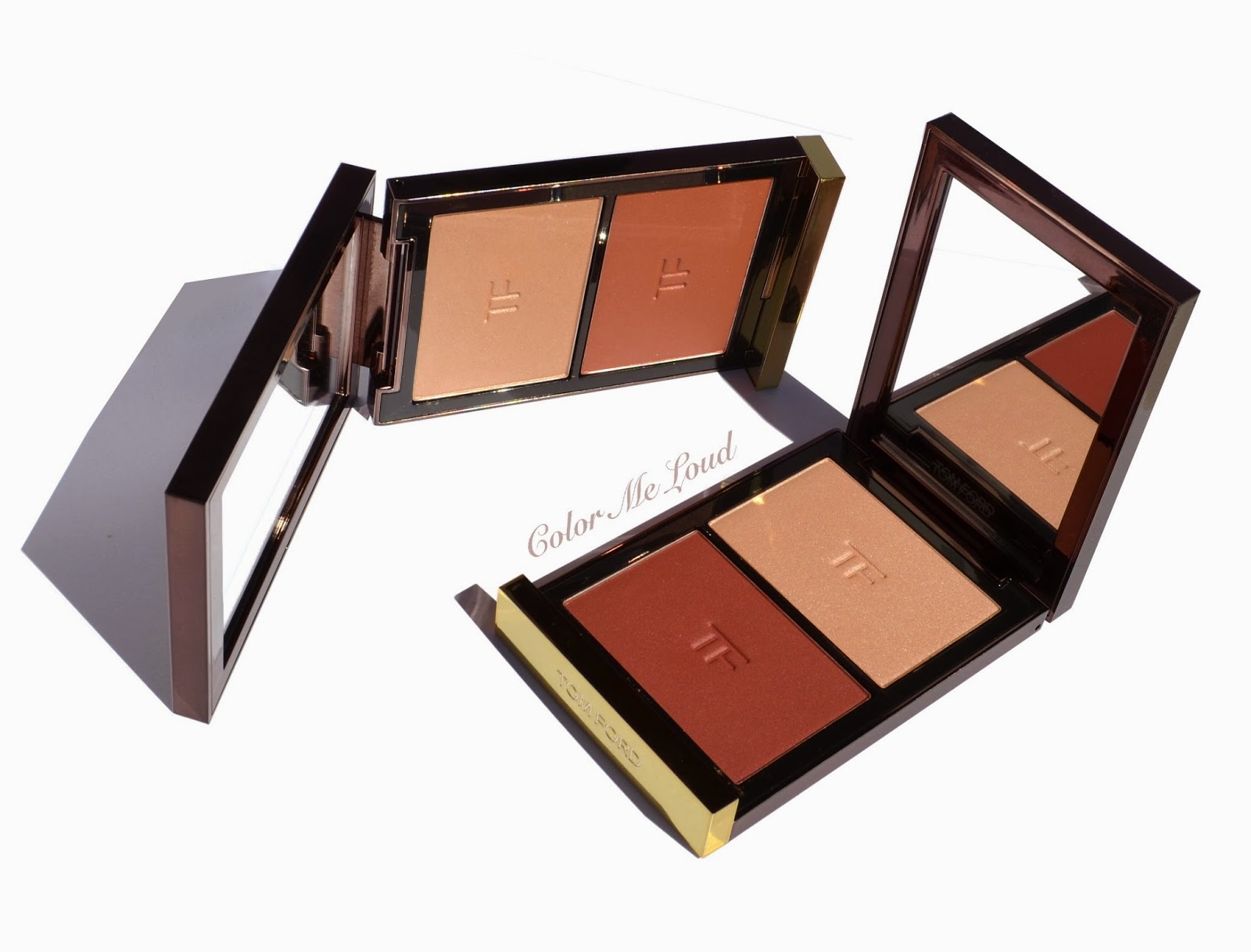
Tom Ford Contouring Cheek Color Duo in Softcore (right) and Stroked (left)


Tom Ford Fall 2014 Collection was released earlier in the States. Since then most of the pieces are already sold out online. Tom Ford releases started to come close to MAC limited edition releases which sometimes sell out within hours. It must be only Mr. Ford's magic which can sell items with this price tag to so many of us. At the time I am writing this post, these Contouring Cheek Duos are both available at Selfridges and they are sold out online at KaDeWe. If you are in the states, your best bet should be to track them down by calling some stores.

Housed in a similar compact to Tom Ford Shade & Illuminate, Contouring Cheek Duos are composed of a blush and a highlighter. In this case the name "contouring" can be misunderstood. These achieve sculpted cheek bones by giving color (blush) and highlighting on top of the cheek bones so you can still apply a contouring powder before using one for more defined cheek bones.


Tom Ford Contouring Cheek Color Duo in Softcore (up) and Stroked (down)

There are two color options available, which are both perfect for Fall. 

Softcore is composed of a very light natural pink highlighter and a reddish pink blush. At swatches online, I have seen Softcore looking cooler on some skin tones but on mine it looks natural almost warm. 

Stroked has a very light champagne/gold warm highlighter and a terracotta blush. Both highlighter and blush pulls very warm on me. 

Both of the blushes are very pigmented and buttery. Highlighters look frosty on the swatches but once applied they look natural. The powder is very finely milled and quality is suburb in terms of application and blending.


Close-up: Tom Ford Contouring Cheek Color Duo in Softcore (left) and Stroked (right)

As you can see from the swatches both of the blushes have satin to shimmery finish. I was undecided to pick these up because of this property. But it is proven once more that one should have faith in Mr. Ford. Once applied on the cheeks, blush does't look shimmery at all, it gives more of a lit within glow.


Swatch (direct sun light): Tom Ford Contouring Cheek Color Duo in Softcore (left) and Stroked (right)

Now onto application, although I have a bit of tan going on at the moment, I have found that Softcore supports my natural to cool undertones best and it looks more natural on me than Stroked. I can wear Softcore with all kinds of lip & eye combination since I don't have to make it work. The highlighter is stunning and once applied with a light hand, it looks understatedly pretty. I was told that Softcore is thought to be for a night make-up but I believe it is suitable for all occasion depending on the lightness of application. Below I am wearing Softcore on my cheeks.


FOTD with Tom Ford Contouring Cheek Color Duo in Softcore

Stroked, although it is not too different than Softcore, it is more on the warm side. You see me wearing it below. It doesn't work all that well with a cool natural eye and pinkish lip stain on me, I need to combine it with corals or peaches on lips. It is still pretty but a little warmer than I would usually go for. 


FOTD with Tom Ford Contouring Cheek Color Duo in Stroked

As opposed to some other reviews I have read, I don't think that both of them are must haves for one person since they are rather close. They are like warmer and cooler of one particular product so I would go for the one which looks best on you. For me that would have been Softcore. If you are warmer than me, you would probably liked Stroked most. 

Also check out more swatches and reviews at The Beauty Look Book, Temptalia,  Makeup and Beauty Blog and Cafe Makeup.

Tom Ford Contouring Cheek Color Duo in Softcore (up) and Stroked (down)

Final thoughts: Beautiful texture and quality in Tom Ford packaging and fun *cough cough* names. Tom Ford Contouring Cheek Color Duos are one of the most finely milled and easy to blend powder product I own. Don't let the shimmer scare you as these apply beautifully on the face, these are not over the top. Two of the shade options though are quiet close in terms of concept, one being warm and the other more on the cooler side so I recommend getting only one, which fits to your coloring best. If your complexion is close to me, I would recommend Softcore.

Have you picked yours yet? How do you find the concept of blush and highlighter in a palette?
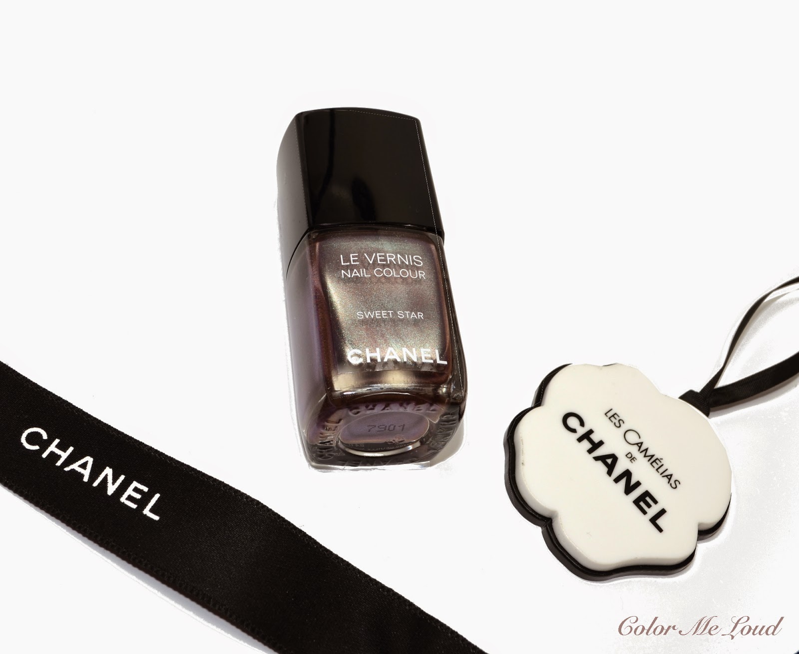
Giorgio Armani Nail Lacquer #214 Incence Velvet, #624 Crimson Velvet, #714 Iron Velvet and #724 Acid Velvet from Fade to Grey Fall 2014 Collection, Review & Swatches

$
0
0
If you remember my previous post about Armani Fall, the story went on like this: A day before my birthday I came across the pretties at the counter and made myself a big present. I was considering to pass on the nail polishes but as soon as I have seen that they have a very unique finish, I couldn't resist.

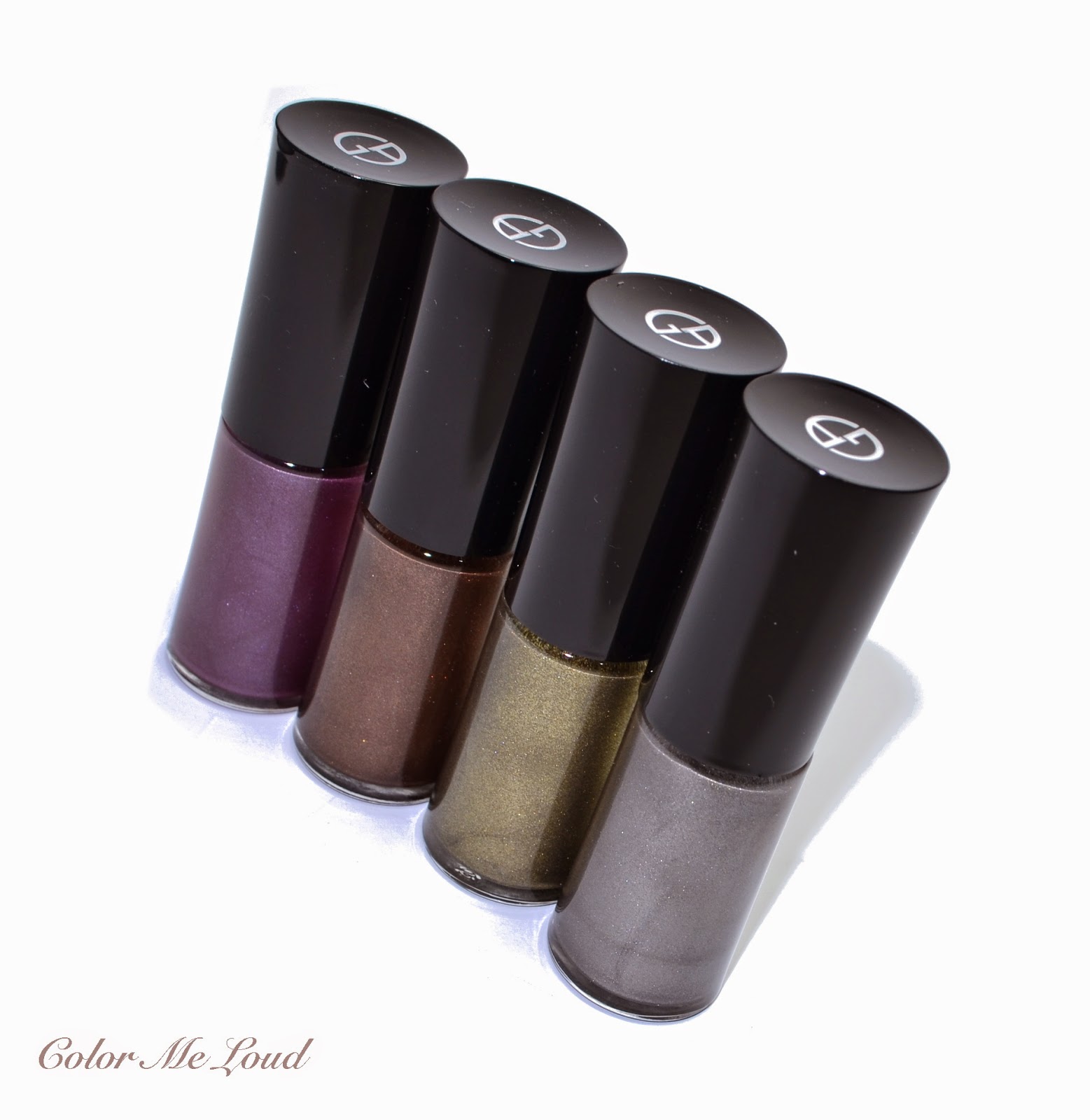
A note about all the four polishes, they have a metallic look in the bottle with very pretty multi colored shimmer. Once applied on the nails, they go on metallic as well but they dry to a matte finish. In shadow they look pretty much matte and under the sun multicolored shimmer shows up, making the polish look like a frost over a metal, if that makes sense. I don't own anything like these so no comparisons this time around. Also I didn't apply a top coat to make them glossy because I loved wearing them like this as they are more unique. Without a top coat, the longevity was impressive, I have worn them 5+ days and still there was only minor tip wear. 


Giorgio Armani Nail Lacquer #214 Incence Velvet, #624 Crimson Velvet, #714 Iron Velvet and #724 Acid Velvet

#214 Incence Velvet is a chocolate color with multi-colored shimmer and matte finish on the nails. This one was one of the most opaque and thicker one of the bunch. The application was easy, I didn't end up getting any brush strokes or imperfections. For the pictures below I applied 2 coats but one coat would be fine as well.


Giorgio Armani Nail Lacquer #214 Incence Velvet

#624 Crimson Velvet is a reddish purple with slight silver, light pink and other colors of shimmer in the bottle. On the nails it looks more frosty and matte than the others and even under sun light the shimmer is not very pronounced. I chose this shade for my birthday mani and loved wearing it. 


Giorgio Armani Nail Lacquer #624 Crimson Velvet

#714 Iron Velvet has the strangest name ever, wouldn't iron and velvet make an oxymoron? Iron Velvet is a mid-toned silver with white and silver shimmer and matte frosty finish. The matte finish of Iron Velvet is more on the subdued side, like Crimson Velvet it doesn't have lots of shimmer under the light. It is a great grey for the Fall season, it also has a tad of warmth which makes it not clash with my skin tone.


Giorgio Armani Nail Lacquer #714 Iron Velvet

#724 Acid Velvet is the stunner and most unique shade of this collection. It is a metallic olive green with multi-colored shimmer and matte finish. Under the light, all the shimmer goes crazy here, as you see below and it looks not that matte but in shadow it is very natural and not over the top. Acid Velvet was a tad thinner than the others from this collection and the first coat applied sheer, but with the second coat, it was opaque. Below swatches are with two coats. Although this are not exactly my type of color, I love this one to bits. In fact I am typing this post with Acid Velvet on my nails. <3


Giorgio Armani Nail Lacquer #724 Acid Velvet

All in all I love all four of them and ended up wearing them since the day I purchased. I notice that Armani nail polish didn't really make it to many blogs and stashes. I think it is a pity since they are of best quality in terms of consistency and longevity. I am guessing the round bottle is putting off  some of the people as well as the price. I would recommend you get one of those to try, they are worth it.


Giorgio Armani Nail Lacquer #214 Incence Velvet, #624 Crimson Velvet, #714 Iron Velvet and #724 Acid Velvet

Final thoughts: These must be the most interesting polishes of Fall 2014 Collections so far. They are unique interesting and wearable. Consistency and longevity are also at their best. I highly recommend checking them out.

Are you eyeing any of these? Which one is your favorite?


Tom Ford Eye Color Quad #03 Nude Dip for Fall 2014 Collection, Swatch, Review & FOTD

$
0
0
I was pondering about this review since Tom Ford's Fall Quad Nude Dip is sold out almost everywhere. It must be the fastest selling item of this price point that I have seen since years. My quick question in Instagram revealed there are still ones out there who would like to read my review so here it goes.

Tom Ford Eye Color Quad #03 Nude Dip is the third quad in Tom Ford's dry & wet formula. Two others were released for Fall 2012 Collection, a green/blue quad called Emerald Lust and a Pink/Neutral Quad called Enchanted. Enchanted sold out also very fast and afterwards could be purchased in eBay for hundreds of $$$. I still receive e-mails asking me if I would like to sell my Enchanted, which is a palette I love to bits. I had to scream when mine fell down from the table during a comparison swatch session but so happy that it is still intact!


Tom Ford Eye Color Quad #03 Nude Dip


Nude Dip has a highly metallic finish with multi dimensional shimmer so it would look different from each angle. You can see the photo above shows its warm side whereas photo below is a little cooler. On a side note although the compact has 6 g (.21 OZ) of eye shadow as opposed to 10 g for the permanent ones, since the formulas are not comparable, it doesn't really mean that you are getting less for your money. Dry & Wet formulas tend to be baked and these weight less than pressed powders. 

By the way how funny is to name that one Nude Dip, when it can be used wet ;-))


Tom Ford Eye Color Quad #03 Nude Dip

If you take a closer look at the below close-up, you can see what I mean by multi-dimensional shimmer. You see greens, golds, coppers and blues flashing through the surface of the eye shadows. These give Nude Dip a unique finish once applied on the lids.


Close-up: Tom Ford Eye Color Quad #03 Nude Dip

The shades in Nude Dip are as follows:

Top left: Very light natural to warm off-white with metallic finish and multi-dimensional shimmer. I like applying this one to the inner corner as a highlight.

Top right: Light natural pink with metallic finish. Since this shade isn't very cool, it is flattering across the complexions. This shade can be applied all over the lid or as a highlight, it is very versatile.

Bottom left: Mid-toned taupe with metallic finish and very complex shimmer. It must be one of the pretties taupes I ever own, love it! I like using it all over the lid. On a busy day, I can get along with just this shade and nothing else is needed.

Bottom right: Deep natural brown with satin to shimmery finish. Shimmer is again very complex and gorgeous. This shade is for definition but it can also be used on its own all over the lid. I like the fact that it is not metallic, less shimmery and dark enough for any drama you might need.

Below you can see two sets of swatches. Under the sun you can see the shimmer properties and shadow swatch shows the base color better.


Swatch (under sun light): Tom Ford Eye Color Quad #03 Nude Dip
Swatch (in shadow): Tom Ford Eye Color Quad #03 Nude Dip

Have I said I love that taupe? Love it! I have applied it all over the lid for the eye look below. I then highlighted my inner corner with the lightest off-white shade and defined the outer corner with the deepest brown shade. I love how soft and understated yet complex it looks. I can now understand the hype going around this palette. It has a similar concept to the Fall Quad of Chanel, Poesie (reviewed here). Nude Deep turns out to be cooler on my eyes. I applied the taupe wet and all other shades dry for this eye look. Eye shadows in Nude Dip also have great color pay-off once applied dry but I think wet application brings out their pretty shimmer even more. 

I completed the below look with Urban Decay 24/7 Glide On Eyeliner in Twice Baked and Rouge Bunny Rouge Mascara in Witchery. 


In-action: Tom Ford Eye Color Quad #03 Nude Dip

Below you can see the look in context. I am wearing:


  • Tom Ford Eye Color Quad #03 Nude Dip
  • Tom Ford Blush Duo in Stroked (reviewed here)
  • Tom Ford Lipstick in Twist of Fate (review coming up soon)
I still think Stroked pulls way too warm on me but once it is combined with Twist of Fate, it doesn't look that much out of place. Still my favorite combination is Negligee and Softcore, which I will show soon for my lipsticks review.


FOTD with Tom Ford Eye Color Quad #03 Nude Dip, Blush Duo in Stroked and Lipstick in Twist of Fate

Final thoughts: Nude Dip is a easy to wear everyday natural with metallic finish. The shimmer in these are so refined and so complex, you wouldn't regret getting it even if you are not big on shimmer. I am hearing it is sold out everywhere so you need some luck to locate one at the moment.


Do you use your dry & wet formulas also wet from time to time or do you rather like dry application?

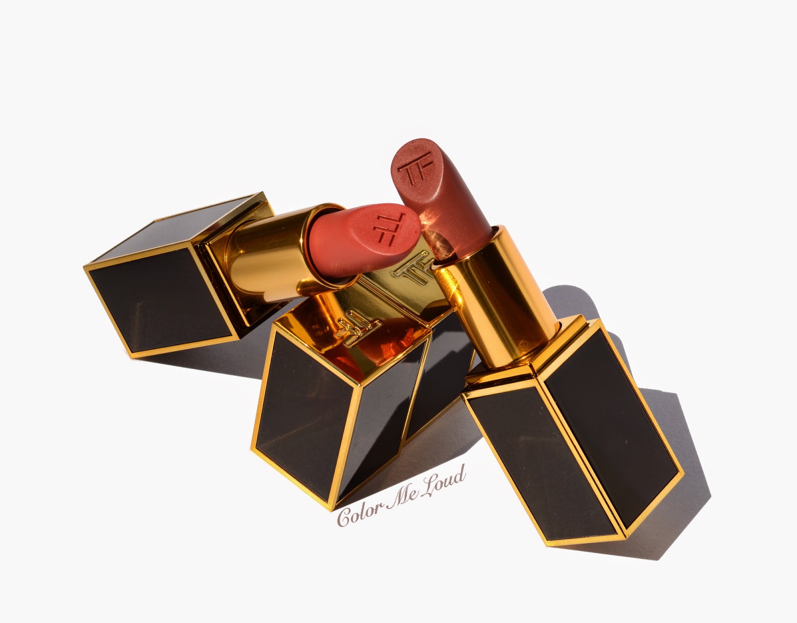
Tom Ford Lip Color #30 Negligee and #31 Twist of Fate for Fall 2014 Collection, Swatch, Review & FOTD

$
0
0
Tom Ford's Fall 2014 Collection must be one of my favorite collections this fall. I love how the shades combine with each other. With only a few products, Tom Ford managed to bring out a naturally glamorous look fitting to many different skin tones. Naturally glamorous? Is there anything like that? In Tom Ford dictionary there is. It looks enchanting, sophisticated and sexy but not over the top.

Today I would like to introduce the two lipsticks of this collection, Negligee and Twist of Fate.

Tom Ford Lip Color #30 Negligee (right) and #31 Twist of Fate (left)


I find Tom Ford's lipstick formula very creamy and they last very long on me. I almost never have dry lips so it is hard for me to comment if they dry the lips out. Bright lipsticks wash me out so I make sure to try out before buying. This time around because of holiday, I couldn't make it to a counter and had to order them sight unseen. I am happy that they both worked fine on me. 

I think these lipsticks combine especially good with the Contouring Cheek Color Duos from the same collection, which I have reviewed previously here. You can see some FOTDs of these together at the end of the post.


Tom Ford Lip Color #30 Negligee (right) and #31 Twist of Fate (left)

#30 Negligee is a mid-toned rosy browny plum which has subtle pink sheen to it. You can see this on the second photo below with forced flash. I love the plum undertones of it without being too blue based. Negligee is pure love for me, such a perfect shade for Fall. I recommend it especially to the ladies with pigmented lips, like myself, since it gives a accentuated lip appearance. I love combining Negligee with my other love from the collection, Softcore Contouring Cheek Color Duo.

#31 Twist of Fate is a natural coral which is not too bright. It has less sheen once compared to Negligee but it is more bright on me. It is just the right amount of brightness and pigmentation, which doesn't wash my face out and doesn't erase the rest of my features. I like combining it with Stroked Contouring Cheek Color Duo.


Swatch (sun): Tom Ford Lip Color #30 Negligee and #31 Twist of Fate
Swatch (shadow): Tom Ford Lip Color #30 Negligee and #31 Twist of Fate

Below I am wearing Tom Ford Nude Dip Eye Shadow Quad (reviewed here) on the eyes, Stroked Cheek Color Duo (reviewed here) on the cheeks and as highlighter, #31 Twist of Fate on the lips. I find this combo a little warmer than I usually wear but since I am tanned at the moment, it somehow works. I especially like Stroked and Twist of Fate combination. Twist of Fate can be my go-to coral for next season although I don't find this particular shade very autumny. Probably I will end up wearing it all year around.


FOTD with Tom Ford Lip Color #31 Twist of Fate

For the look below, I applied Tom Ford Nude Dip Eye Shadow Quad (reviewed here) on the eyes, which I combined with Softcore Cheek Color Duo (reviewed here) on the cheeks and highlighter on the top of the cheeks. I am also wearing #30 Negligee on the lips. This must be my favorite combination from Tom Ford Fall Collection, a touch of plum on cheeks and lips with multi dimensional metallic finishes on eyes. 


FOTD with Tom Ford Lip Color #30 Negligee

It is very windy at Aegean Coast at the moment, great news for surfers but everyone else has to struggle with waves and the cooling effect of the wind. I thought I use this opportunity to incorporate  the windy in this FOTD for you. 

I ended up wearing Nude Dip, Softcore and Negligee all day and received a few compliments for the eye look and lipstick. Love this combination so much.


FOTD with Tom Ford Lip Color #30 Negligee

Final thoughts:  #30 Negligee and #31 Twist of Fate are both great additions to my stash. These can be combined with many different eye looks without taking over the scene on my face. On my complexion, I am especially enjoying Negligee combined with Blush Duo Softcore from the same collection. 

Tom Ford #30 Negligee and #31 Twist of Fate are both limited edition and now available worldwide. To the best of my knowledge, they are easier to track down than the eye shadow quad and blush duos from the same collection.

Do you prefer bright and bold lipsticks or ore subdued ones? Have you checked out these two?

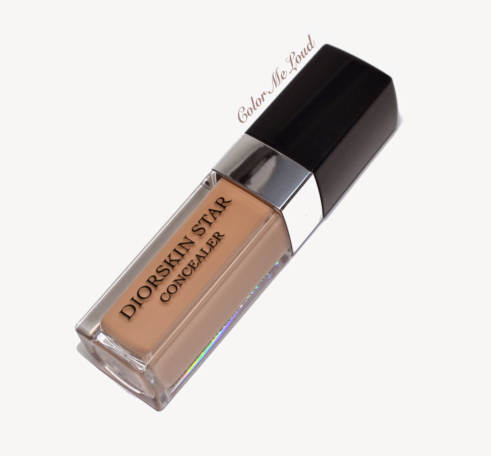
Diorskin Star Concealer, Swatch & Review, Comparison with Dior Hydra Life BB Eye Cream

$
0
0
A few weeks ago, Dior released a new foundation and a concealer around the globe. I have yet to try the foundation out but it has been over 2 months (as posted here at Instagram) since I have been using Diorskin Star Concealer. It has been put through a good testing phase and now I am ready to write my thoughts about it. 


Diorskin Star Concealer


Diorskin Star Concealer comes with a sponge applicator and a twist opening, very typical of other concealers we know from Dior, Chanel etc. The consistency is liquid and thought to be more for under eye area since thicker consistency tend to cake and dry out under the eyes. On the packaging it is written that the product is supposed to sculpt and brighten. 


Diorskin Star Concealer

I was able to test the color #002. I didn't have the chance to select the shade since I was purchasing it from a friend who got these much before the promo images were released. I might have tried #001 if I were at the counter but probably that would have been too light for me. #002 is a tad darker but it works fine especially after I get a little bit of tan at the moment. 

I would like to compare Diorskin Star Concealer to the other Dior concealer that I like, Hydra Life BB Creme. Hydra Life was my go-to concealer before I laid my hands on Cle de Peau one, which is a holy grail product for me in terms of consistency, color and performance. I use the lightest shade in CdP. Hydra Life comes unfortunately just in two shades, #01 and #02. I use #01 and the swatches and application photos below are with #01.


Diorskin Star Concealer vs. Dior Hydra Life BB Eye Cream

Color:

  • Diorskin Star Concealer #002 is very close to Dior Hydralife BB Eye Cream #01. This is good news for fairer ladies out there since they might have a better match chance with Star Concealer #001. 
  • Dior Hydralife BB Eye Cream has more peach undertones, hence works better to erase under eye darkness optically. Star Concealer on the other hand claims to brighten under eye area once used frequently. I haven't seen this effect on my under eye darkness. Although I have used it over 2 months.
  • Diorskin Star Concealer has 4 shades, Dior Hydralife BB Eye Cream comes in only 2 shades.


Swatch: Diorskin Star Concealer vs. Dior Hydra Life BB Eye Cream

Texture/Consistency:


  • I find Diorskin Star Concealer thicker than Dior Hydra Life BB Eye Cream, which smooths out the structure like fine lines much better. I would call the coverage with the first application of Star Concealer medium but it can be build up.
  • If you have mature skin or if you tend to dry up under the eyes, I found Dior Hydra Life more hydrating. It also claims to have more skincare benefits.
  • Dior Hydralife has SPF whereas Diorskin Star Concealer doesn't.


Size and Price:


  • Both tubes have 6 g/0.20 OZ 
  • Diorskin Star Concealer is more affordable, priced around 33 € while Dior Hydralife BB Eye Cream retails for around 43 €.
Longevity:

  • I find Diorskin Star Concealer to last a little longer because of its higher coverage.


Swatch (smudged): Diorskin Star Concealer vs. Dior Hydra Life BB Eye Cream

Please excuse my untamed brows, but here is quick application photos of both of the concealers. Now you was saying me that they can't see under eye darkness, well, here they are. 

On the first photo you see that under the eye is not touched whereas around the face there is foundation, so the difference is even more. On the second photo you see that I apply the concealer directly with the sponge under the eye and pad it lightly with my fingers. On the third photo you can see the end results. 

What you see is that Diorstar Skin Concealer brightens the under area more because it catches the light in a nice way (look right under my eye) but since Dior Hydra Life can erase more of my darkness thanks to its peach tones and texture, I find it all in all better.


In Action: Swatch: Diorskin Star Concealer vs. Dior Hydra Life BB Eye Cream

Final thoughts: If you have more under eye darkness and you need more hydration, then I would recommend you pick up Hydra Life BB Eye Cream. If you want more coverage, a little more light catching effect and affordable price, you can try Diorskin Star Concealer. Still if you are searching for your holy grail concealer, ready to shell out a bit more for that and haven't tried Cle de Peau yet, I would skip them both.

What is your favorite under eye concealer?

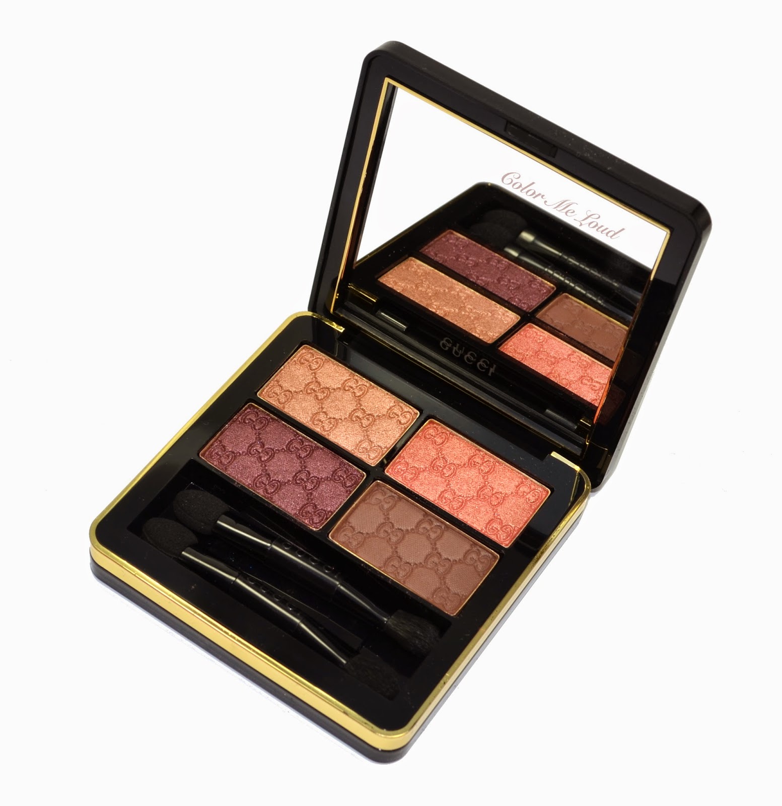
Gucci Magnetic Color Shadow Quad #040 Autumn Fire for Fall 2014, Swatch, Review & FOTD

$
0
0
The word is out since almost six months by now, finally highly coveted Beauty Line from Gucci is launched. It has been a big launch, including 10 eye shadow quads, 16 eye shadow singles, 7 eye shadow duos, 7 blushes, 3 bronzers, 25 nail polishes, over 70 lipsticks and lip glosses. It looks like there are lots to review in the upcoming days/weeks, even months. The most pleasant surprise must have been to see that the line launched at many countries at once. I was happy to find out that gucci.com online shop delivers to Germany with free shipping and ordered one of the quads just to try out, #40 in Autumn Fire.

Gucci Magnetic Color Shadow Quad #040 Autumn Fire


Packaging:
Gucci Magnetic Color Shadow Quads come in a matte black carton box, on it is printed in gold. Inside there is a velvet pouch which carries small imprints of Gucci's two Gs. Inside the package there is an explanation card, it has all written content without pictures.  The quad is black and gold, feels heavy although it is made of plastic. The closure is magnetic, which is great: I won't be breaking another nail to open it up in the morning. 


Package contents: Gucci Magnetic Color Shadow Quad, Velvet Pouch, Instructions Card

Inside the compact there is 5 g of eye shadow in four pans. I tried to understand why these are called Magnetic Color Shadow Quad, I don't think it is because the closure is magnetic. I hope it doesn't indicate that I will attract many of these in a short amount of time because they cost 58€ each in Germany.


Velvet pouch: Gucci Magnetic Color Shadow Quad

I selected a quad which looked more unique and fun and fitting to the fall season. #040 Autumn Fire is composed of warm naturals. Each powder has Gucci G imprint which wear off easily after using it a few times but takes your breath away after you open the compact for the first time. I bet this is the intention.


Gucci Magnetic Color Shadow Quad #040 Autumn Fire
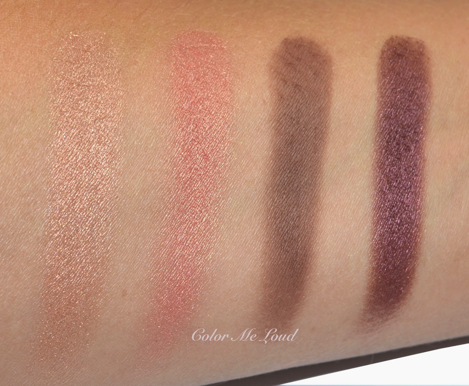
The shades are as follows:

Top left: Light peachy gold with satin to shimmery finish. The shimmer in this one as well as the shade next to it on the top row is pleasantly complex, read: love.

Top right: Light rose gold with satin to shimmery finish. Similar to golden shade, it has lovely complex sheen. It reminds me of MAC's Expensive Pink and Artistic License (latter reviewed here). 

Bottom right: Deep neutral brown with matte finish. The finish of this matte is somewhere along Burberry and Guerlain, very soft and velvety, therefore it blends a bit too much into the other shades, making it difficult to go really dark for a definition. This might be a good or a bad thing depending on your skill level. In other words, it is hard to overdo, which is usually a good thing. 

Bottom left: A deep plum with pink shimmer. The finish is close to the two lighter shades but with less shimmer. It is also a great stand alone shade if you want to go for a deep plum, something like Chanel's single Magic Night.


Swatch: Gucci Magnetic Color Shadow Quad #040 Autumn Fire

Color:
I don't own anything close to Autumn Fire for comparison, if you have any ideas please leave a comment below. I tried to swatch Tom Ford Burnished Amber next to it and the shades were not that close other than two of them showing resemblance. I thought YSL Afrique would be close, once compared shade by shade it isn't either. I still find the end result of Afrique close though.

Texture:
In terms of texture, Autumn Fire mostly resembles Burberry's quads, which are pigmented like their last release Nude Blush. After I felt the powder, it reminded me of Burberry with a tad more shimmer. I then found out that the ingredients are all close, Talc and Mica are listed as first two. They also both have 5 g of eye shadow, just note that Gucci is 58€ while Burberry is only 51€. 


I was asked if Gucci Quads are close to Tom Ford's. I don't see a resemblance of the ingredients nor the texture between these two, so it is rather hard for me to compare. I personally prefer Tom Ford since they blend slower and so shades can be distinguished from one another on the lids, which again might not be desirable for some others, so it is a matter of preference.


In-action: Gucci Magnetic Color Shadow Quad #040 Autumn Fire

You see that the end result is soft and very well blended. The eye shadows are very finely milled and they blend effortlessly. If you don't want to blend, well, than you need to put effort in there, which is why the formula is not love but like for me after my first try.

For the eyes I applied the peachy gold on the inner corner, rose gold on the lid, plum at the outer lid and brown matte on the crease. I wished brown matte would be more intense to be able to go on full drama with that one.

Below I am wearing:

  • Gucci Quad #040 Autumn Fire
  • Diorskin Star Foundation and Hydra BB Eye Concealer
  • Burberry Lip Mist in Pink Heather
  • Chanel Joues Contraste in Innocence
  • Chanel Le Volume Mascara
  • Chanel Stylo Water Proof Ambre Dore (lower lash line)


FOTD: Gucci Magnetic Color Shadow Quad #040 Autumn Fire

Final thoughts: Welcome to beauty world Gucci. Although I tend to like metal cases (like Burberry's) I like the Gucci packaging, it is simple yet chic. The color combinations of the quads are not too ton sur ton, which I really appreciate. The powder is finely milled, it is very buttery to touch. My only concern about Autumn Fire would be that the dark shade is too soft for a real drama and the shades tend to blend a little too effortlessly for my taste. Also the price is a little off putting, 58 € for 5 g, whereas Burberry (with metal packaging) offers the same amount for 51 €. I will be reviewing some other quads shortly. These are permanent, so no rush.

Are you eyeing anything from the new Gucci line?


Jo Malone London Wood Sage & Sea Salt Cologne Review

$
0
0
"You can smell the salt in the air only when you were far away, far too long."

This is what I thought after I went out of the airport in Istanbul and took a long deep breath. I have been to this airport before, many times. But it was the first time I could ignore the traffic chaos, taxis, police cars, smell of exhaust, smell of the passenger's sweat but on top of everything there was a sheet of salt aroma covering everything else. Maybe it was only to those who were missing it as much as I do...


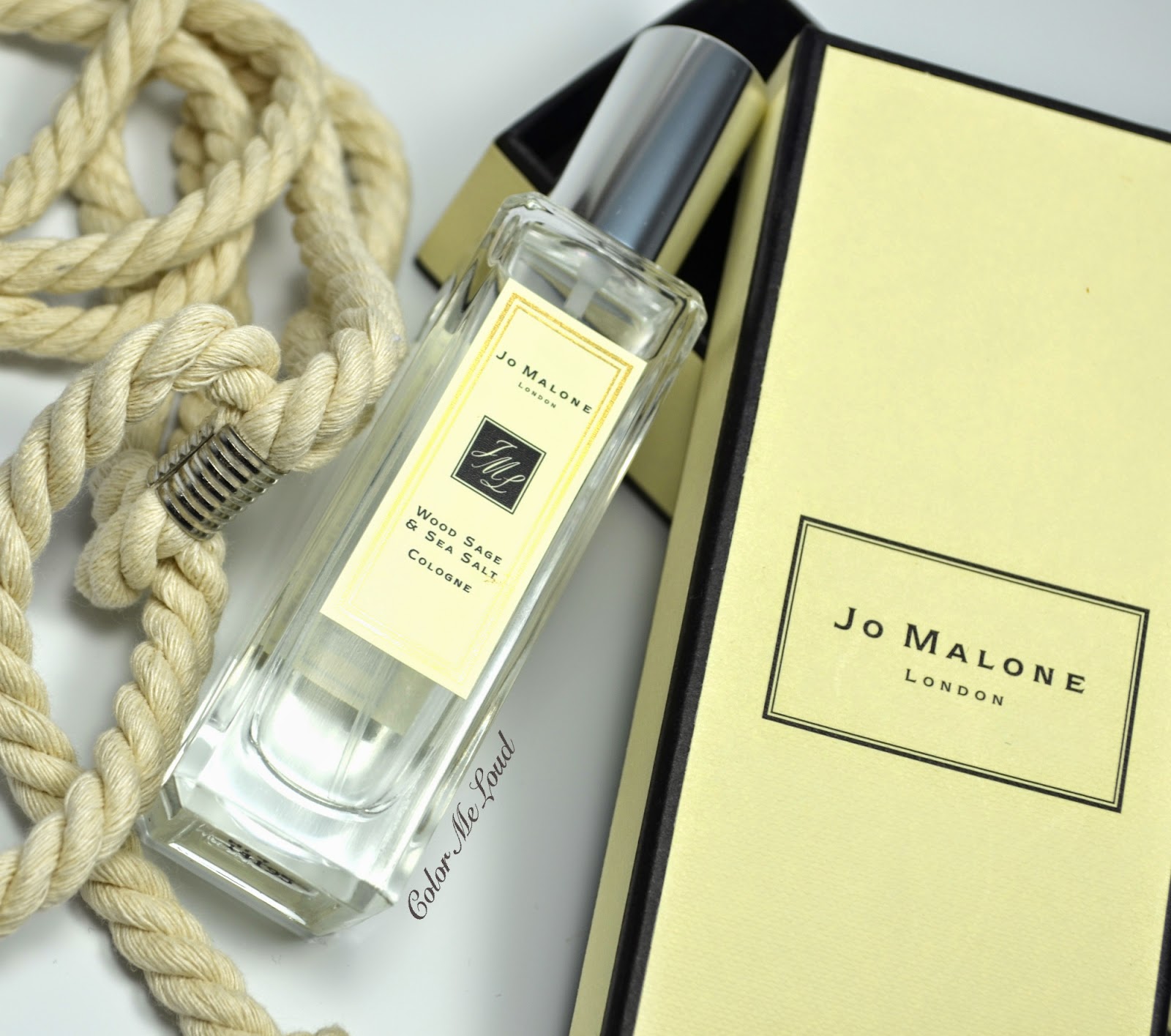
Jo Malone London Wood Sage & Sea Salt Cologne


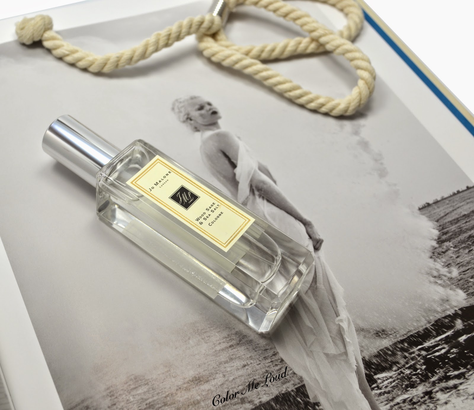
Jo Malone's newly release fragrance Wood Sage & Sea Salt spiked my interest because of my constant longing for sea climate, the fresh breeze and salt in the air. I love the detail in the packaging. Although the flacon comes in Jo Malone's chic carton box as usual, instead of a ribbon the box is wrapped with a sailor's rope. The nose behind Wood Sage & Sea Salt is Jo Malone's regular perfumer Christine Nagel, who now left the brand and joined Hermes as an in-house perfumer.

Wood Sage & Sea Salt opens with a kick of citrusy freshness of its grapefruit notes. Soon after I can smell the salt on my skin resembling a breeze from the sea. This phase of the perfume makes me happy. Since it has nothing fruity or exotic, it doesn't give the feeling of a summer holiday beach but as dry and woody it is on my skin, I can relate the scent with a coastal feeling, waves beating the rocks as the breeze messes up my hair. 

To me Wood Sage & Sea Salt is rather a linear perfume, which has a complex opening and a unique scent all along. As the citrusy opening slightly gets more woody with a ghost of sage appearing and vanishing yet reappearing, it might smell a tad spicy from time to time. As the musky base uses herbal ambrette, it has a tad of floral feel to it too. Very well blended, these notes never steal the scene to make this fragrance their own, make Wood Sage & Sea Salt one of the most complex fragrance of the brand.

Similar to most fragrances of Jo Malone, Wood Sage & Sea Salt is not particularly long lasting and it stays close to skin. On me I can notice it for 2 hours and smell it for 2 more hours. I would classify its sillage is moderate. I believe both men and women would enjoy this fragrance alike. 


Jo Malone London Wood Sage & Sea Salt Cologne

I have been a enjoying Maria Candida Gentile's Finisterre (reviewed here) which was my go-to fragrance this summer. I was asked how these two fragrances with similar themes compare. The sea notes in Finisterre is mainly coming from Ambergris, freshness provided by pine tree notes as during the dry down Sandalwood is pronounced. Wood Sage & Sea Salt on the other hand has a herbal musky base. Freshness comes from citrusy notes as our noses are more used to it, I would give a thumbs up to Finisterre to be more unique in this aspect. I prefer the blend of sea salt with woody notes on Wood Sage & Sea Salt though. Since the compositions and percentages are different it is hard to compare longevity, Finisterre stays up to 12 hours on me. 


Jo Malone London Wood Sage & Sea Salt Cologne

Final thoughts: Subtle and short but complex and unique, Wood Sage & Sea Salt is a great fragrance for those who are in search for something different for upcoming fall and for those who miss a breeze from the sea, as long as they don't mind reapplying after a few hours.


Have you tried Jo Malone's new fragrance? How important do you think longevity of a fragrance is?


Chanel Le Vernis Sweet Star for Fashion Night Out 2014 Nail Polishes, Review, Swatch & Comparison

$
0
0
We like complaining about it but no one can deny how much joy of hunting rare makeup gives. 

Did you find yourself opting for one over another because it was harder to get? Did you find yourself petting a rare brush, smelling an exclusive blush, sleeping next to a hard-to-find nail polish? 

I know, I know, these give pleasures like no one can understand but we do. Do we? Even after paying more than the twice of the item on evil Bay, I am asking myself, "where does it stop?".

Don't worry though, this post is about a very pretty duo multi-chrome Chanel nail polish, not about me weeping about how much it costed.

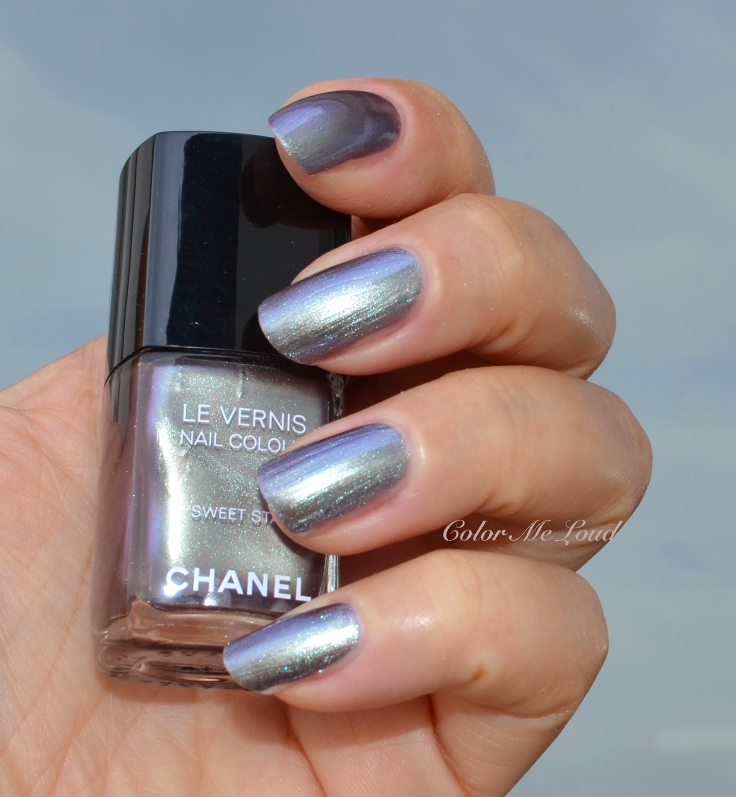
Chanel Le Vernis Sweet Star


Once a year Vogue Magazine organizes a fashion event called Fashion Night Out around the world. The cities picked for this event are rather fashion capitals or big metropoles. Since two years the event is not being carried out in the States but in Europe it goes on as before. In Germany FNO takes place in Düsseldorf and Berlin. During the event Chanel usually releases a set of nail polishes specially designed for that day, which is very difficult to get hold of since one has to show up in person, at the right place on the right time.

When it was taking place in the States, I was asking a friend to pick one for me from Chanel.com. It would go online even a week before the event took place. Last year I was fortunate enough since one of my best friends was in Berlin and she took them for me. This year I started to search for a solution a month before, asking at the forums, asking a few others... I was not lucky and time was running out. I might even gone so far and asked my husband to drive to Düsseldorf to pick up the nail polish (over 3 hours drive from here in one direction!). 


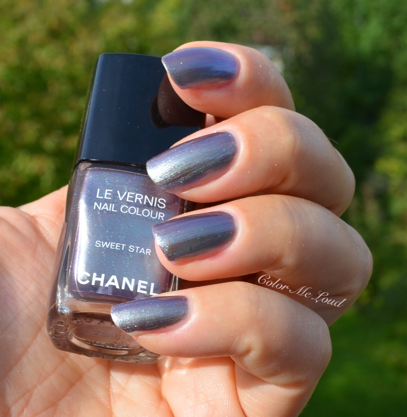
Swatch (sun): Chanel Le Vernis Sweet Star

During my stay in Turkey I called the Chanel Counter in Harvey Nichols Istanbul and asked them if they could arrange one for me. They would, if they could. Because they didn't receive the nail polish yet!

All the indications were pointing in one direction. I gulped and enter the "place bid" button at eBay. It was a little over the price of two nail polishes but probably it would have costed more to drive there and back, *cough cough*

Anyhow let me introduce you to Sweet Star. It is green, it is purple and it is gray. It may even look bronze at some directions. It is another metallic multi-chrome from Chanel, similar to Azure from Summer 2013 Collection. Sweet Star also has similar qualities in terms of shimmer under the sun or strong light, which are flashing green. 


Swatch (shadow): Chanel Le Vernis Sweet Star

I have made many photos to show you the different faces of Sweet Star. It is a unique and lovely shade, great for fall season since it looks like a complex grey most of the time. In terms of consistency, unfortunately mine was a little thin and showed all the imperfections on the nail surface. If your nails are not that smooth at the time you would like to wear it, I recommend applying a filling base coat first. The finish also is not free of brush strokes although I usually have a calm hand while application. If you hate brush strokes, this may not be for you either.


Swatch (flash): Chanel Le Vernis Sweet Star

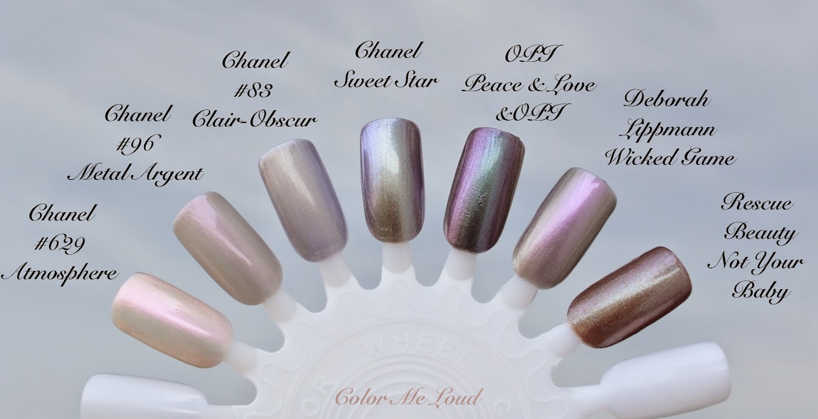
I suspected I might have similar shades in my stash since purple green grey multi-chrome is a shade which is done before and I love collecting. I am happy to report though, Sweet Star was unique. Below you can see the base by the shadow comparison swatches (1st photo) and the shimmer by flash (2nd photo). 

I have included Chanel Atmosphere because it has a similar finish but of course the colors are very different. Chanel #96 Metal Argent (discontinued) is also much lighter, closer to Atmosphere. Chanel #83 Clair-Obscur is also lighter, subtler and has a matte/frosty finish. One of my all time favorite duo-chromes OPI Peace & Love & OPI is more intense, has more green and less grey. Another favorite of mine, Deborah Lippmann's Wicked Game has more pink flash. Newly released Rescue Beauty Lounge's Not Your Baby from KDrama Collection is much warmer but under strong light, it has similar bronze tones to Sweet Star,


Comparison (shadow): Chanel Le Vernis Sweet Star
Comparison (flash): Chanel Le Vernis Sweet Star

Final thoughts: Chanel, very hard to get and very unique, read $$$ if you missed it. If it would be widely available, I would say, it is for those who like cool toned duo-chromes and who wouldn't mind somehow thin consistency and some brush strokes. Regardless of those, if you see it, be sure to get it. If you end up not liking it, you might have fun putting it up for sale and watching how high it goes.

Notes on availability: If you are in France, you can order Sweet Star at Chanel's online store. It is not released in US yet, but it should be available soon. After I posted nails of the day on Instagram, __smk__ let us know that it is now available at Chanel Covent Garden in London and will be available at Chanel boutiques in France next month. With so much upcoming releases, I expect the prices to go down very soon.

How much would you be willing to pay for a nail polish? Do you love or hate the very restricted releases? 

Chanel Rouge Allure Gloss One Click Collection Swatches, All Glosses, Nail Polishes #635 Expression, #639 Exception and new Rouge Allure Lipstick Shades, Review & FOTD

$
0
0
I must have forgotten how it feels like. Now I remember, having a cold is not fun. Nothing serious really but my sore throat and constant head ache prevents me from doing anything other than activities which require no brain, like shopping online, ugh, very dangerous!

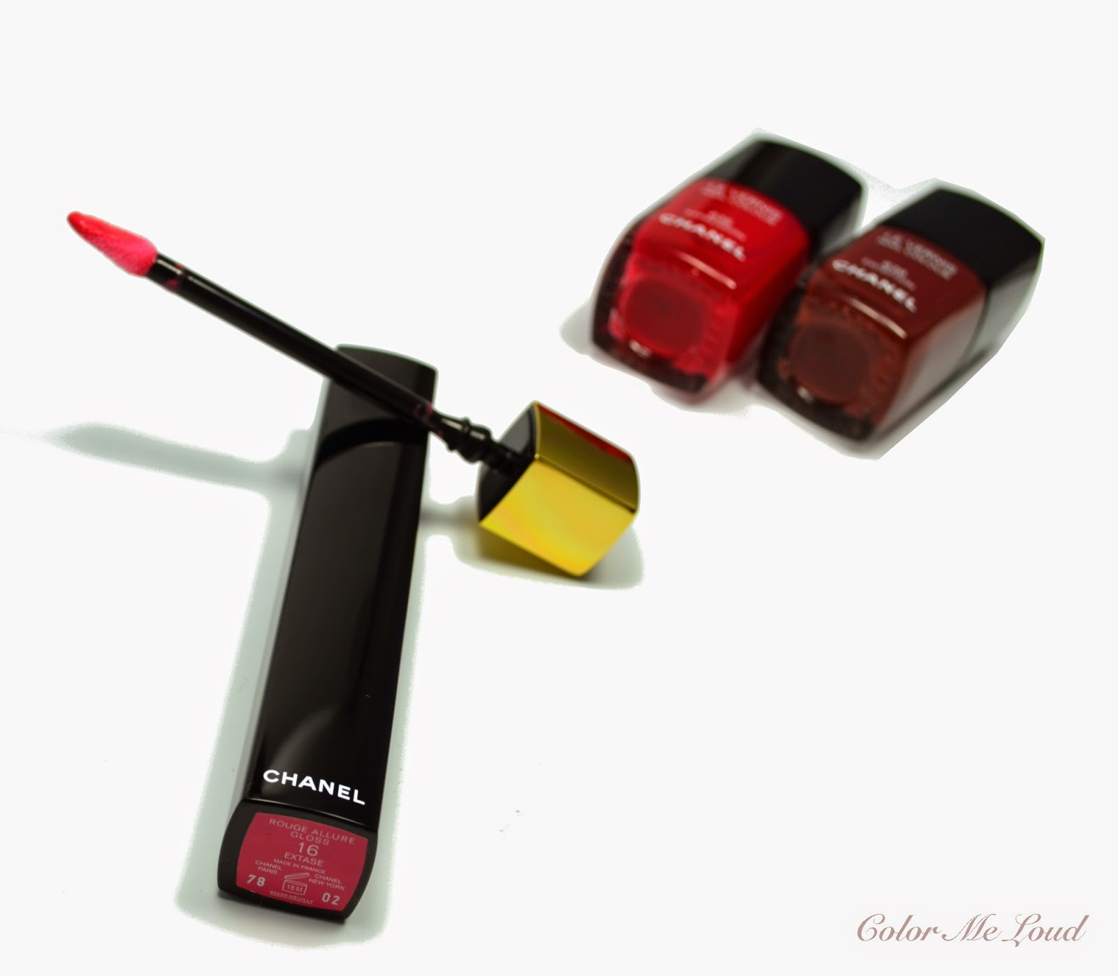
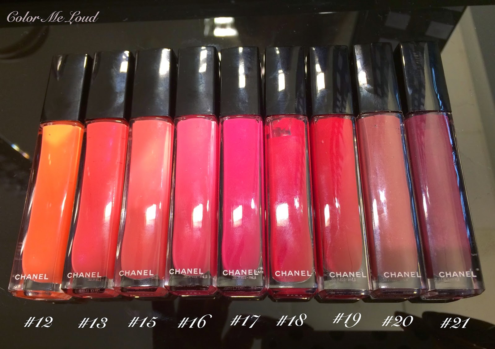
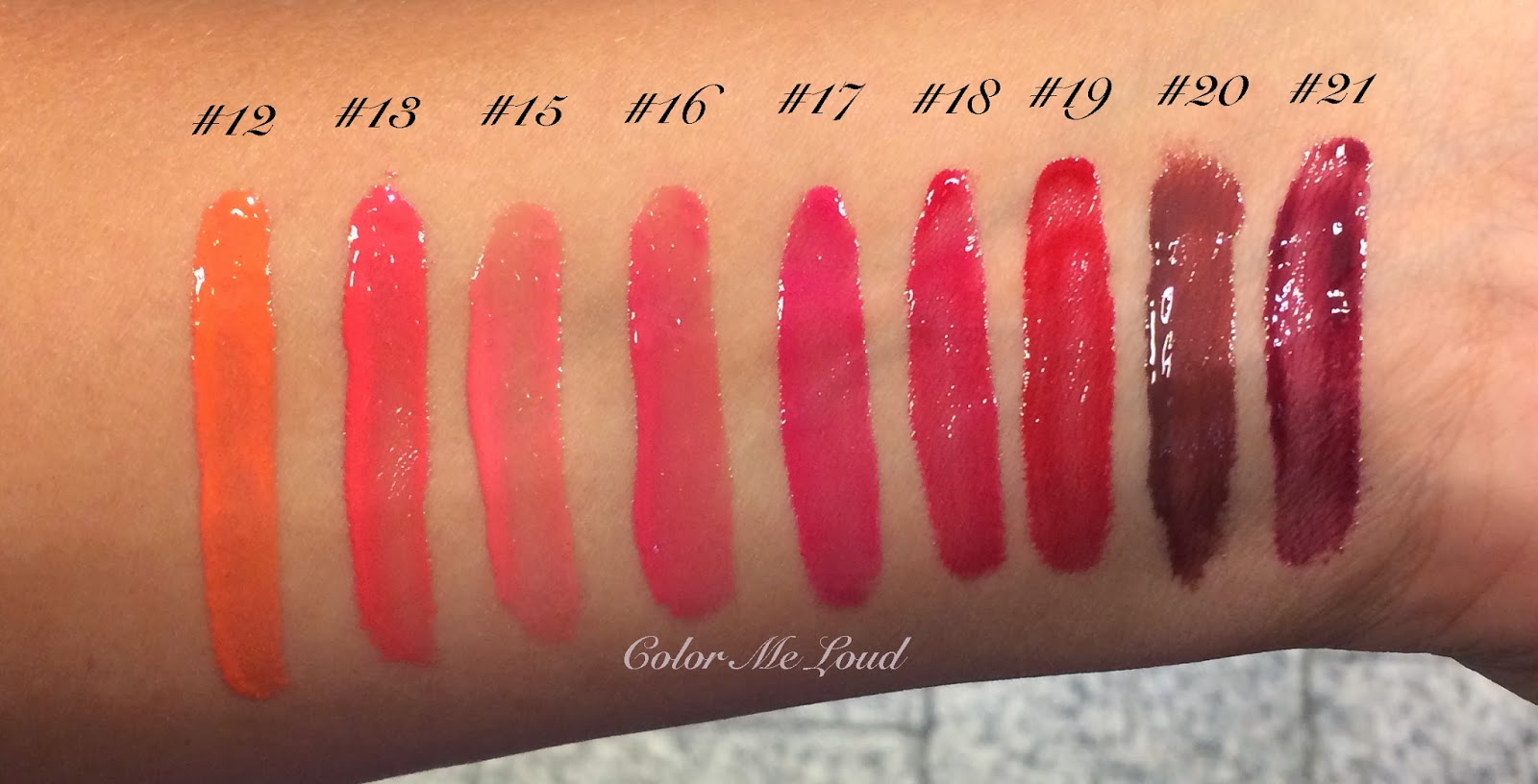
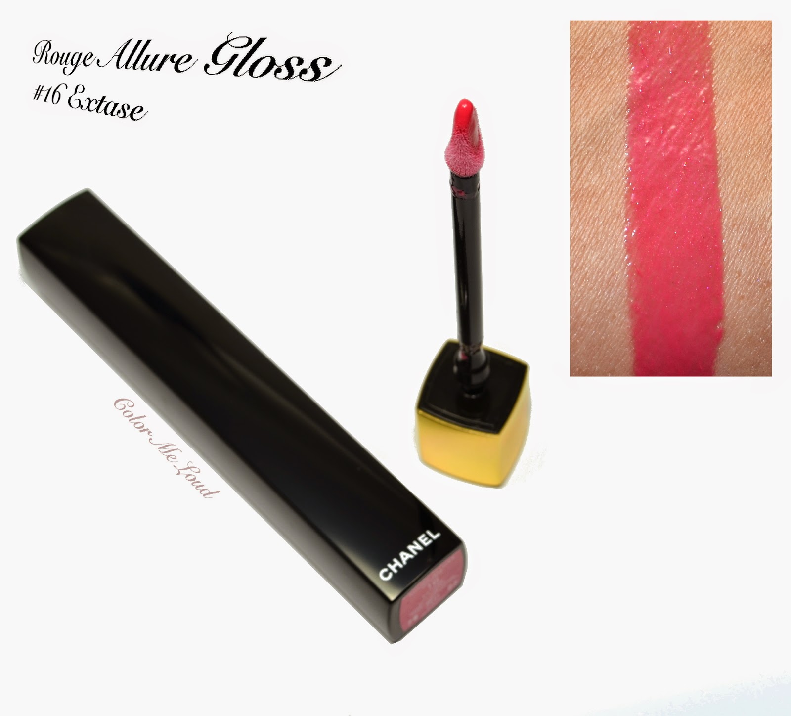
Chanel recently released a capsule collection around their new Glosses, Rouge Allure Gloss. These now open in a similar fashion to their signature Rouge Allure Lipsticks. You have to click on the top side and voila, the golden part comes up so you can take the brush out of the tube. Tube is black and opaque similar to Rouge Allure Extrait de Gloss. In this collection there are 3 new nail polishes, 10 Rouge Allure Glosses and 3 new Rouge Allure Lipsticks and one lipliner besides some re-promote products, shall we take a look?


My Picks from Chanel Rouge Allure Gloss One Click Collection featuring Rouge Allure Gloss #16 in Extase 


I would like to start with the nail polishes. The collection has three new nail polishes:

  • #633 Intention
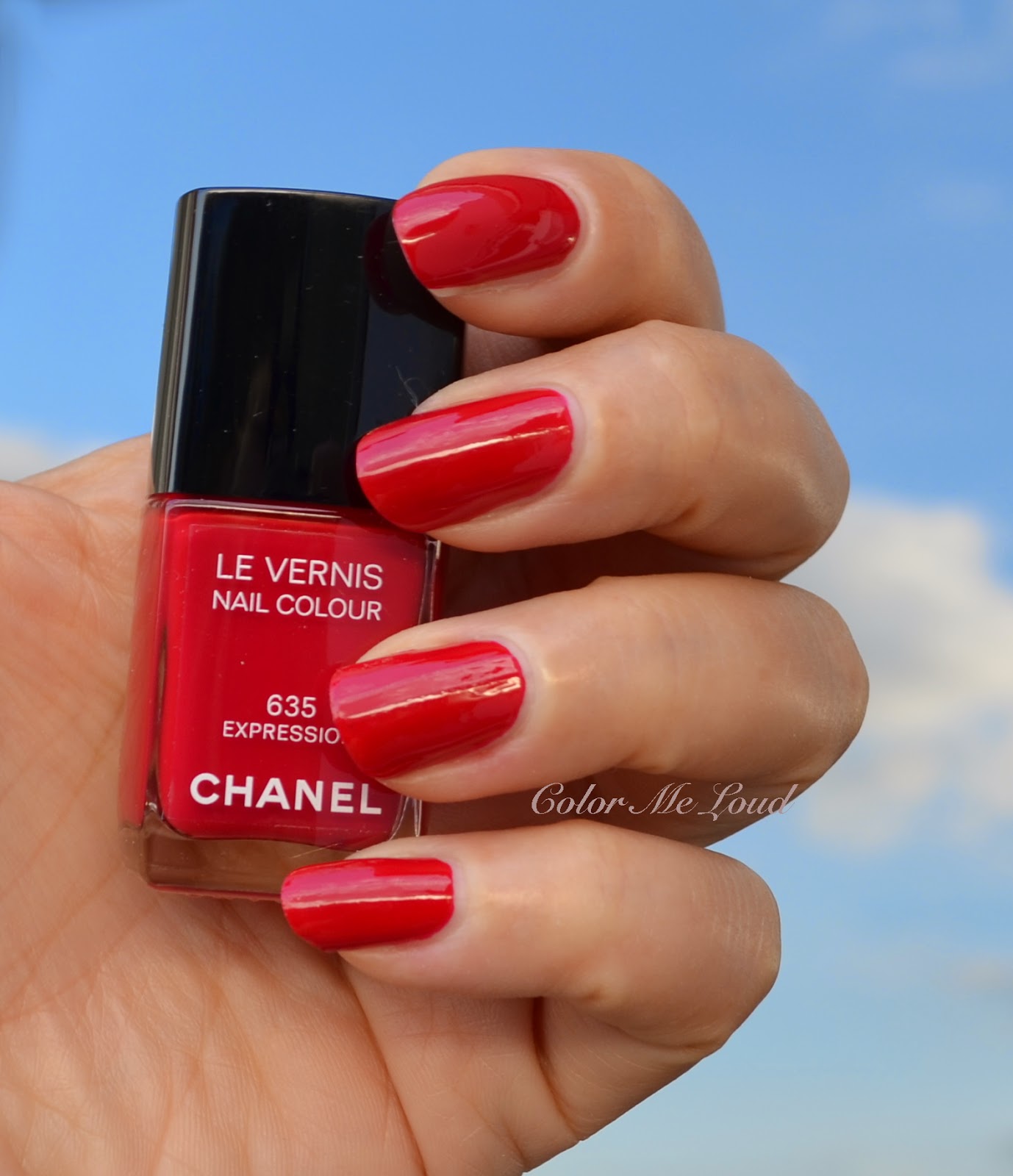
  • #635 Expression
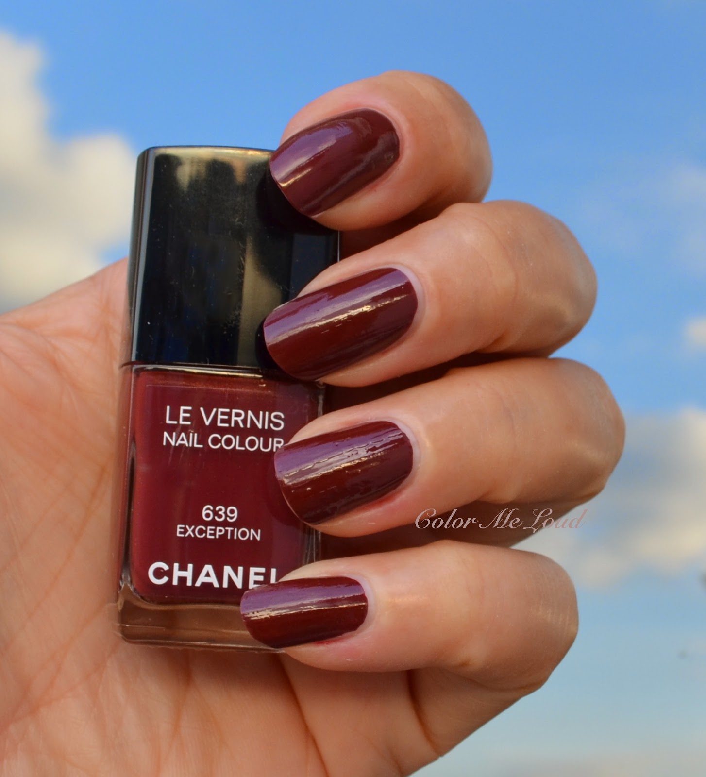
  • #639 Exception


Unfortunately Chanel decided not to bring one of them to Europe. The reason they stated was that the yellow undertones in #633 Intention (I found a nice swatch of it here) was not flattering for European skin tones. I will try to ignore their main streaming approach. I want to believe that they had hard time selling their stock of Beige and they want to prevent it from happening again. 

As #633 Intention stays to be another Chanel nail polish yet to be hunted (in case you see it, please contact me!), meanwhile I would like to show you the other two that I purchased.

Chanel Le Vernis #635 in Expression is a lovely blue based red cream. Just that I was thinking I don't wear reds anymore, I put on Expression to take photos and I didn't want to take it out. I loved the balance in there: not too bright (Rouge Rubis) nor too muted (Cinema), not too cool nor too warm. I am not going to go into a comparison effort here since it may take weeks. When I see Chanel reds coming, I sigh and remember my post 50 Shades of Red ;-) 

Consistency of Expression is great, I applied two coats for the photo below.


Swatch: Chanel Le Vernis #625 Expression

Chanel Le Vernis #639 Exception is a deep plummy/brownish red. I believe this tone flatters cooler and lighter complexions. Since I am tanned at the moment, I didn't like it on me and so rather a miss for me. I will try it again after my tan fades. The very interesting news though is that the below photos are taken with just one coat. Yes, this is a one coater!


Swatch: Chanel Le Vernis #629 Exception

There are in total ten new Rouge Allure Gloss shades. We received nine of them in Germany. I decided to swatch them for you. Thank you very much for lovely SA in Stuttgart Breuninger for helping me out with the swatches. If you ever come to Stuttgart Germany, you should definitely drop by Breuninger and chat with Chanel stuff there. 

Here is a list of the colors released here:

  • #12 Exotique is a mid-toned orange beige. On my lips it looked very natural, not too orange. I might go back for this one if I learn to get along with the package (read on for my thoughts on that one).
  • #13 Affriolant is a mid-toned bright warm pink. I tried this one and #16 Extase, to compare. They are very similar but Affriolant would flatter warmer skin tones as well as those of you who usually opt for brighter lip shades.
  • #15 Sensible is a light milky cool pink, I haven't tried it but if you like cooler paler pinks, this is your shade.
  • #16 Extase is a mid-toned cool pink with a touch of mauve undertone. This is definitely my shade from the nine here, hence my pick. You can see my FOTD at the end of this post.
  • #17 Supreme: A lovely fuchsia which is not too bright. I was thinking about buying it until I put it on at the counter, came home and realized it would be hard for me to wear with stronger eye looks. Nevertheless this shade is lovely.
  • #18 Seduction: A cooler red for those of you who like blue-based reds.
  • #19 Pirate: The signature red of Chanel, now in their new gloss formula. I own that one in Rouge Allure form, I rarely wear it so I haven't tried it.
  • #20 Audace (limited edition): I was very intrigued by this plummy brown. After trying it out two times and make sure I am not missing it (it is limited edition), I safely skipped it. SA told me that it is a best seller at the moment, but again similar to Exception on my nails, this one was too brown for my face. 
  • #21 Distinction is a deep plum, which you might want to check out for this season. It is not too purple so easier to wear for warmer complexions.


Chanel Rouge Allure Gloss One Click Tubes
Chanel Rouge Allure Gloss One Click Swatches

Before I go into how I feel about the new Rouge Allure Gloss formula and packaging I would like to show you the swatches of the three new Rouge Allures and similar shades from the permanent line. Three new shades are:


  • #149 Elegante: A deep plum, it is deeper and a tad cooler than Envoutante.


  • #148 Foudroyante: A mid toned to deep rosy brown. It is a bit lighter and has more rose in it once compared to Farouche.
  • #146 Craquante (limited edition): A light cool pin, it would be flattering on lighter complexions. It is cooler and lighter than Seduisante.


Chanel Rouge Allure Gloss One Click Collection, Swatches & Comparison of new Rouge Allure Lipsticks.

I picked up #16 Extase to try the new formula out. Here are my thoughts:

Formula

I find the formula to be a cross between regular Chanel glosses and Rouge Allure Extraits. It has the pigmentation of Extraits but look of a gloss if that makes sense. 

Some of the shades have some micro-shimmer in them but all in all they are glossy but not metallic nor shimmery. If you like wet lip looks you might like the formula.

These didn't stay long on me, max. three hours. If you eat or drink something, you have to reapply.

Packaging:

Although I like the idea of clickable gloss packing and love the package of Rouge Allure Lipsticks, I don't find this very practical once used. The reason is that you have to live with the amount which comes on the applicator, you can't get rid off the access by rubbing it to the neck of the tube because this neck doesn't exist anymore. If you are done i one swipe, great. If you want a little bit more for here and there, you end up getting too much product. 

I also don't see a particular advantage of a clickable package. For the lipsticks, it is great because it doesn't open in your purse but Extrait Glosses had a twist tube, which had no disadvantages.

Thumbs down for the packaging in my opinion.

Price:

Chanel Rouge Allure Gloss One Click costs exactly the same as Rouge Allure Extrait de Gloss, around 33 € in Germany. Be aware though, you are getting 6 g (0.20 OZ) of product instead of 8 g (0.28 OZ).  


Chanel Rouge Allure Gloss One Click #16 Extase

Here is me wearing Rouge Allure Gloss One Click #16 Extase. I am not a gloss girl and given the less product for same money and a tricky to use packaging, I believe I got all what I wanted from the collection at the moment. I just have to hunt Le Vernis #633 Intention down. Below I combined Extase with MAC Fun Ending Blush on the cheeks. I will post about the eye makeup this week ;-)


FOTD: Chanel Rouge Allure Gloss One Click #16 Extase

Final thoughts: Although I like the shades, Chanel Rouge Allure Gloss One Clicks are rather a miss for me since they have less product for same money and the packaging is really not practical to use and prone to waste of product. The nail polishes and Rouge Allure Lipsticks from the collection are worth to check out, they are permanent though so take your time.

Availability:
Chanel Rouge Allure Gloss One Click Collection is started launching in Europe. It will be available in the States in October.


I would be very interested in your thoughts on this, do you like the new packaging? Do you see an advantage of clickable tube? 

MAC The Matte Lip Collection, Swatches of All Lipsticks and Blushes and Review of My Picks

$
0
0
One of the most coveted Fall Collection of MAC started to hit the stores. Since I still have bad sore throat and not feeling all that well, I thought it might help your picks and I gave myself an hour (challenge!) to prepare this post. If you see typos or strange photo effects here and there, you know I was trying my best.


My Picks from MAC The Matte Lip Collection


I picked up four shades from this collection but swatched every shade for you under the sun. I think the swatches are color correct. My picks are: 

  • Nouvelle Vogue: Love at the first sight.
  • Pander Me: A great nude for that matte days.
  • Styled In Sephia: I was ready for the challenge to make it work.
  • Heroine: This one is permanent but I didn't picked it up before. Since there was some reduction going on, I thought I would.

You can find lip swatches of first three at the end of the post. Fashion Revival is a very nice shade but I thought it would look too red on me and didn't have time nor the energy to try it out. Now I think I already started having skippers remorse :-( I will try to catch it once it goes online, or maybe I shouldn't. Decisions, decisions...


MAC The Matte Lip Collection, swatches of all shades under the sun

I skipped Living Legend because I just picked up Lingering Kiss a few weeks ago and these are really close. If you missed Lingering Kiss, you might want to get Living Legend. Comparison shows Living Legend is a tad darker and slightly cooler.


MAC Lingering Kiss vs. Living Legend

I picked up Make You Mine from the blushes, I don't think I have anything like it, it is like a salmon color. I found Fleeting Romance a little too bright for this season and I Am A Lover to be too cool for my tanned skin at the moment. I also have Fun Ending from A Novel Romance and I think I can reach for that one if I need a light & cool blush.


Blush swatches of MAC The Matte Lip Collection

MAC Nouvelle Vogue was the only one I wanted originally. It is a great natural pink which is not too light nor too dark. I can imagine wearing it all year around. The matte formula of these are very comfortable, doesn't accentuate the lines or dryness. 


MAC Nouvelle Vogue from MAC The Matte Lip Collection

I then thought I would pick up Pander Me because it reminds me of a pumpkin soup and I started getting in that mood as Halloween approaches. I will wear it with the blush "Make You Mine" and I think it will be a great combo. I think Pander Me makes a great fall nude lippie.


MAC Pander Me from MAC The Matte Lip Collection

Styled In Sepia, I can see this one not selling out as the other colors do. In fact there is one online store and this one is the only one left at the moment (together with Heroine, which is permanent). Styled in Sepia would work on cooler skin tones as a statement lipstick which is not too dark. I am willing to try and combine it with different blushes or eye makeup. I thought if it doesn't work, I will use it as a cream version of Chanel Notorious to contour ;-) We will see.


MAC Styled In Sepia from MAC The Matte Lip Collection

Although I had lip swatches of heroine, I thought I save the time to edit it at the moment since web is full of those swatches. 

This is my very quick review, I hope it was helpful. All in all, I love the shades and the formula is very comfortable. Recommend you all matte lip lovers to check these out.

Which of the products are you eyeing from this collection? What are your thoughts about matte lips?

Yves Saint Laurent Couture Palette 5 Couleurs #11 Ballets Russes Swatches, Review & FOTD

$
0
0
You might have noticed that I am rather silent at social media and behind answering the comments. As the work is getting the best of me together with a nasty cold which I caught earlier this week, I am trying my best to show existence so please bare with me. I am hoping to make a return in a weeks time. I can't wait since I have so many beautiful new fragrances and make-up products to share with you. I am kicking myself not to be able to smell properly and my puffy eyes and nose are not that great for carrying makeup but luckily I had shot a few FOTDs before it all began. Today it is about a very special palette, Yves Saint Laurent Couture Palette 5 Couleurs #11 Ballets Russes.


Yves Saint Laurent Couture Palette 5 Couleurs #11 Ballets Russes


YSL 5 Couleurs #11 Ballets Russes is special for me not only because of its very unique color and texture combination but also because I purchased it during my visit to Strasbourg for my birthday. Three of the palettes from the regular line up (see the swatches here) were not released in Germany yet and I was dying to try out #11 Ballets Russes. As I swatched it at Sephora, I knew it was coming home with me.


Yves Saint Laurent Couture Palette 5 Couleurs #11 Ballets Russes

From the abundance of photos, you see that I am very fond of how this beauty poses. Antique gold, pink, baby blue and purple, such an interesting combination. Designed as a homage to russian ballet costumes, the purple and gold combination certainly gives an eastern flair. The combination of cheerful pink and cool baby blue, like fire & ice, brings the palette to life and separates it from any other you know.


Yves Saint Laurent Couture Palette 5 Couleurs #11 Ballets Russes

I was expecting the shades to be less pigmented and more shimmery not to scare people off by the first swatch but I was positively surprised to see how pigmented they are. That said the textures, other than the antique gold base shade, have a certain transparency to it. This helps to blend such different colors together seamlessly, so that they work together. I was impressed by how nicely they blended despite of shades being so different from each other. You might heard me complaining about YSL Palettes tending to blend a bit too much, too easily. This property might be a little off putting if the shades are very close, because you can't differentiate the difference of each eye shadow. But once the shades are very bold or very different, it becomes a huge advantage.


Close-up: Yves Saint Laurent Couture Palette 5 Couleurs #11 Ballets Russes

The shades in the palette are as follows:

Top left: Mid-toned antique gold with satin to metallic finish, the most opaque shade of the palette.

Top right: Light gold with shimmery finish. This shade is the most transparent of all, can also be used to be layered on other shades.

Center: Mid-toned to deep purple with satin to shimmery finish. I love how this shade catches the light, it certainly can be applied all by itself for a purple smokey eye.

Bottom right: A light baby blue with satin to shimmery finish. I love this one on the inner corner to bright the light to the eye make-up.

Bottom left: A mid-toned reddish pink with satin finish. It is the most satiny, less shimmery shade of the palette and the color is very intense. A touch of this goes a long way so apply with caution.


Swatch: Yves Saint Laurent Couture Palette 5 Couleurs #11 Ballets Russes

For the eye look below, I used:

Inner corner: Baby blue (bottom right)
Crease: Purple (center)
Lids: Antique Gold (top left)
Outer Corner: Pink (bottom left)

Liner (below): Chanel Stylo Yeux Waterproof #911 Ambre Dore
Liner (above): Urban Decay 24/7 Twice Baked 
Mascara: Chanel Le Volume

From the eye look below, you can see why I am so crazy about this palette. The shades do blend but they can still be recognized. The resulting look reminded me of sun set (purple, pink, gold) on a clear sky(blue).

In-action: Yves Saint Laurent Couture Palette 5 Couleurs #11 Ballets Russes

To combine with this colorful eye, I went for something low-key on lips & cheeks. I lightly dusted applied Tom Ford Flush on the cheeks and applied Chanel Allure Gloss #16 Extase (reviewed here) on my lips.


FOTD: Yves Saint Laurent Couture Palette 5 Couleurs #11 Ballets Russes

Final thoughts: YSL's new eye shadow formula sings a ballad with in this particular palette. With its beautiful textures and a very unique color combination, YSL Couture Palette 5 Couleurs #11 Ballets Russes is a winner. I recommend to try it out even if you are a little shy of colors. You will be surprised how wearable it turns out to be.


Availability: This spring, it was first released at a few countries such as USA and France. As of September, YSL #11 Ballet Russes is available at all YSL Counters.

What do you think of this color combination?

New Fragrance of Burberry, My Burberry Eau de Parfum, Photos & Review

$
0
0
“Last night the rain spoke to me
slowly, saying, 
what joy to come falling out of the brisk cloud, 
to be happy again in a new way on the earth! 

That’s what it said as it dropped, 
smelling of iron, 
and vanished like a dream of the ocean
into the branches and the grass below."


Mary Oliver

My Burberry Eau de Parfum by Burberry

Brand new fragrance from the house of Burberry were to be designed to represent a piece of fabric, a classical clothing, even a life style... Their signature trench coat should be put in a bottle. The nose selected for this mission was no other than renowned and talented Francis Kurkdjian. As an admirer of most of his creations (e.g. Eau Noire), once the fragrance was first released in September, I was on holiday but couldn't wait to check it out. I rushed by the counter at the airport as they were calling for the boarding, my first encounter with the flacon which is feminine in a chic and understated way. Then comes the first sniff...


My Burberry Eau de Parfum by Burberry

Right before we enter the gardens of Kurkdjian, let me talk about the flacon a little more. It is made of heavy and thick glass and ornamented by gold letters in contrast. It feels luxurious and feminine but casual and urban. The fabric used as a ribbon is Thomas Burberry's gabardine and signed by the words "Woven in England".  The stopper is inspired by the button of trench coats, each bottle has a unique pattern on it. Once I hold this bottle in my hand, I can't stop but admire the details.


Details make it, My Burberry Eau de Parfum by Burberry

Kurkdjian explains his creations with these words:

“by London, an urban garden. You have the vibrancy of the city, so it is something contemporary. You have the garden. You have the flowers…and the art of gardening, which is very important for the British. The flowery aspect of the perfume comes from that idea of the garden after the rain. You have the lush wetness. You have the soil. You have the earthiness. All of these feelings.”

The notes listed as follows:

Top Notes: Sweet Pea, Bergamot
Middle Notes: Geranium, Freesia, Quince
Base Notes: Patchouli, Damask Rose, Centifolia Rose


My Burberry Eau de Parfum by Burberry

Right after I spray the fragrance onto my skin, it pronounces itself as a care-free fresh floral bouquet. I can't sense bergamot on me, other than the feel of freshness it provides. As the heart of the bouquet starts appearing, geranium leaves naturalizes the femininity into a low key pleasant scent, like a breeze bringing the best of the garden to your nostrils. At this stage, despite being slightly fruity, it must be the quince, it never appears light hearted.  As the patchouli brings the scent of earth into the garden, we know why the fragrance is told to represent a garden after rain. It is just right amount of patchouli on me to balance out the femininity of the flowers. After a few hours, roses start taking over the bouquet with their elegant presence. These are the old garden roses such as Damask and Centifolia with certainly an urban feel to it as patchouli lingers. 

My Burberry is very long lasting on me (over 12 hours), has a pleasantly moderate sillage which makes it a great day/office scent. As the flowers never become too rich and it is well-blended, I would feel confident in recommending it also for those of you whose first choice are not flowery scents.  For winter, I opt for warmer scents, but I can see myself wearing My Burberry in fall as a spirit lifter and also during spring and even into summer. 


My Burberry Eau de Parfum by Burberry

Final thoughts: My Burberry is an urban chic floral which pronounces a femininity with a touch of masculinity.  It is understatedly beautiful, modern and well made. Its luxury is hidden in details. Be sure to pay a visit to your counter to join the experience. 

Availability/Price: My Burberry is now available around the globe, priced as 90 ml (118 €), 50 ml (82 €), 30 ml (55 €). If you can't get enough of it, you can even order a 900 ml from burberry online shop.

Have you tried My Burberry yet? Do you like florals?


The product in this post is provided free of charge for my consideration. 
I am not paid for this review, all opinions are honest and my own.


Viewing all 679 articles
Browse latest View live