Quantcast
Channel: Color Me Loud
Viewing all 679 articles
Browse latest View live

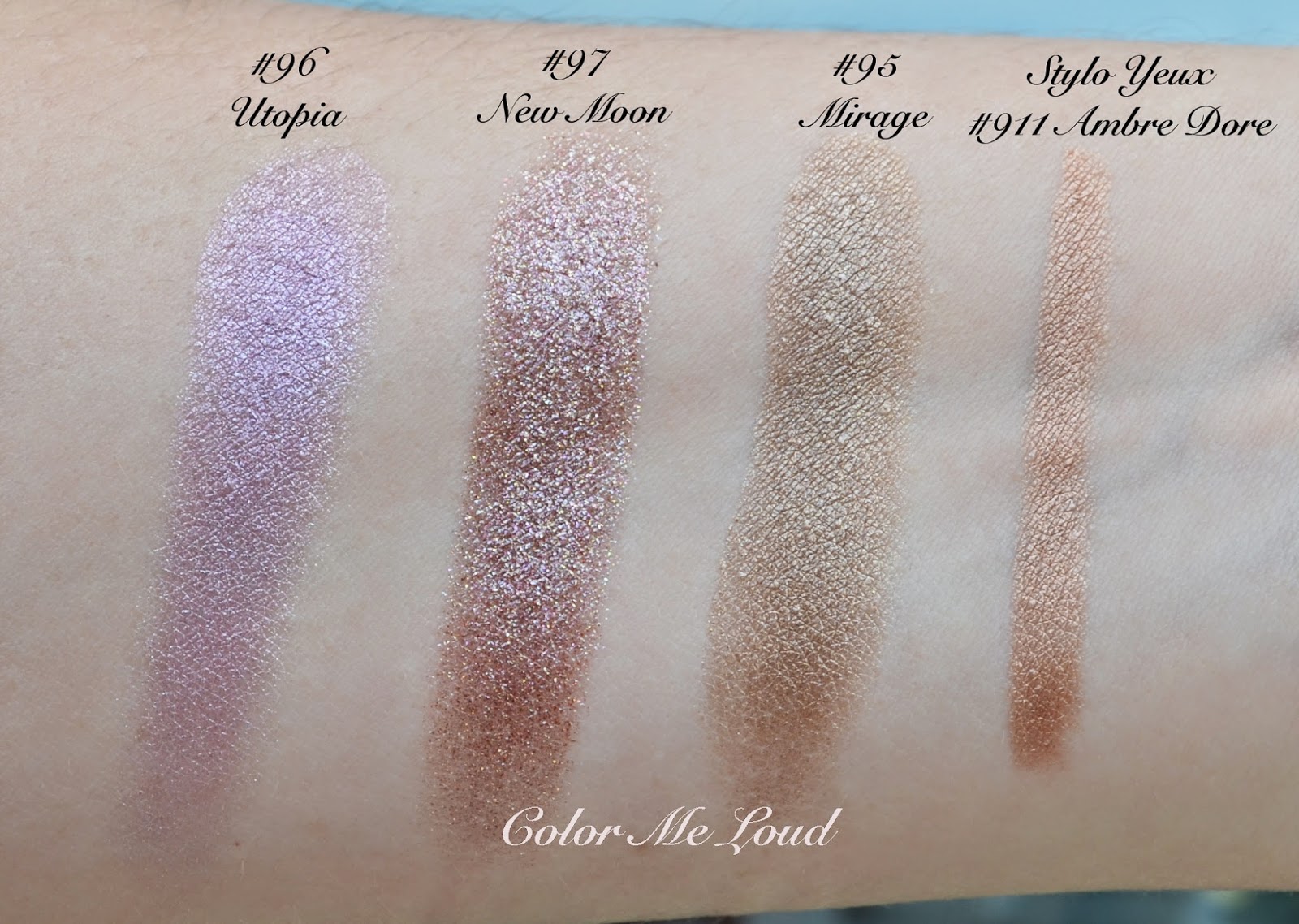
Chanel's Summer Eyes, Illusion d'Ombre #95 Mirage, #96 Utopia and #97 New Moon, Stylo Yeux #911 Ambre Dore from Reflets D'Été Collection

$
0
0
I hope you are all having a wonderful weekend. My plans are shopping, watching world cup and get a good nights sleep. I have been playing with Chanel's eye releases from their Summer 2014 Collection Reflets D'Été and have been asked a few times to tell my thoughts about it. I am a big fan of Illusion d'Ombre formula and use them often for a simple and quick look in the morning. I was very much in love by the recent ones from Spring 2014 Collection, Diapason and Impulsion and Holiday 2013 Collection Fatal and Initiation. So when I have heard that there were three more shades coming up, I was very excited to try them out.
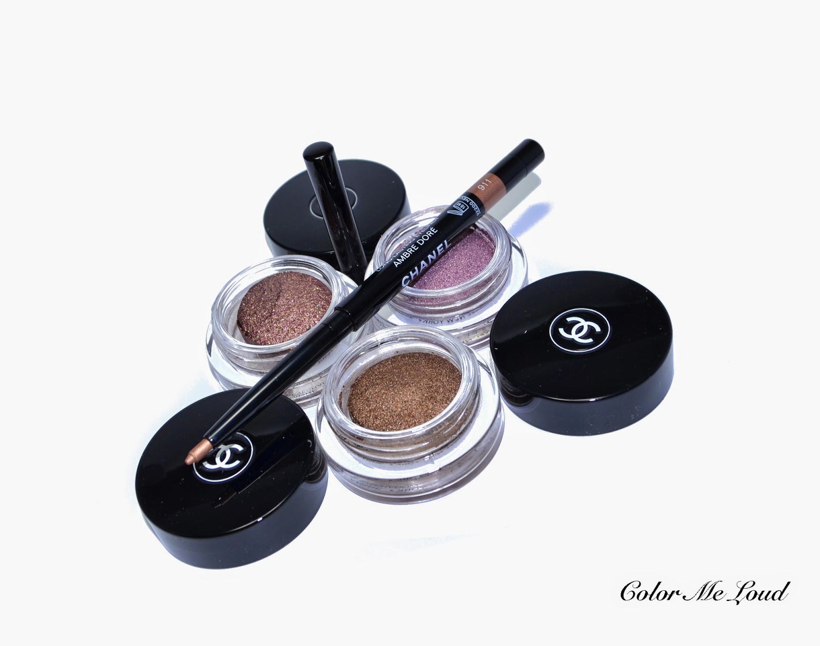


Chanel  Illusion d'Ombre #95 Mirage, #96 Utopia and #97 New Moon, Stylo Yeux #911 Ambre Dore

#95 Mirage is defined as bronze. It is a khaki gold with multi-colored shimmer. The shimmer in this one is not over the top, it is close to the shimmer in Fatal which is there but easy to wear for a day look. 

#96 Utopia is defined as luminous lavender. It is a cool pinky lilac. It is close to the nail polish shade Sweet Lilac (reviewed here) in a sense that I would expect to get more lilac/lavender but it looks  more like pink on me. The shimmer in this one is also subtle and suitable for a day wear all over the lid.

#97 New Moon is the stunner of the collection and it is full of surprises. It is described as luminous copper but the definition of "luminous" in this one is different than that of Utopia. The first time I applied it, I did so with day light since I like applying my make-up like this. I applied more and more to get the opacity, then I went to the restroom to clean my fingers (which I used for applying) and wow! It was as if I applied whole bottle of glitter on my eyes. This one changes so much with light so I recommend applying it under "strong light" and with a "light hand".
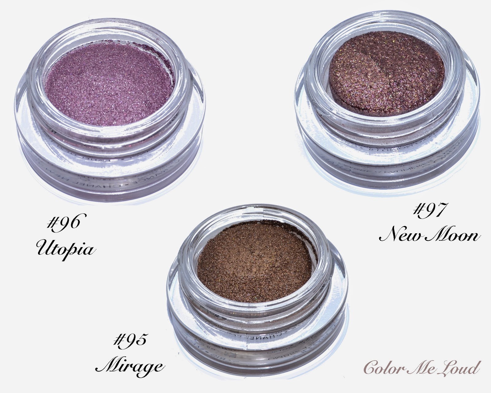

Chanel Illusion d'Ombre #95 Mirage, #96 Utopia and #97 New Moon

There is also a new Stylo Yeux Waterproof Eyeliner, #911 Ambre Dore, which is a coppery gold. This one has a very soft formula which applies easily but you have to be very cautious not to take too much out because it breaks easily. My first one broke by the first application and I got a replacement. Now I am afraid to use this very lovely shade. If you have blue eyes, you need this one to use it lightly on your water line.

Chanel Stylo Yeux #911 Ambre Dore

Below you can see two set of swatches with sun and in the shadow. The shadow swatches show the base shade and sun swatch shows the glitters and shimmers. Look how New Moon looks like with direct light to understand what I mean. You can see the difference of blink ratios (if there is something like this), Mirage & Utopia being nice, multi dimensional and not over the top, New Moon is blink plus plus and pretty for those of you who like glitters on the eyes.


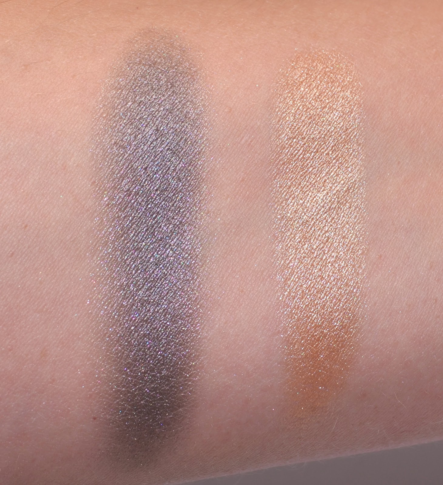
Swatch (sun): Chanel Illusion d'Ombre #95 Mirage, #96 Utopia and #97 New Moon, Stylo Yeux #911 Ambre Dore
Swatch (shadow): Chanel Illusion d'Ombre #95 Mirage, #96 Utopia and #97 New Moon, Stylo Yeux #911 Ambre Dore

Here are a few comparisons to other Illusion d'Ombres. Utopia is a unique addition to the line. Although I prefer Illusoire (one of my all time fav) to this one, Utopia is still pretty. Just wished it would be a touch cooler and more lavender than it is. Unfortunately it also lacks the funky duo chromish light games only Rose des Vents and Diapason can do.
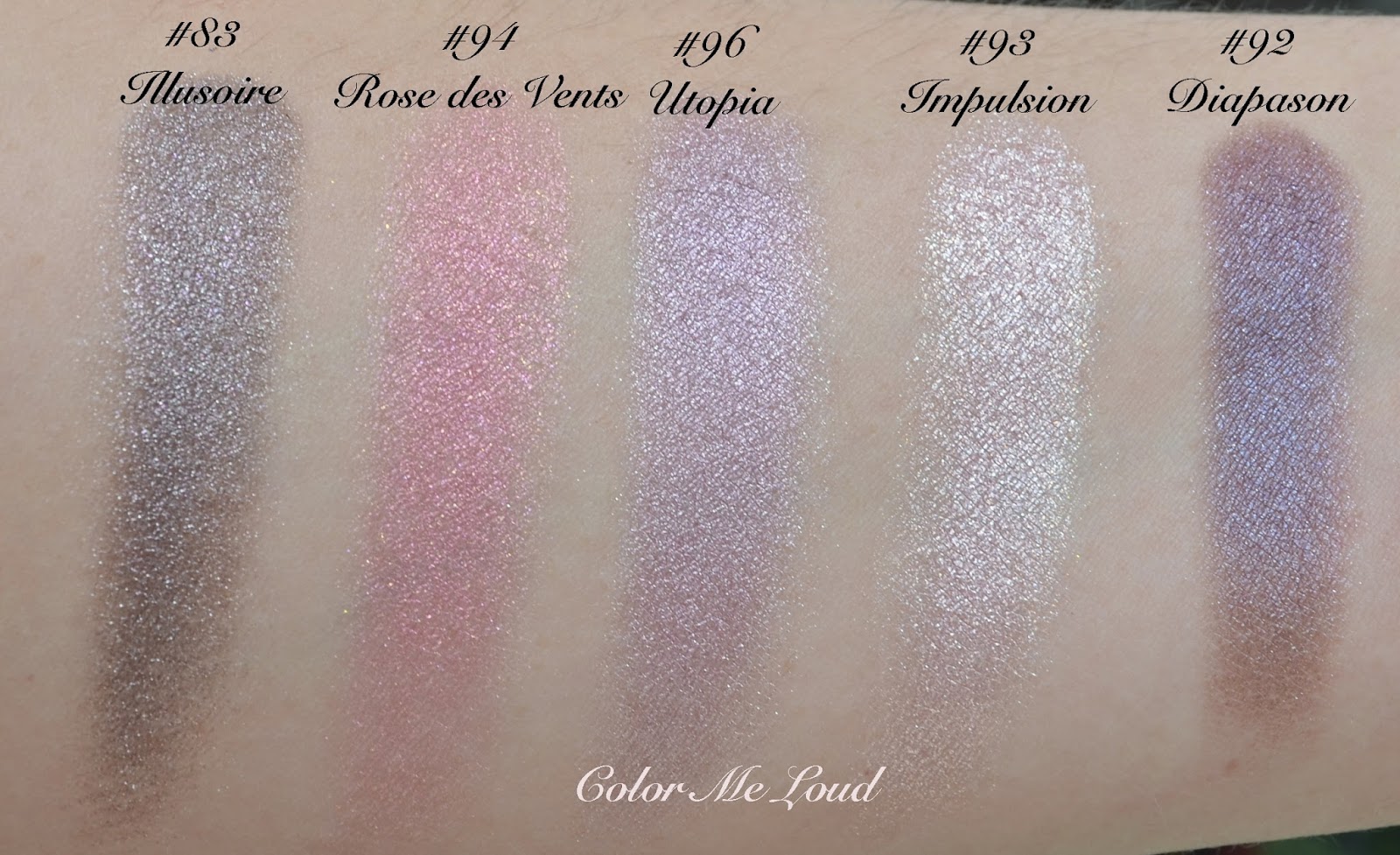

Comparison swatches: Chanel Illusion d'Ombre #96 Utopia

I like wearing Utopia with black eye liner, like seen below. Now you can see that it looks more like a cool pink on the lids and not very much like lavender. I can see that being an advantage for warmer complexions being able to pull this one off but for me I would wish for a little more blue in there.
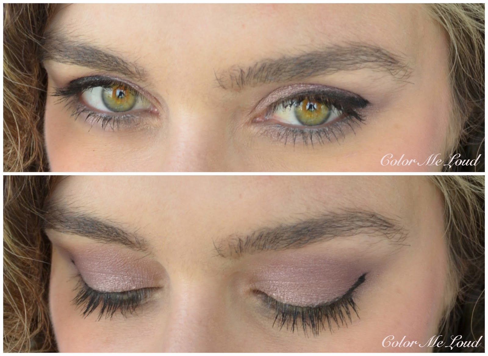

In-action: Chanel Illusion d'Ombre #96 Utopia

#95 Mirage is close to Initiation, like a slightly darker and less shimmery version of it. I like Initiation and found Mirage to be a bit subdued, but probably that is just me because I can see that everyone loved it. It is a great swipe and go shade. This one can also be used all year long. Comparisons show that Apparance and Vision are more Gold, Epatant is more green and cooler.
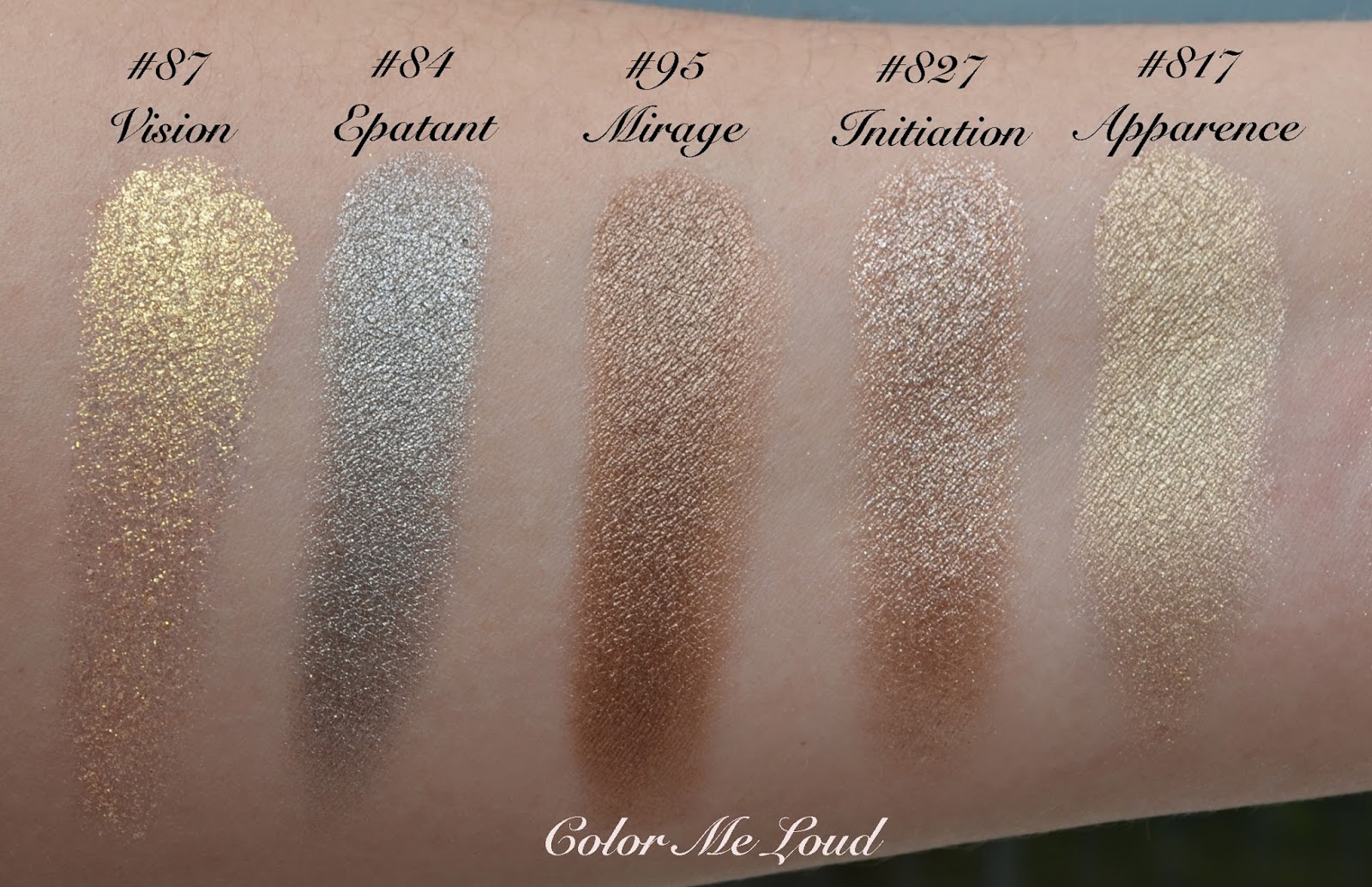

Comparison swatches: Chanel Illusion d'Ombre #95 Mirage

The most blink Illusion d'Ombre to date was Initiation and who would expect that this record would be broken by New Moon.  New Moon is the glittery version of Fatal, which I truly love and can't get enough. New Moon though, is a little too glittery to be worn on its own for me. It does work wonderfully when slightly padded on the lid to add a little bit of something to the eye make-up, or to use as a base to bring matte to satin colors to life.
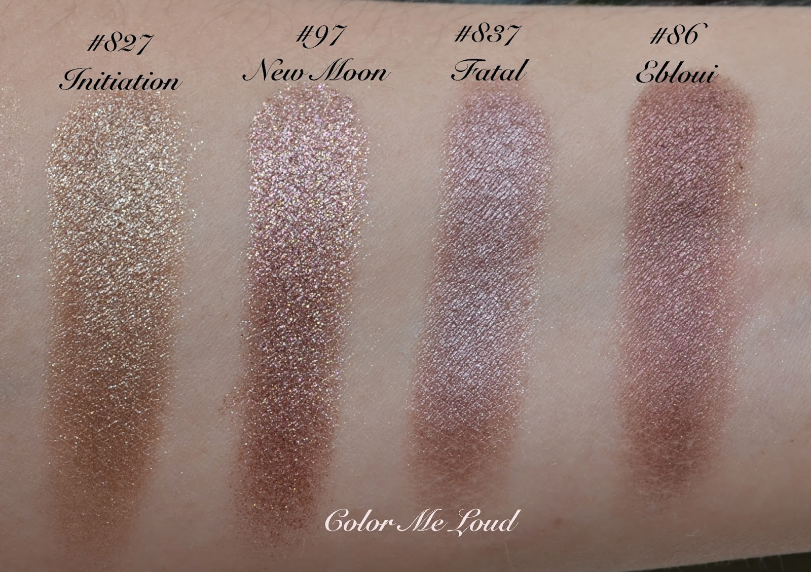

Comparison swatches: Chanel Illusion d'Ombre #97 New Moon

Below I am wearing Mirage all over the lid with a touch of New Moon on the center. This way they combine nicely. As I previously mentioned, I have to make sure that I apply New Moon with a strong light, to not to over apply it. 


In-action: Chanel Illusion d'Ombre #95 Mirage and #97 New Moon

Here is the whole look using Cream Blush in Cheeky and lipgloss in Happy from the same collection. Mirage & New Moon on the eyes.

FOTD with Chanel Illusion d'Ombre #95 Mirage, #96 Utopia and #97 New Moon

All in all, I am not blown away by these three releases as I was with Fatal, Diapason, Rose des Vents or Initiation. They are though pretty and unique additions to the Illusion d'Ombre family. 


Chanel Illusion d'Ombre #95 Mirage, #96 Utopia and #97 New Moon

Final thoughts: Bronze lovers and those who found Initiation from Holiday to be too glittery may want to check out Mirage. Utopia is not as scary as it looks and it pulls almost too rosy on me so I can see it working on warmer complexions as well. New Moon is not for the shy and I can see myself using it as a slight addition to my makeup with a very light hand or as a base. I recommend applying New Moon under strong light, not to be surprised later on seeing your super glittery eye makeup in the restroom mirror.

Mirage is listed as permanent, Utopia and New Moon are limited. I don't understand though why they gave them permanent shade numbers (numbers starting with 80 and 90) instead of limited addition numbers (numbers with 800s). 

Did you get any of those? How do you like to combine them?
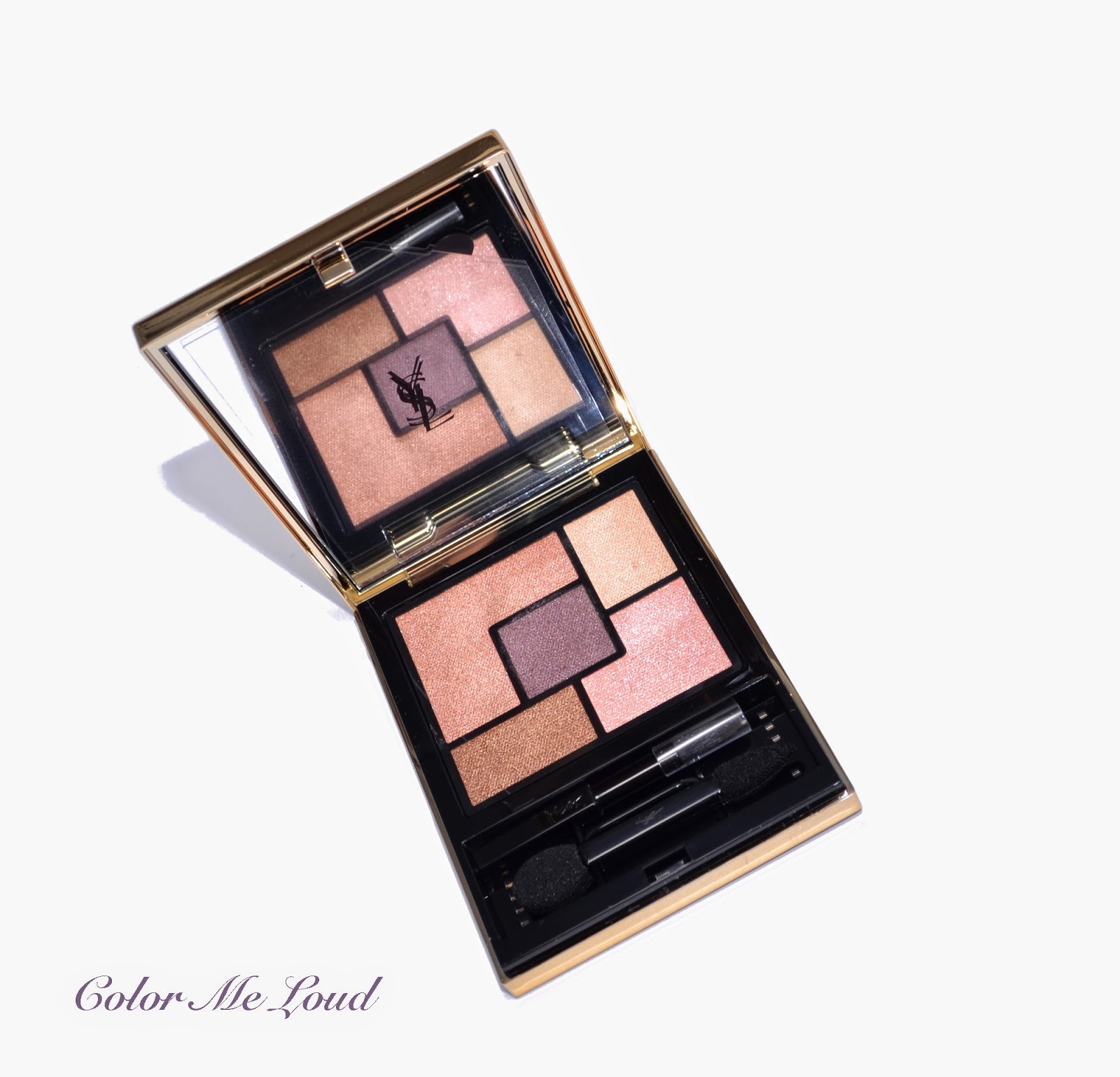

Yves Saint Laurent Couture Palette 5 Couleurs #03 Afrique, Swatches, Review & FOTD

$
0
0
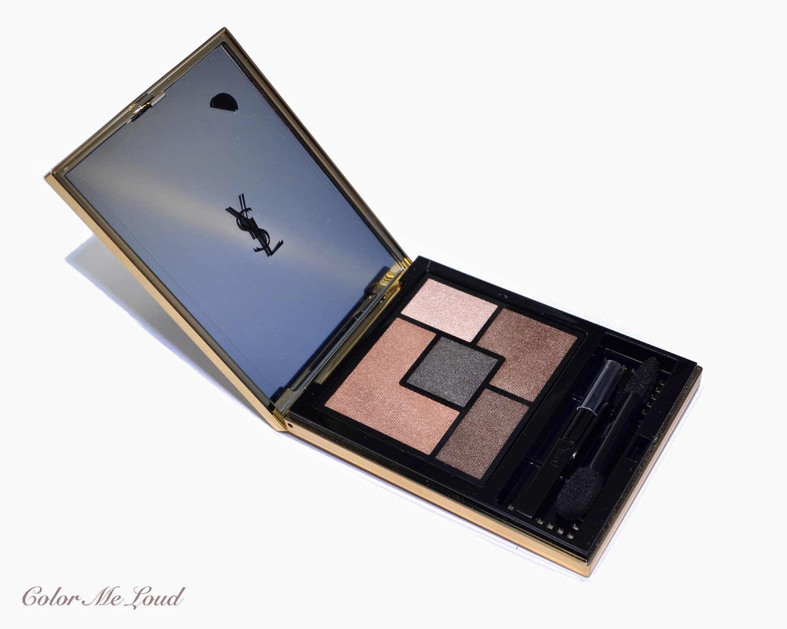
Today I have another palette to share with you which released by YSL as a part of their new 5 Couleurs Couture Palette range. I have reviewed #7 Parisienne a few days ago. If the shades in Parisienne were too cool for you, you may want to check #3 Afrique out.


Yves Saint Laurent Couture Palette 5 Couleurs #03 Afrique

The colors of a sunset, bronze, rose gold and lila are combined in YSL Afrique together with two lighter shades for highlighting and blending. In fact I have just watched the sun setting over the mountains across our flat and the clouds were looking exactly like the center eye shadow in the  palette among the shades of red and pink reflections on the sky. 


Yves Saint Laurent Couture Palette 5 Couleurs #03 Afrique

The textures are satin to light shimmery and are consistent throughout the palette. The shimmer is very fine, doesn't look frosty nor does it emphasize the fine lines. Eye shadows are all very smooth to touch and feel very creamy. These eye shadows are very easy to apply and blend.


Close-up: Yves Saint Laurent Couture Palette 5 Couleurs #03 Afrique

The shades in YSL #03 Afrique (from left to right) is as follows:

Top left (base): Mid-toned warm golden rose with fine golden shimmer. This is a truly stunning shade and perfect especially for spring and summer.

Center: Deep plummy brown with subtle shimmer. It is dark enough to define the eye look and yet easy enough to blend.

Top right (highlight): Light ivory with shimmery finish. It is a nice warm shade for highlighting the inner corner or lightly dust under the brow bone.

Bottom right: Very light neutral pink to brighten up the inner corner or blend out the crease.

Bottom left: Mid-toned copper with golden shimmer. Another stunner, which is slightly darker than the rose gold shade so can be combined on the outer corner or can be applied as the base color and sheered out as needed. 


Swatch with direct sunlight: Yves Saint Laurent Couture Palette 5 Couleurs #03 Afrique

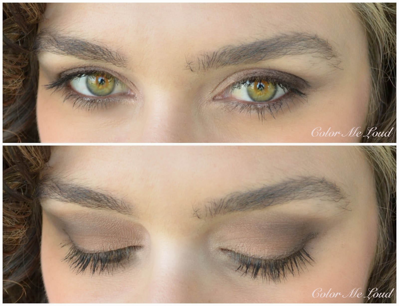
I really love the base color and the definition shade (center) in this palette as well as the copper shade. They are all stunning. The two lighter shades also can be combined nicely with these. I am much more in love with this one than I am with Parisienne, who would think that, because these are not my favorite shades (a bit too warm for my liking). I used the base shade all over, ivory on the inner corner, center shade to define the crease and copper to enhance the outer corner. The resulting is a lovely soft warm eye, which I like wearing especially during summer. As a liner I used UD 24/7 Glide on in Twice Baked and added Chanel Le Volume Mascara.


In-action: Yves Saint Laurent Couture Palette 5 Couleurs #03 Afrique

Here is the FOTD using Afrique. On the cheeks I am wearing MAC Ocean City (special thanks to Linda, Chrissy and Maureen to send me two of those across the ocean). On the lips I am wearing Tom Ford Spring/Summer shade in Sweet Spot, which I think goes lovely with this apricot/corally look.


FOTD: Yves Saint Laurent Couture Palette 5 Couleurs #03 Afrique

Final thoughts: I was not expecting that #03 Afrique would work all that good on me but I really enjoy wearing it. To me it is that effortless summer palette which literally blends itself. The center shade in this palette can be build up much deeper than some other palettes in the range. Important to note though is that this one did fade a bit on me after 5-6 hours once applied over Nars Pro-prime but it didn't crease. Afrique gets a thumbs up from me. Don't miss it especially if you like warm colors on your eyes.

Yves Saint Laurent Couture Palette 5 Couleurs #03 Afrique is permanent and is available at YSL counters across the world.

Do you like sunset shades on your eyes? To which time of the year would you like to wear such colors?

Chanel Les 4 Ombres #224 Tissé Riviera, Review, Swatches & FOTD

$
0
0
Back in March Chanel discontinued some of their eye shadow palettes in Europe and released eight new palettes. I am really hooked into their new formula. The more I try it, the more I love it. A few days ago the new quads started appearing at counters all around the world, so I decide to share my thoughts on the ones I haven't reviewed yet. You can check out the previous reviews here:


Today I would like to write about the blue palette of the new line, #224 Tissé Riviera.


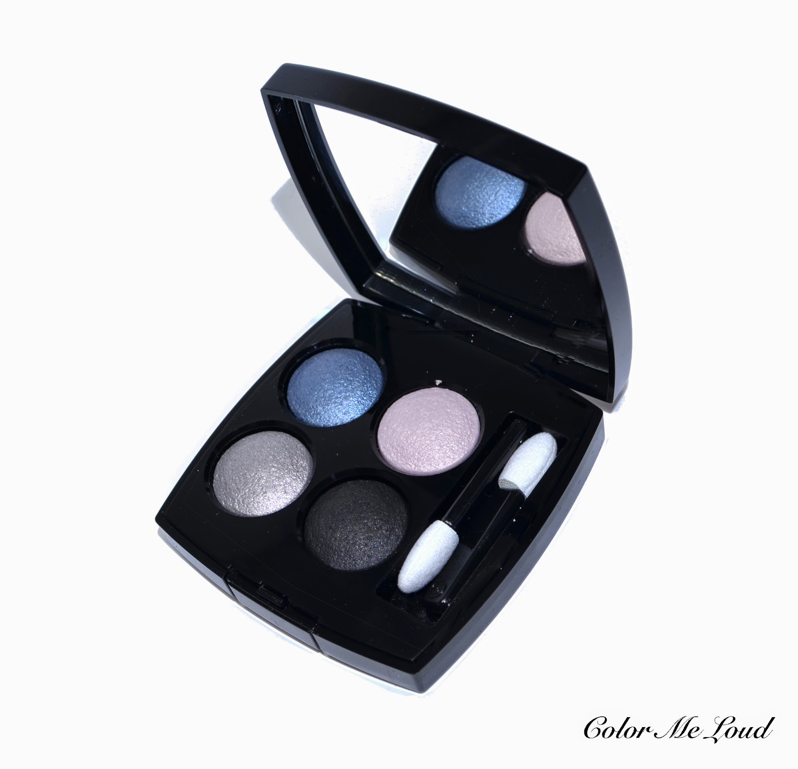
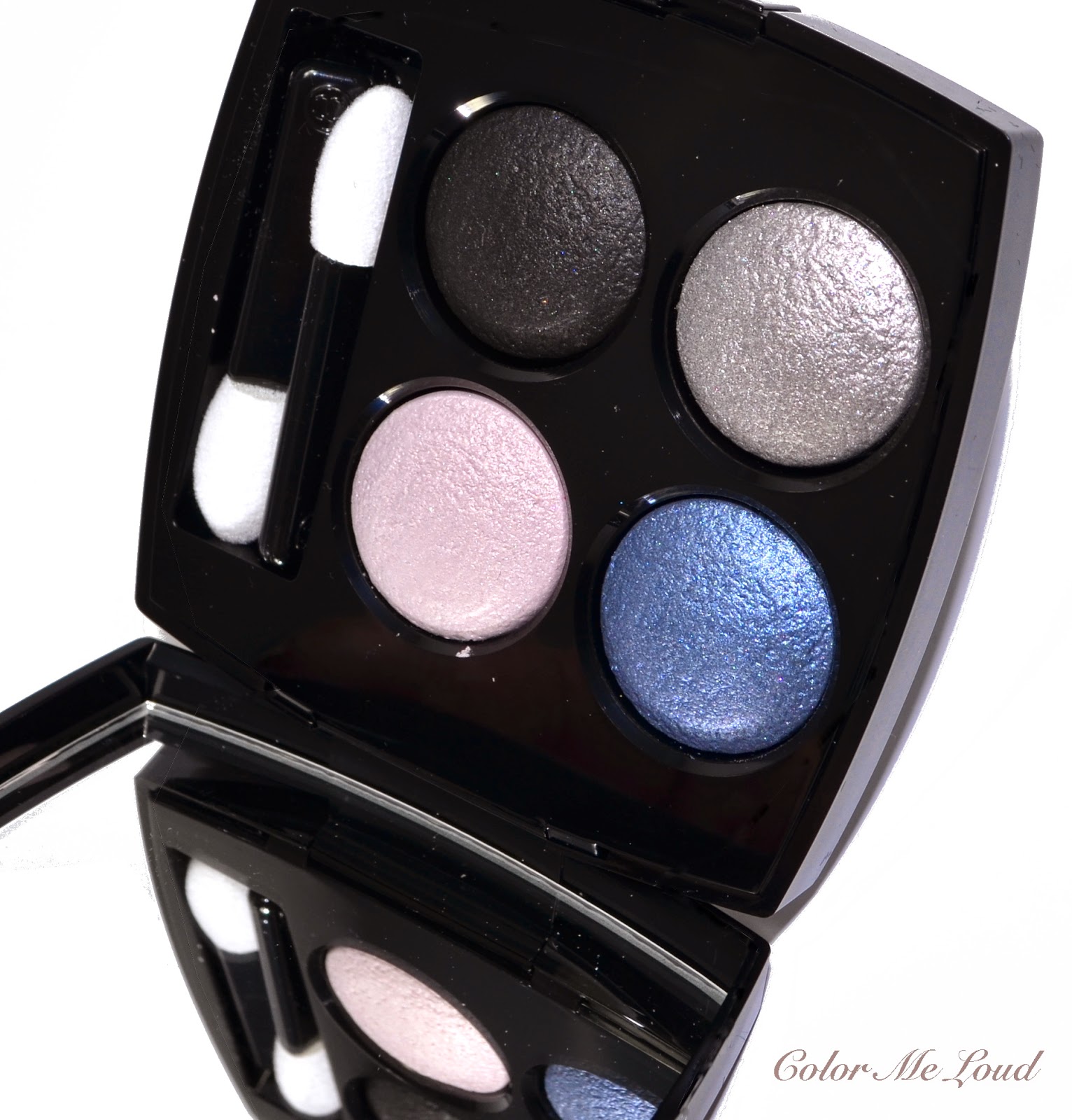
Chanel Les 4 Ombres #224 Tissé Riviera

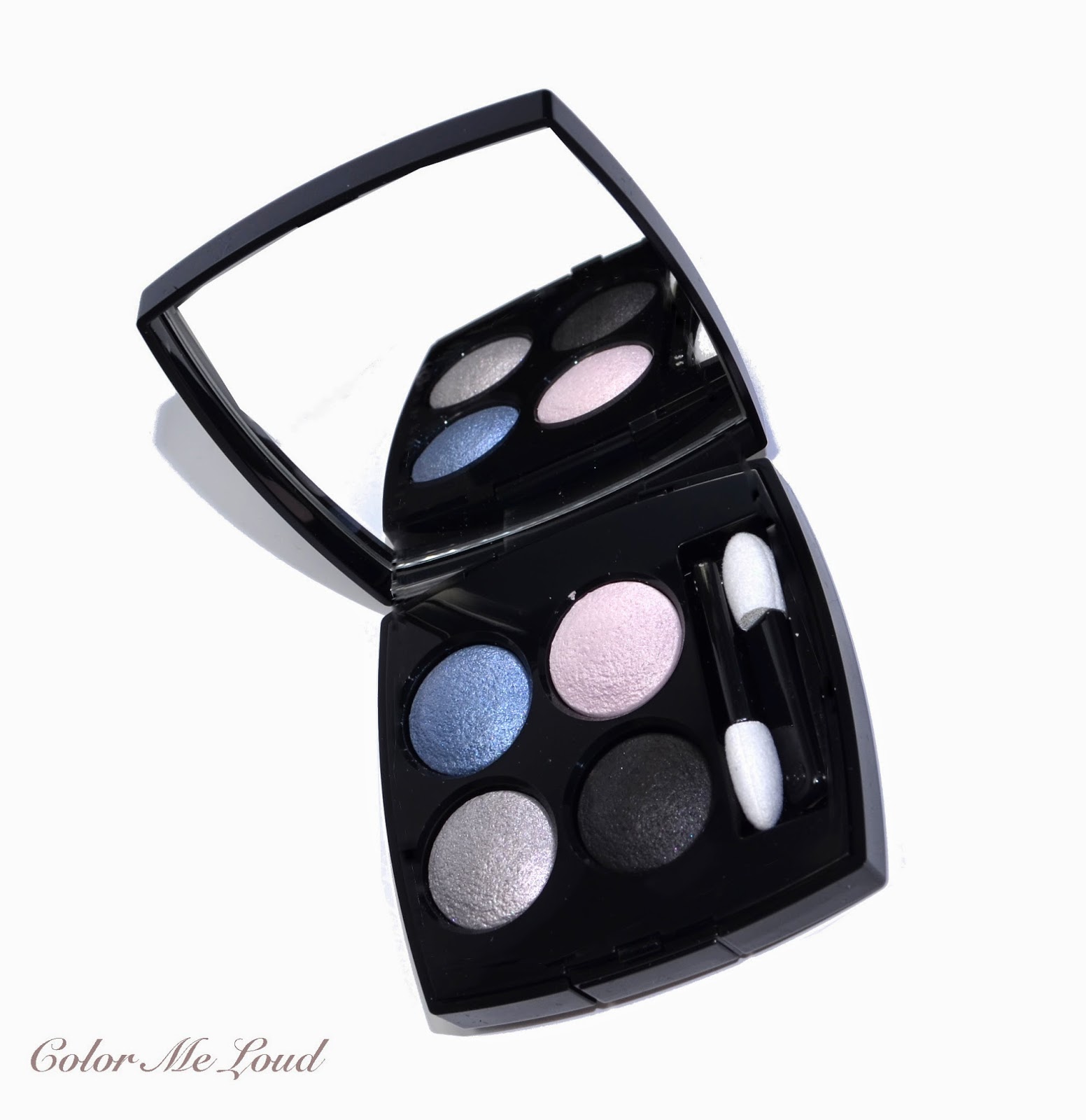
Most of the eight new palettes are presenting a natural to warm color selection but Ice Queens out there will certainly like #224 Tissé Riviera with its blue and silver tones. 


Chanel Les 4 Ombres #224 Tissé Riviera


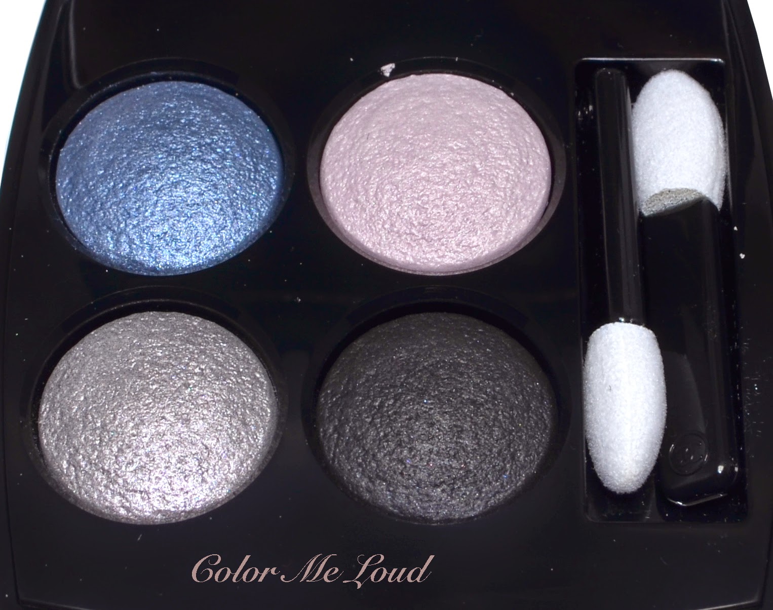
The finish of Tissé Riviera is similar to that of Tisse Venitien and Tisse Rivoli with a lovely metallic but not over the top touch on two main shades. Deepest shades has satin to matte finish which is great for definition as well as a liner. The shades in the palette manage to stay not too pastel nor too grey/classical smokey.


Close-up: Chanel Les 4 Ombres #224 Tissé Riviera

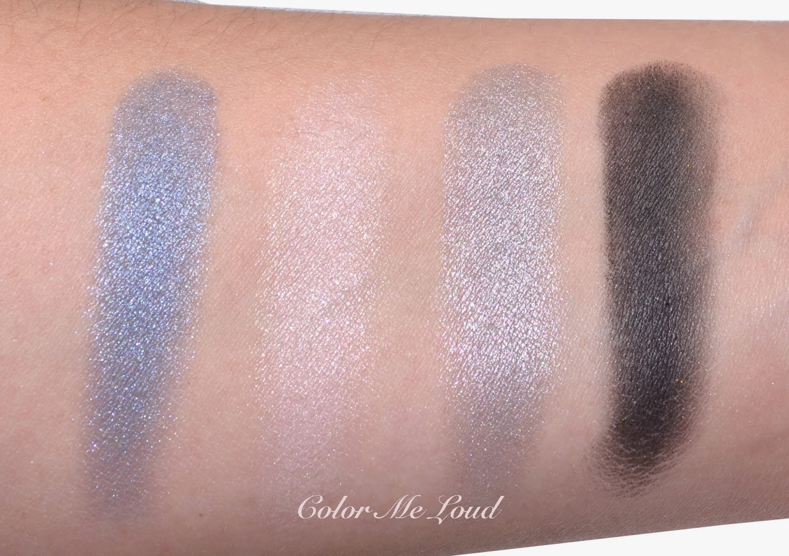
Top left: Medium blue with grey undertones and metallic finish. Although the shade of blue is close to being pastel, the metallic finish gives it an extra dimension and turns it into a complex lovely shade of blue.
Top right: Very light pink with satin finish. It is great for highlight on the inner corner as well as under the brow bone.
Bottom left: Light slate grey/silver with metallic finish. 
Bottom right: Very deep cool black with satin to matte finish. This shade of black is one of the best I own at the moment, the texture is great and it is very pigmented and deep.


Swatch: Chanel Les 4 Ombres #224 Tissé Riviera

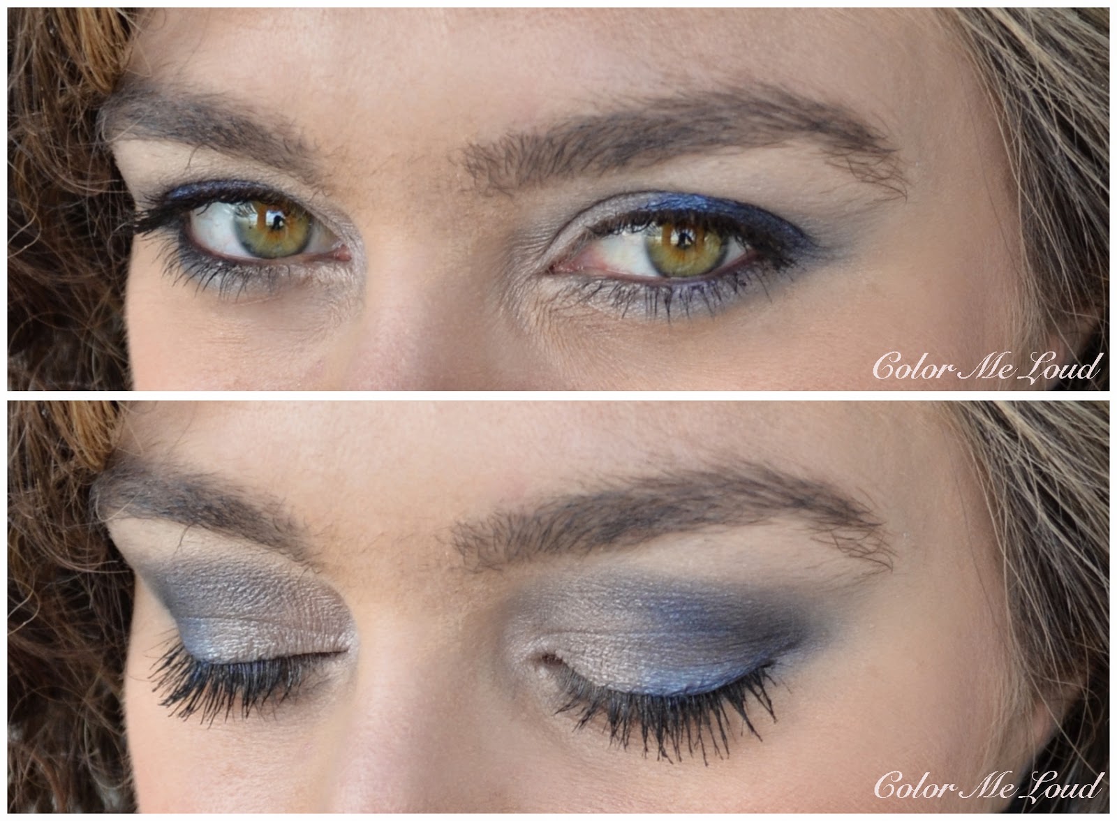
Below I used the blue shade from middle to outer lid and silver at inner to middle upper lid. I then defined the look with the black on the crease, which I used sparingly. I blended the crease with the light pink and dusted a little bit of that under the brow bone. I combined this look with Urban Decay 24/7 Eye Liner in LSD along the upper lash line and Chanel Le Volume Mascara on upper and lower lashes.


In-action: Chanel Les 4 Ombres #224 Tissé Riviera


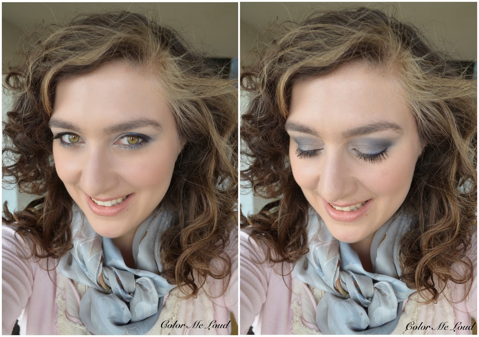
Here is the whole look with some other make-up on my face but I don't remember what exactly they were... It has been almost a month, so I hope you excuse me for that. If you are especially curious about something, I can try to find it out. With these cool blue grey eyes, I like wearing light blush and nude lips with some warmth to it, like apricot tones. I think this way the whole look gets more neutral than cool.


FOTD: Chanel Les 4 Ombres #224 Tissé Riviera

I have recently received e-mails from readers asking about comparisons between the texture of quads from different brands. I can safely say that I like Chanel's formula much more than YSL's new formula which, to me, is a little too soft and has tendency of blending itself to nothing. Chanel's formula though is soft and creamy but it stays put and different shades show up wonderfully. I also like the color concepts of Chanel's Quads more. 

Check out more swatches of Tissé Riviera at Indigo Kir Royale.


Chanel Les 4 Ombres #224 Tissé Riviera

Final thoughts: Another thumbs up for Chanel's new formula. These are now arriving to all the Chanel Counters so in case you haven't tried them yet, I strongly recommend checking them out. 

I will review the last three palettes also soon. Just a little spoiler, the ones I have already reviewed are my favorites in terms of formula and shade combinations.

Do you like warm (corals, apricots) or cool (pinks) lips with blue eye shadows?

My Picks from MAC Moody Blooms Collection, Eye Shadows in Deep Fixation, Green Room, Lucky Green, Hidden Motive, Blooming Mad and Artistic License, Fluidlines in Black Ivy, Nightshade and Copperthorn, Sheen Supreme Lipsticks in Moody Bloom and Quiet the Thing, Review, Swatch and FOTD

$
0
0
It must have been time to get into something colorful, matching to the name of the blog. Lately I caught a MAC bug and went crazy over their Alluring Aquatics collection (reviewed here and here) and Pedro Lourenco (reviewed here) became one of my go to makeup looks for professional settings. After having fun with Osbournes collection (Kelly's part reviewed here, Sharon's is coming up), I was convinced that nothing could excite me as much as these did. 

But there it was, Moody Blooms. First of all, I am loving the name, which I think, is a word play on Moody Blues, a band which I adore. Although they were active much before my time, I discovered their music during my late teens. Especially their album called Days of Future Passed has been my obsession over years. Maybe you know Night in White Satin? That one is from this album, together with other songs which take the listener to different times of the day. 


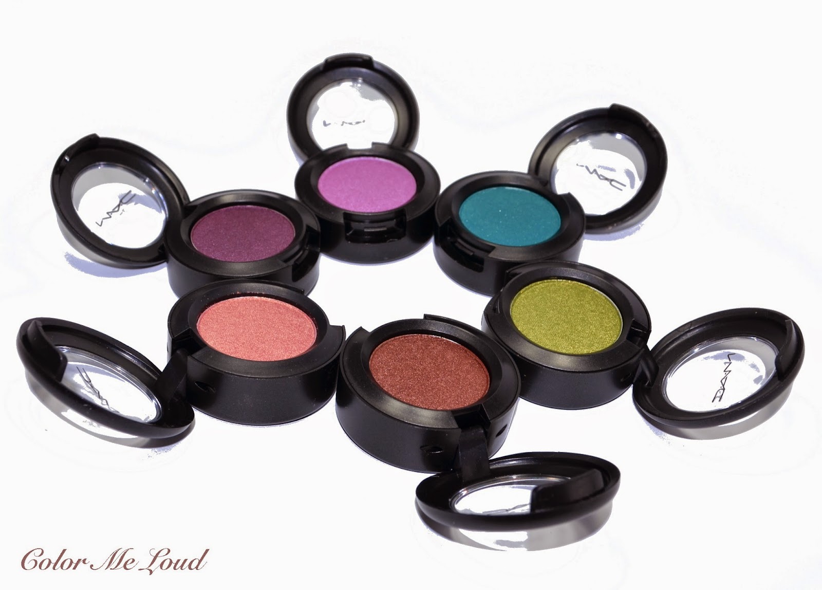
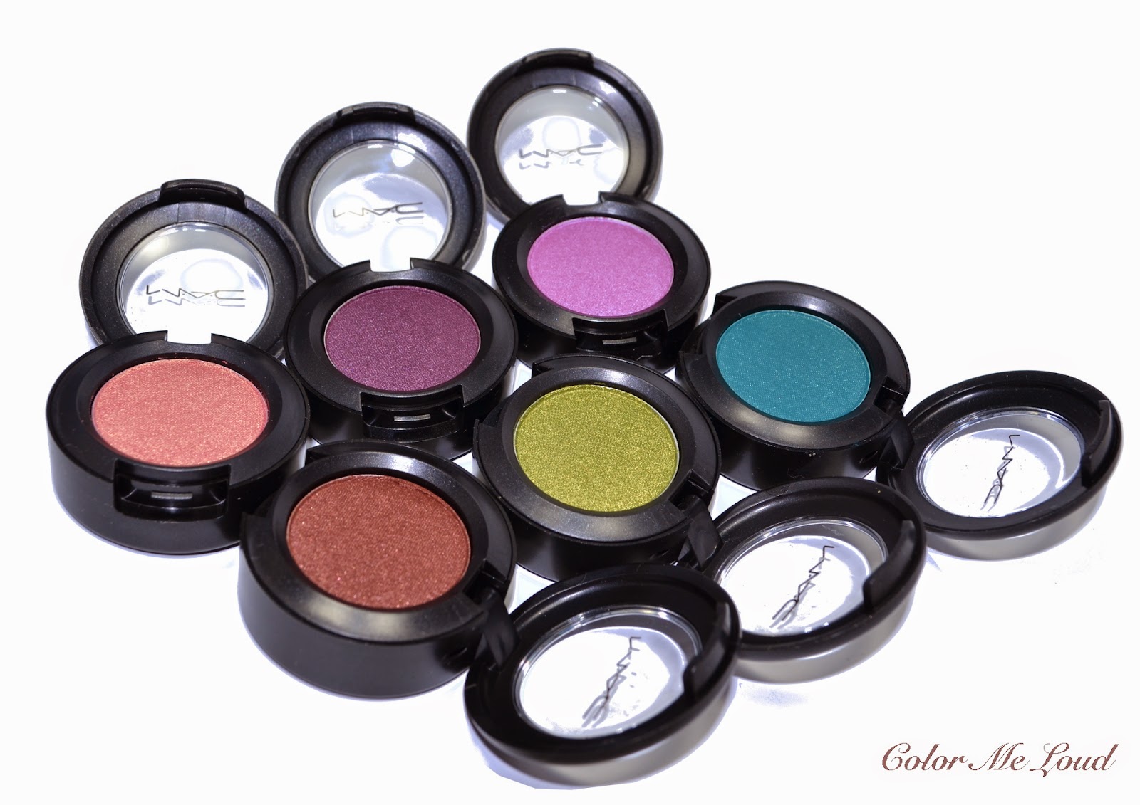
MAC Eye Shadows in Deep Fixation, Green Room, Lucky Green, Hidden Motive, Blooming Mad and Artistic License

Moody Blooms Collection is composed of six eye shadows, five Sheen Supreme Lipsticks, five Sheen Supreme Lipglass Tints, two powder blushes and three Fluidlines. To me the eye shadows were the stars of the collection. Six eye shadows can be classified into three main color categories, brown/peach, green and purple. 

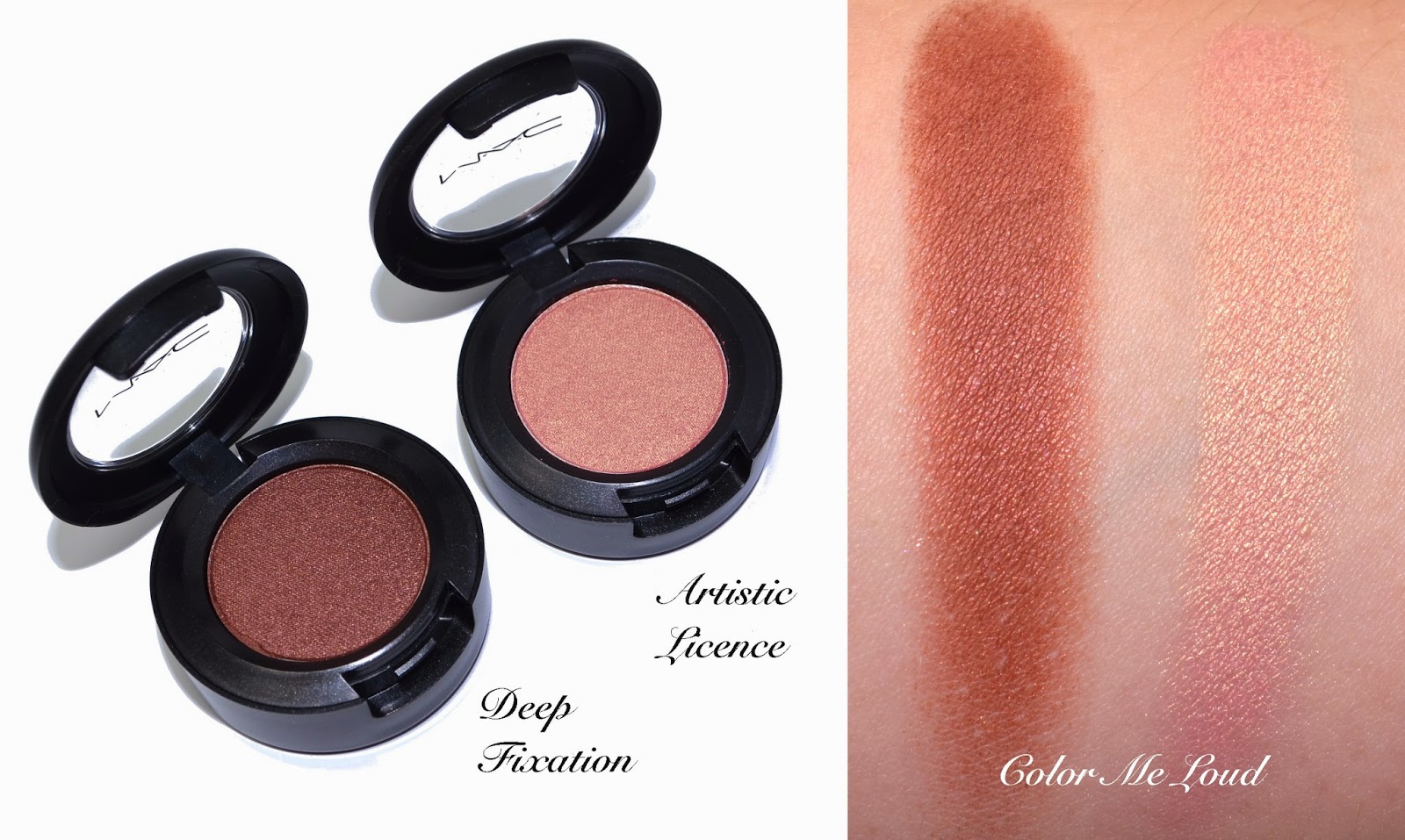
For the natural lovers, the collection offers a stunning peachy rose gold called Artistic License. It is very smooth and creamy and the shade shows up perfectly on the lids. It was love at first sight. A deeper bronze brown called Deep Fixation is a little drier to touch but applies beautifully. I like my crease shades a little on the drier side so this one is perfect for me. Both are very pigmented and apply beautifully. 


MAC Eye Shadows in Deep Fixation and Artistic License


Two beautiful purples of the collection for eyes are Blooming Mad and Hidden Motive. Hidden Motive is a stunning deep warm plum/orchid with lovely pink shimmer. Blooming Mad is a mid-toned pinky lilac which is very iridescent once worn. Both of the shades are very radiant and beautiful, again the lighter shade is more creamy to touch and deeper shade is a little drier, I think the consistencies and pigmentation are great during application.


MAC Eye Shadows in Hidden Motive and Blooming Mad

Two of the eye shadows I was not very keen on getting were the green ones. Green Room is a mid-toned forest green with a touch of teal. I was not very fond of Green Room since those green tones tend to look muddy on my complexion (and give me a punched eye). Since I really liked Lucky Green, I didn't want to pass the last one in the line so ended up getting Green Room too. The consistency of Green Room is a little drier but it is pigmented and works well once applied. Lucky Green, an acid green, is such a gorgeous shade, it looks very electric but on the lids, it blends beautifully and combines very nicely with the rest of the shades.


MAC Eye Shadows in Green Room and Lucky Green

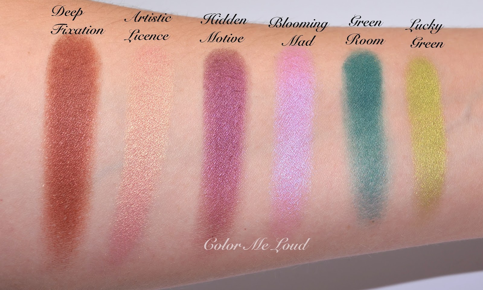
Here are all the shades together for those of you who still can't make up their minds. I have also swatched them all together for reference. The shades first look like uncoordinated but the magic happens when you start mixing and matching those. I can think of thousand possibilities with these, but first I took the challenge to apply all of that at once, you can see the results down below, but first Fluidlines...


MAC Eye Shadows in Deep Fixation, Green Room, Lucky Green, Hidden Motive, Blooming Mad and Artistic License
Swatch: MAC Deep Fixation, Green Room, Lucky Green, Hidden Motive, Blooming Mad and Artistic License

I purchased all the Fluidlines of the collection. First I was thinking to get only Black Ivy, which is a deep teal with sparse beautiful shimmer. Then I have seen Nightshade and my plum loving heart couldn't skip it. That one is unfortunately a bit thin once applied and as a liner, it may not give the best definition but I thought I could use it also as a cream base to some of the eye shadows. Copperthorn is an interesting liner, it is very sparkly and I usually like sparkling eye liners. I thought of combining it with black ivy to add a little bit of something for a special occasion make-up or use it sparingly on the inner corner for a day make-up.


MAC Fluidlines in Black Ivy, Nightshade and Copperthorn

Here is the resulting eye look of the challenge of using all the eye shadows at once. 

Artistic License: Inner corner to the mid-lid
Lucky Green: Middle lid
Hidden Motive and Deep Fixation: Crease and outer corner
Blooming Mad: Blending above crease
Green Room: along lower lash line, blended with Urban Decay 24/7 Eyeliner in Mars
Black Ivy: Along the upper lash line
Copperthorn: Inner corner


In-action: MAC Moody Blooms Collection, all the eye shadows and two of the Fluidlines.

There are many more things I would like to try with the eye shadows and Fluidlines, for example using the Fluidlines as base to eye shadows, such as shown in the following swatch. Nightshade and Blooming Mad looks gorgeous once layered.


MAC Moody Blooms Fluidlines and Eyeshadows layered

I also picked up two lipsticks from the collection. Moody Bloom is a real stunner and I think is a very unique one, so a definite stand out of the collection for me. Quiet The Thing! is a lovely pink/plum. These are my first Sheen Supreme Lipsticks, the formula reminds me of YSL's Rouge Volupte lipsticks since these also have a great slip and they are relatively pigmented for a sheer lipstick. 


MAC Sheen Supreme Lipsticks in Moody Bloom and Quiet the Thing

Here is the resulting look, I have passed on the blushes of the collection since I got way too many of those recently. I combined the look with MAC Ocean City on the cheeks and Chanel Les Beiges #30 as a subtle bronzer. Although I wouldn't classify Moody Bloom Lipstick as a nude on me, I really like how it combines with all the craziness going on on my eyes. 


FOTD: MAC Moody Blooms Collection

Also check out the lovely swatches of Cafe Makeup and their picks from the collection.

Final thoughts: A lovely collection from MAC for all tastes, natural lovers need Artistic License and Deep Fixation as well as Sheen Supreme Lipstick in Moody Bloom, team purple needs Hidden Motive, Blooming Mad, Nightshade and Quiet the Thing! 

My personal favorites from the collection are: Moody Bloom, Artistic License, Lucky Green, Hidden Motive, Deep Fixation and Black Ivy in that order. 

The collection is available since one week in Germany and some shades are already sold out online but they can still be found if you call a few counters. On Saturday almost all the items were available in Stuttgart Breuninger and Douglas on Koenig Strasse. In the States, I see that most of the products can still be purchased online, from MAC Cosmetics or other stores such as Nordstrom. 

What are you thoughts on Moody Blooms? 

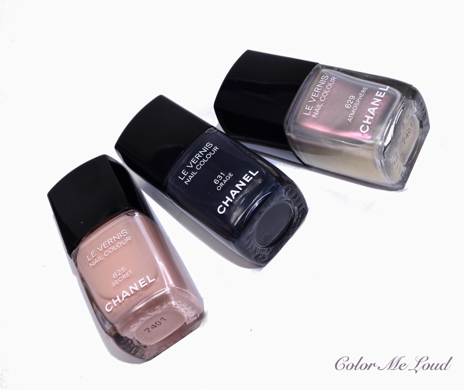
Chanel Le Vernis #625 Secret, #629 Atmosphere and #631 Orage from États Poétiques Fall 2014 Collection, Review, Swatch & Comparison

$
0
0
It has been two days of bad weather in Stuttgart, cold, rainy without any rays of sun. I thought, there can't be a better day than today to present you the Fall 2014 nail polishes of Chanel.


Chanel Le Vernis #625 Secret, #629 Atmosphere and #631 Orage from États Poétiques Fall 2014 Collection

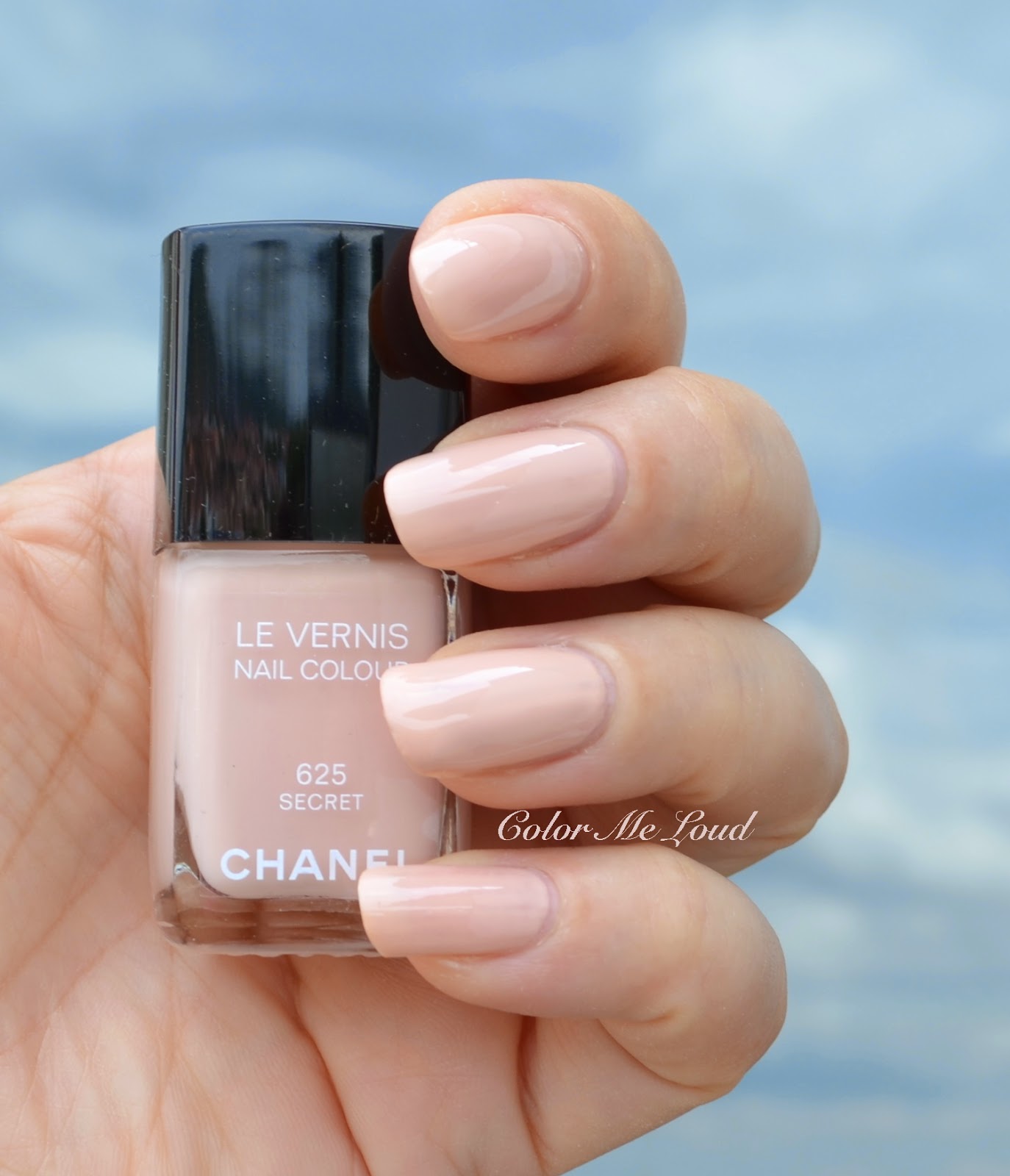
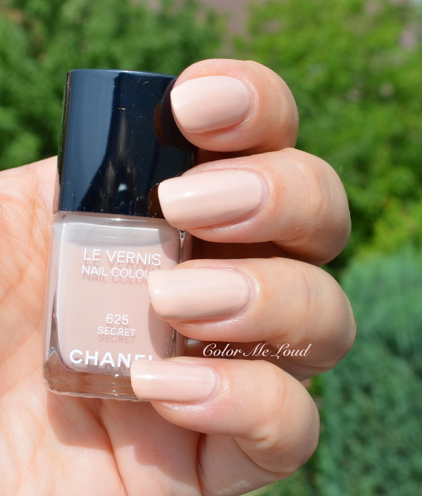
Chanel Le Vernis #625 Secret is a light nude with pink undertones and cream finish. I haven't noticed any hidden shimmer in that one. The consistency of Secret is a little on the thinner side so if you have imperfections on your nails, they may show through. In this case you might want to apply a base coat first, or go for three coats. Below I am wearing two coats of Secret.


Swatch in shadow: Chanel Le Vernis #625 Secret

I like the pink undertones of Secret, since I don't like very warm beige nudes. Still I think Secret would look better on darker or lighter skin tones than mine since on me it almost blends with my skin, giving me mannequin hands. It is a matter of taste but I don't usually like camouflaging my nails so I'd rather go for a little more contrast on those.


Swatch under direct sunlight: Chanel Le Vernis #625 Secret

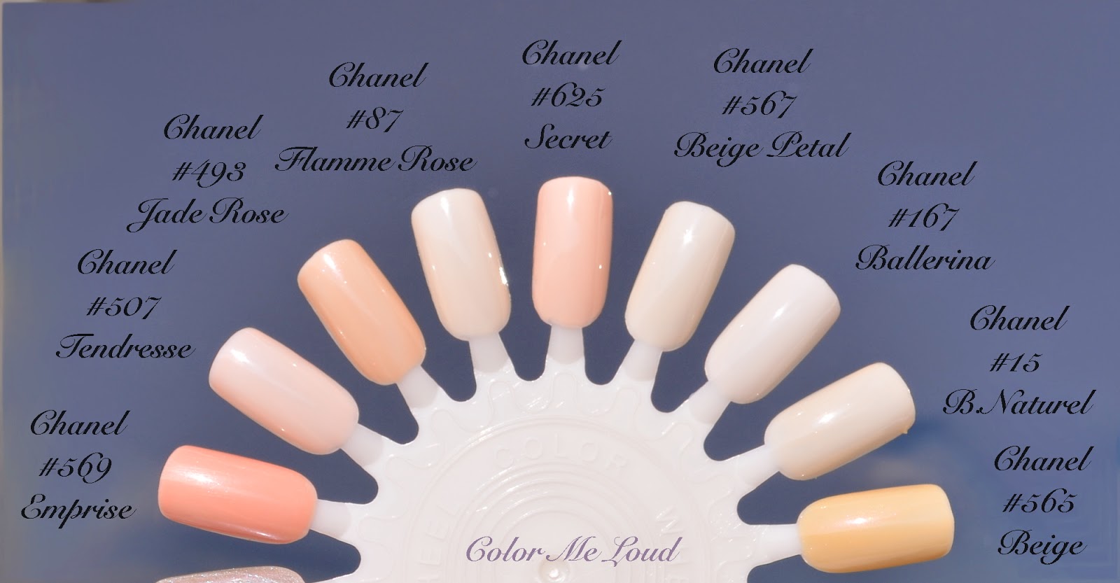
Below you can see my efforts in finding a close Chanel nail polish to #625 Secret. Although Secret looks like being very dupable, none of Le Vernis in my stash was too similar. The closest I have found is #507 Tendresse, which is a tad more pink. The regular nudes from Chanel, such as #87 Flamme Rose, #567 Beige Petal, #167 Ballerina or #15 Beige Naturel are all lighter. Chanel Le Vernis #498 Jade Rose is a tad darker and warmer. #569 Emprise is even more darker and warmer. Chanel #565 Beige is much more warmer, more beige.


Chanel Le Vernis #625 Secret and comparison to closer shades

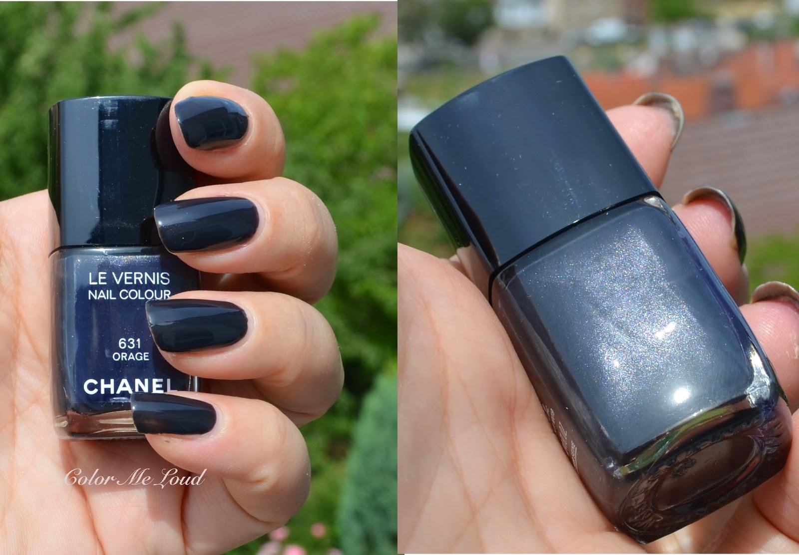
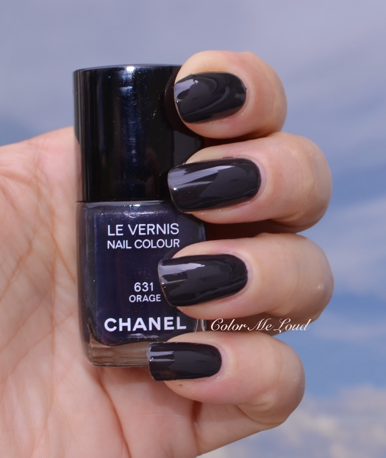
After seeing the color of the clouds before the storm and thunder yesterday night, I can see why Chanel named their new deep blue nail polish Orage (means storm in French). The hidden silver and multi colored shimmer of Orage prevents it from looking flat on the nails. It especially looks pretty under direct sunlight. Since it is not a black but a deep blue, it doesn't appear harsh once worn. Chanel releases a vamp nail polish each Fall and this year's Orage is a pretty one, not that unique but nice and wearable. Consistency of Orage was also a little thin but it covered the nails nicely in two coats (as worn below).


Chanel Le Vernis #631 Orage from États Poétiques Fall 2014 Collection

Swatch with forced flash: Chanel Le Vernis #631 Orage

I love vampy nails and Chanel does them like no one else. I appreciate the subtle difference between these and believe that they all look different enough to justify owning. Once compared to #631 Orage, Chanel Inframetal looked very close in the bottle but turned out to be warmer once applied. Chanel #357 Nuit de Russie has more of a blue shimmer and black base. Chanel #601 Mysterious is warmer and pulls more khaki. Chanek Cosmic's shimmer is more apparent and base coat is darker. Chanel Steel is the closest to Orage with a tad more shimmer. Chanel Western Light pulls redder. Chanel #563 Vertigo, one of my favorite vamps from Chanel is a tad warmer.


Chanel Le Vernis #631 Orage and comparison to similar shades

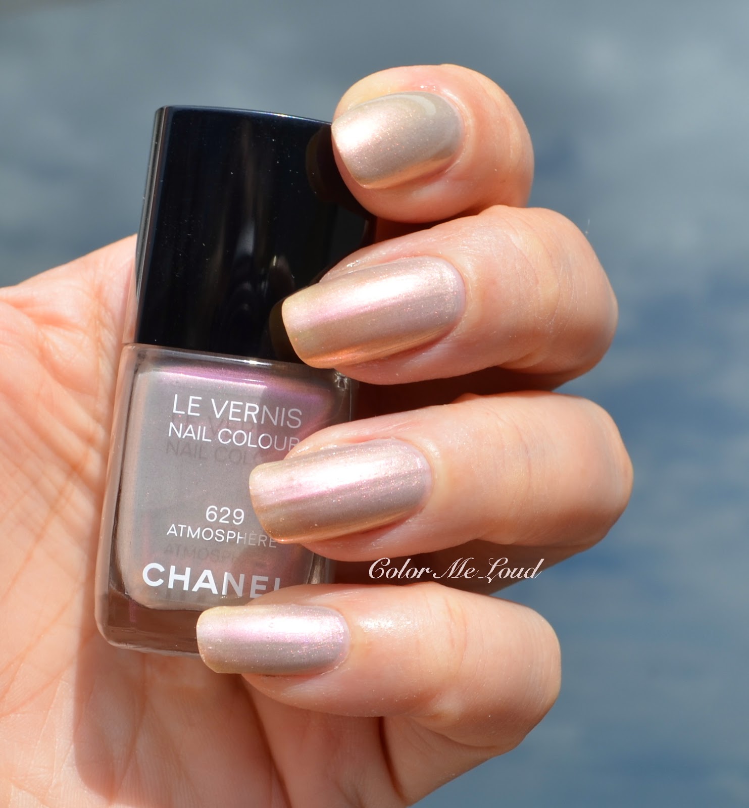
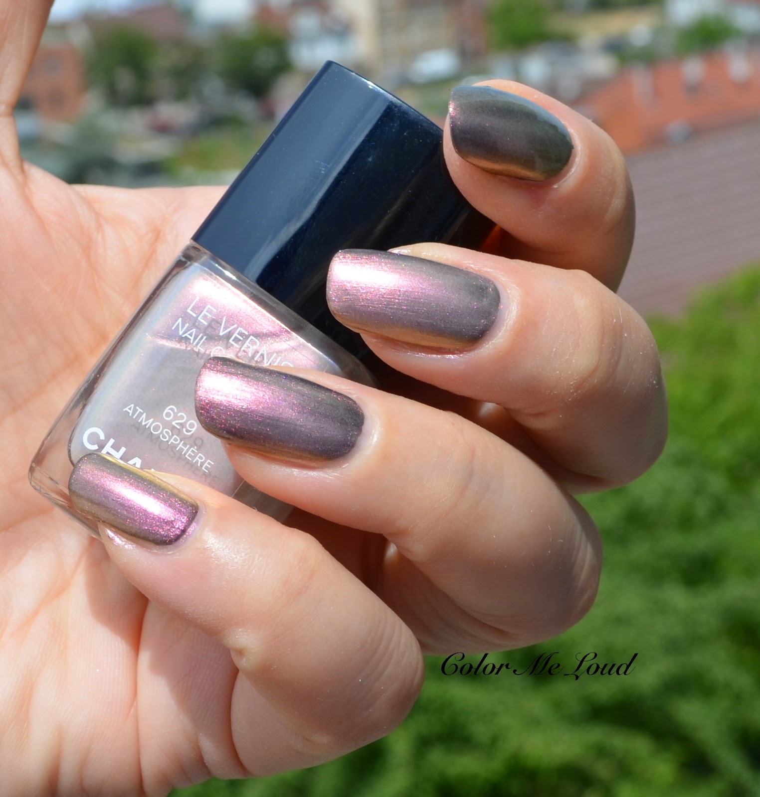
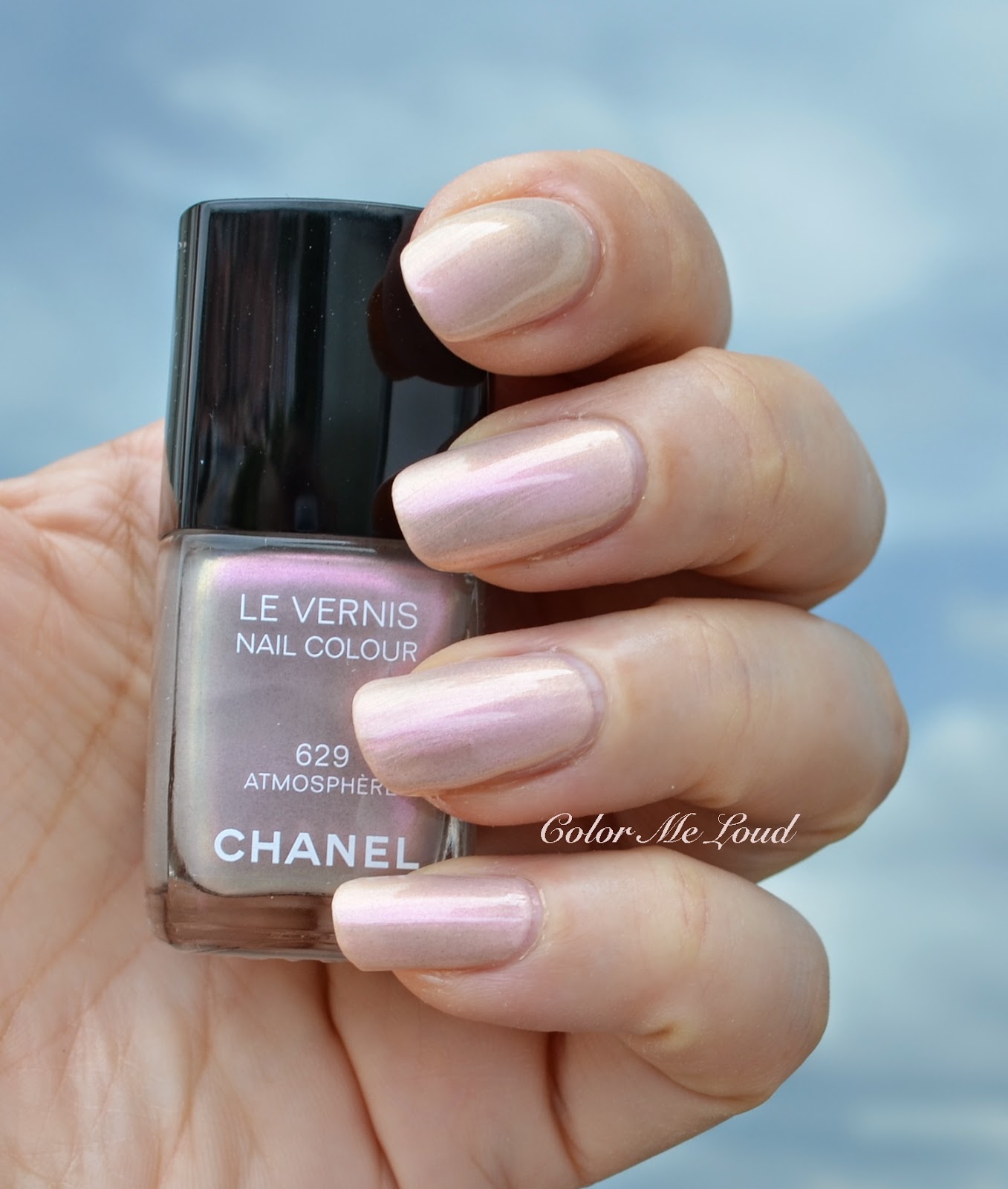
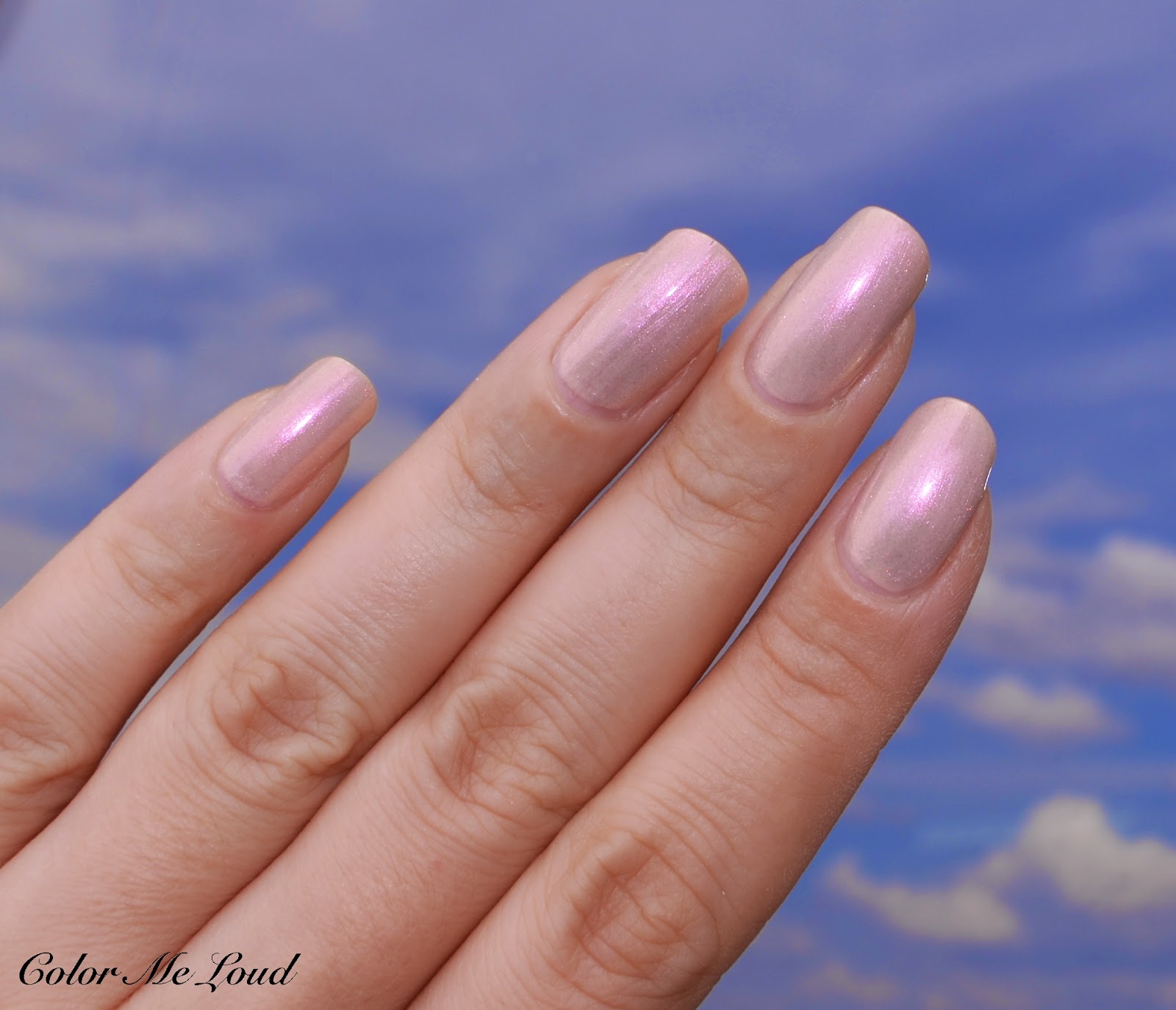
I saved the best for the last. To me the most unique nail polish of this collection is #629 Atmosphere. It is a nude pearl duo-chrome, the color shifts between beige and light pink. I like the fact that it is not frosty, which would make it more old-fashioned. Atmosphere is a modern day take on pearly effect feminine nail polishes of 80s. The consistency is a little thin on that one too, I needed three coats and still it was not possible to cover my nail line. If you don't mind a bit of nail line showing through, the effect is really pretty. Below you can see three coats of Atmosphere with direct sun light, which shows the pretty shimmer and it is not too frosty. The second photo shows it in the shadow, so you can see the pearl effect better.


Swatch under direct sunlight: Chanel Le Vernis #629 Atmosphere (two coats, on its own)
Swatch in shadow: Chanel Le Vernis #629 Atmosphere (two coats, on its own)

When I first saw the promo pictures of Chanel Atmosphere, I thought of Chanel #96 Metal Argent, an old discontinued nail polish which also has a pearl duo-chrome effect. It turns out they are really close but Metal Argent's base color is a tad darker and cooler. A recent release from A-England called Hurt No Living Thing also has a very similar concept to Atmosphere but it is sheerer on its own. Chanel #593 Rose Moire is darker, pinkier and more frosty. Chanel Le Vernis Facettes #81 Vice-Versa and #84 Ange-Demon are more saturated and have a gorgeous matte frost finish. These two are from my all time favorite Le Vernis Facettes series. I wished that Atmosphere would be a dupe for at least one, but no luck there. By the way I was thinking about writing a post about four Facettes nail polishes, would you be interested?

Some have said that Dior's #187 Perle from this year's Spring Collection would be close to Chanel Atmosphere but I don't see any similarities between these two. Perle has a matte frost effect and is very sheer once worn on its own. 

Another close nail polish which is available at the moment is Giorgio Armani's #702 Kaleidoscope (reviewed here). The base color is very similar to Atmosphere but Kaleidoscope has blue and green duo chrome effect which is a bit harsher. I find Atmosphere more wearable but Kaleidoscope has a stronger duo-chrome effect, thus it is edgier and more unique.


Chanel Le Vernis #629 Atmosphere and comparison to similar shades

Since Atmosphere was a little sheer on its own, I decided to experiment by layering it on the other nail polishes from États Poétiques collection. I started by layering it over Secret. You can see that this way it is more opaque but as a result the pearl effect is a little tuned down. You can see this in the second photo, once a strong light falls on it, pearl effect becomes more apparent. Although I like Secret and Atmosphere duo, I still think a darker shade brings Atmosphere's unique character better into light. Below you can see one coat of Atmosphere on two coats of Secret.


Chanel Le Vernis #629 Atmosphere over #625 Secret (Shadow)
Chanel Le Vernis #629 Atmosphere over #625 Secret (forced flash)

After that I tried one coat of Atmosphere over two coats of Orage. This one looks really nice and unique but it also needs a perfect application not to look streaky and to make all three layers exactly the same. I really don't like the dark shade showing through the edges.


Chanel Le Vernis #629 Atmosphere over #631 Orage (direct sunlight)

Final thoughts: If you follow me, you already know that I am a die hard Chanel nail polish fan. I have to say though, I am not feeling this collection. Secret is not such a great nude on my skin tone (almost a nail camouflage for me), Orage is pretty but not a love at first sight. I enjoyed Atmosphere for the last 4 days, in fact I am typing these lines wearing it, but I didn't caught myself staring at my nails once. I am hoping other pieces I picked up from the collection will be more exciting.

Secret and Orage are permanent, Atmosphere is listed as limited. These are now available in the states and will be available worldwide in August. Special thanks to Chic Science for sending them my way. Check her gorgeous photos and swatches of Atmosphere here.

Which one is your favourite?

Yves Saint Laurent Couture Palette 5 Couleurs #02 Fauves, Swatches, Review & FOTD

$
0
0
Can one ever have enough natural eye shadows (palettes)?

Knowing that the answer for me is certainly a "no", I got curious over the natural side of YSL's new permanent Couture Palette 5 Couleurs line, and ordered #02 Fauves. I usually go for the more dramatic and dense natural palettes from a certain brand, since I like my natural eye to have some definition, so I felt me and Fauves would get along well. Afterwards I forgot my "no nude nudes" rule and ordered #04 Saharienne, which is a whole other story and will be saved for another post.


Yves Saint Laurent Couture Palette 5 Couleurs #02 Fauves

The first thing to note about #03 Fauves is that it is one of the less shimmery palette of the range with mostly satin to matte finish. I was a little underwhelmed with #07 Parisienne and #03 Afrique in terms of texture versatility but I am happy to report that #02 Fauves is not only a soft shimmer no definition kind of palette. It has different tones, different finishes and less shimmer. It is that almost matte palette each brand has to offer for an everyday or bridal makeup.  


Yves Saint Laurent Couture Palette 5 Couleurs #02 Fauves

That being said, I still find the darkest shade to be too soft and a little more shimmery than I would prefer, but not to the degree of, say, #07 Parisienne. I like the fact that Fauves plays with the undertones rather than tones, providing browns with different degrees of coolness. I can see this palette getting into make-up kits of professionals to be used across different complexions. 


Close-up: Yves Saint Laurent Couture Palette 5 Couleurs #02 Fauves

The shades of #02 Fauves are as follows:

Upper left (base shade): A light natural brown with matte finish. 
Upper right (highlight): A very light warm off-white with satin finish
Bottom right (color): A medium toned warm to natural brown with satin to matte finish  
Bottom left (color): A medium to deep cool brown with satin to matte finish
Center: A deep cool brownish grey with satin finish.


Swatch: Yves Saint Laurent Couture Palette 5 Couleurs #02 Fauves


Below I used the highlight shade on the inner corner, base shade all over the lid, bottom right shade to define the outer corner and center shade to define the crease. The textures are silky and very easy to blend. All of the shades have great color pay-off. 


In-action: Yves Saint Laurent Couture Palette 5 Couleurs #02 Fauves


Below I combined this eye look with MAC Cheeky Bugger blush and Kelly Yum-Yum lipstick worn as a stain, both were reviewed here. #02 Fauves gives the opportunity to combine the eye look with various other elements such as looks with bold lips or defined cheeks.


FOTD: Yves Saint Laurent Couture Palette 5 Couleurs #02 Fauves


Final thoughts: #02 Fauves is a solid palette of Yves Saint Laurent's Couture Palette 5 Couleurs range. On me I like natural palettes with slight plummy undertones (such as Chanel Charming) but YSL Fauves is a lovely addition to my small(!) natural eye palette collection.


Yves Saint Laurent Couture Palette 5 Couleurs #02 Fauves is permanent and now available across YSL counter.

Do you bother with the "undertones" of your natural quads? What kind of brown tones do you like most?

Chanel Les 4 Ombres #214 Tissé Mademoiselle, Review, Swatches & FOTD

$
0
0
Since the beautiful new palettes of Chanel are rolled out around the world about a week ago, I am trying my best to review my (yet small) collection. I have been testing them for months now. I haven't felt the urge to collect each and every item of a single collection for a long time but new Chanel Les 4 Ombres changed this. Being very much in love with the new texture and their color stories, I consider them one of the best palettes in the market at the moment. Here are my previous reviews in case you would like to check out:

Chanel Les 4 Ombres #214 Tissé Mademoiselle

#214 Mademoiselle is a shy and understated beauty. When I swatched it first at the counter, I remember writing my first impressions and this one was my "least favorite" of the bunch. This is why I didn't pull the trigger until I owned 7 of the 8 palettes and felt the urge to complete the collection. The reason why I didn't feel it the first time around was because of its golden and khaki undertones, which blends with the colors of my eyes and crashes a little against the mauve undertones of my skin. 

After purchasing Mademoiselle and trying it, it turns out that I really like it.


Chanel Les 4 Ombres #214 Tissé Mademoiselle

I still believe Mademoiselle would look much better on others, but nevertheless I enjoy the smooth and silky texture, lovely shade range and its subtle but pretty shimmer. I especially recommend it for those with blue eyes, this one would make their eyes pop. Also warmer skin toned fair to medium complexions would love Mademoiselle for a daily subtle and polished look.


Close-up: Chanel Les 4 Ombres #214 Tissé Mademoiselle


#214 Tissé Mademoiselle is composed of four shimmery eye shadows. The first time I swatched it, I was a little disappointed to see that the darkest shade had a satin to shimmery finish. I learned then to appreciate it since it compliments the soft look the shades create. Here are the list of the shades:

Upper left: A medium tan brown with satin finish.
Upper right: A light shimmery ivory.
Bottom left: A stunning mid-toned natural gold with satin to shimmery finish. This one is my favorite of the bunch, it manages to get the attention without shouting, if that makes sense.
Bottom right: A deep cool brown which leans slightly khaki. It has satin finish but it doesn't look very shimmery once applied on the lids.


Swatch: Chanel Les 4 Ombres #214 Tissé Mademoiselle

Below you can see a classical look one would create with this palette. Golden shade is worn on the lid, ivory is used to highlight the inner corner and slightly dusted under brow bone. I defined the outer corner first with the mid-toned brown (upper left) then with the deeper khaki brown. I also applied a tiniest bit of the mid-toned brown along the lower lash line. I complemented this look with Urban Decay 24/7 Glide On Pencil in Stash and Chanel Le Volume mascara.


In-action: Chanel Les 4 Ombres #214 Tissé Mademoiselle

Here is the complete look with Mademoiselle, products I have used are:

Complexion:
  • Chanel Vitalumiere Aqua in B10
  • Laura Mercier Secret Camouflage in SC-2
  • Dior Hydralife Concealer in 01 Light
  • Rouge Bunny Impalpable Finishing Powder in Diaphonous*
Eyes: 
  • Nars Pro-Prime
  • Chanel Les 4 Ombres #214 Tissé Mademoiselle
  • Urban Decay 24/7 Glide on Eye Pencil in Stash
  • MAC Eye Shadow in Omega (brows)
  • Chanel Le Volume Mascara
Cheeks/Lips:
  • Rouge Bunny Rouge Decadent Duo #21 Samba Enredo*


FOTD with Chanel Les 4 Ombres #214 Tissé Mademoiselle

Final thoughts: Chanel Les 4 Ombres #214 Tissé Mademoiselle is another lovely palette from the brand's fabulous new line. If you are a drama queen, you might want to keep looking but if you need a polished day-time look, be sure to check this one out.


Do you like splurging for make-up which is subtle enough to be worn frequently or do you rather find interesting color stories and creative combinations splurge-worthy?


*The products which are marked are sent free of charge for my consideration and honest review.

Chanel États Poétiques Fall 2014 Collection, Color Focus: Rosewood/Mauve, Joues Contraste #160 Innocence, Ombre Essentielle #106 Hesitation, Rouge Coco Shine #93 Intime, Review, Swatches & FOTD

$
0
0
I have started exploring États Poétiques Collection of Chanel for Fall 2014 a few weeks ago. I swatched and compared the three new nail polishes here and dark plum eye shadow single #112 Pulsion here. Popular make-up shades of Fall 2014 are burgundy and rosewood so for today  I would like to show you an almost monochromatic selection of a blush, an eye shadow and a lipstick from the collection. 

Chanel Joues Contraste #160 Innocence, Ombre Essentielle #106 Hesitation, Rouge Coco Shine #93 Intime

Chanel Ombre Essentielle #106 Hesitation is one of the satin shades of six new singles. There are three matte and three satin shade. The matte one I tried before, Pulsion, was a little dry to touch and as a result I found it a little patchy to apply all over the lid but it worked good on the socket. I am happy to report that Hesitation has a great quality. It is buttery and smooth, applies and blends beautifully once applied all over the lid. 


Chanel Ombre Essentielle #106 Hesitation

Hesitation is very pretty, I can see why it is right now on backorder at chanel.com. I love its light catching sparse shimmer which gives it a beautiful dimension. The shade is very flattering since it is not too pink nor too brown. It must be one of the easiest shades to wear for this fall's burgundy trend. 


Swatch: Chanel Ombre Essentielle #106 Hesitation


Below I am wearing Hesitation all over the lid and along the lower lash line. I defined the outer lid very slightly with Pulsion from the same collection. I coupled this look with black liner since the red and berry shades may make you look tired or bruised. I used Marc Jacobs' Magic Marc'er as a liner but once the collection comes to Germany, I would like to check out their new liner too.  I really love Hesitation and can see myself wearing it over and over this fall. 


In-action: Swatch: Chanel Ombre Essentielle #106 Hesitation

Another pretty piece from Chanel États Poétiques is the mauve/pink powder blush Joues Contraste #160 in Innocence. If Chanel would offer me to create a blush for me, I would exactly ask for this shade. The texture is matte, which I love from my blushes. It is a rather light one so I am enjoying how it is easy to build up but hard to overdo. That said, if you enjoy stronger blushes or have darker than medium complexion, this one might not be for you. 


Chanel Joues Contraste #160 Innocence

I would like to also show a comparison of Innocence but after going through my Joues Contraste stash, I couldn't find anything similar. #87 Emotion has similar undertones but it is darker. Rose Initiale is warmer and brighter. To me #160 Innocence is a true stunner and is one of my picks from Chanel États Poétiques together with Hesitation. 


Swatch: Chanel Joues Contraste #160 Innocence

The last product I would like to introduce today is Rouge Coco Shine in #93 Intime. On my pigmented lips, it does nicely show up and complement the rosewood concept. I believe though it is close to the sheerer formula, like Chanel Boy. It is glossy but it is not frosty. I really like Intime for an everyday nude eye, which goes well with Joues Contraste in Innocence. 


Chanel Rouge Coco Shine #93 Intime

Here is the resulting look wearing Joues Contraste #160 Innocence, Ombre Essentielle #106 Hesitation and #112 Pulsion, Rouge Coco Shine #93 Intime. I really like how the shades work together. I can also see myself trying this look with a stronger lip, maybe Rouge Coco Shine Aura or Viva from the same collection?


FOTD with Chanel Joues Contraste #160 Innocence, Ombre Essentielle #106 Hesitation, Rouge Coco Shine #93 Intime

Final thoughts: Chanel made Burgundy trend made easy by using more flattering mauve/rosewood tones. Hesitation and Innocence are both must-haves for me, Rouge Coco Shine in Intime is probably not very unique but compliments Innocence nicely. Hesitation and Innocence are both right now on back order at Chanel.com but no worries since they are permanent. 

Have you picked up any of those? Do you like wearing rosewood on the eyes as much as I do?

Dior 5 Couleurs Eyeshadow Palette #276 Carré Bleu from Fall 2014 Collection, Swatch, Comparison, Review & FOTD

$
0
0
You might have heard the buzz, Dior is about to release 11 new and permanent eye shadow palettes in the beginning of August along with their Fall Collection. I am preparing a post to compare these new quints to the existing ones in terms of packaging and ingredients but first things first, today I would like to talk about the blue quint of the line, 5 Couleurs Eyeshadow Palette in #276 Carré Bleu.


Dior 5 Couleurs Eyeshadow Palette #276 Carré Bleu

I will post some comparison photos with the next post but right now all I can say is that the new compact is sleeker, more chic and includes the same amount of eye shadow (6g). The signature Dior pattern on the eye shadows remained unchanged, so did the CD logo embossed on the center shade.


Dior 5 Couleurs Eyeshadow Palette #276 Carré Bleu

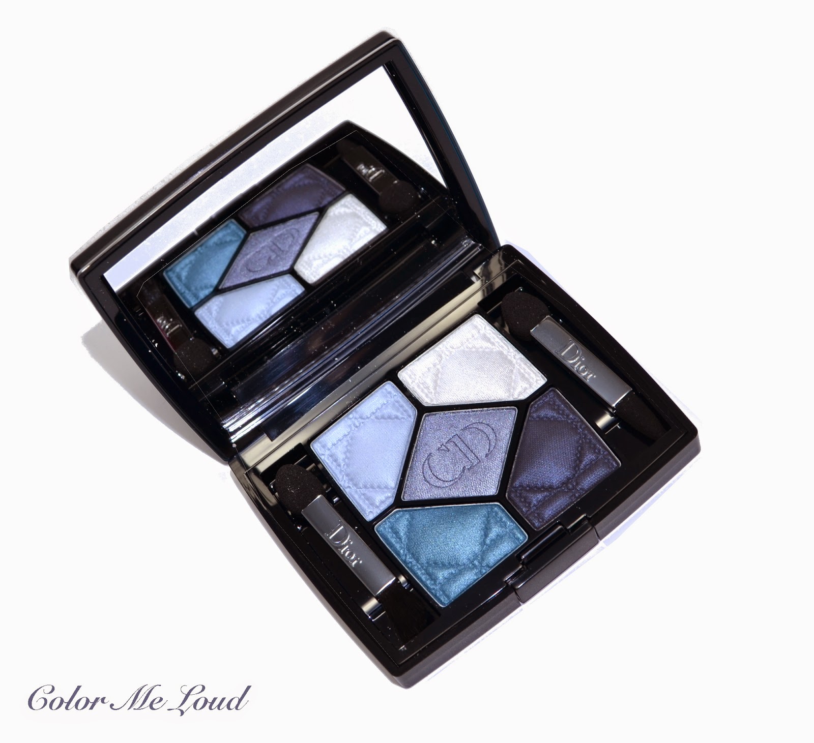
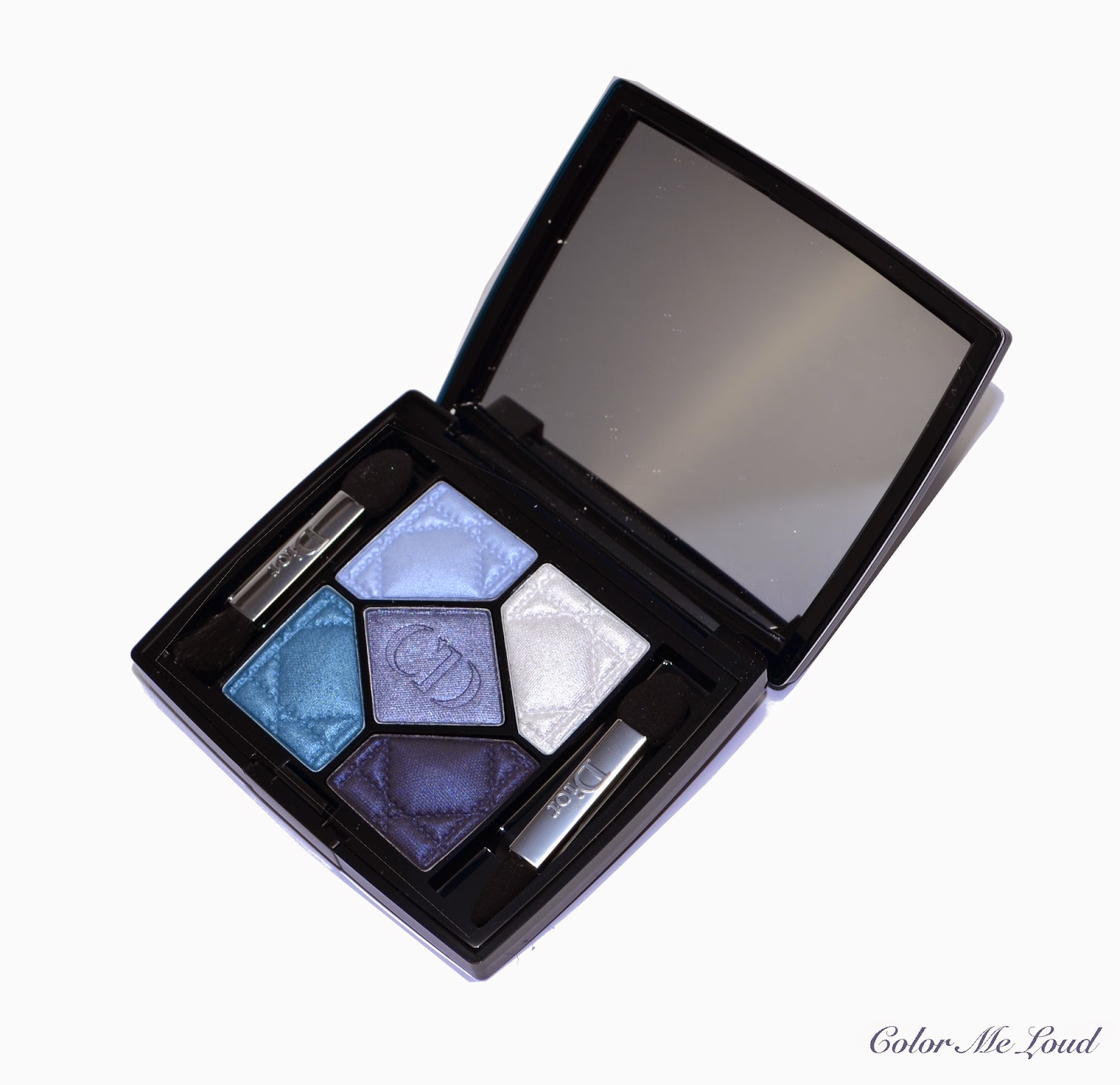
I would classify #276 Carré Bleu as a ton sur ton palette since it has four different tones and textures of blues combined with white. Matte, satin, frost and metallic textures differentiate these shades from one another along with their undertones.


Close-up: Dior 5 Couleurs Eyeshadow Palette #276 Carré Bleu

Here are the list of the shades in #276 Carré Bleu:

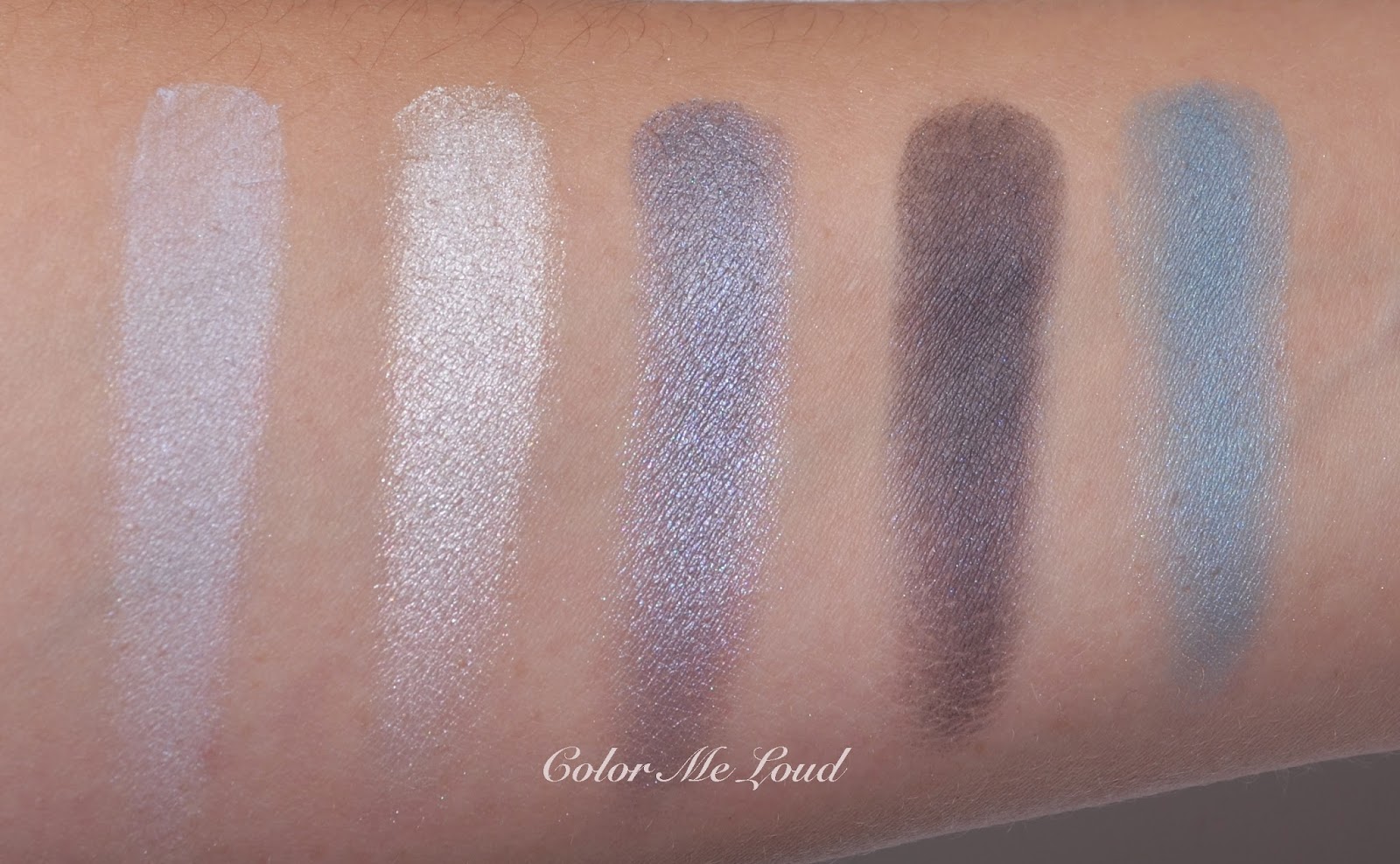
Top left: A light pastel baby blue with matte finish. It has good color pay-off but depending on how you apply it, it might be a little powdery. I recommend to tap off the access before the application.

Top right: A cool white with frosty finish. This one is very smooth to touch and it has great color pay off. For using it under the brow bone a very light hand or a very soft fluffy brush is needed.

Center: One of my favorite shades of this palette, a mid-toned metallic grey blue with gorgeous silver shimmer. It is not too cool and has the tiniest bit of red inside to make it more wearable. 

Bottom right: A deep navy blue with matte finish. I was determined to love this shade because of the undertones as well as the finish but unfortunately it turned out to be a little too dry for me and I couldn't get the color pay-off I was expecting. I also will try it with a damp brush and edit this post if it applies any better.

Bottom left: The other shade which I really like, a very pigmented mid-toned turquoise blue with matte to satin finish.  It has great color pay-off. You can see below that after applying this one on the lids, nothing else wanted to show up. ;-)


Swatch (studio light): Dior 5 Couleurs Eyeshadow Palette #276 Carré Bleu

I was contemplating since last night if I should post this close-up eye look or not. It is the result of my first experiment with Carré Bleu, trying to apply the shades so that they show up but I failed to get them right. You can see the center and the bottom left shade on the lid and white one on the inner corner. The darkest shade didn't build up to define the crease after numerous sweeps. I used Tom Ford Blending Brush which is one of the stiffest of the crease brushes I have. I would like to use it damp on my next try. I lined my eyes using an eye liner with purple undertones to make the blues work with my eye color. You can see that the other shades are very vivid and great for blue fans out there.


In-action: Dior 5 Couleurs Eyeshadow Palette #276 Carré Bleu

Here is a quick comparison to Chanel's newly released Tisse Riviera (reviewed here) in case you would like to decide which one to get. Tisse Riviera has more shades combined, a pink, a grey and a black with a metallic blue. As you can see on the swatches, the metallic blues of each palette are close, Chanel's blue is a little warmer but therefore it has a cooler black and grey. All in all Chanel's quad pulls cooler on me. If you like drama on your eyes, Tisse Riviera's darkest shade works better to give you that, which applies very deep. But if you are in the search for different tones and finishes of the color blue, then you can opt for Dior's #276 Carré Bleu.

Comparison: Dior 5 Couleurs Eyeshadow Palette #276 Carré Bleu vs. Chanel Les 4 Ombres #224 Risse Riviera
Comparison swatch: Dior 5 Couleurs Eyeshadow Palette #276 Carré Bleu vs. Chanel Les 4 Ombres #224 Risse Riviera

Here is the resulting look with Dior 5 Couleurs Eyeshadow Palette #276 Carré Bleu on the eyes, Chanel Joues Contraste #160 Innocence on cheeks and Rouge Coco Shine #93 Intime on lips, both are recently reviewed here.


FOTD with Dior 5 Couleurs Eyeshadow Palette #276 Carré Bleu

Final thoughts: Dior 5 Couleurs #276 Carré Bleu is a ton sur ton blue palette which offers different finishes and tons of blue for die-hard blue lovers out there. Only one wish yet remains to be fulfilled, just a little bit more pigment and slip for the darkest navy blue.

You can see the promo photos of Dior Fall 2014 Collection here.

Do you like palettes which have combination of one particular shade or do you like palettes with different shades combined? Which one do you find to be more versatile?

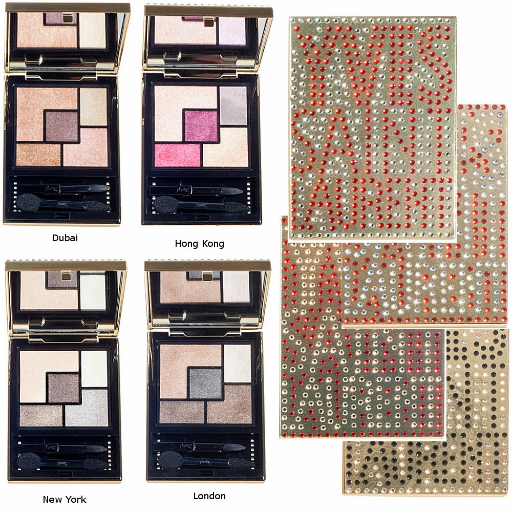
Shopping Tips: Watch-out, YSL Swarovski-Embellished Couture Palettes (Selfridges Exclusive) Are Exactly The Same as the Ones with Regular Packaging

$
0
0
Today I have received an e-mail from a reader who was very frustrated after receiving her order from Selfridges. She paid over $500 to get some palettes which she already owned. I decided to post about this and let everyone know in case you are planning to purchase one or more of the YSL Swarovski-Embellished Couture Palettes. These are exclusive to Selfridges and they have pretty city names as well as crystals on their front cover and they retail for about 1.5 times the regular price because of this add-on. Stacey was crazy enough to order three of these and posted about it here. She also confirmed the following information, so be aware that:
  • Dubai is the same palette as #03 Afrique (reviewed here)
  • Hong Kong is the same palette as #09 Love (swatched here, review coming up soon)
  • New York is the same palette as #04 Saharienne (swatched here, review coming up soon)
  • London is the same as #02 Fauves (reviewed here)
  • There seems to be another palette which is missing at Selfridges website at the moment, it might be sold out. The name was Paris and it is the same one as #07 Parisienne (reviewed here)


It was reported that Swarovski-Embellished Couture Palettes were numbered right after their twins and on the package the city names was not indicated. On Selfridges website though, there is nothing that indicates these are exactly the same and the numbers are not written. Also the photos are different, city palettes have lighter colors and regular ones have more contrast. This makes it easy for someone who orders online to make a mistake. I just would like to let you know so that you know what you are ordering. Thanks to Ashlee for the information, who unfortunately had to pay over $40 to send her items back.

How do you feel about special packaging and exclusive items? Would you splurge just for the packaging? I would love to read your thoughts on this.

Dior 5 Couleurs Eyeshadow Palette #056 Bar from Fall 2014 Collection, Swatch, Review & FOTD

$
0
0
Today I have a true beauty for you. When I have seen the promo pictures, I must have gasped. It is the classical smokey eye palette which has something modern about it. I am talking about one of the five new Dior Palettes from Fall 2014 Collection, #056 Bar.


Dior 5 Couleurs Eyeshadow Palette #056 Bar

Grey, taupe and a light pink combined with black and white. All in all it pulls cool but not icy cool. The center taupe shade balances the grey, black and white. The end result doesn't clash with my natural to slightly warm complexion.


Dior 5 Couleurs Eyeshadow Palette #056 Bar

#056 Bar is the one with most natural tones among the five fall palettes. Carre Bleu (reviewed here) is a palette of blues, Pied-de-Poule has dark tones of gold and khaki, Trafalgar is the burgundy and bronze palette, of which I am very much excited about. There is also a pastel-leaning pink palette called Tutu which is an interesting selection for a Fall Collection. These are now all available at Nordstrom. 


Close-up: Dior 5 Couleurs Eyeshadow Palette #056 Bar

#56 Bar is composed of the following shades:

Top left: A mid-toned grey taupe with satin finish. This makes a nice case color if you want to go for some drama. For a day look, you might opt for using it on its own. It has nice quality and great color pay-off.

Top right: A cool white with frosty finish. This one is nice for highlighting the inner corner or, if used very lightly, it can be used for highlighting the brow bone. It is no secret that I don't prefer frost finishes and I don't think I will reach for this one very frequently.

Center: A light to mid-toned shimmering neutral taupe. It is my favorite shade in this palette. The shimmer in that one is not too much, it just gives enough dimension to it. I like using it as a base color all over the lid. This shade is very smooth to touch and it is very pigmented.

Bottom right: A very deep brown black with matte finish. Dior nailed it with this shade, it has great color pay-off and great for both lining or defining the eyes. It is a little drier than the satin or shimmery shades, which is great because it doesn't produce fall-out. Thumbs-up!

Bottom left: A very light pink, which swatches almost like an off-white. It has shimmery finish, not as frosty as the white one, which I like. I just wished though it show a little more of its pink, like seen in the compact.I was a little disappointed after swatching that one and finding out it is not true to pan but on the eye look, it combined beautifully with the other shades.


Swatch with studio light: Dior 5 Couleurs Eyeshadow Palette #056 Bar

Before I show you the results of my first date with #056 Bar, I would like to compare the old and the new quints and point out the differences. 

  • New quads are sleeker. The look more chic while the save place.
  • CD Logo on the frost cover of old quints, which could only be seen with light is not there any more. Although I liked this effect of the old palettes, this really doesn't bother me. I think I am ready to sacrifice this effect for a sleeker result.
  • The metal lining around the edges is now a little lower.
  • Opening/closing  mechanism stays unchanged.
  • At the back of the quad, now there is a tiny picture showing the shades, which I find to be very useful to get a grasp of it before opening. 
  •  Both compacts have 6 g/0.21 Oz of product, so the size remains unchanged.
  •  Once you open the compacts, you see that the initials of Christian Dior, the letters C and D embossed on the center shade are designed again. The new letters appear to be closer to one another in the new palettes. This gives the illusion that the eye shadows are smaller, but they are exactly the same.
  • One of the sponge tipped applicator that comes in the compact has now a tiny brush on one side.

Comparison of Dior's old and new compacts, front side
Comparison of Dior's old and new compacts, backside
Comparison of Dior's old and new compacts, inside the compact (sorry about typo, I will get it done soon)

I also included the ingredients of the new and the old quints. As far as I am concerned the new releases are not new formulations but only new shades in new compact. If you know more about it please leave a commend below. Both new and old quads have talc and silicone and they don't have parabens.


Ingredients of #734 Grege (old compact)
Ingredients of #056 Bar (new compact)

Here is my first attemp in a smokey eye using #056 Bar. You can see the pink on the inner corner, taupe all over the lid, grey on outer corner which I then intensified with black. I used Urban Decay 24/7 Glide-On Pencil in Demolition for this look on top lash line and bottom water line. I thought black would be too harsh and I wanted to keep the softness of this look.


In-action: Dior 5 Couleurs Eyeshadow Palette #056 Bar

Below you can see the resulting look using Dior 5 Couleurs Eyeshadow Palette #056 Bar on the eyes, Dior My Lady Glowing Blush in pink (coral one was reviewed here) on the cheeks and MAC Sheen Supreme Lipstick in Quiet the Thing (reviewed here) on the lips.


FOTD with Dior 5 Couleurs Eyeshadow Palette #056 Bar

Here is another photo of the super pretty new palette, Dior #056 Bar. I must have taken hundred of photos of this one...


Dior 5 Couleurs Eyeshadow Palette #056 Bar
Final thoughts: A lovely modern take-on classical smokey eye, #056 Bar is one of the five palettes Dior released for this fall. It is pigmented and smooth and easy to work with. Only if the pink shade would pull more pink, it might have been one of my all time favorites.

All five of the palettes are now available in Nordstrom for those of you who are in US, for the rest of us, we have to be more patient until the mid of August.

Is true-to-pan important for you or you wouldn't care how the shadows look as long as they perform good?

Yves Saint Laurent Couture Palette 5 Couleurs #09 Love Swatches, Review & FOTD

$
0
0
For the power of the rabbit, today I would like to show you which palette got me worried at most from YSL's new releases and how the story ended up. Is it love or is it hate? Today I have Yves Saint Laurent Couture Palette 5 Couleurs in #09 Love for you.


Yves Saint Laurent Couture Palette 5 Couleurs #09 Love


Here is the story of me and #09 Love. I ordered it months ago from Feelunique but it got stuck at customs. In between these came to Germany and I ended up swatching it at the counter. My first impression was like, oh no rabbit eyes is on its way to me. Lucky (or not) the package got lost and I got a refund from the store (thanks so much to Feelunique for their uncomplicated and superb customer service). I was first happy to get my money back and not have the eyes of the rabbit. Then I started to hear the voice of a rabbit calling me. Each time I would come closer to a YSL counter, the soul of the rabbit haunt me. Evil rabbit! I got weak and thought, well, what can be so bad about having a blush palette which was originally intended to be worn on the eyes? I brought that rabbit home with me.


Yves Saint Laurent Couture Palette 5 Couleurs #09 Love

Here are the shades #09 Rabbit Love is composed of:

Top left: Light peach with satin to shimmery finish. Top left corner of YSL palettes are meant to be the base shade, this one is very pigmented and smooth with a great color pay off. If you are afraid of pink eyes, you might go with this one all the way and add a slight accent of pink somewhere. Such a flattering lovely shade.

Top right: Light pink with a touch of orchid/lavender. It has frosty finish and it is wonderful for an inner corner highlight. It provides brightness and compliments the other shades in the palette, lovely!

Center: Mid-toned plummy pink with satin finish. This one is not dark nor matte enough for a dramatic crease color, but I found it does compliment the look in a lovely way and there is enough contrast to define the eyes.

Bottom right: A light peachy gold with shimmery finish. The texture is lovely, it would especially make blue eyes pop but can be flaterring on everyone else too, even worn alone or all over the lid, you choose.

Bottom left: This is the main rabbit shade, a mid-toned reddish pink with satin finish. It turns out though that this one is so much fun, like Roger Rabbit (ha ha!). Who else loved that movie? Anyway, I love this shade, it works, it does!


Close-up: Yves Saint Laurent Couture Palette 5 Couleurs #09 Love


What I like most about #09 Love is that, it is not a ton sur ton palette like some others from the range (and from so many other ranges, *clears throat*). It might have crazy shades but the combination is unique and shades are all lovely, 


Swatch with studio lighting: Yves Saint Laurent Couture Palette 5 Couleurs #09 Love


Here is me and the rabbit. What do you think? Is it that scary? (say no if you don't want the evil rabbit paying you a visit!)


In-action: Yves Saint Laurent Couture Palette 5 Couleurs #09 Love

I combined this look with a peachy pink blush (MAC Cheeky Bugger, reviewed here) and a mini gloss I got from Bobbi Brown as a tester, the gloss unfortunately turned out to be sticky and not long lasting at the same time. Bummer. The eyes wore and wore, still rabbit even after 12 hours when I was back from work. Thumbs up.


FOTD with Yves Saint Laurent Couture Palette 5 Couleurs #09 Love

It turns out, me and the rabbit, we like each other. Love? Yes please!


FOTD with Yves Saint Laurent Couture Palette 5 Couleurs #09 Love

One more shot, because it is so gorgeous, very creative and feminine, yet not too much bling nor too muted. I found #09 Love to have the perfect balance of everything.


Can you still resist it? Yves Saint Laurent Couture Palette 5 Couleurs #09 Love

Final thoughts: I thought I should face my fears. It turns out this is the palette I like most from the new YSL 5 Couleurs Palette range because of its uniqueness, creativity and perfect harmony of lovely different shades. #09 Love is love for me. 


I am going to host a give away and give you one brand new YSL #09 palette. It will be love, looove!
Stay tuned.

I would love to hear your thought, do you like the shade combination in that one?

Giveaway: Yves Saint Laurent Couture Palette 5 Couleurs #09 Love

$
0
0
I was planning to post about some more fall make-up but got caught while trying to change the design of the blog a little. It is hard to believe that I have worked as programmer for several years and used to deal with thousands of lines of code. Even adding the media buttons took ages! Anyhow, now that it is done, hope you like it. I might have skipped a Sunday post but instead, I have this one for you...


Yves Saint Laurent Couture Palette 5 Couleurs #09 Love

I have just reviewed Yves Saint Laurent Couture Palette in #09 Love (check out swatches and FOTD here) and received positive thoughts and comments from you. This showed me that there are other bunny lovers out there and this giveaway is especially for you, the price is a brand new Yves Saint Laurent Couture Palette 5 Couleurs in #09 Love. Just log in to Rafflecopter and follow the instructions. I would be very happy if you use some of my new media buttons *click click!* to add me to your RSS Feed, Instagram or Twitter. If you want to tweet about the giveaway, you can do so each day and get more points. I still don't have a Facebook page, do you think I need one? 

Giveaway is open internationally, ends on the 3rd of August. Good luck to you and to me since it is my first giveaway, hope I didn't forget anything ;-)


a Rafflecopter giveaway

Dior Vernis #206 Pied-de-Poule, #796 Carre Bleu and #853 Massai from Fall/Winter 2014 Make-up Collection, Review, Swatch & Comparison

$
0
0
I hope everyone is having a great start in the week. I might have worked too hard during the first two days or I must be totally confused because I just wished a colleague who works four days a week "a nice weekend"! This was when I recognized that there are three more days, ugh...

Before I start with the beauties of today, I just would like to remind you that I am hosting my first give-away ever, so please go check it out if you haven't joined yet. It is so much fun that I suspect a new one is on its way! I have enjoyed reading the comments so much, got some new ideas and a lot of motivation. Huge thanks to everyone who left them.

Lovely Dior gel-effect formula that I am loving to bits! *happy sigh* I have reviewed some of them previously here (Part 1) and here (Part 2). Part 3 is also coming very soon. Today I would like to review two of the four limited edition shades coming up for this Fall and also show you a quick swatch of a repromote from their permanent line. 

The new shades are called #206 Pied-de-Poule and #796 Carre Bleu.


Dior Vernis #206 Pied-de-Poule and #796 Carre Bleu from Fall/Winter 2014 Make-up Collection

A gorgeous mid-toned nude with slightest hint of lilac is called after the famous pattern (a.k.a. Houndstooth) which was used to design Chriastian Dior's best seller suits. Check out this picture from 1950, and you know what I mean. 

#206 Pied-de-Poule is a great nude, not too dark not too light, very flaterring due to its natural undertones. It is opaque in two coats, has the long wear time of their new gel-effect formula. Pied-de-Poule is a true cream. It also appears warmer or cooler depending on the light, therefore I have two swatches for you.


Dior Vernis #206 Pied-de-Poule

I pulled out some of my favorite nude nail polishes for a comparison. I love nudes which are not too yellow nor too dark and Pied-de-Poule exactly fits the bill.


Dior Vernis #206 Pied-de-Poule and similar nail polishes from my stash

Dior #403 Palais de Royal (reviewed here) from the permanent collection is darker. It is great because I am loving it but I was wishing for one, which is close but lighter. Burberry #103 Ash Rose (reviewed here) is one of my all time favs, which is slightly lighter. Giorgio Armani #103 ParmaGreige has more lavender and #104 Greige is darker (both are reviewed previously here).

Tom Ford Sugar Dune (reviewed here) is lighter and more pink. Chanel #559 Frenzy is warmer, I was really not expecting the latter!

Dior #306 Gris Trianon is cooler and darker. The closest shade in my stash is YSL #39 Beige Gallery (reviewed here) which is a little cooler but they are really close. So I would say, you might want to skip Pied-de-Poule if you own Beige Gallery already. However if you missed Beige Gallery, I recommend that you don't miss this opportunity twice! ;-)


Nail wheel comparison of Dior Vernis #206 Pied-de-Poule and similar nail polishes from my stash

Dior #796 Carre Bleu is a deep night blue with secret silver shimmer which only reveals itself under a strong light. Before I tell you what I think about the color, I would like to mention that the consistency is very good, longevity is au par with other nail polishes from gel-effect range, so it is rather impressive. Carre Bleu is also self levelling and a dream to work with.

The shade... It must be my all time favorite dark blue nail polish! It is not too dark and at the same time it has this understated beauty, a chic and professional aura. It is a great alternative to black without being black nor blackened. This one is pure love for me and I can see myself wearing it often after the summer is over.


Dior Vernis #796 Carre Bleu
Dior #796 Carre Bleu with flash, to show the faint shimmer

I would like to show you some comparison swatches and you will understand why I liked Carre-Bleu so much. Those are a few dark blue nail polishes from my stash...

Dior #796 Carre Bleu and similar nail polish shades from my stash


Dior #607 Blue Denim (disc.), Chanel #553 Blue Rebel and Chanel Magic (disc., reviewed here) are all lighter and brighter.(see?)

Dior #908 Tuxedo (disc.) is more metallic, Chanel #461 Blue Satin is darker and has more of a metallic finish. Dior #900 Poison Blue (disc.) leans more purple and is darker.

Chanel #631 Orage from this year's collection didn't move me much if you remember the post about this one, because to me it rather looks like another black. If you would like to choose only one dark blue polish this year, I would recommend you getting Dior's Carre Bleu instead.

The closest shade I have in my collection is Giorgio Armani's #701 Bleu d'Armani (swatched here), which is another blue I love wearing. I would say it is a little bit deeper. I think if you have one, you don't need the other but if you will pick only one, go for Dior #796 Carre Bleu since you get more product for your money.


Nail wheel comparison of Dior #796 Carre Bleu and similar shades

There is also a repromote shade #853 Massai, which is also reformulated and included in the permanent line. In the pictures I have seen that they slightly changed the name and called it Red Massai, which is a little confusing but as long as the number stays the same, don't worry, they are exactly the same shades. This one is also a stunning burgundy red with great formula and cream finish. Below swatch is with two coats.


Dior #853 Massai, repromote from permanent collection for Fall 2014

Final thoughts: A lovely natural mid-toned taupe nude and a stunning midnight blue which is not too deep nor too bright. I can't wait for the Fall to come. Wait a minute, it is so rainy at the moment here, I might consider to wear one of them tonight!

Check out these other posts for Dior's Fall Collection

What do you think of Dior's Fall Collection? What is in your wish-list?

Chanel Les 4 Ombres #202 Tissé Camelia, Review, Swatches, Comparison & FOTD

$
0
0
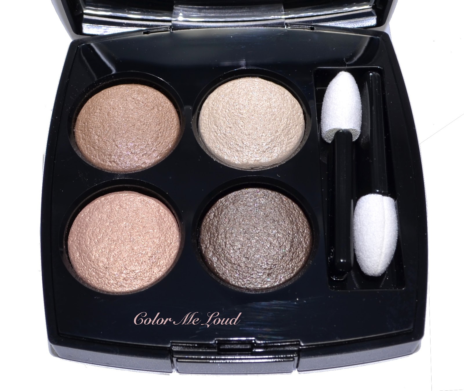
Chanel released eight new Les 4 Ombres a few months ago in Europe and the collection rolled out about a month ago around the globe. If you follow me, you must have understood how crazy I am for this new formula. It is certainly one of my favorites out there at the moment, so the story goes, fast forward to the day, I ended up with all eight of them. I have reviewed six of them previously (check out the end of this post for the links) and here comes the seventh, one of the coolest among them, iridescent pink, taupe and plummy brown, it is #202 Tissé Camelia.


Chanel Les 4 Ombres #202 Tissé Camelia

Camelia is definitely one of those quads which will look best on paler and cooler complexions. It has very good color pay-off but the shades are rather muted and light. They are also not metallic like other quads, such as Rivoli or Venetien, so if you are not getting along with metallic shades, you may want to check out Camelia. It is the understated beauty among the others (along with Mademoiselle), great for a polished and feminine day look.


Chanel Les 4 Ombres #202 Tissé Camelia

Two of the shades, the taupe on the top left and the pink on bottom left have iridescent almost duo chrome quality which brings this palette to life. Under certain light, they have beautiful multi dimensional sheen. Call me crazy but this makes me visit the bathroom mirror from time to time just to check it out, anyone relate with my unhealthy obsession?. ;-)


Close-up (with flash): Chanel Les 4 Ombres #202 Tissé Camelia
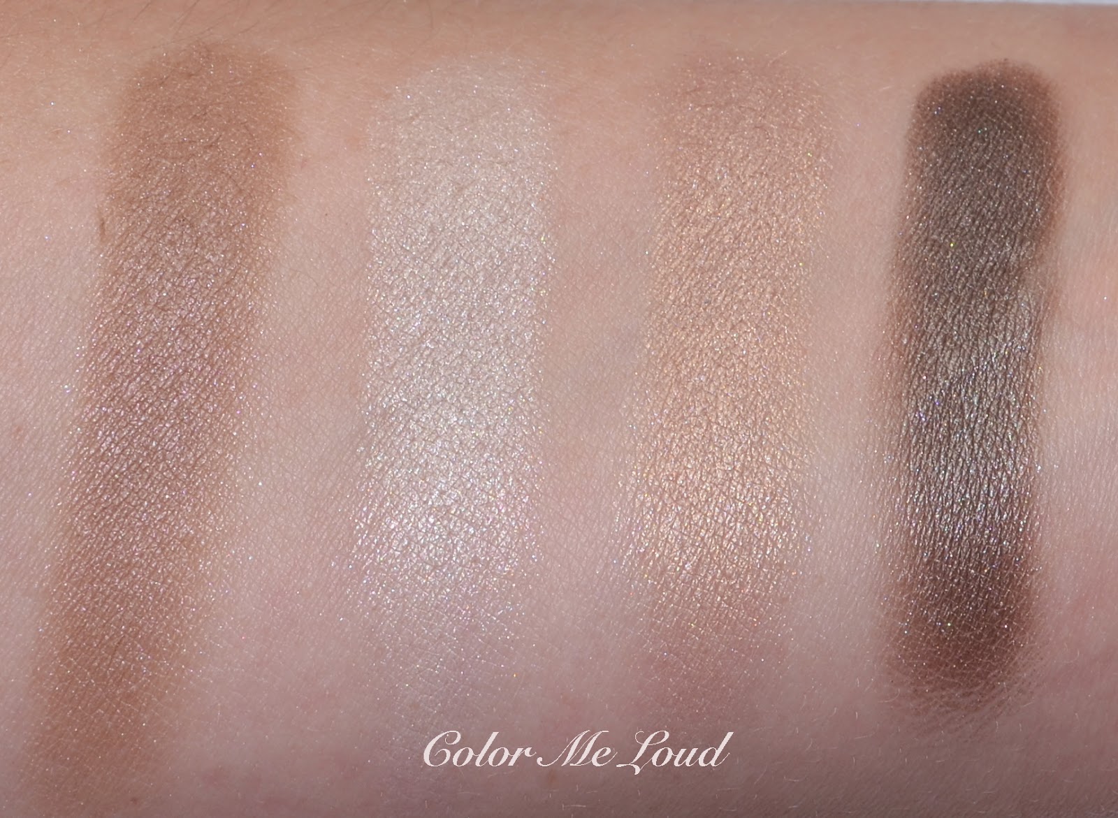
Trying to find swatches which are color accurate was not that easy. I had some swatches under the sun but found out the shades don't show their qualities and get washed out by that. The best light to show the multi-dimensional effect is indoor lighting. Still it is hard to capture the real beauty. 

Top left: Mid-toned taupe with slight lavender undertones. It is one of the duo-chromish shades and just to say that it has satin to shimmery finish would be an understatement. It is really lovely.

Top right: Shimmery off-white with a touch of pink. This has great color pay-off and lovely as a highlighter on the inner corner or once sparingly used, it also looks great under the brow bone.

Bottom left: A light iridescent peachy pink with duo chrome effect and very fine shimmer. It is my favorite shade of the quad, something like magic happens when I apply it on my lids, it brightens up the look in a very unique way. Love it!

Bottom right: A deep plummy brown with satin to matte finish. This one is dark enough for some drama if you are in need of one. It also can be used as a liner. Another lovely shade.


Swatch (studio lighting): Chanel Les 4 Ombres #202 Tissé Camelia

Now before I go on to in-action photos, I see my brows and tell myself "girl now you need a pair of tweezers" :-P Although my brows look like I am not plugging them, I have to say I do (very lightly!) because they get out of control (see below!). So for the time being please no comments about how bushy they look, lol, I will address this issue tonight!

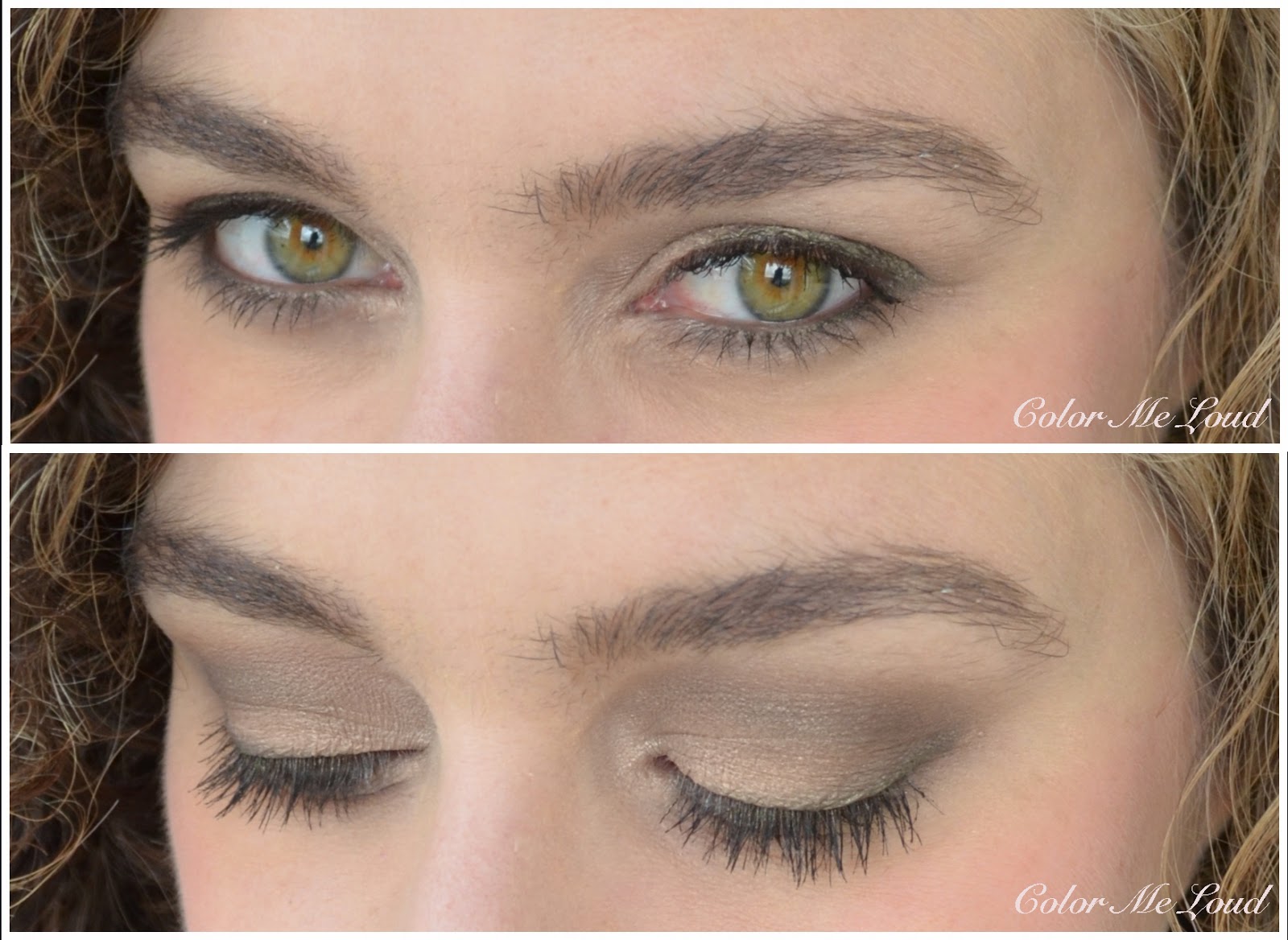
Below I applied the white at the inner corner, pink at the lid all the way to the outer corner and taupe at the outer corner. I then defined the look with the deep brown on crease. Can you see how much the pink brightens up my lids? Have I already told you that I love it?


In-action: Chanel Les 4 Ombres #202 Tissé Camelia and my bushy eye brows

I thought I was missing a bright lip for so long so here is the rest of the look with Tom Ford Wicked on the cheeks (special thanks to Dawn who swapped it with me!), Guerlain Rouge G #864 in Rose Grenat on the lips, applied almost as a stain (yes it is so bright!)


FOTD with Chanel Les 4 Ombres #202 Tissé Camelia and Guerlain Rouge G #864 Rose Grenat

And to those of you who wonders how Tisse Camelia compares to a recently released Duo #70 Rose Majeur (which is also permanent), here you see that both shades of the duo are very different: Pink shade of Rose Majeur is warmer and brighter, dark shade is cooler and is more plummy. Another difference which is hard to capture is that Tisse Camelia has a duo chromish iridescent quality which Rose Majeur doesn't have. Needless to say that my pick from these two is Tisse Camelia.


Swatch, comparison outdoors, Chanel Les 4 Ombres #202 Tissé Camelia and Chanel Duo #70 Rose Majeur

Also check out the following posts if you haven't made up your mind yet. I will also review the last quad (Cambon) soon and write a wrap-up.
Final thoughts: Chanel Les 4 Ombres #202 Tissé Camelia is a lovely understated beauty, great for a polished day look, I believe it is best suited to lighter and cooler complexions, if you have tried it and made it work on a medium to darker complexion, it would be lovely if you let us know at the comment section below. And that iridescent pink on bottom left corner, it is to die for!

Are you also going bananas over these quads? Have you picked any yet?

Clarins Eye Quartet Mineral Palette in No. 13 Skin Tones for Fall 2014 Ladylike Collection, Swatch, Review & FOTD

$
0
0
It is almost weekend! Plans are to go shopping and to eat at our favourite restaurant (Japanese cuisine, yummy!). Additionally I will try to practice some type of sports (Zumba?) and avoide all types of sweets (no chocolate!), my summer holiday is getting closer and I have to get in shape :-P

Today I have a gorgeous palette for the natural lovers. Lastly I was told the "nudy tunes" part of my blog description is not particularly noticable *lol*. So I decided to go for something nude today.


Clarins Eye Quartet Mineral Palette in No. 13 Skin Tones

Clarins Eye Quartet Mineral Palette in No. 13 Skin Tones is going to be released with Fall 2014 Collection called Ladylike. Although I am not particularly a fan of the name which sounds to me like lady bug lol, I really like the promo photos (check them out here). Once the collection hits the counters, I will check out the blush, which looks gorgeous on promo images. I am not sure what the model is wearing on her eyes since it looks more rosy. The palette though has more browny and bony tones...


Clarins Eye Quartet Mineral Palette in No. 13 Skin Tones

#13 Skin Tones is for those of us, who don't like shimmer too much and don't get along too well with warm naturals. This one has cooler naturals with matte and satin finish. Sounds like a dream? Like something you were looking for? Let me go on ...

Close-up: Clarins Eye Quartet Mineral Palette in No. 13 Skin Tones

When I opened the compact, my eyes shone. Two mattes two satins and cool naturals, yes! Then I started shooting photos from every angle, love the combination. Then I wanted to swatch it... Ouch, no color pay off. I am used to Clarins Palettes having one problem shade but this one was so dry across the board. The following swatches are dry and they required multiple swipes of each eye shadow, like maybe five times? Then I remembered these could be used wet as well, huh, why haven't I thought about it before? The eye makeup below is done mostly with wet application and I can say they perform much better once they are wet...

Top left: A light nude/tan with satin finish and subtle golden shimmer. This shade is almost non-recognizable on my skin tone since it blends with it.

Top right: A light off-white with rosy beige undertones and matte finish. This one was rather chalky once used dry. Once used wet, it was chalky again, but rather like a wet chalk :-} You know how a wet chalk performs then you understand what I mean. (Reminds me of my classes lol) But let me tell you something, if you can get the right amount on your brush, this shade is stunning! Don't ask me how a chalk can be stunning, just check out the photos below and you will see since I applied it all the way to the mid of the lid and it brightens up the look like no other.

Bottom right: A mid-toned cool brown with satin finish. Another gorgeous shade, it has a tad of pink in it to make it very flattering. This one shows much better on my skin and performs better once used wet, but can also be used dry.

Bottom left: A deep natural brown with matte finish, dark enough to define and line.


Swatch: Clarins Eye Quartet Mineral Palette in No. 13 Skin Tones

Here is the resulting eye look, top left shade is too subtle on me to show up on the camera so I layered it with top right (off-white matte) all the way to the mid of the lid. I then used bottom right shade at the outer corner and defined my crease with the darkest brown (bottom left). I was rather disappointed after the swatches but I liked the application on the eyes, once certain shades are used wet.


In-action: Clarins Eye Quartet Mineral Palette in No. 13 Skin Tones

Below I combined my nudish eyes with Tom Ford Wicked on the cheeks, Rouge d'Armani Sheers in #603 on the lips. Lipstick is from Armani's Bright Ribbon Collection and I am really loving it. Thanks to MACina from Specktra for enabling me on that one. You can read my review of #604 here which was rather too sheer for my taste but I am happy to report that #603 performs much better on me and it combines well with Wicked.


FOTD with Clarins Eye Quartet Mineral Palette in No. 13 Skin Tones & Armani Sheer Lipstick in 603

Final thoughts: I always have a place for a good cool toned natural palette with combination of mattes and satins and Clarins Mineral Palette #13 Skin Tones fits the bill. It has to be mentioned though, you can only fully appreciate it if you don't mind wet application.

Clarins Fall Collection should be available in August. I got mine from a friend (hugs to Teresa) who is fortunate enough to receive products in advance.

What do you think, will you be checking out #13 Skin Tones or do you have closer shades in your stash?

Rouge Bunny Rouge, My Summer Picks, Bronzing Glow Liquid, Long Lasting Eye Shadows in Angelic Cockatiels, Umber Firefinch and Fire-Tailed Sunbird, Lip Plump in Swell Bliss, Blush Wand in Manet and Brightening Liner Duo, Review, Swatches & FOTD

$
0
0
It started raining in Germany again, or I should say, spraying? It is not like a normal rain more like walking near to a water fall if that makes sense. The worst part of it all must be that we are all happy to see some water dropping from the sky because it was incredibly humid during the last days, to the point that all I can remember of last weekend is the word perspiration.

Today's post is for those of you who are more fortunate in terms of weather. I selected my favorites from Rouge Bunny Rouge line to provide you with a healthy glowing and brightening summer make-up.


Rouge Bunny Rouge, My Summer Picks

Let's start with the eyes. Rouge Bunny Rouge Long Lasting Eye Shadow range is full of subtle beauties for a natural polished look. My favorites for this summer are peach and gold tones on eyes defined with a natural soft brown, or a more defined soft brown smokey eye for summer evenings. I have picked three shades for these two looks.


Long Lasting Eye Shadows in Angelic Cockatiels, Umber Firefinch and Fire-Tailed Sunbird

Angelic Cockatiel is a peachy gold with metallic finish. Although it is quiet shimmery, it doesn't look frosty or cheap, nor does it emphasize my fine lines. As a wash of color all over the lid, it gives the perfect polished look wile brightening up the eye and make it appear larger. Like all the RBR Eye Shadows, Angelic Cockatiel is buttery soft and very pigmented.

Umber Firefinch is a deep natural brown with a hint of plum. It has a satin finish with a subtle and beautiful sheen, which makes it appear complex and therefore very versatile. I like wearing Umber Firefinch on its own or combine it with softer colors. It works both with warm and cool tones too. Lovely!

Fire-Tailed Sunbird is a light soft peach with satin finish. I use it mainly to give a nudy sheen on the lids or to blend over the crease since it is very close to my skin color. I recommend it especially to the ones with fairer complexions.


Long Lasting Eye Shadows in Angelic Cockatiels, Umber Firefinch and Fire-Tailed Sunbird

For Brightening and Highlighting, I use Rouge Bunny Rouge Eyes Wide Open Brightening Duo under the brow bone, at the corner of the eyes and sometimes sparingly along the waterline. It has a jumbo pencil thickness and two sides, one to brighten (pink, matte) the other to highlight (white, pearl). The consistency is very creamy and pigmented and therefore has to be carefully applied and blended. I especially like adding a few dots from the highlighter under my brow bone and to the inner corner of the eyes for a subtle highlight.


Brightening Liner Duo in Eyes Wide Open

Here is my interpretation of bright peachy eyes, with a soft definition.
  • Angelic Cockatiel all over the lid
  • Umber Firefinch on the crease for definition
  • Lasting Eye Pancil in Lola as eye liner along the upper lashes and below on my waterline. 
  • Brightening Liner Duo under brow bone and on the inner corner for a subtle highlight.
  • Modelling Mascara in Witchery on the lashes. I can't rave enough for this one therefore I am going to do this in a separate post!


In-action: Long Lasting Eye Shadows in Angelic Cockatiels and Umber Firefinch

To combine bright eyes with a healthy glowing complexion, I went for a natural coral Blush Wand in Manet. This is my first Blush Wand from the range and I really liked the sheer but buildable quality of these. Below swatch is very heavy, it took me many swipes to get this, so don't be afraid. I like padding the blush wand directly from the bullet onto my cheeks gently. That way you won't drag the foundation underneath and you can build up to the intensity you wish. I believe Burberry has a similar Blush Wand for their summer collection, Rouge Bunny Rouge line has four shades and they are permanent. These all have names of great painters. The pink (Vermeer) and plummy (Rubens) Blush Wands are definitely in my wish list after trying Manet out!


Cheeks in Bloom Blush Wand in Manet

Now comes the star of the show... That product which changed my desperate "matte white" face (ugh!) to a dewy sun kissed complexion... *drums drums* It is Bronzing Glow Liquid in As It Were Summer Still. It comes in a luxurious glass bottle and a pump so the application is easy and gem free, yay! In the beginning I had to shake the bottle quiet a bit to make sure that consistency is not too watery but afterwards I didn't have to shake all that much. I apply one pump at the back of my hand and pad it with fingers on the top of cheek bones and high points of the face where the sun would naturally hit. I then tried to apply it with Rouge Bunny Rouge #014 Highlighter brush (reviewed here) and the application was more even and easier.

Below you can see how a pump of this magical liquid transforms my poor arm which haven't seen sun in ages (photo left) to a bronzy glowy super arm (photo right)! I suspect it also works great for legs and arms or decolletes. If I won the lottery some day, I will get hundreds of bottles of it to take a bath in them! *dreams on*


Bronzing Glow Liquid in As It Were Summer Still

To understand the effect of the magic liquid and lovely eye shadows, here is my take on a sun kissed glowing complexion and bright eyes. It is a natural and flattering look for everyone, great for a day out or can be worn to work. In addition to the products used on the eyes which I listed above, here is the list for rest of the face:
  • Guerlain Lingerie De Peau BB Creme in Light all over the face 
  • Rouge Bunny Rouge Impalable Finishing Powder in Diaphanous dusted lightly over the most shining part of my face: my chin! (you keep talking about T zone, I have a C zone :-P ) 
  • Diorskin Star Concealer under the eyes (review coming up soon).
  • Rouge Bunny Rouge Bronzing Glow Liquid in As It Were Summer Still on the high points of the face.
  • Rouge Bunny Rouge Cheeks in Bloom Blush Wand in Manet
  • Rouge Bunny Rouge Colour Burst Lipstick in The Plot Thickens on the lips layered by Rouge Bunny Rouge Lip Plump in Swell Bliss


Dewy Summer Make-up with Rouge Bunny Rouge

Dewy Summer Make-up with Rouge Bunny Rouge

Talking about lips, although I am usually not a gloss girl, I can't imagine a summer without lip glosses. Here are a few picks from Rouge Bunny Rouge Line:

  • Rouge Bunny Rouge Lip Plump in Swell Bliss: A lovely peachy pink shade flattering on anyone. Worn on its own, it has a sweet tingling effect on the lips and makes them look fuller with a trick I haven't understood. Swell Bliss also has regenerating, soothing and moisturising effect provided by a long list of skin care ingredients, check them out here (not an affiliated link). I found the formula especially moisturising and comfortable and to me, the most important of all, it is not sticky.
  • Rouge Bunny Rouge Decadent Duos: A two sided mini blush/lipgloss duo in the cutest packaging ever. Unfortunately they are discontinued and sold out quickly after they went on sale on RBR Website. I recommend you grab a few if you come across one at a store.
  • Rouge Bunny Rouge Lipgloss in Uncaged Tigress, another sold out beauty. The line seem to have a similar range, called Glassy Gloss though. The ones I have tried so far has been very comfortable without sticky effect of some of other brands, so I don't think you can go wrong with any of these.


Rouge Bunny Rouge, Lip Plump in Swell Bliss, Decadent Duo in Samba/Enredo, Lip Gloss in Uncaged Tigress

Below is a similar dewy complexion, this time combined with a soft brown smokey eye: Umber Fire-finch all over the eye, blended into the crease with Fire-Tailed Sunbird. I am wearing Decadent Duo in Samba/Enredo on my lips.


Smokey Bronzy Summer Look with Rouge Bunny Rouge

Smokey Bronzy Summer Look with Rouge Bunny Rouge

Final thoughts: I hope you liked my interpretation of Rouge Bunny Rouge's understated beauty message for this summer. I am loving especially two of the eye shadows, Angelic Cockatiels and Umber Firefinch for a polished bright wide-eyed look. Blush Wand is a lovely alternative for hot Summer days to pop a little bit of color on the cheeks. My most loved, used and abused product awards goes to Bronzing Glow Liquid in "As It Were Summer Still" for transforming my dully pale complexion to that of a Sunkissed Hollywood Star's. Check out Amy's great comparison of this magical liquid with other highlighters and illuminators at Cafe Makeup too.

On a side note, only a little more than 4 days left for the giveaway, so make sure to sign up here.

Have you tried any of these products? Bright eyes for summer or would you rather opt for something more smokey?


This post contains sample products which are sent for my consideration. 
I am not compensated for this review and all opinions are honest and my own

Current Wish List, Birthday Edition

$
0
0
I was planning to review some more eye shadows today but then I stopped and said, hey, it is your birthday tomorrow, why not dreaming a little so I prepared a list which I would love to get my hands on. Some of them will probably end up in my Christmas Wish List as well, especially the perfumes and the watch since I have been eyeing these for quiet a while.


Wish list, birthday edition


La Grande Classique de Longines

I have been loving my Tissot watch for the last ten years and never thought I would need another one so soon but it turns out mine started having some minor problems now and then so I got my eyes on this beauty a few months ago. I usually like using watches with white backgrounds but once combined with diamonds instead of numbers, this one with black background and silver bracelet won my heart.


La Collection Privée - Gris Montaigne by Dior

A lovely floral chypre from one of my favorite noses, François Demachy. I have been circulating around Dior Counter (like the moon around earth!) in the department store and always end up spraying this from head to toe as my nose each time follows me to where it is. I have Oud Ispahan for winter, which is, along with my never ending love for Eau Noire, my favorites from La Collection Privée line. I am not usually big on roses but the rose inside Gris Montaigne isn't too pronounced on me, it lasts long and it is very day appropriate.

Les Exclusifs de Chanel - Coromandel

I am having a long affair with Coromandel and I have been through various samples of it. I also enjoy Beige from the same line which is a easy day time beauty but Coromandel is more than that, it is edgy and unique, a rich woody oriental tune to my nose but it is unlike anything, like a mystery which should never be solved. The only thing which kept me away from investing in a full bottle was the fact that it is EDT but I have seen that my large bottle of Beige is holding strong since two years. I may pull the trigger any minute.

YSL Palette Couture #11 Ballet Russes

I have gathered almost all the palettes from new YSL Line, some more dear to me than the others and my favourite up to now is #09 Love which you can still win by entering my give away here. Meanwhile I have tried #10 too, which was a bit too blue and green for my taste but great in terms of color pay-off and texture. I have noticed that #11 is going to be released in Germany in September but it is already available in France, Sephora. What a coincidence, I will be in France tomorrow ;-)

Chanel Les 4 Ombres #234 Poésie

I tried to order that one from US but it was sold out just a few hours ago before I could hit the button. Then it was an in-store exclusive, so hard to get for me with an international CC. Now that I know it will be reaching our shores soon, I can't wait to try it out!

Guerlain Fall 2014 Palettes

There are three of these beauties, each one more beautiful than the other. It will be very hard to select one, or two, or maybe three?

Suqqu Fall Collection

Since the promo images hit online, this one has been on my radar. That split-pan palette is too gorgeous to use and I am very curious about the trios too. I am even thinking to try out one of their lipsticks from this collection, never tried a Suqqu lippy before, any recommendations?

Nars Fall Collection

It looks like another lovely collection from Nars and two of the eye shadow duos are said to have similar texture to the ones from Spring, which I am loving at the moment. I am also very curious about the blush this time. Here comes my confession: I don't own a single Nars blush! Shocked? *laughs*. Anyway this fact may change any minute, I just have to get to France to check things out in person because we don't have any Nars Counters in Germany... yet...

Was it a long list? I am not even done yet. Tom Ford Fall Collection is going to be a big haul for me because I have been eyeing almost everything from that one. I have been also enjoying permanent MAC Eye Shadows at the moment and may end up getting a second empty palette to fill out during the months to come. I also have a long Hakuhodo order list for the months to come.

What is in your wish list at the moment? Anything common to mine?

Dior 5 Couleurs Eye Shadow Palette #876 Trafalgar from Fall 2014 Collection, Swatch, Review & FOTD

$
0
0
Before we drive to France to eat in our favorite restaurant in Strasbourg, get a drink and spend the night (birthday wish! ;-)), here is a quick review of one of the most talked palettes from Dior's Fall 2014 Collection, 5 Couleurs Eye Shadow Palette in #876 Trafalgar. 


Dior 5 Couleurs Eye Shadow Palette #876 Trafalgar 

Trafalgar is an absolute eye catcher. There are thirteen new palettes to be released this Fall and everyone who looks at the list, gets caught by this one. I remember thinking to myself "Oh that one with the red, I want it!". Trafalgar comes in a sleeker compact than its ancestors, I have already compared the old and the new compacts and ingredients in detail here. Since then I have heard that the new shadows are indeed new formulations and not just repackaging. I can't see the difference to the older formulation though and I already liked the older ones, so no issues there for me.


Dior 5 Couleurs Eye Shadow Palette #876 Trafalgar 

Here is Trafalgar up close, it has a shade combination which I haven't owned before, pink, pearly white, burgundy red, antique gold and a deep plum. It has something a little oriental and vintage about it. Dior Golden Flower from Holiday Collection had Antique Gold and Plum combination, which was lovely but Trafalgar takes it one step further by placing the "it-color" of this Fall right in the middle, burgundy...


Close-up: Dior 5 Couleurs Eye Shadow Palette #876 Trafalgar 

All the shades in Trafalgar are shimmery or metallic , with the exception of the red shade which is more of a satin. I think it is a good idea to keep this shade more tuned down in terms of shimmer because it doesn't need all that much to get the attention anyway. All in all I am a little disappointed by the top two shades which don't deliver the color pay-off I would expect from Dior Quints, but the bottom and center shades make it up for it. They are buttery, smooth and they have great color pay-off. 

Top left: A very light pink with pearly finish. It reminds me of the center shade from Dior's Spring Palette Pink Pompadour. It is rather sheer. I have yet to try to layer it on other shades in the palette but all the shades have their glow already, so didn't think I need to layer one more thing on top.

Top right: A light off-white with slight pink undertone and shimmery finish. This shade appears very close to the light pink once swatched and on the eyes they are almost identical. I used this one on the inner corner for a highlight and it worked wonderfully.

Bottom right: A deep brownish plum with satin to shimmery finish. it is pigmented and texture is very smooth but I wished it would be a little less shimmery, but it may be just me. This one is really very pretty and can be applied all over the lid on its own or combined with the red shade, it would sing!

Bottom left: A light antique gold with natural undertones and metallic finish. I like the fact that this one is not too yellow nor too green. The texture is again good and color pay-off is great.

Center: The jewel of the quad, it is a ruby red shade with slight pink shimmer and satin to matte finish. The color pay-off of this one is the best in the quint along with the plummy shade. This shade is a real stunner and don't worry, it is not that hard to wear it either ;-)


Swatch with studio lighting: Dior 5 Couleurs Eye Shadow Palette #876 Trafalgar 

I have worn Trafalgar yesterday and got a few compliments from hubby and at the counters. I think the end effect is lovely. Below I really went very easy on red and blended it with the gold. These can be worn for a full effect, more plum and more red. I actually have a few more ideas about how to wear it, I may post about it if you are interested. Here is a light day appropriate version...


In-action: Dior 5 Couleurs Eye Shadow Palette #876 Trafalgar 

And the whole look, I combined it with Rouge d'Armani #603 on the lips, Armani Cheek Fabric Sheer Blush in #306 Attitude on the cheeks. By the way for those who wonder, yesterday I went for a great Armani haul and you can see the products from Fall Collection very soon on the blog. 


FOTD: Dior 5 Couleurs Eye Shadow Palette #876 Trafalgar 

FOTD: Dior 5 Couleurs Eye Shadow Palette #876 Trafalgar 

Here is one last look to the stunner... #876 Trafalgar is now available in US and UK (Selfridges). It will be soon available in Europe too. In Germany I believe the release is on the 15th of August.

Dior 5 Couleurs Eye Shadow Palette #876 Trafalgar, this time upside down

Final thoughts: I was a little skeptical, two of the top shades are rather sheer and look almost the same, and the palette is more on the shimmery side with no matte. On the eyes though, this one is truly stunning. It is also very versatile, I can't think of all the the combinations it offers. Loving mine, can't wait to play with it a little more.


Which of the 13 new eye shadow quads are you eyeing? Do you like this particular combination of red, gold and plum?

Giorgio Armani Organica Palette, Rouge d'Armani Sheers in #114, #524, #624 and Eyeliners #2, #3, #4 and #6 and ETK Solo #24 from Fade To Grey Fall 2014 Collection, Review, Swatches & FOTD

$
0
0
Right on time for the discussions of 50 Shades of Grey trailer, Armani brings us an alternative, Fade to Grey Collection for Fall 2014. I have to say that I like Armani's version of grey more than way-too -fictional-for-my-taste Christian Grey, but this is another story ;-) And yes just between us (and everyone else on the internet) I confess reading the first novel with a record speed (read a day!) but then hated the time I spent on it and ended up not getting the other two. But maybe that is just me.


Giorgio Armani Organica Universal Eye Shadow Palette

Let me go back to the real grey beauty, Organica Universal Eye Shadow Palette which is the star product of Fade to Grey Collection. Maestro knows what we girls want, I don't think there exist many who would let out a happy sigh seeing this one. Without a doubt, this is the prettiest eye shadow duo I own...


Giorgio Armani Organica Universal Eye Shadow Palette

Organica Palette is housed in an Armani signature compact and has 5 g/0.177 OZ of product, same as the Belladonna Highlighter from Spring. I have just happened to read my review of the highlighter, I complain about the tiny product and the price. I guess we get used to this and this time I won't complain. Or maybe since this one is an eye product and includes two shades, I find it a bit more bearable. Or maybe because it was my treat on my birthday to myself ;-)


Close-up: Giorgio Armani Organica Universal Eye Shadow Palette

Most of you contemplated if Organica has an overspray. This one has a very thin over spray so the color of the product doesn't change dramatically once it is gone (like... remember the beautiful palettes from last fall?). So it might be that company has heart our complaints and acted to it. The left shade in the palette is a beautiful greyish taupe with lila undertones. This one is more wearable than a silver for many of us because of the slight purple touch. 

The second shade is a mid-toned metallic natural gold which is not too warm nor too yellow. Both shades are very flattering and they have a very complex multi dimensional shimmer which is hard to capture with camera. You can wear them one by one or mix them as I did below. 

I suspect taupe is very close to Chanel Illusion d'Ombre in Illusoire (one of my holy grail eye shadows, love!). If you have any other ideas of comparison/dupes, please leave a comment below and I will prepare a comparison post for Organica Palette.


Swatch (studio lighting): Giorgio Armani Organica Universal Eye Shadow Palette

There are also three Eyes To Kill Solos for Fade to Grey Collection. #01 and #03 are both repromotes and I have already swatched them here with all the other shades. #25 is new and limited. It is a matte off white shade which I like using for blending under the brow bone. I haven't picked it up though since to me its function is very close to MAC Blanc Type, which I already own. #25 is buttery smooth and have a great color pay off.


Giorgio Armani Eyes To Kill Solos #01 & #03 (repromotes), #25 (new, limited)


A new product released with this collection is Eyes To Kill Liner. There are four new metallic shades. I picked up #03 in Mercury Nude, which is very close to the taupe shade in Organica Palette. When worn together, it intensifies the shade around the lashes and makes your eyes look brighter. It would be also nice to try this one with a matte eye shadow all over the lid, similar to the effect of bare lashes (empty eye) and silver adhesive eyeliner that was used at Paris Haute Couture Week by Peter Philips (you can find a nice post about it at Cafe Make-up).


Giorgio Armani Eyes To Kill Liner #03 Mercury Nude

Here are swatches of all four of the shades, #2 Sunset is a white gold, #4 Stars is a silver taupe with green and blue undertones, #6 Morning is a Antique Gold with Khaki undertones.


Giorgio Armani Eyes To Kill Liner #02, #03, #04 and #06

Below you can see my take on Organica Palette and Mercury Nude Eyeliner. I applied the taupe from the palette to the inner and outer third, padded the gold from the palette to the middle of the lid. I used the liner up and down along the lashes. It is hard to see it on the photo but in real life it adds brightness to the whole look. I defined the crease with the taupe from the palette.


In-Action: Giorgio Armani Organica Palette and ETK Liner #03 Mercury Nude

There are three lipsticks in Fade To Grey Collection. These are all Rouge d'Armani Sheers but they are much more pigmented than the ones brand released for Spring and Summer. I went with the most safe one as I was running late (and the store was about to close), I picked up Rosewood, which almost always works on my complexion (mauve undertones anyone?). I was like oh no probably #114 would look awful on me (a brownish gold) but looking again to the swatches and considering how much I loved MAC Moody Bloom, it might as well work. I have to try it out tonight :-) #624 is a lovely Fall shade but I am afraid it would be too dupable with my other Armani purples, so I will try to be strong :-)


Giorgio Armani Rouge d'Armani Sheers #524 Rose Wood

Giorgio Armani Rouge d'Armani Sheers in #114, #524, #624 swatches (counter)

The Collection also has a blush, Cheek Fabric #503 Daybreak, which is permanent in USA but  as far as I understood it is limited in Europe, since it is listed as such and we didn't have the shade before. #503 is close to #502 but with many subtle shimmer particles. It is lovely but I think I have similar blushes.

Here is the whole look, eyes are as explained above, on cheeks I am wearing Armani Cheek Fabric #306 Attitude, on lips Rouge d'Armani Sheer #514 in Rosewood. I really like the resulting look and ended up wearing it for my birthday. I hope you like it too.


FOTD Giorgio Armani Organica Palette, Rouge d'Armani Sheers in #524 and ETK Liner #03

Final thoughts: It gets ever better with Armani and it must be always their best collection of the year, Fall! Organica Palette is tiny and expensive but the quality is phenomenal and design is to die for. I also like the idea of metallic neutrals with a twist, even if you don't feel like splurging for these, you can get inspired by the shades. All thumbs up, it must be my favorite Fall Collection released so far.

What do you think about metallics, combination of gold and grey taupe and metallic eye liners? How would you wear a metallic liquid eye liner?
Viewing all 679 articles
Browse latest View live