Quantcast
Channel: Color Me Loud
Viewing all 679 articles
Browse latest View live

Chanel Les 4 Ombres #208 Tissé Gabrielle, Review, Swatches & FOTD

$
0
0
With a slow but steady pace I am reviewing Chanel's new quads. If you have missed out the previous posts, here is swatch of all the shades, review of Tissé Vénitien, Tissé Rivoli and Tissé Vendôme. I am going to review each of the eight new quads in the course of next weeks, so stay tuned if you are yet undecided or working on your wishlist. Today I would like to write about #208 Tissé Gabrielle.


Chanel Les 4 Ombres #208 Tissé Gabrielle

Tissé Gabrielle was one of my first picks, That was before I went crazy over this new formula and kept on ordering new shades. Ever since I have seen the promo pics, I knew I would love this particular shade combination. After the first swatches, I picked up Tissé Vénitien and Gabrielle and next day I went for Rivoli. Upon trying out all of those, I found out, Gabrielle was not that much of a love that was expected.


Chanel Les 4 Ombres #208 Tissé Gabrielle

Don't get me wrong, the formula and texture of these shadows are to die for. The complexity of the shades are a show-stopper. Just upon the application on my lids, I didn't know if I liked the end result as much as I wanted. A part of this was because three of the four shades are all dark colors and very close. Upon application on the lids, they look pretty much the same to me, so the work horse of this palette is the ivory shade, which can be layered with others to lighten up the inner corner or inner half of the lid.

I held back my review for several weeks and tried this quad over and over again. In the end I am happy to write that it grew on me. Although I don't find it very versatile, I find it very pretty by the way it applies. A few of the times I got compliments about the "nice complex shine" I had on my eyes. Today I see Tissé Gabrielle as a modern take on classical smokey eye.


Close-up: Chanel Les 4 Ombres #208 Tissé Gabrielle

Here are the shades swatched under sun light and indoors with artificial light. 

Top left: Deep cool grey green with multi colored shimmer. 

Top right: Light warm ivory with satin to shimmery finish

Bottom left: Deep plummy brown with multi colored shimmer.

Bottom right: Very deep cool brown with multi colored shimmer. This one is less shimmery than the rest of the shades and deeper in tone than the other deep tones.

From the second swatch, you can see that all the shades have a pretty multi dimensional finish which is not frost nor too shimmery. I think what makes Tissé Gabrielle special is the finish of two of the shades (top left and bottom left). Also the ivory shade can be layered on any of the deeper shades to lighten it up without getting chalky.


Swatch indoors: Chanel Les 4 Ombres #208 Tissé Gabrielle

Swatch outdoors (sunlight): Chanel Les 4 Ombres #208 Tissé Gabrielle

Below you can see ivory on inner corner, mix of deep green and plum on outer corner as well as the deepest brown shade on the crease. If you look at the end result, you see that it looks like a variation of a gray black/brown palette for classical smokey eye but it is a new take-on of this theme.


In-Action: Chanel Les 4 Ombres #208 Tissé Gabrielle

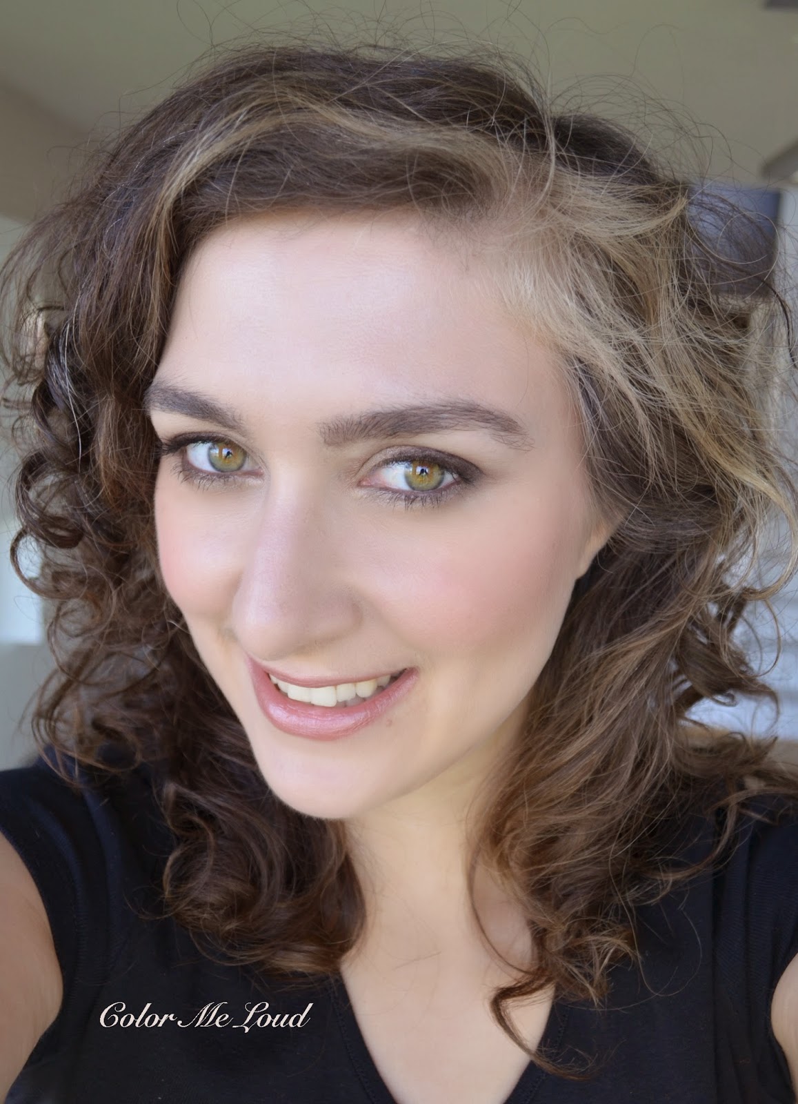
Here is the whole look with Les Beiges Multi-Colored Healthy Glow Powder in #1 as blush #2 as contour, Guerlain Rouge G #15 Galiane on lips (reviews coming up soon) and #208 Tissé Gabrielle on eyes. As you can see the resulting look is rather natural, nothing over the top and would match perfectly with a strong lip and it would be great for a professional setting.


FOTD with Chanel Les 4 Ombres #208 Tissé Gabrielle

Below you can see me wearing Chanel Les 4 Ombres #208 Tissé Gabrielle with a stronger lip. This one was a few weeks ago so I lost track of what else I was wearing. I might be wearing Chanel Rouge Coco in Dédicace on lips, but don't call me on that ;-)


FOTD with Chanel Les 4 Ombres #208 Tissé Gabrielle

Final thoughts: It took me some time to understand and appreciate the concept behind this quad so I held up my review. I now see it as a modern take on classical smokey eye, which fits in all occasions and it is easy to combine with nude lips or strong lips, different outfits and occasions. On the other hand each time I apply this quad, it looks pretty much the same. The difference though is on the shimmer dimension of it which does show itself under strong lights. I like the finish of the shades too, which are complex but not too shimmery or frosty. All in all I grew to like this palette and enjoying it more each time I wear it.

Chanel Les 4 Ombres Collection is already released in Europe. These are expected to hit the counters world wide at the end of May, beginning of June.

Have you tried the new formula yet? How did you find it?


MAC Alluring Aquatic Collection Nail Polishes Submerged & Shimmerfish, Swatch & Review

$
0
0
I have already talked about my picks (Part I& Part II) from fabulous Alluring Aquatics Collection from MAC and mentioned that I would like to review two of the nail polishes I picked up in another post. Submerged and Shimmerfish are my first MAC nailpolishes so I gave them a proper test of application and longevity. Here are my thoughts.


MAC Alluring Aquatic Collection Nail Polishes Submerged & Shimmerfish

Submerged is defined as dark teal chrome, finish is listed as frost. To me it is a teal/deep blue/green duo-chrome with metallic finish. I have seen many sheer duo chromes, which have to be applied over a black base. To me, trying to layer two different shades is time consuming so I was happy to find out that Submerged is perfectly opaque in two coats by itself. The consistency though was a little thin for my liking so making sure that there is not too much on the brush is important. I also recommend waiting for the first coat to dry properly, or you may drag the first coat end up with a bald spot like on my pinky. Submerged had shown the brush strokes lightly under sun light but it didn't bother me.


MAC Alluring Aquatic Collection Nail Polishes Submerged

Shimmerfish is defined as sparkling aluminium and finish is listed as pearl. To me it is a silver taupe with visible golden flecks and foil finish. Because of the golden/copper flecks, the cool undertones of Submerged is easier to pull off by warmer skin tones. On me sometimes silvers doesn't look good but I really enjoyed wearing this one. I also like the consistency of Shimmerfish more than Submerged. It was opaque in two coats and wore like iron over the course of 5 days before I experienced tip-wear on my right hand. This is very long for a metallic/foil finish on me.  


MAC Alluring Aquatic Collection Nail Polishes Shimmerfish

Final thoughts: My first encounter with MAC nail polish was unexpectedly good. The consistency of Submerged is a little thin but it applies beautifully. I really like the color and finish of Shimmerfish and tested it over 5 days to see that longevity of that one was exceptionally good. I am definitely getting these with me to my sea holiday and see if the fishes like them.

MAC just twitted that starting from tomorrow in US (15th of May) you can order Alluring Aquatics online by MAC Cosmetics and or wait one more week (22th of May) to check these out at your favourite MAC Counter.

Have you tried MAC nail polishes yet? What are your thoughts?

YSL 5 Ombre Eyeshadow Palette in Bleus Lumiere for Summer 2014

$
0
0
There are many versions of blue eye shadows for this summer but one of prettiest has to be this palette by Yves Saint Laurent. An unexpected color combination of different shades of blue with intense coral, Blues Lumiere Palette takes the beautiful moments of sun rise to sun set over the sea and brings it on your eyes. 


YSL 5 Ombre Eyeshadow Palette in Bleus Lumiere

YSL 5 Ombre Eyeshadow Palette in Bleus Lumiere is a special limited edition version of their brand new quints. The new quints are already released in the states but in Europe we are still waiting for them to hot the counters. Meanwhile YSL Summer Collection was released in UK, hence I ordered mine from Feelunique, where it is still available. Germany haven't received the YSL Summer Collection yet. The compact has a special design for Blues Lumiere Collection, similar to their previous limited edition eye shadow palettes. The logo of YSL is painted over baby blue and mid-brown background on a soft plastic (but not cheap looking) cover. 


YSL 5 Ombre Eyeshadow Palette in Bleus Lumiere

The shades are electric and look beautiful combined with the new design YSL adapted. The black parts which seperate the eye shadows gives it a minimalistic and modern feel to it. This design reminds us of Yves Saint Laurent's admiration of Abstract Impressionist Piet Mondrian and his collection in 1965 inspired by his art work.


YSL 5 Ombre Eyeshadow Palette in Bleus Lumiere


Because of the asymmetric design, there are different amount of each the individual shade in the palette. The darker shade in the middle has YSL Logo embossed on it, which wears off after the first few uses. Blues Lumiere Palette consist of different finishes which make it very versatile.


Close-up: YSL 5 Ombre Eyeshadow Palette in Bleus Lumiere

The shades are as follows:

Top left: Mid-toned salmon shade with satin to shimmery finish. This shade is butter smooth and very pigmented, my favorite of the palette. I love the fact that it is the largest pan of them all.

Top right: Mid-toned coral shade with satin to matte finish. Although this shade is more vivid than the salmon shade, it is also easy to pull of because of the lack of shimmer. By just the right amount of subtle shimmer, it doesn't appear flat either.

Bottom right: Light baby blue with satin finish. The dimension of this shade is very pretty, it is not too shimmery nor too matte. 

Bottom left: Medium azure blue with satin finish. It is a pigmented and soft shade with right amount of shimmer.

Center: Deep violet blue with satin to shimmery finish. My least favorite of the touch since it is somewhat drier to touch compared to the other shades of the palette. The pigmentation is also mediocre and it is a bit too shimmery for my taste of crease color. Once applied of the lids, it worked beautifully though and didn't appear that shimmery.


Swatch (studio lighting) : YSL 5 Ombre Eyeshadow Palette in Bleus Lumiere

Here is YSL Bleus Lumiere in action. I used baby blue on the inner lid, salmon shade in the middle azure and violet blue on the crease. I am wearing Urban Decay 24/7 Glide-On Eye Pencil in Deep End on the lower water line and in LSD along upper lash line. I would like to get the baby blue eye liner from YSL Blues Lumiere Collection once it hits the stores here. 

In-action: YSL 5 Ombre Eyeshadow Palette in Bleus Lumiere

Below you can see the complete look. On cheeks I am wearing Chanel Les Beiges Multi-Color in #01 as blush (review coming up soon). I combined this look with Guerlain Rouge G #15 Galiane on lips which is a beautiful nude I am loving at the moment. For the look below I got some compliments from hubby, who said this must have been the most beautiful look he had seen on me so far. The eye look wore all day over 14 hours on me without fading or creasing. 


FOTD: YSL 5 Ombre Eyeshadow Palette in Bleus Lumiere

Final thoughts: A lovely palette for summer from YSL with an original shade combination and very versatile textures. This is my first palette from their upcoming new Quints. I am very excited to see the rest since I loved Blues Lumieres. It may not be for the color shy but it surely is something special if you like experimenting with different shades.

Did you ever combined salmon/coral and blue on eyes or face?

Laura Mercier Nail Lacquer Reckless & Attitude from New Attitude Summer 2014 Collection, Review & Swatches

$
0
0
Being a real purple/violet/lilac/orchid fan, 2014 so far has been a blessing for me. Many lovely nail polishes from Spring and Summer releases quickly became my all time favourite. Laura Mercier's two nail polishes from their Summer Collection New Attitude are no exception.


Laura Mercier Nail Lacquer Reckless & Attitude

If you like light baby blue on nails, Attitude is as light as it gets. It is almost a blue toned white cream, which will certainly look even better once I get my summer tan. It is hard to get cream whites right so I was expecting Attitude to be streaky and was very surprised to find out that it wasn't. The consistency was a little too thick for my liking but it applied good, was opaque and smooth after two coats. Promo images look like as if both of these shades have some shimmer but I found them to be plain cream on the nails. Below swatches are taken with two coats and without a top coat.


Laura Mercier Nail Lacquer Attitude

Reckless is my favourite among the two, as well as one of my favorite nail polishes from this summer. Unfortunately some of the nail polish released with the name of "lilac" or "orchid" turned out to be rather tones of pink. If you are looking for a real lilac, like me, Reckless fits the bill. I wore Reckless for a week and didn't get tired of it (which is an extremely rare situation!). The longevity was also great, as well as the consistency which is neither thick or thin and opaque in two coats.


Laura Mercier Nail Lacquer Reckless


Final thoughts: Two lovely nail polishes from Laura Mercier for this summer. Attitude will accentuate your sun kissed skin in summer while Reckless will speak to the true lilac lovers. Lovely formula, great staying power. These are now available around the globe.

Are you enjoying lilac named pinks this summer or would you rather get a true lilac for your money? Any one out there from #teampurple? ;-)

Guerlain Terracotta Sun Celebration Bronzing Powder and Blush 30th Anniversary Edition, Review, Swatch & FOTD

$
0
0
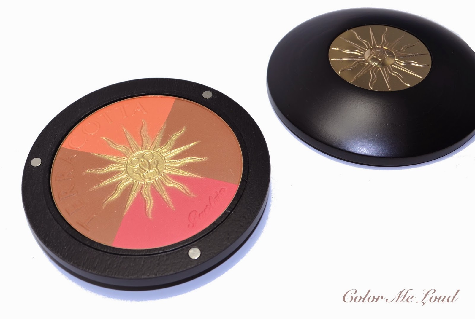
Today I would like to share with you one of the three items I picked up from Guerlain's Summer Collection, Sun Celebration. Sun Celebration Bronzing Powder & Blush is a collectors item which is designed to celebrate 30 years since Terracotta was first launched. It comes in a luxurious Guerlain wooden compact, similar to last year's Terra Ora (reviewed here). Three small metal circles are the magnets to hold the lid and best way to open this is to twist the lid slightly to part the magnets from each other. The compact is one of my favorite designs of all times for a bronzer because of the lovely natural but luxurious feel to it while being not too heavy. The top lid has a golden sun with Guerlain's logo in the middle. 


Guerlain Terracotta Sun Celebration Bronzing Powder and Blush 30th Anniversary Edition

Inside we see the same golden sun as over spray and words Terracotta embossed on the surface. Compact has a generous 16 g of product. Blush/Bronzer has four sections and each section is large enough to swirl my favorite blusher brushes, such as Suqqu Cheek or Chikuhodo Z4 for a light application. The colors are very pigmented and they apply beautifully with a light hand on my light to medium complexion. I can see this one working on deep complexions as well. Since sun in the middle is an over spray, it goes away after a few uses, which is a little heart breaking but since the product is great once applied, I didn't give it a second thought to keeping it untouched. 


Guerlain Terracotta Sun Celebration Bronzing Powder and Blush 30th Anniversary Edition

The pink part of the product is very intense and leans red/fuchsia, the orange/peachy part is very soft so you shouldn't fear that it turns orange on you because it has some pink to balance the warmth. Both of the bronzer parts are nicely pigmented, one being cooler and the other one being warmer and deeper. They all have satin to matte finish so if you like your bronzers matte as I do, you will love how it applies.


Swatch: Guerlain Terracotta Sun Celebration Bronzing Powder and Blush 30th Anniversary Edition

For the FOTD below, I used the pink shade on the apples of the cheeks and contoured with the cooler bronze shade. As you see it gives a beautiful natural sun kissed look to my cheeks. I haven't tried to apply it all over since I usually don't like using bronzer extensively. Below I am also wearing Shu Uemura's Mint and Vanilla Palette on the eyes which I got from a dear friend (*waves*) and enjoying it very much recently. On lips I have one of Guerlain's new Rouge G's, #77 Geraldine which I am also obsessed about at the moment.


FOTD: Guerlain Terracotta Sun Celebration Bronzing Powder and Blush 30th Anniversary Edition

Final thoughts: A very solid release from Guerlain, a definite collector's item but make sure you have the heart to use it because it applies beautifully. This one is a little expensive for a bronzer but you get 16g of product and a very luxurious compact, so is definitely worth checking out.

Guerlain Sun Celebration is released in Germany about two weeks ago. The items are still available though. I have heard in some countries there were very few pieces of Sun Celebration Blush & Bronzer but hopefully you can hunt one down if you are determined to get it.

Bronzers and blushes together, yay or nay?

Chanel Le Vernis #615 Sweet Lilac, #619 Pink Tonic, #621 Tutti Frutti and #623 Mirabella from Reflets D'Été Summer 2014 Collection, Swatch & Comparison

$
0
0
Today I would like to share the four new nail polishes from Chanel Reflets D'Été Summer 2014 Collection. If you still haven't gone through Summer Collections, I now have a page which sums up most of the collections and the items I have reviewed, so make sure to check it out. 

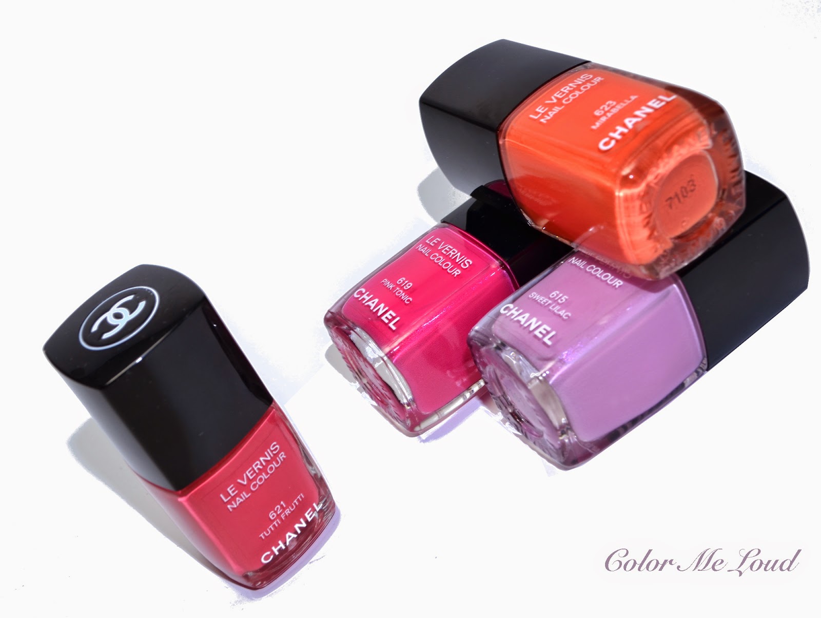
Chanel Reflets D'Été Collection has five nail polishes, one of them is a reprobate from Hong Kong Collection, Eastern Light. It is a stark white in creme finish which I really like wearing alone or combining with other polishes in a fresh or reverse french fashion. Today I would like to concentrate on the four new beauties, #615 Sweet Lilac, #619 Pink Tonic, #621 Tutti Frutti and #623 Mirabella. 


Chanel Le Vernis #615 Sweet Lilac, #619 Pink Tonic, #621 Tutti Frutti and #623 Mirabella

You know my obsession about purple, lilac, lavender and all derivations but you might not know my second obsession, orange! If you remember "What is in my bag" post from last year, you can see I was searching for a proper orange bag for months. I always wondered why Chanel didn't released a "proper" orange nail polish. Two years ago when "Holiday" came out, I was very excited but it turned out it was more of a red/coral than orange. Last year's summer coral from Chanel was Lilis, which was even more red than Holiday. I was almost loosing hope when it happened. Chanel released Mirabella!


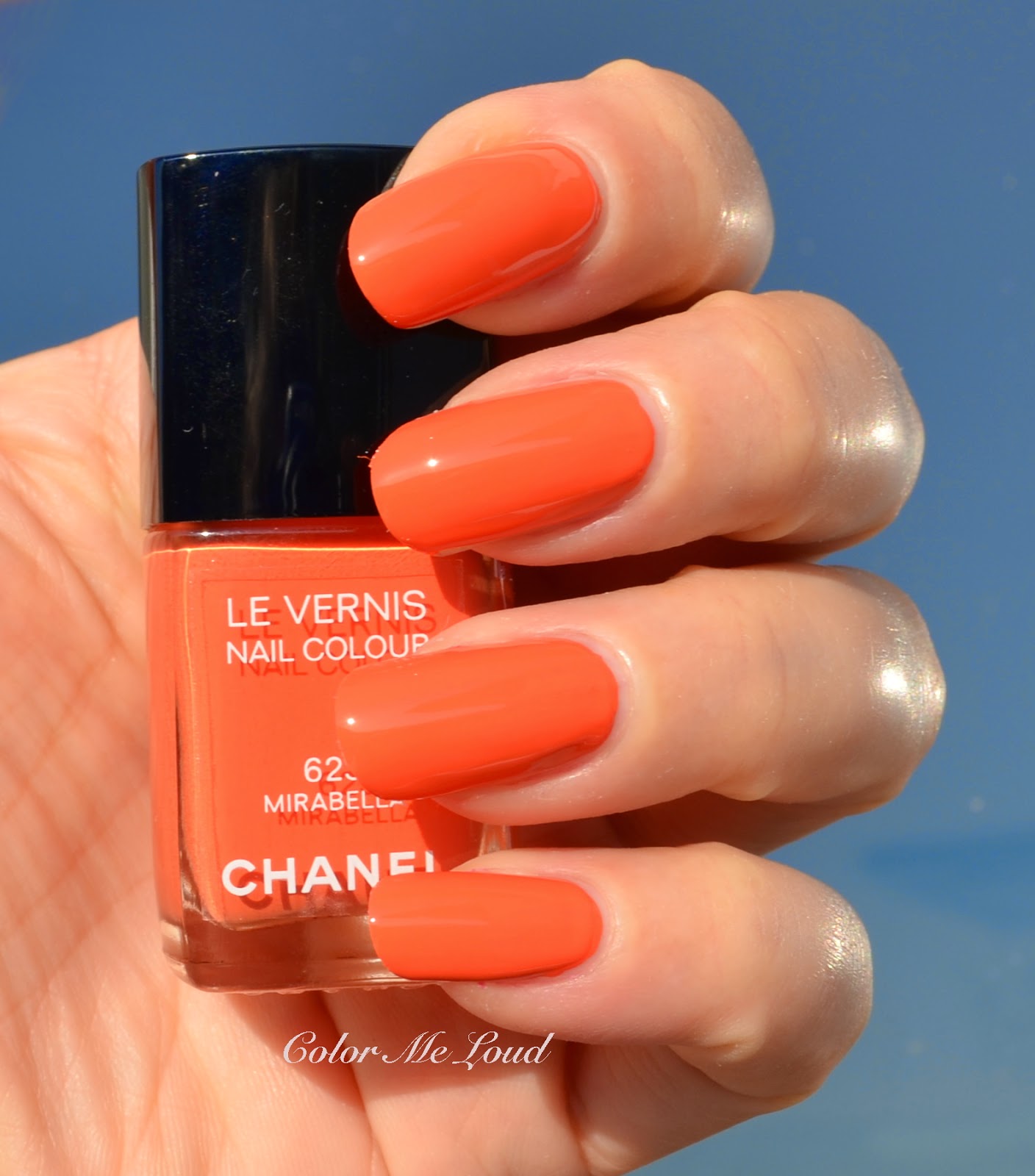
Swatch with direct sunlight: Chanel Le Vernis #623 Mirabella

Mirabella is an orange that leans slightly red, which makes it less yellow and more wearable. It has the true cream formula and it is the only one among the four new shades which doesn't have Chanel's famous hidden shimmer. Mirabella has a dream consistency. I think Chanel improves their formula with each and every release and this four are all phenomenal in terms of being on the exact spot between thick and thin. Mirabella is opaque in two coats and very easy to apply. 


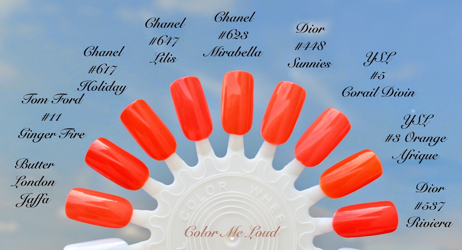
Chanel Le Vernis #623 Mirabella and similar nail polishes in my stash

I pulled out some shades which I cumulates over the years in the search of "perfect orange". 

Chanel #647 Lilis (reviewed here) is more coral with more pink, Chanel #617 Holiday is redder. Tom Ford #11 Ginger Fire is slightly darker and has also more red. Butter London Jaffa is close but slightly more coral, hence has a tad more pink. 

#Dior #448 Sunnies (reviewed here) is close but is slightly more coral, YSL #5 Corail Divin is more coral. Dior #537 Riviera is redder and slightly darker. The most orange nail polish I have in my stash is YSL #3 Orange Afrique which is slightly more yellow than Chanel Mirabella. I think Chanel did a great job in creating something wearable yet orange. All thumbs up. (I am writing this post with Mirabella on my nails, I can't get enough!)


Comparison Swatches: Chanel Le Vernis #623 Mirabella

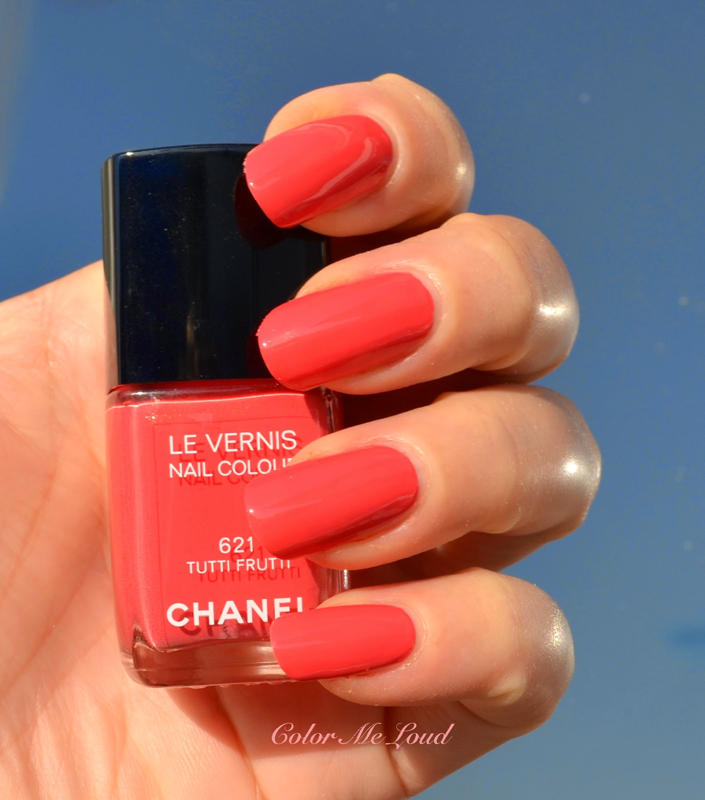
Chanel Le Vernis #621 Tutti Frutti is the only shade which is listed as permanent while other three being limited. I can see why Chanel wants to keep this one in the line, because it is a true rock star! My favorite Chanel coral up to date must be #549 Distraction and it is a permanent shade. Distraction has a faint pink shimmer which makes it very unique. #621 Tutti Frutti is a pinker sister of Distraction with even prettier golden hidden shimmer. Tutti Frutti is also more saturated and pigmented and has a better formula. It is opaque in two coats and dream to apply.


Swatch under direct sunlight: Chanel Le Vernis #621 Tutti Frutti 


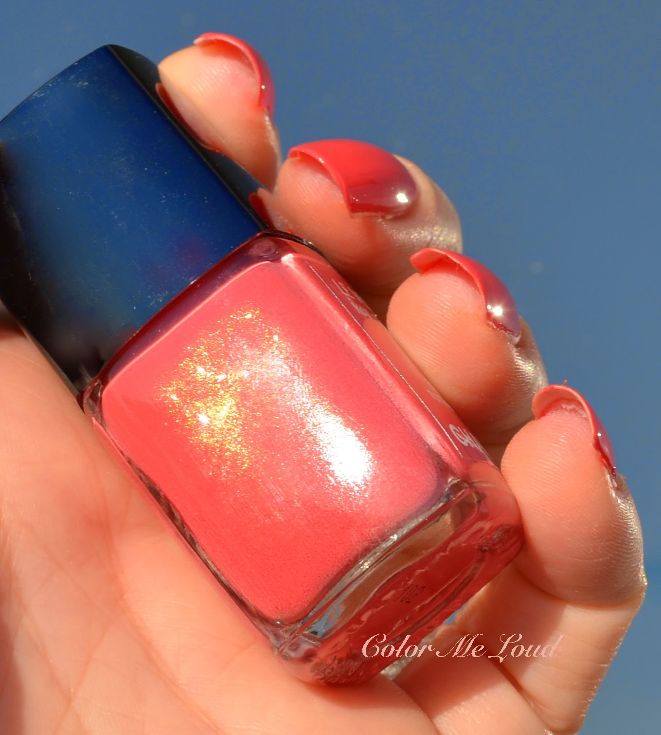
Under a strong light, you can see the faint shimmer on the nails. Below I photographed it in the bottle since it is easier for the camera to pick up. On the nails Tutti Frutti is a complex shade but the shimmer is almost invisible.


Hidden Shimmer of Chanel Le Vernis #621 Tutti Frutti

I thought I had many corals and one would be close to Tutti Frutti, so took out some of them for comparison. It turns out there is no real dupes in my stash.


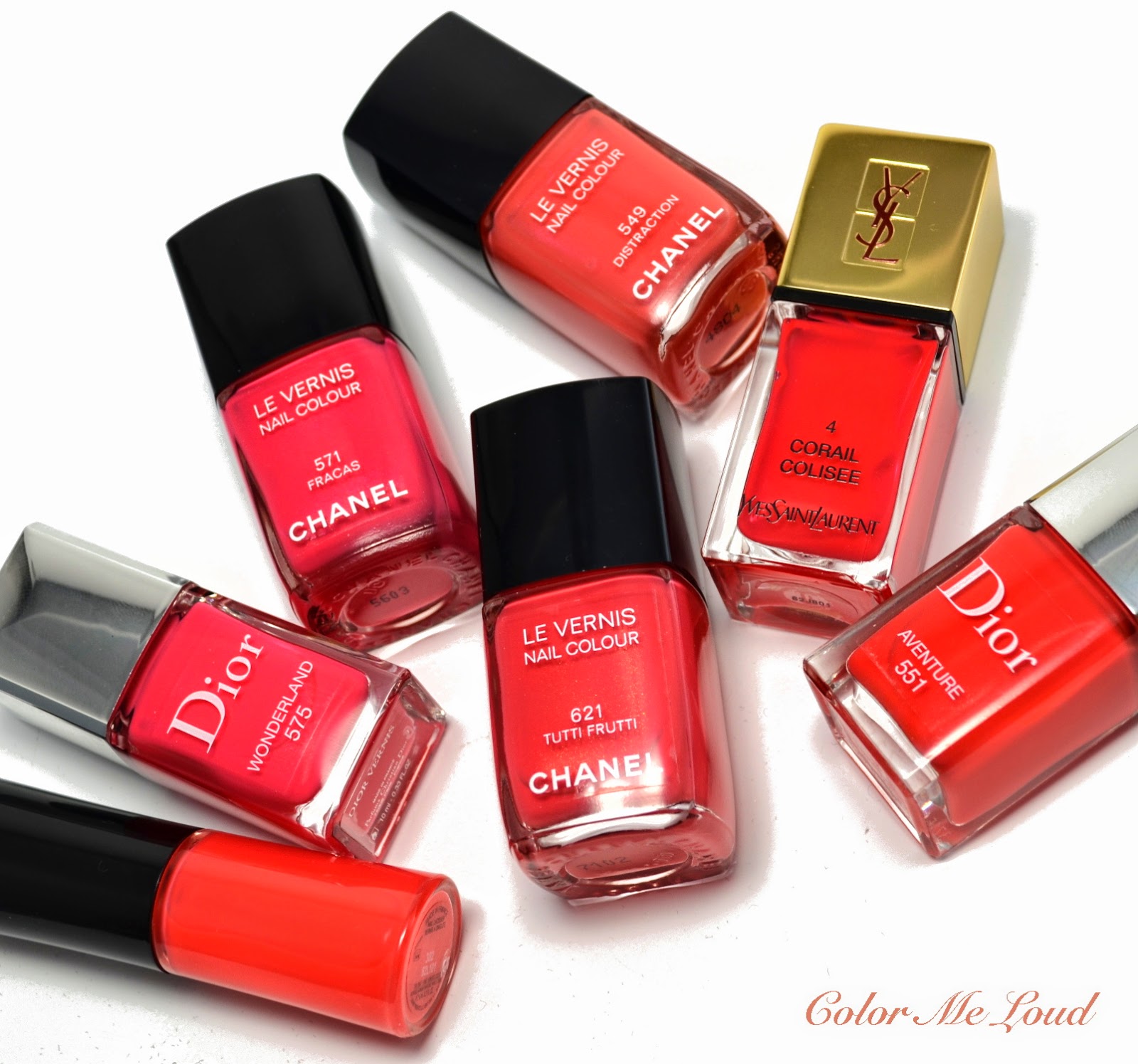
Chanel Le Vernis #621 Tutti Frutti and similar nail polishes from my stash

Here are the comparison swatches, Chanel #571 Fracas is the closest shade from Chanel line but is more pink and it is brighter. Dior #575 Wonderland is also close but is slightly lighter and brighter. Chanel #549 Distraction is more coral, less pink. YSL #4 Corail Colisee is more red and slightly darker. Dior #551 Aventure is almost more red. Giorgio Armani #302 Corallo (from Bright Ribbon Collection, reviewed here) is more orange. Chanel Tutti Frutti is now my favorite pinkish coral. I think it will look pretty across different complexions.


Comparison Swatches: Chanel Le Vernis #621 Tutti Frutti

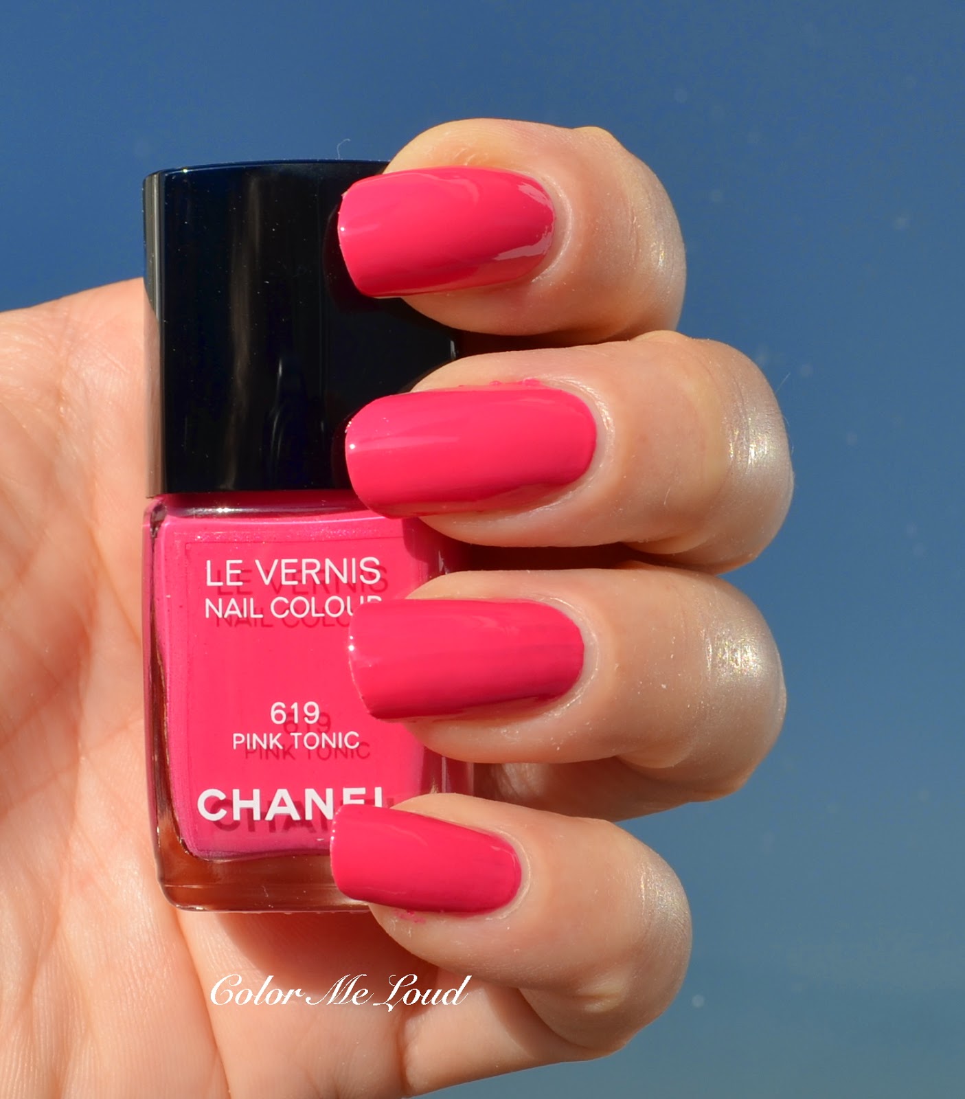
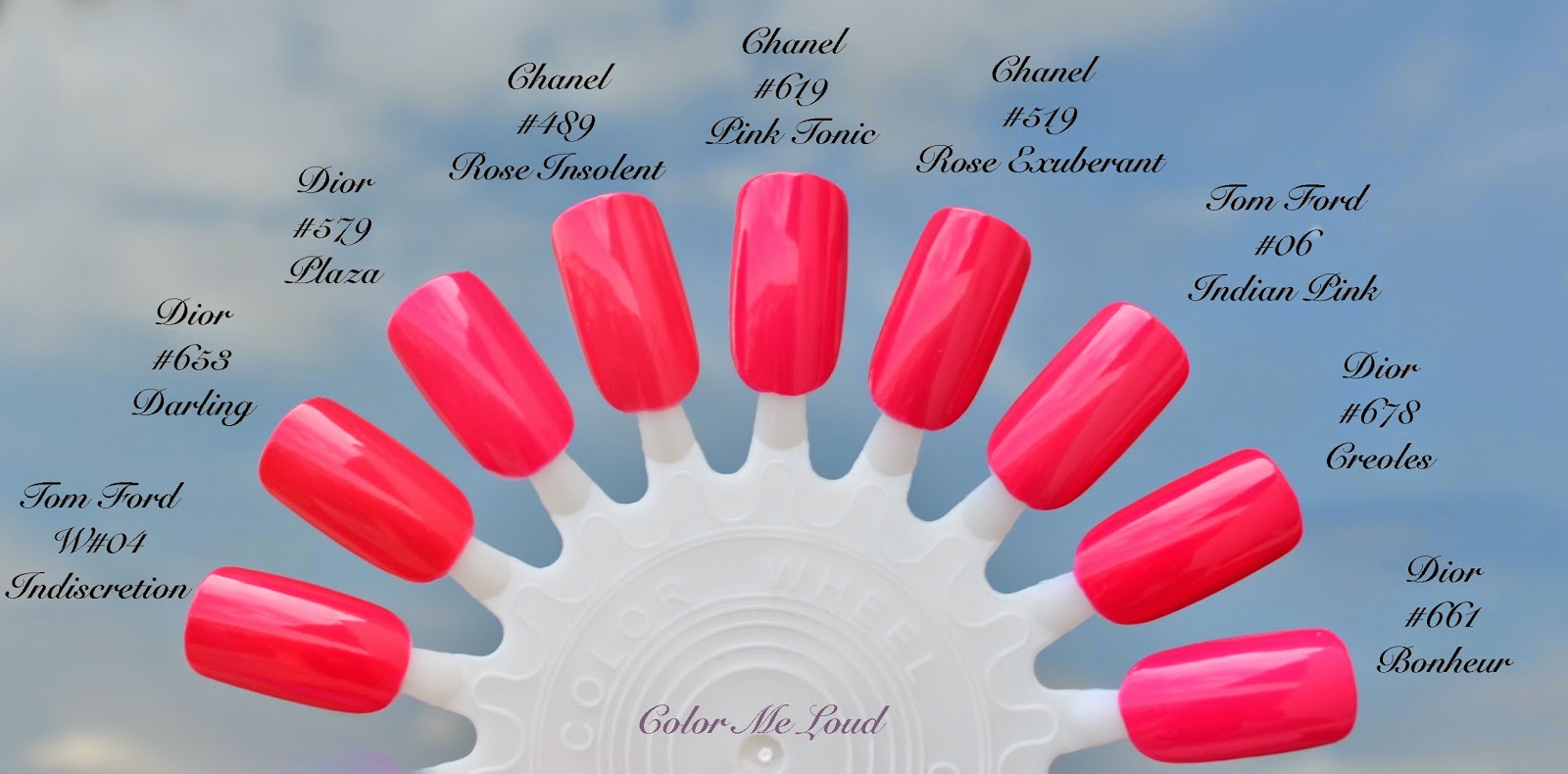
If you think Tutti Frutti is not pink enough, Chanel has your covered with #619 Pink Tonic, which is a bright summery pink and is have a great balance between red and fuchsia. Pink Tonic shares the great formula of this release. It is opaque in two coats and it is self leveling and consistency is great. 


Swatch under direct sun light: Chanel Le Vernis #619 Pink Tonic

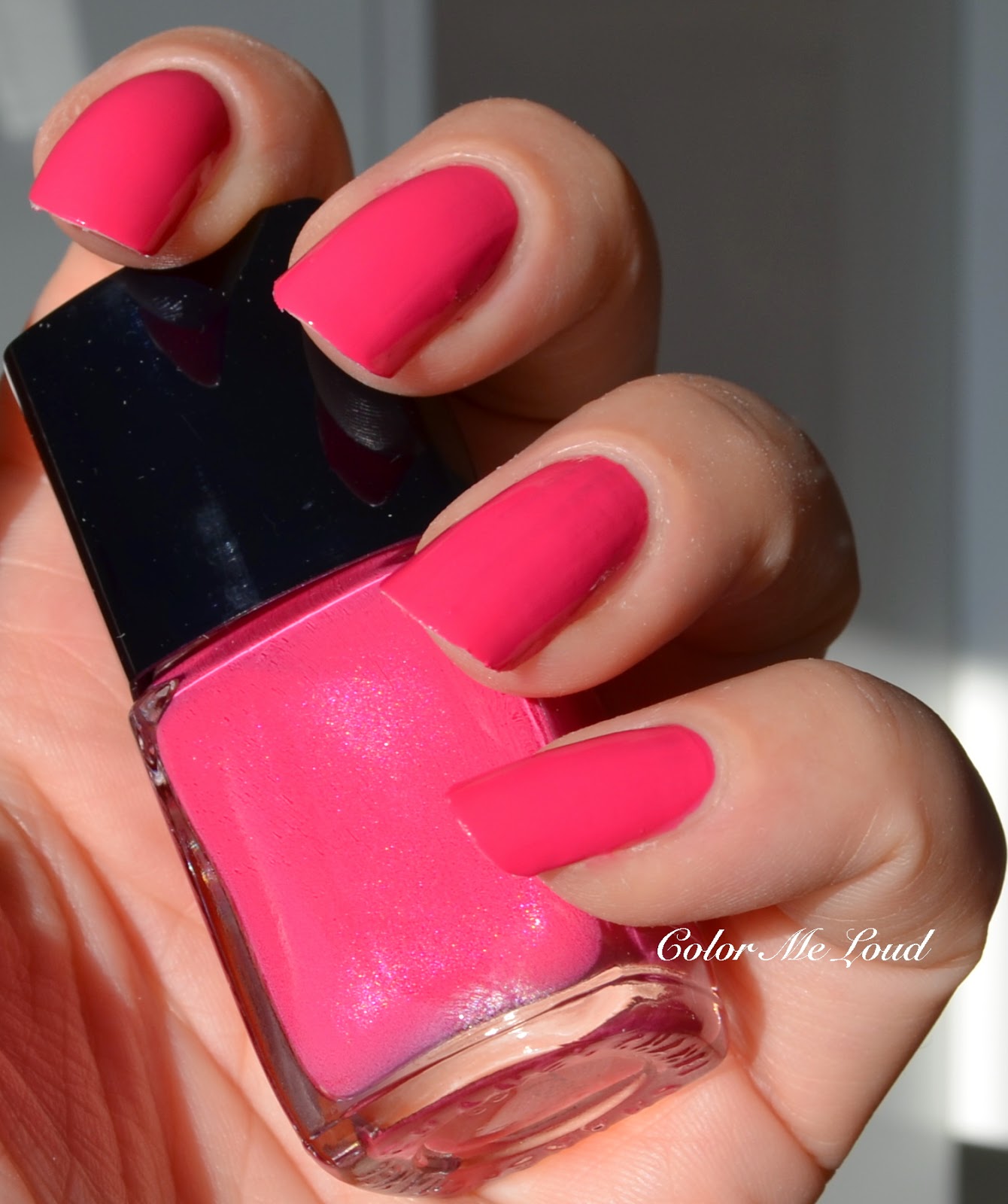
Pink Tonic might be one of the more common shades in my stash but its lovely hidden pink shimmer makes it unique. The shimmer doesn't transfer on the nails but adds a little bit of something which you can't put your finger on it. 


Hidden Shimmer of Chanel Le Vernis #619 Pink Tonic

Below you can see the closest shades from my stash. I have to say something terrible happened when I was preparing this post, my Tom Ford Indiscretion's inner cap broke while I was turning it as tight as I can. I am obsessed about closing the nail polish bottles very tightly but until now I have never experienced such a mishap. I was very disappointed and didn't know if I can get this nail polish again. Luckily as I went to the Tom Ford Counter at my local shopping center and asked them if I can swatch my broken inner lid (and connected brush) with one from their testers, they agreed on that immediately. I can't tell you how happy I was! :-) Now my Indiscretion has a black inner lid lol.


Chanel Le Vernis #619 Pink Tonic and similar shades in my stash

Back to the subject, here are the comparison swatches for Pink Tonic. Chanel #489 Rose Insolent is very close but is slightly lighter and a tad warmer. Chanel #519 Rose Exuberant is also close but slightly darker and a tad cooler. Tom Ford #06 Indian Pink is very very close (for me they are dupes except than the hidden shimmer of Pink Tonic). Dior #678 Creoles (reviewed here) is slightly darker and Dior #661 Bonheur (reviewed here) is slightly lighter and a tad brighter. Dior #579 Plaza is also very very close other than Pink Tonic's shimmer. Dior #653 Darling is warmer. Tom Ford W#04 Indiscretion (W for white cap, reviewed here) is also a tad warmer.


Comparison Swatch: Chanel #619 Pink Tonic

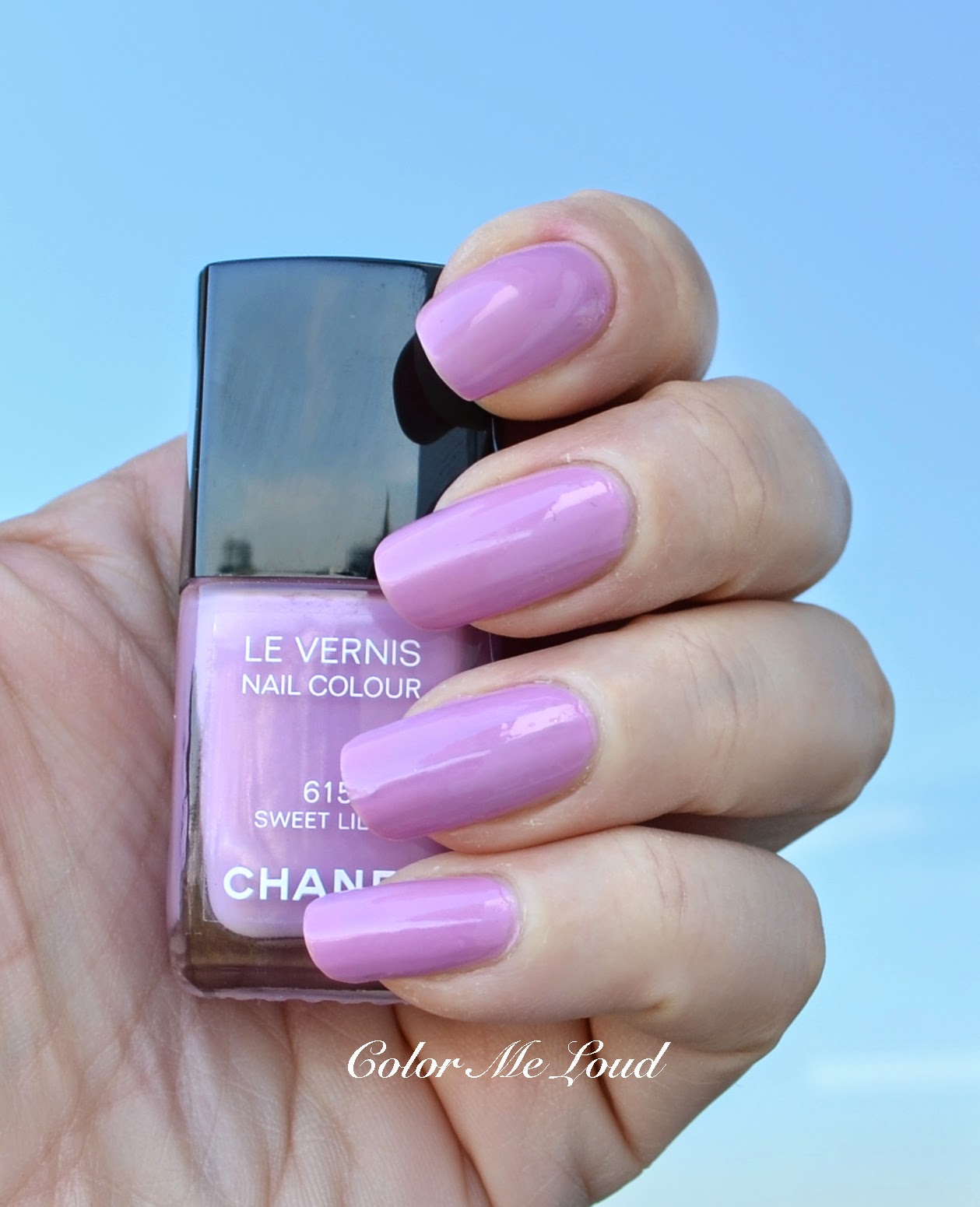
I saved the one that I was most excited about to last. #615 Sweet Lilac. My lilac loving heart is betting since the information of Chanel releasing a lilac spread in the beauty community. I was hoping that this time it would be more lilac than Lilac Sky, which I found to be a little too pink for my taste. Well, it turns out it really isn't more lilac than Lilac Sky but still it is very pretty.


 Swatch in Shadow: Chanel Le Vernis #615 Sweet Lilac

The faint shimmer Sweet Lilac has is very beautiful. The base is more of a pink but with the cooler shimmer, it turns out to me more lilac or more pink depending on the light. Since on me everything looks more purple, the above swatch is rather a cool representation os Sweet Lilac. Below under afternoon sun you can see the pink face of it. 


Hidden Shimmer of Chanel Le Vernis #615 Sweet Lilac

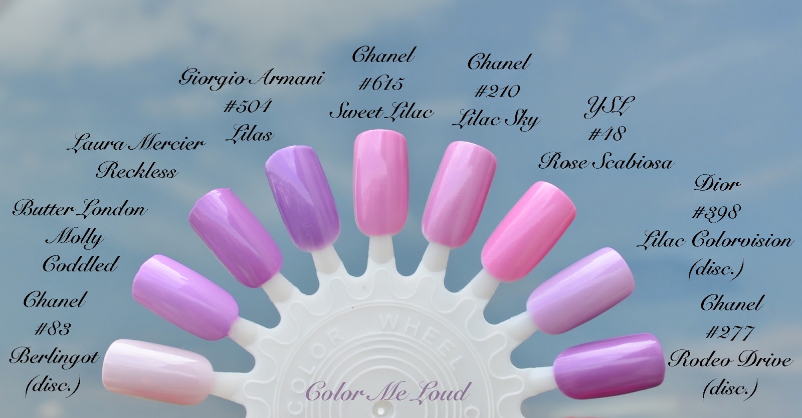
I am obsessed with shades of lilac and here is what I could find in my stash.


Chanel Le Vernis #615 Sweet Lilac and similar nail polishes from my stash

Shade of Sweet Lilac is very close to the base color of Lilac Sky but lacks the frosty/pearly quality of that, which is a great think since I don't love pearls for light shades all that much. It is also close to YSL #48 Rose Scabiosa (reviewed here) but Rose Scabiosa is brighter and it leans more pink. Sweet Lilac is like a nude version of Rose Scabiosa if that makes sense. One of my all time favorite Lilacs, Lilac Colorvision of Dior is lighter and cooler. Chanel #277 Rodeo Drive (love love love!) is darker and cooler. Recently released Laura Mercier Reckless (reviewed here) is cooler and slightly darker. Giorgio Armani #504 Lilas (reviewed here) from their upcoming Bright Ribbon Collection is also darker and cooler. Chanel's long discontinued shade #83 Berlingot is much lighter. Butter London's lilac shade Molly Coddled is slightly cooler.

All in all I had Sweet Lilac on my nails for a week and I loved it. It is not as edgy as I would like it to be but still it is very pretty in an understated way, which Chanel seems to master. Sweet Lilac almost looks like a nude on my (lilac pulling) skin tone and I will back it up to make sure I won't regret using it up.


Comparison Swatch: Chanel Le Vernis #615 Sweet Lilac

Thank you for reading, the comparison was a full day job which I loved doing. I hope that it helps you while giving your decisions. Below is a group photo of the nail polishes which were used for this post. Chanel Summer Collection is about to be launched in Europe and Asia. It is on the counters over a month in US at the moment and special thanks go to a dear friend of mine who got these for me *blows kisses*. 


All Nail Polishes Used In This Post

Final thoughts: Four lovely new shades from Chanel. All of them have perfect formula which I find  to be ever improving by each Chanel release. Most unique are #615 Sweet Lilac and #621 Tutti Frutti. #623 Mirabella is for those of you who like orange as much as I do and would like to own an orange from Chanel. #619 Pink Tonic is very pretty but on the nails it is the most dupable. 

Now a note for German readers. My local Chanel counter informed me that they will only receive 6 pieces of each nail polish and those are already reserved, so they won't be able to sell any of them. If you already know what you want, I urge you to reserve the pieces to make sure you are getting them.

Are you eyeing any of those nail polishes? Which one is your favorite?
Guerlain Tonka Impériale Duo, La Laque #602 Nail Polish and Rouge Automatique #602 Lipstick, Review, Swatch & FOTD

$
0
0
My favorite perfume of Guerlain's line L’Art et la Matière must be Tonka Impériale. It is no secret that I like gourmand scents, is it because I am a foody? That, we will never know. There is something very uplifting about the way Tonka Beans meet the deliciously sweet Almond and are balanced by the sophisticated wood notes, amber and tobacco. That is why when I heard about a nail polish and a lipstick with the same name, I knew I had to get them.


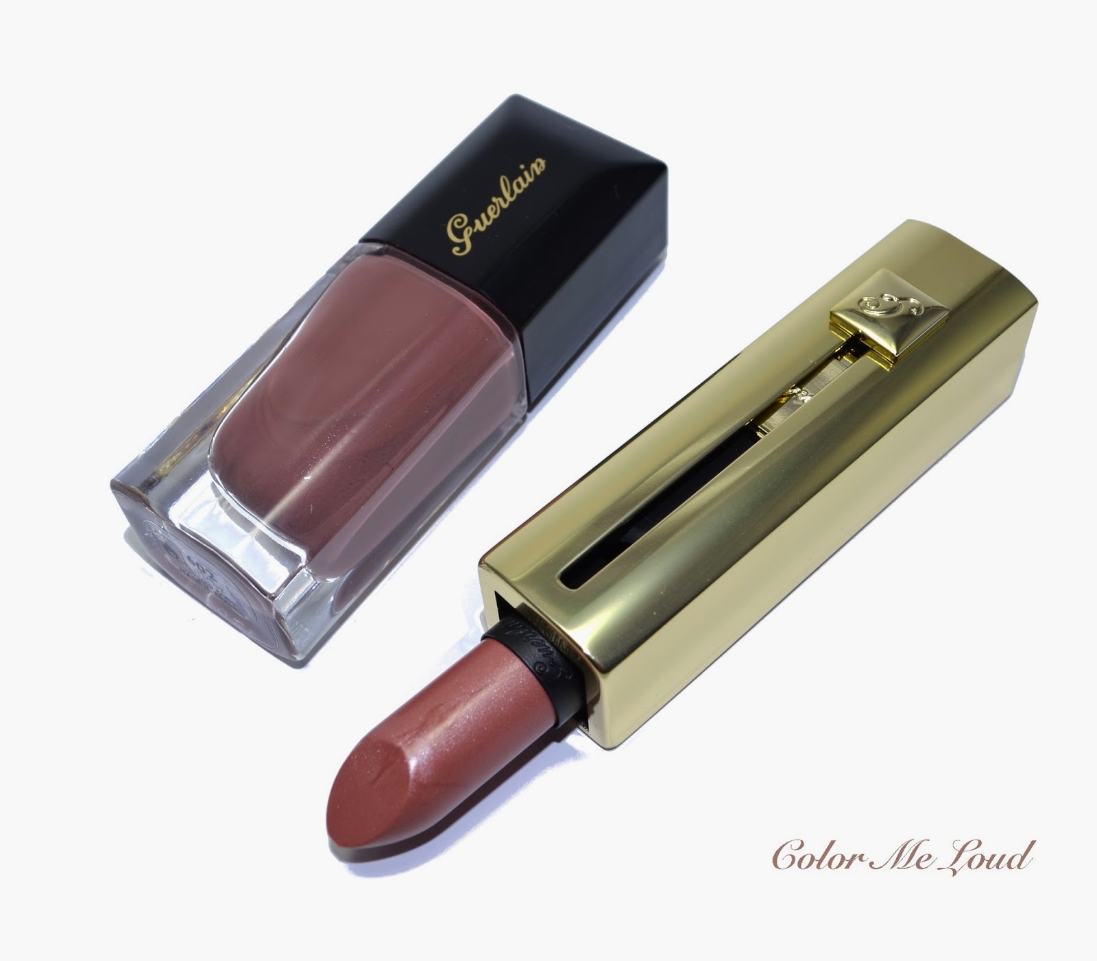
Guerlain Tonka Impériale Duo, Nail Polish and Rouge Automatique Lipstick

That color.... Is it the color of Tonka Beans or Tonka Beans mixed with Almond (yummy)? Nail Lacquer in Tonka Beans is a bronzy plummy brown cream with a hint of silver shimmer. That plummy tone might be my undertones making everything plummy though, so don't call me on that.


Guerlain La Laque Nail Polish #602 Tonka Impériale

Under direct sun the faint silver shimmer can be slightly seen on the nails, but on the bottle it is more apparent. I liked the formula of #602 Tonka Impériale, the consistency was good, it was opaque in two coats. If you like warm mid-toned taupes on your fingers, you may want to check out this one. To me it was exactly at the limit of being too brown but my complexion save it and brought some plum in this equation, which makes it more wearable for me.


Guerlain La Laque Nail Polish #602 Tonka Impériale

As for the lipstick, Rouge Automatique #602 Tonka Impériale, I was expecting to love it a bit more than I do. I do like the tone of this one but it is a bit too frosty for my taste. I know though this summer has frosty metallic lippies written all over, so I don't complain to be able to catch the trend here. I guess, I just have to get used to it. Below I am wearing Rouge Automatique #602 Tonka Impériale on lips with a minimal makeup elsewhere.


FOTD with Rouge Automatique #602 Tonka Impériale

Final thoughts: The shade of tonka beans converted to a nail polish and lipstick? Only a major perfume house would do it. Both products have lovely texture. I have to say though I can see myself loving these more with my pale skin since I find the brown shades muddy on my tanned self. But maybe that is just me?

They are both limited editions and right now available on Guerlain Counters. Have you checked out any of these? 

Nars Duo Eyeshadow Lost Coast and Tropical Princess for Summer 2014 Adult Swim Collection, Swatch, Review & FOTD

$
0
0
Nars Summer Collection Adult Swim was launched almost a month ago in US and just a week after that in Europe. I loved the texture of the latest two duos China Seas and Kauai (reviewed here) so the new ones were on my radar. There is no Nars Counter in Germany (at least in my city) and local online shops don't carry the brand, so each time I am undecided. I have read the reviews of Cafe Makeup, which is my favorite source, especially for Nars reviews. Also Linda from Silverkis has a great review of Lost Coast. I was browsing Lookfantastic.com at 3am night and suddenly it told me I was getting a good deal with late night shopping discount. This pushed me to the edge and I pulled the trigger.


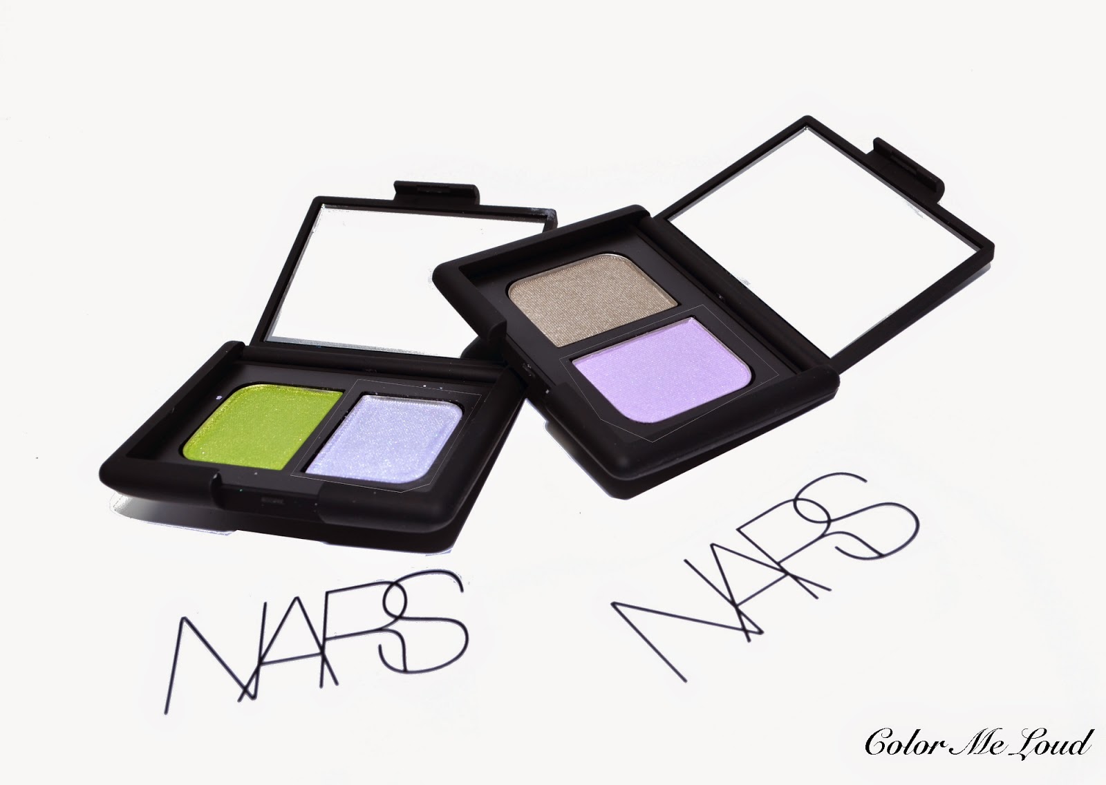
Nars Duo Eyeshadow Lost Coast and Tropical Princess
Originally I was eyeing Nars Single in Malacca from this collection, which I am sure I will get eventually but at the time it is only available through European Nars Online Store Nars.eu. I really don't like shopping there all that much and there is a reason for it. Firstly I need to spend 50 EUR for free shipping and this makes me buy things I don't feel like. Secondly when I ordered last time, I happened to read the "return conditions" on the receipt. It was written that I can only return items which I haven't used, I am ok with it since it is common in Europe but then it was written that if I would like to return anything, I should also return all the samples delivered with the order!!! *shakes head in disbelief* Now I find this to be unreasonably cheap. I like Nars and I am sure the company is unaware of the policies of EU Online shop because I can't imagine they stand behind this. Anyway, so much for this topic, I decided to get nothing from Nars EU again. Lucky enough there are a couple of shops from UK who carry the brand and have free shipping on all orders. Also I go to Sephora each time I drive to France and check those out in person.

Now let me go back to the subject, first duo I would like to show you is Lost Coast. It has a pale lilac and a light taupe. Such an unusual but pretty combination.


Nars Duo Eyeshadow Lost Coast


Tropical Princess is even more unique when it comes to shade combination. It has a metallic/frosty white with a metallic/frosty yellow green. I have seen this particular duo as a challenge and had to try to make it work since frosty whites look awful on me. 


Nars Duo Eyeshadow Tropical Princess

Below you can see two set of swatches, indoor with studio lighting and outdoor with full midday sun.  You can see that Lost Coast has the satin shades while Tropical Princess is for the metallic lovers. Also lilac in Lost Coast is really pale, it gives more of a brightening effect than color.


Swatch with studio light: Nars Duo Eyeshadow Lost Coast and Tropical Princess
Swatch under sun light: Nars Duo Eyeshadow Lost Coast and Tropical Princess


Below you can see Lost Coast in action. I applied the lilac shade to the inner corner and on the crease to blend. I added the taupe shade all over the lid and nuanced it a little with lilac on mid-lid. The resulting eye look is very subtle but brightening. It is more of a no makeup makeup duo.


In-action: Nars Duo Eyeshadow Lost Coast

Below I am wearing Nars Duo in Lost Coast on the eyes, YSL Kiss & Cheek #03 on lips and Diorskin Nude Shimmer in Pink on cheeks (I will review both of these soon). It almost looks as if I was wearing nothing on my eyes, this is expected though since my complexion has lilac undertones (not a joke!)


Nars Duo Eyeshadow Lost Coast

Tropical Princess. I didn't know what to expect. White? Lime Green? No thanks. But once again Nars is genius and this works. Below I applied the green shade to the inner and outer lid, padded the white on the mid lid and blended for softer transient. This look needed some liner though, since it is a little light on the eyes, which makes me look puffy. I used some brown liner for that.


In-action: Nars Duo Eyeshadow Tropical Princess

For the following FOTD I am wearing Diorskin Nude Shimmer in Amber on the cheeks as blush. MAC Aphrodite's Shell as bronzer, MAC Pet Me Please on lips, all from Alluring Aquatics Collection (reviewed here and here). This look turned out to be softer than I expected, I wore it during the day at work and it was not too much. However It may look more dramatic on deeper skin tones.


FOTD: Nars Duo Eyeshadow Tropical Princess

Here is the FOTD with Tropical Princess which I enjoyed wearing today. Some readers asked me to write the tops I am wearing, so this one is from Desigual. On the nails I have MAC Neptune which I went back to get (I reviewed the other two nail polishes from Alluring Aquatics here) and enjoying very much at the moment.  


FOTD with Tropical Princess, MAC Neptune on nails, MAC Pet Me Please on lips.

Final thoughts: Two interesting shade combinations from Nars and I thought both worked wonderfully. Given the size of my taupe stash, honestly I might have passed Lost Coats though, still happy that I got it. Tropical Princess looks scary but once applied, it gives rather a soft look on my complexion.

What do you think about these unusual combinations? Do you find that alright that the shop asks for the samples back once you return things? 

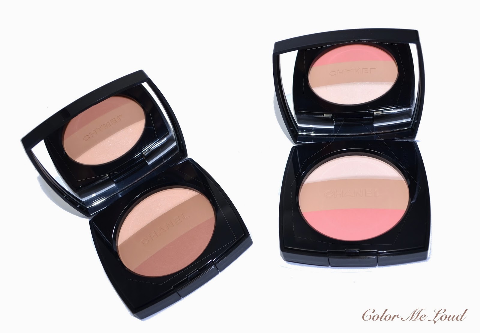
Chanel Les Beiges Healthy Glow Multi-Colour Powder #01 & #02, Review, Swatch & FOTD

$
0
0
If you are a Chanel fan, you should watch out the counters on 5th of May since they usually bring out new collections or launch new products on the day when the lucky number of Coco Chanel doubles, 05.05. This year was no exception. The brand released a new version of No.5 as well as two limited edition multi-colored version of their Les Beiges Powders. In Breuninger Stuttgart, they were also giving away a single white rose to their customers tied to a card sprayed with No.5 which decorated my living room that week. I have posted a photo of white Rose of Chanel on my Instagram. In case you are not following me, please do so, stop by and say hi. I caught the Instagram Bug about a month ago after having an inactive account over a year.


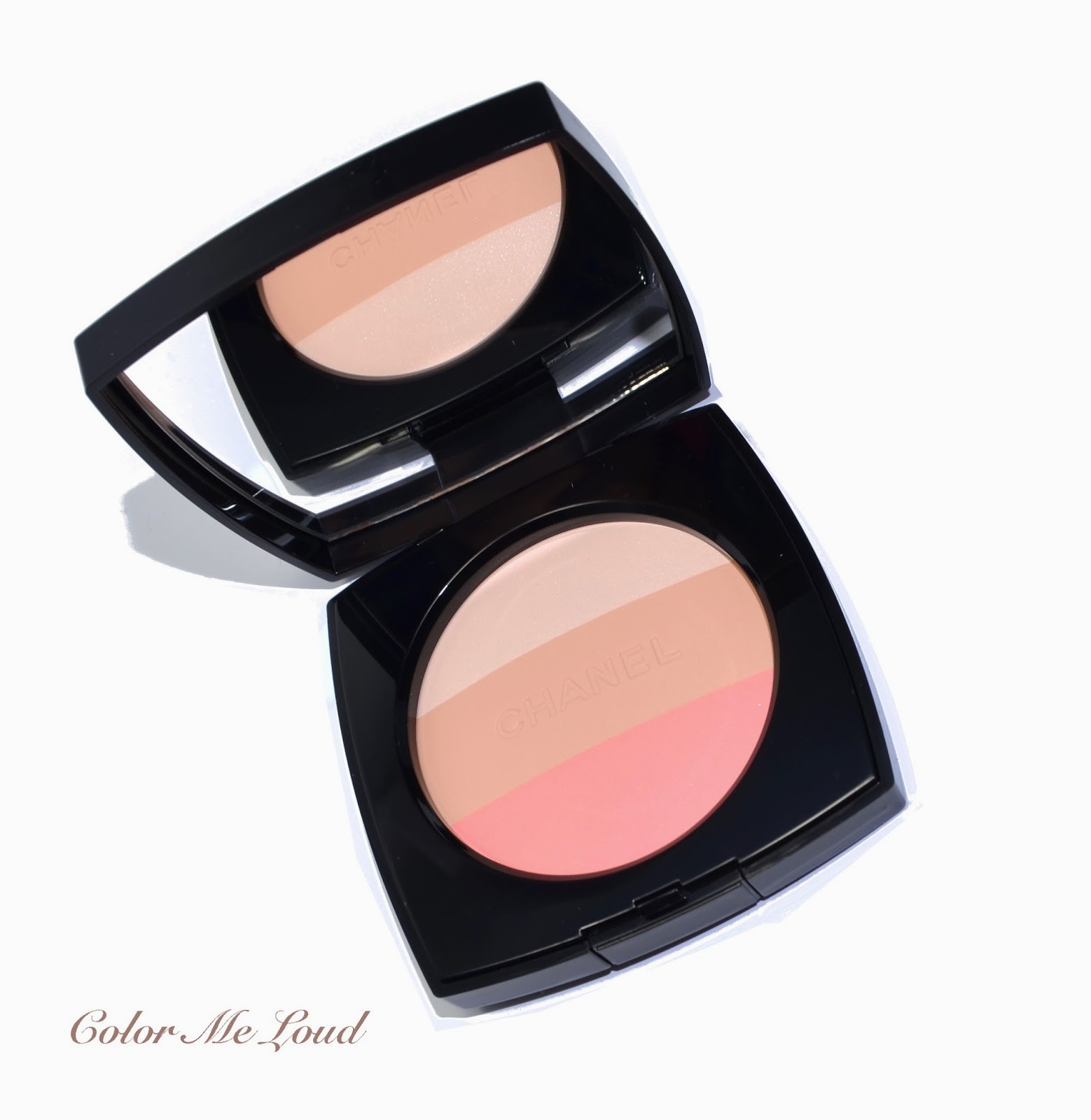
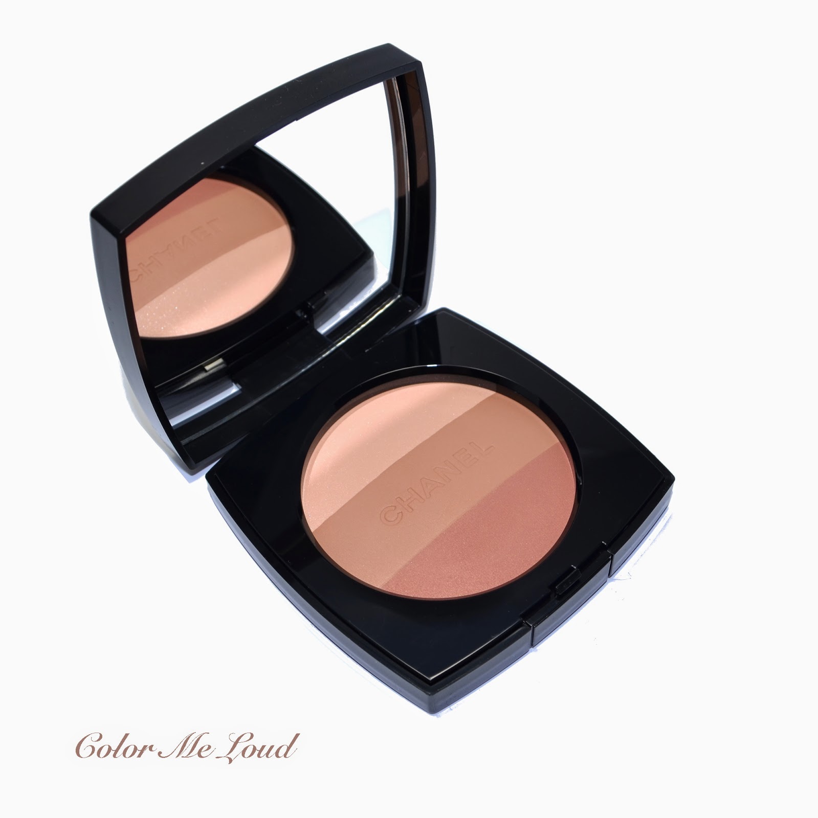
Chanel Les Beiges Healthy Glow Multi-Colour Powder #01 & #02

I decided to splurge on both of Les Beiges Multi-Colour Powders. I knew I would like #01 since the color of the blush was very fresh and brightening, but I was also planning to get a darker Les Beiges shade, like #50 to contour and as a subtle bronzer. When I went for a make-up by Chanel's International Make-up Artist, Yannick Lemaire (which I mentioned about previously here), he used #30 to contour and sculpt my cheekbones and it looked very natural and polishes. I couldn't decide between #30 and #50 and I knew I didn't want #40 because it leans too warm. An important thing to note about Les Beiges Powders are that, as much as their shades go deeper as the number gets higher, the undertones do differ a lot so one has to always try the powders and make sure the undertones match. As an example, I can see #30 and #50 working on me but #40 not. Long story short, I decided to get Les Beiges Multi-Coloured #02 instead of my long term wish product #50 (or #30). Was it a good decision? Let's see...


Chanel Les Beiges Healthy Glow Multi-Colour Powder #01

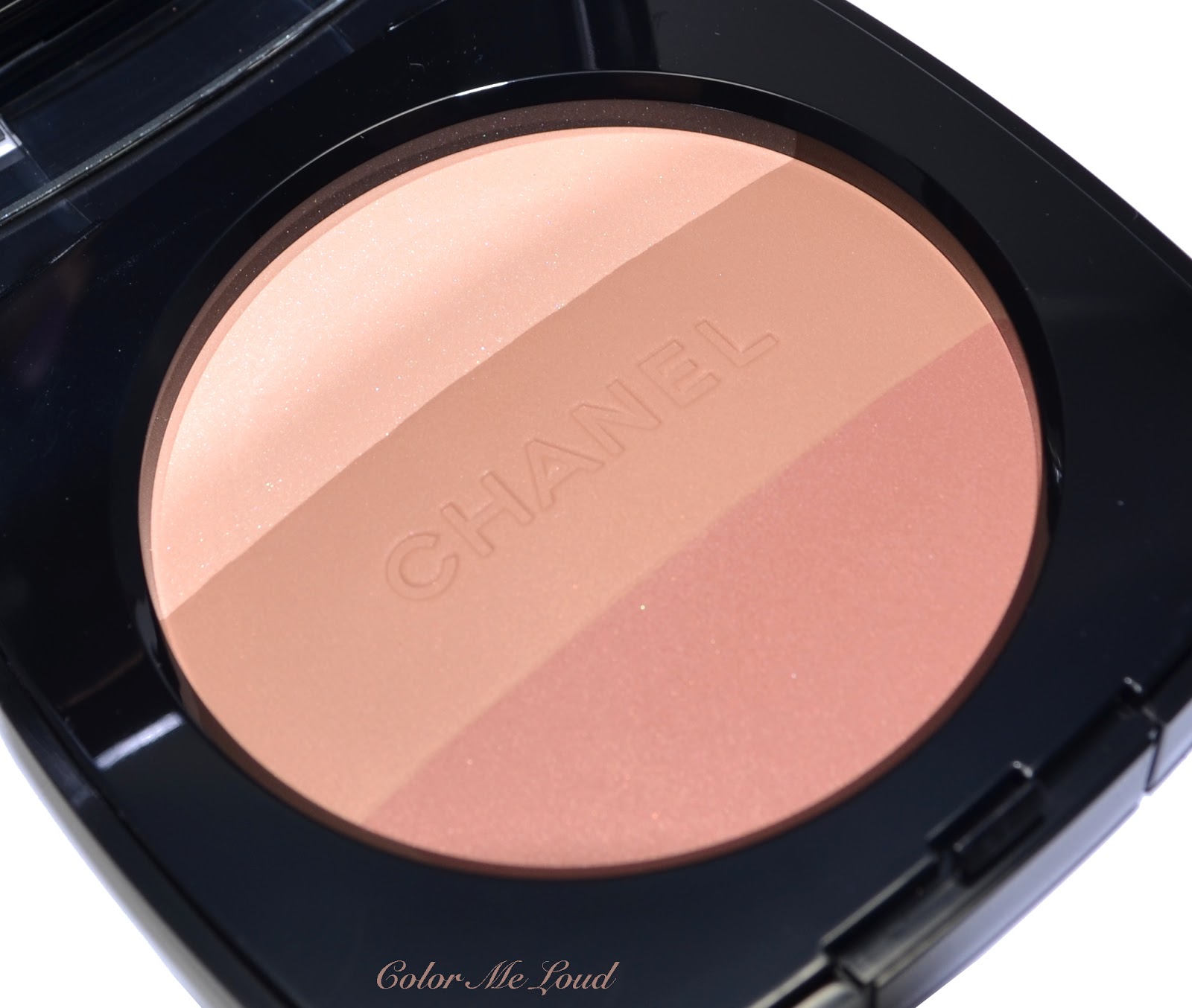
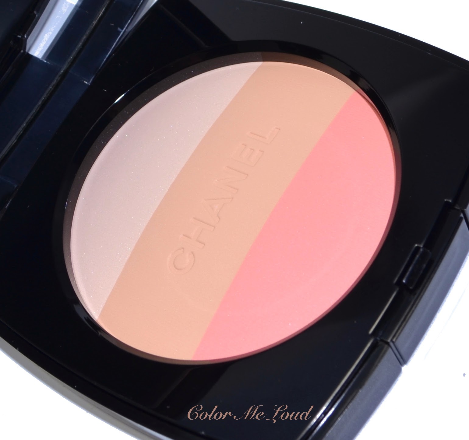
The first one I would like to talk about is Les Beiges Multi-Colour Powder in #01. The top of the powder has a light and shimmery powder to highlight, the layer in the middle is a mid-toned yellowish beige with matte finish, which is very close to the regular powders of the range but very "warm toned" and the bottom stripe is a light peachy pink shade with satin finish to brighten up or to use as a blush. 


Close-up: Chanel Les Beiges Healthy Glow Multi-Colour Powder #01

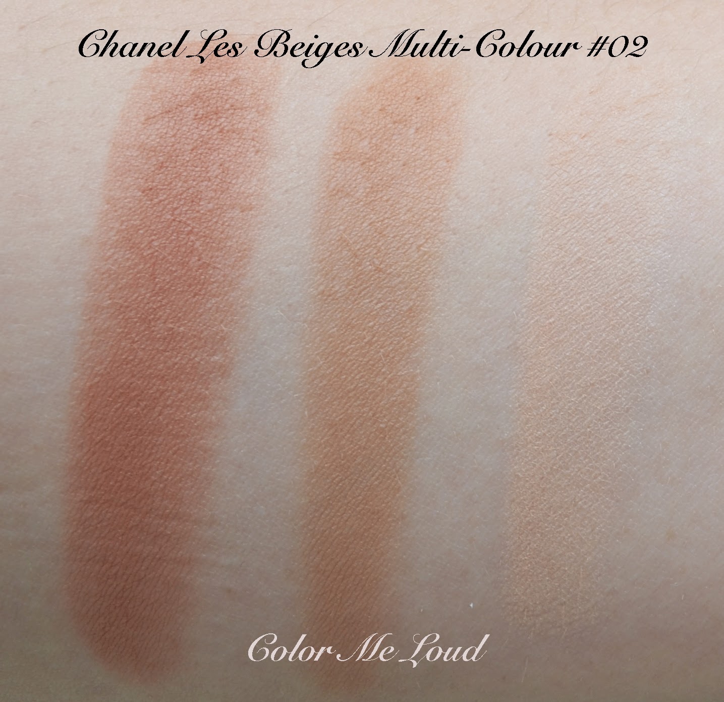
Below you can see the stripes swatched one by one. You can use this product by mixing all the shades together and using it as an all over powder to brighten up the complexion or use the stripes separately. The highlighter is a beautifully subtle one on my complexion and the blush works beautifully on my cheeks with a dense blusher brush (like Tom Ford or Rouge Bunny Rouge ones). The mid shade though is too warm for my undertones and it can't contour since it is too light to do that. The middle shade is a miss for me if I want to use the parts separately. If I want to mix all of them together, it makes other shades blend with my skin and provides some warmth to my complexion.


Swatch, studio lighting: Chanel Les Beiges Healthy Glow Multi-Colour Powder #01

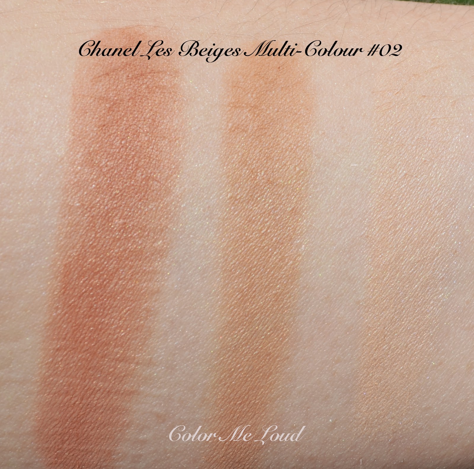
Les Beiges Healthy Glow Multi-Colour Powder #02 has also similar stripes to highlight, contour and brighten, but on my complexion this one works as a bronzer rather than multi functional powder. For deeper skin tones, I can imagine the highlighter applying beautifully, on me highlighter is way too dark to be used as a highlighter. The middle shade is again too warm for my liking. All of them swiped together makes a nice bronzer with not so much "orange" undertones, which wouldn't work on me. The bottom stripe takes away the orangeness of the middle stripe and brightens the complexion up. At the moment, #02 is too dark to use all over on me but I will take it with me to summer holidays and expecting to get a good use of it there after my skin darkens a little.


Chanel Les Beiges Healthy Glow Multi-Colour Powder #02

Chanel Les Beiges Healthy Glow Multi-Colour Powder #02

Swatch, studio lighting: Chanel Les Beiges Healthy Glow Multi-Colour Powder #02

Below I have taken one more photo of both shades under the sun to show you the reflective properties and how nice and subtle the highlighter shades glow. 

Swatch with direct sunlight: Chanel Les Beiges Healthy Glow Multi-Colour Powder #01
Swatch with direct sunlight: Chanel Les Beiges Healthy Glow Multi-Colour Powder #02

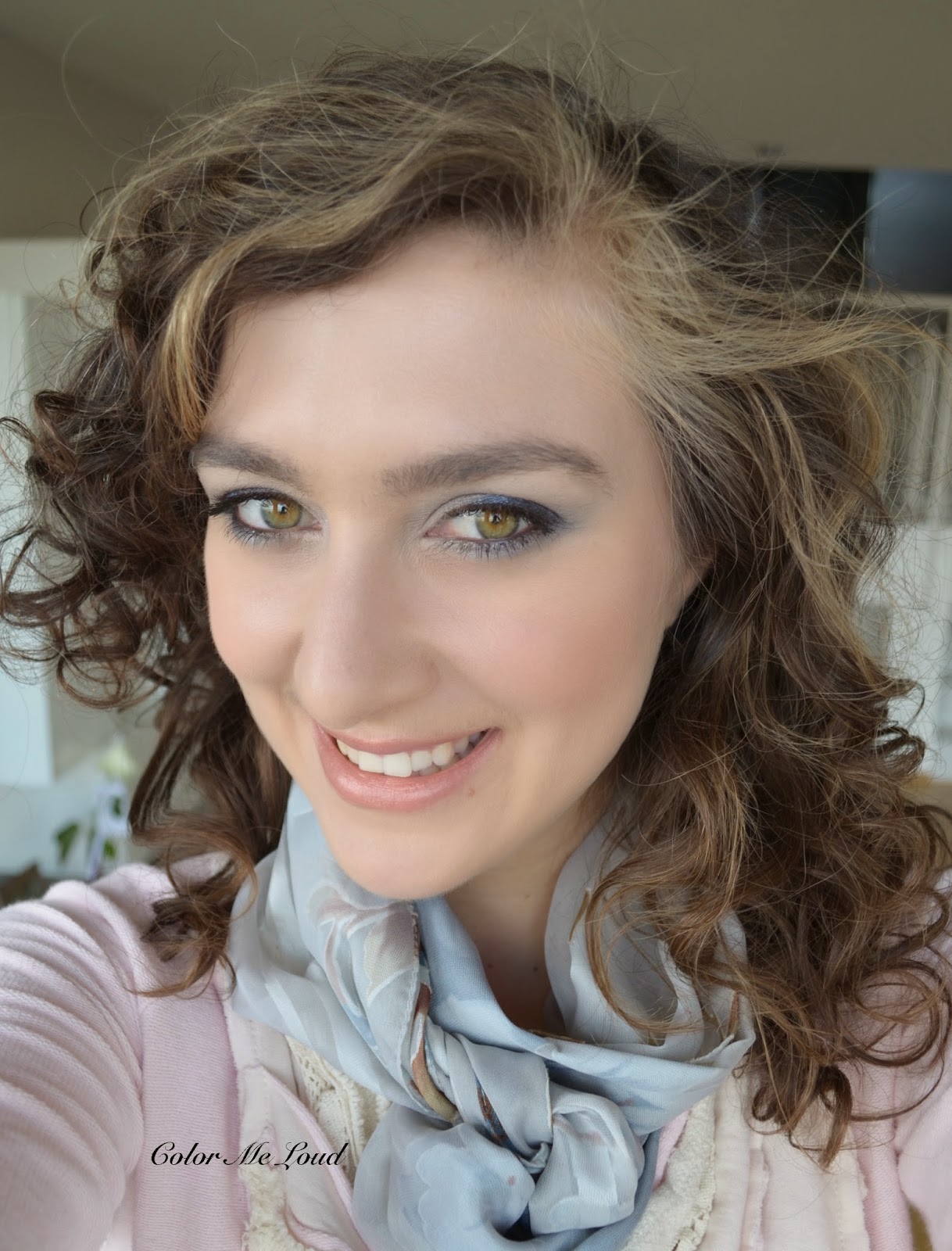
Below I am wearing Les Beiges Multi-Colour #02 as a contour and bronzer with a very light hand and #01 bottom most stripe as a blush and highest stripe as a subtle highlighter. On my eyes I have one of the new Quads of Chanel, #224 Tisse Riviera and on my lips I am wearing Guerlain Rouge G #15 Galiane which I am obsessed about at the moment as a nude lip.


FOTD: Chanel Les Beiges Healthy Glow Multi-Colour Powder #01 & #02

Final thoughts:
All in all I like adding Les Beiges Powder to my collection but I could as well live without it. The middle stripes are very warm to my liking and although highlighter and blush are pretty, I have many other highlighter and blushes which would give the same effect. On me, #01 is nice as an all over powder but with my normal to dry skin, I don't need a finishing powder or an all over powder. I might use #02 for the humid days at summer holiday where I opt not to put on any makeup, so it might help to brighten up my complexion and slightly control any unevenness of the skin after I am a few shades darker.

I think it is important to analyze what your needs are and how your skin tone and undertone is before approaching these powders. Do you at all need a powder? Do you need an overall powder or something to sculpt? Do you need a travel companion? Do you have warm or cool undertones? Also check out many swatches from different skin tones to make up your mind, as an example, Jenny from Belletristic Beauty is few shades lighter than me and here she swatched #01. Also Sabrina from Beauty Look Book, who is a few shades darker than me with warmer undertones swatches #02 here.

I now have the feeling I should have gone for #30 or #50 of the regular line instead of getting something I partly can't use (the middle shades) but depending on your needs and wishes you might find these to be the dream product you were searching for. 

Both of the powders are listed as limited edition. Have you checked them out yet? I would love to hear your thoughts.

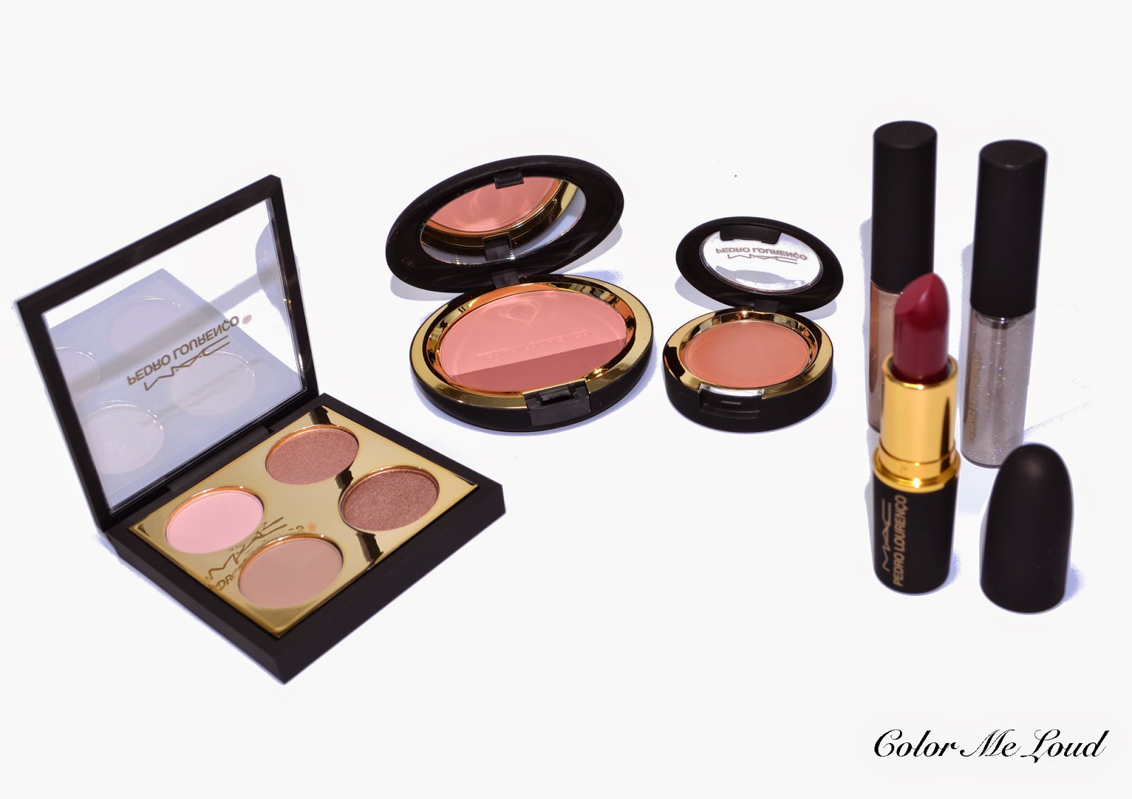
My Picks from MAC Pedro Lourenço Collection, Nude Eye Shadow Quad, Powder Blush Duo in Corol, Amplified Lipstick in Roxo, Cream Color Base in Hush and Lipglasses in Mirror and Goldmirror, Review, Swatch & FOTD

$
0
0
A little secret: I am having one of the most stressful times of this year. I wouldn't like to go into detail but this week I am very short of time. To be able to bear the stress, I went ahead and ordered some pretty goodies from MAC's Pedro Lourenço Collection which were in my wish list since the collection was revealed. I would like to show you some swatches before everything sells out. You know I like writing long about everything I try but post is meant to be more pictures than text because of time pressure. I hope you understand.


My Picks from MAC Pedro Lourenço Collection, Nude Eye Shadow Quad, Powder Blush Duo in Corol, Amplified Lipstick in Roxo, Cream Color Base in Hush and Lipglasses in Mirror and Goldmirror

The packaging is black and gold, looks very classy. The compacts have gummy outside, which you might like or hate. It is a little bit like Nars, if you are familiar with their packaging but with golden details which makes them look more elegant. Inside the boxes there are also gold print which reflects beautifully and from some angles they look reddish gold. Beautiful. I am definitely keeping the boxes :-)


MAC Pedro Lourenço Collection, lovely boxes

One of the items I had to get was the eye shadow quad. It has two matte eye shadows and two shimmery ones. Shimmery ones are permanent, two of the matte ones come with this palette (please correct me if I am wrong here, no time to research at the moment). I love how matte and shimmer balances this quad. Also it is soft but not too much so that it disappears. It gives a great polished look. 


MAC Pedro Lourenço Collection Nude Eye Shadow Quad,
Pink Sands (Matte), All That Glitters (VXP), Rose Cloud (Matte), Sable (Frost)

MAC Pedro Lourenço Collection Nude Eye Shadow Quad,
Pink Sands (Matte), All That Glitters (VXP), Rose Cloud (Matte), Sable (Frost)

All the shadows are pigmented and have lovely textures. Mattes are hard to get right but these are really great, I very much recommend this quad if you are in search for something nude but not boring. It is like UD Naked 3 done right. I know you might love UD Naked 3 but I find the texture of UD eye shadows a little hard to pull off. They accentuate the lines on my eyes but these don't. Here is the list of eye shadows included:
Pink Sands (Matte), All That Glitters (VXP), Rose Cloud (Matte), Sable (Frost)
Rose Cloud is a great crease and contour shade. Sable is one of the pretties rose golds that I own.


MAC Pedro Lourenço Collection Nude Eye Shadow Quad,
Pink Sands (Matte), All That Glitters (VXP), Rose Cloud (Matte), Sable (Frost)

Next item is discussed at the moment in beauty forums, Powder Blush Duo in Corol. I was reading Specktra today, it seems there was a batch with hard surface which was send to bloggers for consideration. Then they released these in US and the ones who ordered from MAC online shop received a good batch with soft powder. I ordered mine from Ludwig Beck yesterday and unfortunately it is one of those bad batches. It has bad color pay off and the powder is very stiff. I have read that below it might be better but after trying to scratch off a few layers today, I lost hope. It does still show off on my cheeks though and at the moment I am undecided about what to do with this one. I love the colors and the idea though.


MAC Pedro Lourenço Collection Powder Blush Duo in Corol
Swatches with sunlight and in shadow: MAC Pedro Lourenço Collection Powder Blush Duo in Corol

Cream Color Base in Hush is permanent. It is a lovely cream highlighter which I loved on top of my cheeks. It is frosty but by padding can be sheered out. The peach and gold undertones are very pretty.


MAC Cream Color Base in Hush (Frost)

Roxo was a hype buy for me, everyone talked about it, I had to get it. I haven't worn dark red lipstick for ages but after posting the look on Instagram today, it seems there was some love for it. I have to say I also loved it once combined with Nude Quad and Blush. Scroll down for FOTD. Also this is my first amplified lipstick and I love the texture and staying powder.


MAC Pedro Lourenço Collection, Amplified Lipstick in Roxo

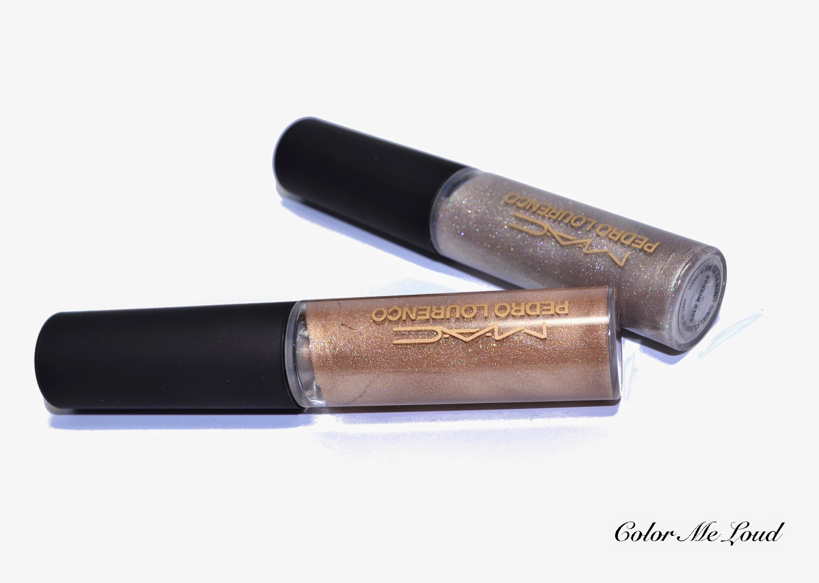
Now the stars of the show, two highly metallic lip glosses, which reminds me of sci-fi fashion of the designer. Oh maybe it was too shallow to put into two words. Although I don't like MAC's Lipglass formula, I had to get these two because they are so unique. Metallic nude lips are very trendy this summer and these two glosses carry this concept one step further.


MAC Pedro Lourenço Collection, Lipglasses in Mirror and Goldmirror

Be aware of that though, there is a labeling problem with these. So if you order Mirror, you might get Goldmirror and visa versa. I reported this issue to Ludwig Beck today, they kindly took my number and never called back. Luckily the other gloss I ordered from Mac Online shop also came wrong and I ended up with one of both so I am fine with it. If you want to make sure you get the right one, your best bet is to order both and send the one you don't want back.


Switched Labeling by MAC Pedro Lourenço Collection Lipglasses, Mirror and Goldmirror

The multi-color shimmer of these are very pretty. I also ordered the nude lipstick (Peach Beige) from this collection which is on its way to me, I think they will layer beautifully on that one.


MAC Pedro Lourenço Collection Lipglasses Mirror and Goldmirror, Swatches

Here are some FOTDs, Nude Quad on eyes, Blush Duo on cheeks (darker color used to contour), Cream Color Base in Hush as highlighter on tops of cheeks and Lipglass in Goldmirror on lips.


FOTD with Nude Quad, Blush Duo Corol, Cream Colorbase Hush, Lipglass in Goldmirror


Here is the same look with Roxo on lips. What do you think, dark red lippie yes or no?


FOTD with Nude Quad, Blush Duo Corol, Cream Colorbase Hush, Lipstick Roxo

Final thoughts: A lovely collection with a solid color story. The items combine beautifully. I like both strong red lip nude peachy eyes or metallic lips combos. The only items I was not head over heels about was unfortunately the blush. Also make sure you get the right Lipgloss since they are labelers wrong. Small glitches doesn't bother me. I am loving my piece of sunshine today in this dark day. 3 more days to endure, then I am back again. Can't wait!

Are you eyeing anything from MAC Pedro Lourenço Collection?

Suqqu Blend Color Eyeshadow EX-20 Natsubotan for Summer 2014, Swatch, Review & FOTD

$
0
0
Slowly, I am recovering from last weeks marathon. Luckily we have a long weekend so I am hoping to fully get beck on track by Tuesday. I prepared this post a week ago but couldn't post it due to time constraints. It is about this very hard to get Summer Quad of Suqqu. I am posting the review so that you might check your stash to put something together which is close and recreate the look. If you do that please write a comment to help others too.


Suqqu Blend Color Eyeshadow EX-20 Natsubotan

You know my affords of learning a few Japanese words by trying to translate Suqqu Quads (and sometimes terribly failing), so to me this one means Summer (Natsu) Peony (Botan), which makes sense because of the pink shades in that one. Hope I am not totally off with my interpretation.


Suqqu Blend Color Eyeshadow EX-20 Natsubotan

I have to admit I was a little nervous with that pink shade. You know rabbit eye concept? This happens to me with some bright pinks and I am no fan. The other two shade also looked very close to each other so I was pondering to get the quad or not. I was basically caught by the darkest shade, knowing it is right up my alley.


Close-up: Suqqu Blend Color Eyeshadow EX-20 Natsubotan

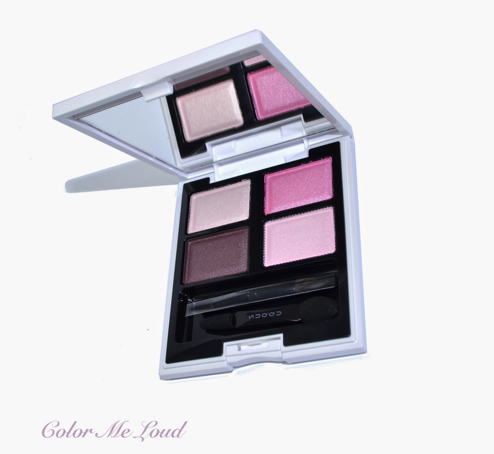
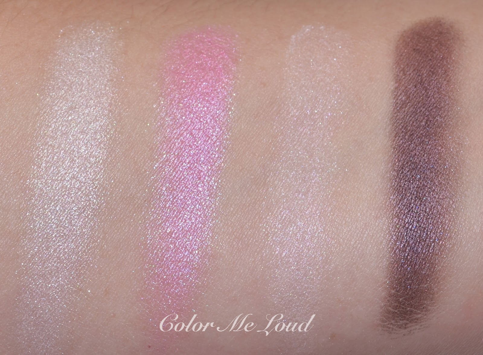
Suqqu Ex-20 Natsubotan is composed of:

Upper left: A pale champagne with pink undertones and frost finish.
Upper right: A bright mid-toned cool pink with semi transparent shimmery finish
Bottom right: Base shade, a light beige pink with slight shimmer.
Bottom left: Deep Plummy brown with purple shimmer, satin finish.


Swatch, photo with studio light: Suqqu Blend Color Eyeshadow EX-20 Natsubotan

The texture of pink shade is close to the vivid shades which were a part of divided pan from Fall 2013 releases, like the one in Ex-16 (reviewed here) which is a little redder. Those vivid shades were designed to be worn over a liner or darker color to modify the color. I believe there is a similar concept with this pink too. Once worn alone it provides just a wash of color and can't be build up even with a dense brush but once applied over the plummy brown in the quad, it does give it a nice cooler/purple hue, which I really like.


Swatch, photo outdoor: Suqqu Blend Color Eyeshadow EX-20 Natsubotan

Here is one attempt to wear Natsuban. I think the liner I chose here was not really optimal (Chanel Grenat) but you get to see how pink layers over plum and ends up looking wearable.


In-action: Suqqu Blend Color Eyeshadow EX-20 Natsubotan

Here is the whole look. Please excuse me but I don't know anymore which lipstick I was wearing for this one since last week my mind was a little overload. It must have needed some hard disc space badly and deleted all "irrelevant" information from my brain. By the way yesterday after paying at the car lot, I couldn't find the card to drive out anymore. I had to call customer service and make them track my credit card to open me the gate. You see in which level of deleting information my brain reached. 


FOTD: Suqqu Blend Color Eyeshadow EX-20 Natsubotan

All in all Natsuban is really a nice quad which may also be versatile if different base colors are used. I believe if you have Ex-16 though, it might be a little bit of a repeat for you. The semi-transparent pink shade is unique so I don't know if something like that can be found outside Suqqu range. If you have any ideas, please leave a comment below.

Now rant time. I found the accessibility of Suqqu even worse after Selfridges started shipping worldwide. It is almost not possible to catch 2-3 products from my wish list all at once since they are almost always sold out and occasionally become available for a few hours each one to two months. This quad was only available for half an hour before selling out. I really wished Suqqu experience would be possible to more of us, since the textures and color pay-off is phenomenal as well as the longevity. I will always stay a fan of the brand but if at some point I may start feeling that it is too much work and I might quit hunting them down. Just saying...

All in all, don't worry if you missed it. It is pretty but we can all live without this one. 

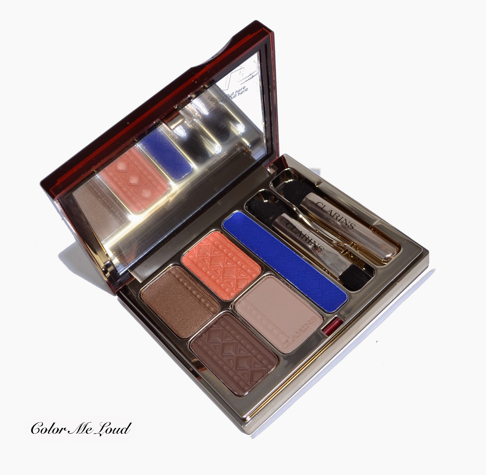
Clarins Colours of Brazil Eye Quartet & Liner Palette for Summer 2014 Collection, Review, Swatch & FOTD

$
0
0
Peaches & Blues are having a moment this Summer. Right on time for FIFA World Cup in Brazil, Clarins releases Colours of Brazil Eye Quartet & Liner Palette which combines peach & taupe with vivid Brazil Blue liner, a beautiful combination. 


Clarins Colours of Brazil Eye Quartet & Liner Palette

Clarins Colours of Brazil Eye Quartet & Liner Palette comes in a sleek compact, a velvet pouch and a look card which shows how to use the palette. The eye shadows can be used dry for a soft look or wet for a more intense dramatic one. In the past I have seen some of the palettes working much better when used wet but Color of Brazil has good color pay-off even when it is used dry. 


Packaging: Clarins Colours of Brazil Eye Quartet & Liner Palette

The palette has three neutral shades, one peachy shade for a summery fresh look and a vivid blue liner shade which is a little drier and stiffer but is denser so can be used better on a small area with more intensity. In the compact there are two brushes, one has a pointier edge for lining and a brush for blending. The eye shadows are embossed with traditional patterns of squares and circles (can anyone tell us if this is special to Brazil?).


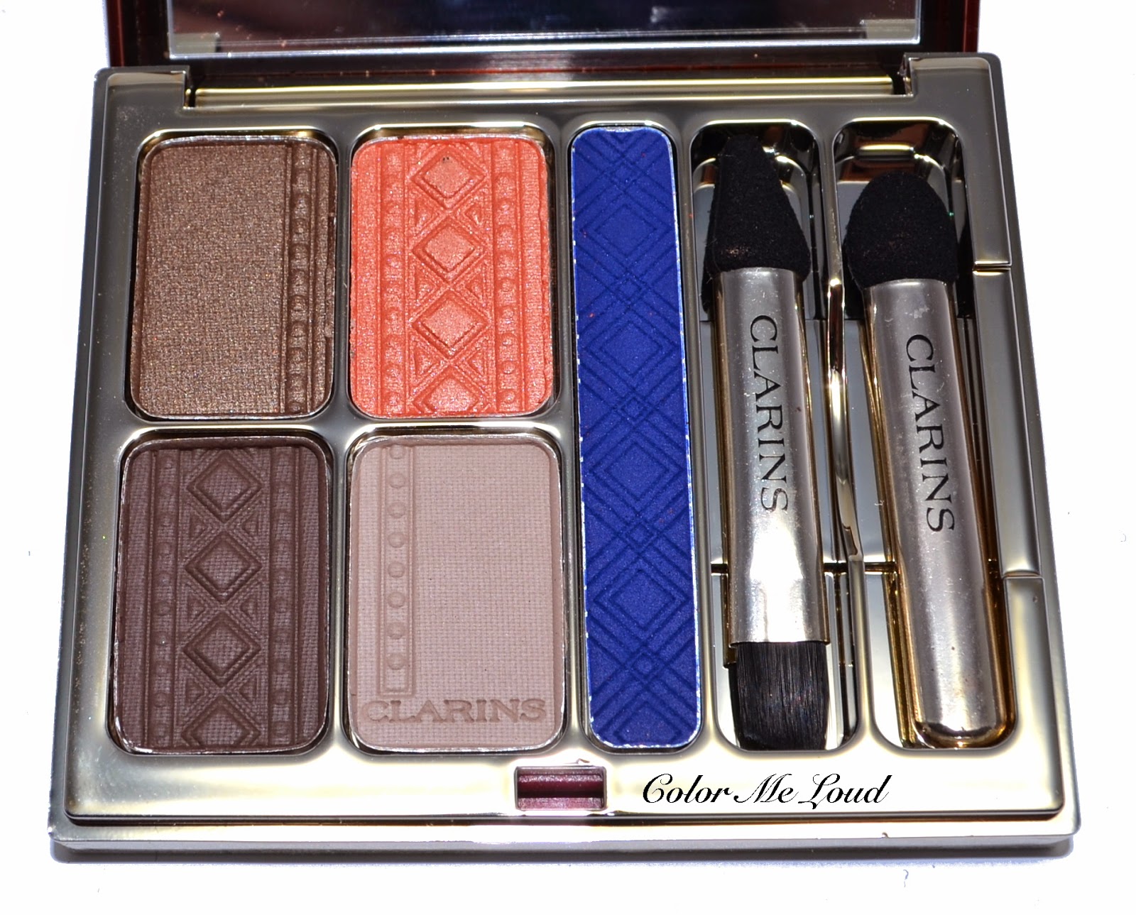
Close-up: Clarins Colours of Brazil Eye Quartet & Liner Palette

Colours of Brazil Eye Quartet & Liner Palette is composed of the following shades:

Top Left: Mid-toned bronze gold with a tad of green. The finish is satin to metallic. This one was the only shade which was a little drier compared to the others and didn't have a very good color pay-off. It performs better when used wet though.

Top Right: Mid-toned peach shade with satin finish. It has subtle shimmer and a very good color pay-off. Also perfect for layering to add a freshness to the eye look.

Bottom Left: Deep natural brown with satin to matte finish. It is very soft to touch and pigmentation is very dense.

Bottom Right: Light matte taupe. This is a gorgeous shade for a base or a subtle eye look. It applied beautifully.

Liner shade: Vivid blue with matte finish. Although this one has a good color pay-off once dry, I recommend it using wet to get the full density for an eye liner. With a right brush, this can also add some color to your eye look once layered on other shades.


Swatch with direct sun: Clarins Colours of Brazil Eye Quartet & Liner Palette

Below I used the light taupe on inner corner, peach on mid-lid and darker brown on the outer. I then applied the blue as a liner and added a bit more to the other corner to smoke it out. I used Urban Decay 24/7 Glide-On Eye-Pencil in Ultraviolet (which is a shimmery sister of Chaos) on the lower lash line and smoked it out with the liner shade from the palette.


In-action on the eyes: Clarins Colours of Brazil Eye Quartet & Liner Palette

For the rest of the look, I used Giorgio Armani Dolci blush on the cheeks and YSL Kiss& Blush #04 in Orange Fougueux concentrated mostly on the center of lips for a bitten effect. I really liked how summery and fresh this look turned out to be. The resulting effect is close to Tom Ford's Summer Palette Unabashed which also had a similar blue and taupe combination. If you missed on that one or you are in search for a more affordable option, check out Clarins Colours of Brazil Eye Quartet & Liner Palette. Also watch the application tips on this video at Clarins USA website.


FOTD: Clarins Colours of Brazil Eye Quartet & Liner Palette

Final thoughts: A lovely color combination and nice texture (only the golden shade could be smoother with better color pay-off). Clarins Colors of Brazil is now available at Clarins counters, for those of you who love the fresh breeze of summer over the dark blue seas.

Have you tried Clarins make up products? What are your impressions?

Yves Saint Laurent Couture Palette 5 Couleurs #01 Tuxedo, #02 Fauves, #03 Afrique, #04 Saharienne, #05 Surrealiste, #07 Parisienne, #09 Love, #10 Lumières Majorelle, Swatches & Review

$
0
0
Yves Saint Laurent recently released 11 new and permanent eye shadow palettes. Before those started appearing at the counters, I could lay my hands on the limited edition Summer Quint Blues Lumieres, which has the same design. Read the story of the inspiration behind the palette's design and see my blue coral FOTD here.


Yves Saint Laurent Couture Palette 5 Couleurs Display at Breuninger Stuttgart

I have already ordered a few (!) of these from Feelunique when they were having a 20% promotion 10 days ago but I haven't received my parcel yet. It should be here very soon though, so do expect some reviews coming up. In the meanwhile I have seen them popping at random counters, and here is the display from Breuninger Stuttgart. They did have the display but not the products though, but these are now available online at various retailers. Some of the shades are harder to find though, such as #06 Ruve Gauche, #08 Avant-Garde and #11 Ballet Russe. Breuninger had only 8 of the shades as seen below, so I took swatches for these three. 


Yves Saint Laurent Couture Palette 5 Couleurs Display at Breuninger Stuttgart

#01 Tuxedo is a classical cool/neutral smokey eye palette with grey and black. It also has two glitter shades to carry a day look into a night one. 

Impressions: A cool grey, a warmer taupe and black make a great everyday palette. These three shades have matte to satin finish and they are very pigmented. White glitter shade has a transparent base so it can be applied on top of the others. I thought black glitter shade was a little dry and I have to test it to make sure that this doesn't have fall outs. This is one of the palettes I ordered, so I will be reviewing it in detail soon.


Swatch: Yves Saint Laurent Couture Palette 5 Couleurs #01 Tuxedo

#02 Fauves has one of the best textures in the range. All the shades are buttery with great color pay-off. It is a warm brown palette, which would look especially good with blue eyes as well as on those of you with warm complexions.

Impressions: The texture of Fauves is to die for, my only problem with this one was that the below two shades were too close to see a big difference, I suspect they might apply very similar on the lids. This palette is also one of those I decided to order, so I will review it in detail soon and report about how these two shades look on me. I like the balance and the color combination of this one. You can also see lovely swatches here at Jenny's blog.


Swatch: Yves Saint Laurent Couture Palette 5 Couleurs #02 Fauves

#03 Afrique is a stunner! This is the one which I was eyeing since I have seen the promo pictures. Plummy dark shade and complimenting rose gold and coppers make my heart skip a beat. No need to say that this one is also on its way to me. I can't wait to try it out.

Impressions: The textures in this palette are mostly shimmery, darkest shade has less shimmer, copper and rose gold are almost metallic. The palest shade is not very opaque but since all the others have great color pay-off, I think they will all coordinate well. The color combination reminds me of Dior's summer palette in Sundeck, which had some mattes thrown in, so the difference in textures justify owning both I think.


Swatch: Yves Saint Laurent Couture Palette 5 Couleurs #03 Afrique

#04 Saharienne is a cooler natural combination with a gorgeous taupe and two light shimmery shades. The pigmentation in this palette was good but not as smooth and buttery as some other palettes, so I am thorn between getting this one or not. In the end I might give up just because of the taupe shade (lower right).

Impressions: This would work good on cooler and lighter complexions since it has a soft color pay-off. It took me more swipes to get the color density in this one. Nevertheless it is a lovely palette. Check out the swatches at Jenny's blog too.


Swatch: Yves Saint Laurent Couture Palette 5 Couleurs #04 Saharienne

#05 Surrealist is a purple lover's dream. It has four different shades of purple and a pale pink to highlight. The texture is mostly satin to shimmery and some of the shades show some transparency.

Impressions: Despite all the expectations, this one is not love at the first sight for me. After playing with it at the counter, I can see myself not reaching for it very often. The reason is that to me it lacks variation by color as well as texture. The textures are all shimmery and colors are all pretty much purple with same undertones. I couldn't resist it though, just because it is purple.


Swatch: Yves Saint Laurent Couture Palette 5 Couleurs #05 Surrealiste

#07 Parisienne, be still my beating heart. Although the palette is more shimmery than I would normally go for, I love the selection of shades, not being too pink nor too plummy, everything is balanced with a taupe. Only if that taupe would have a better color pay-off. 

Impressions: Just by looking at the color combination in the pan, I can sigh happily. After I play with those though, I am pondering a little how all the shimmery shades will look on the eyes. To find it out, I ordered that one too, so I will report about it soon.


Swatch: Yves Saint Laurent Couture Palette 5 Couleurs #07 Parisienne

#09 Love is, well, not love. I ordered that one before I swatched it and now I am afraid this is the ultimate palette for a rabbit costume at a Easter Party. Shimmery, yellows, pinks, even fuchsia. *shakes head* I will have to see about this one.

Impression: No comment yet. I doubt though many of us can pull off these shades. I unfortunately ordered that sight unseen so you will hear about how wearable these are on me, very soon.


Swatch: Yves Saint Laurent Couture Palette 5 Couleurs #09 Love

#10 Lumières Majorelle is not for the shy. I appreciate it when high-end brands release some bold artsy shades like this one. It reminds me of YSL's Pure Chromatics release from last year's fall collection, Palette Arty, reviewed here.

Impressions: Two of the shades, the medium blue and deep blue has sparse glitters in them which looks like they are prone to fall out. The soft green is very beautiful both color and texture wise. A pop of acid green might also look interesting. 


Swatch: Yves Saint Laurent Couture Palette 5 Couleurs #10 Lumieres Majorelle


This post has only my first impressions. I will be doing a detailed review of the palettes I ordered. Linda from Silverkis also has a swatch galore of these and do check out her blog too to get a better idea if you are ordering sight unseen.

Are you eyeing any of the new YSL Palettes or have already tried them? I would like to hear your thoughts.


MAC Sculpting Powder in Sculpt from Maleficent Collection, Review, Swatch & Comparison

$
0
0
Today it is our 3rd Wedding Anniversary but I am a little heart broken since my grandmother (who raised me up) is in hospital at the moment. Still I am going to try to make the best out of tonight. There is something I would like to share with you before me and hubby go out for one of our favorite Japanese Restaurants. It is the only piece I got from MAC's Maleficent Collection, Sculpting Powder in Sculpt.


MAC Sculpting Powder in Sculpt from Maleficent Collection

Although I haven't seen the movie yet (we are planning to watch it on Thursday), I have noticed the strong contouring going on at photos and trailer. There are also so many make-up tutorials at You Tube which are so much fun to watch (horns included). Since contouring made its way from editorial/show looks to everyday make-up, I am very much amazed to see how make-up enthusiast hunt for contouring powders. These are seriously hard to find "over the counter". Once they are released, they are always the first to sell out. Best examples would be Chanel's Notorious and many sculpting powders MAC is releasing with some of their collections. I still don't understand though why marketing departments don't see this trend...


MAC Sculpting Powder in Sculpt from Maleficent Collection

MAC Sculpting Powder in Sculpt was the first item that sold out from the collection at pretty much everywhere. But did you know that actually this one is permanent as a refill pan at MAC Pro-Shops? In US, you can even order it online, in Germany you have to call Berlin or Düsseldorf for them to send you one. If you were eyeing it but didn't know how to lay your hands on one, now that you know, here are some comparison swatches to help you make up your mind (and cheekbones).


MAC Sculpting Powder in Sculpt from Maleficent Collection vs. Chanel Notorious and Kevyn Aucoin Sculpting Powder

Chanel Notorious is the coolest tone Sculpting Powder to the best of my knowledge which may turn ashy if you have warm undertones. On me it works nicely if used sparingly. Kevyn Aucoin Sculpting Powder is the most pigmented one so if you are a beginner in contouring, you might want to get the access powder at the back of your hand before you attempt to give those cheekbones some shadow. MAC Sculpt on the other hand is not that pigmented so easier to use. Also it has a bit more warmth than the other two but still because of slight rosiness it has, it doesn't turn orangy. I can see this being a fool proof cheek bone enhancer for fair to medium complexions. I think for anyone darker than NC30, it might be too subtle though.


MAC Sculpting Powder in Sculpt from Maleficent Collection vs. Chanel Notorious and Kevyn Aucoin Sculpting Powder

Final thoughts: If you need a fool-proof contouring powder to enhance your cheekbones on a daily basis, MAC Sculpt might be what you are searching for. If you are fine with having a refill pan without fancy Angelina Jolie Wings on the packaging, you can always call a MAC Pro-Store or if you are in US, you can order it online since this is permanent at MAC's Pro Line.

Do you contour daily? What is your favorite product? Which brush do you use?
Chanel Le Blush Creme #71 Cheeky from Reflets D'Été Collection for Summer 2014, Review, Swatch, Comparison & FOTD

$
0
0
Thank you for all your good wishes and comments on the previous post. Unfortunately according to the latest news my grandmother's situation got worse. I am trying to stay calm and hope for the best. I have stayed up a little late last night (read: couldn't sleep) and decided to edit some photos I have taken during the weekend. Today I would like to review another item I picked up from Chanel's Summer Collection Reflets D'Été. After the nail polishes, it can be my favorite piece of the collection which is a little surprising. What happened to eyes right? Well, that will be a topic of another post. But until then, here is Chanel Le Blush Creme #71 in Cheeky.


Chanel Le Blush Creme #71 Cheeky from Reflets D'Été Collection for Summer 2014

By looking at the pan, some might think it is too brown or is like a bronzer, but as the comparison swatches later on will show, it is neither too brown nor is close to the bronzing base of Chanel. To me it is a mid-toned rosy brown with matte cream to powder finish.


Chanel Le Blush Creme #71 Cheeky from Reflets D'Été Collection for Summer 2014

This picture might be a little abundant but I had to pose with my reverse manicure featuring Le Vernis #623 Mirabella over #613 Eastern Light. With direct afternoon sun, you see that Cheeky appears more like a coral-brown and less rosy.


Chanel Le Blush Creme #71 Cheeky, On nails: Le Vernis Mirabella and Eastern Light

The closest shade I had in my stash is Chanel's Cream Blush #61 Destiny which is warmer and more brown but once sheered out, on the cheeks they look quiet close so if you have one, you might not need the other. As you see Chanel's Bronzing Base Soleil Tan is more beige/brown. On my complexion Cheeky mimics the brownish rosy shades my tanned skin shows up since I don't become chocolate brown but there is always a pinky undertone. Once compared with Destiny, I prefer Cheeky because it doesn't turn orange on me.


Chanel Le Blush Creme #71 Cheeky vs. #61 Destiny and Chanel Soleil Tan Bronzing Base

Below I am wearing Cheeky on the cheeks, Lipgloss in Happy on my lips and some of the IdOs, all from Chanel's Summer Collection which I will review shortly. The linen dress I am wearing is from Per Una. Since it has been over 30°C lately, I am struggling with make-up, especially with base products but even under these conditions, Cheeky performed quiet well. You see that it can be sheered out to give a healthy summer glow.


FOTD with Chanel Le Blush Creme #71 Cheeky 

Final thoughts: If you want to decide for one item, Cheeky is my pick from Chanel's Summer Collection, which just hit the stores in Germany this week. It can be used sheer or built up to give a healthy look without turning orange. Cream to powder formula is great to apply under or over powder products, thumbs up.

What are your picks from Chanel Summer Collection?

Chanel Ombre Essentielle #112 Pulsion from États Poétiques Collection for Fall 2014, Swatch, Comparison and FOTD

$
0
0
I have been silent for a few days, since I didn't feel like writing after my grandmother's passing away. I feel like my mood is somehow unstable, to me it is very hard to believe that I won't be able to see her again. Isn't it such an inevitable conflict that although eventually everyone dies, still it is hard to cope up with the loss of a loved one. 

But don't worry, this post is not about life and death. Instead it is about the first winds of Fall reaching Color Me Loud during last week. Chanel released their Fall Collection a few days ago in the States and these will be available in Europe not before August. The collection has three nail polishes, one blush, 6 single eye shadows, 4 Coco Rouge Shines and 2 lip glosses (promo photos can be seen here). I got lucky on evil bay and I would like to show you one of the eye shadow singles today. 

Chanel Ombre Essentielle #112 Pulsion

Chanel Ombre Essentielle #112 is a deep plum/aubergine with matte finish. I might be going crazy but I have seen some very sparse and fine silver glitters, which can only be noticed once it is on the eye and I was like wowed. Then I had to swatch it again and I didn't see it. I suppose those very sparse glitters were left off from blending of my recent Illusion d'Ombre eye look, hmpf.

I like seeing the single eye shadows like a concerto or a rhapsody (where a Solo Instrument stays  in focus throughout the piece) while quads being, say a String Quartet and larger palettes being Symphony. Strange analogy right? Let me try to explain what I mean.


Packaging: Chanel Ombre Essentielle #112 Pulsion

To me since the singles are being sold separately, they are supposed to function alone to provide a certain look without being "combined" with other eye shadows. I would personally not invest in a single just to use on the crease or as a liner. Therefore I am a little undecided about Pulsion. On one other hand it somehow lacks a bit of complexity for me. The texture is a little dry to touch too. On the eyes though, I loved wearing it. I really liked the resulting look and the fact that it could be build upon on the crease for a defined look and sheered out on the lid for a softer look, all could be done with one eye shadow.


Chanel Ombre Essentielle #112 Pulsion

You are probably guessing that I have quiet a bit of Plums and Aubergines in my stash. I wanted to show Pulsion against some other singles I own. You can see that what I mean about Concerto when you see Chanel's Magic Night. It is such a stunner with complex shimmer and dimension. Chanel's Amethyst has gorgeous purple shimmer. Giorgio Armani's Dark Plum has very fine shimmer and a buttery texture, which I like a lot. Chanel's Pulsion on the other hand has a matte texture and is close to Laura Mercier's Violet Ink, which I like using on my crease when I wear Plums and purples. 


Chanel Ombre Essentielle #112 Pulsion and similar single shades from Laura Mercier, Giorgio Armani and Chanel

Nevertheless, I loved the resulting look with Pulsion. I combined it with MAC Sculpt to contour (reviewed here) and MAC Corol to add color to the cheeks (reviewed here). I then mixed a few pink lipstick with a plum one to achieve that pink plummy lips. I am also wearing Marc Jacobs Precision Eye Liner on the eyes which was given me as a present from a dear friend (sending hugs and kisses!) and I love it. I have worn black eye liner all through my teen years and now I might get addicted again. Back to the topic though, Pulsion could be build up on the crease and could be used lighter or darker which was a nice surprise. 


FOTD: Chanel Ombre Essentielle #112 Pulsion

Final thoughts: Pulsion is a matte deep plum and can be sheered out or build up and looks lovely once worn on its own despite of being a little drier to touch. Still I am not sure if it is worth shelling out 30 bucks for 2 g of a plummy matte single, one which you probably already own.

Are you ready for Fall yet or do you find this release a little too early?

YSL Fétiche Eyeshadow Palette from Fall 2014 Leather Fetish Collection, Review, Swatch & FOTD

$
0
0
After a long winter for some of us (and no winter for the others), all we want to think about might be sun shine warming our face while sipping a glass of Mojito. I thought staying up to date still counts while doing that, so today I bring you a very pretty item from Fall 2014, YSL Fétiche Eyeshadow Palette.


YSL Fétiche Eyeshadow Palette from Fall 2014 Leather Fetish Collection

Excuse me for the abundance of photos but I couldn't help myself but took them as I am excited about how the colors and the design look so pretty together. Deep Blue, beige and warm naturals are the theme of this gorgeous palette. They remind me of autumn leaves on a night walk by the park.


YSL Fétiche Eyeshadow Palette from Fall 2014 Leather Fetish Collection

The design of the palette is the same as the new eyeshadow palette releases from YSL (swatches here) and their summer palette (reviewed here).


YSL Fétiche Eyeshadow Palette from Fall 2014 Leather Fetish Collection

When I have heard the name Fétiche, I wondered what kind of fetish are they talking about? Well, you can see that after touching the palette since it is covered with leather. I am guessing (and smelling) that it is artificial but the optic looks very pretty. 

On a side note, I am thinking about these while writing the post: 
I am trying not to think about leather clothes since it is very hot here in Stuttgart since days. 
I can't help but smile thinking what kind of "search" words will led people to this post *big grin*

Packaging: YSL Fétiche Eyeshadow Palette from Fall 2014 Leather Fetish Collection

On the package the top most shades are indicated as base (left) and highlight (right) as the other  three are denoted to be "color" shades. All in all the palette pulls quiet warm while blue cools things down a bit. This looks like a perfect color combination for brown eyed ladies with warm complexion as well as blue eyed gals. I tried my best to pull it off too though (scroll down to see the results).


Close-up: YSL Fétiche Eyeshadow Palette from Fall 2014 Leather Fetish Collection

All shades are buttery/silky to touch with great color pay-off without an exception.

Top left: A mid-toned warm bronze with golden shimmer
Top right: Light beige with satin to shimmery finish
Middle: Very deep cool brown with subtle golden shimmer
Bottom left: Deep petrol blue with satin finish. By the way I have just learned that petrol is not blue and the name comes from Blue Petrel which is named after teal duck.
Bottom right: Very deep cool black with satin to matte finish and very sparse silver shimmer.


Swatch under sunlight: YSL Fétiche Eyeshadow Palette from Fall 2014 Leather Fetish Collection


Below I applied the highlighter shade on the inner lid, base shade on the lid until the outer corner. I added blue to the outer corner and defined the crease with the deep brown, which I later on deepened with black. On this look I used Urban Decay 24/5 Eyeliner in Junkie along the upper lash line and lower waterline. The crease can be softened with the base shade but you know me, I liked it a little dramatic.


In-action: YSL Fétiche Eyeshadow Palette from Fall 2014 Leather Fetish Collection

Here is the whole look, combined with my favorite nude lippie at the moment, MAC Woodrose (reviewed here). With a strong eye, I kept the rest of the makeup very minimal. Teal blue shirt which I am wearing is from Jake*s. 


FOTD: YSL Fétiche Eyeshadow Palette from Fall 2014 Leather Fetish Collection

Final thoughts: Although it is too early to think about leathers and fallen leaves, I can't recommend YSL Fétiche Eyeshadow Palette enough. I love the texture and the color combination. This one is a good candidate for being a stand out of the next season.

YSL Leather Fetish Collection will be released in August, you can see the promo pictures here.  I found mine at evil bay by luck. 

Are you eyeing anything from YSL Fall Collection?

My Picks from MAC Sharon and Kelly Osbourne Collection, Bloody Brilliant Quad, Peaches & Cream and Cheeky Bugger Blushes, Jolly Good Mineralize Skinfinish, Kelly Yum-Yum and Dodgy Girl Lipsticks, Review, Swatch & FOTD

$
0
0
MAC Sharon and Kelly Osbourne Collection is released a few weeks ago in US and it is almost sold out. If you are still eyeing some items, you should act quickly. I was following discussion threads in Specktra and seeing how gorgeous the ladies look with their goodies. I started to form a wish list although I learned that the collection will only come to Germany in August. Today I feel blessed to be able to show you my picks. Special thanks go to Susan who picked these up for me after it was released last week in London. 


My Picks from MAC Sharon and Kelly Osbourne Collection


Sharon & Kelly Osbourne Collection is composed of two parts, Sharon's part which has red packaging, the products have warmer and more subtle shades. Kelly's part in lavender packaging has cooler toned products and it also features daring lips. I went mostly for Kelly's Collection since I prefer cooler shades to warmer ones. I have to admit that I then went back and ordered Sharon's Quad in US, since it received very good reviews, such as Stacey's here. She also thinks this one will look nice on green eyes so we will see ;-)

The items which were sold out first were the Powder Blushes. I picked up both Sharon's Blush Peaches & Cream and Kelly's Blush Cheeky Bugger and I can see why they were on high demand. They have lovely textures, very smooth to touch. They are subtle, yet buildable and color pay-off is very good. I especially like Cheeky Bugger on my complexion.


MAC Cheeky Bugger and Peaches & Cream Blushes

Cheeky Bugger is a light peachy pink with satin finish. The shimmer in these are very subtle and lovely. Peaches & Cream is a mid-toned warm rose shade which can be flattering across complexions. With a light hand, it looks lovely on me but it would show up well on deeper complexions as well. Peaches & Cream also has satin finish and very subtle shimmer similar to that of Cheeky Bugger.


Swatch: MAC Cheeky Bugger and Peaches & Cream Blushes

Next item I picked up is a Mineralize Skinfinish Duo. To the best of my knowledge, duos of this formula is brand new. I decided for Kelly's MS Duo since Sharon's have very warm tones, which easily turn orange on me. I need to try it out in person though once the collection arrives here. Kelly's Skinfinish Duo in Jolly Good is a safe bet for those around NC15-20 and lighter if you want to contour and highlight with it. If you want it as an overall powder to brighten up your complexion and add a subtle heathy glow, it would work also on medium complexions. On me I feel like I can do both, so it is love for me. 


MAC Jolly Good Mineralize Skinfinish

I used the skin toned part to contour and pale pink to highlight for the look below. Although the finish is not matte, it still looks lovely as a contour since the shimmer in these are much more subtle than any other Mineralize Skinfinish I personally own. Once mixed together, it disappears on my skin (hence no swatch) and provides a lovely brightening effect. I can't recommend this one enough if you are close to my coloring. 


Swatch: MAC Jolly Good Mineralize Skinfinish

I picked up Kelly's Eyeshadow Quad Bloody Brilliant although I have read mixed reviews about it. The main concern was that the makeup worn by Kelly on the promo photos looked more purple and intense whereas this quad neither of both. After trying it out though, I really liked it combined with the other pieces of Kelly's Collection, especially with the lip and cheek products. 


MAC Bloody Brilliant Quad

It is also important to not that Bloody Brilliant Eyeshadow Quad does perform much better than it swatches. As you can see below the only matte shade, a very deep plum called Shadowy lady is a little dry and patchy once swatched. It did apply fine though. My favorite shade of this quad is Tickety Boo, which is a warm taupe with matte to satin finish. I contoured my nose with that one as well as defined my crease of the look below. It is a lovely "sculpting" shade. I like how Fizzy Rose, a lilacy pink with satin to matte finish brightens up the eyes. I used Spoonful of Sugar on the inner corner of the lids to highlight and found it a littlee hard to work once layered with other shades. On its own, it works much better too.


Swatch: MAC Bloody Brilliant Quad, Shades: Spoonful of Sugar, Tickety Boo, Fizzy Rose, Shadowy Lady

As for the lipsticks go, I picked up two boldest shades from this collection and passed on the nudes since I have recently acquired one nude lipstick from MAC Pedro Lourenco Collection, Peachy Beige and it doesn't look all that great on me (aka concealer lips) so I decided to check out the nudes on the counter before I commit. 


MAC Kelly Yum-Yum and Dodgy Girl Lipsticks

Since I have seen promos I had to have Dodgy Girl since I don't have anything like that in my stash. Kelly Yum-Yum was more of a hype buy for me, given the fact that I also purchased Chanel's La Diva and couldn't find an opportunity to wear it since months. It turned out though both of these shades are very wearable as stains and very eye catching and interesting once applied fully. I tried to pull off full-on Dodgy Girl below, please tell me in the comments how do you like it :-)


Swatch: MAC Kelly Yum-Yum and Dodgy Girl Lipsticks

Here is my FOTD with Kelly's Products. I am wearing Cheeky Bugger on the apples of my cheeks and contoured and highlighter them with Mineralize Skinfinish Duo in Jolly Good. I applied Tickety Boo on the crease which I then deepened a little bit more with Shadowy Lady. I have Fizzy Rose applied over the eye lid and Spoonful of Sugar on inner corner. I am also wearing Dodgy Girl on my lips (couldn't you tell? ;-))

All in all I liked how this look turned out to be. The most challenging thing about it must have been to find an outfit which wouldn't crash badly with the lipstick. I went for the safest shade, white, but I believe cooler tones should work. Any suggestions?


FOTD with Cheeky Bugger Blush, Bloody Brilliant Quad, Jolly Good as Contour & Highlighter, Dodgy Girl Lipstick

Final thoughts: MAC's Osbournes Collection has lovely items with good textures. I especially liked how these complimented each other. My picks within the items I tested would be Cheeky Bugger Blush, Jolly Good Mineralize Skin Finish Duo and Dodgy Girl Lipstick. 

How would you combine Dodgy Girl? Blush, eyes, clothes... Ideas?

"Be Right Back" Post featuring Chanel Le Vernis #499 Gondola, Review & Swatch

$
0
0
You know that I am an avid Chanel nail polish collector and from time to time I can't help but feature a few older discontinued nail polishes here. You can check out most of my stash and if you have some special requests, let me know. For today I picked up this lovely burgundy shade with gorgeous red shimmer...


Chanel Le Vernis #499 Gondola

Have you noticed that I am not around or not that responsive lately? Well, that is because I am on a short holiday with hubby. You can guess where we are by these photos ;-)


Chanel Le Vernis #499 Gondola

Once more against the blue sky. I will try to put up some photos to instagram too so follow me in case you would like to see some real gondolas in the next days.


Chanel Le Vernis #499 Gondola

I will be back before you know it, but in the meanwhile I hope you have a lovely weekend.


Yves Saint Laurent Couture Palette 5 Couleurs #07 Parisienne, Swatches, Review & FOTD

$
0
0
I am back from holiday and happy to tell that it was a great one. It started somehow awkward when I noticed that I left my iPad on the front pocket of my suitcase. I have to tell you, make sure you check out everything before you hand in your luggage because it is not possible to get it back! Anyway, I was lucky that it survived. Venice is a beautiful city, where I have visited 12 years ago when I was a poor student. Needless to say this time it was much more fun.

I have many stories to tell but today I would like to introduce you to one of the 11 permanent eye shadow palettes (8 of them are swatched here) released by YSL, #07 in Parisienne. This one was my first pick since it has my two favorite shades, taupe & plum, and all in all it is more cool toned, which I also prefer.

Yves Saint Laurent Couture Palette 5 Couleurs #07 Parisienne

I have already raved about how much I like the modern design of these while I reviewed YSL Bleus Lumiere for Summer 2014 and Fetiche Palette for Fall 2014. In other words new YSL Palettes pose so well! I can't help myself but take tens of photos, left, right, top, left again until my memory card is full :-}


Yves Saint Laurent Couture Palette 5 Couleurs #07 Parisienne


Here is a close look at Parisienne. YSL defines top left shade as base shade and top right shade as the highlight. Central shades in each palette are the darkest and they are supposed to be used as definition or liner. Bottom shades are denoted as "color" and are designed to make the palettes more versatile by mixing or replacing with the other shades.


Close-up: Yves Saint Laurent Couture Palette 5 Couleurs #07 Parisienne

Note on textures: All of the eye shadows are silky and smooth to touch, they blend effortlessly.
Here is the description of each shade:

Top left (base): Mid-toned neutral taupe with rosy undertones and satin finish. I believe this shade warms up the palette a little and should work on cooler as well as warmer complexions.

Top right (highlight): Light cool off-white with frosty finish. I like using it on the inner corner of the lids blending it towards the half way to open up the eyes.

Central: Deep to mid-toned brownish plum with satin to shimmery finish. Although I like the quality of this shade, I wished it would be a little darker and less shimmery, but maybe that is just me.

Bottom right: Light cool pink with satin to shimmery finish. If you want to cool down the neutral taupe (top right) this is the one you should mix with it.

Bottom left: Mid-toned old rose/taupe with satin finish. This is a lovely shade to use as a base and create different looks.


Swatch: Yves Saint Laurent Couture Palette 5 Couleurs #07 Parisienne

Before I talk about how I feel about it after wearing it several times before and during my holidays, here is few looks, one with a nude lip and other with a stronger lip. For both of them I applied taupe all over the lid, deepened the crease and defined the outer corner with the central shade. I also used the highlighter shade for inner corner. 

I paired this palette with Urban Decay 24/7 Glide On Eye Pencil in Mushroom, which is a soft neutral taupe and doesn't go too strong with the rest of the make-up. I really love Mushroom also on the lower water line (which I am wearing below).


In-action: Yves Saint Laurent Couture Palette 5 Couleurs #07 Parisienne

For the rest of the look, on the lips I am wearing YSL Rebel Nudes #107 which I am obsessed with. I am not sure about the blush since I somehow haven't noted it down but I am guessing it is Sunset Beach (reviewed here).


FOTD with Yves Saint Laurent Couture Palette 5 Couleurs #07 Parisienne

Here is another look with a bit more bronzer (and probably indirect afternoon sun), this time with nude lipstick as I have worn it yesterday. To get that definition on the crease, I needed to blend and add about 10-15 minutes. I used Suqqu Brush M for this (reviews of Suqqu brushes coming up soon).


FOTD with Yves Saint Laurent Couture Palette 5 Couleurs #07 Parisienne

Now my thoughts... The textures are soft and silky and the eye shadows blend effortlessly, still I am not head over heels with this palette, despite its color selection matching my personal preferences. Here is why:

  • The darker shade is a bit too light for my taste. It is good for someone who just starts make-up because it is hard to overdo but if you know what you are doing and you like dramatic looks, you might be disappointed.
  • I like the darker shades to be a little more matte again for the drama purposes (matte doesn't reflect light and therefore gives the appearance of a deeper socket). Also a matte shade with a little drier consistency would double as a liner but this one is too soft and shimmery.
  • The palette is consist of very similar shades and textures so overall I don't find it to be very versatile. It would be great to have a gold or a silver thrown in, or a more brownish (maybe matte) shade to get different resulting looks.
  • Have I told that they blend effortlessly? It would be a good thing if the shades would be more distinguishable but since these are so close, once applied on the lids, they all blend into each other to look like as if you are wearing a single or a duo. It might be desirable for some, but not that much for me.

Final thoughts: YSL's Couture Palette 5 Couleurs #07 Parisienne is a great palette for beginners or those who like softer eye looks. If you are more of a drama queen (like me) you may want to invest in another edgier palette. I will also review almost all the other palettes from the range, so stay tuned if you can't make up your mind just yet.

Have you checked out the new YSL Couture Palette 5 Couleurs Palettes yet? Which one caught your eye?
Viewing all 679 articles
Browse latest View live