Quantcast
Channel: Color Me Loud
Viewing all 679 articles
Browse latest View live

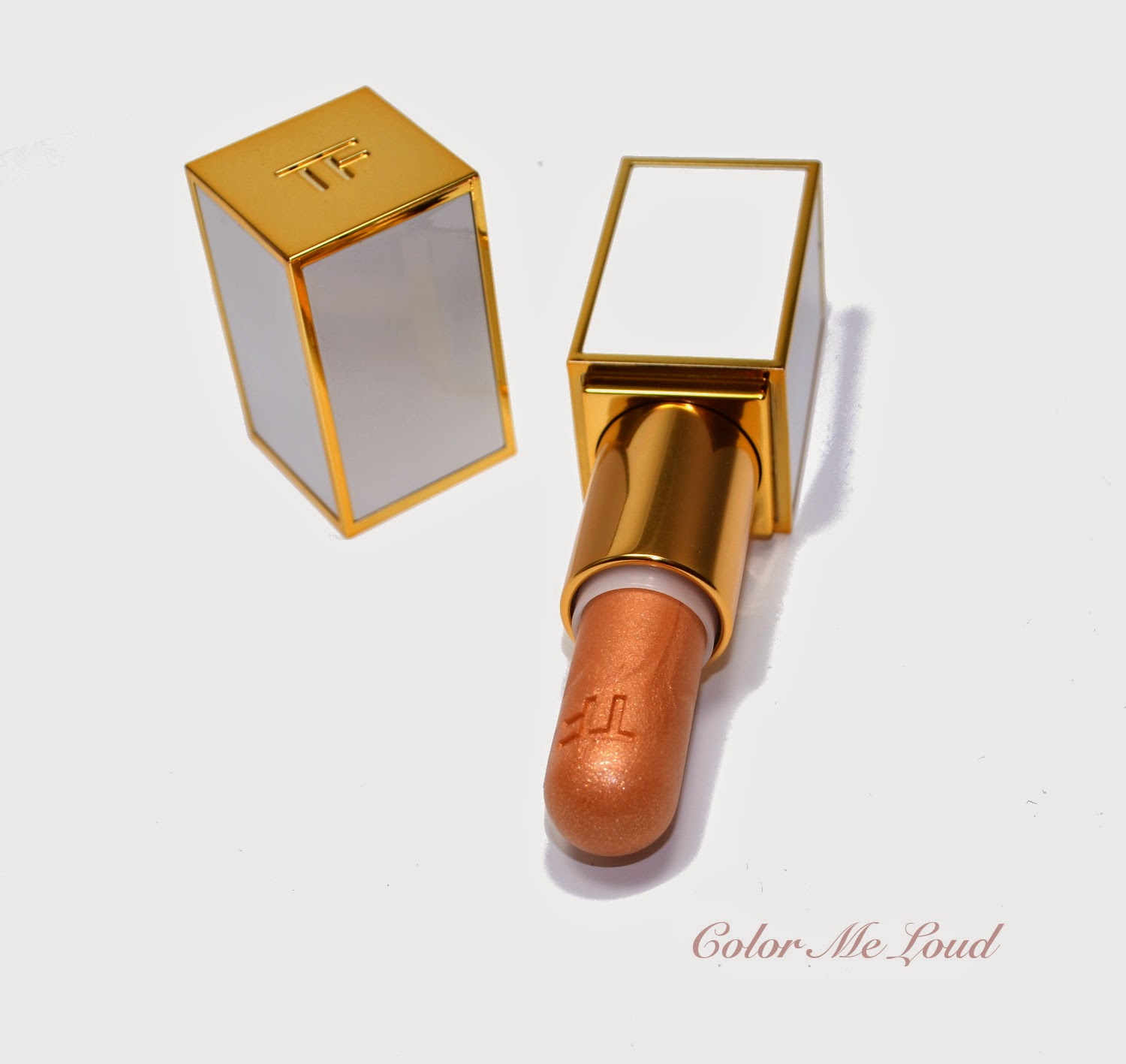
Tom Ford Summer 2014 Color Collection Lip Shimmer in Solar Gold, Swatch & Review

$
0
0
As pieces of summer collections started to pop at counters around the world, Tom Ford's capsule collection which consists of one eyes and cheek compact and two lip (and cheek) shimmers came to everyone's attention. Last year's summer collection set the expectations very high as it must have been one of the best coordinated nude collection of all times with pretty individual items which delivered superb quality across the board.

Tom Ford Summer 2014 Color Collection Lip Shimmer in Solar Gold

Since I am collecting eye products of Tom Ford (you know my crazy Blog Series don't you?) for me it was clear that I would go for the Eye and Cheek Compact which is on its merry way to me at the moment. I was not sure what to expect from the Lip Sheers though. These are listed as Lip Shimmer but they have the same form as Lip & Cheek Stain in Tainted Love from Fall 2012 Collection, (which I think was another epic collection). Chic ivory package must have stolen my heart and curiosity must have gotten the best of me, so I ended up with Solar Gold, which I thought would have more color than Moon Light.


Tom Ford Summer 2014 Color Collection Lip Shimmer in Solar Gold


Looking at the swatch below, the first thing to understand is why they didn't call these as "Lip & Cheek Stain" because it does not have that much color to be a stain. Below swatch shows multiple layers which took many swipes. I have heard that in a review it is told that Solar Gold could be use as a subtle bronzer. I guess to be able to do that, you have to be very very pale. On me it adds a very subtle golden sheen and provides a nice golden shimmer (see the second swatch which is off focus to show that). Solar Gold makes a casual highlighter which you can just take with you and add a little bit of something to the top of your cheeks and dab on your lipstick for a wet look. But all comes with a price...


Swatches: Tom Ford Summer 2014 Color Collection Lip Shimmer in Solar Gold

As much as Solar Gold feel moisturising on the lips, it does feel sticky on my face. It does catch my hair too. You may also end up liking it though if you find yourself reaching for the highlighter part of Shade& Illuminate which has similar consistency.


Tom Ford Summer 2014 Color Collection Lip Shimmer in Solar Gold

I wish I could show you a face shot with this one but I doubt you can see it since the effect is very subtle on me (even on the lips). These are now available online (Saks, Selfridges etc.) as well as on Tom Ford Counters (Germany still has to wait a month or so) and retails for a steep £36.00 in UK, probably the price will be the same as their lipsticks in Germany (47€).

Final thoughts: Solar Gold is a very expensive lip balm for me. I would have rather invested that money to one of their regular lipsticks or Lip Color Sheers from Spring Collection. I didn't have time to review them here but I am currently loving Summer Fling and Sweet Spot.

Can you use cream highlighter? What do you think about sticky products on your cheeks?

Dior 5 Couleurs Transat Edition #344 Atlantique for Transat Summer 2014 Collection, Review, Swatches & FOTD

$
0
0
Some lovely Dior pieces landed to Color Me Loud Quarters last week, which I gathered from different sources around Europe. All in all I am very excited about this collection, especially on the eyes and cheeks area. I would like to start my reviews with one of my favorites, which I didn't expect to love until the first swipe...


Dior 5 Couleurs Transat Edition #344 Atlantique for Transat Summer 2014 Collection

Dior 5 Couleurs #344 Atlantique is host in their signature quint compact, but the middle shade has matting pattern instead of usual CD letters. Atlantique is composed of three blue shades of different undertones and intensity, one glitter shade and a warm bronze/brown shade. 


Dior 5 Couleurs Transat Edition #344 Atlantique for Transat Summer 2014 Collection

The first time I have seen this quad, I thought I wouldn't be able to pull off the pastel baby blue, nor was I expecting the difference between two other blues showing up on me. I was also a little nervous about the combination with brown. This must have challenged me and I wanted to try it out. I am glad I did. But before we come to that, let me introduce you to each shade.


Close-up: Dior 5 Couleurs Transat Edition #344 Atlantique

Dior 5 Couleurs Transat Edition #344 Atlantique consist of:

Top left: White semi transparent glitter.
Top right: Light pastel baby blue with matte finish. This one has a good intensity and doesn't look chalky on me.
Bottom left: Medium-toned blue with satin finish. Very fine silver shimmer avoids this shade from looking flat or dull.
Bottom right: Medium bronze brown with matte finish.
Center: Deep violet-blue with very parse silver shimmer and matte base.

All these shades are insanely pigmented and mostly "matte" (other than the shimmer shade) which make them very wearable. The color combination is very unique (do you know any other palettes which is similar to that one?). 

Swatch: Dior 5 Couleurs Transat Edition #344 Atlantique

Here is Atlantique on the eyes. Although blue is not the favorite color on me,  I really liked the resulting effect. Here is baby blue on the inner corner, medium blue on the outer corner, brown in the middle and dark blue on the crease. I also used a little bit of glitter shade near my tear duct. Although there are 3 blue shades in the palette, I really like how distinctive they are even after blending. Do I sound impressed? Well, that is because I am.


In-action: Dior 5 Couleurs Transat Edition #344 Atlantique

Here is a FOTD using Dior 5 Couleurs Transat Edition #344 Atlantique. 


Complexion
Guerlain Lingerie De Peau BB Creme in Light, Dior Hydra BB Eye Creme #1, Rouge Bunny Rouge Impalpable Finishing Powder #055 Diaphanous
Eyes
Dior 5 Couleurs Transat Edition #344 Atlantique, Nars Pro-Prime, Suqqu Brow Pencil, Le Volume de Chanel Mascara, Diorshow Liner #548 in Gold, Diorshow Liner #258 in Turqoise.
Cheeks: 
Dior Snow Face Palette
Lips:
Tom Ford Lip Sheer in Summer Fling


FOTD with Dior 5 Couleurs Transat Edition #344 Atlantique

Final thoughts: Pigmented, edgy, unique, smooth, matte = winner in my book. Nothing else but love, when I least expected it. Don't pass this beauty just because it looks so blue...

Dior Transat Collection started to be released around the world. It should be in Germany in a week or two. Is your wish list ready? How do you find the combination of blue and brown?

Dior 5 Couleurs Transat Edition #564 Sundeck for Transat Summer 2014 Collection, Review, Swatches, Comparison & FOTD

$
0
0
Dior madness goes on at Color Me Loud since I laid my hands on some of their Summer Collection pieces, special thanks go to lovely Teresa from Barcelona. After being blown away by the nice pigment and formula as well as the color combination of 5 Couleurs #344 in Atlantique, today I would like to introduce you to a more natural alternative for those of you who like soft summer looks, Dior 5 Couleurs Transat Edition #564 in Sundeck.

Dior 5 Couleurs Transat Edition #564 Sundeck

The first time I have seen the promo pictures, I knew I had to get it because:
1) That dark shade was looking so intriguing
2) The orange in the middle made me curious to see how it would combine with the antique gold on the bottom left.

To me it was clear that if the pigmentation of the product would live up my expectations considering how good the quality was across the board for last Dior releases (I am loving the ones from holiday and last fall), I had to have Sundeck.

Dior 5 Couleurs Transat Edition #564 Sundeck

Last year many palettes were released with theme "soft peach". To name a few: Chanel Ombres Matelasees in Pearl River, Armani Summer 2013 Face & Eye, Clarins Splendours. Sundeck though is different to all of these since it starts with the peach theme and an orange combination but then at the bottom of the palette brings these together with a khaki/taupe and a deep plum.


Close-up: Dior 5 Couleurs Transat Edition #564 Sundeck

Here is the list of shades in Sundeck:

Top left: Light matte tan shade. This is great for a base as well as to soften the edges on the crease. It is very close to my skin tone ( a little lighter) which makes it a nice subtle highlighter under brow bone too.
.
Top right: Light peachy gold with satin finish. It is great for the inner corner or all over the lid for a subtle soft look. It is also very pigmented and soft.

Bottom left: Mid-toned gold with a khaki undertone, satin finish. I would describe it as antique gold. It is a very lovely shade for all year around, very soft and pigmented too.

Bottom right: Very deep plum with matte to satin finish. This one is less shimmery than the golden shades, hence great for a liner or deepen the crease. Lovely consistency, it is pigmented but not out-of control kind of pigmented if you know what I mean.

Center: Mid-toned orange with matte to satin finish. Shimmer in this one is very subtle, and it is one of the most pigmented oranges I have come across. Once used on the lid, it shows up very nicely without having to layer it many times. Lovely twist to this beautiful natural quint.

Swatch (studio lighting): Dior 5 Couleurs Transat Edition #564 Sundeck

What I especially like about Sundeck is the darkest shade. It could be a warm brown but this plum is so much edgier and more interesting. It also cools down the whole thing a little, making it wearable for natural and cooler complexions. You know antique gold is not my favorite on my eyes but this one is really lovely and combines so well with the rest. I would definitely prefer this one to a more yellow, warmer gold tone.


Swatch (sun):Dior 5 Couleurs Transat Edition #564 Sundeck

Here is Sundeck on my eyes. I applied matte shade all over as a base to start with. Then added the light gold to the inner corner and antique gold to the outer corner, I left a little gap in between the two, applied the orange in the middle and blended with the other two. I then defined my crease with the darkest shade and softened any edges with the light tan shade. I also added a little bit of orange to the lower lash line, exactly below the one from above.

In-action: Dior 5 Couleurs Transat Edition #564 Sundeck

Here is the whole look using Sundeck, I am wearing Tom Ford Sweet Spot on the lips and Chanel Joues Contraste in Frivole on the cheeks. I wore Sundeck this Saturday when I was meeting lovely Shelynx from "Der blasse Shimmer". I really recommend her blog (in German), I am also an avid reader. And yes we had some great time shopping as you may imagine ;-)

FOTD using Dior 5 Couleurs Transat Edition #564 Sundeck

I thought I would also show you the comparisons with the closest Dior Quint from my stash. It is Dior 5 Couleurs Croisette Edition #654 Aurora from Summer 2012. I loved Aurora and wore it many times since then but I always found it a little too warm for my taste. Make-up gods must have granted my wish and sent Sundeck on earth ;-)


Dior 5 Couleurs Transat Edition #564 Sundeck vs. Croisette Edition #654 Aurora

Here is a comparison of these two, you see that Aurora has a very light frosty pink which I could also use on my tear duct as a highlighter. The gold shade (top left) is really very yellow, and the deeper shade has more shimmer and warmth. To me Sundeck is like a revamped version of Aurora, no "too yellow" golds, the darkest shade is more matte, hence can give better depth and lightest shade is much more usable than the frosty pink.


Swatch (sun): Dior 5 Couleurs Transat Edition #564 Sundeck vs. Croisette Edition #654 Aurora

My last obsession is to pad a crazy matte shade in the middle of the eye lid. I found it to be a modern way to add a little bit of something without being too over the top. Sundeck gives me the perfect orange shade to do this but it can also be worn in a more classical way, if you prefer.

Final thoughts: If you like a natural palette with a twist, Sundeck is a must have for this Summer.

Orange eye shadow for a change, would you see yourself combining it with your natural eye look?

Tom Ford Eye and Cheek Compact Unabashed for Summer 2014, Review, Swatch, Comparison & FOTD

$
0
0
It must be around January when I was playing around with lipsticks and nail polishes at our small Tom Ford counter, I happened to ask if they know about the future releases. SA pulled out a brochure and opened it up to show me the new lipsticks and nail polishes, then I have seen a compact which was round and divided, she nodded "this is for summer!".

Yes, it is round, the compact is sleek and hefty. Here is the star product of Tom Ford Summer Collection, Unabashed.

Tom Ford Eye and Cheek Compact Unabashed

Unabashed might look like a new word to extensive(!) Tom Ford vocabulary, but it doesn't count as one since it is just a version of another word which is already included. Do you remember the nail polish from last Holiday, Shameless? Most used words remain the same, namely, Haze, Smoke, Orchid, Bitch and Lust. I have heard that Titanium Smoke will be discontinued and replaced by a new quad called Smokey Bitch but I might be just making it up so don't call me on that. ;-))

Don't get me wrong though, I like Tom Ford make-up, which must be my worst addiction. Each season it  becomes more and more dangerous for my pocket. The only thing I can't get along with must be the names...

But what makes this compact so shameless? Its golden dropping luxury screaming ivory case or combination of five generously sized products in one? Might be the price?


Tom Ford Eye and Cheek Compact Unabashed

Ivory compact is really elegant. Unabashed has the same size as Tom Ford bronzers and has 13.5 g/.47 OZ of product, which is larger than their regular quads (10g) or in other words includes three of their trios (4.5 g). I got mine from Selfridges and there it costs only £3 more than their regular Eye Shadow Quads. Thin but big compact might be practical or not that practical depending on your storage ways and your handbag forms but no one would ever deny that it looks hefty and luxurious. I would like to believe that this is not designed for a evening hand bag but for a beach tote. Or maybe Mr. Ford is about to design a bag in which this can fit in?


Tom Ford Eye and Cheek Compact Unabashed

Inside the compact there are five products for eyes and cheeks. Intuitively one would think that left hand side is for eyes and right hand side is for cheeks, but we will come to that again. All of the product are powder. 

Left hand side has (classified as it looks in the picture below):
Top: Light champagne glitter on a transparent base
Middle: Mid-toned natural taupe with matte finish, 
Bottom: An insanely pigmented deep blue with matte finish.

Right hand side contains:
Top: Medium copper with satin to shimmery finish
Bottom: Medium coral pink with satin finish.


Close-up: Tom Ford Eye and Cheek Compact Unabashed

Glitter shade felt somehow dry to touch and it was a little harder than usual to get the product. On the lids though, it performed well, giving a wash of glitter to add a little bit of something to the eye makeup. 

Two matte shades are very smooth. They feel almost creamy to the touch and they don't kick excess powder. These mattes are both to die for. I don't think I own anything similar, so pigmented but at the same time they are so easy to build up and blend. At some point I was wondering if Mr. Ford collaborated with an alien laboratory to bring a new formula out of this world. I wouldn't be surprised as the blue shade could even be applied dry on the lower water line!  

The face part of the palette is a little confusing. Blush applies beautifully but bronzer/highlighter shade is too dark to be a highlighter for me and too shimmery to be a bronzer. I mixed it with the blush to get a bronzy effect going on on the cheeks and it worked fine. It is so pigmented, I believe it can also be used as an eye shadow.


Swatch (studio lighting): Tom Ford Eye and Cheek Compact Unabashed
Swatch (sun): Tom Ford Eye and Cheek Compact Unabashed

For the look below I only used Tom Ford Unabashed for eyes (no liner), just added mascara. On the cheeks I have both of the cheek shades layered. On my lips, I have the highlighter/lip stick Solar Gold (reviewed here) from the same collection. For eyes I applied taupe shade all over the lid and accentuated it with blue shade. I used blue as a liner as well. I then padded some glitter with my fingers on the inner corner, which doesn't who's up on this photo but the effect was gorgeous under low light.


FOTD: Tom Ford Eye and Cheek Compact Unabashed

I pulled out some other palettes for comparisons. I was mostly wondering how taupe and glitter compares to that of She Wolf and Silvered Topaz. I also took out Cobalt Rush to compare it with the blue shade.


Comparison: Tom Ford Unabashed vs. Tom Ford She Wolf, Silvered Topaz and Cobalt Blue

As far as taupes go, Unabashed has the lightest matte shade among the others, which is a little darker than the lighter shimmery taupes from She Wolf and Silvered Topaz. Taupe in Unabashed is unique in its way of being mid-toned and matte. It is warmer than She-Wolf.


Taupe Shade in Tom Ford Unabashed Compared to She-Wolf and Silvered Topaz

Unabashed has the most subtle glitter of all three as Silvered Topaz and She Wolf have more opacity.


Glitter Shade in Tom Ford Eye and Cheek Compact Unabashed Compared to She-Wolf and Silvered Topaz

The blue from the other world (the one in Unabashed) is no other blue on earth, therefore this comparison with Cobalt Rush makes no sense but I leave it here for a reference.


Blue Shade in Tom Ford Unabashed Compared to Cobalt Rush

After all comparisons were over, a thought stroke me. That matte taupe shade suddenly looked so intriguing as a contour. Then I was almost sure it would be very close to Kevin Aucoin's Sculpting Powder but it turns out it is a little cooler than that one. The level of pigmentation is close though, so this one would also work. Oh and it is still warmer than Notorious, so be sure to give it a go.

Tomorrow I will try the bronzer shade on the eyes and taupe shade on the cheeks!


Tom Ford Unabashed Taupe Shade Compared to Kevin Aucoin Sculpting and Chanel Notorious

See more swatches and beautiful pictures from Jenny and Ebru. Ebru also has the analysis of ingredients.

Final thoughts: Unabashed is something every beauty addict can enjoy. I believe this one will also look gorgeous on deeper skin tones. It is something I would love wearing even more after I become my black self during summer (which is unavoidable even with so many factors of SPF). Unabashed has some great matte formulation which I hope to see more from Tom Ford.


Will you be checking out Unabashed? 

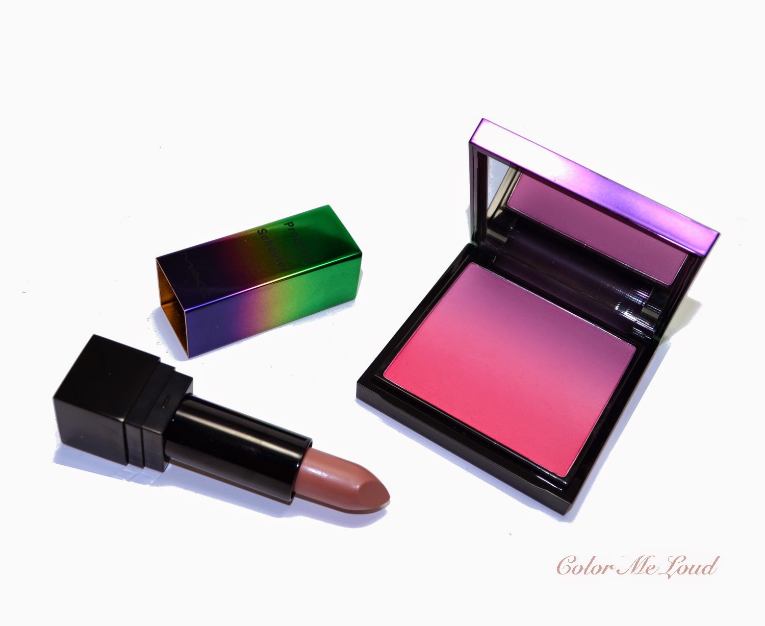
MAC Proenza Schouler Collection, Blush Ombre in Sunset Beach, Lipstick in Woodrose

$
0
0
Ready to read confessions of a make-up addict? 

It has been a long time since I was staying away from MAC counter. Although I do like quiet a few of their products. The reason for me was simple, didn't matter how much I would chase a particular shade, I might not be able to get it. The very limited edition products do sell within hours here and this did really put me off the brand. I transferred from a chaser/hunter to a happy customer who just drops by and gets if she happens to like something. With MAC it rarely happens that there is something left that I would like so since months I was cleared from any purchase.

This must be why I didn't know about MAC Proenza Schouler Collection until last Monday. I have seen some colorful packaging at MAC Counter in Breuninger. I approached saying "probably the lipsticks are already sold out right?". A friendly SA smiles "only one of them, all the others are still available".


MAC Proenza Schouler Collection, Blush Ombre in Sunset Beach, Lipstick in Woodrose

This answer was unexpected. I swatched the remaning shades (a dark plum called Primrose was sold out) and decided to get the nude one called Woodrose. I sometimes struggle finding a good nude but this one had enough pink inside so didn't make me look like the dead. I was about to pay when SA showed me THAT blusher "what about this one?". I was undecided and shrugged. "Ok, let me try". It was after a long day (of work + lecturing) and I must have been very tired not seeing the originality of the product. It is an Ombre Blusher which goes from a lighter shade to a darker one. After trying out and seeing it looked nice enough to give it a go, I purchased the items and drove back home.


MAC Proenza Schouler Collection, Blush Ombre in Sunset Beach, Lipstick in Woodrose

It must have been the lovely packaging which was so inviting, but on the way back home I felt rather guilty about the purchase. After all it was not "planned". I am trying to plan every purchase since I might go overboard easily. Do I needed another blush? What about another nude lipstick? As I was driving back home, I decided to return them during my next visit to the counter.


MAC Proenza Schouler Collection Lipstick in Woodrose

Once I was home, I took them out to have a look inside. The blush seemed to be very heavy so I checked it and have seen that it was 14 g! Considering I used some coupons to get some discount, it was very economical for an interesting effect. After googling about the collection, I learned that they are rather hard to get and in Germany these are released exclusive to Breuninger where I got mine (which explains why the lipsticks were not sold out). I opened the blusher to decide and under better lighting, I have seen that beautiful ombre effect, then I knew returning was not an option.


MAC Proenza Schouler Collection, Blush Ombre in Sunset Beach

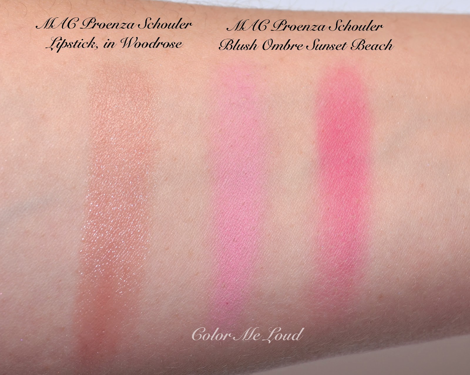
I really like the idea of Ombre Blush, which can be used to contour and highlight to accentuate the cheekbones. Or depending on the lipcolor the cheek color can be adjusted from light to dark. There is one more shade, an orange one, which was already sold out at the time I was at the counter but usually I go for pink to brighten up my complexion so I am happy with the purchase. Below you can see the lightest (upper) and darkest (bottom) part of Sunset Beach swatched together with lipstick in Woodrose.


Swatch: MAC Proenza Schouler Collection, Blush Ombre in Sunset Beach, Lipstick in Woodrose

Here I am wearing Sunset Beach on the cheeks and Woodrose on the lips. I applied the blush by swirling everything together, then highlighted with the lightest color. It is very pigmented so one should use a light hand. Sunset Beach wears extremely well on me, over 12 hours and counting.


FOTD with MAC Blush Ombre in Sunset Beach, Lipstick in Woodrose

I am going to edit this post with another FOTD tonight since I am wearing the blush and the lipstick today again in a more cheek defined look. Loving it, seriously, Sunset must be my favorite blush at the moment.

Final thoughts: Although I am not fan of impulse buys and believe that they make me give wrong decisions, this time I was lucky enough to be there on the right time. I think Sunset beach is really a stand out, also very economical for the price considering huge amount of product you are getting. If you can get your hands on this one or the orange one called Ocean City, I recommend you to grab one.

Have you seen any Ombre Blushers before? What do you think about the idea?

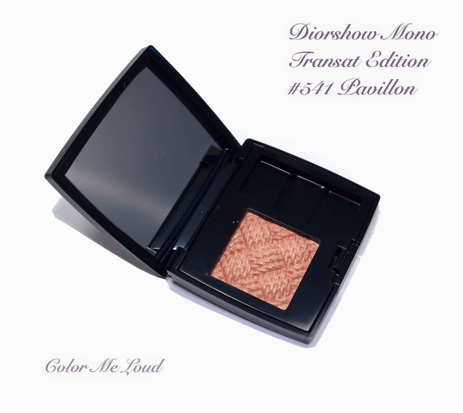
Diorshow Mono Transat Edition #541 Pavillon for Transat Summer 2014 Collection, Review, Swatches & FOTD

$
0
0
Today I have another piece of Dior Summer 2014 Transat Collection to share with you, Diorshow Mono #541 in Pavillon. I have already reviewed both of the quads, if you would like to check out, here and here.


Diorshow Mono Transat Edition #541 Pavillon

Being Transat Edition, Pavillon has a similar matting pattern to center shade of the quads. The powder feels a little dry to touch, this is because it can be used dry & wet and ha a good deal of pigment to it. If used wet, the shimmer and the color is more intense. 


Diorshow Mono Transat Edition #541 Pavillon

In the pan the shade is a peachy gold. Once swatched, the fine rose gold shimmer makes this almost appear duo-chrome, looking more peach or more gold depending on the angle. I find Pavillon to be an easy shade, just to dust on the eye lids and pair with a nude or strong lip for the day time.


Swatch: Diorshow Mono Transat Edition #541 Pavillon

Below I used Pavillon all over the lid and I slightly defined my crease and outer lid with a brown matte shade. This can also be worn alone but I felt like adding a bit more definition. As a liner to this look, I used Urban Decay Twice Baked and finished it with Chanel Le Volume Mascara.


In-action: Diorshow Mono Transat Edition #541 Pavillon

Below you can see the complete look, I think I am wearing Chanel Melodieuse on the lips but don't call me on that. On cheeks I am wearing Diorsnow Fresh Cheeks Blush which I have to yet review. By the way I purchased so many pretty blushers, which I am drying to show you soon but I am behind the reviews. Hope you like this natural polishes eyes look with Pavillon.


FOTD: Diorshow Mono Transat Edition #541 Pavillon

Final thoughts: Pavillon is subtle but very pretty for a polished day look. Just that type of shade that you can't go wrong with, be it combined with a stronger or a nude lip.

Dior Transat is almost on the counters, are you eyeing anything?

Dior Manucure Transat #210 Yacht, #700 Sailor, #750 Captain Nail Polish and Couture Stickers Duo for Summer 2014, Swatches & Comparison

$
0
0
I am being much behind the posts but it has been a busy week. The ones I promised about will be coming up very soon, as Easter Holidays are approaching and I will have a few days off. Today I have three gorgeous shades from Dior's Summer Collection. Don't you think these three look so pretty together?

Dior Manucure Transat #210 Yacht, #700 Sailor, #750 Captain

Thanks very much to a dear friend, I got these from the early release of Saks. All three polishes come in a bigger box, combined with a cute mini Dior file and nail stickers. These are called Manucure Transat, Nail Polish and Couture Stickers Duo. As the theme of the collection is sailing, they have fun names, Sailor, Yacht and Captain, which makes you say Ahoy! Here are the contents of the package.


Package Contents of Dior Manucure Transat Nail Polish and Couture Stickers Duo

I would like to start by #210 Yacht. This one is that kind of cool natural that I can't get enough of. I can only wear nudes when they are somehow cool or natural. Yacht has a great consistency and it is opaque in two coats. I find them much modern that way. Here is Yacht in shadow and under sun. Although the second picture shows something like a shimmer, this is just reflection of light. Yacht is a true creme.

Dior Manucure Transat #210 Yacht 
Dior Manucure Transat #210 Yacht

It is no surprise that Yacht is close to some other cool naturals I am loving at the moment, including Burberry #103 Ash Rose (reviewed here) which is cooler, Tom Ford Sugar Dune (reviewed here) which pulls more pink. Chanel Frenzy is cooler and Dior #257 Incognito is darker and pinker. I don't have any dupes to Yacht in my collection.

Comparisons for Dior Manucure Transat #210 Yacht 

#750 Captain on board! It is a orangey vivid red with a creme to jelly finish. With two coats Captain is not totally opaque and my nail line can still be seen. This one will make a great summer shade since it just glows under the sun. Below you can see the swatches in two coats and without top coat in shadow and under the sun.


Dior Manucure Transat #750 Captain 

Captain drove my camera crazy, so did the comparison shades all together. Dior's jelly red Calypso is lighter and pinker, Tom Ford #12 Coral Blame is very close and slightly darker. A recent Dior release, Trafalgar is cooler but also close. Chanel #677 Rouge Rubis is darker and cooler.


Comparisons for Dior Manucure Transat #750 Captain 

I saved the best for the last, Sailor... I was thinking I had vivid blue cremes in my collection but I didn't know that I had to yet have the best one coming to me. I love this one on my fingers, it glows, in a good way. It is not neon and this blue is so saturated and pretty, it takes my breath away. Sailor is a true creme and is perfectly opaque in two coats. 


Dior Manucure Transat #700 Sailor 

Dior Manucure Transat #700 Sailor 

I compared Sailor to some other blues, which I thought to be vivid. Look at Dior's Electric Blue or YSL's Bleu Majorelle, they are both lighter and more muted. Chanel Magic is much darker, Dior #607 Blue Denim is Darker and warmer. I have no dupes to Sailor in my stash, also this one makes it now to my favorite mid-blue category. Love at first sight!


Comparisons for Dior Manucure Transat #700 Sailor 

One more side note, these have the new brush of Dior but I don't think they have the gel effect quality of the new shades. It is hard to tell but new polishes do last a little longer. You can see my swatches of the new shades here and here. One more post is coming up with 5 more shades, so stay tuned.

Final thoughts: Three lovely shades from Dior for our summer tips and toes. I have to yet try out the stickers, which look like fun too. My picks would be Yacht and Sailor, which are unique to my stash.

Have you ever tried stickers on your nails? What is the best way to apply them? All tips and tricks are appreciated!

Chanel Les 4 Ombres #204 Tissé Vendôme, Review, Swatches & FOTD

$
0
0
It is no secret that I went crazy with the new formula of Chanel Les 4 Ombres after swatching all of them at the counter and coming home with two. Then that two became, well, four, then five... I have already reviewed two of them for you. Tisse Vendome, the green quad, was sold out a week after its release in Germany. I can understand that because it is beautiful and that metallic shade is to die for. I have also shown you Tisse Rivoli, which is a superb natural in my opinion. I also got Gabrielle and Camelia, which I will review as soon as possible, then I might as well share Riviera which I recently got. However today I would like to show you Tissé Vendôme because I have an upcoming post which is a slight variation to this color combination.


Chanel Les 4 Ombres #204 Tissé Vendôme

I don't want to repeat everything about the formula but it is very creamy, no fall out, not powdery and color pay-off is very good. I don't think this leaves anything to be desired, at least not to me. Maybe just a little bit more product wouldn't be bad but I am happier with less and effective product once compared to more and ineffective ones. 


Chanel Les 4 Ombres #204 Tissé Vendôme


Tissé Vendôme is one of the unusual combinations in the line. It has a nice vivid corally shade combined with naturals which are leaning khaki. If you follow me for some time, you know that I am not very fond of khakis or warm browns on myself. But this quad is definitely different to the point I would say that it is a home run for those of you with green eyes. 


Close-up: Chanel Les 4 Ombres #204 Tissé Vendôme

Top left: This is a warm mid-brown which may lean a little khaki depending on the light. It has satin finish.

Top right: Light champagne with satin to shimmery finish. This one looks like frost, but it really isn't to me since the shimmer is very fine.

Bottom left: Mid-toned soft coral with satin finish. This color can be built up for more intensity or can be blended with other eye shadows for a slight tone change. I absolutely love that one.

Bottom right: Deep warm brown with satin finish. The shimmer of this one is very subtle, it is not flat but once applied looks more like matte. I like the fact that deep shades are a little more matte, so loving that one as well.


Swatch: Chanel Les 4 Ombres #204 Tissé Vendôme

Two weeks ago I was at Breuninger Chanel counter to meet Chanel International Artist, Yannick Lemaire and get my make-up done. He selected Tissé Vendôme for me and combined it with liner Blue Metallique. Unusual combination? He used the lightest brown over the liner and it appeared green. It was gorgeous, I will try to recreate the look and post at some point. But at the moment, you are stuck with the look I have done.

I used the white in the inner corner and mid brown at the outer corner. I blended them with the coral in the middle and added definition to this look by the darkest brown shade on the crease.


In-action: Chanel Les 4 Ombres #204 Tissé Vendôme


Coral in this palette makes green eyes pop but I am sure it makes interesting things to other eye colors as well, since it brightens up the look and adds that little bit of something to the natural tones. I combined this with nude lips and soft pink cheeks.


FOTD with Chanel Les 4 Ombres #204 Tissé Vendôme

I personally can't wear oranges on the eyes all that well because it makes my eyes look orange (or very yellow) but I think coral works just fine. I became obsessed with coral shades on the lids after i have tried Tissé Vendôme and have seen how nice it may look. Then I took this one one step further but this is the topic of another post. ;-)

Final thoughts: I am loving this formula and adoring the shade combination. I can't recommend this one enough.

Do you wear corals on eyes? Do you have any coral eye shadows?

Dior My Lady Glowing Colour Blush Palette in Soft Coral, Review, Swatches & Comparison

$
0
0
Today I have read in Specktra about availability of Dior My Lady Blush. This is originally released in Japan as a part of their Spring Collection. Then it popped at some other countries, I got mine some time ago from Singapore (special thanks to a very dear friend) and didn't write a review since it was sold everywhere. Today though, for those of you who are in US, this beauty is now available in Saks Fifth Avenue, online and in store.


Dior My Lady Glowing Colour Blush Palette in Soft Coral

I don't think I have to write much about this one, it speaks for itself. I love Dior Lady Bags and these blushes have a similar cannage design to them. Three shades of corally pink can be seen, the ropes are mid-toned cool pink, background is lighter pink and bands are in coral. Once I swirl my brush on everything at once, I get a nice soft pink with natural to cool undertones. 


Dior My Lady Glowing Colour Blush Palette in Soft Coral

The compact is hefty, it is definitely metal, not plastic and this blush comes with its own mini Kabuki, like the recent highlighters or bronzers. The content is 10 g/ 0.35 OZ and at the moment I see that it is priced for $60 in US. Considering Regular Dior blushes retail for $42 for 7.5 g of product and do the math, this one is almost the same price and comes in a more luxurious compact.


Close-up: Dior My Lady Glowing Colour Blush Palette in Soft Coral

I compared My Lady Soft Coral to some other corals and similar shades from my stash. If you have also any other ideas or wishes, let me know in the comments below. 


Comparison: Dior My Lady Glowing Colour Blush Palette in Soft Coral


Dior My Lady in Soft Coral applies and blends beautifully. The closest shade I have is Diorblush #763 Corail Bagatelle from Spring Collection Trianon, which is slightly warmer and a little lighter. Chanel Joues Contraste #72 in Rose Initiale is slightly warmer and is more shimmery. Dior My Lady applies almost like matte although has very fine shimmer which is only apparent under strong light. Burberry #05 Blossom Blush is also warmer, and what I would call more of a coral. Chanel #76 Frivole is more orange.


Swatches of similar shades vs. Dior My Lady Glowing Colour Blush Palette in Soft Coral

As written above, if you have a US Address, you can now get Dior My Lady Blush from Saks Fifth Avenue. For the rest of us, we can keep checking since it seems to pop here and there so I wouldn't be surprised to see it at Harrods or Selfridges soon.

This one is available also in shade pink, check out Silverkis' swatches for comparison. (On me Coral looks much cooler than it does on her.)

Final thoughts: Beautiful blush, a collectible item. Be sure to check it out if you can get your hands on one.

What do you think about local releases and regional differences?

Rouge Bunny Rouge Blusher Brush #002, Face Contour Brush #012, Highlighter Brush #014, Large Shader Brush #003 and Blender Brush #016, Review & Comparisons

$
0
0
I wish you all 
           Happy Easter Holidays!!

I thought there is nothing more fitting than a Rouge Bunny Rouge post for Easter. I have been testing five of their brushes for the last couple of weeks and today Mr. Bunny and me would like to present you these.

Rouge Bunny Rouge Brushes #002, #012, #014, #003 and #016

Rouge Bunny Rouge Brush line has 16 Brushes to cover all our needs. The range extends from Foundation to Concealer, Eye to Lip, Brow and Cheeks, designed to make the best use of RBR products. Handles are black and made of wood, ferrule is black metal. Except Brow Brush, the hairs are usually medium to dark brown. I believe some of the darker brushes are slightly dyed to unify the color of the hairs since I noticed slightly darker water at the washing process but after a few washes, this is not noticeable anymore.

I would like to start with one of my favorite brushes in this line, #002 Blusher Brush. It is made of natural squirrel hair and it is densely packed. 


Rouge Bunny Rouge Blusher Brush #002

I found the density and shape of #002 Blusher Brush is close to Tom Ford #06 Cheek Brush, which is one of my all time favorite cheek brushes after Suqqu Cheek. I use Suqqu Cheek to blend soft shades that I apply with TF Cheek or to apply more pigmented blushes. If I have the time I also use it for less pigmented blushes but since it is very soft, to build up the color takes more time so it is not an option for me in the mornings when I am rushing to work. 


Rouge Bunny Rouge Blusher Brush #002 vs. Tom Ford #06 Cheek, Suqqu Cheek and Bobbi Brown Blusher

The softness of Rouge Bunny Rouge is very close to Tom Ford Cheek, which is made of goat but much softer compared to other goat brushes I own. A major advantage of RBR Blusher for me is that it is not white. I found myself getting obsessed about keeping Tom Ford white and washing it way too often, which I am sure has a negative effect on the durability of the brush. I think the effectiveness of application of these two brushes are very close. Considering that Tom Ford is over 80 EUR whereas Rouge Bunny Rouge retails just for 50 EUR makes #002 Blusher even more attractive. 


Rouge Bunny Rouge Blusher Brush #002 vs. Tom Ford #06 Cheek


One more shot where Mr. Bunny is showing us the cross sections of Tom Ford and Rouge Bunny Rouge side by side. All of the photos are taken after washing the brushes but I keep Tom Ford in a brush guard at the moment, therefore it appears in a better shape. I need to order brush guard for my new love RBR Blusher to keep a few of its rebellious hairs in place.  

Bottom line: Rouge Bunny Rouge #002 Blusher already replaced my Tom Ford Cheek Brush in my morning make-up routine since it has very similar effectiveness and softness but requires less washing (not white). I am loving it.


Rouge Bunny Rouge Blusher Brush #002 vs. Tom Ford #06 Cheek

Next brush Mr. Bunny and I would like to show you is #012 Face Contour Brush. This has similar qualities to #002 Blusher Brush in terms of softness and density but it has shorter hair. Face Contour Brush is also made of squirrel hair.


Rouge Bunny Rouge Face Contour Brush #012

Once compared to Tom Ford #02 Cream Foundation brush, RBR Face Contour Brush is bigger and has longer bristles. I like using Tom Ford Cream Foundation brush to apply cream blusher. I liked using RBR Face Contour Brush to add a darker shade of blusher or bronzer to contour my cheeks. I like smaller brushes to have more control on the application process. I also tried using Face Contour Brush with Kevyn Aucoin Sculpting Powder but found out that since it is a dense brush, it picked way too much product. If you want to use it for this purpose, I think to get the access powder at the back of your hand is the way to go. To me RBR Face Contour Brush works better with less pigmented contouring powders such as Chanel Notorious. 


Rouge Bunny Rouge Face Contour Brush #012 vs. RBR #002, Tom Ford #06, #02 and Suqqu Cheek

One more shot to show you the cross section of the bristles. RBR Face Contour Brush has slightly smaller cross section once compared to RBR Blusher Brush but it can apply the product in a denser way since the hair is shorter therefore it has a stronger hold of its bristles.

Bottom line: Rouge Bunny Rouge Face Contour Brush promises you to get the best of your less pigmented contouring powders.


Rouge Bunny Rouge Face Contour Brush #012 vs. RBR #002, Tom Ford #06, #02 and Suqqu Cheek

Given that both #002 Blusher and #12 Face Contour are made of squirrel hair, I like using them for powder products. As for the cream products go, Rouge Bunny Rouge has recent additions to their brush line, such as #014 Highlighter Brush which is made of synthetic bristles. 

Highlighter Brush has a very interesting flat shape with short hair and is designed for Rouge Bunny Rouge Seas of Illumination Liquid Highlighters, which I still need to try out. I tried this brush with Tom Ford Fire Lust Highlighter, Dior Skin Illuminating Base as well as Armani Fluid Sheers and it worked very well with all of these liquid products. I think the best way to use Highlighter Brush is to pick up some product and gently pat it onto the skin so that I don't drag my foundation around.


Rouge Bunny Rouge Highlighter Brush #014 vs. Tom Ford #04 Shade & Illuminate Brush

Once compared to Tom Ford's Shade & Illuminate brush, which is also a short and flat brush with synthetic bristles, Rouge Bunny Rouge #14 Highlighter Brush is thicker therefore stiffer. I think Shade & Illuminate is hard to control since it is short and rather thin. I find Rouge Bunny Rouge Highlighter working well with both contour and highlighter products. I recommend though that after contour is applied, you blend it with a kabuki for a natural look. RBR Highlighter Brush retails for 30 EUR and I believe Shade & Illuminate is around 60 EUR. Below Mr. Bunny shows you the cross sections of each brush. 

Bottom line: If you work with creme products, you may want to add Rouge Bunny Rouge Highlighter Brush to your stash for its unique shape. 

Rouge Bunny Rouge Highlighter Brush #014 vs. Tom Ford #04 Shade & Illuminate Brush

I would also like to talk about two eye brushes from Rouge Bunny Rouge Range: #003 Large Shader Brush and #016 Blender Brush.


Rouge Bunny Rouge Large Shader Brush #003 and Blender Brush #016

Rouge Bunny Rouge #003 Large Shader Brush is a rather large eye shadow brush to pack color over the lid. Although I like smaller laying brushes, I also have a few larger brushes in my stash which I especially use for singles or wash of color for stronger lip looks. Laura Mercier's All Over Eye Color Brush is a little too large for me and doesn't receive much love at the moment. The longer bristles of Tom Ford #11 make it hard for me to control the application and I find this one better for wash of color. My MAC #239 is the least loved of all since it is very thin and doesn't pack many powder all at once. With this one I have to go more times between the pan and my lid, which is no option for me in the mornings. 

Rouge Bunny Rouge Large Shader now became my go to laying brush for large areas and singles. For more detailed work, I reach for my Hakuhodo G5507 (horse), which is my holy grail laying brush. Rouge Bunny Rouge also offers a smaller shader brush, which I yet have to try out.

#003 Large Shader is made of pony hair, which is great if you also like applying your eye shadows damp like I do. 

Bottom Line: Great for all over color on your eyelids. It can be used dry as well as damp. 


Rouge Bunny Rouge Large Shader Brush #003 vs. MAC #239, Laura Mercier All Over Eye Color, Tom Ford #11

Mr. Bunny saved the best brush for the last. I would like to introduce you to my new holy grail, #016 Blender Brush which changed the way I apply eye shadows. 

First of all I have to admit that I got the name "Blender" in the wrong context and tried to use this one on the crease, which didn't work all that well for me. Then by applying accent colors on the middle of the lid, I started using this one and it have seen it working wonders. You could see eye shadow applications done with this brush here, here or here. If you apply one shade on the outer lid and one shade on the inner lid, then you have to "blend" these to in the middle, this task is done so well with #016 Blender Brush. I am planning a tutorial that I promised a few of the readers for such a long time and hopefully you will be able to see this baby in action. This one is also made of synthetic bristles and therefore works on cream and powder products alike. It retails for 27 EURs and I can't recommend it enough.

Bottom Line: If you could get just one brush from this line, I would recommend #016 Blender. It makes color transitions so much easier.


Rouge Bunny Rouge Blender Brush #016

All in all I have been loving my Rouge Bunny Rouge brushes. I like each of them at their own task but my favorites must be #016 Blender and #002 Blusher. I would like to stress once more that brushes are very individual choices so milage does vary but I think this line has effective brushes with good quality in reasonable price range.

Here is how I store my RBR brushes at the moment...


Rouge Bunny Rouge Brushes, storage idea

Also check out Queen of Brushes Sonia's review and great comparisons of RBR Face Brushes here.

Have you tried any RBR Brushes? I would like to hear about your thoughts. Are you also so obsessed with keeping the white brushes clean?

This post contains products which are sent free of change for my consideration. 
I am not compensated for this review and all thoughts are solely mine.
Wearing Coral on Eyes: Giorgio Armani Eyes To Kill Macro-Color Solo Eyeshadow #23 Corallo, Swatch, Review & FOTD

$
0
0
Today I am in holiday mood since we have holidays on Friday and Monday in Germany, so I would like to post about something fun. I thought why not "Coral On Eyes"?

We all wear coral on cheeks, coral on lips or on nails, but what about eyes? I would like to experiment with this after seeing how a peachy apricot may brighten up the look, so went for something more... Intense...

Giorgio Armani Eyes To Kill Macro-Color Solo Eyeshadow #23 Corallo

You know how excited I was seeing the new Giorgio Armani Solos at the counter some time ago. These are not released all around the globe yet but I suspect that it will soon reach everywhere. You can see swatches of all the shades here. The range has some matte and some naturals as well as vivid shades which you don't see often at high end market. I first went with a safe choice and got #9 Tadzio to try out. I really liked that shade and wore it often since then. 

Then I figured out I was missing all the edgy shades in there. The decision was not that easy so I got #14, which was another safe shade. The third visit to the counter, I was determined to get something more fun. I was in a good mood, it was a sunny day and this happened...


Giorgio Armani Eyes To Kill Macro-Color Solo Eyeshadow #23 Corallo

#23 Corallo is one of the limited edition items in this range together with #22 and #24. It is definitely an interesting shade but not only that, it is vivid in a not overwhelming way, if that makes sense. All the other shades have some fine shimmer to them whereas Corallo's shimmer is even more subdued which makes it more wearable. Below you can see the shade I have at the moment but I already reserved two more, so stay tuned for more looks coming up. I will also post a look with #14 and #21 soon. Today it is all about Corallo.


Giorgio Armani Eyes To Kill Macro-Color Solo Eyeshadows #9 Tadzio, #14 Aurore, #21 Moon Jelly, #23 Corallo

Below picture shows how subtle Corallo's shimmer is. It is also very pigmented but not too much, again very balanced between the color and the shimmer. I am seriously loving this range and I can see me getting more and more shades along the way.


Giorgio Armani Eyes To Kill Solo Eyeshadow swatches #9 Tadzio, #14 Aurore, #21 Moon Jelly, #23 Corallo

I would like to show you two ways to wear Giorgio Armani Eyes To Kill Solo in #23 Corallo. First is a bold look with coral all over the lids. I also deepened the crease just slightly by adding some matte brown from my Laura Mercier Artist's Palette as well as a dark brown liner from Urban Decay. Below I am also wearing Chanel Le Volume mascara.


Giorgio Armani Eyes To Kill Macro-Color Solo Eyeshadow #23 Corallo all over the lid

Since I am not that much experienced with coral on eyes, I experimented a little with different lipstick and blushers. Below I am wearing Giorgio Armani Cheek Fabric #305 in Dolci, which I would like to review soon. It is a soft coral shade with not much yellow nor red, which I find to be fitting to this look. 

On the lips, I tried some coral shades, which I thought to be not that flattering. I really like a pink toned nude with this look. Below I am wearing MAC Woodrose from Proenza Schouler Collection (reviewed here).  As you see the resulting look is not something scary ;-) I  can even imagine myself wearing it for a business occasion. What do you think?


FOTD with Giorgio Armani Eyes To Kill Macro-Color Solo Eyeshadow #23 Corallo all over the lid

Alternatively if you think it is too much coral on eyes for you and you would like to wear it combining with a natural, below you can see Corallo combined Tadzio and used as an accent color. For this purpose, I like using Rouge Bunny Rouge Blender Brush (recently reviewed here) to get the color intensity. 


Giorgio Armani Eyes To Kill Macro-Color Solo Eyeshadow #23 Corallo as an accent color to #9 Tadzio

The eyes are again combined with soft peachy blusher and some bronzer as well as nude lips. It is more of a smokier look than the one above but at the same time you could classify it as natural eyes with a twist. This one might be easier to pull off if you haven't slept very well (redness in the eyes) or you have a bad skin day (blemishes on the face). 


FOTD with Giorgio Armani Eyes To Kill Solo Eyeshadow #23 Corallo and #9 Tadzio

Final thoughts: I am loving coral on the eyes for this Spring/Summer. Thanks to Giorgio Armani for releasing something fun for those of us who like experimenting. #23 Corallo is listed as limited edition so check it out sooner than later.

At the moment #23 is sold out in Germany (as for now only Breuninger carries these new eyeshadows), they may restock soon though. As of today Douglas lists these as "item coming soon". This line should be released soon at other countries.

What do you think about the resulting looks, do you think you would wear them during the day?

Chanel Joues Contraste #88 Vivacite, #89 Canaille, Review, Swatch & Comparisons

$
0
0
Together with their new foundation Perfection Lumiere Velvet, Chanel released two new blushes from their powder blush, Joues Contraste line. #88 Vivacite is a bright pink and #89 Canaille is a burnt orange. 


Chanel Joues Contraste #88 Vivacite and #89 Canaille

These are both very pigmented with satin to matte finish so while applying one should be light handed. I can see that on deeper tones they will show nicely without even having to build them up by applying over and over again.


Chanel Joues Contraste #88 Vivacite and #89 Canaille


#88 Vivacite is home run for me since it is a cool plummy pink, which I like wearing a lot as blush. It is also very pigmented but not insanely pigmented, so using a soft brush, like Suqqu Cheek, I can get a natural look. I took out some similar blushes from my stash for comparison.


Chanel Joues Contraste #88 Vivacite vs. Chanel #74 Ultra Rose, #87 Emotion, Armani #509 Eccentrico and Tom Ford Narcissist


The most pigmented blushes in my stash must be Armani #509 Eccentrico, which is lately released (review coming up soon). Eccentrico is even more pigmented than Tom Ford Narcissist (discontinued). These are both deeper and more bright shades once compared to Vivacite. I thought Vivacite would be close to #74 Ultra Rose but it is very different. Ultra Rose is cooler and lighter. The closest match I had is again a recently released Joues Contraste shade, #87 Emotion (reviewed here). Emotion looks very different in the pan but once swatched/applied it is just a tad warmer but very close to Vivacite. Emotion was not released in Europe so some of you might like to get Vivacite instead. 


Chanel Joues Contraste #88 Vivacite vs. Chanel #74 Ultra Rose, #87 Emotion, Armani #509 Eccentrico and Tom Ford Narcissist

The first time I tried Canaille, I thought I should have a bronzer close to this shade but I was mistaken. Below I swatched it side by side with Givenchy Terra Exotique (reviewed here) and as you see Canaille has more orange and red inside. I also would like to compare it to Chanel's discontinued bronzer Sable Rose, which has both some pink as well as bronzing powder. Although these tones are close, Sable Rose is much lighter. A recently released Chanel Joues Contraste, #85 Evocation (reviewed here)  is the closest match I have and it is very different. Evocation has a shimmery finish and it leans more brown.


Chanel Joues Contraste #89 Canaille vs. Givenchy Terra Exotique, Chanel Soleil Tan Sable Rose and Chanel Joues Contraste #85 Evocation

I am having trouble using Canaille since it is a little too warm on my skin and it is very pigmented. I am trying to find the optimal combination of lip and eye shades with that one and post about it. It is a very unique shade but I found it hard to use for natural to cool complexions. Vivacite on the other hand could be more versatile.

Final thoughts: Great pigmentation, wonderful matte effect. If you think the shades can flatter you, don't miss. Since these (especially Canaille) are rather unusual, I recommend you to test them out on a counter before investing. 

Vivacite and Canaille are listed as limited edition. They are already released at most of the countries. I got mine at Douglas.

What about you, do you think you can pull off a burnt orange cheek?

Giorgio Armani Eyes To Kill Macro-Color Solo Eyeshadow #10 Beige Nudo, #15 Parma, #16 Dark Plum, #17 Green Viper and #18 Scarab, Swatch, Review & FOTD

$
0
0
Would you like to see my butterflies for Spring? Here they are. They keep flying around my head and all I can do is to bring them home with me. Do you remember the 4 shades I posted about a few days ago? It turns out I have now 6 more and I would like to show you five of them today, #10 Beige Nudo, #15 Parma, #16 Dark Plum, #17 Green Viper and #18 Scarab.


Giorgio Armani Eyes To Kill Macro-Color Solo Eyeshadow #10 Beige Nudo, #15 Parma, #16 Dark Plum, #17 Green Viper and #18 Scarab

This time I made sure to get all the plums and crazy shades as well as a neutral to ground them down a little. #16 is just a little deeper than #15 so I didn't know if that one was the right choice but given my enthusiasm for plums, it just had to be. A for #18 and #17, I thought they would layer well... Also I believe on the promo picture model is wearing #17 and #18 and yes it is "a little" photoshopped as usual but I would like to try it out nevertheless.


Giorgio Armani Eyes To Kill Macro-Color Solo Eyeshadow #10 Beige Nudo, #15 Parma, #16 Dark Plum, #17 Green Viper and #18 Scarab

On my desk now I have two towers like this and mornings are fun trying to figure out which of them to combine that day. I have been on a blush kick lately but I have to admit that there is nothing like eye shadows that cheer me up.


Giorgio Armani Eyes To Kill Macro-Color Solo Eyeshadow Tower

Here are quick swatches of five of the shades. In case you missed them, I have previously swatched all the shades on the counter here, and four other shades here,

#10 Beige Nudo is a light champagne with golden shimmer. It has shimmery to satin finish. It is not frosty but one of the most shimmery shades of the range.

#15 Parma is a medium plum with satin finish. It leans more red than blue.

#16 Deep Plum is exactly what the name suggests. Deep Plum has satin to matte finish and once applied on the lids, it looks more like matte but with some dimension.

#18 Scarab is a teal which leans more blue than green. Under store lighting it was more green so I thought it would be very unique to my collection but at home and once applied I have seen it to be a blue leaning slightly green. It has satin finish with beautiful green shimmer.

#17 Green Viper is a light yellow green with satin to matte finish. It immediately reminded me of this look and a more friendly version of the acid green in that palette. Right now I enjoy popping a little bit of color, especially on natural looks, so I thought it would be fun to experiment with Green Viper.


Swatches of Giorgio Armani Eyes To Kill Macro-Color Solo Eyeshadow #10 Beige Nudo, #15 Parma, #16 Dark Plum, #17 Green Viper and #18 Scarab


The first look I would like to present you is a combination of #10 Beige Nudo and #18 Dark Plum. I thought the golden hues of Beige Nudo would combine beautifully with Dark Plum.


Giorgio Armani Eyes To Kill Macro-Color Solo Eyeshadow #10 Beige Nudo
Giorgio Armani Eyes To Kill Macro-Color Solo Eyeshadow #16 Dark Plum

By the application, I had a little bit of difficulty while using #10 Beige Nudo because my brush was slightly damp and this formula just don't like it. I applied Beige Nudo all over the lid and added Dark Plum to the outer corner. It was today in the morning and I was in a little bit of hurry so please bare with the degree of blending ;-)


In-Action: Giorgio Armani Eyes To Kill Macro-Color Solo Eyeshadow #10 Beige Nudo & #16 Dark Plum,

For the second look, I used Scarab with Green Viper. Only after I applied and blended I remembered that I haven't used an eye base, so below you can see how these perform without one. On a side note, with a base these do last on me whole day but without base, I found that Scarab creased a little on me. For reference I am using Nars Pro-prime for almost each look.

Giorgio Armani Eyes To Kill Macro-Color Solo Eyeshadow #18 Scarab
Giorgio Armani Eyes To Kill Macro-Color Solo Eyeshadow #17 Green Viper

I wore this one on Saturday, so it is weekend kind of look with vivid colors. I applied Green Viper to the center of the lid and added Scarab to the inner and outer half. I then layered Scarab with Green Viper on the inner lid. I completed this look with UD 24/7 eye liner in Junkie on the water line as well as along the upper lash line.


In-action: Giorgio Armani Eyes To Kill Macro-Color Solo Eyeshadow #17 Green Viper and #18 Scarab

Here is the whole look with Armani Cheek Factory in Dolci on the Cheeks and two/three lipsticks layered on lips. I couldn't get the shade I wanted so I kept adding.  ;-) Also to make it modern, I didn't want to ground greens and blues and wore a coral shirt. 


FOTD: Giorgio Armani Eyes To Kill Macro-Color Solo Eyeshadow #17 Green Viper and #18 Scarab

Final thoughts: I am loving the shades and the formula but the more I use, the more I find out about things that one has to take care of. Don't use them damp/wet and be sure to use a primer for a longer stay. These are now also released in US after Europe. It should be around the globe in no time. 

Which one is your favorite?

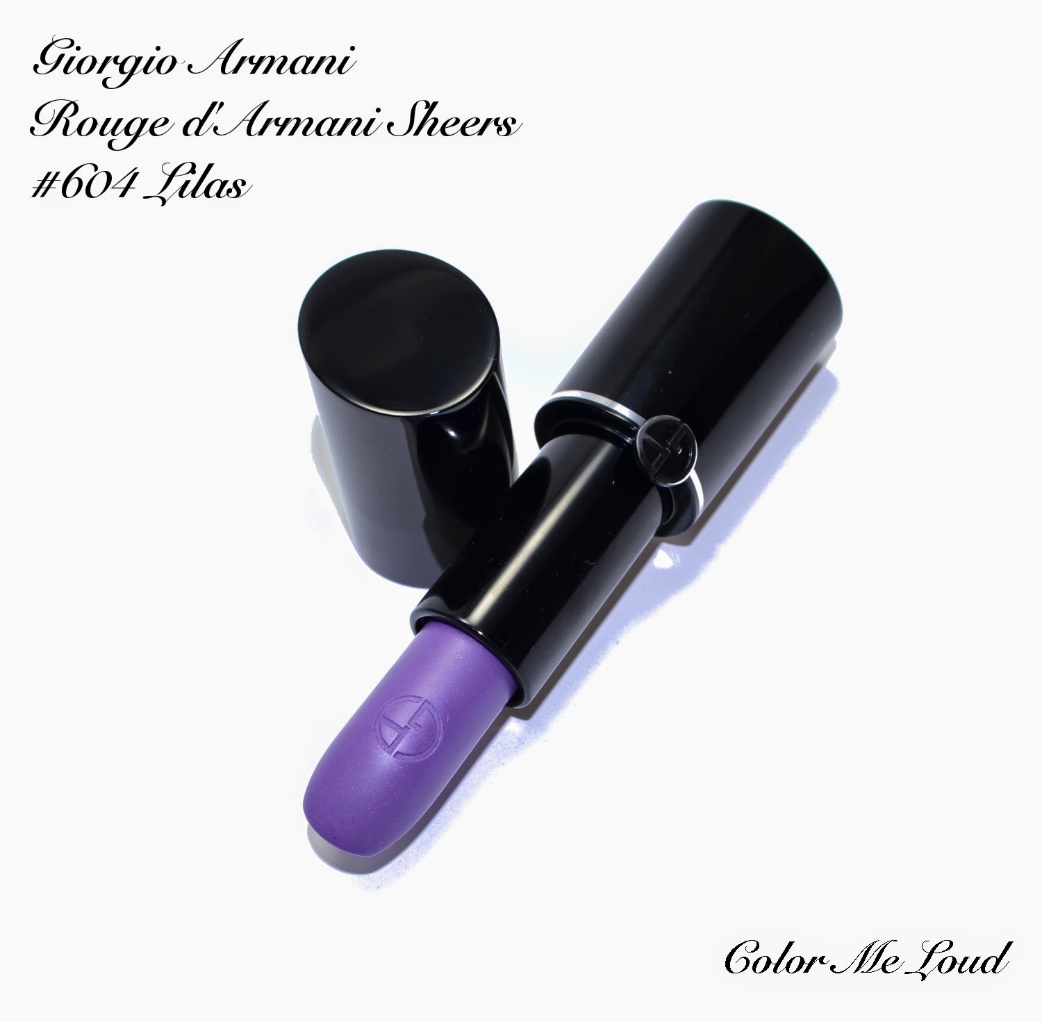
Giorgio Armani Rouge d'Armani Sheers #604 Lilas from Bright Ribbon Collection for Summer 2014, Review, Swatch & FOTD

$
0
0
Giorgio Armani released an unexpected capsule collection called Bright Ribbon, consisting of six nail polishes and five lipsticks (check promo photos here). Although these are already released in France, my local counter haven't heard about it yet. Thanks to Sephora.fr which delivers to Europe, I got my hands on one of the lipsticks and all the nail polishes. I didn't want to invest on more lipsticks remembering from Bella Donna Collection that these can be very sheer. As for a started, I decided on the most interesting looking one, #604 Lilas.


Giorgio Armani Rouge d'Armani Sheers #604 Lilas

This looks very scary in the tube and I was hoping that it would be as scary as it looks on the lips, but there is nothing to worry, since it is very sheer. It just gives a barely there cool toned hue to the lips and let your own lip color shine through. For the below swatch, I really had to swipe it several times to show color.


Giorgio Armani Rouge d'Armani Sheers #604 Lilas
Swatch: Giorgio Armani Rouge d'Armani Sheers #604 Lilas


Here you can see that it changes the color of my lips a little and make them look cooler. It also doesn't have the shimmery/frosty quality of the Rouge d'Armani Sheers from Belladonna Collection, it is more like a glossy finish with a hint of color.  


On Lips: Giorgio Armani Rouge d'Armani Sheers #604 Lilas

Below I am wearing Rouge d'Armani Sheer #604 Lilas on the lips. On the eyes I have Giorgio Armani Eyes To Kill Solos, #17 Green Viper, #15 Parma and #16 Deep Plum. I liked how fun this look turned out to be, it was also looking wearable, at least to me ;-)

Here is a complete list of make-up I am wearing

Complexion:
Guerlain Lingerie De Peau BB Creme in Light, Dior Hydra BB Eye Creme #1, Rouge Bunny Rouge Impalpable Finishing Powder #055 Diaphanous

Eyes: 
Giorgio Armani Eyes To Kill Solos, #17 Green Viper, #15 Parma and #16 Deep Plum
Urban Decay 24/7 Eyeliner in Rockstar
Yves Saint Laurent Baby Doll Mascara

Cheeks:
Kevyn Aucoin Sculpting Powder

Lips:
Giorgio Armani Rouge d'Armani Sheers #604 Lilas

FOTD with Giorgio Armani Rouge d'Armani Sheers #604 Lilas

Final thoughts: All in all a nice addition to my stash but I could also do without it since it is very sheer for my taste. It does feel moisturizing and nice on the lips though. If you like transparent glosses you may like this one too. I know that Chanel has released a bunch of them for their summer collection too, so maybe they are a thing at the moment. 

What do you think about very sheer lippies? Not worth the money or do you like the way your lips are treated? 

Giorgio Armani Nail Lacquer #300 Pistil, #302 Corallo, #500 Cherryblossom, #501 Bougainville, #504 Lilas and #706 Turquoise from Bright Ribbon Collection for Summer 2014, Review & Swatches

$
0
0
I would like to post quickly about nail polishes from Giorgio Armani's Bright Ribbon Collection, which just hit the counters in France and are expected elsewhere very soon. The reason why I would like to post this review as soon as possible is because the promo pictures of this collection are very misleading. So if you would like to order, here are how the colors look like in real, photoshop free life...

Giorgio Armani Nail Lacquer #300 Pistil, #302 Corallo, #500 Cherryblossom, #501 Bougainville, #504 Lilas and #706 Turquoise

#501 Bougainville is a reddish pink with cream finish. All the nail polishes in this collection have a bit of jelly consistency and therefore they are not very opaque with first and sometimes even with the second coat. Bourgainville has the best opacity among the others. With two coats, nail line was invisible. Below swatches are with two coats and a top coat. Durability of this polish was phenomenal.


Giorgio Armani Nail Lacquer #501 Bougainville
Giorgio Armani Nail Lacquer #300 Pistil, #302 Corallo, #500 Cherryblossom, #501 Bougainville

#300 Pistil is an apricot cream with rather sheer consistency. This one needs three coats for full opacity, hence swatches below are with three coats and no top coat. I really like this shade for Spring and Summer but wished that the formula would be more opaque.


Giorgio Armani Nail Lacquer #300 Pistil

#302 Corallo is a mid-toned coral which leans more orange than red. It is not very bright, wearable but still fun, perfect for Summer. Unfortunately this one is rather sheer too, so I needed three coats for opacity, below swatches are also with three coats and no top coat.

Giorgio Armani Nail Lacquer #302 Corallo

 #500 Cherryblossom is a very light pink cream. This one must have been the most sheer of them all. Although for some of the nails I went for a fourth coat to get rid of visible nail line, you can still partly see it. This one is a definite miss for me, since the bottle is anyway tiny with only 6ml of product. After one time usage, you might see the level going down to 2/3, which tells you that you just had the most expensive manicure ever ;-)


Giorgio Armani Nail Lacquer #500 Cherryblossom

Now for Turquoise, I have a few issues. Firstly, it looks nothing like on promo photos, which looked more like a bright green. Secondly to me it leans more teal than turquoise. Third issue is the opacity, again had to go for three coats. This one reminds me of YSL's Vert d'Orient, which was almost a one coater and had a dream consistency. It is also half the price for what you get, so I guess this one is also rather a miss. Below you can see it with three coats and no top coat.


Giorgio Armani Nail Lacquer #706 Turquoise

The last one is my favorite of the collection, #504 Lilas. The name matches to the Rouge d'Armani Sheers Lipstick in Lilas which I just posted about yesterday. #504 Lilas was also sheer and needed three coats, which is a little booh, but I so much liked the resulting effect of "watery/glossy" quality (does that make sense at all?) and the light hearted color so I can bear with the three coats that needs to be applied. Below swatches are with three coats and no top coat.


Giorgio Armani Nail Lacquer #504 Lilas

Final thoughts: I have mixed feelings about Bright Ribbon Collection of Armani. I was very excited to get my hands on these and ordered them from France since I couldn't wait for them to come here. Then I found out that the press photos are very misleading. I also wonder which nail polish (and lipstick) the model is wearing there, since it doesn't look like any of them. I was so confused that I had to check the numbers of the nail polishes to make sure that I received the right ones. What is the intention of a press photo? To induce curiosity, yes, to get your attention, yes. But what about helping with your order? I think it is sometimes forgotten that not everyone is fortunate enough to check things out in person.

EDIT: I don't know what the blogger which was referred above did to the promo photos, but in this post they seem to be closer in color.

My favorites among these are #504 Lilas and #501 Bougainville. If you like jelly, semi-transparent nail polishes, you may like all of them though.

What do you feel about misleading press photos?

My Picks from MAC Alluring Aquatic Collection, Swatches & Review, Extra Dimension Blush in Sea Me Hear Me, Lipstick in Goddess of The Sea, Eye Shadows Sea Worship, Fathoms Deep, Soul Serenade and Nail Polish Submerged

$
0
0
I have to admit, I was not waiting for this collection as many others. I just happen to stumble upon it during my usual counter visits last Friday. When I see a new collection, I am like a kid in a sweet shop, so I started trying the products out. I was really surprised by the quality since I think a few of the previous collections didn't deliver consistent quality across the board. Alluring Aquatic though seems to be a hit in all aspects, packaging, design, shade selection and quality. 


My pics from MAC Alluring Aquatic Collection

The packaging of this collection is really one of the prettiest I have seen for a long time. The water drops on a gorgeous turquoise metallic compacts are very pleasing to eye. I also love the fact that the same drops and colors are also placed on the boxes. 


Extra Dimension Blush in Sea Me Hear Me, Lipstick in Goddess of The Sea, Extra Dimension Eye Shadows in Sea Worship, Fathoms Deep, Soul Serenade and Nail Lacquer in Submerged

Since I didn't have a wish list before, I started with safe choices for me, some purples, some gold and blush which had more pink than brown/orange. Here are my first picks, first because I couldn't help and get to the counter once more today and picked a few more products, which I will try to review later this week. 

  • Nail Lacquer in Submerged
  • Extra Dimension Eye Shadows in 
    • Sea Worship, 
    • Fathom's Deep and 
    • Soul Serenade
  • Extra Dimension Blush in Sea Me Hear Me
  • Lip Stick in Goddess of the Sea


Extra Dimension Blush in Sea Me Hear Me, Lipstick in Goddess of The Sea, Extra Dimension Eye Shadows in Sea Worship, Fathoms Deep, Soul Serenade and Nail Lacquer in Submerged

The true stunner of the collection are in my opinion the eye shadows. I liked the metallic finish, which doesn't turn frosty but rather very complex with right amount of shimmer. Once applied on the eyes, they don't turn extra shimmery but they look rather like a foil finish nail polish for eyes, if that makes sense. They are all very pigmented and most of the shades (except Lorelei) are dark so go for them in case you like your eyes smokey. 


MAC Extra Dimension Eye Shadows in Sea Worship, Fathom's Deep and Soul Serenade

Sea Worship is a mid-toned gold with khaki undertones. It has the metallic finish of most of the eye shadows in this collection but the shimmer is more linear than some others. It doesn't make it less appealing though, I really like this shade and especially how it teams up with the other two I have picked.

Soul Serenade, can I start by saying that I love the name. The color is also almost as gorgeous, it is a deep eggplant with metallic finish and multi dimensional shimmer. It is for those of you who wouldn't like Fathom's Deep as it has more red in it.

Fathom's Deep is a true stunner. It was the first eye shadow which was sold out everywhere, so I had to run around a few counters to find a last one waiting for me. It is a deep purple with metallic finish and multi-colored shimmer. Once applied to the eyes, it does give a purple hue but does look rather natural. 


MAC Extra Dimension Eye Shadows in Sea Worship, Fathom's Deep and Soul Serenade

Here are all the eye shadow shades swatches from this collection. I took the photo with day light under shadow. The duo chrome, crazy dimension colors are Legendary Lure, Soul Serenade and Fathom's Deep. Today I went back to pick up Silver Sun and Lorelei too, which I will try to review later this week. First I was not very fond of Lorelei but I think it will look pretty as a natural makeup for strong lips.


MAC Alluring Aquatic Collection Extra Dimension Eye Shadows Swatched


Here is the eye makeup I wore today featuring Fathom's Deep and Sea Worship. As you see as much metallic and pigmented the colors are, they don't look scary once applied. The resulting effect is rather wearable and smokey.


In-action: MAC Extra Dimension Eye Shadows in Sea Worship and Fathom's Deep


I wanted a nice bronzy blush for the summer, but my last pick from Chanel (Canaille, reviewed here) is not working all that good on me. So I thought I give it a go with MAC Extra Dimension Blush Sea Me Hear Me. I liked the duo chromish effect of this one which is due to the very fine golden shimmer. It turned out this one is much easier to use for me since it leans more pink than Canaille, which is more orange.


MAC Extra Dimension Blush in Sea Me Hear Me

Here are both of the blushes swatched. Seduced at the Sea is warmer and a little lighter. It has also more shimmer. 


Swatch: MAC Alluring Aquatic Collection Extra Dimension Blushes

There are also two Extra Dimension Bronzer at this collection. Today I went back to pick up Aphrodite's Shell which is a gorgeous bronzer with beige pink undertones. It is also very light so the ones with fair complexions will love it. I passed on Delphic since it is very orange/warm for me but I am sure it would look fabulous on a deeper complexion.


Swatch: MAC Alluring Aquatic Collection Extra Dimension Bronzers

Here is the last piece I picked. After trying out all the lipsticks, I went for the purple one, how predictable, right? Anyway I tried this against a few Chanel lipsticks from Variations collection that I was eyeing. This one was more purple and others were more red or pink, so it won!


Swatch: MAC Alluring Aquatic Collection Lipstick Goddess of the Sea

Siren Song and Pet Me Please both gave me concealed lip effect. Enchanted one and Mystical both looked very orange, although after seeing the swatches of Mystical, I wonder why. I know that usually MAC Collections have very strong lip focus but to me Alluring Aquatic is so successful at other parts (Eye Shadow, Bronzer, Blush) that skipping lipsticks and investing on other pieces wouldn't harm.


Swatch: MAC Alluring Aquatic Collection Lipsticks

Here is me wearing Sea Me Hear Me on cheeks, Goddess of the Sea on lips, Sea Worship and Fathom's Deep on eyes. The collection seems uncoordinated at the first sight but once mixed and matched there are many beautiful combinations. 


FOTD: MAC Alluring Aquatic Collection

I also picked up Nail Lacquer in Submerged and couldn't resist but ordered Shimmerfish afterwards. I will post about them after wearing them this week. I have never worn MAC nail polish before so I would like to test it properly. 

Final thoughts: A lovely collection from MAC which delivers a superb quality across the board. It must have been the biggest MAC haul in my life since I am not a loyal customer of the brand. I love the packaging and the names too, music, sea, water and turquoise, it couldn't get better.

Will you be picking up something from Alluring Aquatics? 

Chanel Dentelle Precieuse Illuminating Powder, Review, Comparison & Swatches

$
0
0
Just when you think that you own all the prettiest powders ever released, Chanel comes up with something which takes your breath away. Chanel Dentelle Precieuse Illuminating Powder with the most beautiful delicate lace pattern, looks almost made of fabric. It was released in the beginning of April and was sold exclusively at selected Chanel Stores in France. Twenty four pieces of Dentelle Precieuse made an appearance at Stuttgart Breuninger last Friday. If you are chasing it, make sure to give a call today. I know the dilemma though, can I use it, ever?

Chanel Dentelle Precieuse Illuminating Powder

Well, I have some good news for you. The tester at the store still had some pattern left although it was heavily swatched. SA told me that this particular highlighter is designed in a way that the pattern is preserved longer. I found out if I use a brush rather than my fingers, I don't notice this lovely lace vanishing after each use, which was the case with, say Poudre Signee. 


Chanel Dentelle Precieuse Illuminating Powder

It is hard to capture the color of Dentelle Precieuse. My camera didn't want to contribute to my passion of giving you at least one color accurate photo. The ones above look much more pink than it is. The one below though is taken with my phone, which has the best color accuracy. Dentelle Precieuse is a natural light beige with only a hint of pink, not a champagne nor rose gold. It is very close (one tone darker) than my skin color (NC20 for reference) and has very fine shimmer rather than glitter or frost, this is why it looks very natural on. I can use it as more of a bronzer/blush on the cheeks than a highlighter. 


Close-up: Chanel Dentelle Precieuse Illuminating Powder

I used this opportunity to pull out some of my precious highlighters and play with them. Here is a comparison between Chanel Illuminating Powders from my stash. By the way have you seen photos of the Christmas highlighter, it has platinum color and a very pretty flower design. Anyway, back to the precious lace...


Chanel Dentelle Precieuse Illuminating Powder vs. other Chanel Illuminating Powders

Once Dentelle Precieuse is compared with other highlighters, you can see that it is darker and less shimmery. I like the very subtle effect it gives as a daytime enhancer. Route des Indes and Lucky Stripes are both more golden/yellow. Mouche Beauty has more pink and it is more shimmery/frost. Poudre Signee (my everyday highlighter) is lighter and a tad more shimmery.


Comparison Swatches, Chanel Dentelle Precieuse Illuminating Powder vs. other Chanel Illuminating Powders

For more swatches and lovely photos, check out Indigo Kir Royale, Ommorphia Beauty Bar and Silverkis.

Final thoughts: A truly exceptional collectors item which I am trying not to use that often ;-). Dentelle Precieuse might be too dark as a highlighter for fair ladies though, in case you intend to use it (than rather watching it). I can see it work well on deeper complexions as highlighter and lighter complexions as bronzer/blush. 

Do you buy items just for the packaging and its design or is the function/performance more important to you?

Yves Saint Laurent La Laque Couture #50 Bleu Celadon, #51 Bleu Cyclades for Bleus Lumiere Summer 2014 Collection, Reviews, Swatches & Comparison

$
0
0
Yves Saint Laurent's Summer Collection Blues Lumieres is all about the shades of blue. The name of the collection makes me think of reflections on the water surface which I love watching, especially right after the sunset when I got to spend some weeks on the sea side. Needless to say, I can't wait to go there this summer and I will make sure to get these two breathtaking nail polishes with me when I travel. 


Yves Saint Laurent La Laque Couture #50 Bleu Celadon, #51 Bleu Cyclades

#50 Bleu Celadon is one of the most beautiful aqua blue/turquoise cream nail polishes that I own. It is no secret that I have a sweet spot for these type of shades and this explains why I have back-ups over back-ups of Chanel's Nouvelle Vague with the fear that I would run out of it sometime. The formula of Blue Celadon is flawless. It is self leveling, smooth and not streaky and completely opaque in two coats. Bleu Celadon is a true cream without any visible/invisible sheen. Under some light it looks more like a baby blue but under shadow it shows its delicate green features. The following swatches are with two coats and without a top coat.


Yves Saint Laurent La Laque Couture #50 Bleu Celadon

I pulled out some close shades from my stash. Being an aqua lover for my tips & toes, I had quiet a bit of potential dupes to compare with but I am happy to say none of them were an exact match.


Yves Saint Laurent La Laque Couture #50 Bleu Celadon, #51 Bleu Cyclades vs. similar shades from my stash

YSL#50 Bleu Celadon is a little  darker than Chanel Riva and much darker once compared to Chanel #123 Crystal Blue. It leans more green once compared to Dior Porcelaine (reviewed here) and slightly bluer compared to Chanel #527 Nouvelle Vague. Dior #307 Nymphea from last year's Asia Exclusive Collection is the closest match but Blue Celadon leans more blue. Dior #401 Saint-Tropez is darker and Butter London Poole is more green.


Nail wheel comparison of Yves Saint Laurent La Laque Couture #50 Bleu Celadon

YSL #51 Bleu Cyclades is a gorgeous medium blue with metallic finish. I don't know how YSL managed that but this one doesn't leave any brush strokes. It is opaque in two coats and the formula is a dream to work with, self-leveling and not too thick or thin. A very important thing to note is that it doesn't stain even without base coat. I also liked the way that it was not very flashy but not blackened either. The following swatches are with two coats and without a top coat.


Yves Saint Laurent La Laque Couture #51 Bleu Cyclades

I don't have many medium blues in my collection. I used to skip these type of shades until I met Chanel's Bel Argus last summer, which I really like (reviewed here) and reach for quiet often. Bleu Cyclades though is a serious new favorite blue candidate.


Yves Saint Laurent La Laque Couture #51 Bleu Cyclades vs. similar shades from my stash

When I first got to see YSL #51 Bleu Cyclades, I was wondering how it would compare to another blue, a permanent shade from YSL line, #17 Bleu Cobalt. It turns out that Bleu Cobalt is deeper and less metallic once compared to Bleu Cyclades. Chanel #461 Bleu Satin is more blackened blue and looks almost like a black once worn. Chanel #667 Bel Argus is lighter and more metallic with a unique sheen but bit of brush strokes. Dior #908 Tuxedo is close to YSL #17 Bleu Cobalt and Chanel #461 Blue Satin, and is much darker. I like how #51 Bleu Cyclades manages to stay blue without being too dark but at the same time does it in a not very overwhelming way. 


Nail wheel comparison of Yves Saint Laurent La Laque Couture #51 Bleu Cyclades

Final thoughts: Two lovely blues from YSL to bring the sea to your tips and toes. The formula of these are a dream to work with. I would say both of them are must-haves for blue lovers.


Do you like wearing blues? What is your favorite shade of blue on a nail polish?

MAC Alluring Aquatic Collection, My Picks Part II, Swatches, Review & FOTD, Extra Dimension Bronzer in Aphrodite's Shell, Lipstick in Mystical, Eye Shadows Lorelei, Legendary Lure and Nail Polish Shimmerfish

$
0
0
Last weekend I wrote about the first part of my haul from MAC's Alluring Aquatic Collection. After that, I went to the counter several times to make sure that I was not missing anything, especially inside that gorgeous packaging that I am loving at the moment. It turned out I was in fact missing some pieces, so I took some action that I don't regret. Here comes the second part of my haul. Today might be a good time to post about it since I have hear that the collection started to roll out in US too.


 MAC Extra Dimension Bronzer in Aphrodite's Shell, Lipstick in Mystical, Eye Shadows Lorelei, Legendary Lure and Nail Polish Shimmerfish

I started firstly by picking up rest of the eye shadows since the quality of these are superb. They are very pigmented and complex. I also picked up Silver Sun after preparing this post (which I am wearing and loving at the moment). I swatched all of the shades last time but here I include a sun swatch for you to see the multi colored pretty shimmer.


MAC Extra Dimension Eye Shadows Lorelei, Legendary Lure

I feel like I have way too many bronzers so I didn't even check that section of the release the first time around. Then I have heard everyone speak about Aphrodite's Shell so as I was visiting the counter on Monday, I checked it out in person to see why. Aphrodite's Shell is a great bronzy nudy blush/bronzer for fair to medium ladies. It has enough pink inside so that it doesn't look orange. Also the very fine shimmer of it doesn't look flat nor shimmery. If you think you can't pull off bronzers or they all appear/look unnatural, you should definitely check out Aphrodite's Shell.


 MAC Extra Dimension Bronzer in Aphrodite's Shell

 MAC Extra Dimension Bronzer in Aphrodite's Shell

Here are some swatches of Aphrodite's Shell together with Extra Dimension Blush Sea Me Hear Me, Chanel Joues Contraste #89 Canaille and Hourglass Mood Exposure.


Swatches of MAC Extra Dimension Blush in Sea Me Hear Me and Extra Dimension Bronzer in Aphrodite's Shell vs. Hourglass Mood Exposure and Chanel JC #89 Canaille

Having purchased only one lipstick last time, this time I took my time and tried some of them once more. You can see all the lipsticks of this collection swatched in my previous post. Pet Me Please and Siren Song gave me concealed lip effect since I naturally have pigmented lips. I would like to get either Mystical or Enchanted One and upon trying them both, somehow I didn't feel comfortable with Enchanted One. It is a matte formula and it sat between the cracks of my lips, looking as if I am on a desert and I haven't drunken anything for days. I thought this can't be the intention of "Aquatic" Collection so sadly had to skip this. I am seeing though that particular shade worn beautifully by many others so probably it is just me. Instead I went for Mystical, a mid toned reddish pink with glossy finish.


MAC Lipstick in Mystical

After some days, it was discussed at Specktra how MAC Mystical and Morning Rose (from Magnetic Nude Collection) are related. I don't own many MAC Lipsticks but I happened to have Morning Rose, which is a special one for me since it is a present from my hubby. Here is a side by side swatch of the two. As others pointed out, Mystical has more red, is more intense and has more of a wet/glossy finish. Morning Rose pulls more pink, is lighter  and has more of a shimmery finish.


Swatch: MAC Lipstick in Mystical vs. Morning Rose

To Round it up, here is me wearing Aphrodite's Shell on the Cheek and temples, together with a wash of Sea Me Hear Me on the apples of the cheeks. On Eyes I have Lorelei and Legendary Lure. On my lips you can see Mystical in action.


FOTD : MAC Aphrodite's Shell, Lipstick in Mystical, Eye Shadows Lorelei, Legendary Lure and Blush in Sea Me Hear Me

Final thoughts: I am so happy that these started selling out before I can purchase the whole collection since it is hard to resist that quality and packaging. Now MAC set that bar high, I hope the upcoming releases to be as good. Be sure to check these out in person.

My favorites from Alluring Aqua:
  • Aphrodite's Shell to naturally defined cheeks for fair to medium ladies.
  • Eye Shadows in Sea Worship, Lorelei and Soul Serenade (or Fathom's Deep) for their pigmented multi dimensional finish.
  • Extra Dimension Blush in Sea Me Hear Me for its iridescent duo chromish quality, which especially teams up wonderfully with Lipstick in Mystical.
What are your picks?

Charlotte Tilbury Luxury Eye Shadow Palette in Dolce Vita, Swatch, Review & FOTD

$
0
0
I wish you all a wonderful Sunday and celebrate Mother's Day of all the mothers out there. 

I have way too many thing going on right now in my life, so it has been a busy month, or even months, which is hopefully going to settle down in a few weeks time. I have some exciting posts which I already partly prepared and hoping to share them with you soon. 

At the time I was placing an order for Tom Ford Unabashed Eye & Cheek Compact (reviewed here) at Selfridges, one of Charlotte Tilbury palettes fell unintentionally(!) in my shopping bag. I was curious about these for a long time but didn't have the real urge to pull the trigger. Personally I found them too expensive to justify the purchase. They are just a few Pounds cheaper than high-end brands such as Dior and Chanel. As a reference, Selfridges prices of Dior and Chanel Palettes are both £40, Charlotte Tilbury Quads are £38, if we check the amounts of product, Charlotte Tilbury has 5.2 g while Dior has 6 g! I use Dior as a reference since Chanel has another type of formula in Europe which can't be compared with this one in terms of weight. I always assumed when you buy a Dior product, you pay partly for the name and this is exactly the point that my logic falls short to justify prices for Charlotte Tilbury, because I just don't know what I am paying for at her case. Not having a counter close by is also another drawback, once you are paying even more than a high-end brand, you want to at least try things out before buying them right?


Charlotte Tilbury Luxury Eye Shadow Palette in Dolce Vita

Long story short, I wanted to try at least one of those just for science. My logic said no but my blog duties (is there something like this?) said yes. The epic swatcharama of Kate helped me a lot while giving my decision. I personally don't like frost finish eye shadows and many of this range has one or more shades like this, so it was easy to restrict myself to a few in no time. Then I have read Stacey'sSilverkis' and Jo's reviews of Dolce Vita and I thought I would give that one a go. Dolce Vita is a little too warm for my taste but the finish of this being more satin was the main factor for me, also Stacey reported this one having better quality than Uptown Girl, which I was also considering.


Charlotte Tilbury Luxury Eye Shadow Palette in Dolce Vita


The compact looks alright, it is not what I would expect from a palette which is denoted as "Luxury Palette" but I can live with it. One thing to note though, although it looks like "metal" inside, it is just shiny plastic, compact feels rather light and the closure is a little cumbersome (watch out your nails once you open that one). I might be spoiled by say Armani compacts but I would like a magnetic closure or at least a button (like Dior's) to open this. I might be a little too skeptical for this product, but please stay with me. All I am just trying to say is that once it is labeled as Luxury Palette and has such high price, my expectations went sky high, not that all of these are that important. Let's move on to quality.


Close-up: Charlotte Tilbury Luxury Eye Shadow Palette in Dolce Vita

I like the color combination of Dolce Vita. Reminds me of Tom Ford's Burnished Amber, which is one of my favorite quads and is unfortunately discontinued. Some compared it with Tom Ford's Cognac Sable but I think resulting effect on eyes is closer to Burnished Amber. 

Upper left: This is a very light champagne leaning taupe. It has a satin finish with multi colored shimmer which you can see at sun swatches. 

Upper right: This is my favorite shade in this quad in terms of quality and color. It is a reddish brown with slight pink undertones and lovely coppery shimmer with satin finish.

Bottom left: Coppery golden glitter shade which is nicely pigmented. It has a cross finish between glitter and metallic because it is not as transparent as many other golds, yet not that opaque as a metallic eye shadow.

Bottom right: Deep bronze brown with satin finish and golden shimmer. In terms of pigmentation, this one is unfortunately not au par with the other shades of this palette. I had to get several swipes to get the density you see down while the others needed only one to two swipes. It is also a bit too shimmery for my liking of the deepest shade. 


Swatch with studio lighting: Charlotte Tilbury Luxury Eye Shadow Palette in Dolce Vita
Swatch with direct sun: Charlotte Tilbury Luxury Eye Shadow Palette in Dolce Vita

Here is Charlotte Tilbury Dolce Vita in action. I used the pinkish copper shade all over the lid, champagne at the inner corner and deeper brown to define the crease and outer lid. As you see the brown shade here falls a little short for definition if you like a bit more drama, you may want to go over it with your favorite matte deep brown. All in all it gives a soft eye look, which is maybe the intention of this range. I am telling it because Charlotte communicated that she wane to design something "fool proof" which can also be used by beginners. So this is why she labeled everything and uploaded tutorials with these. Following that concept, she might intentionally opted for a soft definer shade, but I personally find that brown a bit too "soft".


In-action: Charlotte Tilbury Luxury Eye Shadow Palette in Dolce Vita


Here is the full look with Charlotte Tilburry Dolce Vita on eyes, MAC Sunset Beach on cheeks and MAC Woodrose on lips (both of them are from Proenza Schouler Collection and are reviewed here)
There was some controversy about Sunset Beach blush, so here it is to show you how pigmented it is. I needed a light hand to achieve the following look.


FOTD with Charlotte Tilbury Luxury Eye Shadow Palette in Dolce Vita

Final thoughts: I like the quality of Dolce Vita and the multi dimensional finish. The only shade I am not very fond of must be the darkest one, which is too shimmery and too light for my liking. All in all I will use this one and like it, but I don't think I will go for another one since I still find these too expensive for what they offer meaning packaging, design, quality and shade range.

Have you tried out anything from Charlotte Tilbury range? How do you find the prices?

Viewing all 679 articles
Browse latest View live