Quantcast
Channel: Color Me Loud
Viewing all 679 articles
Browse latest View live

Burberry Complete Eye Palette #15 Sage Green from Spring 2014 Collection, Review & Comparison

$
0
0
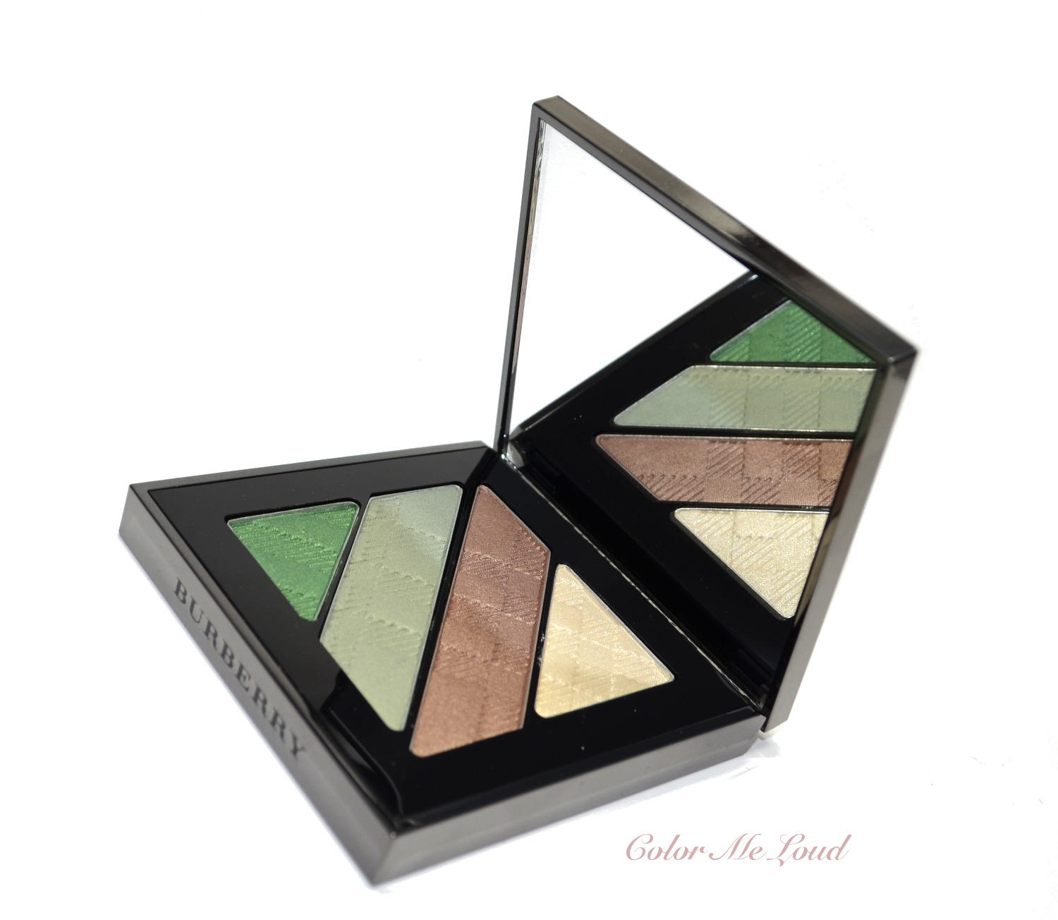
I just happened to receive my Burberry order tonight and I couldn't wait to share this one with you... The brand new green quad from their Spring 2014 Collection, Sage Green. 
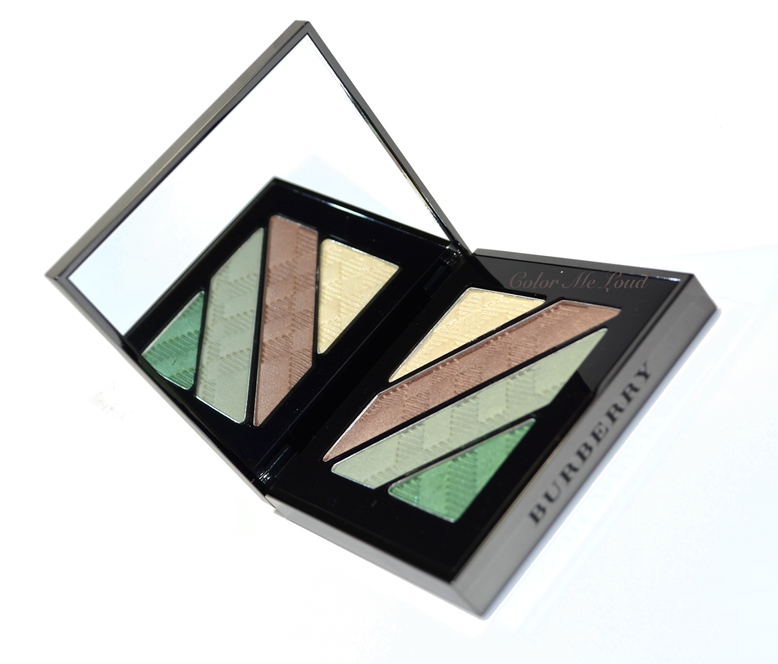

Burberry Complete Eye Palette #15 Sage Green

The packaging is the same as the permanent quads, comes with three applicators which can be kept inside the pocket of the velvet pouch.
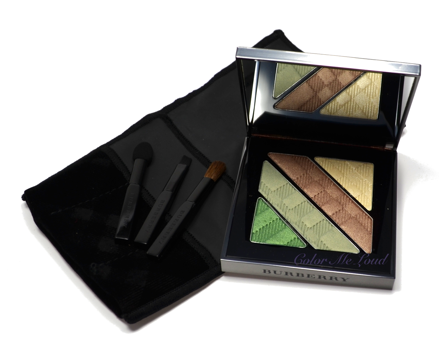


Burberry Complete Eye Palette #15 Sage Green

Sage Green is a quad composed of soft colors of greens, one mid-toned bronze and a frosty pale ivory. It is very finely milled and soft to touch, color pay-off is good but as I mentioned those are rather soft colors so don't expect any drama here.


Close-up: Burberry Complete Eye Palette #15 Sage Green

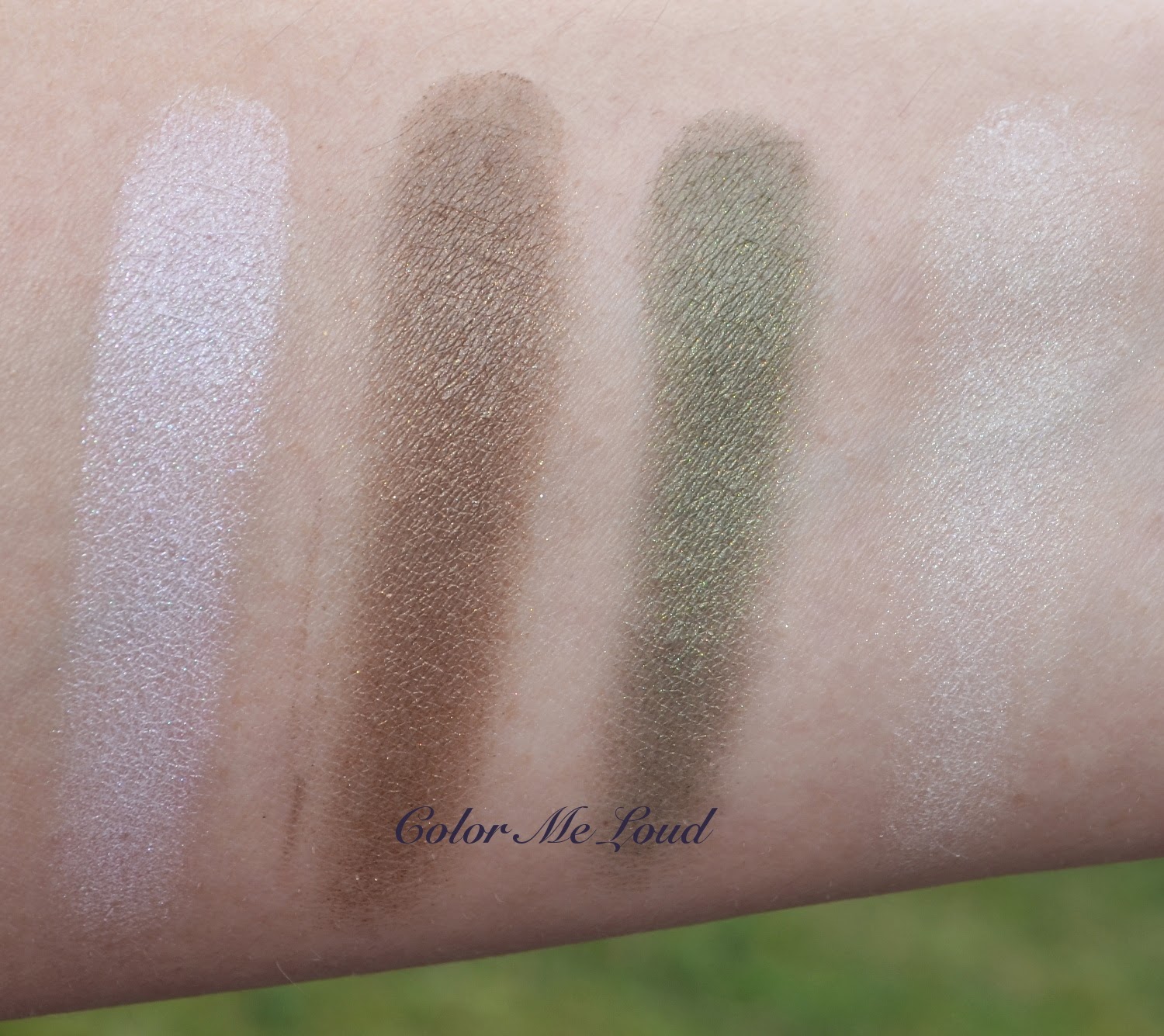
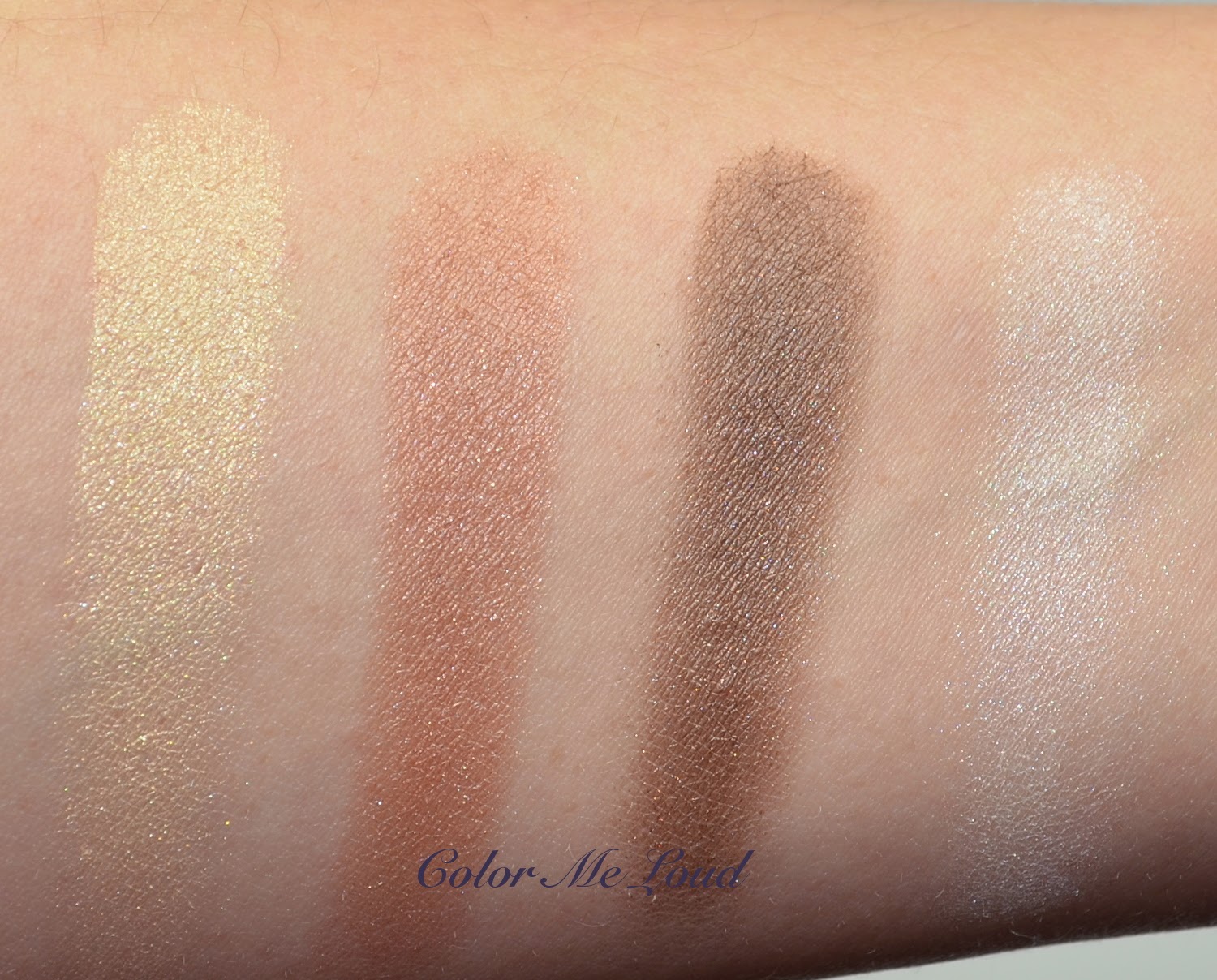
Swatched side by side, you can see that the shades don't offer a lot of contrast for defined eye looks. I think I might need a darker color to define the crease with this particular palette but I will let you know after I try these on my eyes tomorrow. I just wanted to post some swatches and comparisons for those of you who are considering to check it out. One of the greens is vivid and more shimmery, second one is subdued and almost matte. Bronze shade is gorgeous and complex, ivory is frost but looks nice and wearable.


Swatch: Burberry Complete Eye Palette #15 Sage Green

I quickly pulled out some palettes which I thought to be close and two Burberry singles to compare with the bronze shade. I also checked Dior's Garden Pastels quad (not show here) which was very different and pastel! I am happy that Sage Green is not a proper pastel but more of a soft Spring palette.


Comparison: Burberry Complete Eye Palette #15 Sage Green, Burberry Pale Parley & Midnight Brown, Dior Bonne-Etoile, Giorgio Armani Venomous Green

I think the closest palette I own is Venomous Green of Giorgio Armani from their Fall 2013 Kaleidoscope collection (reviewed previously here).  You see Venomous Green offers more contrast and is for more dramatic looks (I kept thinking this is why I must be loving Fall for buying make-up)


Giorgio Armani Venomous Green vs. Burberry Sage Green

Next I would like to compare just greens of all three palettes. You see that Sage Green has two greens which don't resemble any others. Dior Bonne Etoile (reviewed here) has more metallic shades, just like the collection they were released with, named properly as "Mystic Metallics".

Comparison of greens: Burberry Complete Eye Palette #15 Sage Green, Burberry Pale Parley & Midnight Brown, Dior Bonne-Etoile, Giorgio Armani Venomous Green

Once the bronze and browns are compared, you can see why I call Sage Green a "soft" palette. The darkest shade of Sage Green is just a little darker than Pale Barley! Now that I see this, I am not sure if these all show that well on me. I will try them on tomorrow and let you know. I will probably update this post then.


Comparison of browns: Burberry Complete Eye Palette #15 Sage Green, Burberry Pale Parley & Midnight Brown, Dior Bonne-Etoile, Giorgio Armani Venomous Green

Final thoughts: I will try these on tomorrow and let you know but it all seems to be very soft and spring like so depends if you like it that way or not.


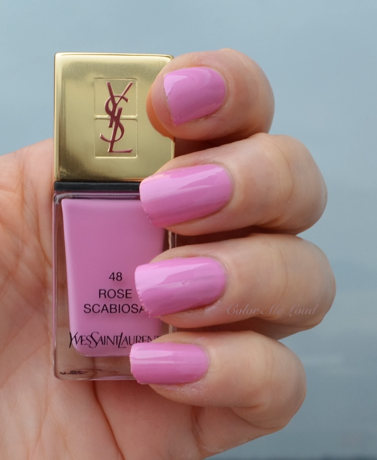

Yves Saint Laurent La Laque Couture #48 Rose Scabiosa, #49 Rouge Pablo from Spring 2014 Flower Crush Collection, Swatches & Comparison

$
0
0
Today I would like to post some notes about my Burberry Spring Quad experience but first things first, I would like to talk about two new Yves Saint Laurent nail polishes which are released for the upcoming spring, as a part of their Flower Crush Collection. Just a side note, I have reviewed the beautiful highlighter palette from the same collection, you can check it out here.


Yves Saint Laurent La Laque Couture #48 Rose Scabiosa and #49 Rouge Pablo

This one is going to be a short post since we are running late for movies tonight. After not being able to get tickets (all sold out) for Wolf of Wall Street on Friday and Saturday, tonight we have reserved and hoping that this time it will work. Movies are being shown in original sound in only a very few theaters in Stuttgart, Germany so getting a ticket is sometimes not that easy. Alright so back to those pretties...

Yves Saint Laurent La Laque Couture #48 Rose Scabiosa and #49 Rouge Pablo

YSL La Laque Couture #48 Scabiosa is a creme lilacy pink. It applies a little streaky and sheer by the first coat but it all evens out by the second coat. You should make sure though not to apply too much at once because it has tendency to get thick. YSL has one of my favorite nail polish formulas and this one impressed me a little less than usual but still it is easy to work with and the result is totally worth it. Look at this... It may look like a few shades you know but I ensure you it is indeed rather unique. (excuse me for the state of my nails, ugh, wanted to cut them shorter but they are always a challenge to file)


Yves Saint Laurent La Laque Couture #48 Rose Scabiosa

Once more against the still green background. Here in Germany the weather has been so nice throughout the winter, I am already in Spring mood. I hope it stays that way.


Yves Saint Laurent La Laque Couture #48 Rose Scabiosa

YSL #49 Rouge Pablo may look familiar. This one has the dream formula of YSL, not thick but covers beautifully, dream consistency and drying time. It is almost one coater but I applied two for the photos below. It is a gorgeous cheerful red creme with blue undertones. It is a classically beautiful one, which would appeal to red lovers.

Yves Saint Laurent La Laque Couture #49 Rouge Pablo

It is not too light nor too dark, makes it a day appropriate shade but also can be worn to a special occasion alike.

Yves Saint Laurent La Laque Couture #49 Rouge Pablo

I thought Rose Scabiosa would be very close to Chanel #535 May but I was wrong. May has less blue in it and appears more pink than lilac. Dior Rosy #355 Bow is also more pink, less lilac. Chanel #277 Rodeo Drive is lavender (cooler) and darker. As you see Rose Scabiosa is very unique to my stash and this is why I am loving it.

YSL #49 Rouge Pablo is darker than Givenchy's Spring shade #16 Rose Addiction (reviewed here) but it is very close to Chanel #Tapage (reviewed here) and Chanel Rouge Rubis (reviewed here). It is indeed between those two in terms warm/cool scale. If you have one or both of these shades, you may want to skip Rouge Pablo.


Yves Saint Laurent La Laque Couture #48 Rose Scabiosa, #49 Rouge Pablo, comparison to similar shades

Final thoughts: YSL's new nail polishes for spring are a lilac which is rather unique and a red, which has great formula but rather close to two recent Chanel shades. Rose Scabiosa and Rouge Pablo are already released and both should be limited edition.

What is your favorite Spring nail polish for the upcoming season until now?

Caught In Action: Burberry Complete Eye Palette #15 Sage Green from Spring 2014 Collection

$
0
0
A few days ago I posted my first impressions, swatches and comparisons of one of the two new Burberry Quads here. For a complete review, I would like to wait to play around with it. This week I used it two times, and here is what I think...

Burberry Complete Eye Palette #15 Sage Green

As I mentioned earlier, the darkest color in the quad, which is a bronze brown is almost as light as Pale Barley. I am telling it for reference here because many of you own PB and you can tell how much it shows on your lids. I was a little let down by the fact it was very soft because there were no shades to define an eye look, unless i would combine it with another palette.

I was very happy with the ivory (up most) and vivid grass green (bottom most) shades. They are indeed very pigmented. Bottom most grass green shade is very interesting. I would buy it if it would be a single. The only problem with these two shades are that they are like half the size of the other two "not that pigmented" shades. Green in the middle is rather muddy and the color pay off of bronze shade could be better.

For the following look I used the ivory in the inner corner, bronze and green on the lid, tried to define the look with bronze, didn't really work though. Then I added the grass green shade to the bottom and to the mid of the lid extending it outwards. It gave me a soft springy eye without being too pastel (which is a good thing since pastels may wash me out).


In-Action: Burberry Complete Eye Palette #15 Sage Green on eyes

I tried those shades with Dior Backstage Primer (yet to be reviewed) and Nars Pro-prime. With Nars Pro-prime it worked better but I experienced some fading throughout the day. I know many of you reported that Burberry shades wear especially well on oily lids but for my rather dry lids, it does somehow "fade". At the end of the day, (about 10 hours later) the shades look even softer. In this case it is a concern because they are anyway very soft to start with. I know other formulas which work better on my skin (like Suqqu). Here is the complete look.


FOTD: Burberry Complete Eye Palette #15 Sage Green on eyes

All in all I am a little torn. I would like to love this one and I do like the soft but colorful look it gives but I find the middle two shades lacking some pigmentation. As for the formula, I still prefer Burberry singles over their quads. I think it is a nice quad though, but maybe not "Complete" as the name suggests as I'd rather need another shade to define the look.

Also check out Jenny's review of the pink quad #10 Rose Pink here. She also has similar feelings about hers. I am not sure if those are limited edition or intended to be added to the permanent line. I purchased mine at Burberry German Website (which is a German version of their Website in UK and everything is sent from there).

Dior Vernis #777 Bloom and #187 Perle from Trianon Collection for Spring 2014, Swatch & Comparison

$
0
0
One of the highlights of Dior's Spring Collection Trianon must be the nail polishes. There are six different nail polishes released around the globe, four of which are available in Europe. I have reviewed two of the available shades, #457 Bouquet and #204 Porcelaine. With the unique color of Porcelaine and perfect formula of Bouquet, both have been hits for me. Today I would like to talk about the other two shades I picked.

Dior Vernis #777 Bloom and #187 Perle from Trianon Collection


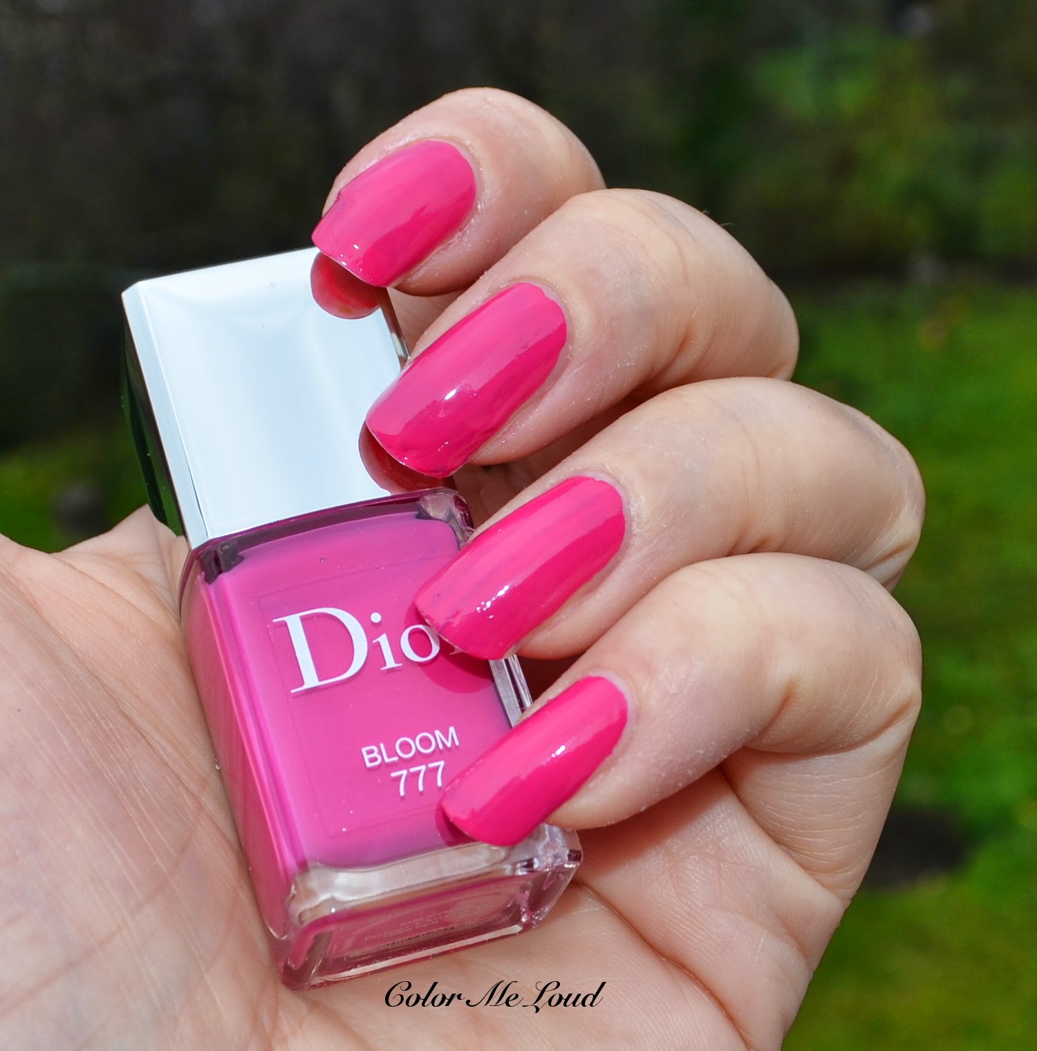
Dior Vernis Trianon Edition #187 Perle is a frosty, almost matte top coat with a very beautiful multi dimentional, multi colored shimmer. Dior Vernis #777 Bloom is a vibrant fuchsia creme for those of you who find pastels rather boring.


Dior Vernis #777 Bloom and #187 Perle from Trianon Collection

I would like to start by apologizing for the state of my cuticles, lol. Please concentrate on the shades instead ;-) Dior Vernis #777 Bloom has the best of Dior's formula. It has a slightly jelly character to it but by two coats it was opaque on my nails. It is a vivid cheerful shade for spring and summer.


Dior Vernis #777 Bloom without flash

Depending on the light, Bloom may look cooler or warmer. Below you can see it looking a bit cooler with flash.

Dior Vernis #777 Bloom with flash

Bloom has a pretty shade but most of us have similar ones in our stash, I took out a few for comparison.


Dior Vernis #777 Bloom and similar shades from my stash

Chanel #339 Cassis is darker, more blue based and more muted. Tom Ford #06 Indian Pink and Chanel #111 Boa are redder. Spring 2014 shade of Givenchy Rose Addiction (reviewed here) is lighter and slightly redder. Dior's Summer shade from last year #678 Creoles (reviewed here) is darker and brighter. Dior Plaza and Chanel Splendeur pull warmer (redder). Chanel #74 Kabuki (discontinued) is darker and cooler. Illamasqua Obsess is much more blue based.

I couldn't find an exact dupe for Dior Vernis #777 Bloom but some of the following shades were very close: Dior #678 Creoles, Dior #579 Plaza, Chanel #111 Boa. If you have any of these, you may want to shop your stash first.


Nail wheel swatches, Dior Vernis #777 Bloom and similar shades

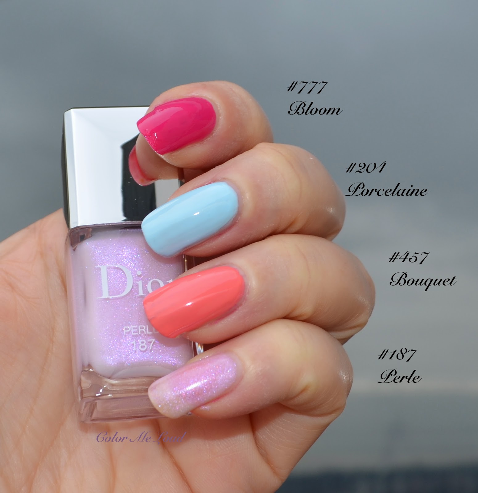
Dior Vernis #187 Perle is more of a top coat and sheer on its own so I didn't want to insist on building it up on all my nails and use up half of the bottle. Instead, below you can see it alone on my pinky and applied on other shades of Dior's Spring collection, like #777 Bloom, #204 Porcelaine, #457 Bouquet on the second picture. First picture has two coats of each, second picture shows three coats of Perle alone and one coat applied over two coats of each nail polish.


Dior Vernis #777 Bloom, #187 Perle, #457 Bouquet and #204 Porcelaine from Trianon Collection
Dior Vernis #777 Bloom,#457 Bouquet and #204 Porcelaine (two coats each + one coat #187 Perle)

Below I added one more layer of Perle on each, so that Perle alone had four coats (you can still see the nail line!) and two coats over two coats of each other polish. I found out that the difference between applying one coat or two coat doesn't really make a big difference in terms of the finish but it takes forever to dry. So lessons learned: One coat of Perle over two coats of the polish of your choice is enough to get the most of the pretty effect.


Dior Vernis #777 Bloom,#457 Bouquet and #204 Porcelaine (two coats each + two coats #187 Perle)

Final thoughts: Dior Vernis #777 Bloom is for those who would like something more vibrant for Spring. It is pretty and has a very nice formula but not that unique to my stash. Perle, on the other hand, is more interesting. It adds an oomph to your polishes and looks especially nice on pastels. I can't wait to wear it on Porcelaine this spring. Love it!

On a side note as once requested, you can now see my nail polish stash by checking out tab "Stash" on the top of the page if you are interested. Some lines are completely missing though, like OPI and YSL. I will try to update and add these soon.

Which Spring polishes are on your radar?

Giorgio Armani Rouge d'Armani Sheers #314 Delirium, #614 Belladonna and Flash Lacquer #614 Belladonna from Effetto Nudo Spring 2014 Collection

$
0
0
I was lucky enough to get my hands on the beautiful highlighter of Giorgio Armani's Spring 2014 Collection, Belladonna already last year. I am still very careful while using it not to ruin the beautiful design (#firstworldproblems anyone?). Armani Spring Collection is released in Germany last week and I ordered two of the lipsticks sight unseen. But then I was too impatient and made it to the counter to check those out in person. There were three very pretty sheer lipsticks...   

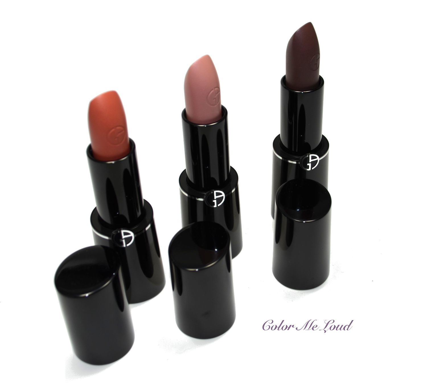
Giorgio Armani Rouge d'Armani Sheers #314 Delirium, #514 Ivy and #614 Belladonna

From left to right: #314 Delirium, #514 Ivy and #614 Belladonna... I tried all three at the counter. Talking about make-up, I can buy almost anything sight unseen but I can't buy lipstick without trying, how strange of me.
Giorgio Armani Rouge d'Armani Sheers #314 Delirium, #514 Ivy and #614 Belladonna

I was surprised to find out that #514 Ivy, one of the lipsticks I ordered online was way too sheer for me. It was very pretty but I thought it didn't move me. #314 Delirium was a surprise, since usually peachy shades don't look good on me but this one really did, so I picked up that one from the counter. But in my opinion the real highlight was #614 Belladonna. We all have sheer peaches and pinks in our collection, but that browny plum, which has the most gorgeous sheen to it and applies so soft on the lips... Love!


Giorgio Armani Rouge d'Armani Sheers #314 Delirium, #514 Ivy and #614 Belladonna

I know many of you will be rather shy about Belladonna because of how dark it looks but if you can try it out, I am sure you will love it as much as I do. Below you can see swatches of Delirium and Belladonna. I couldn't swatch Ivy because I really want to return it. It is still here though, I hope i won't get weak ;-) Maybe I will try it once more at the counter before returning it... See the beautiful sheen and the softest sheerest color? These are superb nudes to add little bit of something without getting too much attention on the lips. 


Swatch: Giorgio Armani Rouge d'Armani Sheers #314 Delirium, #614 Belladonna

Since plummy brown of Belladonna took my mind away, I couldn't resist Flash Lacquer in the same color. I am usually not a gloss girl but I found this one to be very unique. It is sheer but again such an interesting pretty shade...


Giorgio Armani Flash Lacquer #614 Belladonna

Looks dark in the tube but once applied but on the lips it is very wearable, though it is darker and more dense than Rouge d'Armani Sheers #614 Belladonna. Flash Lacquer #614 Belladonna doesn't have any glitter or frost, it is purely glossy, which justifies owning both Sheers and Flash Lacquer in the same shade in my opinion. 

Here are one more set of swatches with Flash Lacquer #614 Belladonna. I would like to take a few lip photos but couldn't do it this week due to traveling and full on schedule. Keep an eye on the blog though, there may be some FOTD coming up which uses these shades on the lips.


Final thoughts: Loving the nude effect concept of Armani for Spring 2014. If you like sheer lipsticks, you should definitely check all three shades out. My favorite is #614 Belladonna, which is more of a unique shade among others but still love all three of them formula and shade wise.

Are you planning to get any of these?

Caught in Action: Plum Lips for Spring, FOTDs with Rouge d'Armani Sheers #614 Belladonna & Chanel Rouge Allure Velvet #45 L'Adoree

$
0
0
Here is a very short post about two of the lipsticks I am loving at the moment. The first one is Chanel Rouge Allure Velvet #45 in L'Adoree. I didn't have time to review it but it is appropriate to say that I adore it!

Chanel Rouge Allure Velvet #45 L'Adoree

I wore it many times during last weeks but one of the fun looks I had was with Urban Decay's Heavy Metal glitter liner in ACDC (the purple one) and Chanel L'Adoree. With this look I received a compliment from the waitress at the restaurant we went for dinner, LOL. I mean I got some comments before at department stores or makeup counters but not at a restaurant. This one must have been the lipstick, who knows ;-)


FOTD with Chanel Rouge Allure Velvet #45 L'Adoree

Next one is my new "love", Belladonna... ahh... Belladonna...
Did it seem so brown in the tube and at the arm swatches? It is not brown, it is a gorgeous plum/berry shade once applied on the lips. <33


Rouge d'Armani Sheers #614 Belladonna


Truly phenomenal that color, I simply have nothing like that in my collection... It has gorgeous multi dimensional pearl effect and is very hydrating too. Below is one of the looks I wore this week... (I think it is Diorshow Mono Eye Shadow in Tweed on eyes)


FOTD with Rouge d'Armani Sheers #614 Belladonna


Plums and Spring, I wouldn't put those two things together but I started enjoying this trend already...

Do you like plummy lips as much as I do? Which lipstick is your favorite at the moment?

Chanel Le Blush Creme #67 Chamade & #69 Intonation from Notes du Printemps Collection for Spring 2014

$
0
0
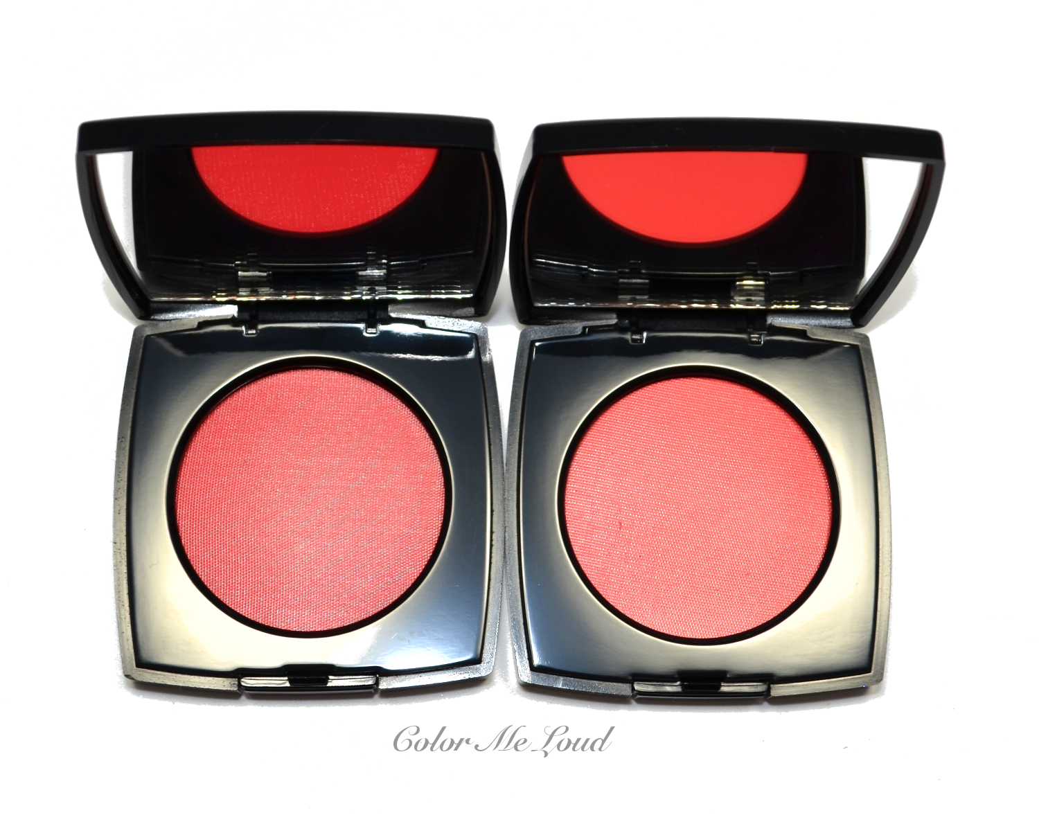
Due to some technical problems (an almost lost package, double orders, package still arriving on time to return most of the items) my Chanel Spring 2014 posts got delayed and delayed. In the end I was convinced that everything was already sold out and there was no point in reviewing things you can't get anymore but hey, today I checked it out, in Germany almost all the pieces are available, even online. Here is a little post to show you the two additions to Chanel creme blushes, one is going to be added to the permanent line.


Chanel Le Blush Creme #67 Chamade & #69 Intonation


Testing the first six creme blushes which were released with Chanel Fall collection last year, I found out that their formulas are similar but have differences depending on the shade. I found some of them to be more drying on my normal to dry skin and some more hydrating and long lasting. Good news is that both Chamade and Intonation have one of the best formulas of this range. Previously I reviewed Presage and talked about how to make it last longer on the cheeks by applying it with a dense cheek or foundation brush, which is a valid statement also for these two shades.
Chanel Le Blush Creme #67 Chamade & #69 Intonation

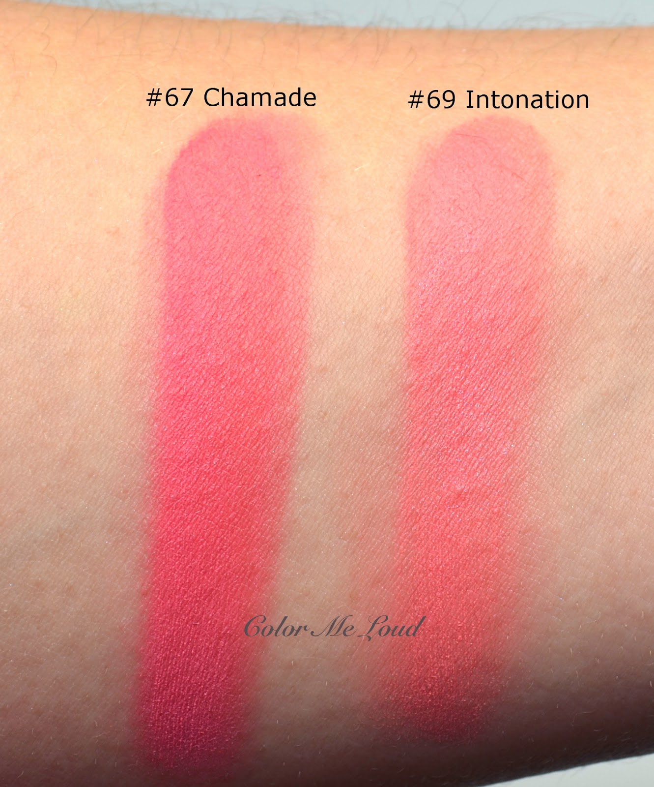
In the pan #67 Chamade and #69 Intonation look similar. Once they are swatched, you can see that Intonation is lighter and a little brighter, Chamade is a little cooler. Once sheered out on the cheeks, they are similar though so if you can't get your hands on Intonation, which is the limited edition item, you can find Chamade in Chanel's permanent range.


Swatch: Chanel Le Blush Creme #67 Chamade & #69 Intonation

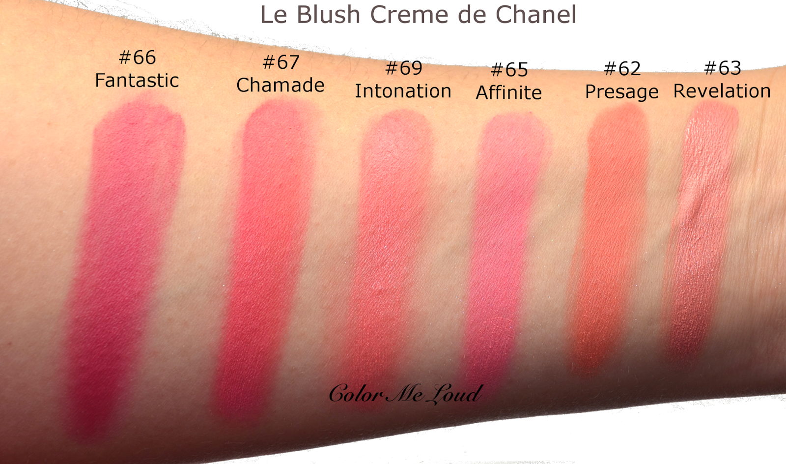
Below you can see the comparison to other Le Blush Creme de Chanel for your convenience. As you can see both Chamade and Intonation are rather unique to the line. Intonation is close to Revelation but a little cooler and brighter. The closest shade to Chamade is Fantastic, which is deeper and cooler.


Chanel Le Blush Creme #67 Chamade & #69 Intonation vs. other Chanel creme blushes

Final thoughts: Two new Creme Blushes of Chanel don't disappoint in terms of formula. Two shades are close so you may want to choose one. I will try to post some looks with these soon.

Have you picked up anything from Chanel's Spring Collection?

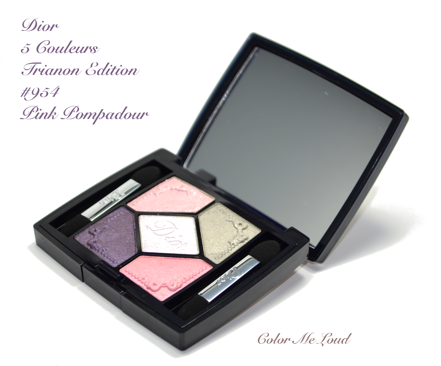
Dior 5 Couleurs Trianon Edition #954 Pink Pompadour from Spring 2014 Trianon Collection

$
0
0
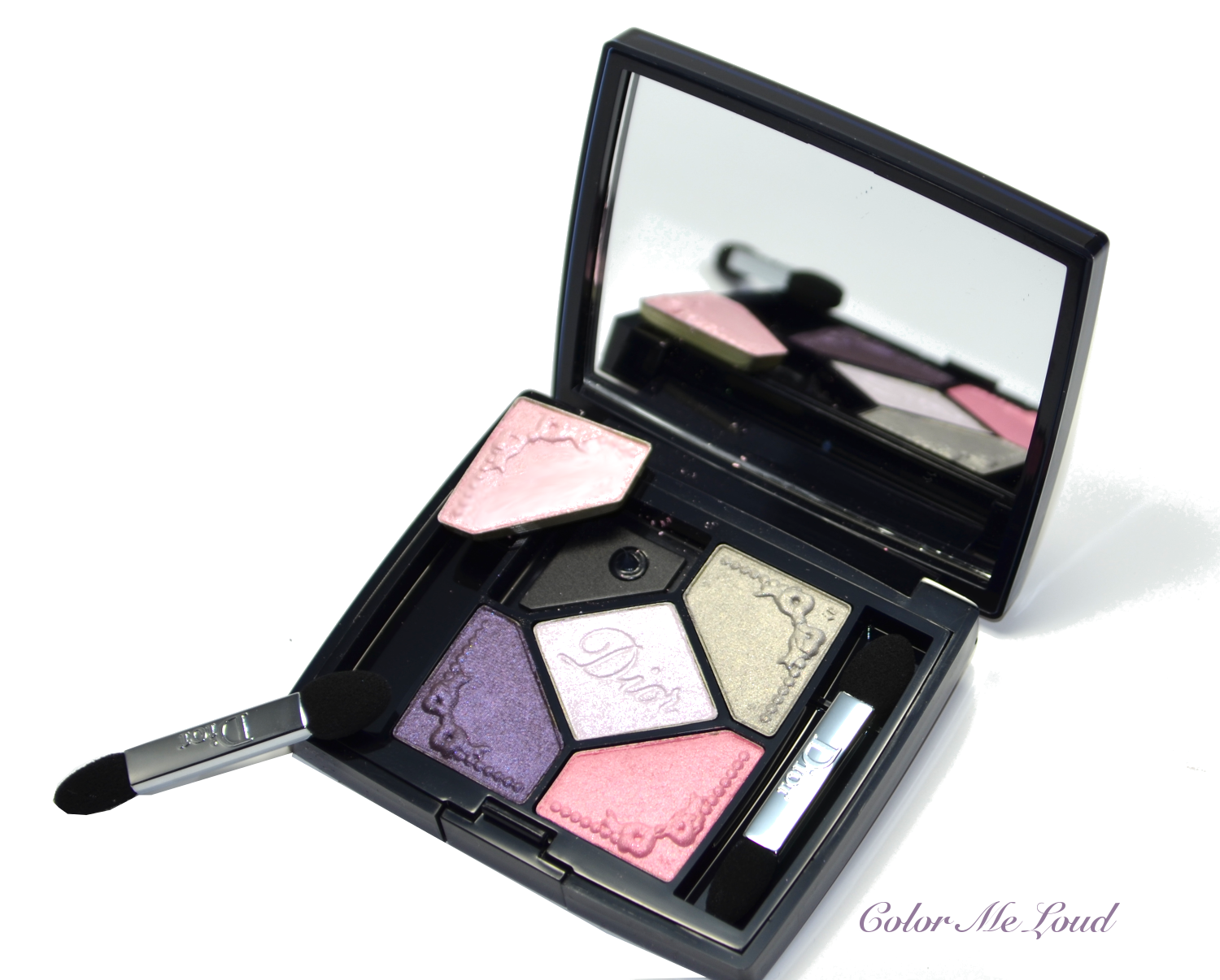
One of the two quints Dior released with Trianon collection, #954 Pink Pompadour is a composition of pinks, silver and purple, much like the blooming flowers, it emits the happy, carefree spring vibes.


Dior 5 Couleurs Trianon Edition #954 Pink Pompadour

Pink Pompadour caught my attention when the first promo pictures were released but I convinced myself that another "pastel" palette which I wouldn't use that often was a waste of money. After swatching it at the counter, I started pondering again. At one point I decided I couldn't skip it. We were talking about pinks and violets after all and the middle shade was too pretty to leave behind. 


Close-up: Dior 5 Couleurs Trianon Edition #954 Pink Pompadour

Coming home, I immediately turned on my camera to shoot some photos before my fingers were all over the palette but while taking the pictures, I have seen that one of the shades were loose. The others didn't also seem to be properly glued. I have head these type of problems before with Dior compacts but this was far worse, so I decided to return it.

At the counter, i checked Dior Make-up Palette in #001 Favorite once more and decided that to get that one instead, which I thought would be more unique to my stash. I didn't end up loving Favorite and I started thinking I made a huge mistake. So off I went to get Pink Pompadour again...


Ooops, one of the shades was loose in compact


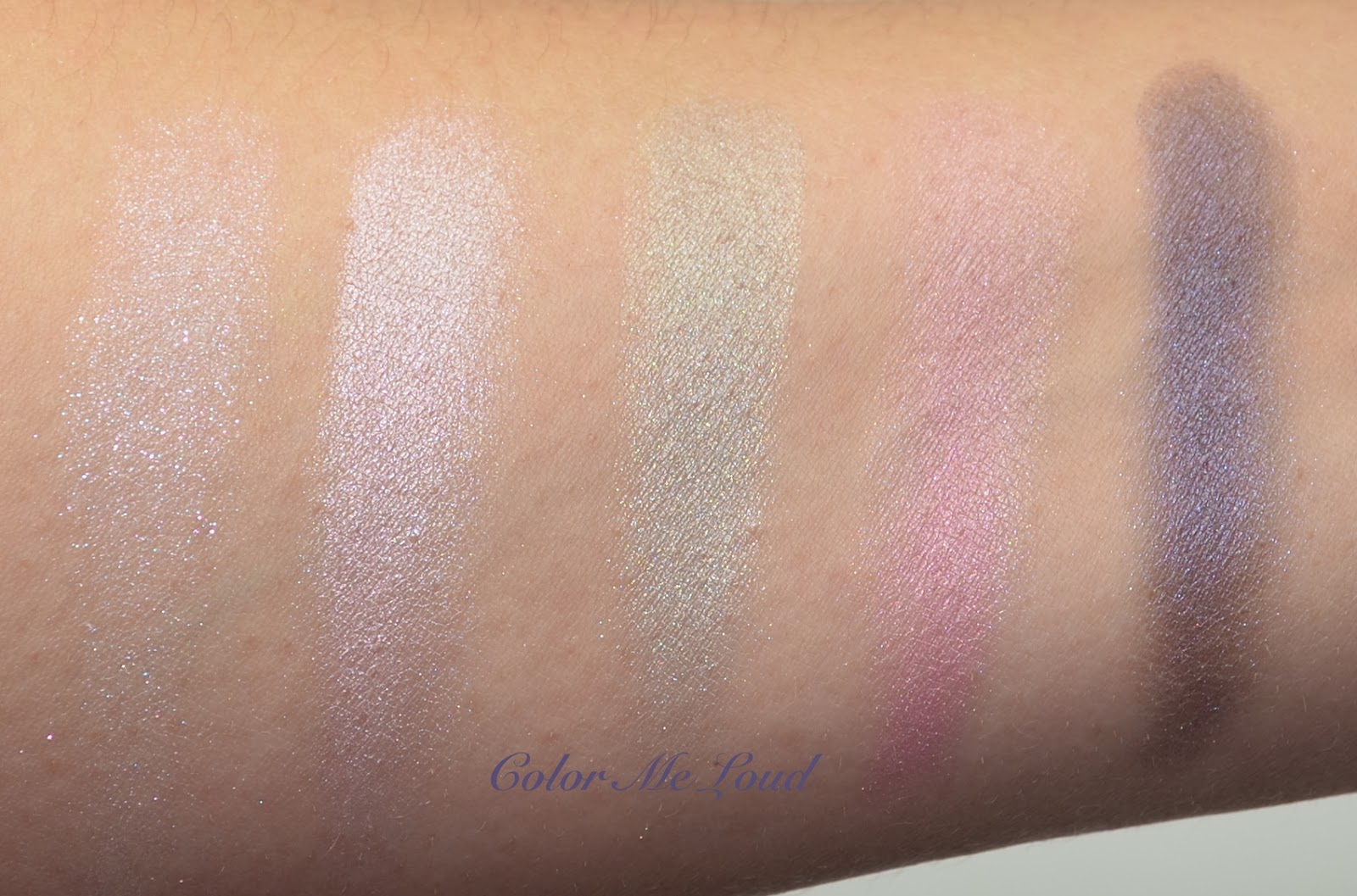
Below you can see swatches of first the middle shade then starting from upper left corner in clock wise fashion. Middle shade is truly exceptional. It is a semi sheer pearl effect eye shadow, very much like the nail polish #187 Perle, also from Trianon collection. It layers beautifully with other shades. There are two pinks, one is a very pale frosty pink which can be used at the inner corner to highlight. Then there is a medium pink, which is very wearable since it is not frost nor shiny, it has a beautiful satin finish. Grey shade is metallic and very close to Dior Mono #87 Gris Montaigne. The purple shade has a gorgeous sheen and dark enough to define the eye look.


Swatch: Dior 5 Couleurs Trianon Edition #954 Pink Pompadour

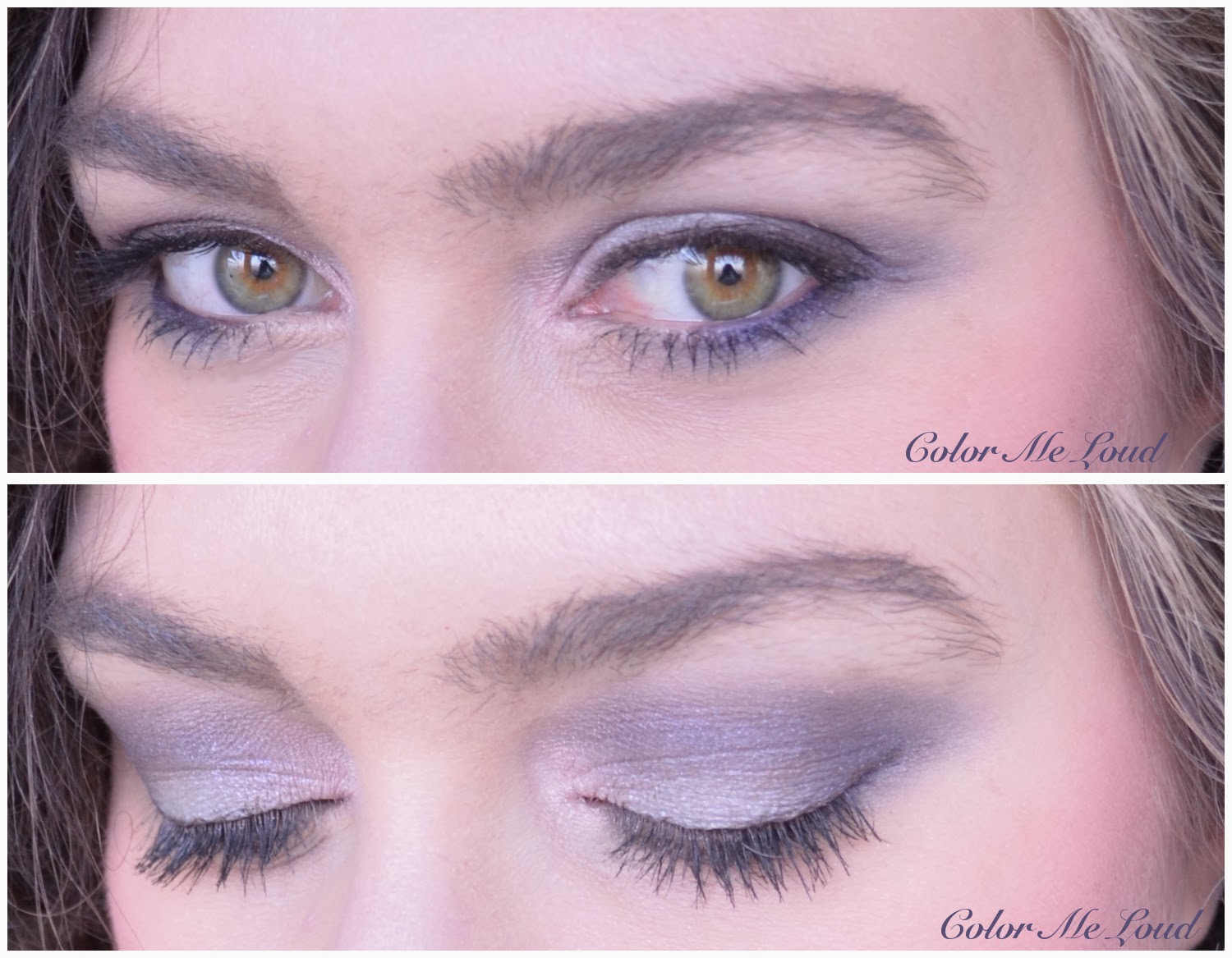
Below you can see the palette in action. I don't know why I am so pink on this pic, but I swear it was not the blush nor the fall out from the palette ;-) For the mid of the lid I mixed silver and mid-toned pink and used purple at the crease. I highlighter the inner corner with light pink.


In-Action, eyes: Dior 5 Couleurs Trianon Edition #954 Pink Pompadour

I may not like pastels, but purples and pinks are out of this equation, here is the complete look, Corail Bagatelle on the cheeks, Rouge Dior in Courtisane on the lips.


FOTD with Dior 5 Couleurs Trianon Edition #954 Pink Pompadour

Final thoughts: If you like the color combination, be sure to check Pink Pompadour out. It is a solid palette with pretty springy shades.


What else do you have in your wish list before Spring comes?

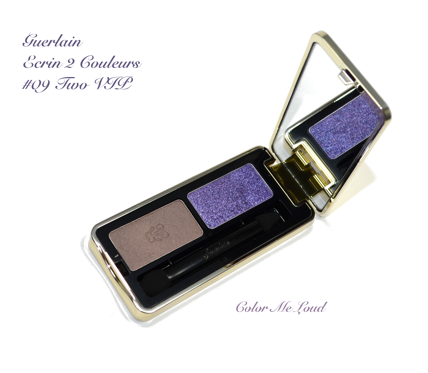
Guerlain Ecrin 2 Couleurs #09 Two VIP from Meteorites Blossom Collection for Spring 2014, Swatches & Review

$
0
0
Guerlain named the Spring Collection after their reformulated Meteorites. I didn't pick any of these considering I have three different Meteorites I am trying to finish at the moment and I am so happy with them that I wouldn't change a thing. I am using Meteorites everyday as a finishing powder over my foundation. After I am finished with mine, it will be exciting to try the new formulation though, hoping that it still works wonders as the old one does. Besides reformulated Meteorites, Spring Collection, Meteorites Bloom had other pretty items too, like an eye shadow duo in #09 Two VIP.


Guerlain Ecrin 2 Couleurs #09 Two VIP from Meteorites Blossom Collection for Spring 2014

The moment I have seen it, I knew I had to try it. I love taupe shades and the glitter looked very pretty and vivid, in a purple way, which I really can't resist. 


Guerlain Ecrin 2 Couleurs #09 Two VIP from Meteorites Blossom Collection for Spring 2014

Upper shade in the compact looks very blue in the pan but once swatched it is a semi transparent lavender with pink, silver and purple mixed glitter. It is very pretty but to build up the shade definitely takes time. Lower shade is a gorgeous taupe with slight pinkish undertones. This one has a satin to matte texture. If two shades are layered, the result can be anywhere from lavender to taupe depending on which shade is used more intensely.


Swatch: Guerlain Ecrin 2 Couleurs #09 Two VIP from Meteorites Blossom Collection for Spring 2014

I applied the taupe shade all over the lid and padded the glitter shade on top. I have to admit, I can't understand the resulting effect of lavender glittery eye look. I mean, it was already rather lavender than taupe with the lower shade and the glitter shade somehow only intensified this. I know I have an interesting complexion which turns everything to berry/purple/violet direction but this time the effect was really strong. 


In-action: Guerlain Ecrin 2 Couleurs #09 Two VIP from Meteorites Blossom Collection for Spring 2014

Final thoughts: Overall I like how the resulting look turned out to be but I find this duo rather high maintenance. I think duos should be all about being practical and easy to apply but the purple glitter shade in this duo needs to be build to show, and taupe needed some blending. At this price range, I would expect that everything should apply pretty much on its own. Still lavender look is very pretty, for you purple fans out there, this one will carry you properly to Spring months.

Checked out Guerlain Spring? Anything catches your eye?

Clarins Opalescence Face & Blush Powder from Opalescence Collection for Spring 2014, Swatches & Comparison

$
0
0
With Spring and Fall Collections, Clarins releases one of their beautiful Face & Blush Powders. This year is no exception. Opalescence Collection gives us this beauty...


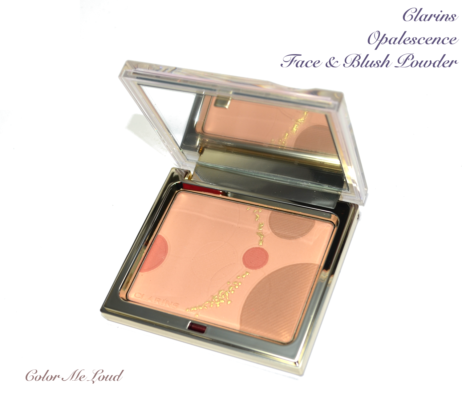
Clarins Opalescence Face & Blush Powder from Opalescence Collection for Spring 2014

I love the formula of Clarins' powders and once it is combined with a modern breathtaking design, I can't resist. Opalenscence Collection also has creme blushes which I am very curious to try once they hit my local counter. Face & Blush Powder was ordered by me, sight unseen, simply because I had very good experience with these in the past years. I wanted to add this one to my small collection of Clarins powder blushes.


Clarins Opalescence Face & Blush Powder from Opalescence Collection for Spring 2014, no it was not falling!

The packaging is made of plastic but very chic in an iridescent, color changing way. It is very difficult to photograph, I hope this gives an idea.

Clarins Opalescence Face & Blush Powder from Opalescence Collection for Spring 2014


The powder is finely milled and partly ornamented with gold over spray which unfortunately fades by the first application. There are three shades combined, a mid-toned rosewood, a mid-toned cool brown and a peachy skin shade.


Close-up: Clarins Opalescence Face & Blush Powder from Opalescence Collection for Spring 2014


Once mixed all together, it becomes a peachier version of my skin tone (NC 20-25). It is very close, so hard to see on my arm. On the face it is a little more apparent but still very subtle.


Swatch: Clarins Opalescence Face & Blush Powder

I pulled out the other pieces of my ever growing Clarins Powder Collection and put them side by side for comparison.


Clarins Opalescence Face & Blush Powder and comparison to other Clarins Face & Blush Powders

Clarins Palette Eclat from last year's Spring collection is a truly gorgeous nudy blush on me. It brightens up my complexion and gives enough color to my cheeks. Once compared to Opalescence, you can see that Eclat is denser and more pink.

Clarins Graphic Expression from Fall 2013 is more of a peachy blush, which I also find myself reaching for at the moment. It has almost the same undertones once compared to Opalenscence but it is denser and pulls more coral.

Clarins Color Accent from Fall 2012 Collection works more like a subtle bronzer. It is more brown than any of the others, including Opalenscence and darker than Opalescence.


Clarins Opalescence Face & Blush Powder and comparison to other Clarins Face & Blush Powders

Final thoughts: Finely milled, gorgeously designed and reasonably priced but if you would like to use it rather as a brush, make sure it shows up on you because this one is much lighter than the previous releases. Opalescence would work best on fair ladies out there.

Do you have any Clarins' Powders? Are you loving them?

Guerlain Ecrin 4 Couleurs #503 Les Tendres and Rouge Automatique #171 Attrape-Coeur from Meteorites Blossom Collection for Spring 2014, Swatches & FOTD

$
0
0
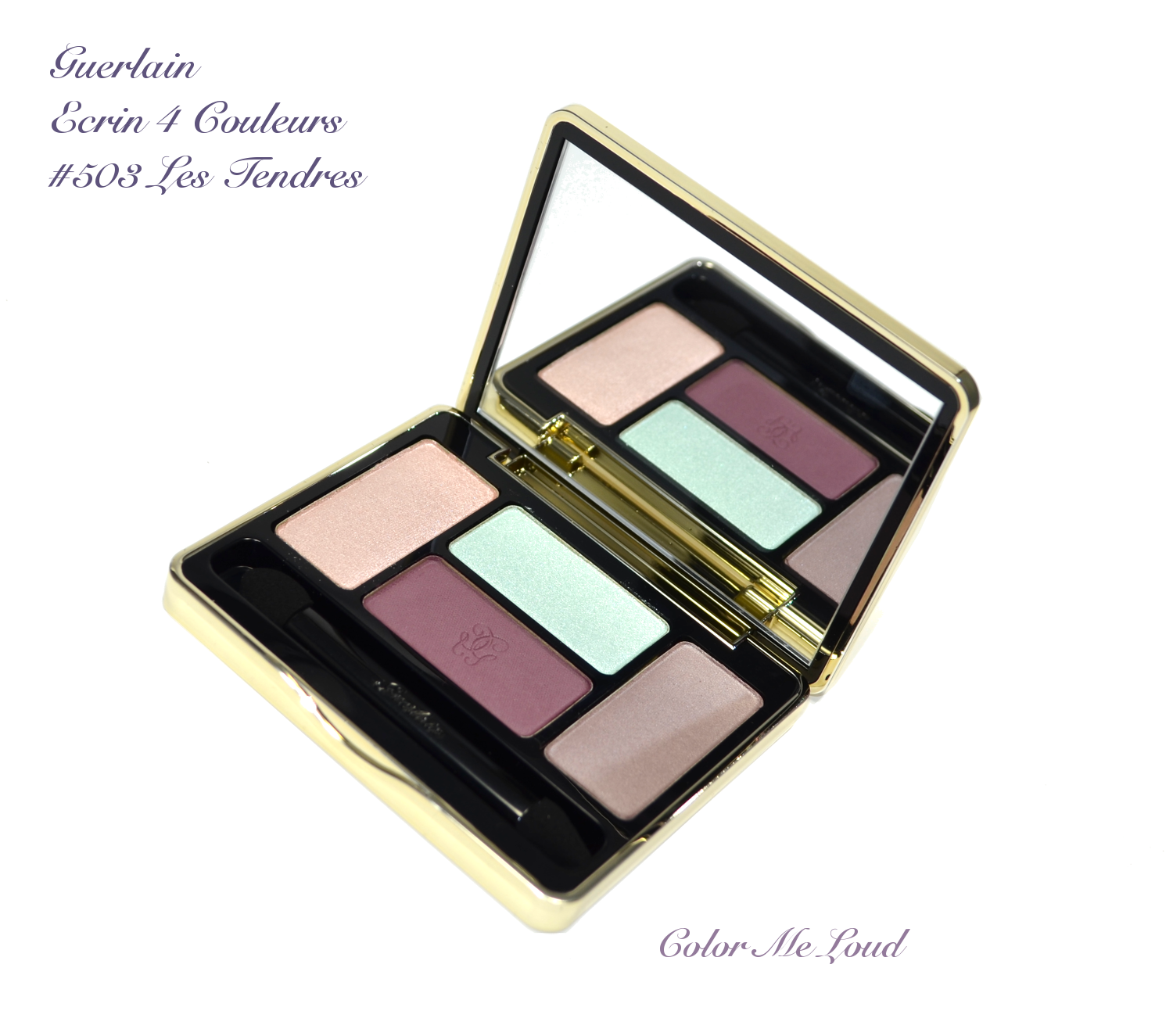
For the eyes the new Duo in Two VIP was not the only release from Guerlain this Spring. There is a quad too, Les Tendres. Gorgeous name, unusual color combination. I opened the lid cautiously, not really expecting to fall in love with it but more as a challenge to make it somehow work. My first impression was something along the lines: The plums, they look gorgeous, but what about that mint and pale pink frost in there? We shall see...

Guerlain Ecrin 4 Couleurs #503 Les Tendres

At first sight, the unusual color combination attracts a beauty blogger in a similar fashion as light attracting flies. I had some ideas of how to place this and that shade but how it would look like in the end can be nothing but a surprise. This is what I truly love, unexpected results...

Guerlain Ecrin 4 Couleurs #503 Les Tendres

Not everything has a happy ending but I was ready to give that one a shot, I swatched them to show you the shades we are talking about and to get to know the textures better. There are two frosty shades combined with two satin to matte eye shadows, which makes this quad not only interesting in terms of colors but also in terms of the texture combinations. Two frosts are very pigmented and opaque once swatched, so I didn't expect them to work layered with the others. There is a gorgeous plummy taupe in there and a reddish plum, both are very close in intensity.


Swatch: Guerlain Ecrin 4 Couleurs #503 Les Tendres

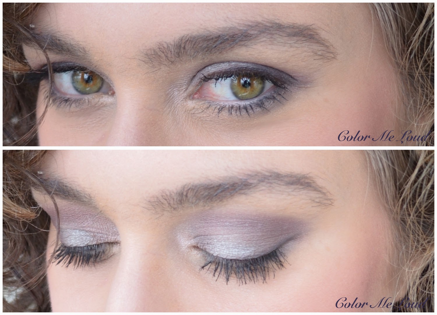
I wanted to place the mint shade in the middle of the lid, pink in the corner. Taupe provided enough contrast around mint shade while reddish plum defined my crease. Here is the end result of this experiment.

In-Action: Guerlain Ecrin 4 Couleurs #503 Les Tendres

I was... wowed! I didn't expect mint showing up so nicely and present such a gorgeous combination with that plummy shades. Everything in this quad suddenly made sense, why plums were not that "dark" (because it would fail the soft minty look) and why mint was so opaque and frosty (because other way around it wouldn't show at all). Love comes when you least expect it!

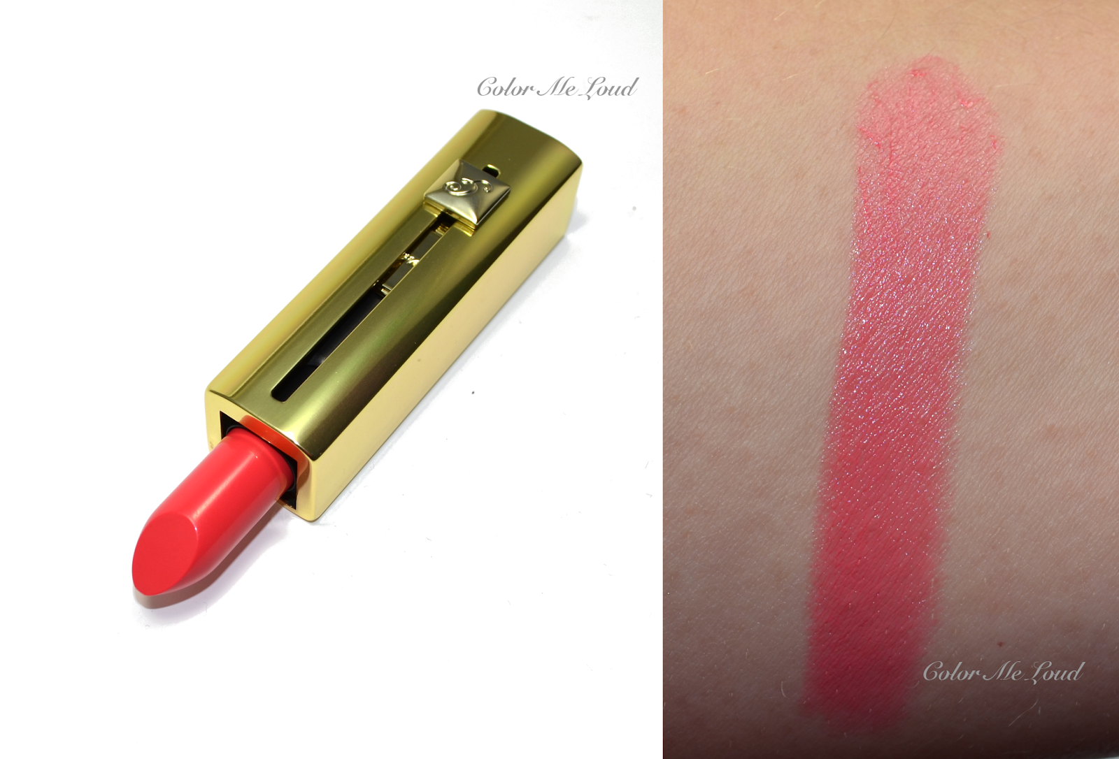
Now on to one of the two Rouge Automatiques of Guerlain Spring 2014 Collection,  #171 Attrape-Coeur, a lovely pinkish coral on my lips, a lovely shade which compliments the eye look in a springy way.


Guerlain Rouge Automatique #171 Attrape-Coeur

Another take on plum, this time on the eyes, do you like this FOTD as much as I do? Oh by the way I am also enjoying the blushes of Meteorites Bloom Collection. Was another unexpected love in a way, review should be up soon.

FOTD with Guerlain Ecrin 4 Couleurs #503 Les Tendres and Rouge Automatique #171 Attrape-Coeur 

Final thoughts: All thumbs, fingers and toes up for Les Tendres! Not to mention that I received a compliment with this one from hubby (which is a great deal since he sees a new look everyday but this one must have stood out for him). Les Tendres wears all day long with a base, without creasing nor fading. It is going to be one of the favorite looks to wear this Spring. Yes, I am ready, now the Spring can come!

Have you checked out Les Tendres, I am curious about your thoughts on that one.

Suqqu Blend Color Eyeshadow #16 Hanashuobo for Spring 2014, FOTD, Swatch & Review

$
0
0
Suqqu's Spring Collection arrived to counters in Japan, and about to reach UK in a week or two. I just got lucky, again on eBay and laid my hands on two of the quads and one of the blushes. Today I would like to show you Suqqu's Blend Color Eyeshadow #16 Hanashuobo. 

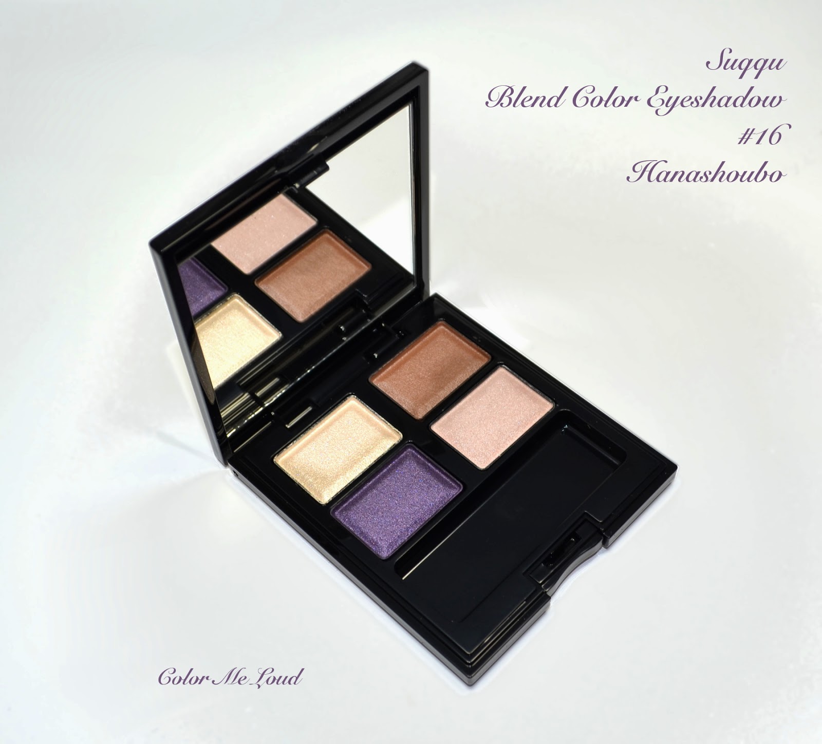
Suqqu Blend Color Eyeshadow #16 Hanashuobo

The limited pieces by Suqqu are being prefixed by Ex before the numbers so as there is not Ex with this one, it is going to join the permanent line. What a pleasant surprise, after having really hard time finding Suqqu Christmas Kit B


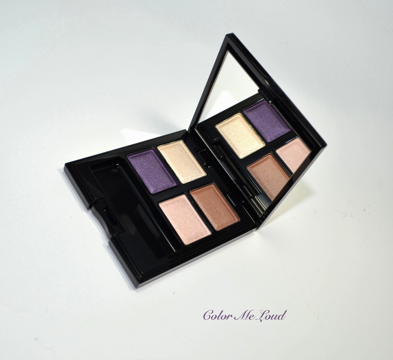
Suqqu Blend Color Eyeshadow #16 Hanashuobo

From what I can see, Hanashuobo is the "smokey" palette of the collection. It has two deeper shades, which can be layered or applied alone. Accompanying this there are two lighter shades. On the bottom right, there used to be a matte base shade to apply all over eye lid. With Hanashuobo, base shade is shimmery and semi sheer. I believe it is done for layering, but haven't tried it yet. There is almost so much to discover in Suqqu palettes.


Close-up: Suqqu Blend Color Eyeshadow #16 Hanashuobo

Here are the shades:

Upper left: Pale ivory with frosty/metallic finish. This one is rather opaque.
Upper right: Mid-toned bronze brown with satin finish. This shade has the hidden Suqqu shimmer which reveals itself only under certain light conditions. It is not very warm, rather a natural brown.
Bottom left: Mid-toned purple with similar finish to the bronze brown shade, with very subtle shimmer. This one is also not very warm nor cool.
Bottom right: Semi-sheer pale pink champagne with shimmer.


Swatch: Suqqu Blend Color Eyeshadow #16 Hanashuobo

Below is the first attempt with Hanashuobo, champagnne is on the inner corner, brown is on the lid and purple is on the crease. This one is rather a natural smokey eye with a purple twist. The shades remind me a little of Armani Quad #12 in Fatal (reviewed here) but Hanashuobo is much more understated and the longevity today was really impressive. Applied at 8am over Nars Pro-prime, removed at 10pm, still almost 90% of the eye makeup was intact. Some eye shadow formulas also irritate my eyes, especially after a long day of wear but I don't even felt that one, it silently wore and wore over 12 hours on me. 

In-action: Suqqu Blend Color Eyeshadow #16 Hanashuobo

Here is the whole look and a sneak peek of Suqqu blush from upcoming review on my cheeks, Tom Ford lip sheer in Summer Fling on the lips, which I am loving at the moment. The only with with this palette would be to have a pale to mid-toned shade for versatility instead of two pale shades which look rather close. 

FOTD: Suqqu Blend Color Eyeshadow #16 Hanashuobo

Final thoughts: Another solid palette from Suqqu, especially perfect for smoky eye fans since two of the shadows are rather deep. It gives a natural smoky eye with that pretty purple twist. Surely worth checking out.

Are you planning to pick anything from Suqqu's Spring collection?

Tom Ford Nail Lacquer #01 Sugar Dune, #02 Incandescent, #03 Coral Beach & #04 Indiscretion for Spring 2014 Collection, Swatches & Comparison

$
0
0
Today I would like to show you the most photogenic nail polishes I have had the chance to review so far, *drums* the gorgeous Tom Ford Nail Lacquer for their Spring Collection. 


Tom Ford Nail Lacquer #01 Sugar Dune, #02 Incandescent, #03 Coral Beach & #04 Indiscretion (left to right)

Before I start the review, please except my apologies for the picture heavy post because I would like to sum up the swatches and their comparisons all together, so it ended up being that way... One thing to note: Tom Ford Beauty numbered these polishes from one to four, but in their permanent line they have other polishes with the same numbers, so for nail wheel comparisons, I referred the ones with the white cap as W#01, W#02 and so on, hope this is not more confusing than it is.

Let's start with the nude of the collection, #01 Summer Dune. This one is a gorgeous light nude with pink undertones. It is fully opaque with two coats, much better than one would expect from a pale nude. It gives a very clean look to the hands, this must be my favorite of the collection. Below i took photos with and without flash.


Tom Ford Nail Lacquer #01 Sugar Dune, with flash
Tom Ford Nail Lacquer #01 Sugar Dune, without flash

Sugar Dune is rather a cool toned nude. Much like frenzy but lighter and pinkier. Burberry's Ash Rose is maybe the closest shade from my stash, but it is darker. I thought you would like to see how it compares to the other sugar nude from Tom Ford permanent line, called Toasted Sugar. Toasted Sugar is definitely warmer and more brownish. Dior #115 Charnelle and Burberry #100 Nude Beige are both warmer and lighter.

Tom Ford Nail Lacquer #01 Sugar Dune, comparisons

Here comes the metallic beauty of the collection, #02 Incandescent, which I am wearing at the moment while writing these lines. If you know me, you may know how crazy I am for a good foil finish nail polish and this one is no exception. It is like liquid rose gold while applying on the nails and ends up being as gorgeous as it looks in the bottle. It is perfectly opaque with two coats, below you can see it with and without flash. I took one more picture to show you how it shines so beautifully under sunlight.


Tom Ford Nail Lacquer #02 Incandescent, with flash
Tom Ford Nail Lacquer #02 Incandescent, without flash

Tom Ford Nail Lacquer #02 Incandescent, without flash, under direct sunlight

After I applied this one on my nails, I have seen that it was indeed quiet close to one of my all time favorite Summer shades from Chanel, #607 Delight. Their finishes and shades are very similar but they are not dupes. Incandescent pulls more pink as Delight pulls warmer and more gold. Incandescent is the first rose gold from Tom Ford but not the first gold metallic nail polish, Tom Ford released metallic polishes two years ago with their summer collection and below I included Silver Smoke (which is more silver) and Gold Haze (more yellow) for comparison. Chanel's Rose Moire is more of a metallic finish, than a foil one and it is more pink. Guerlain's La Petite Robe Noire has a close color but finish is metallic/pearly. Chanel's Gold Shimmer is more beige/brown also with metallic finish. 


Tom Ford Nail Lacquer #02 Incandescent, comparisons

There comes a gorgeous peachy coral, reminds me of a lazy summer day at the beach. This one is properly named Coral Beach. It may appear sheer with the first coat but it was opaque after two coats. It has a finish between creme and jelly (crelly?). Tom Ford line had no peaches or light corals so this one is a good addition. Below you can see swatches once more with and without flash.

Tom Ford Nail Lacquer #03 Coral Beach, with flash
Tom Ford Nail Lacquer #03 Coral Beach, without flash

Against a blue sky, Coral Beach appeared darker. It is very close to Chanel #307 Orange Fizz (discontinued). Chanel #549 Distraction is darker. Dior #457 Bouquet from this year Spring Collection pulls more pink and it is brighter. Dior #231 Bikini is close but a little darker/denser.

Tom Ford Nail Lacquer #03 Coral Beach, comparisons

The last nail polish from the collection had to be a vibrant pink. #04 Indiscretion appears more red or more pink depending on the light. It is bright but not neon (or even close) and very wearable. It has a similar finish to Coral Beach, between jelly and creme but perfectly opaque after two coats. Below you can see it with and without flash. 


Tom Ford Nail Lacquer #04 Indiscretion, with flash
Tom Ford Nail Lacquer #04 Indiscretion without flash

Indiscretion is rather close to other two vibrant pinks from Tom Ford's permanent collection, Indian Pink being a little lighter and cooler, Fever Pink a little darker and redder. Chanel's Rose Insolent is the closest shade to Indiscretion in my stash, which is a tad more pink. Chanel #571 Fracas is brighter and Dior's Bloom from this year's Spring collection has more blue in it.

Tom Ford Nail Lacquer #04 Indiscretion, comparisons

Here is Indiscretion followed by the black capped sisters Indian Pink and Pink Fever on a march...


Tom Ford Nail Lacquer #04 Indiscretion, comparisons

Final thoughts: All in all lovely collection. Formula of these doesn't disappoint, very nicely selected shades for Summer and Spring. But these doesn't keep me from waiting for a more unusual release to Tom Ford nail polish line. Nail polish gods, do you hear me? What about a blue or an aqua green? My favorites are Sugar Dune and Coral Beach. Incandescent too if you don't have Delight in your collection.

If you want more comparisons, with any of the shades listed here, please leave a comment below.

Are you eyeing any of these? Do you like this packaging as much as I do?

Suqqu Blend Color Eyeshadow #17 Yomogiiro for Spring 2014, FOTD, Swatch & Review

$
0
0
As far as my Japanese research went, Yomogi means mugwort and ori is color. Please correct me if I am wrong but hey, look at that one, this green, it tells me that I might be right.


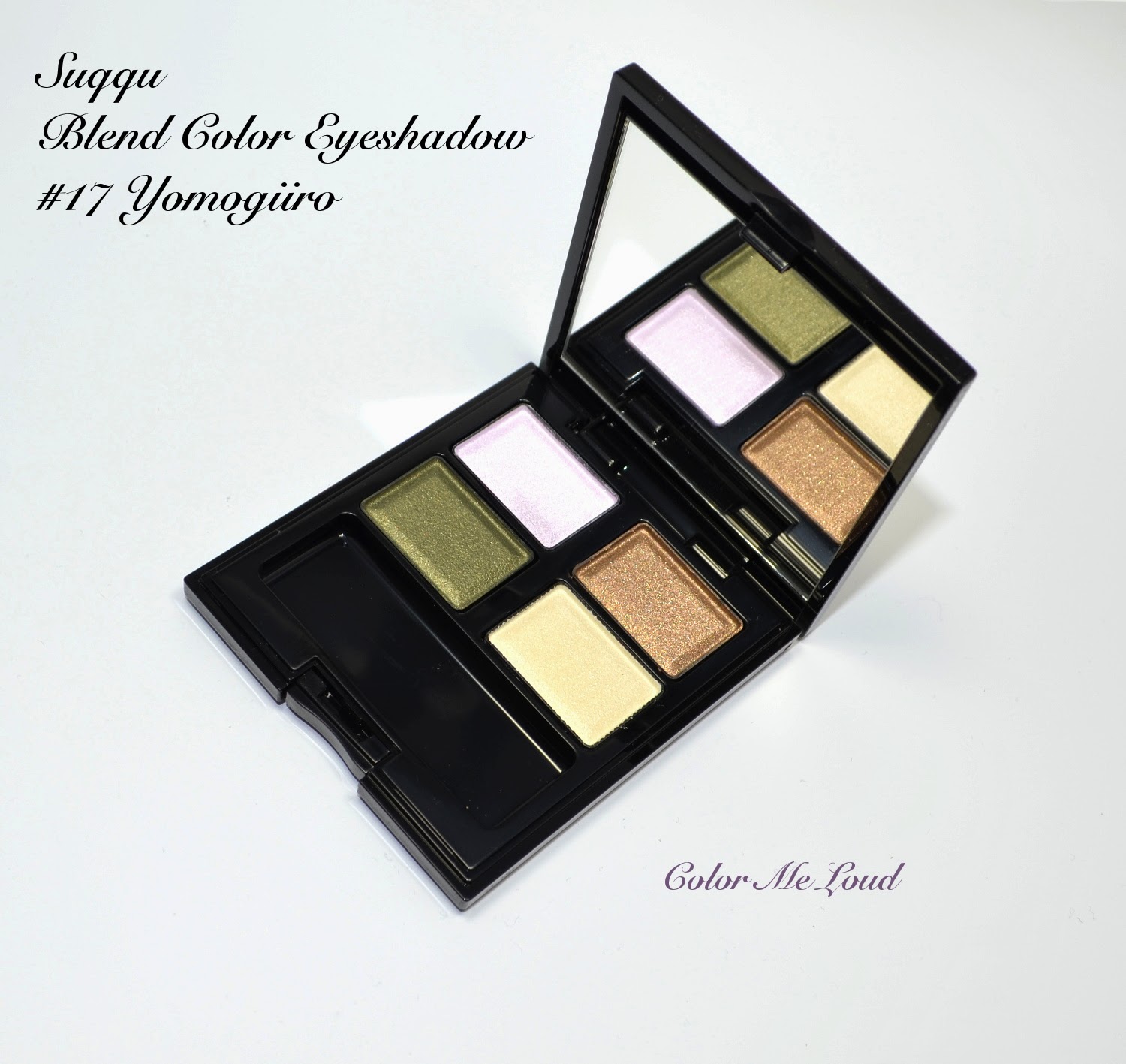
Suqqu Blend Color Eyeshadow #17 Yomogiiro

Number 17 Yomogiiro is one of the three palettes which is released for this spring and going to join Suqqu's permanent line. I reviewed #16 Hanashuobo previously, which is another one with purple theme after Japanese Water Iris, as its name suggests. Yomogiiro combines tan brown with mossy green and throws in an interesting light lavender in there.


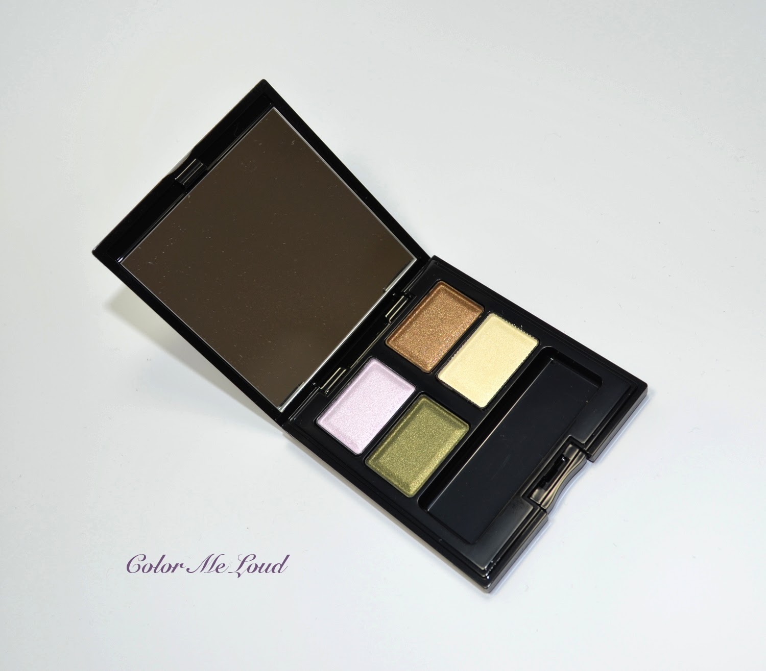
Suqqu Blend Color Eyeshadow #17 Yomogiiro

The textures in this palette are close to Hanashuobo's, under day light they are mostly satin with very subtle shimmer but with yellowish artificial life they have a beautiful multidimensional sheen.  Bottom right of Suqqu's quads have the base color, to apply all over the lid. With these quads, Suqqu reformulated them and made them less powdery, more silky. One more thing to note is that they were previously matte and now they are shimmery. It all depends on your choices I guess, but I rarely use base eye shadow to make a full on color application possible, so I can't comment on how well these perform. I have to note though, being semi sheer, they don't effect the application afterwards in an undesired way.


Suqqu Blend Color Eyeshadow #17 Yomogiiro

I took a photo outdoor and indoors to give you some idea about the textures and shimmer. 

Upper left: Very pale lavender. I swear I am seeing much blue in that. On some skin tones this might pull pink but on me everything pulls berry.

Upper right: Appears like a antique gold in the pan but once swatched it is a cooler brown base with golden shimmer. Finish is satin, shimmer comes to life under artificial light.

Bottom left: A beautiful forest green with golden shimmer, which makes it appear more yellow toned under artificial light, like moss green. Finish is similar to the brown shade.

Botton right: Pale ivory with semi opaque finish, aimed to be the base color.


Outdoor swatch: Suqqu Blend Color Eyeshadow #17 Yomogiiro
Indoor-swatch: Suqqu Blend Color Eyeshadow #17 Yomogiiro

Below I used the pale lavender on the inner corner until the mid lid, then blended that one with the green which I applied starting from two third of the lid outwards. I then layered the brown on the green on the crease for a soft definition. As you see close to the lash line on inner corner there appeared a lighter shade of green, which is the result of lavender and green layering beautifully. Yomogiiro gives a soft green smoky eye, nothing very dramatic but pretty.


In-action: Suqqu Blend Color Eyeshadow #17 Yomogiiro

Here is FOTD with Yomogiiro, used also new blush duo from this collection called Momoshiuro on the cheeks and Giorgio Armani Sheers #314 Delirium (reviewed here) on the lips.


FOTD with Suqqu Blend Color Eyeshadow #17 Yomogiiro

Final thoughts: Suqqu's Spring launches are everyday wearable palettes, Yomogiiro is no exception. If you like green eyes, softly defined looks with a twist (lavender in there) and a palette with good longevity and great consistency, you need Yomogiiro. If you are after something creative for a dramatic eye, this might not be for you, at least not without a black/dark base.

I purchased this one from Ichibankao, it should also be available in Selfridges shortly. It is not limited edition.

What do you think about dramatic eye looks for spring? No way?

Suqqu Balancing Cheeks #01 Momoshuiro Blush Duo for Spring 2014, Swatch & Review

$
0
0
As excited as I am to write about the last one of the three new Suqqu Quads (#16 is reviewed here, #17 here), I would like to first talk about the new Suqqu blush, Momoshuiro.


Suqqu Balancing Cheeks #01 Momoshuiro

This one is an exciting moment for me because Momoshuiro is the first time I try a Suqqu Blush Duo. According to Suqqu, right side of it should be applied to give color and left side (the lighter part) to give dimension, like a highlighter.


Suqqu Balancing Cheeks #01 Momoshuiro


Momoshuiro consists of a light peach shade (left) which has matte to satin finish and a mid-toned natural pink (right) which has a little more shimmer to its texture. This compact also has the softest compact brush I have seen so far, I suspect this made of squirrel but maybe not 100% grey squirrel like their cheek brush but a mixture of grey and blue squirrel. This is just a guess by considering the softness and the color of the hairs, but if you know more about this, please leave a comment below.


Close-up: Suqqu Balancing Cheeks #01 Momoshuiro

Below you can see the swatches of Momoshuiro, which are hard to see. Please note that my arm is darker than my face so sometimes what doesn't swatch good on the arm, performs better on my face. You can see that the left shade has a subtle brightening effect and right side has a refreshing not too blue based pink tone.


Swatch: Suqqu Balancing Cheeks #01 Momoshuiro

You have already seen me wearing this on both of the eye shadow quad FOTDs (here and here) which I applied using Suqqu Cheek blush. Sometimes light pinks turn chalky on me but this one doesn't. By combining the softness of this brush and the colors, the effect on the cheeks is also soft and fresh but it is hard to capture this with camera which usually washes out colors).

Final thoughts: If you like soft brightening fresh cheeks for Spring and your complexion is light to medium than Momoshuiro might be blush you are looking for.

Do you like your blush soft or densely pigmented?

Suqqu Blend Color Eyeshadow #15 Mitsucha for Spring 2014, FOTD, Swatch & Review

$
0
0
I hope you are all having a great Sunday. Before it is over here in Germany, I would like to post about the last Suqqu Quad which joined the permanent line together with the other two releases for this Spring. If you haven't seen the others yet, please check out previous posts for #16 Hanashuobo and #17 Yomogiiro. Today I would like to talk about Blend Color Eyeshadow #15 Mitsucha.


Suqqu Blend Color Eyeshadow #15 Mitsucha for Spring 2014

Japanese is one of those languages I always wanted to learn along with Chinese but I was always afraid of the alphabet. It might sound desperate but nowadays I am using this opportunity to learn a few words from Suqqu Quads, lol! Anyway according to my research, (Hachi)mitsu(iro) is the color of honey. Looking at the quad, this makes sense. Cha on the other hand is tea! So here we go, the colors tell it all, honey and tea or honey tea, in Mitsucha you can find gold peach and brown in a lovely harmony.


Close-up: Suqqu Blend Color Eyeshadow #15 Mitsucha for Spring 2014

Here are the shades swatched, you can see in this quad there are no matte colors, all of them have visible shimmer but these are not over the top. In case you haven't tried a Suqqu quad before, the shimmer in these are very fine. I find them to be suitable also for mature skin since they don't accentuate the fine lines. They do usually look more shimmery under artificial light and more satin under day light, therefore I used "satin to shimmery finish" to describe them.

Top left: Light gold with yellow undertones, satin to shimmery finish
Top right: Mid-toned peach with satin to shimmery finish
Bottom left: Deep natural brown with satin to shimmery finish
Bottom right: Base shade, very light semi transparent ivory with fine shimmer

Swatch: Suqqu Blend Color Eyeshadow #15 Mitsucha for Spring 2014

When I wore Mitsucha, Armani's ETK Quad #10 came to my mind (which is also very similar to their Summer Face&Eye Palette from last year as reviewed here). Both have warm peachy and brown tones for a soft polished look. 


Suqqu Blend Color Eyeshadow #15 Mitsucha vs. Giorgio Armani ETK Quad #10

Armani ETK Quad #10 is one of my all time favorite eye shadow quads. It gives that slight accent on the eyes without a drama and can be combined with any statement lippie of your choice. Now after trying both out and swatching them side by side, I can safely say I like Mitsucha even more! It has the same softness and warmness but I find Mitsucha to be a bit more defining (brown is slightly darker) and its longevity is au pair with Suqqu eye shadows, stays put over 12 hours with a primer on me and doesn't fade or crease.


Swatches: Suqqu Blend Color Eyeshadow #15 Mitsucha vs. Giorgio Armani ETK Quad #10

Another close palette to the color family is Chanel Ombres Matelasees in Pearl River. It is no secret that this one was no love for me. I could never make that orange work on my lids. After seeing the comparison of Suqqu Mitsucha to Armani ETK #10, I thought these two might look even closer.


Suqqu Blend Color Eyeshadow #15 Mitsucha vs. Chanel Ombres Matelassees Pearl River

And I was right. Mitsucha and Pearl River are indeed close, especially the gold shade. But since the orange shade is more peachy and rusty in Mitsucha it works better on me. To me Mitsucha is how I would wish Pearl River to be, texture and color wise.


Suqqu Blend Color Eyeshadow #15 Mitsucha vs. Chanel Ombres Matelassees Pearl River

Here is a very blended look but I hope it gives an idea. Right now it is very rainy in Stuttgart, so although I wore the quad several times, I was not able to take a better looking photo. 

In-action: Suqqu Blend Color Eyeshadow #15 Mitsucha

Below is the whole face makeup to show how Mitsucha works together with a spring lip. I am wearing Tom Ford Lip Conditioner in Paradiso for the look below.


FOTD: Suqqu Blend Color Eyeshadow #15 Mitsucha

Final thoughts: Mitsucha might not be the most unique quad from Suqqu but it is one of those basic palettes "done right" which you can use everyday. Especially in Spring and Summer it gives the soft and polished look and can accompany one of your lively lipsticks. All in all a lovely addition to the permanent line.

New Suqqu Quads are already available in Selfridges and in Ichibankao (links are not affiliated).

Are you eyeing any of those?

Hourglass Ambient Lighting Blush Luminous Flush & Mood Exposure, Review & FOTD

$
0
0
After the big success of their Ambient Lighting Powders, a few weeks ago Hourglass released their Ambient Lighting Blushes in six different shades. I ordered two of these from Space-UK to test it. This was supposed to be a pre-order but a few days after the order I got a shipping notice. Last week these two beautiful blushes was in my hands, so I could play with them a little before I dare to write about one of the most sought after products at the moment, so here is Luminous Flush and Mood Exposure *drums*


Hourglass Ambient Lighting Blush Luminous Flush & Mood Exposure

No one would ever deny, these ARE pretty. Very pretty *happy sigh*. It was a pleasure to take photos of them. Looking how beautiful they appear from different angles, a bloggers dream.


Hourglass Ambient Lighting Blush Luminous Flush & Mood Exposure

I love the random patterns on those and the fact that it stays there even after usage since it is not only on the surface but also deeper down. Luminous Flush is composed of a pinky coral part, mixed with Ambient Lighting Powder in Luminous Light but I find the lighter parts of this blush to be darker than the original powder.


Close-up: Hourglass Ambient Lighting Blush Luminous Flush


Mood Exposure is a plummy shade, mixed with paler rosy highlighter. Pale parts should be the same as Ambient Lighting Powder in Mood Light, which I don't own but looking at the swatches I suspect this one might also be a little darker than the original powder.


Close-up: Hourglass Ambient Lighting Blush Mood Exposure


I was wondering how much plum would mood exposure pull on me. It appeared more of a soft brown on the swatches I have seen and on me it has a very slight plum tingle but I would still classify it as a brown. Luminous Flush is a warm light pink on me, which pulls slightly coral. Both of them are rather matte to satin finish and do not glow on my cheeks, which is good in my book.


Swatches: Hourglass Ambient Lighting Blush Luminous Flush & Mood Exposure

I was praying expecting that Chanel Joues Contraste #84 in Accent (reviewed here) and Mood Exposure would be close but Accent pulls cooler and more plum. I would like to compare Luminous Flush to one of my recent loves, Diorblush in Corail Bagatelle (reviewed here). Luminous Flush is a lighter version of Corail Bagatelle and also slightly warmer.


Comparison swatches: Hourglass Ambient Lighting Blush Luminous Flush & Mood Exposure

Below I am wearing By Terry Eye Shadow Stick Ombre Blackstar in Bronze Moon (love!) and Mood Exposure on the cheeks. By the way if you are trying to track Bronze Moon down, now it is available at Space NK, just saying ;-)

FOTD with Hourglass Ambient Lighting Blush Mood Exposure

For the following look I combined Hourglass Eyeshadow Duo in Exhibition on the eyes with Hourglass Luminous Flush on the cheeks. On my lips I am wearing Giorgio Armani Flash Lacquer #614 in Belladonna, reviewed here (a lovely reader Alicia asked for a FOTD with it, so here it goes out to her). 


FOTD with Hourglass Ambient Lighting Blush Luminous Flush

My impressions? These are very finely milled, they kick some powder but with a soft brush like Suqqu's Cheek Brush it applied beautifully. The color shows up nicely and blending is easy. I actually have only one problem with these, staying time. Almost 2-3 hours after the application, these started to fade on me and after 4 hour mark there was only a slight indication of blush was left on my cheeks. I don't know if it is my rather dry to normal skin and if it lasts longer on other depending on the choice of foundation or chemistry of one's face but for me longevity is a big issue. I put on my make-up before I go to work in the morning and I expect that when I am back home (10-11 hours) it is still on. Most of my other blushes don't fade on me so I was a little disappointed in this respect. Anyone having the same problem or am I the odd one out?

Final thoughts: Pretty, soft and pigmented. Wished they would stay longer on me.


Clarins Ombre Minerale #17 Smoky Plum for Spring 2014 Opalescence Collection

$
0
0
I may have hundreds of purples, plums, taupes but every once a while I get my hands on a new one and my heart skips a beat. Today I would like to show you one of those super exciting eye shadows for me. Please say hi to Clarins Ombre Minerale #17 in Smoky Plum.


Clarins Ombre Minerale #17 Smoky Plum

Smoky Plum. Just hearing this name, I needed to get my hands on it. But then I have seen the promo pictures and I was a little confused. Hey they looked rather brown? I wanted to wait until my counter received it. Upon touching it, I knew we were meant for each other. These are very soft to touch but softly pigmented once applied dry. You can intensify the application to a full on color by damping the brush a little.


Clarins Ombre Minerale #17 Smoky Plum

Below I applied it dry, just using my fingers. It is a very complex shade pulling plum, taupe and brown at the same time while having many pretty multi colored shimmer of pale pink, silver and even green. It doesn't appear frosty on the lids but rather shimmery in a complex and pretty way. By looking at this swatch, can you tell why I am so excited?


Swatch: Clarins Ombre Minerale #17 Smoky Plum

On the eyes, it looks very natural yet so unique. It must be the shimmer and I am loving it. Photos really don't do it justice. Below I applied it all over the lid and slightly deepened my crease with a matte brown from Laura Mercier's Artist's Palette. Over a primer (Nars Pro-prime) this one stayed all day long on me without fading and creasing. 


In-action: Clarins Ombre Minerale #17 Smoky Plum

Here is the complete look with Clarins Smoky Plum on the eyes. Lipstick I am wearing must be Chanel Rouge Coco in Triomphe but maybe I am mistaken ;-)


FOTD: Clarins Ombre Minerale #17 Smoky Plum

Clarins Ombre Minerale #17 Smoky Plum has 2g/0.07OZ of product (the same as singles of many other brands) and retails for 18 EUR/$21. 

Final thoughts: Nothing but love! If I would pick one single from all the Spring Collections, Smoky Plum would be the one. I am wondering why I hate mineral eye shadows from some brands (MAC I am looking at you) and end up loving them from another. 

What is your favorite single eye shadow this Spring?

Nars Duo Eyeshadow in Kauai for Spring 2014 Color Collection

$
0
0
I am very excited to write my first post about a Nars product. Yes, it is hard to believe but true. You might know that I am a worshipper of Nars Pro-prime and mention it very frequently but up to date I have never purchased a eye shadow duo from the brand. I blame the absence of Nars stores in Germany and my contact with the brand being limited to my visits. I was indifferent and my pocket was happy until I have heard a loud applause for one of their new duos from Spring 2014 Color Collection, called Kauai.

Nars Duo Eyeshadow in Kauai

Properly named after a beautiful island in Hawaii, Nars Duo Eyeshadow in Kauai resembles the golden sand and deep blue sea. Actualy this sea is even more purple than blue, which is one of the reasons why this combination was hard for me to resist. Beauty Blogosphere was full of raves so I went on and pulled the trigger.


Nars Duo Eyeshadow in Kauai

Kauai is composed of two shimmery eye shadows. The texture is buttery smooth and insanely pigmented. I found these to be not frosty but rather "foil" like if they would be nail polishes (I hope that it makes sense). Let's call them metallic for the time being ;-) They actually reminded me a little of Urban Decay eye shadow texture but with these I didn't experience fall out and on my lids they didn't accentuate fine lines. 


Close-up: Nars Duo Eyeshadow in Kauai


First shade is a metallic gold with cooler undertones. I love the fact that it is not that yellow. I think this type of gold would look fabulous with blue eyed beauties among you. It is not hard to guess that my favorite shade is the second one, a metallic purple which also leans natural to cool. This one almost swatches duo chrome and looks brownish at some angles (look at the bottom of my arm).


Swatch: Nars Duo Eyeshadow in Kauai

But the magic happens when these are layered to reveal that gorgeous multi facet taupe with gold and purple shimmer. I was very much impressed with how easy it was to layer them without the eye shadows turning muddy.


Swatch: Nars Duo Eyeshadow in Kauai, shades alone and layered

Below I went for a classical replacement, gold at the inner corner all the way to the middle, then purple at the outer corner and they meet in the middle to be mixed and layered. Over Nars Pro-prime, these wore all day without creasing and fading. It is colorful yet not over the top so I can wear it easily at work. I complimented this look with Guerlain's Amber Silver pencil on the lower lash line.


In-action: Nars Duo Eyeshadow in Kauai

Final thoughts: A different take on Spring with gorgeous metallics, a great alternative to all the pastels out there. Formula is also superb. I am very much impressed with my first Nars Duo.

Any recommendations for my next Nars Duos? Which one is your favorite?

Yves Saint Laurent La Laque Couture #41 Eau de Rose, #43 Opulente Cannelle, #44 Ambre Gingembre, #45 Piment D'Ailleurs, #46 Poivre Noir, #47 Feuille D'Or Spicy Nails Collection, Review, Swatches & Comparison

$
0
0
Ever since the promo pictures of seven new Yves Saint Laurent nail polishes were released, I have been trying to track them down. Last year Tie & Dye Collection didn't make it to Germany so I was anxious about this one. My daily checking of feelunique.com paid off and I got my hands on six of the seven pieces. At the moment other than two of them, others seem to be out of stock there. I also know that extremely few pieces were sent to each retailer, but if you had the chance to track lay your hands on these, here they are...

Yves Saint Laurent La Laque Couture #41 Eau de Rose, #43 Opulente Cannelle, #44 Ambre Gingembre, #45 Piment D'Ailleurs, #46 Poivre Noir, #47 Feuille D'Or Spicy Nails Collection

First shade is a nude. #41 Eau de Rose is a nice subdued light peachy pink creme. This one is a perfect shade for upcoming spring, fresh yet nude. Consistency was very good, in two coats it was opaque and there was no streakiness. Below you can see it with and without flash.


Yves Saint Laurent La Laque Couture #41 Eau de Rose

I was most curious about the interesting #42 Safran Sultan, which is a mustards shade and I don't own anything like that. That one is now released in US, so I am hoping to get my hands on it soon.

Here is the next shade, #43 Opulente Cannelle. Cannelle is cinnamon in French. Think about cinnamon sticks and you get a good idea of this shade. It is a mid toned brown tone which strongly pulls pink. It has a creme finish. When I first swatched it, I thought about Chanel Rose Confidential, which I later found out to be pinker than Opulente Cannelle. Comparisons are at the end of this post. Again excellent formula, below swatches are with two coats. 


Yves Saint Laurent La Laque Couture #43 Opulente Cannelle,

Yves Saint Laurent La Laque Couture #43 Opulente Cannelle,

#44 Ambre Gingembre (Amber Ginger) must the most unique shade in this collection. It is a mid-toned rusty orange with creme finish. I own nothing like it and it was amazing to see how it looked on my nails. It needs a little bit of getting used to, that is for sure but worth trying for me since I love orange. Somehow this one reminds me of Autumn, but it might be uniquely chic during Spring.


Yves Saint Laurent La Laque Couture #44 Ambre Gingembre

Red and hot, next is the chili shade, #45 Piment d'Ailleurs, a medium to dark red with blue undertones and creme finish. I really liked this one and ended up wearing it after swatching. I also applied the top coat of this collection on my ring finger for some more fun. Top coat is called #47 Feuille d'Or (gold leaf). It has great quality, packed with golden leaves so that one doesn't have to fish them out. Below you can see with just one coat, it looks quiet intense.


Yves Saint Laurent La Laque Couture #45 Piment D'Ailleurs
Yves Saint Laurent La Laque Couture #45 Piment D'Ailleurs and #47 Feuille D'Or

Without black pepper, no spice collection would be complete, so as the last polish, here is # 45 Poivre Noir (black pepper). It is a deep red shade with some blue so that it looks more of a berry/plum on the nails. I also wore it last week and loved the way it looked. If you like your vamps as much as I do, you may want to check this one out. Just like all other nail polishes in this collection, it has great consistency. It is also opaque with two coats.


Yves Saint Laurent La Laque Couture #46 Poivre Noir

Here are some comparison swatches. A few Chanel nail polishes such as #507 Tendresse or #569 Emprise are close to YSL #41 Eau de Rose but no dupes since those are both more peachier. Chanel#521 Rose Cache is darker.

#43 Opulente Cannelle is close to Chanel #491 Rose Confidential and Chanel Delicatesse, which are both more pink than browner Opulente Cannelle. Chanel #579 Paparazzi is darker and it has shimmer. 

YSL #44 Ambre Gingembre is very unique to my collection, thus I have nothing to compare it to.


Comparisons: Yves Saint Laurent La Laque Couture #41 Eau de Rose, #43 Opulente Cannelle, #44 Ambre Gingembre

YSL #455 Piment D'Ailleurs is close to Chanel #533 April but more red and slightly darker. Chanel #455 Lotus Rouge is redder and a little darker.

YSL #46 Poivre Noir redder and browner once compared to Chanel #599 Provocation or YSL #40 Sepia 7E Art. Chanel #573 Accesoire is close but darker.


Yves Saint Laurent La Laque Couture #45 Piment D'Ailleurs, #46 Poivre Noir

Final thoughts: A fun theme from YSL, very nice formula for all the nail polishes. Most unique are #42 Safran Sultan (not swatched) and YSL #44 Ambre Gingembre. Other are also nice but they may be a little more dupable.

Are you eyeing any of YSL Spicy Collection nail polishes? Which one of those are your favorite?

Viewing all 679 articles
Browse latest View live